Hands-On with the Samsung Galaxy S III
May 3, 2012, 1:00 PM by Rich Brome @rbrome.bsky.social
updated May 3, 2012, 2:30 PM
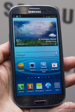
Samsung today announced the Galaxy S III, its global flagship phone for 2012. We spent a bit of time with it. Read on for our first impressions of the hardware and the impressive software, plus photos and video of this sexy phone.
Hardware
Samsung's Galaxy S series is becoming synonymous with a quality high-end Android experience. These are global flagship phones that most carriers around the globe are anxious to offer. They make Apple nervous enough to sue Samsung over the way they work. In London today, Samsung unveiled the third in the series, predictably named the Galaxy S III.
The hardware impresses, but the software is where the real magic is....
There's no doubt that it's a sexy phone. The "marble white" version is simply glossy white. The "pebble blue" version, however, has a transparent front and back, that are glossy and smooth on the surface, but show a brushed-metal texture below. The front is glass that's been rounded near the edge - much like the HTC One X - to feel smooth as you hold it or make swiping gestures. It feels great. The back is polycarbonate that's been coated with something called "hyper glaze". It's very glossy, and does show fingerprints.
The phone is quite thin at 8.6mm, and quite rounded, in every direction. This helps it fit nicely in most hands, even though it has a huge 4.8-inch display. Putting it next to the Galaxy Note, the Note still looks enormous by comparison. Everyone wants the biggest display in the smallest phone, and the Galaxy S III strikes an excellent balance on that front. The overall feel and build quality is great, even with the plastic back. The weight is also excellent, at 133g.
That 4.8-inch display is 720p HD Super AMOLED, of course. It is PenTile, which not everyone likes. But, much like the display on the Galaxy Nexus, it's hard to tell that's it's PenTile at the high pixel density of a true HD display. If you know what to look for and hold it up to your eye, you can tell, but in most daily use, it looks great. It's not technically the best display we've seen recently, but it's not bad. It's quite nice and doesn't embarrass the phone.
There's no camera button, unfortunately, but you'll find everything else where you expect it, including a 3.5mm audio jack on the top and micro-USB port on the bottom. Mercifully, the back cover is easy to remove and replace, unlike last year's model. Underneath, you'll find the 2100 mAh battery and microSD memory card slot.
That memory card slot is one of the first to support SDXC, so it can support cards to 64 GB. Since you will be able to buy the phone with up to 64 GB of internal memory, that means this phone could offer up to an impressive 128 GB of total storage fully loaded.
The bottom of the front sports a nice physical home button, flanked by two capacitive touch keys that are only visible when illuminated. They're illuminated only within one second of touching them, which is a tad annoying. However, since the home key is a physical button, it's easy to feel, and thus it's easy to simply feel the area to the left or right of the home button and press there to activate the correct touch button.
The front buttons aren't the usual ones, though. The home button does what you'd expect, except that it doubles as the multi-tasking key when held down. To the right is the "back" key, which to me would make more sense on the left, but perhaps that's just me. The left is actually a menu key. Yes, you read that right: a dedicated hardware menu key on a phone that ships with Android 4.0! I'm sure that a lot of people will appreciate that, (as Android 4.0 has been widely criticized for banishing the "menu" options to confusing on-screen buttons.)
Other hardware features include NFC, of course, and HSPA+ 21 data, or LTE in some versions (which Samsung isn't providing details about just yet.) There's Bluetooth 4.0 LE on board, matching the iPhone 4S and HTC One series.
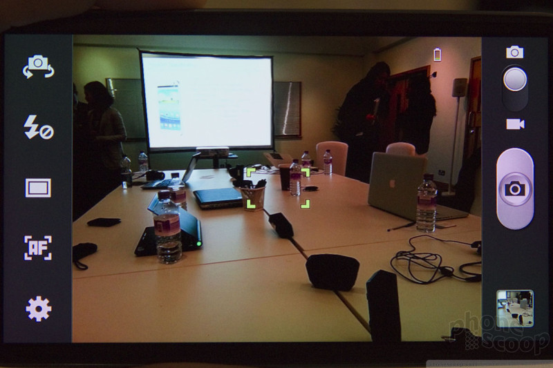
The camera clocks in at 8 megapixels, complemented by a flash and a front camera that can record 720p HD video. The camera interface supports all of the great features and controls we expect from Samsung, including macro mode, sweep panorama, blink detection, smile shot, and face detection. The Galaxy S III brings some new tricks, though, including zero shutter lag and 0.3-second shot-to-shot time. You can actually shoot three photos per second, and in burst mode, six per second. While recording 1080p HD video, you can also shoot 6-megapixel still photos without interrupting the video.
The processor is a quad-core Samsung Exynos, at least in this international version, but Samsung is being tight-lipped so far about how US versions might differ. I noticed some stuttering while using it, but it's not final software, so that doesn't mean much, and any US version could sport a different chip.
Software
The real magic in the Galaxy S III is with the software.
Samsung started with Android 4.0, AKA Ice Cream Sandwich. Much like HTC with Sense, Samsung has heard feedback that TouchWiz was too heavy. So they've trimmed the fat, and the new TouchWiz (it doesn't have a version number) delivers something that looks closer to the "stock" Android experience. The app and widget menu, for example, looks much like it would on a Galaxy Nexus. There are little tweaks, such as sliding panels that "wrap around", such that when you reach the last panel, going further takes you back to the first one instead of just stopping you. The little indicator dots for what page you're on also stay visible and are easier to see. These are the kinds of small changes from stock Android that I - personally - appreciate.
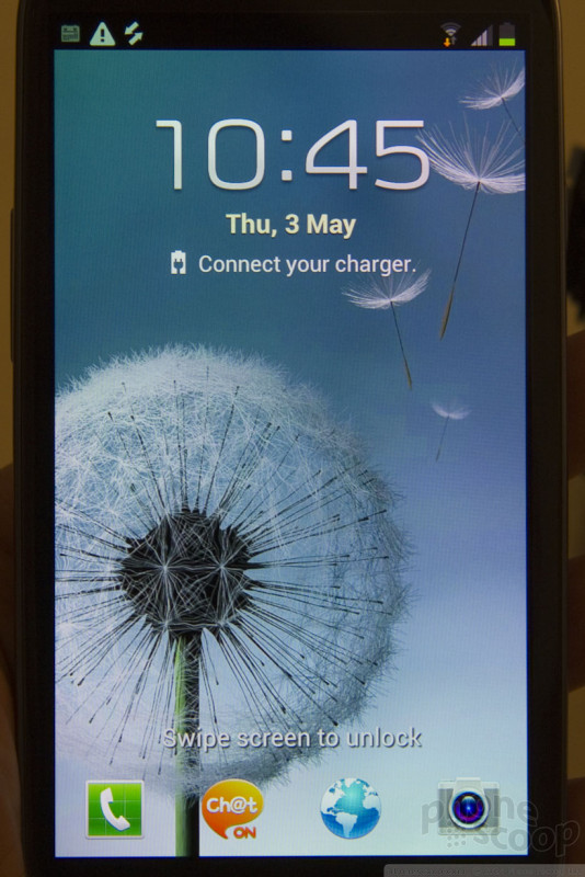
There are also expected improvements like shortcuts directly to certain apps from the lock screen. But that's not the magic part.
The magic part are all of the little "smart" features Samsung has added.
For example, it knows when it's been set on a table for a while. And it knows when you pick it up, so it will then vibrate and show you a special screen with everything that happened while you were "away".
It also knows when you're looking at it. Instead of a dumb timer for dimming the screen, the Galaxy S III uses the front camera and face recognition to "see" you, and won't dim the screen while you're looking at it. I doubt that's great for battery life, but it's a neat idea.
It also knows when you swing it up to your face. So if you're looking at a message, or recent call from someone, you can simply move the phone to your face to initiate a call with that person.
It also has really, really extensive facial recognition features. Every photo you take is matched against your contact photos. From that, you can tap faces to jump to social networking profiles (Facebook or Google+). You can also tap a face on a photo you've just taken and instantly send that photo to that person. It will also use any groups you've set up in your contacts, and automatically create photo albums based on those groups, with all photos of people in those groups.
There's also a Siri-like voice command feature. You can use it to check the weather, control music, set an alarm, etc. A simple double-tap on the home button summons this Samsung software assistant.
Samsung is also making all of these features easier to use. There were actually quite a few smart features Samsung loaded into the Galaxy S II, but they weren't discoverable; if you didn't know the secret trick, you'd never know about them. In the III, Samsung has added a slew of pop-up tips that help you learn all of the cool tricks.
There are also some software tricks that are more for show. For example, the default lock screen has a liquid effect when you unlock it. It looks (and sounds) very cool, but that's about it. You can disable it.
update: The lock screen does have a new font for the clock, which is a bit larger and easier to read, a welcome change. It also offers some customization options, such as weather and a slide-up drawer with news headlines.
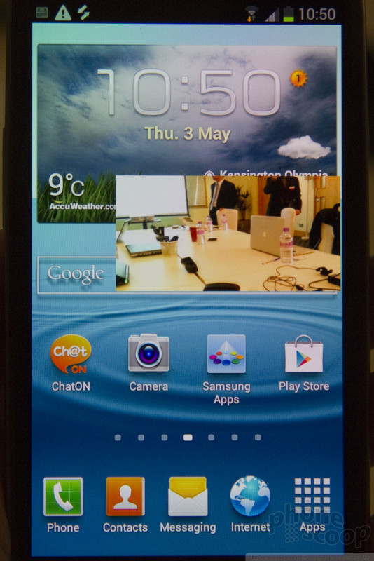
You can also put an active video playing into a small pop-up window that floats above the whole Android interface. So you can keep watching a movie while looking up an actor on IMDB, for example. I'm not sure how useful that is, except to impress friends.
"S Beam" is a feature that uses NFC together with Wi-Fi Direct to share files. Just bring up a photo or video, tap your phone against another Samsung with S Beam, and the file is sent. Because it's over Wi-Fi, it should be fast. It also works for Office files, etc.
Also in the media category, AllShare has been expanded with AllShare Cast, which uses the Wi-Fi Display standard to play media - or even games - on a full-size TV while keeping controls on your phone's display.
To wrap up, the Galaxy S III is a solid successor to the S II. The hardware is nice, although it contains nothing really surprising or exciting. Samsung isn't making any technological leaps ahead of the competition here.
But on the software front, it's a bit more impressive. They've trimmed back TouchWiz in the right ways, while adding some really smart features that should make using the phone just a bit more enjoyable.
Video Tour
Comments
New S II owner...should I be upset?
That said, after reading the early reviews and looking at some of the SII vs. SIII comparisons I am not so sure I should be upset. And since my carrier is TMobile, the carrier that tends to get things super late and/or last it very well could be the same time this year (SII launched for TMobile Oct. 14, 2011) before this phone hits TMobile's network. So what do you think fo ...
(continues)
(continues)
(continues)
Just a couple observations/opinions
(continues)
(continues)
Looks cheap
How Samsung sells a single phone is beyond me.
bluecoyote said:...
Can Samsung produce anything that doesn't look like a chinese knockoff of something else? The UI looks dated-for-2008, and the fake brushed metal finish looks dated-for-2006.
How Samsung sells a single phone is
(continues)
(continues)
Disappointing
- Ugly design
- Ugly UI
- US variants might have Exynos (don't hold
your breath for a quad core on Verizon)
The only thing it has going for it is the processor and thats even if it's Exynos. Battery life will be improved but thats about it.
No thanks. Sticking with the Galaxy Nexus and extended battery. 4.0.4 ICS solved most of the issues many were having and it'll get Jellybean way before the S III does. That's for damn sure.
I have no idea what processor will be in U...
(continues)
Thx for the video Rich!!!
This WILL BE my next smartphone. But I refuse to pay $299+. I will wait, and wait and get it on Amazon, so I can at least afford to buy accessories like spare battieries, protective case to keep it beautiful. Desktop charger.
I won't be buying anything at a Verizon store!!! Rip off!!!
Boy am I glad the battery & memory card are removable!!!
So,...next waiting game, Google I/O, Jelleybean!!!
Did Samsung buy up all the worlds cheap plastic?
(continues)
The only real difference is that it's not unibody. Unibody is nice, but non-unibody means you can access the battery on the Galaxy S...
(continues)
Get outta my way!!!!! I'm in line here!!!
That's the phone I'd buy


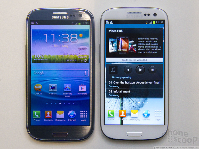


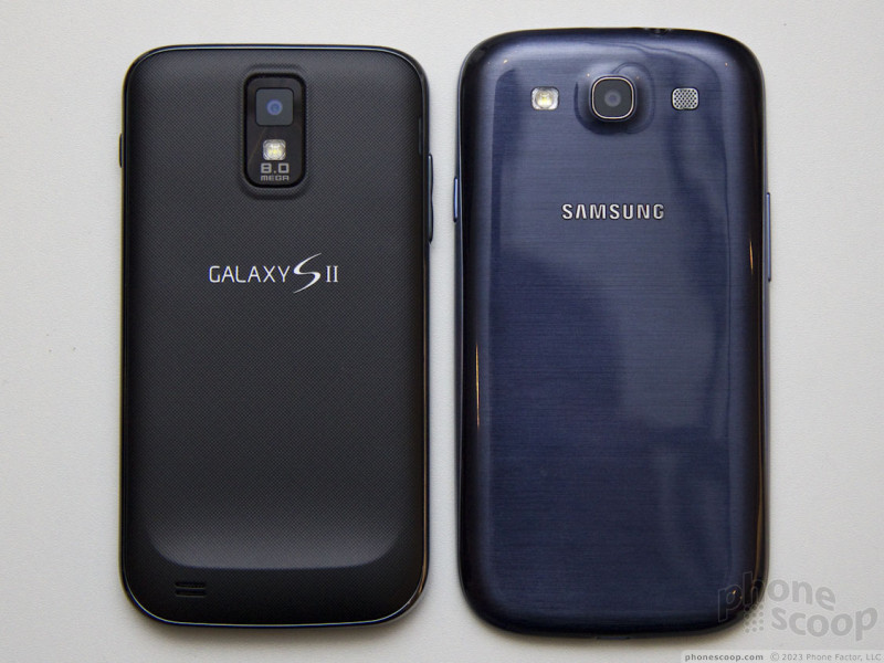








 Review: Samsung Galaxy S III for Sprint
 Samsung Debuts GamePad for Android Phones
 Cricket Launches LG Optimus Regard, Its First LTE Smartphone
 MetroPCS Selling Samsung Galaxy S III for $499
 Samsung Galaxy S III (global)
 Samsung Galaxy S III (T-Mobile)
 Samsung Galaxy S III (AT&T)

