Review: Samsung Galaxy S III for Verizon
Menus
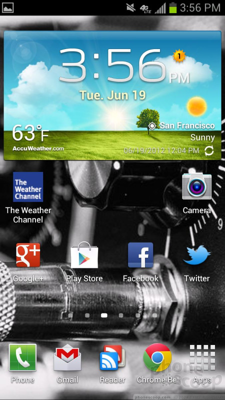
The GS3 runs Android 4.0 Ice Cream Sandwich (ICS) with the latest version of Samsung's TouchWiz software floating on top. The blend of the two makes for some neat innovations and interesting give-and-take compared to other Android 4.0 devices.
The lock screen, which can be unlocked by swiping anywhere, in any direction on the display, offers four customizable shortcuts. By default, those are to the phone, messaging app, S-Note app, and the camera. Just touch the app you want to open, swipe it, and you'll go directly there. The notification bar is visible from the lock screen, so you know if you've got unread emails, messages, and other items waiting, and you can access notifications from the lock screen, which appear when the display wakes up.
The basics of the menu system are essentially the same as on other ICS phones. The GS3 has seven home screens, up to four of which can be deleted. They can be packed with widgets, apps, shortcuts, contacts, and so on. The tool for customizing the home screens is a cinch to use, and I particularly like the widget tool.
The main app menu is a completely customizable set of grids. Apps can be rearranged to suit user preferences, as well as deleted, hidden, shared, and so on. It's the most comprehensive set of tools I've seen yet with respect to managing applications, and is easy to understand thanks to the plain layout and use of the Menu hardware key.
Speaking of which, it is great to have a Menu button, but it conflicts at times with the software-based menu tools that are part of Android 4.0. At times, the three little dots that have become a part of the ICS user experience are missing, which signals the user that the menu button needs to be used instead. In essence, Samsung has taken ICS back a step. The menu button always works whether or not the dots are there, but having two options for some apps might confuse some users.
The drop-down notification shade takes on a lot of responsibility. Not only does it allow you to triage your various missed calls, messages, and other notifications, it also allows you to toggle on/off all the radios and access the full settings menu.
Performance of the user interface software is second to none. It's lightning quick. Transitions are smooth and seamless, apps open in a blink, and the device never became hung up on a task or application. It uses the same dual-core Qualcomm Snapdragon S4 chip that is in the U.S. variant of the HTC One X. This chip is Qualcomm's best effort to date, and it shows in the GS3's performance. It rocks.
Calls/Contacts
Managing the phone and contact applications couldn't be easier. The phone app itself is more or less the stock version of the Android dialer. It's got a huge software dialpad, with tabs that run across the top for accessing the call history and contact groupings.
The dialer offers a killer set of custom options that floored me a bit. When the dial pad is visible, tap the menu button and you'll see an options screen for the phone. It includes normal settings, such as call rejection behavior, alerts, answering/ending calls, setting up voicemail, and controlling the TTY functions. The best part if the In-Call Sound EQ Settings. These are incredible to customizing the sound of voice calls. You can turn on/off noise cancellation, as well as dial in your own preferences for volume, clarity, and warmth. Here's the best part: you can customize the behavior of the earpiece speaker depending on which ear you hold the phone to when making calls. It takes a moment to set up, but once you do, you'll be stunned by the difference in audio quality. Using these tools significantly improves in-call performance and boosts the device into "excellent" territory.
The contact app behaves more or less like the stock Android contact app. One thing I noticed is that the GS3 is more aggressive when it comes to linking Google+ contacts with contacts that have also been tagged by Facebook and/or LinkedIn. Be careful when setting up your accounts for the first time, lest you link accounts you don't want or mean to.
Other features I liked are the different widgets for controlling and connecting with your contacts. You can stick direct access to a contact on the home screen panels, as well as a direct dial, direct message, and direct access with social network status attached. This last one basically shows the contact shortcut plus their most recent Twitter or Facebook update floating next to them. I suppose this could be used to give you a heads-up on their mood before you give them a call.
Oddly, what the GS3 doesn't have is a widget for all your contacts. Often, there's an Android widget that lets you stick a handful of contacts, such as favorites or other groups, on the home screen in a single widget. The GS3 has no such widget.
Messaging
As expected, the GS3 offers the stock Gmail, email, SMS/MMS, Google Talk, Google+, and Google+ Messenger apps. Together with their associated widgets, they make an impressive arsenal for reaching out to and connecting with your friends, family, and colleagues. If you've used Android, you know how these apps work; there's nothing different about them on the GS3.
One app the GS3 offers that's semi-unique is ChatON. ChatON is Samsung's instant messaging app. Rather than send messages via SMS, it sends IMs as network data. The idea is to get a bunch of your buddies to use ChatON instead of SMS and avoid SMS-related fees. The idea has merit. ChatON natively syncs with your Google Talk contacts. Others using the ChatON app who are in your contact database will appear automatically in your buddy list without requiring the user to add them individually. The user interface is plain and simple enough to use. ChatON is cross-platform, meaning it will work on Android devices as well as iOS, Bada, BlackBerry, and Windows Phone. I like the native GTalk IM app better (partly because it also supports video chat), but GTalk is limited to interacting with only other Android device users.
On the social networking front, the native Twitter and Facebook apps are of course present. Each sinks its tendrils fairly deep into the system software (as does Google+), allowing users to fire off tweets or update their Facebook status from pretty much anywhere in the user interface.
Samsung's Social Hub is nowhere to be found. Social Hub is (was?) Samsung's catch-all social network utility that bundles all the networks together under one umbrella. Samsung hasn't said why it is absent from the GS3.
The last big addition, however, is Flipboard. Flipboard was originally an iPad app that eventually found its way to the iPhone and now Android — starting the with GS3. It is a reader/news aggregation app, but it's also highly social. You can pull in your Facebook and Twitter feeds and view them as a digital magazine, compete with flipping pages. For anyone sensitive to design aesthetics, Flipboard will make your soul happy. The way it packages together all the various feeds to which you subscribe is nothing short of visionary. And of course, everything can be shared with everyone. There are tools that make it a cinch to email articles, post them to Facebook or Google+, respond to the original poster, and so on. It's a great app, and definitely worth checking out.


 Hands-On with the Samsung Galaxy S III
 Samsung Stays The Course with its Entry-Level Model
 Samsung Debuts GamePad for Android Phones
 Samsung Galaxy S III (Verizon)


