Review: Motorola Droid RAZR M for Verizon Wireless
The M runs Android 4.0 Ice Cream Sandwich, which has been lightly skinned by Motorola. The most noticeable changes made by Motorola all appear on the home screen, as many of the deeper functions of the operating system are very close to stock Android 4.0.
The M includes some lock screen shortcuts that can take users directly to the camera, phone, or messaging apps in addition to silencing the ringer, rejecting calls, and unlocking the device. These shortcuts aren't customizable.
The M has only a single home screen panel when you first boot it up. You have to add more yourself, if you want to. Motorola offers a selection of home screen panel templates (which are pre-populated with apps/widgets), as well as blank screens. No matter how many home screen panels you choose to add, the left-most panel is the main one.
Beyond these customizations, the M runs a fairly clean version of Android 4.0 Ice Cream Sandwich. The drop-down notification shade, main app menu, and settings tools are all unadulterated Android 4.0.
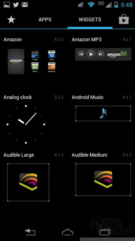
The M's customization powers are as good as any other Android phone. You can add and delete home screen panels at will, stick all sorts of widgets, apps, and shortcuts on them, and do all the normal things such as change ringtones, wallpapers, and such.
Performance is rock solid. The 1.5GHz dual-core processor gets the job done with horsepower to spare. I didn't experience any hiccups or problems with the user interface, with apps, nor any other facet of the M.


 RAZR i First for Motorola-Intel Partnership
 Hands-On: Motorola RAZR HD, MAXX HD, RAZR M
 Motorola Electrify M Causes Sparks with U.S. Cellular
 Motorola Intros the $99 Droid RAZR M
 Motorola Droid RAZR M / Luge


