3GSM 2007
Samsung didn't just make this year's Ultra editions thinner, they tried to make them smarter. Each of the new series of phones don't just have a different thickness or form factor, they each have some unique features. Even though these were announced for Europe and are likely to show up across the pond as early as next month, all of the first round of Ultra Series phones have (or are) coming to the states, so it's likely these will make it to our shores later as well.
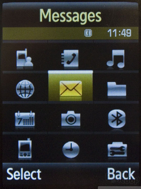
All of the phones feature a more refined version of the interface found on recent Samsung GSM models like the SYNC. The text size has been reduced ever so slightly and navigation has been cleaned up a bit. There are also now 12 icons in the main menu instead of 9. They also have a link in the main menu to Yahoo! mobile services, however that may disappear by the time US carriers customize the software.
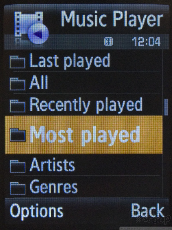
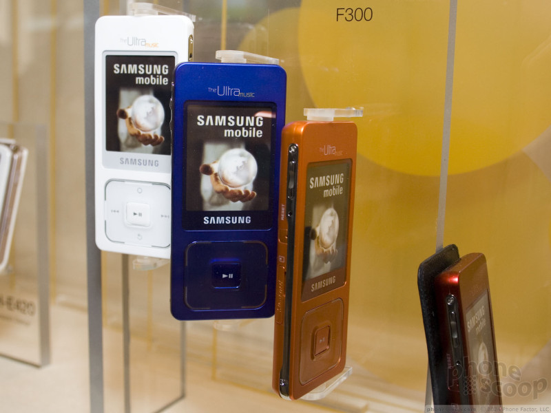
Each of the new Ultra phones also has a new music interface with support for album art, song ratings, and other features clearly meant to bring it more in line with Sony Ericsson's Walkman interface or standalone music players like the iPod and Zune.
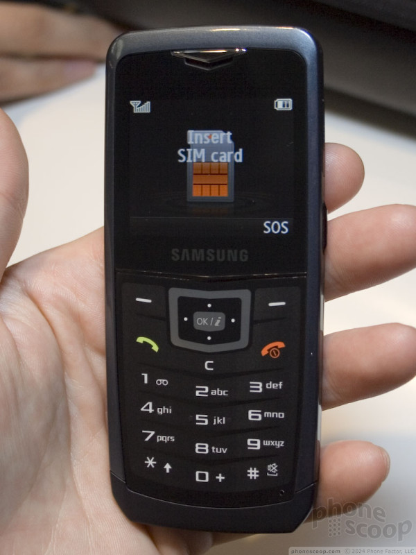
The Ultra 5.9 candybar is the least notable of the bunch because it is so similar to the last Ultra candybar, launched in the US as the Trace and coming as the A727. The latest version is simply a few tenths of a millimeter thinner, however it does have a larger screen. The new screen is a welcome relief. It is clearer than the first model and, obviously, can display more at once. It feels as though the 5.9 is also slightly wider than the Trace. Like previous Ultras, the vibrating alert on the 5.9 is pretty weak, which is to be expected for such a thin phone.
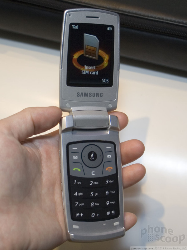
The 9.6 clamshell is unremarkable from the outside, it simply looks like a silver metal-clad version of the last Ultra clamshell, which will come to Cingular as the A717. Because it is also thinner, and there is no good place to slip your finger between the two halves, it is harder to open with one hand.
The keyboard of the 9.6 is the most interesting feature because it doesn't move. It is not a hard plastic capacitive keypad, like the "keys" on the front of the Chocolate. It is like a typical soft touch plastic keypad, however the keys don't actually press in. You press on the keys and the phone vibrates to let you know you've pressed it. How much it vibrates per press can be customized. At anything over the lowest setting, it was like using the Wii menus - a bit annoying.
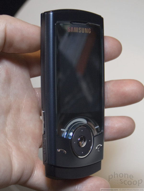
The 10.9 is the stand-out of the bunch - not because it has the most features, but because it works and feels the best. There are 4 capacitive navigation keys on the front (send, end and two soft keys) and a real D-pad. Curiously, the end key doubles as the clear key. which is confusing when doing tasks and the right soft key is labeled "back." We weren't quite sure what to do at first. The navigation keys all work well and because there are only 4, they are highly accurate. Every press was registered accurately. The D-pad is comfortable to use and has a slightly raised select key that is easy to press.
When you slide the front up, the keypad that is revealed is also very usable. The keys are large enough to press easily, but small enough that your thumb can travel over them quickly. They have a soft feel - even the click of the key is soft - but it still feels good.
The 10.9 and 12.1 sliders feature 3 megapixel auto-focus cameras which are hidden behind the slide until you open the phone up. The phone is held sideways to use the camera, with a shutter button at the top. Although this gives you an accurate full-screen viewfinder, it is a bit odd in that the phone has to be open to use it, so you have to hold it with both hands.
The 10.9 also has the strongest vibrating alert of the bunch.
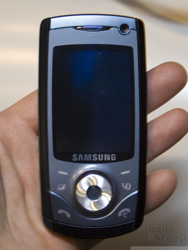
The 12.1 looks like a larger 10.9 at first, with a few extra keys on the front. One is for video calling since it is a 3G phone, and a second for Samsung's task shortcuts, like on the Sync. However the D-pad holds a secret: it doubles as a scroll wheel. Unlike an iPod, the wheel on the 12.1 actually rotates. You can navigate either by spinning the wheel around or pressing the 4 directions on the pad. The difficult part is actually making a selection. The select key is small and is below the level of the click wheel. You really have to dig in with the tip of your thumb to press it. This may have been a prototype issue, however, since it was more pronounced on some demo units than others.
The numerous touch keys on the front are spaced close together, making mis-presses all too easy. The numeric keys are large, easy-to-feel, and have good feedback. Otherwise the 12.1 acts identically to its thinner 2G brother.
















 Video Tour: Motorola Q9h
 Moto Q9h Video Preview
 CTIA 2007
 Helio's Mysto A Mystery No More
 Motorola Q9H for AT&T Sighted
 Nokia E65
 Nokia E61i
