3GSM 2007
Feb 15, 2007, 2:40 PM by Eric Lin & Rich Brome
Our report from this year's 3GSM event in Barcelona. Hands-on with hot new phones from HTC, Sony Ericsson, Samsung, and Nokia, plus Windows Mobile 6, roll-up displays, and LG's Prada phone.
Part 1
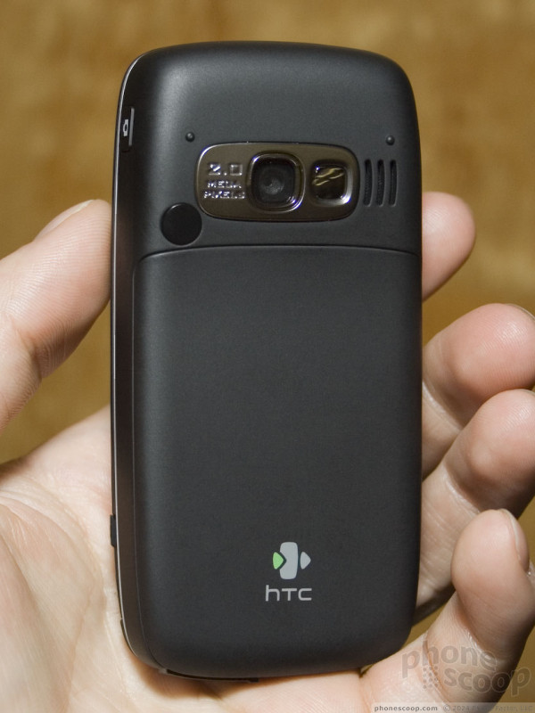
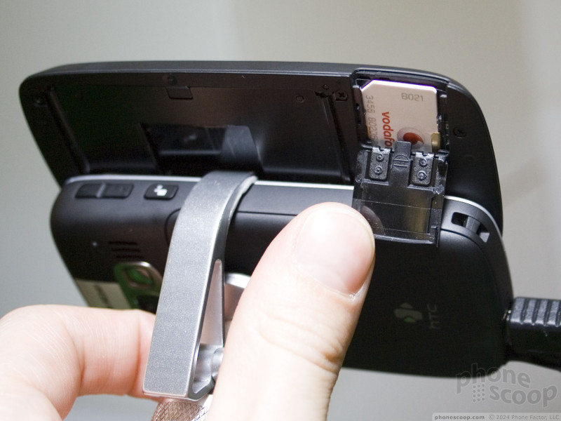
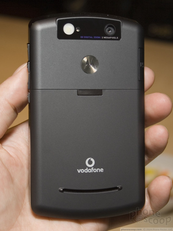
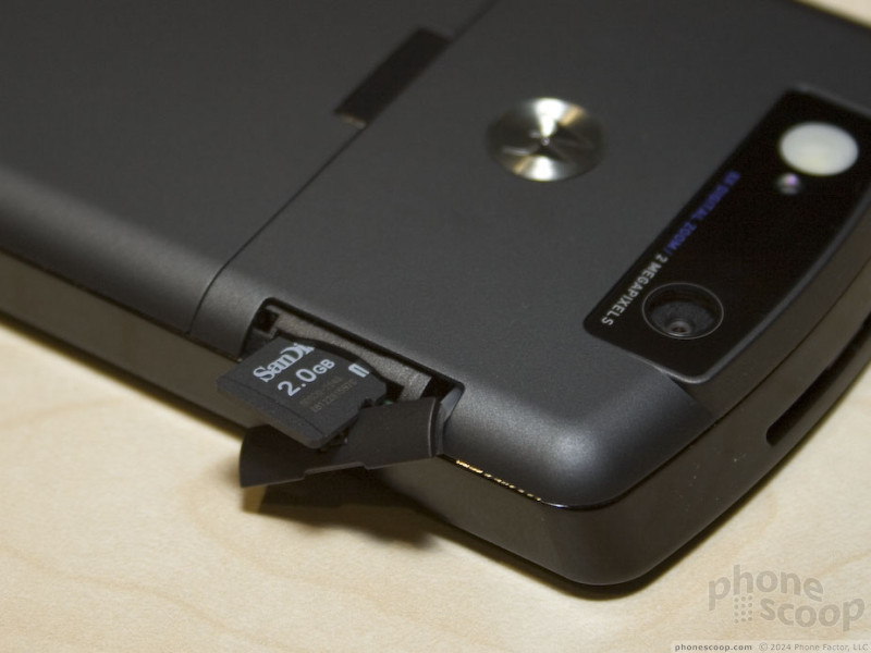
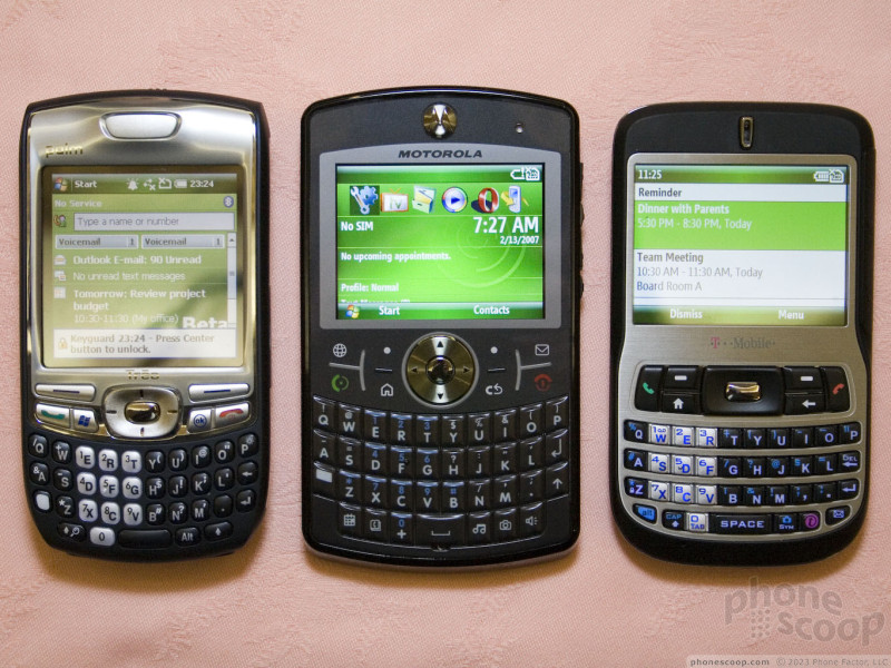
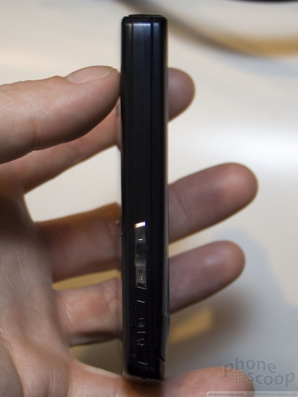
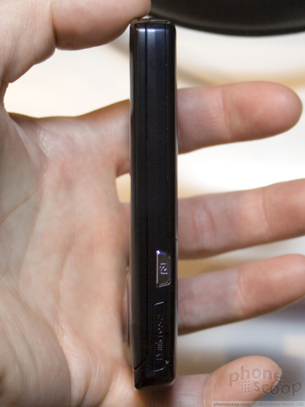
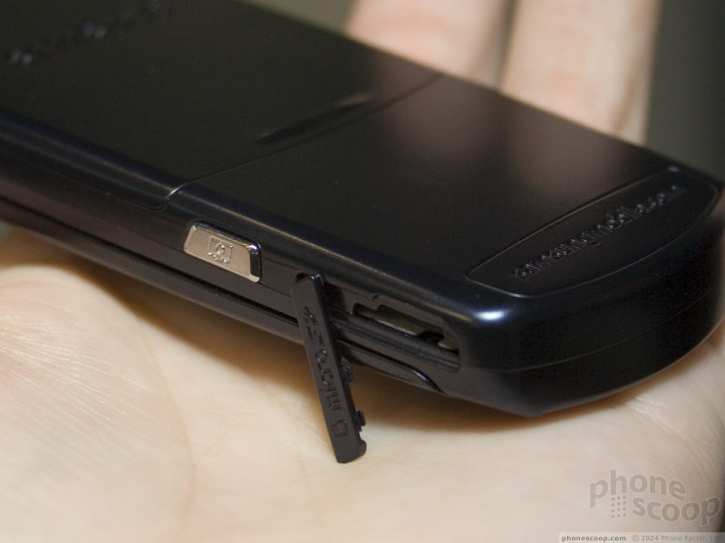
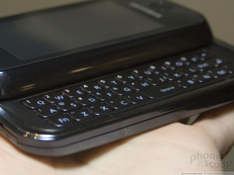
HTC Vox
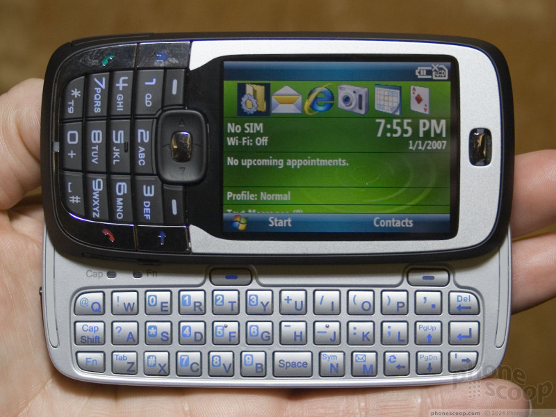
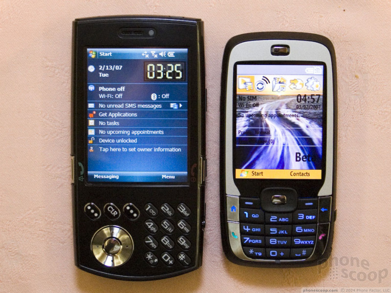
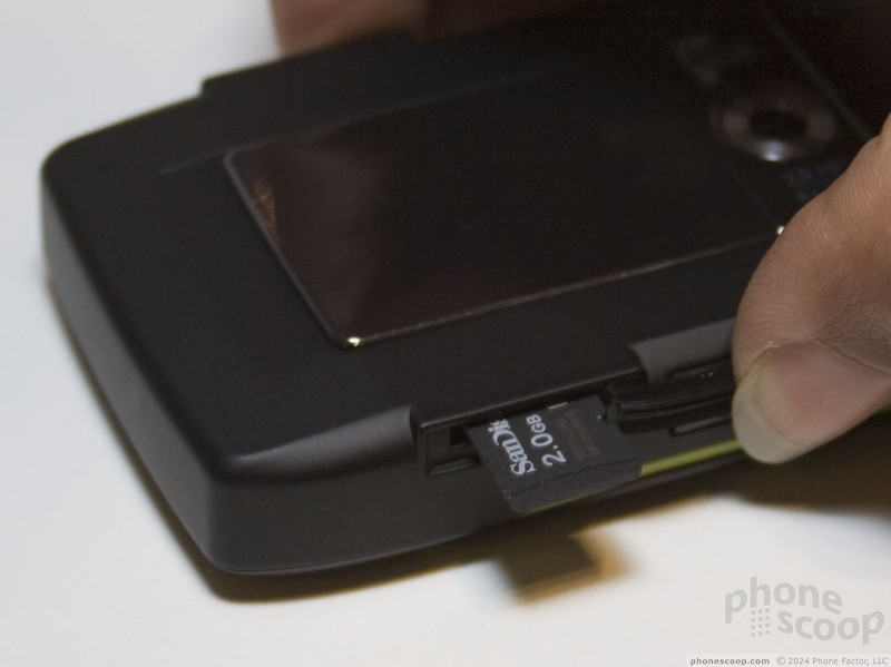
HTC's most interesting new announcement at 3GSM this year is the phone formerly known as the Vox. The new, official HTC name is the S710, although that's only how it will be branded on the unlocked phone market, since each carrier that offers it will call it something completely different. Therefore the "Vox" code-name remains a handy, generic way to refer to this device.
The Vox is a bit of a Transformer with it's 2-in-1 design. It's designed to combine the best of a regular bar-style phone form factor with the best features of today's advanced smartphones.
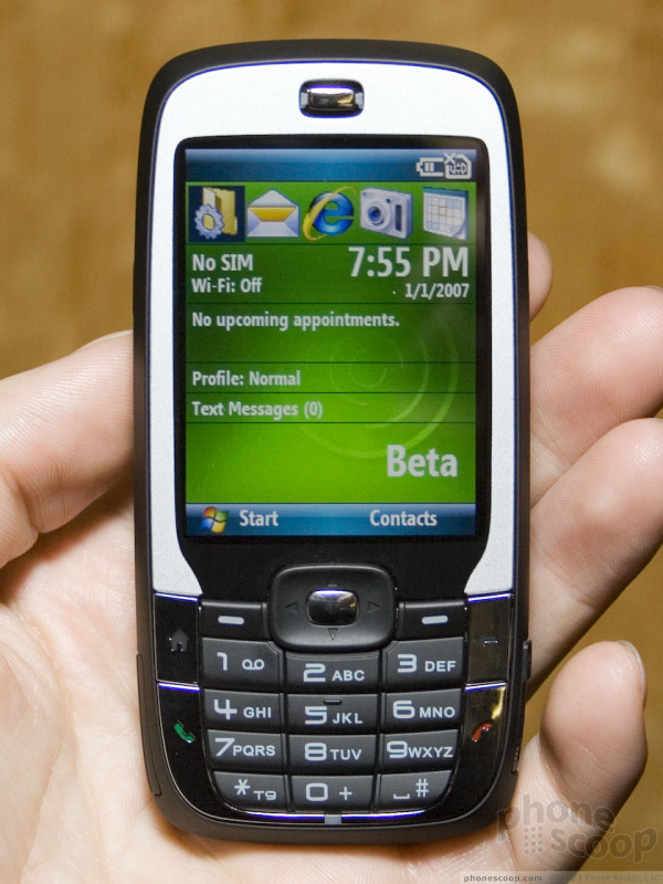
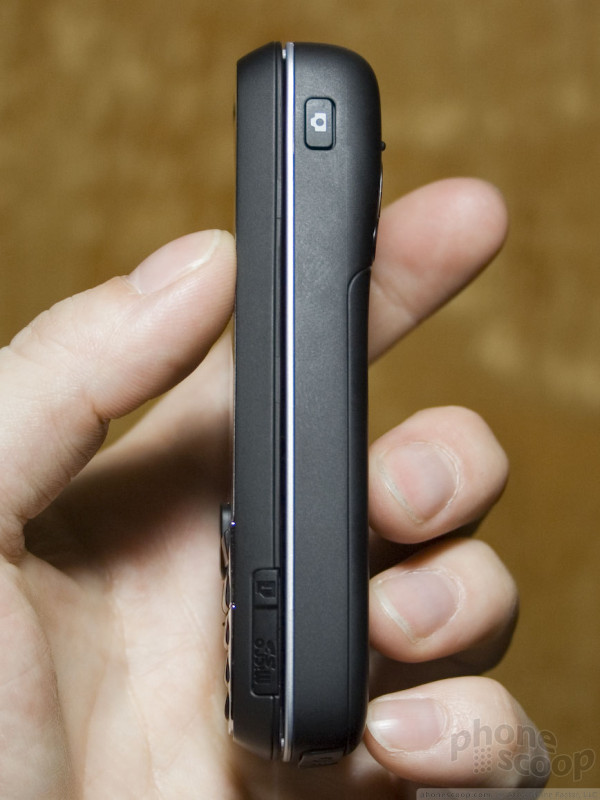
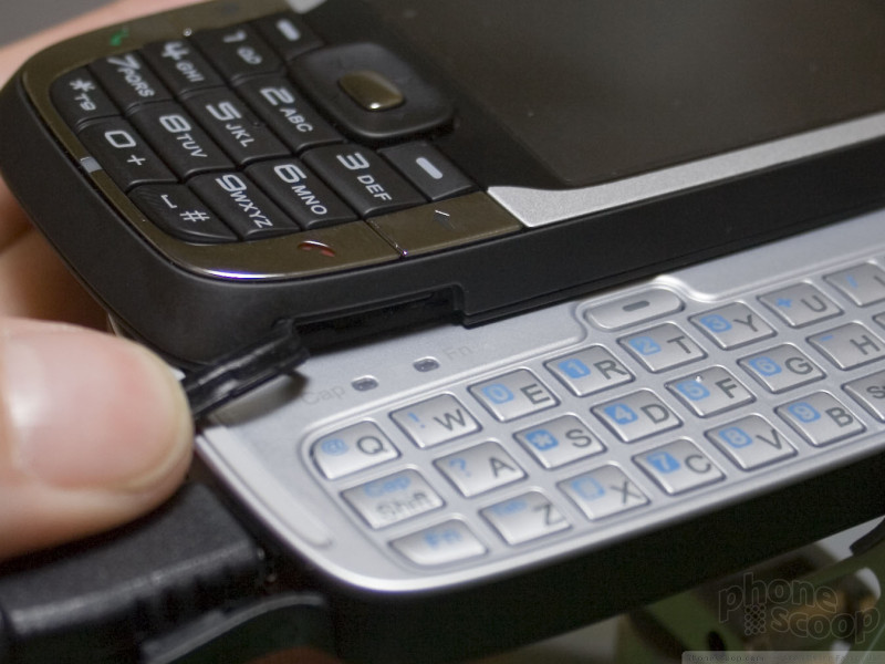
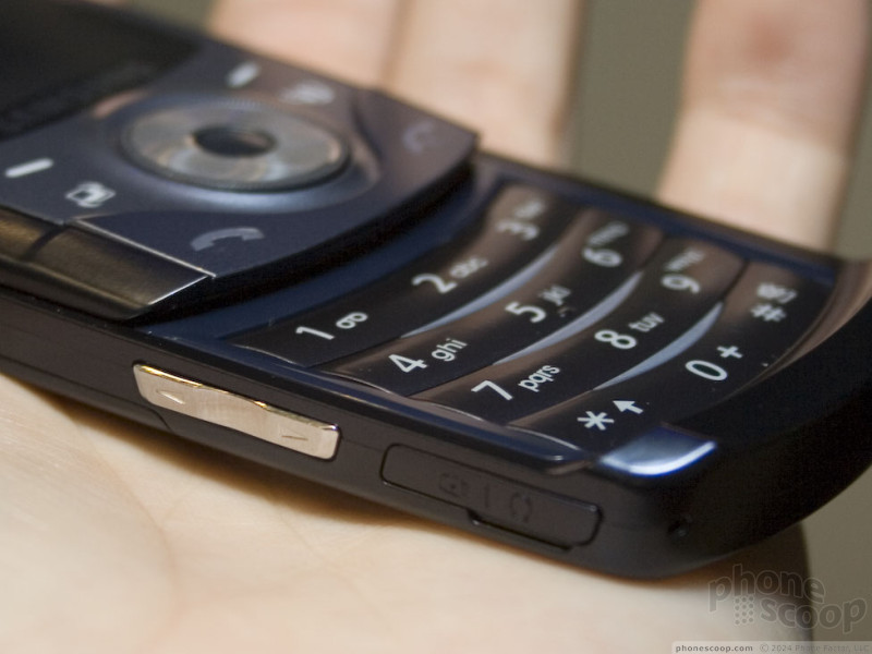
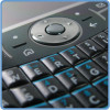
Looking at it as a phone, it's small and pocketable, and it has a regular numeric keypad with large keys for easy number dialing and one-handed T9 texting. Comparing it to a Hermes (Cingular 8525, etc.) the Hermes is much larger, and doesn't offer any way to enter text one-handed since it lacks a standard number pad when closed.
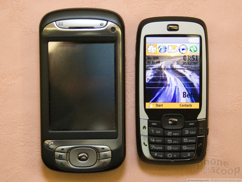
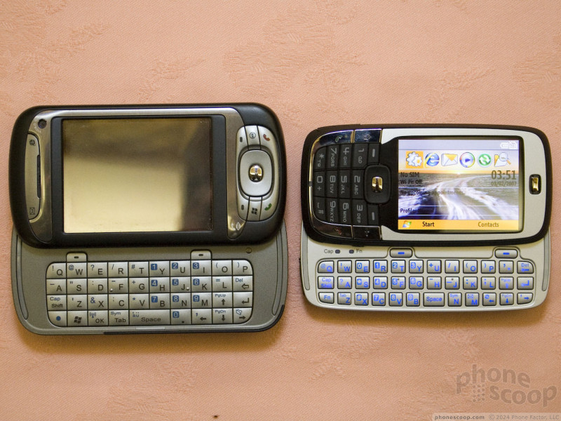
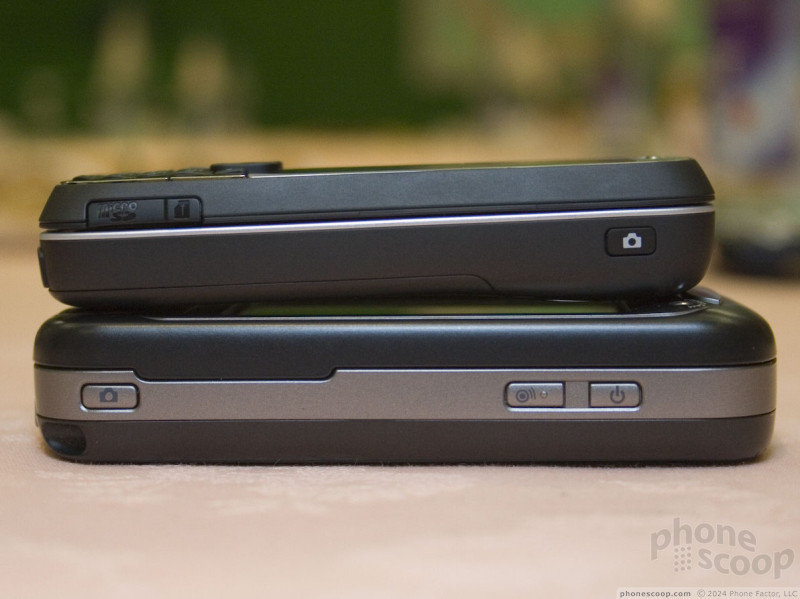
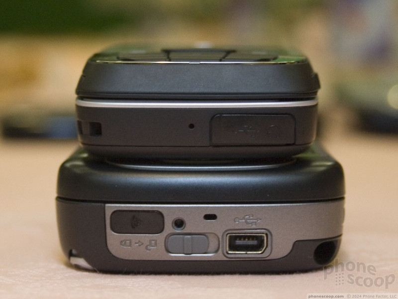
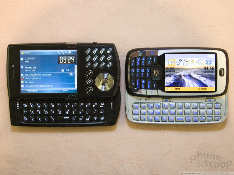
Snap open the sliding keyboard, however, (and it does "snap" open quite nicely,) and you have a full QWERTY keyboard and landscape QVGA display, just like a Motorola Q or Samsung BlackJack. Like both of those phones, the Vox runs the Standard edition of Windows Mobile (what was known as "Smartphone" edition under version 5.)
The form factor is very similar to the LG F9200, and also has traits in common with LG's enV. What sets this apart from the LGs is the real smartphone OS on the Vox. In that category, the Vox will compete against phones like Nokia's E70.
The Vox feels fantastic. It's a great size and weight, and it feels solid all-around, including the spring-assisted slide action. The screen is wonderful: clear and very bright.
I did find two small gripes, though. First, the keys would really benefit from being more raised. It's not a bad keyboard, but it's not the best I've tried. Secondly, its 200 MHz OMAP processor doesn't make it the speediest phone out there; it felt pretty sluggish to me. However, the software I tried is still beta at this point, so the final version may be snappier.
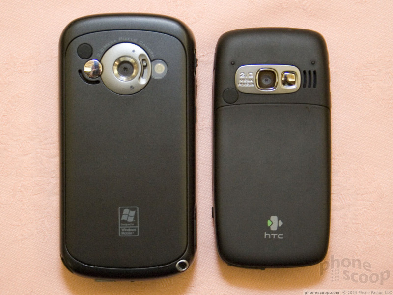
As for other specs, most of them are about what you'd expect: Windows Mobile 6 Standard edition, quad-band GSM, EDGE data, microSD memory card slot, and a 2 megapixel camera. One feature that stands out is Wi-Fi.
HTC has been pitching the Vox to US GSM carriers, but according to VP Todd Achilles, none have bitten yet. T-Mobile's Dash is a very similar device in terms of features, so it's understandable that T-Mobile would pass on the Vox. It's less clear why Cingular would pass up such a promising phone.
On the bright side, HTC has previously discussed a CDMA version called the Libra, which they confirmed was still on track for release with a major US carrier later this year.
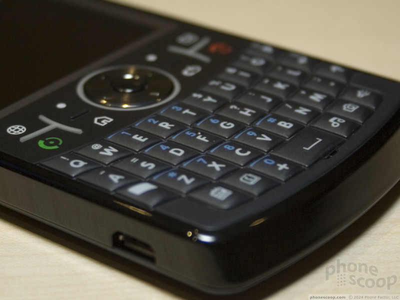
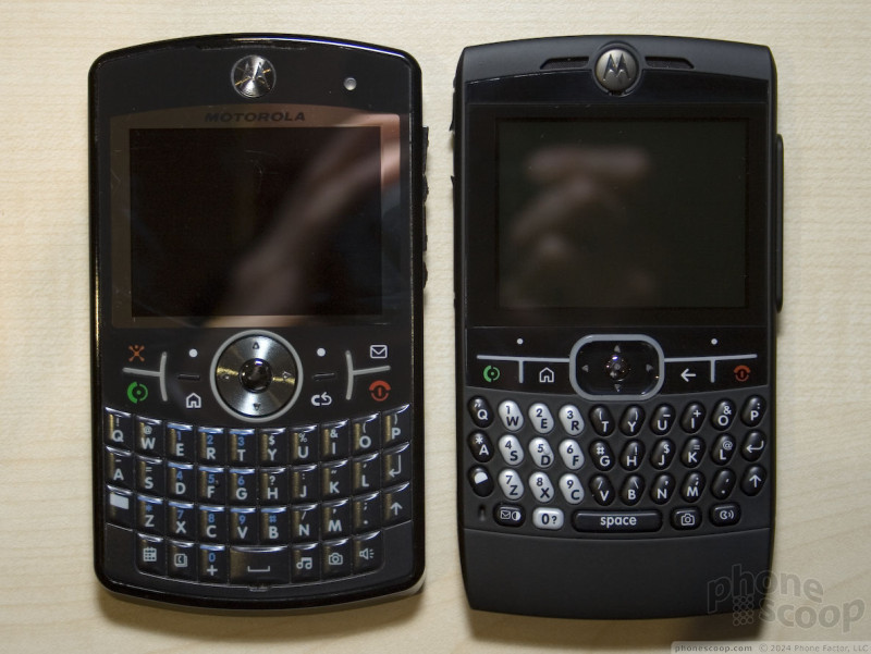
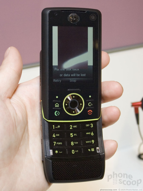
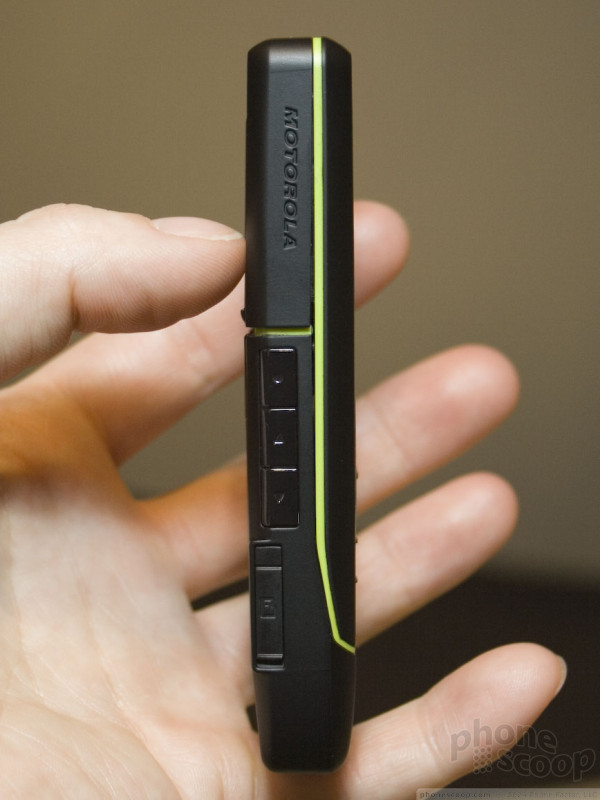
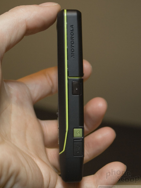
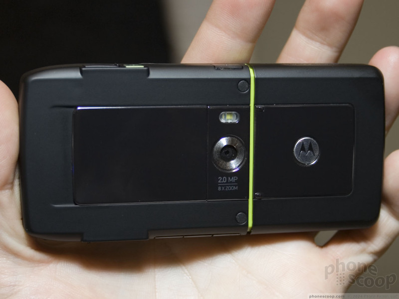
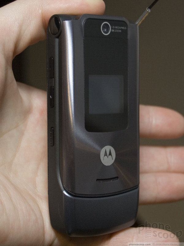
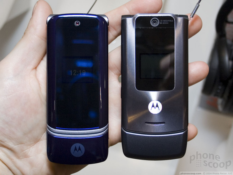
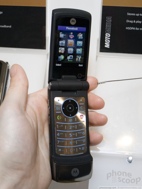
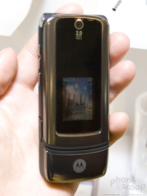
Moto Q9
Motorola made a dizzying number of announcements here at 3GSM this year, although the only new phone clearly headed for US shores is the awkwardly-named "MOTOQ q9".
Since it is so awkwardly named, we're just going to call it the "Q9", Motorola brand police(TM) be damned. Since we are talking about the successor to the original Q, (the Q1, if you will,) Q2 would have probably been the most sensible name. Perhaps Motorola thought it would be too freaky to say "the Q2 is coming in Q2."
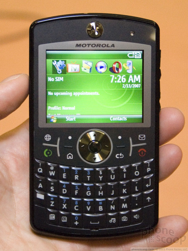
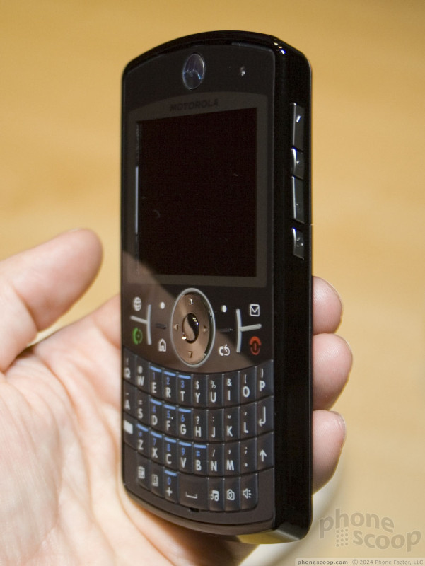
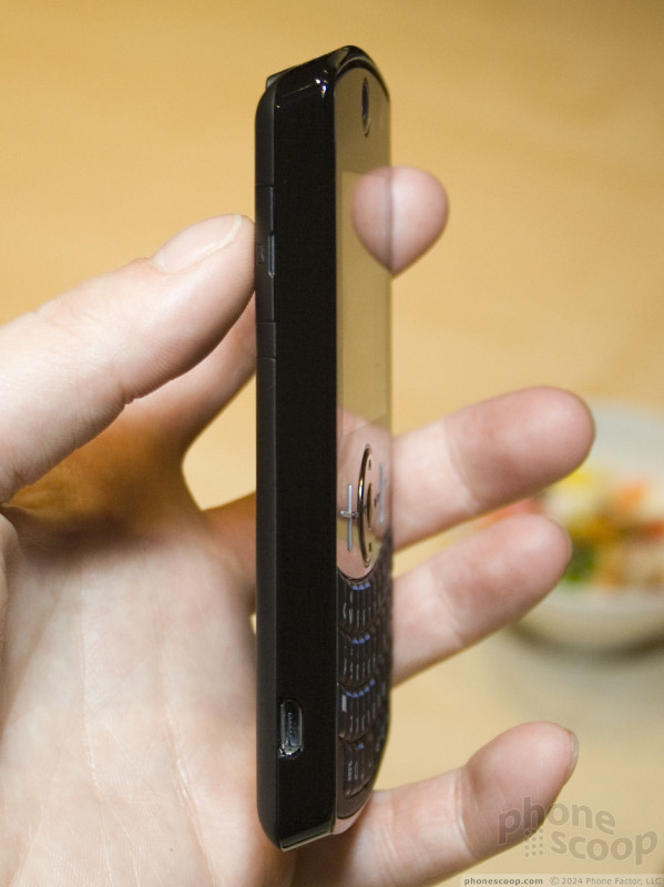
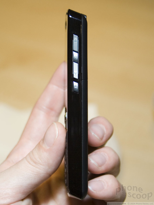
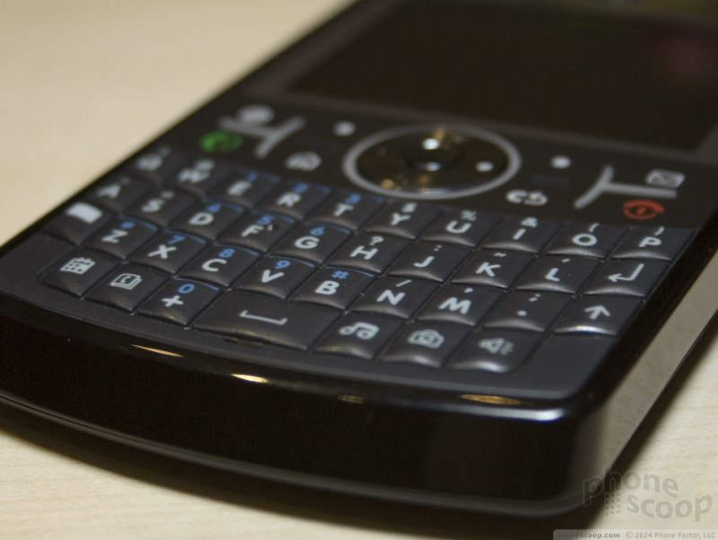
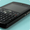
The Q9 is a noticeable improvement on the original Q in almost every way. The original Q had an odd size ratio that was unusually long, and it's size/weight ratio made it feel slightly cheap. The new Q9 suffers from neither issue, with a size, shape, and weight that feels perfectly balanced and solid.
The keyboard is the biggest single improvement. The new keys are simply fantastic. One nice thing about the original Q was how the extended bottom section gave you plenty to hold on to while typing with your thumbs. When you first see the Q9, you might think the buttons are too close to the bottom to type while keeping the phone comfortably balanced, but in fact the way the bottom edge is beveled out makes it surprisingly easy to hold and type.
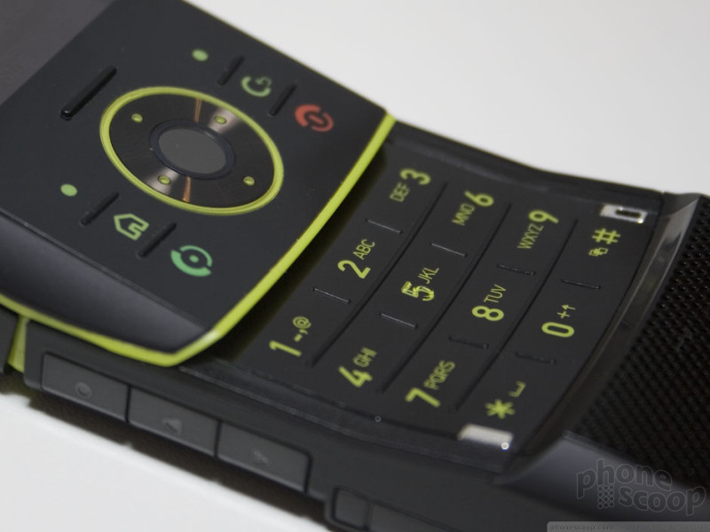
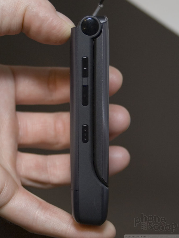
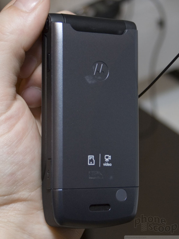
The Q9 is the second in Motorola's "SCPL" series. (The first was the ultra-basic MOTOFONE.) Although Motorola has been hyping SCPL for over a year as the next big thing after RAZR, it turns out that SCPL is really just a "design language". The bright chrome raised d-pad seems to be part of it, as are the way the top and bottom are rounded and beveled.
Moving to the innards, the memory has also been boosted. In fact, the Q9 has industry-leading memory specs for a mainstream Windows Mobile device: 256 MB flash memory for storage (expandable via microSD) and a whopping 96 MB of RAM for running many applications at once (64 is standard).
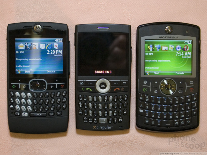
The Q9 will compete against an increasingly crowded market of Windows Mobile smartphones with QWERTY keyboards. In size, the Q9 is competitive with the rest of the pack, although it doesn't lead the pack the way the original Q did when it was announced. The Samsung BlackJack may be the Q9's closest rival. Although the BlackJack is smaller, the far roomier keyboard and display of the Q9 may make up for the size difference for most people.
There will be three versions of the Q9 coming out over the next several months. All have quad-band GSM and EDGE. The difference is in the 3G (WCDMA + HSDPA) bands they support. Naturally, one version will do 2100 for Europe. For North America, there will be a 850/1900 version - presumably for Cingular - and a 1700 version, presumably for T-Mobile USA. That last version is the most interesting, because it's the first device to be announced that supports the new 1700 / AWS spectrum that T-Mobile just won in an FCC auction. Motorola hopes to have the European version and at least one of the US versions launched by mid-year.
The rest of spec sheet is mostly what you'd expect these days: stereo Bluetooth, microSD memory card slot, and a 2 megapixel cameras with 30 FPS video capture. One welcome spec is the inclusion of the speedy HSDPA 3.6 standard (as opposed to 1.8.)
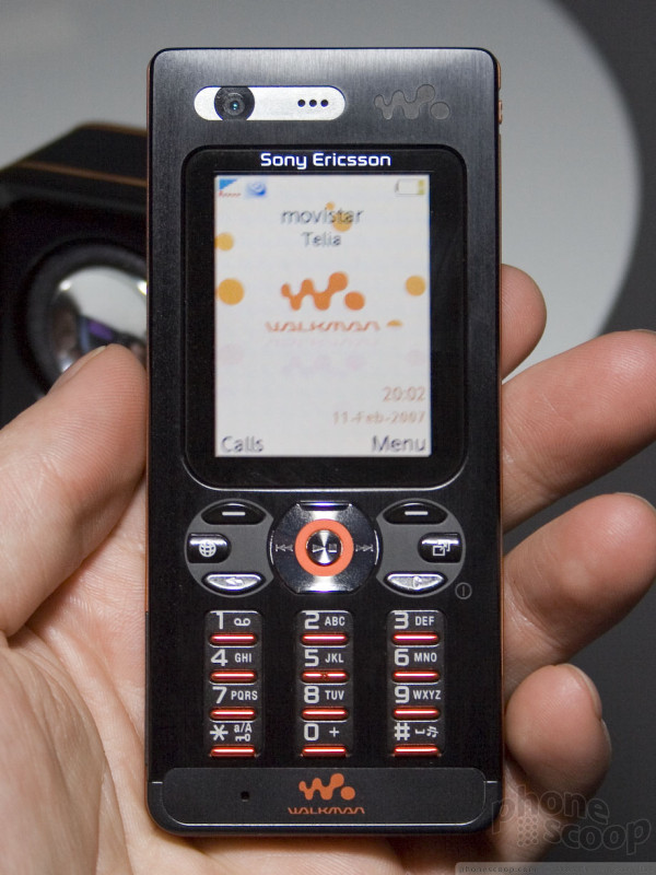
Sony Ericsson
Sony Ericsson's new batch of phones this month were aimed mostly at Europe and Asia. The group did include a couple of quad-band models that could work well in the US, though. We asked about US availability, and were basically told not to hold our breath for a major carrier release. However Sony Ericssons should continue to be popular with regional GSM carriers as Cellular One and SunCom.
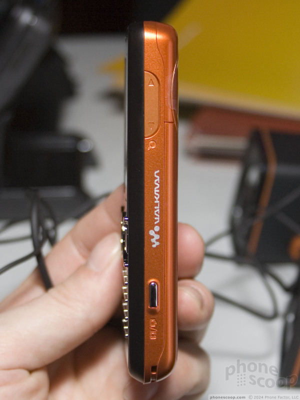
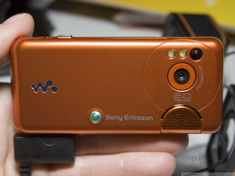
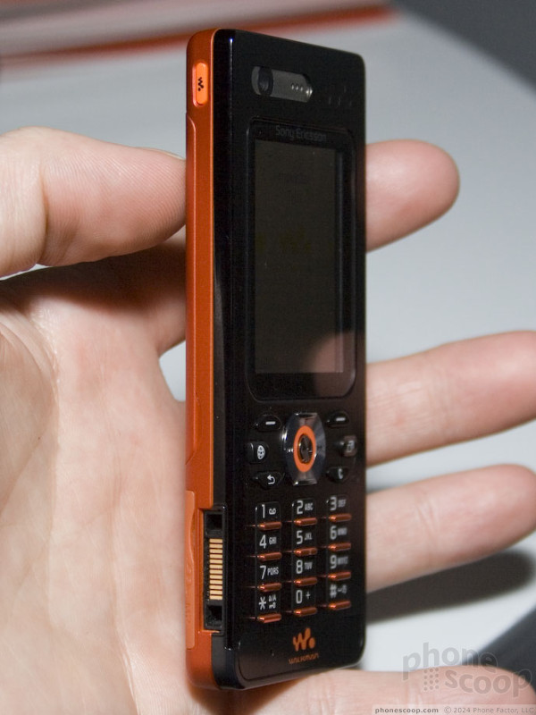
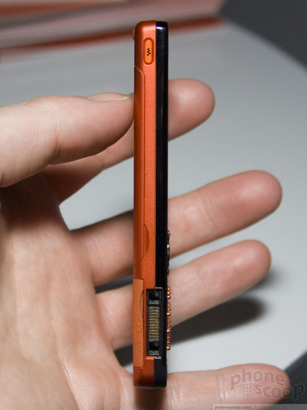
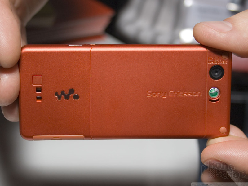
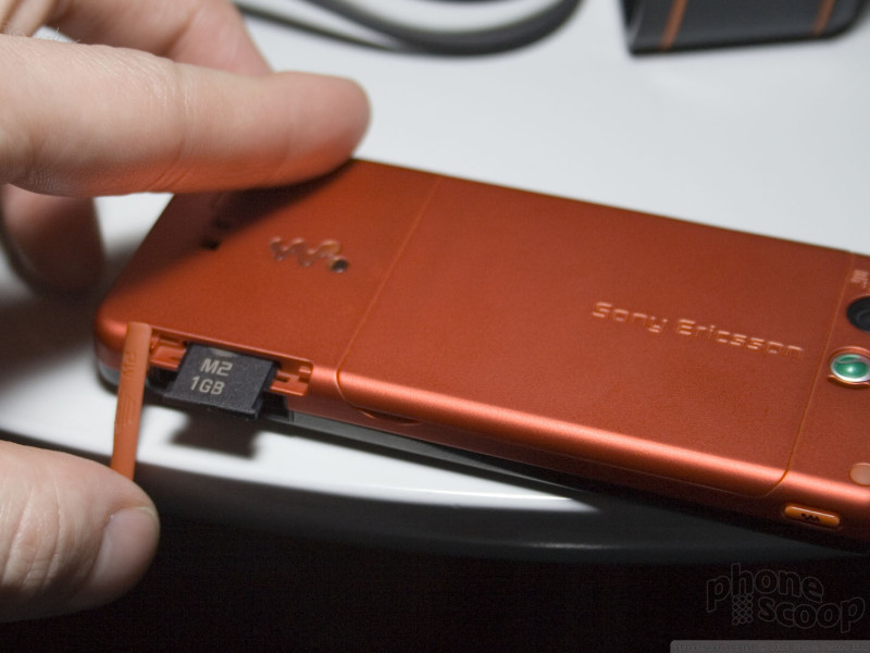
The two quad-band models aren't really two different models at all. The W610 and K550 are pretty much the same phone; the former is simply Walkman-branded, while the latter carries Sony's Cyber-Shot mark.
The model numbering is confusing, because Sony Ericsson already offers a K610 that is quite different, and W550 that is wildly different. We're starting to have a hard time keeping track of Sony Ericsson's model numbers, and this is what we do for a living. We have to wonder what chance the average consumer has at keeping them all straight.
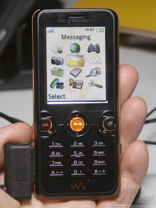
The Walkman series of phones is almost solely responsible for Sony Ericsson's recent success in the global market. It's no surprise, since music what's hot now, Walkman is a brand synonymous with portable music, and, of course, they are generally quite good phones.
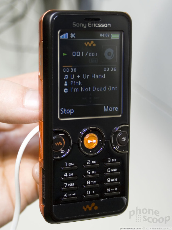
As a Walkman phone, the W610 has the special Walkman music interface. It also has Sony Ericsson's nifty new TrackID service like the W710. TrackID can identify any song that you can hear, just by recording a snippet using the microphone.
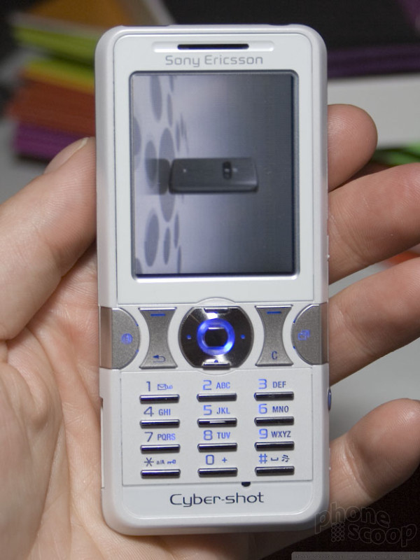
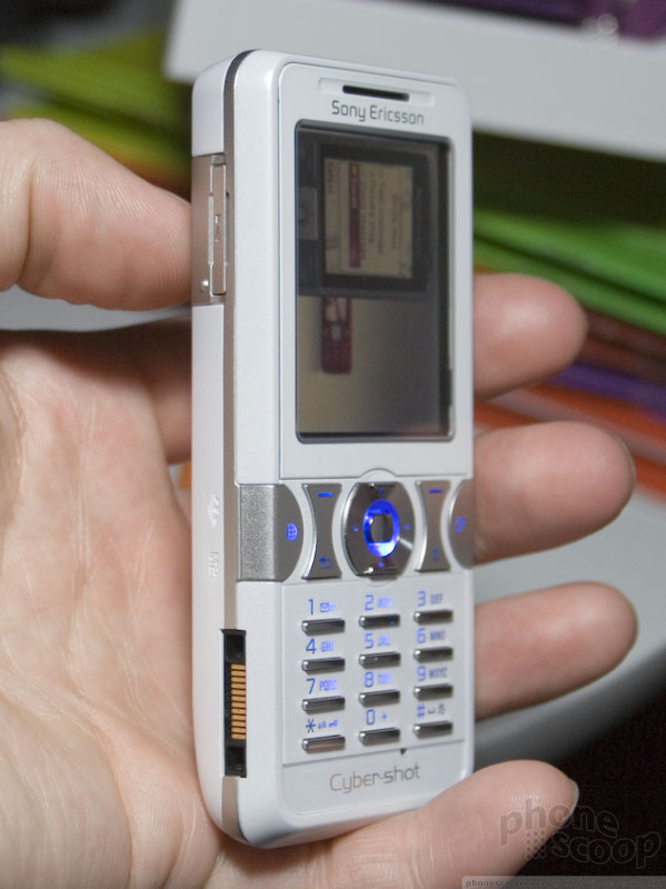
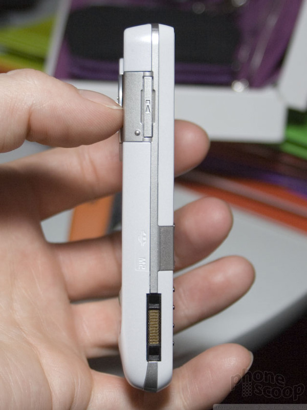
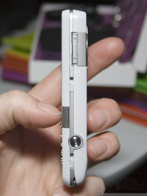
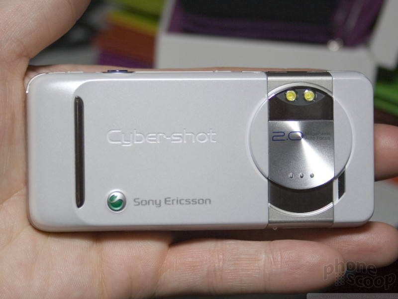
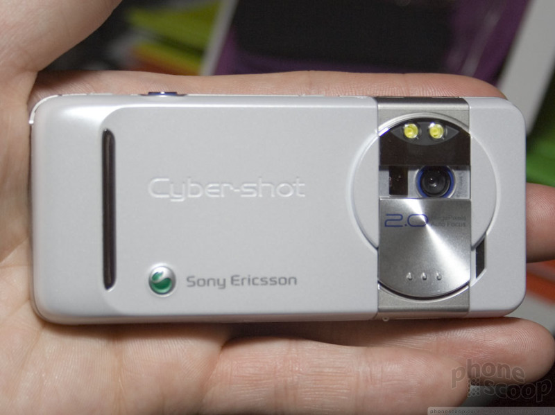
The K550 is very similar to the W610, simply trading Walkman branding for Cyber-Shot. The K550 still has a music player, of course, it just doesn't have the snazzy Walkman interface. Both also share the same 2 megapixel auto-focus camera with a high-power LED flash. The K550 does add a lens cover, but that's about it.
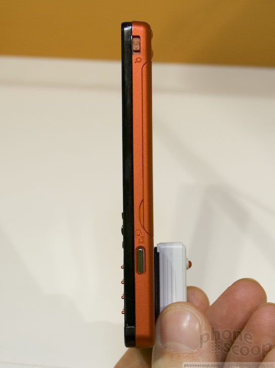
In fact, looking at the camera, specs, and everything else, it's hard not to be reminded of the popular K790, W800, and W810 models. The specs are almost identical, including the 176x220-pixel display. They have re-arranged the components inside to make it noticeably thinner, but other than a few mm thickness, all that's really changed is that a phone with these specs is now considered mid-range instead of high-end.
Last but not least (unless we're talking thickness) is Sony Ericsson's late entry into the thin-phone race, the W880.
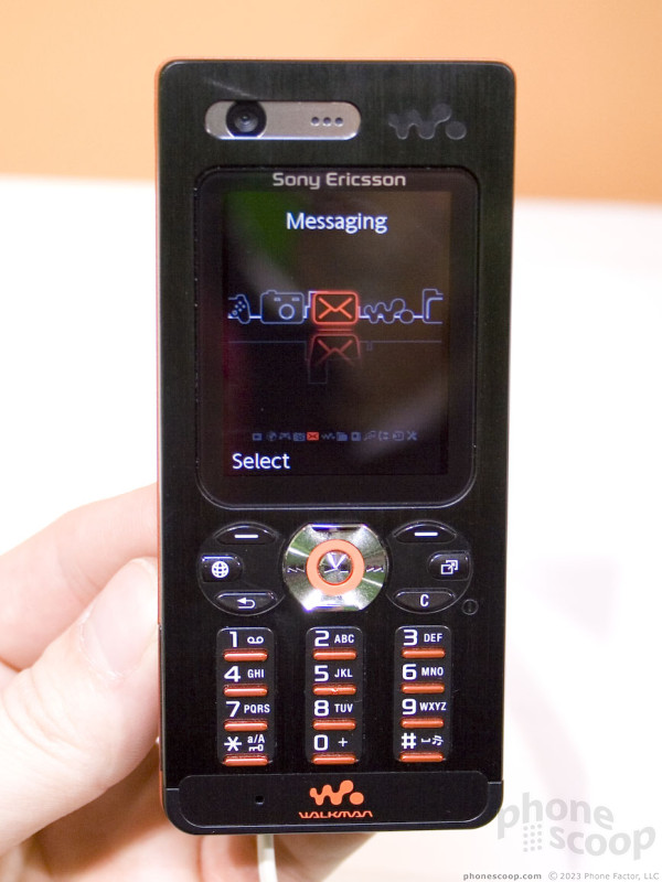
The W880 is indeed quite thin, and quite sexy. It feels incredibly light, yet solid.
It's not without compromise, however. Although the display is super-sharp thanks to QVGA resolution, it's also relatively small in physical size, with a huge border of unused space surrounding it. It's a shame Sony Ericsson didn't follow Motorola's lead on using the thin/wide form factor to offer a larger display like they did with the RAZR.
The W880 also has one of the worst keypads I've tried in a long time. Pressing keys reliably isn't awfully difficult, it's just very uncomfortable. It feels like tapping out a few decent-length messages in a row would leave your fingertips sore. The number keys are worse than the d-pad and soft keys. While soft keys are uncomfortable, they are extremely easy to press reliably. It's the number keys that require using your fingernails at a funny angle to get any accuracy.
It's just as well that the W880 is tri-band GSM 900/1800/1900, and therefore not optimized for US networks.
Unfortunately, the W610 and K550 share this same unfortunate key design. We hope this is only a temporary design experiment for the company and doesn't become their standard key style.
Windows Mobile 6
We had a chance to spend some time with Microsoft's new operating system using an upgraded HTC S620 (T-Mobile Dash). After we recorded this video, T-Mobile announced that they would make an upgrade available to all Dash users. We show off many of the new features but couldn't squeeze in all of the improvements. Microsoft continues to refine their OS with every new version, however Windows Mobile 6 still features many of the same quirks.
You can watch the preview here:
or you can visit YouTube or Google Video for more viewing and sharing options.
Part 2
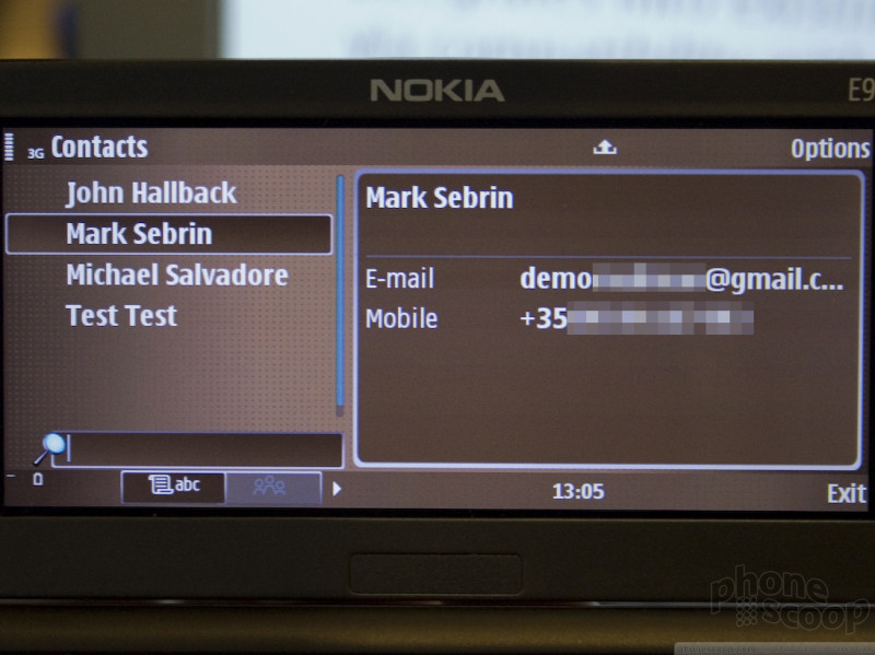
Nokia
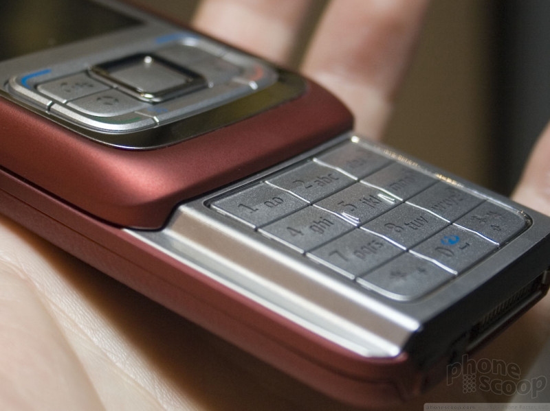
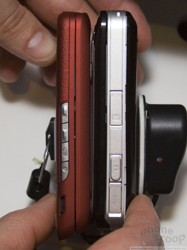
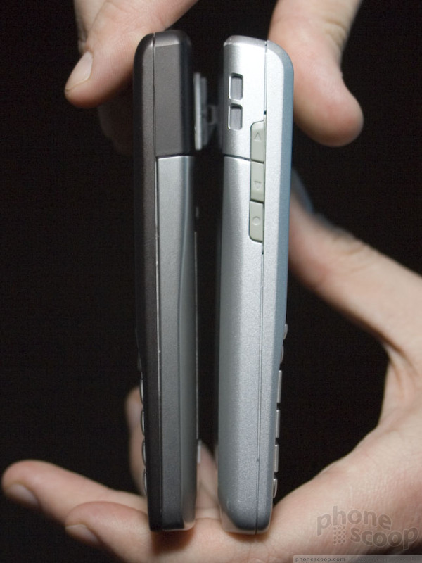
Although pictures of Nokia's new Eseries phones had all leaked before the company announced their new line on Monday, they still held a few surprises up their sleeve - primarily the power that each packed into a smaller than expected form. These phones all pack quad-band GSM/EDGE, HSDPA and Wi-Fi and more into smaller bodies than you might expect. In fact, it seems slimming down and "sexing up" the previous E series line was Nokia's main goal. No longer is this series going to be known for boxy grey phones. The E65 is positively curvy, the E61i is sleek, and all 3 will come in 2 colors - a deep red and a nearly black brown "mocha."
In addition to the colors and features, these phones have a new look and feel to their navigation keys in common. The joysticks and D-pads of past models have been replaced by a new, well, "D-ring." The center is a large square select button, and around it that is a raised, beveled square ring that controls the direction. When trying these out on all the demo models, they worked well once they got broken in. When we tried a fresh E61i, the D-ring was a bit hard to press, but after a few hours of use, all the phones were equally easy to navigate around. Your thumb sits nicely in the well of the ring and you can roll it around with very little effort.
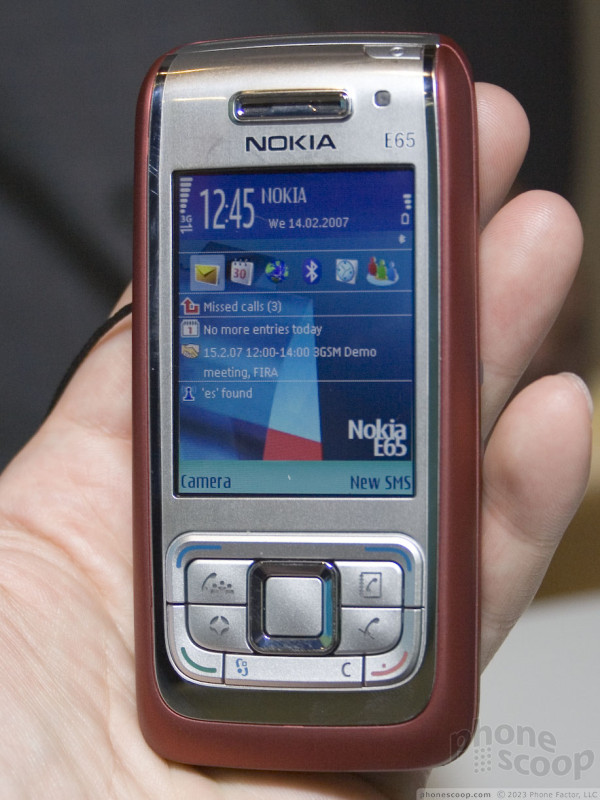
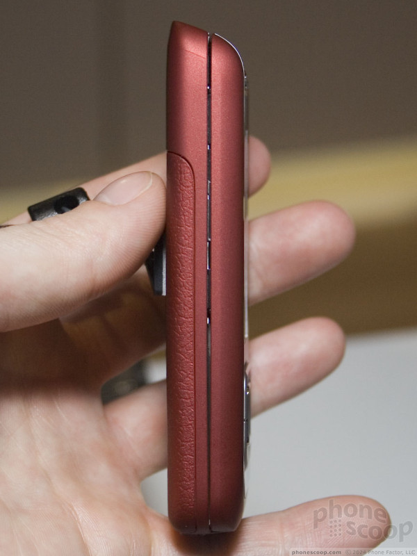
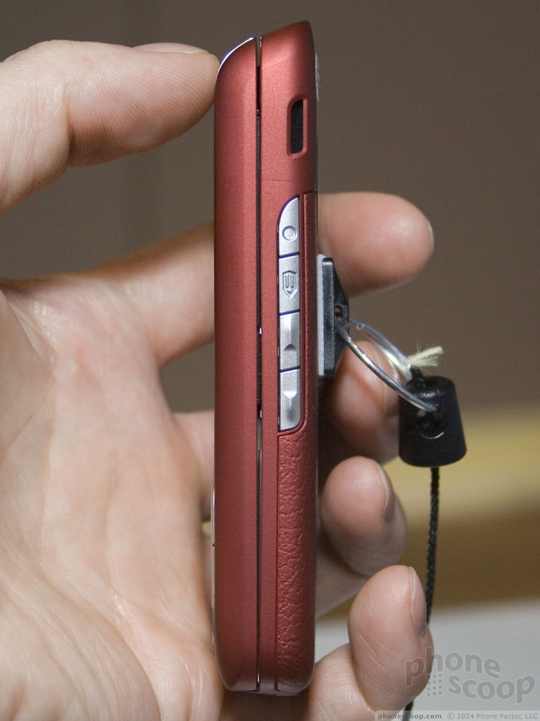
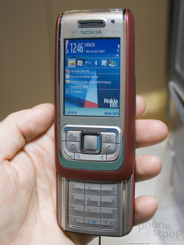
The E65 blurs the line between a business and a fashion phone. Some people need a little power than the average user - maybe for push email, VOIP calls, or some other application but don't want a big, blocky corporate phone. The E65 suits them with a small, slim slider. The rounded sides and an angled top let the phone rest gently in your hand; and the soft-touch finish of the mocha or red portions makes the small phone even more comfortable.
It also has one of the smoothest spring-assist slides we have felt. You can either open it from the bottom or just by pushing up on the side, and after some slight resistance meant to keep the phone closed, the E65 glides right up. I'm sure opening and closing the E65 will be as tactility addictive as the Helio Sidekick.
The E65 has a couple of call-specific hard keys, one for muting the call (in S60 the right soft-key is always speakerphone now) and another for setting up a conference call. This new conference call interface works like addressing an SMS, which is much easier that the typical conference setup. You simply tick off a few people on your contacts list and the phone takes care of conferencing them all in.
While all the phones feel physically solid, the E65 matches it with solid software that's fast and clearly ready for prime time. This makes sense considering it's expected out in just a few weeks. The E61i was a close second, but could still use a few tweaks like a speedier camera start-up.
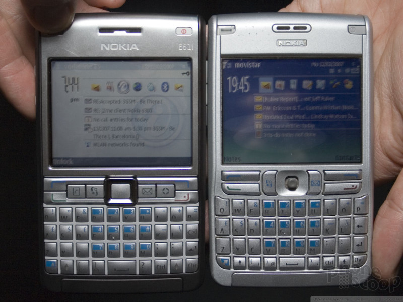
The sleek colored sides and brushed metal front and back accentuate the E61i's new thinner form factor. Though the top is slightly thicker than the bottom, the difference is not nearly as great as on the E61. Even though the shape has changed only slightly, the new model feels very different - not just how it feels in the hand, but also how the keys feel.
The QWERTY keypad of the E61i quickly became a favorite among many at the show. The E61 had a good keypad layout, but many disliked the feel of the keys. The new version has the same layout but has a completely different feel. When you press a key, it offers a slight bit of resistance, after which it goes in and pops right back up. It is springy and responsive, but not hard to press or spongy.
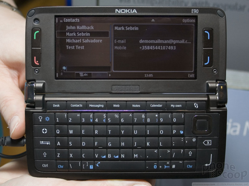
The keyboard of the E90, at least the QWERTY keyboard, was more hotly debated. Eric thought it felt like typing on piece of granite, though he had no problem with it once he realized how little response to expect from it. Rich had no complaints. He found it easy to type on straight away and did not think it felt odd at all. Other bloggers we spoke to were split as well, though a slight majority agreed with Eric. Everyone agreed the external keypad was large and easy to use.
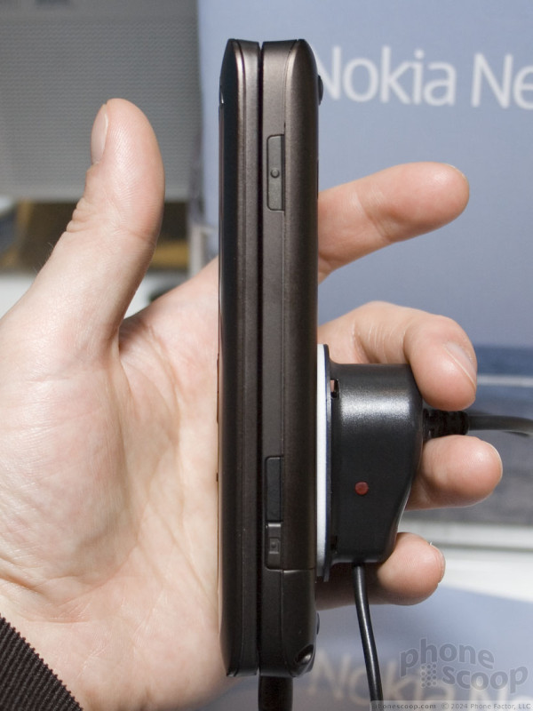
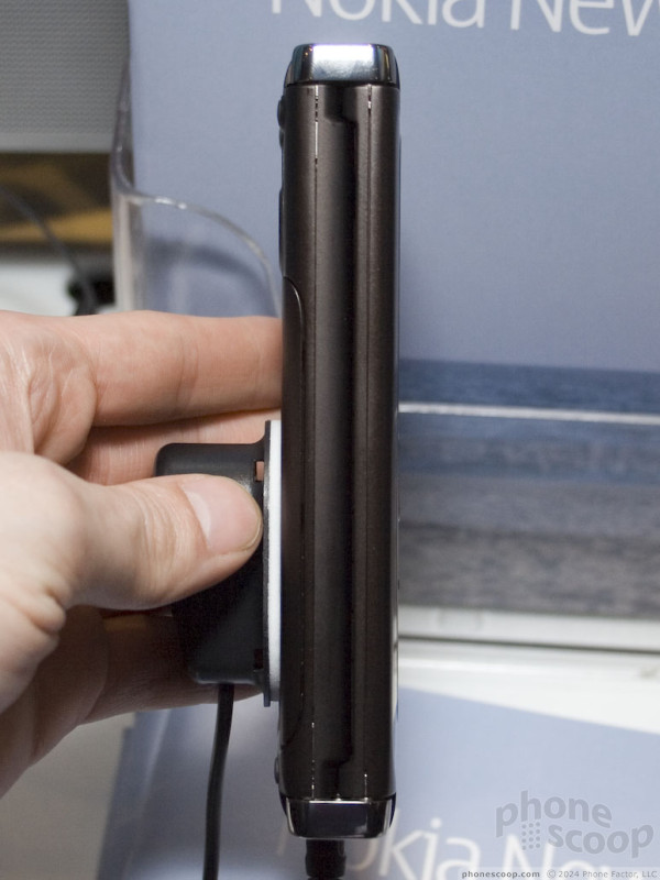
Holding the E90 in your hand, it's hard to believe that it's smaller than the Sidekick 3 in every dimension. It still has that brick feel that past communicators had, though it's more like a small brick than a cinder block. With the large, flat front the E90 is not going to be comfortable to hold up to your ear and talk into for a long time. But that's clearly not what it's meant for, even if it does have a full S60 interface on the outside.
Opening the E90 to use the keyboard and large screen is easy, but interesting none the less. There is a two stage hinge, one stage that opens fully to put the screen at 90 degrees to the keyboard and a second stage that is adjustable from 90 to 180 degrees. The inside screen is so large, you can view most websites in their normal desktop layout without having to scroll left and right.
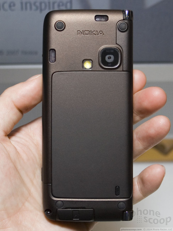
Although the E90's software was less stable than the other two new Eseries phones, it was still workable and we were able to try everything from the auto-focus camera to email to the media player.
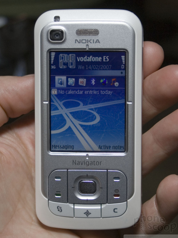
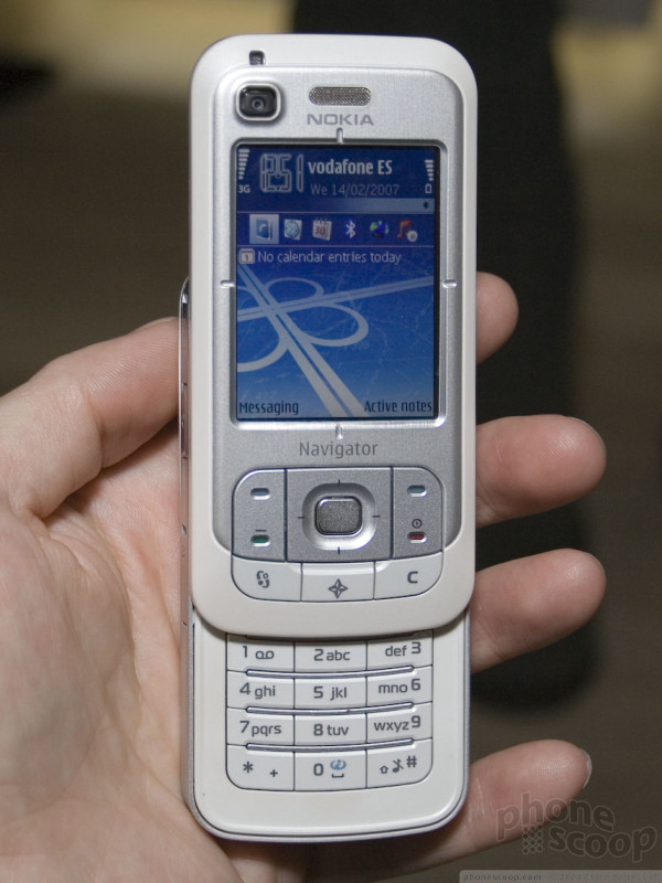
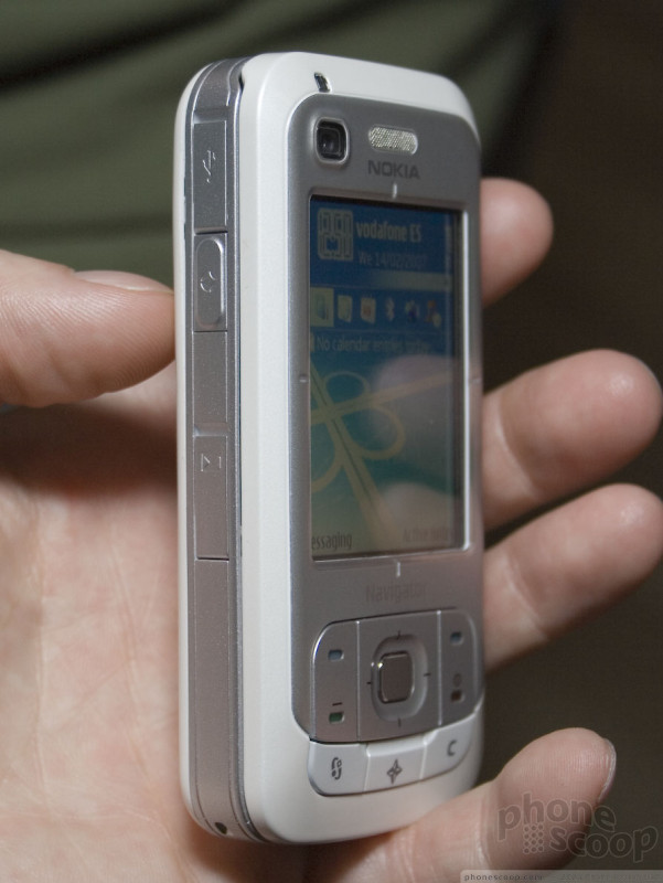
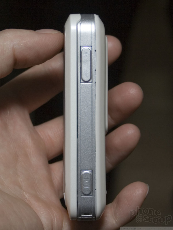
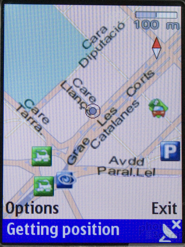
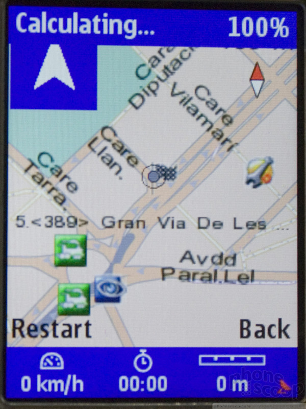
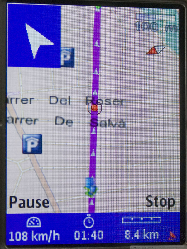
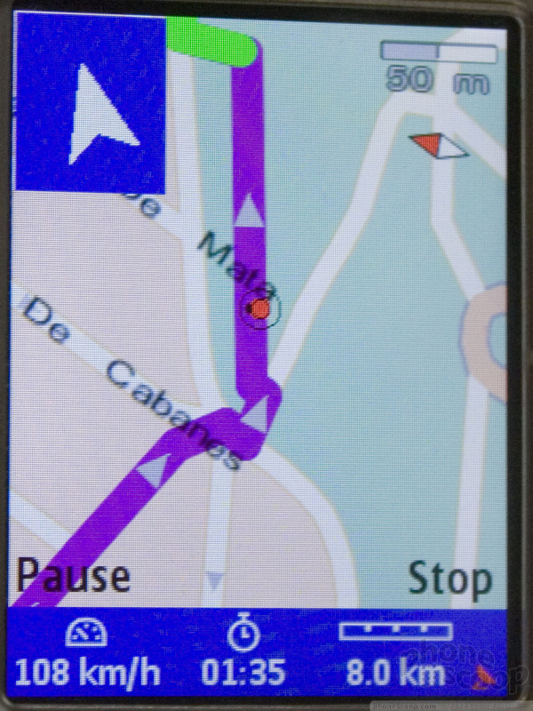
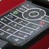
The 6110 is a slightly thicker and blockier slider than the E65, which is to be expected considering it's a not a high-end phone like the Eseries and it has GPS. It is not unwieldy, it's just not sleek - maybe it just doesn't have the E65's curves. But it packs a solid feel and a great GPS experience.
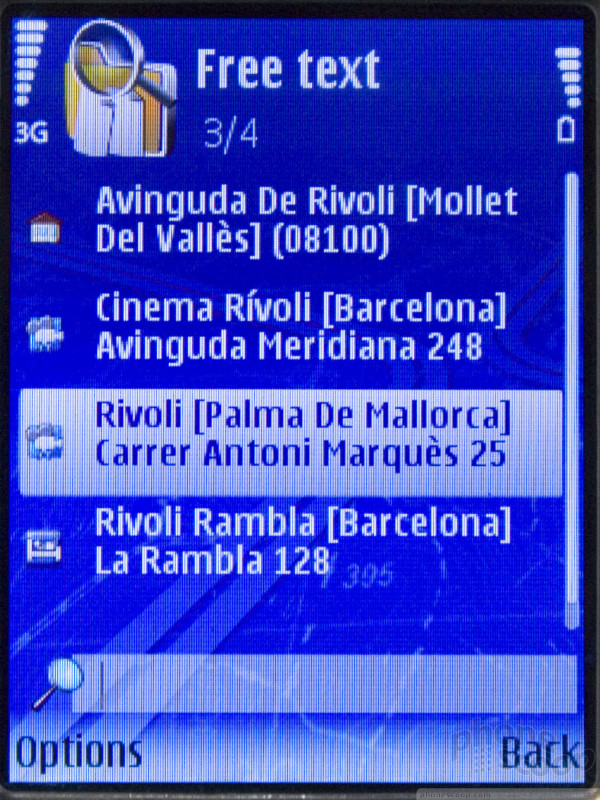
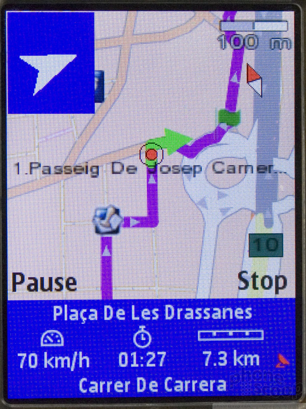
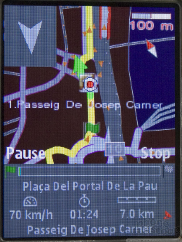
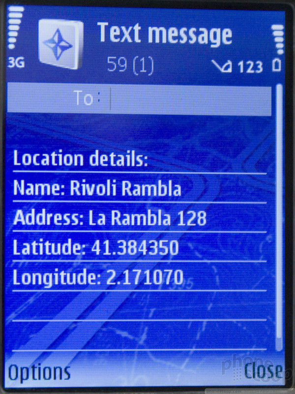
Instead of Nokia Maps, the 6110 features Nokia Navigator, which includes many of the features that must be purchased as add ons to Maps like turn by turn directions and city guides. But Navigator still has additional services you can subscribe to like live traffic and weather updates. Navigator also features friend finder-like functionality. You can send your location from the application to any other Nokia Maps or Navigator user as an SMS. The receiver can then open that on their phone and get directions there from their current location.
Nokia said that they will release a number of phones with GPS and similar software this year, and it seems possible - maybe even likely - that at least one will be for the US.
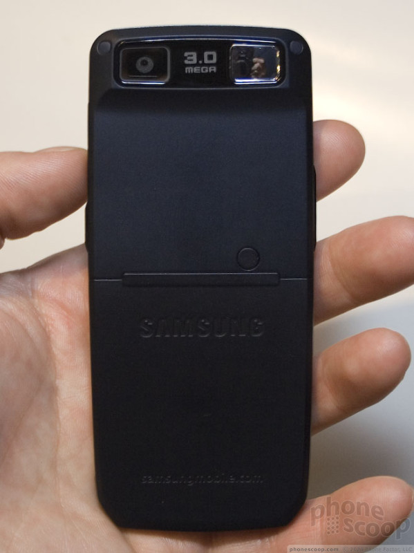
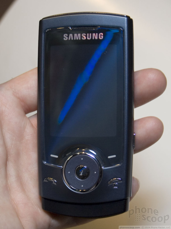
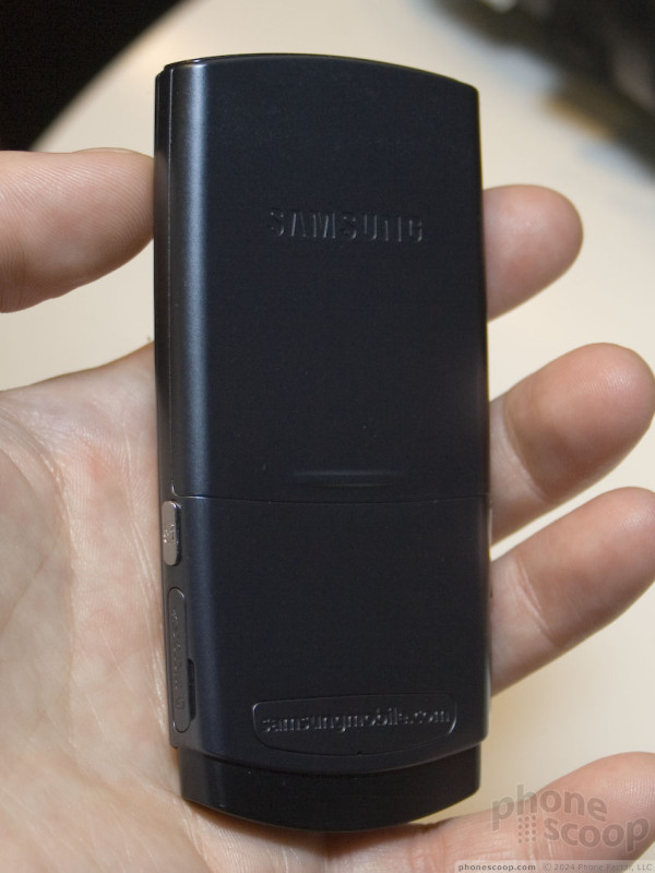
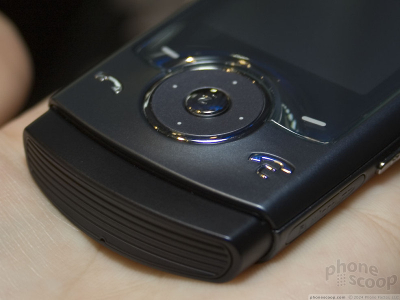
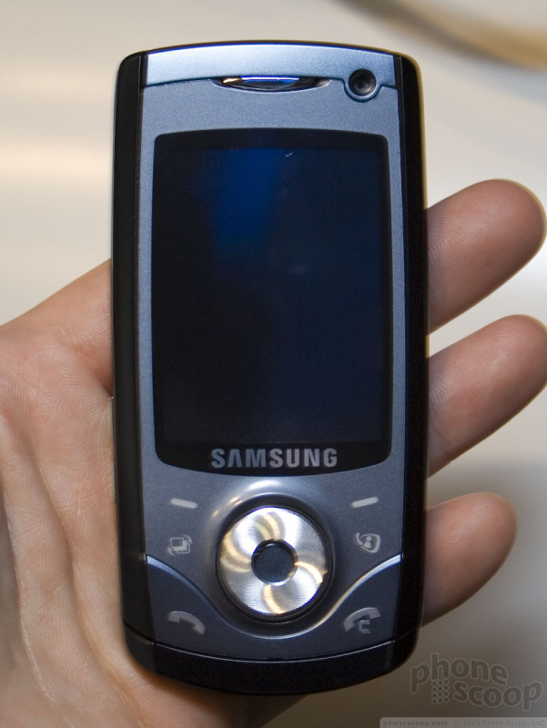
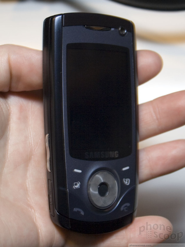
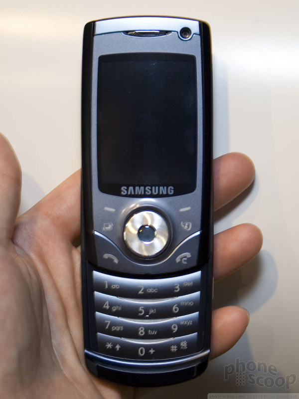
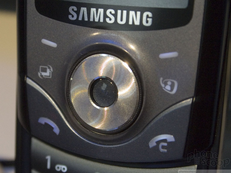
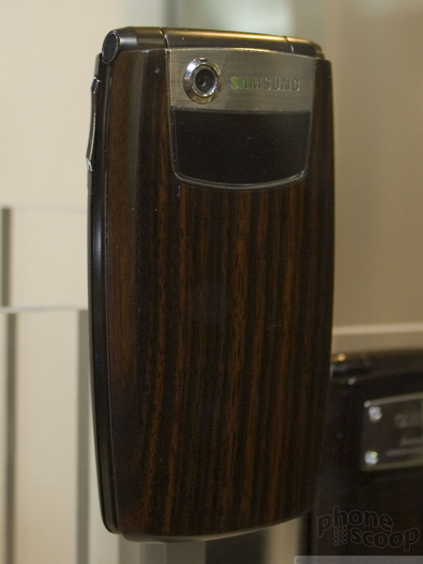
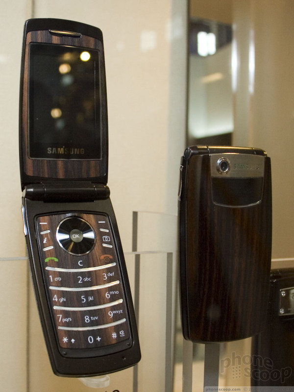
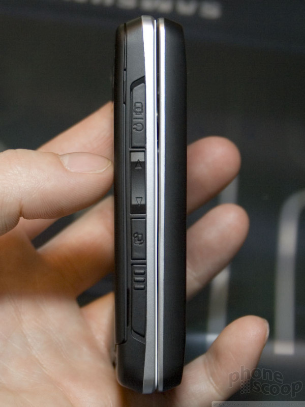
Samsung Ultra II
Samsung didn't just make this year's Ultra editions thinner, they tried to make them smarter. Each of the new series of phones don't just have a different thickness or form factor, they each have some unique features. Even though these were announced for Europe and are likely to show up across the pond as early as next month, all of the first round of Ultra Series phones have (or are) coming to the states, so it's likely these will make it to our shores later as well.
All of the phones feature a more refined version of the interface found on recent Samsung GSM models like the SYNC. The text size has been reduced ever so slightly and navigation has been cleaned up a bit. There are also now 12 icons in the main menu instead of 9. They also have a link in the main menu to Yahoo! mobile services, however that may disappear by the time US carriers customize the software.
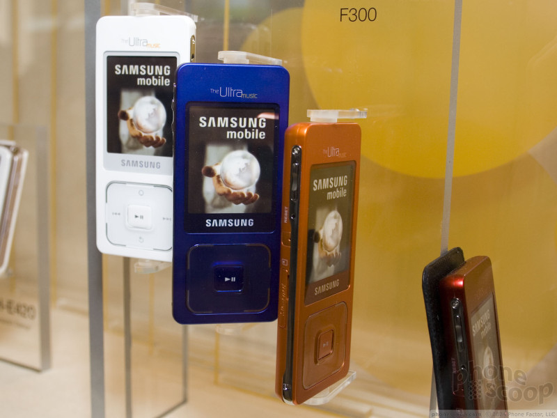
Each of the new Ultra phones also has a new music interface with support for album art, song ratings, and other features clearly meant to bring it more in line with Sony Ericsson's Walkman interface or standalone music players like the iPod and Zune.
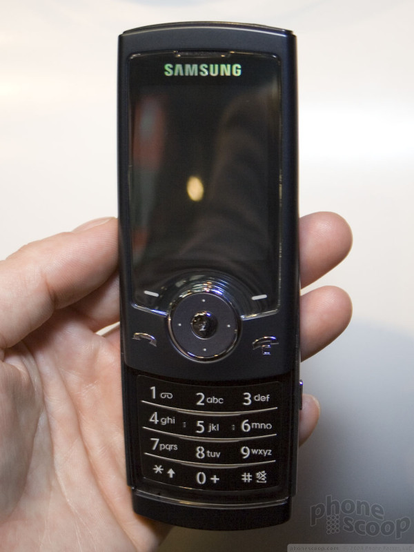
The Ultra 5.9 candybar is the least notable of the bunch because it is so similar to the last Ultra candybar, launched in the US as the Trace and coming as the A727. The latest version is simply a few tenths of a millimeter thinner, however it does have a larger screen. The new screen is a welcome relief. It is clearer than the first model and, obviously, can display more at once. It feels as though the 5.9 is also slightly wider than the Trace. Like previous Ultras, the vibrating alert on the 5.9 is pretty weak, which is to be expected for such a thin phone.
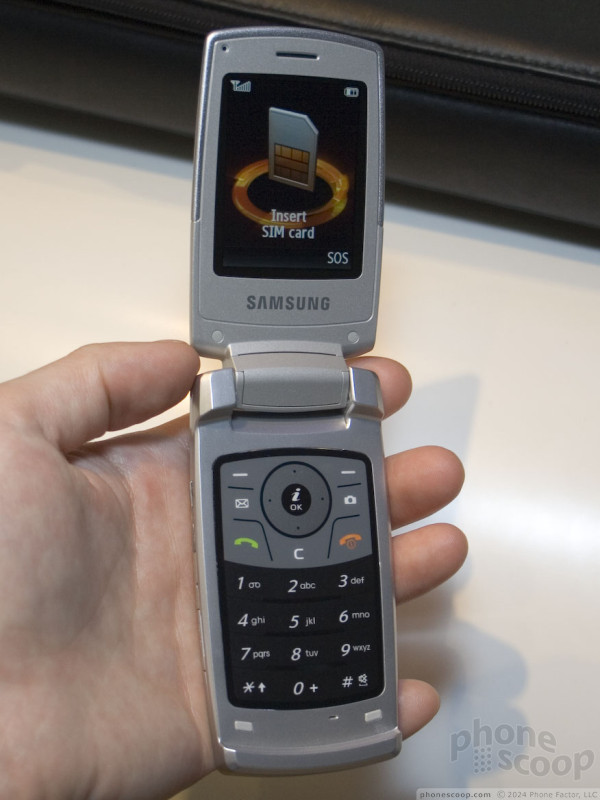
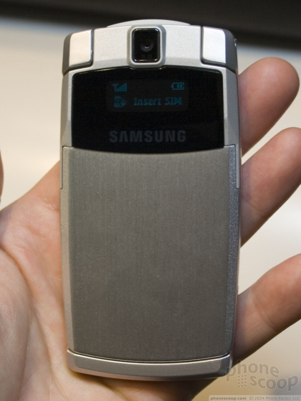
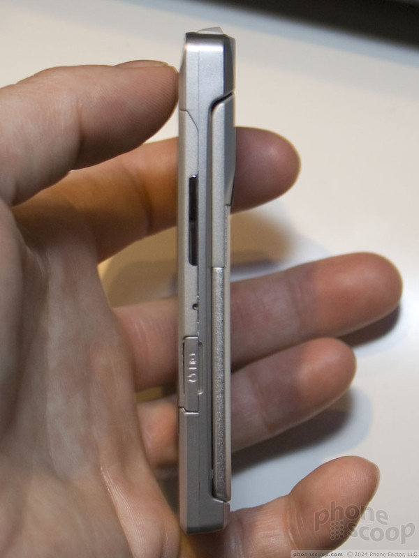
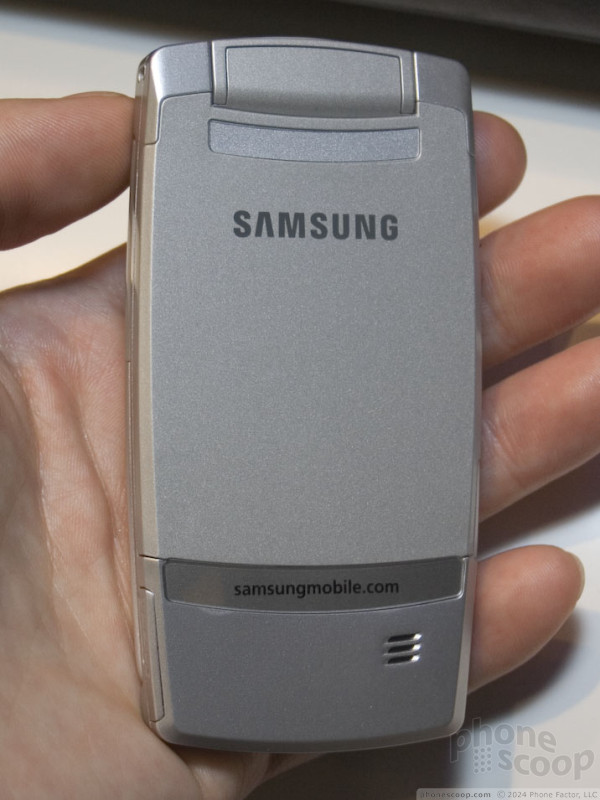
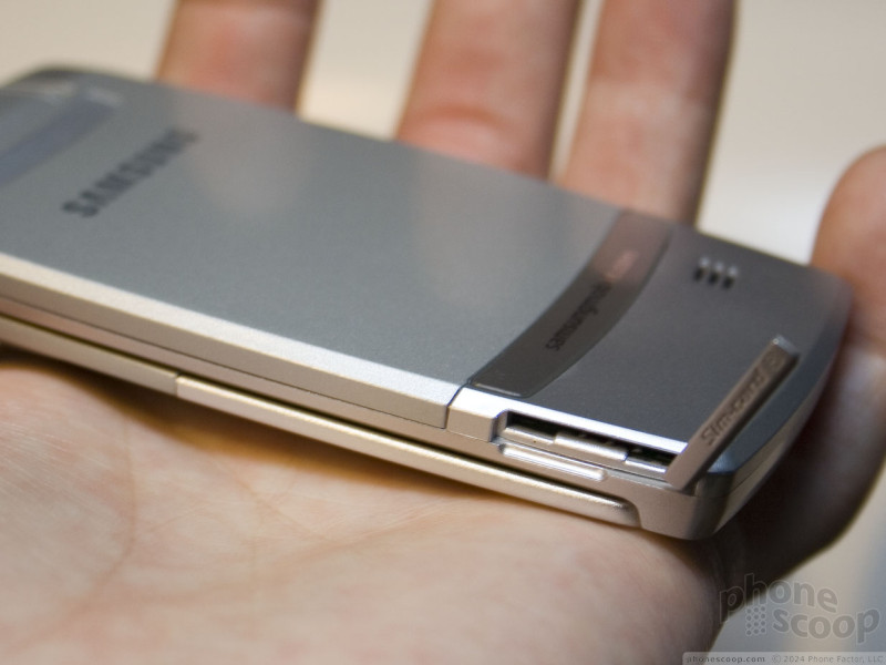
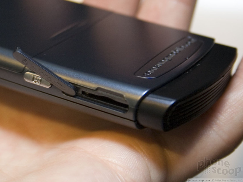
The 9.6 clamshell is unremarkable from the outside, it simply looks like a silver metal-clad version of the last Ultra clamshell, which will come to Cingular as the A717. Because it is also thinner, and there is no good place to slip your finger between the two halves, it is harder to open with one hand.
The keyboard of the 9.6 is the most interesting feature because it doesn't move. It is not a hard plastic capacitive keypad, like the "keys" on the front of the Chocolate. It is like a typical soft touch plastic keypad, however the keys don't actually press in. You press on the keys and the phone vibrates to let you know you've pressed it. How much it vibrates per press can be customized. At anything over the lowest setting, it was like using the Wii menus - a bit annoying.
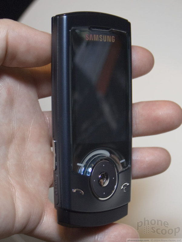
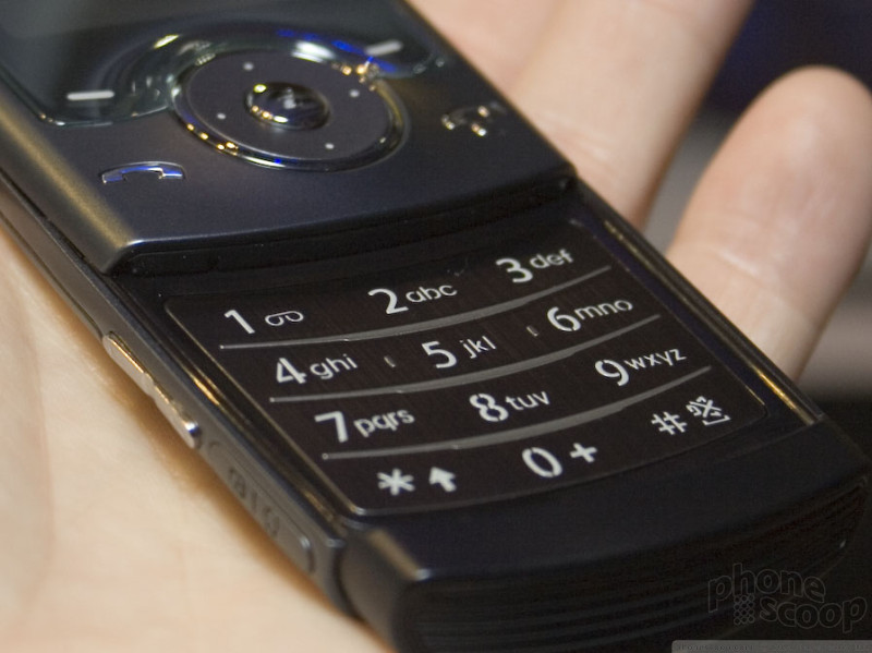
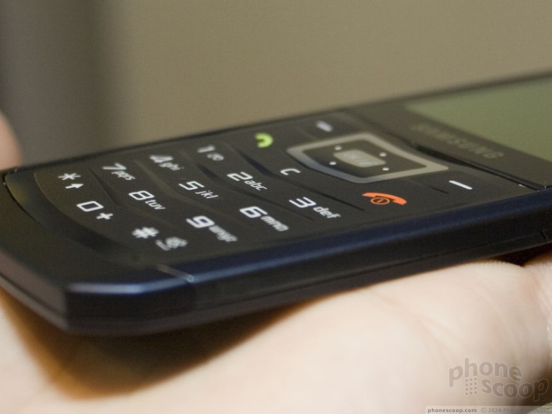
The 10.9 is the stand-out of the bunch - not because it has the most features, but because it works and feels the best. There are 4 capacitive navigation keys on the front (send, end and two soft keys) and a real D-pad. Curiously, the end key doubles as the clear key. which is confusing when doing tasks and the right soft key is labeled "back." We weren't quite sure what to do at first. The navigation keys all work well and because there are only 4, they are highly accurate. Every press was registered accurately. The D-pad is comfortable to use and has a slightly raised select key that is easy to press.
When you slide the front up, the keypad that is revealed is also very usable. The keys are large enough to press easily, but small enough that your thumb can travel over them quickly. They have a soft feel - even the click of the key is soft - but it still feels good.
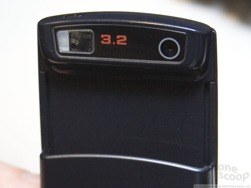
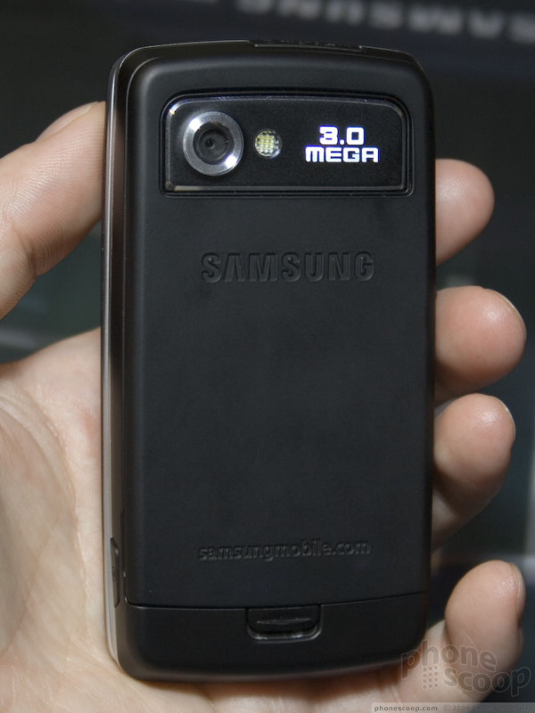
The 10.9 and 12.1 sliders feature 3 megapixel auto-focus cameras which are hidden behind the slide until you open the phone up. The phone is held sideways to use the camera, with a shutter button at the top. Although this gives you an accurate full-screen viewfinder, it is a bit odd in that the phone has to be open to use it, so you have to hold it with both hands.
The 10.9 also has the strongest vibrating alert of the bunch.
The 12.1 looks like a larger 10.9 at first, with a few extra keys on the front. One is for video calling since it is a 3G phone, and a second for Samsung's task shortcuts, like on the Sync. However the D-pad holds a secret: it doubles as a scroll wheel. Unlike an iPod, the wheel on the 12.1 actually rotates. You can navigate either by spinning the wheel around or pressing the 4 directions on the pad. The difficult part is actually making a selection. The select key is small and is below the level of the click wheel. You really have to dig in with the tip of your thumb to press it. This may have been a prototype issue, however, since it was more pronounced on some demo units than others.
The numerous touch keys on the front are spaced close together, making mis-presses all too easy. The numeric keys are large, easy-to-feel, and have good feedback. Otherwise the 12.1 acts identically to its thinner 2G brother.
Samsung Ultra Smart
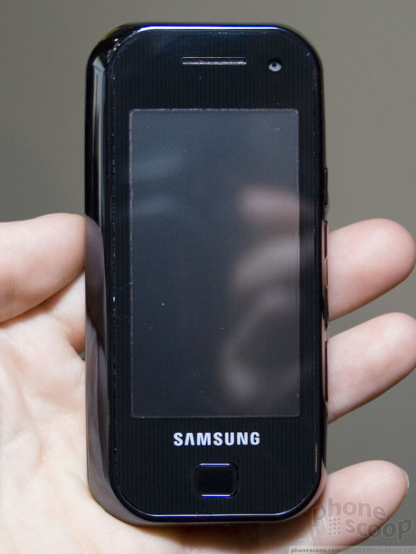
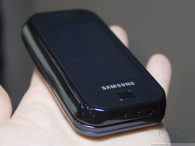
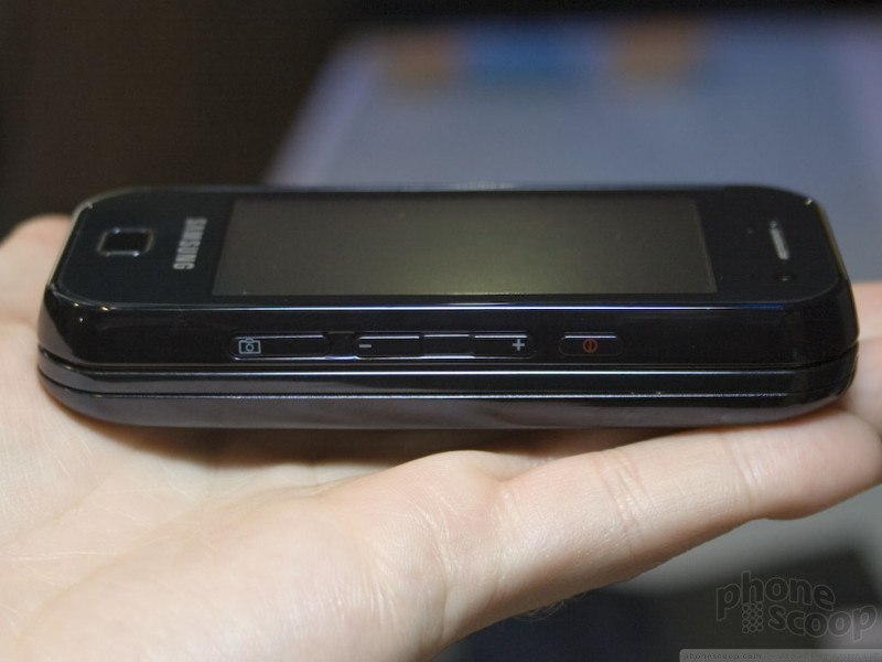
Shortly after Apple announced the iPhone, Samsung announced that it had a similar phone in development: the "Ultra Smart F700". Nearly every part of it seems like a direct answer to the iPhone, from the finger-touch interface to the shape of it, right down to the streamlined front design with a single "home" button below the screen.
However Samsung seems to have developed a whole new finger-touch user interface (UI) that surely took more than a month to develop. It wasn't quite clear how Samsung reacted to the iPhone with a complete product so quickly.
Things became a bit clearer at 3GSM this week, when the Ultra Smart F520 was announced, and we had a chance to try Samsung's new finger-touch UI ourselves.
First, the new UI is a long way from being finished. While it's clearly beyond the concept / demo stage - it does really work interactively, and do many things just fine such as play music and make phone calls - there are still quite a few "dead ends" where icons and menu items simply don't do anything yet. That's not surprising, though; journalists who have tried the iPhone say the that UI is at about the same stage.
Second, of the two Ultra Smart phones, the F520 is clearly further along in development. In fact, it's the only of the two that would even power on. We suspect that the F520 is the original "Ultra Smart" phone the new UI was intended for, and the F700 is simply a new spin-off hardware model created quickly to provide a more direct answer to the iPhone.
It's tempting to compare Samsung's new finger-touch UI to that of the iPhone, but it's not really a fair comparison. While Apple is clearly trying to create a whole new UI paradigm, Samsung's goals don't appear quite as ambitious. Samsung's UI is more about trying to make a good finger-touch UI for a typical high-end phone, while Apple is aiming for a whole new platform. A phone using Samsung's finger-touch UI fits somewhere in-between a regular phone and the iPhone.
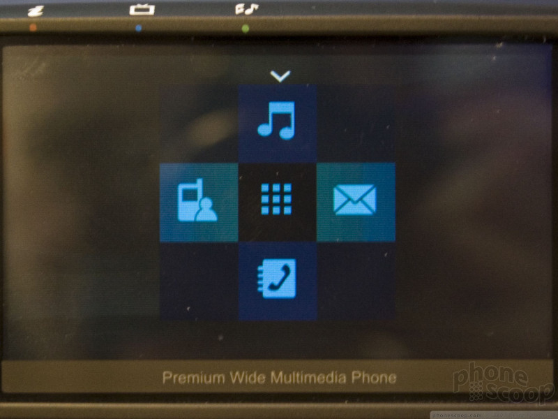
The home screen, menus, and options within Samsung's new UI aren't that different from a regular phone. What's new are a few standard UI elements that replace certain hardware keys. On most screens, there's a row of four small icons across the bottom. They are, in order: options, home, back, and exit. The "home" function actually brings up a simple 4-way shortcut menu to the most commonly used functions.
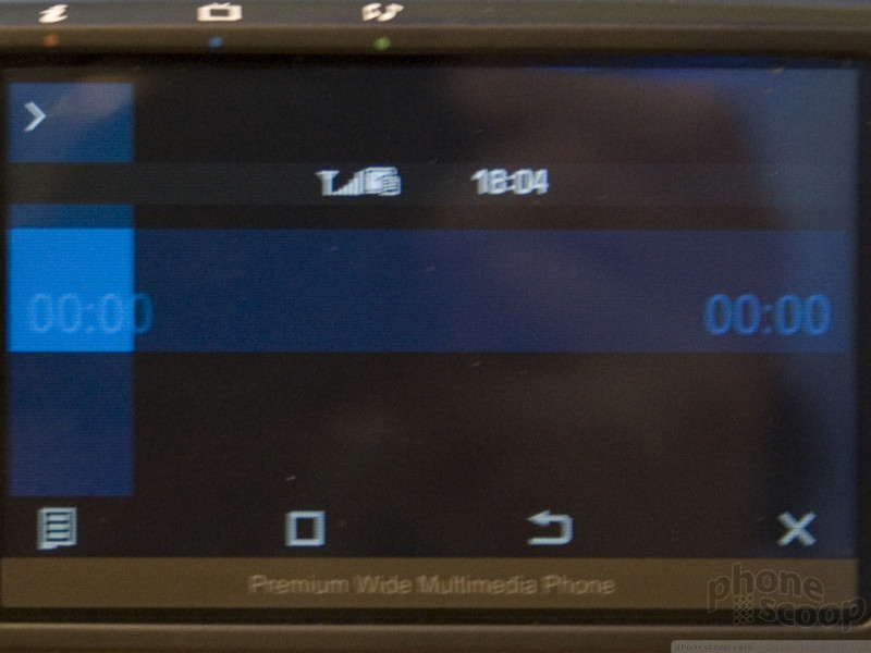
Throughout the interface, there's a wide blue crosshair-like element. In the main menu, you can "drag" it around and wherever you lift your finger is the option that's chosen. It's not any more efficient than simply tapping an icon, but it's fun to play with. The one place where the "crosshairs" are useful is the music player. The whole screen becomes a control for the song playing. Dragging the crosshairs up or down adjusts volume, while left/right skips right to the part of the song you want to hear.
iPhone clone or not, the F700 is one damn sexy phone.
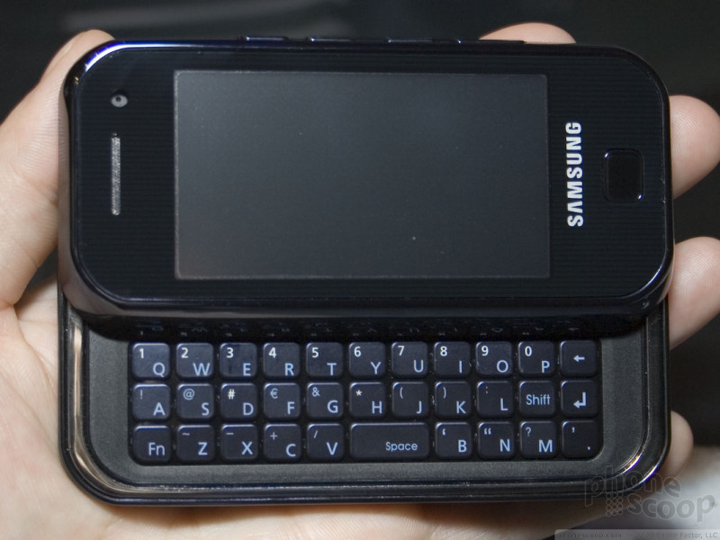
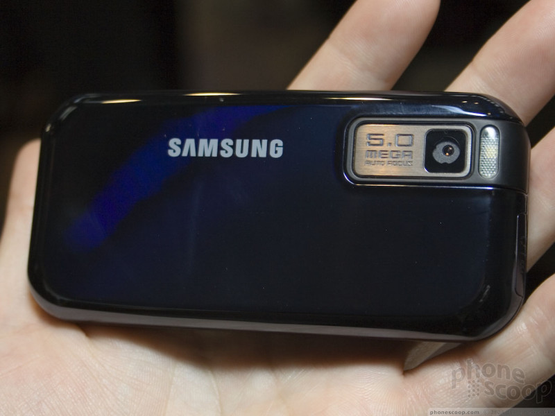
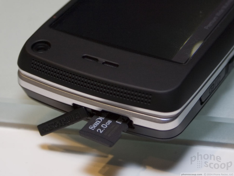
The F700 has a decent-feeling slide-out keyboard. The specs are pretty impressive, including HSDPA and a 5 megapixel auto-focus camera. It does have a memory card slot, but it's below the battery cover. That keeps the outside nice and slick-looking, but hinders convenience a bit.
Without being able to turn it on, there's not much else we can say about the F700 specifically.
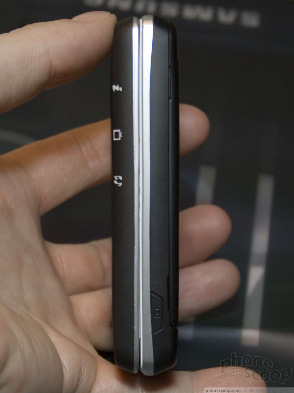
The F520 has Samsung's dual-slide design where some keys do double-duty as either number keys or letter keys, depending on which way you slide the screen. The idea is interesting, but it creates an awkward, somewhat arbitrary blank space in the middle of the QWERTY keyboard. The large numbers also make it difficult to read the letters on the right half of the keyboard.
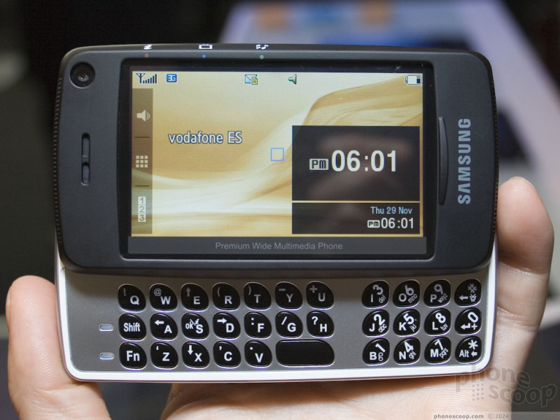
The dual-slide mechanism wasn't very solid; it felt loose and easy to slide diagonally. That could be a prototype issue, however, or due to the demo unit being abused, so it's simply an issue to look for in reviews of the final shipping unit.
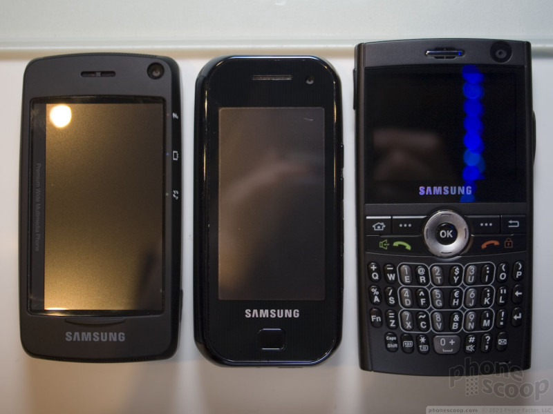
Here's a quick side-by-side size comparison of the Ultra Smart F520 and F700 against the SGH-i600 (just like the i607 BlackJack):
Readius
Polymer Vision showed off their Readius mobile media device. This is the cellular-enabled handheld with a rollable e-ink screen. The model they were showing off is the one that will be launched in Italy as the Cellular Book. When closed, it is about the size of a Nokia N73, but it opens to reveal a large, high resolution display with 16 grey shades.
In the central bulk of the Readius is its battery, which will go for about 2 weeks on a single charge if you use the Readius 2-3 hours per day. It also houses 4 GB of storage and 3 radios for data transfer - EDGE, UMTS and DVB interactive. An EDGE-only version is expected to come to North America sometime this year. There is also a touch panel which is used for navigation by pressing one of 5 button areas, as well as for scrolling by running your finger up or down the length of the sensor.
You can watch the Readius in action here:
or visit YouTube for more viewing and sharing options.
Part 3
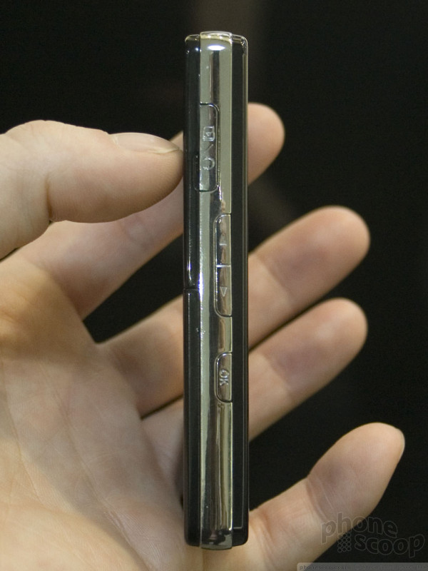
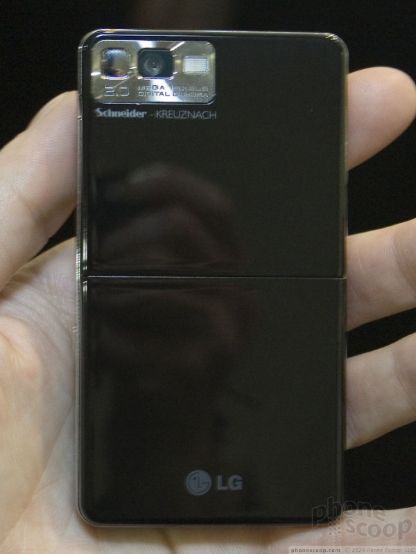
LG Prada
Although LG announced their Prada phone a month before Apple spilled the beans on its first phone, it was the iPhone announcement that really thrust the Prada phone into the spotlight. The obvious similarities and close timing of the announcements will forever link the two devices in the public mind, which is both a blessing a curse for LG.
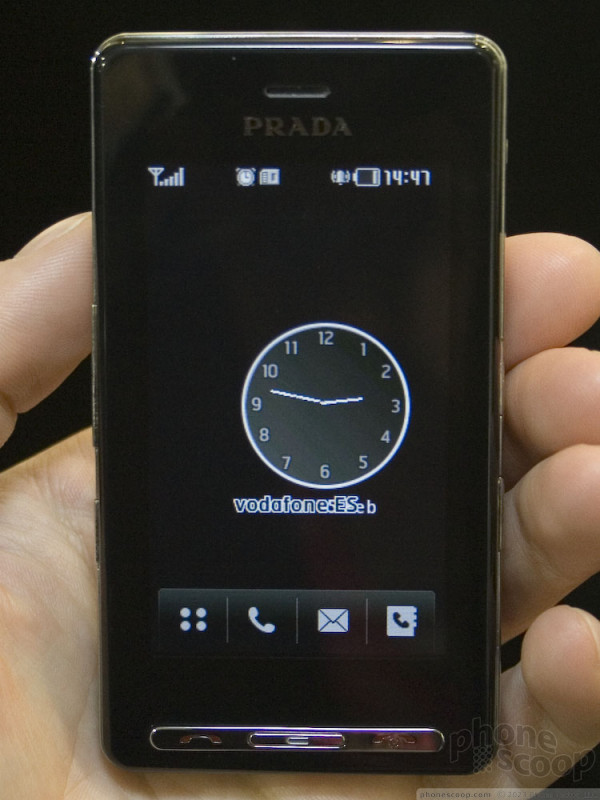
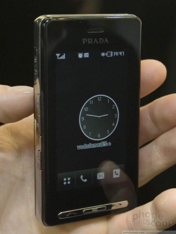
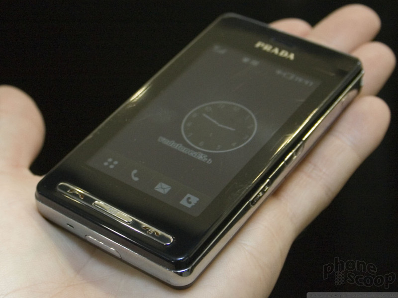
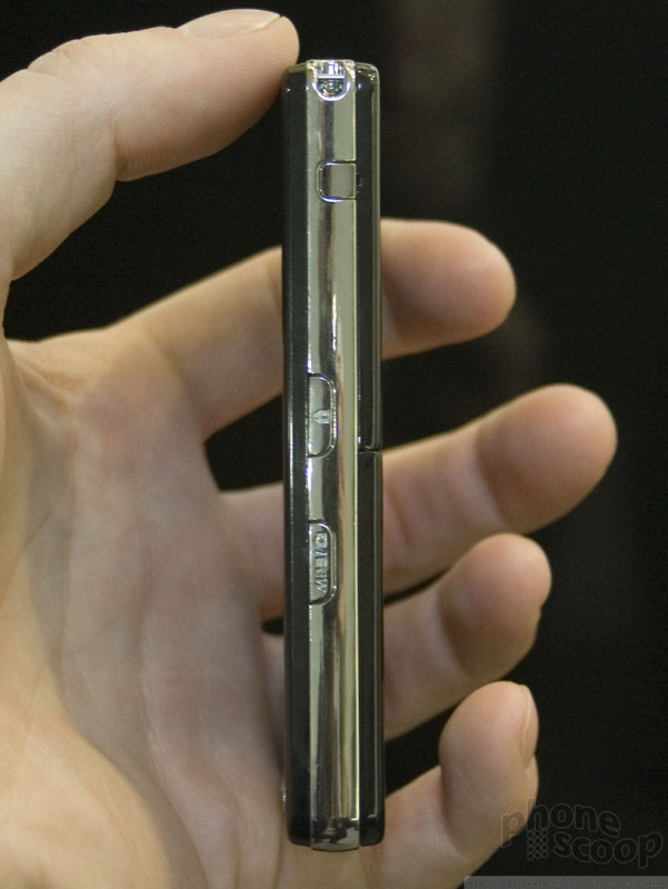
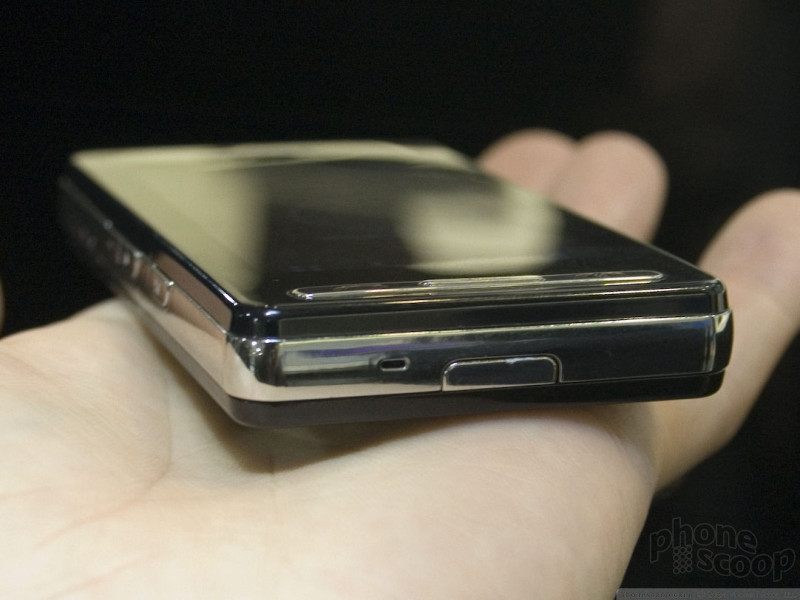
The Prada phone shares much of the iPhone's sleek design. Although they're equally thin, the Prada phone is noticeably smaller in its other dimensions. It has a great feel to it and a size and weight that make it very pocket-friendly.
LG placed a number of side buttons around the edge, but the front features only a thin strip of silver buttons below the display. Those buttons are one of our few gripes with the phone's design. The strip of three buttons are a bit small to press easily. Otherwise the phone's ergonomics are excellent.
Our other gripe is the glossy finish that shows fingerprints all too easily. There's no magic coating that repels skin oil here.
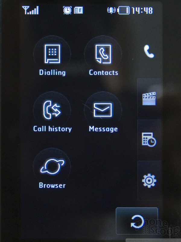
Ignoring the fingerprint smudges, the finger-touch user interface of the Prada phone is incredibly slick. It looks very stylish - fitting of the Prada name - with shading and icons that fit the design of the hardware perfectly, making it feel like a fully integrated hardware and software experience. Slick animation enhances the experience even further and makes it feel extra-polished (even if you forget to bring along a cloth to polish away the finger smudges.)
Most of the interface is very simple and intuitive, although it's not without some small quirks. One is the main menu, which is grouped into four pages of icons. That's fine, but the "tabs" to choose among those pages are laid out down the right edge of the screen, which is where you would expect to find extra, minor options, not the top-level menu. The "back" button also looks more like "refresh" button, but both issues would be easy to get used to.
The Prada phone doesn't attempt to emulate a full text keyboard like the iPhone. That's probably just as well, since the Prada phone is smaller and therefore has a smaller screen. It's hard to imagine how a full text keyboard could be successful on a screen this size. LG's solution for text entry is therefore a standard phone keypad layout, using T9 for word entry. This works relatively well, since the virtual keys are very large, and in places where you don't need numbers - like contact searching - they hide the numbers so the letters are larger.
In trying the Prada phone in person, all parts of the software seem to be complete and functional, with no dead-end menus or crashing. The software features are also quite extensive; they've managed to leverage the touch-style interface quite effectively to create a phone with a simple-looking interface that still has nearly every feature you'd expect in a modern high-end phone.
Look for the Prada phone to hit the market next month for just under $800 (USD).
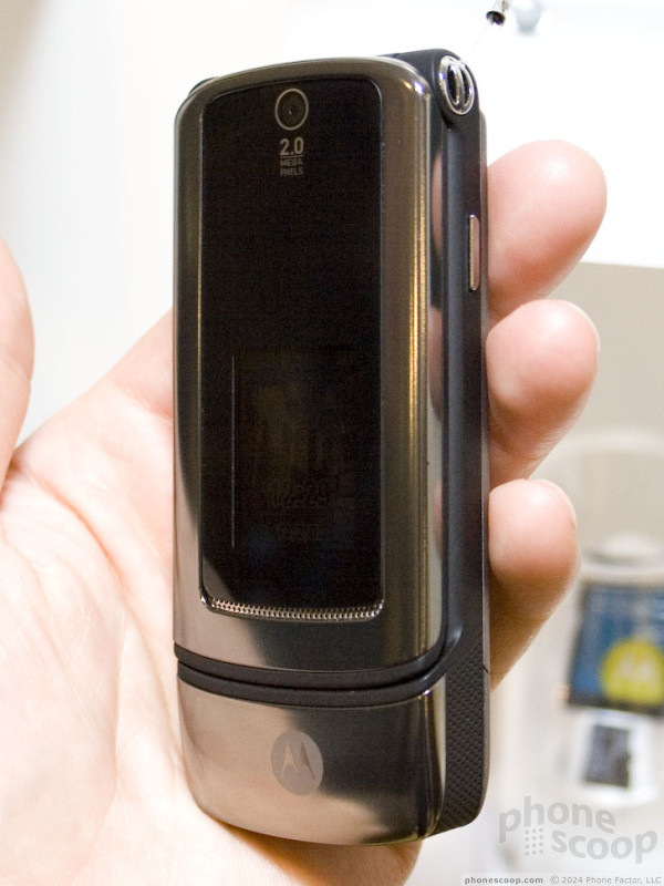
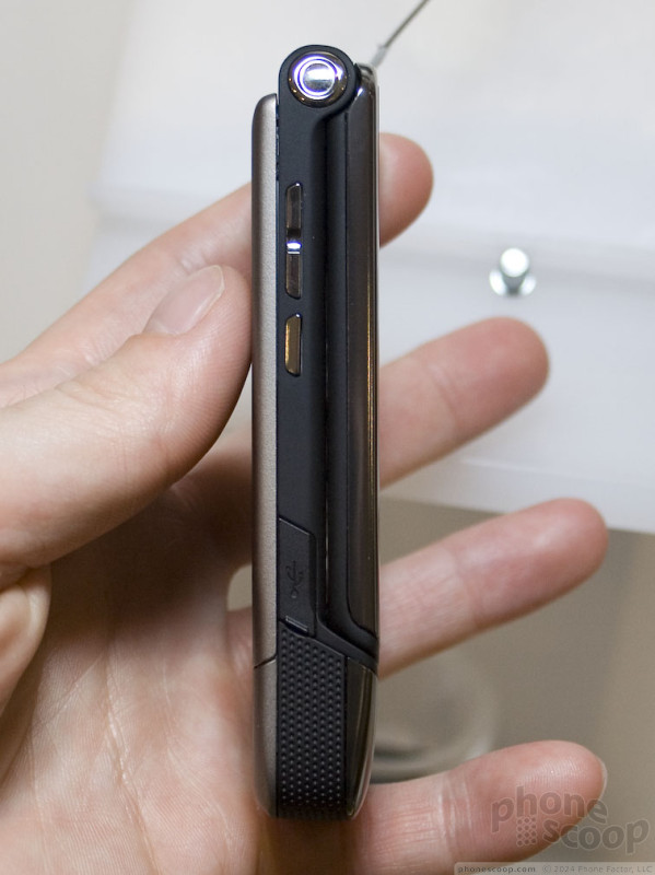
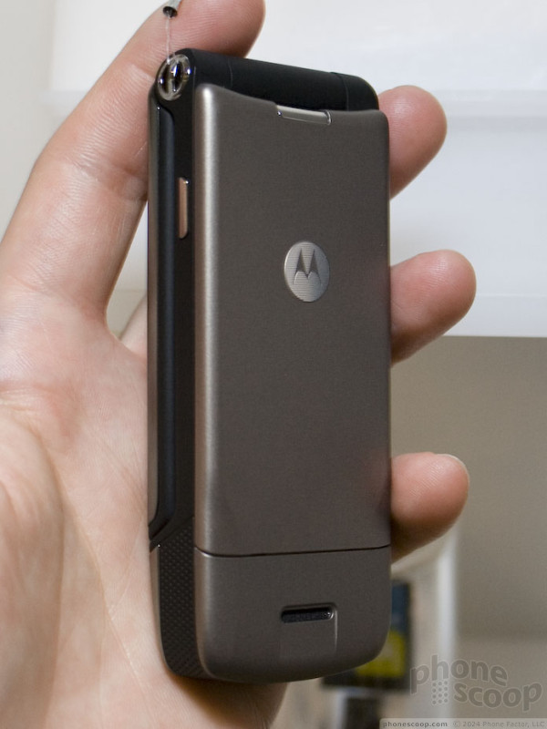
Moto Z8
Motorola used to launch UIQ phones in Europe almost every year around this time. They were bulky but they were some of the first 3G smartphones and had many features that were ahead of their time. But after limited success, the new models stopped coming.
Then Monday Motorola surprised everyone by revealing that their new slider, the RIZR Z8 was running a new version of UIQ: a new user-friendly version that no longer requires a touch screen. Even the Symbian world barely heard wind of it before Sunday.
The Z8 (pronounced "zed eight" in Europe) is just slightly wider than the other RIZRs, but otherwise about the same size. Unlike other RIZRs, the Z8 is tapered at the bottom to look more like the RAZR / KRZR than previous sliders, with a perforated grill on the bottom part below the slide.
The slide is definitely unique. There is a hinge about 2/3 of the way up the back of the phone. As you push the slide up, the back part bends at the hinge, tilting the top of the slide forward. When the phone is open it is more like a clamshell than a slide, so it is comfortable to hold to your ear while talking.
The slide mechanism is firm and solid. in part due to the unique hinge and slide system, and also because the bottom of the slide is rounded so that it fits in the crease created by the hinge perfectly. Because the keypad is under the slide, this also means the keypad is rounded, with the bottom half coming towards the user. We were worried this would be more difficult to use than a flat keypad, but that is not the case at all. The keypad is easy to use and the curve actually means your thumb travels up and down it less.
This new implementation of UIQ might just be the most user-friendly software Motorola offers. It has many of same improvements Motorola added to the Linux-Java platform, but has additional ones as well.
For example, the Z8 features a new home screen with all sorts of status plug-ins. A large number will be available, but the user will only be able to pick 5 because that's how many fit without any scrolling off screen. Each plug-in provides direct access to a function like calling, email, texting or the music player if nothing is going on. But if you have a missed call or new text or a song playing, the plug-in will display that information on the home screen and one click quickly takes you to whatever is new.
The first day we played with the Z8, we were worried it wasn't ready for prime time - the menus were slow and navigation was buggy. But by day 2, the software had been updated and was running fast and smooth. By fast we don't mean lightning fast, but it was at least as quick as any Linux-Java or even S60 phone we've tried. Fast enough to playback full-screen movies at close to 30 frames per second.
About the only thing that wasn't finished was the camera, which manufacturers always seem to leave for last. However we were shown that when the phone is closed, the main camera is used with the phone in landscape orientation like a standalone camera, and when the slide is opened, the front-facing camera is used and the phone is held vertically.
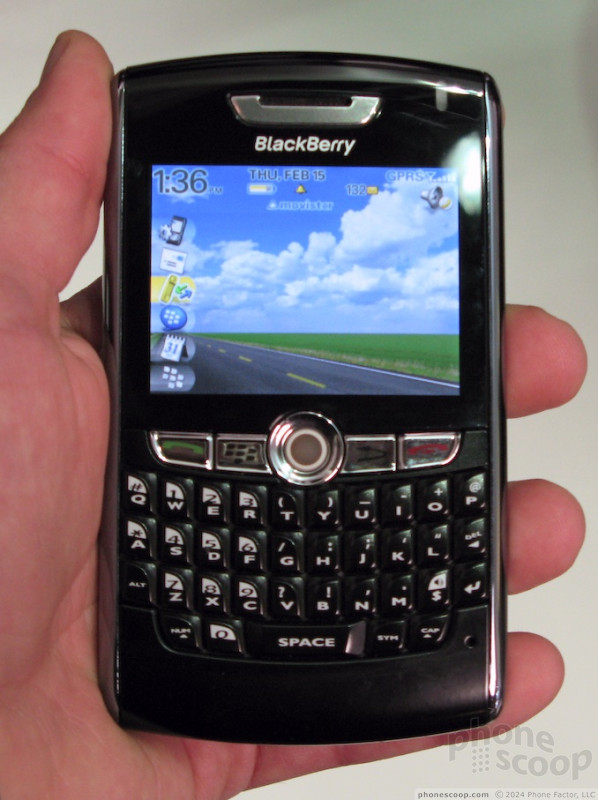
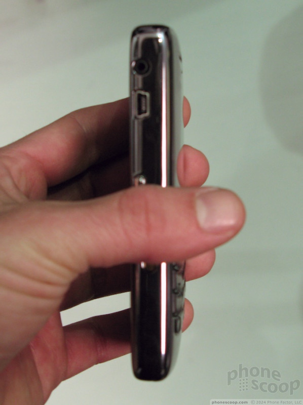
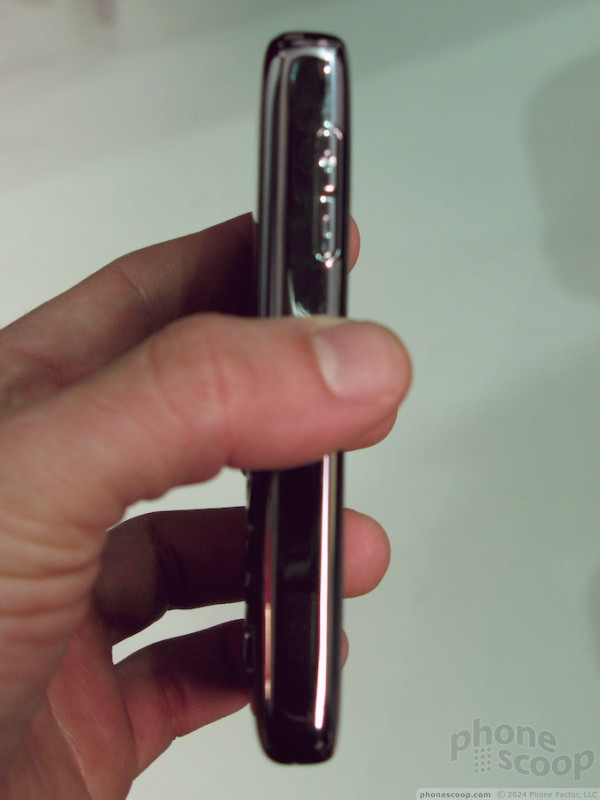
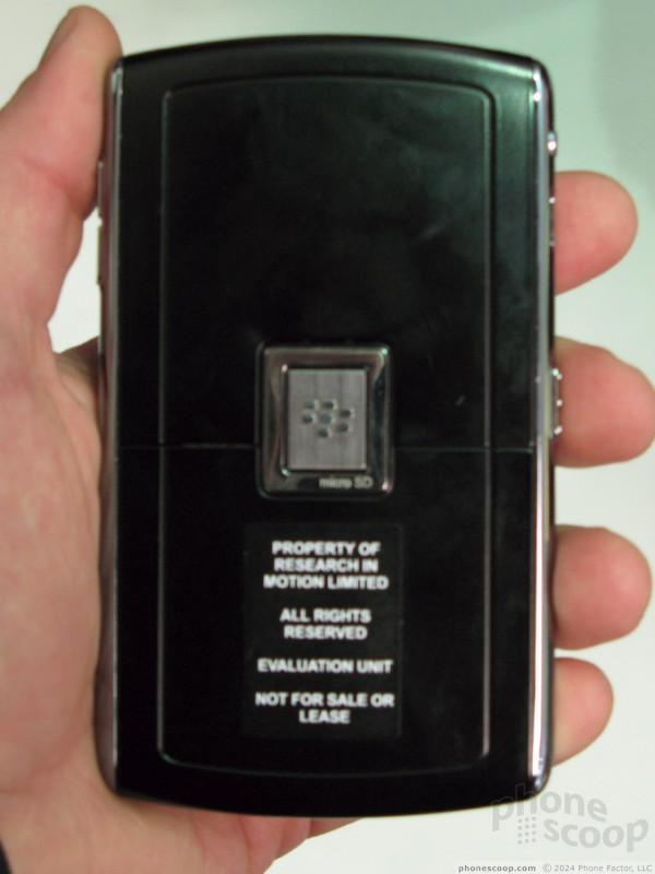
BlackBerry 8800
The Pearl was just the start. RIM knew they would have to put all their Blackberries on a diet to compete with all the other thin models, but it took them a while to do it. The 8800 is the exact same thickness as the Pearl, which is to say about half as thick as the 8700 series.
The 8800 has both a bigger keyboard and a bigger screen than the Pearl, but the interface and most the features remain the same. It even has the same media player. However the 8800 swaps the Pearl's camera for GPS, a fact we're sure many corporations are pleased with. This integrates with the Maps application that also shipped with the Pearl.
The 8800's keyboard feels much more solid than that of the Pearl, and probably ties the E61i for second best keyboard of all the new smartphones shown off at 3GSM. The q9 was his top pick.
more Motos
Motorola's exciting announcements were no doubt the Q9 and Z8. There were some other phones announced worth covering, however.
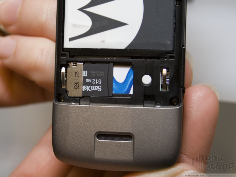
The W510 is technically in Motorola's line of phones for "emerging markets", but it's at the very top end of that lineup, so it's more like a decent mid-range phone. Features include stereo Bluetooth and a memory card slot (unfortunately located under the battery). Where it skimps a little is the small display.
The W510 is based on the same basic chassis and design as the W370 / W375, which in turn is a cross between the design of the RAZR and KRZR. Putting it next to a KRZR K1, you can see that it's a smidgen thicker and wider, but not as long. The KRZR design heritage gives it an unusually high-end feel for a phone of this class.
Although the phone wasn't specifically announced for the US, the W510 is quad-band GSM, so we'd surprised if it didn't hit US shores at some point.
Less likely to the reach the US (though it's still quite possible) is the new KRZR K3.
The K3 is essentially just a KRZR with HSDPA. There's not much else to say about it other than the new two-tone silver/black design shown in the photos.
 Video Tour: Motorola Q9h
 Moto Q9h Video Preview
 CTIA 2007
 Helio's Mysto A Mystery No More
 Motorola Q9H for AT&T Sighted
 Nokia E65
 Nokia E61i
Comments

Q9 for VZW?

Readius video
(continues)

Q9 + Wi-Fi?
peace
peace
Quad-band: yes

where is sophia???

Which carrier will have the blackberry 8800?

WHAT CARRIER WILL CARRY THE PRADA PHONE??

Q9

Touch screen UI and N2

Thanks from all of us
Could you give us any time frame for the release of these new smart phones from Moto, Nokia, Samsung and HTC?
Also which carrier will have these beauties?

Ultra Music Suprise
Is the big suprise color choices? If not, what?
Later we were able to reveal that a CDMA version is coming to the US. That was pretty much the "surprise".
Vox or S710