Review: Samsung Galaxy Victory 4G LTE for Sprint
Oct 12, 2012, 10:38 AM by Eric M. Zeman
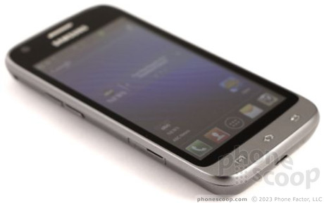
The Samsung Galaxy Victory 4G LTE is a capable mid-range Android smartphone for Sprint. In addition to LTE, it offers Ice Cream Sandwich, and a 5-megapixel camera all wrapped up in a small, pocketable device.
Is It Your Type?
For the consumer seeking a mid-range, affordable smartphone with a dash of LTE 4G, the Samsung Galaxy Victory fits the bill. It's no Galaxy S III, but it still stuffs plenty of features into its compact form.
Body
About the most appealing aspect of the Samsung Galaxy Victory 4G LTE's hardware is that it isn't black. Unlike so many other Galaxy devices before it, the Victory is solid gray. The gray plastics have tiny, reflective flecks that catch light and give the appearance a wee bit of luster. The tone of the gray changes as you rotate it in your hand. It's kind of neat. At least black phones don't do that. Everything else about the Victory's design, though, is familiar.
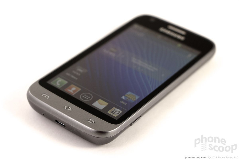
The Victory is a conservative slab with rounded corners and soft edges. The plastics are smooth and the Victory is comfortable to hold. It's not too heavy, nor is it too light. The quality of the materials is good enough and the Victory doesn't feel cheap at all. It is manufactured well. All of the seams matched tightly and there was no creaking or loose elements. The smallish profile and glossy plastics mean it will easily slip into and out of pockets.
Samsung brought back one design element for the Android control buttons that I particularly like. Back in 2007/2008, Samsung used capacitive buttons that were raised from the surface a little bit (think the Helio Mysto). These are the types of buttons on the front of the Victory. What I like about them is that you can easily find them with your thumb without looking. The raised symbols are by no means obtrusive. They're just subtle enough to make the functions easy to discern from one another. These three buttons provide haptic feedback when pressed, and illuminate as well.
The volume toggle on the left is a cinch to find and use. Travel and feedback is quite good. Oddly, Samsung has tossed the lock button on the top edge of the Victory. Samsung usually puts the lock button on the right edge. The lock button sticks out nicely and also has good travel and feedback. Surprisingly, the Victory has a dedicated camera button along the right edge. It can be used to launch the camera as well as snap pictures. It's a single-stage button, but provides excellent travel.
As for ports, the headphone jack is on top, the microUSB on the bottom, and the microSD memory card slot on the left edge. The microSD slot is covered by a hatch. The hatch isn't any trouble to peel back.
The battery cover is a breeze to remove. The battery itself can be pulled, which has become an increasingly rare "feature" in the last year or two. The SIM card is embedded in the device and can't be accessed at all.
Nothing about the Victory's design or hardware stands out as "Awesome, man!", but it works as intended and doesn't hinder usability.
Comments
What's the point of this over the Nexus?
I don't see the point of this phone at it's current pricing. $99 is too high - it honestly should've been free or $20. Otherwise, the Nexus is a superior phone for the mid-range pricing.
The only downside I see to the Nexus, is the lack of an SD card slot.
Am I the only one who feels this way?
(continues)




 Hands-On: Samsung Galaxy Victory
 LTE Comes To Virgin, Boost
 Galaxy Victory a Low-Cost LTE Phone for Sprint
 Samsung Galaxy Victory 4G LTE


