Review: Pantech Discover for AT&T
Menus
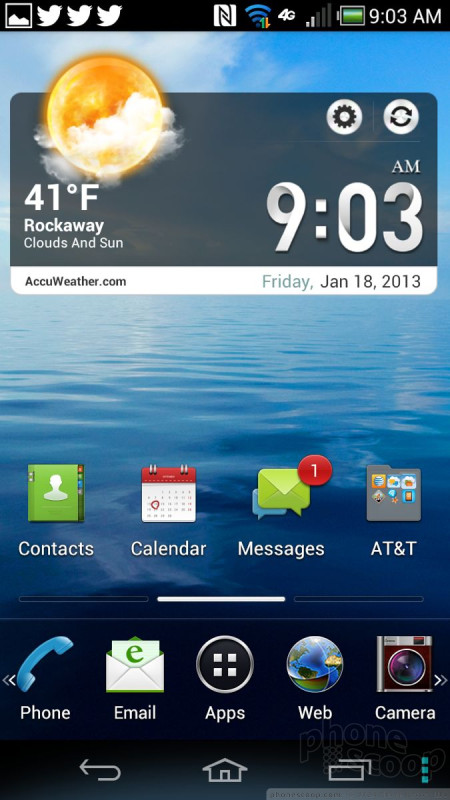
The Discover runs Android 4.0 Ice Cream Sandwich, with a too-busy-for-me user interface skin from Pantech. It also has the Pantech Easy Mode and Standard Mode tools, which alter the entire experience of the phone.
Why do I say "too busy"? There are at least five different segments to the home screen, each with its own background, buttons, and functions. I've seen much cleaner homescreen treatments. It simply looks like a jumbled mess. The regular mode includes five home screens and a typical allotment of widgets and apps. One of the cool features is an expandable dock of icons at the bottom of the screen that slides to the left or right just like the home screens do.
The regular mode also has the killer Pantech lockscreen shortcut tool. There's a large ring in the center of the lock screen and it is surrounded by six apps. Drag the app you want into the circle and you go directly there. Out of the box, those apps include messaging and camera. They can be customized if you wish.
The main app menu can be arranged in a ton of different ways, including alpha grid, custom grid, and list. Individual apps within the app menu can be hidden from view, and some can be deleted.
As for the easy mode, it really tones down the clutter. It makes all the icons larger and easier to read, reduces the number of home screens down to one, and uses alphabetical lists for the settings and app menus. One bummer is that it drops the handy lock screen shortcuts, and disables the use of widgets entirely. It also hides the bulk of the apps installed on the device, leaving only the main communications tools available. It will probably be easier for first-time smartphone users to begin with the easy mode enabled, but it really cuts down on some of Android's best features (widgets, and so on.)
There's no difference in the way either performs. The fast processor under the hood gives the Discover's noticeable muscle to speed along. I did notice a lot of app crashing, though.
Calls/Contacts
Aside from the lock screen shortcut that takes you directly to the call log, there's little setting the Discover apart from other Android handsets when it comes to the phone app. You can, however, select from five different dialpad styles.
The contacts application, too, is that of stock Android. The one thing setting it apart is a really useful home screen widget. The widget lets you create a miniature contact list that is accessible from the home page. It holds at least ten people, and includes their thumbnail photo.
Messaging
The Discover covers all of the messaging basics. It runs the stock messaging (SMS), email, Gmail, Google+, Google+ Messenger, Latitude, and Google Talk apps. All of them work well, though they don't present any new features.
There are two separate AT&T messaging apps, as well. The first is really a general inbox for SMS, voicemail, and missed calls all in one. I really don't see the point of it since the native tools work just as well. There's a second app called Social World, which is used to manage social network account messages, including Facebook, LinkedIn, and Twitter. It's easy enough to set up and use. It lets you see your entire feed, as well as respond to direct or instant messages.


 Hands-On: Pantech Discover for AT&T
 Pantech Discover for AT&T Boasts HD Display, 12MP Camera
 Hands On with the Boost Summit 5G
 Qualcomm Expands Flagship Phone Chip Series
 Snapdragon 8 Gen 3 Can Run Generative AI Voice Assistant On-Device
 Pantech Discover


