Review: BlackBerry Z10 for Verizon Wireless
Menus
The Z10 runs the brand new BlackBerry 10 operating system. We reviewed BlackBerry 10 in detail here. If you really want to know all there is to know about BB10, please read that review. If you're looking for the quick-and-dirty version, here goes.
BB10 includes a lock screen that provides messaging notifications, a clock, and a shortcut to the camera, but it cannot be customized. The main "home screen" is used for multitasking. It houses active tiles of the last eight applications opened by the owner; each tile provides a preview of that app and its content. The main app menu is a swipe to the right. Apps are listed in 4 x 4 grids on each page, and can be organized into folders if you wish.
The big element is BlackBerry Flow, which is a series of gestures that are used to move through the UI. The gestures take time to learn and master. The most significant of which is called BlackBerry Peek, which is used to see a preview of new messages and calls from within any app on the phone.
A drop-down shade at the top provides access to controls such as the wireless radios and full settings tools. BB10 offers some customization options, but not as much as on Android or even Windows Phone. The wallpaper can be changed, there are multiple ringer profiles, and of course users can select their own ringtones, and so on. Users cannot customize the home screen.
Verizon did not (and, as with iOS and Windows Phone, cannot) do anything to molest the BB10 user interface, but it did add some of its own apps, such as My Verizon Mobile.
In terms of performance, the Z10 is quick and smooth. The UI flows from one screen to the next and I didn't notice any lagging or stuttering. I did see a few app crashes, though.
Calls and Contacts
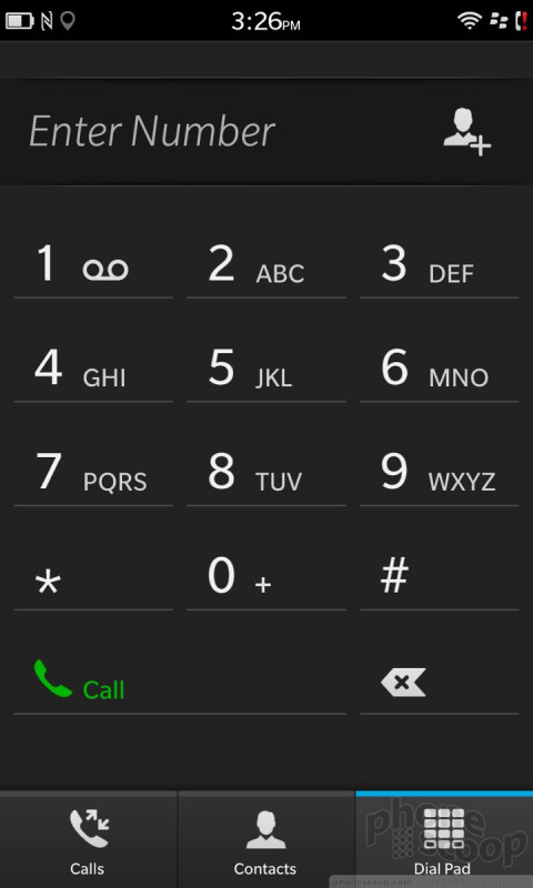
The phone app is not unlike that found on Android devices. It has a large software dialpad for punching in numbers, as well as quick access to the call log and contact database. It includes many of the features you're used to, such as send to Bluetooth, speakerphone, and mute.
The contacts app is much more visually pleasing than the older BB7 app, and syncs with far more accounts. The contact app can pull in data from Twitter, Facebook, and LinkedIn, in addition to your IMAP or other email service. I like that the app offers a peek at your recent communiques with various contacts and makes it easy to call or message them.
Messaging / BlackBerry Hub
BB10 includes the all-new BlackBerry Hub. It's a universal inbox for absolutely all of your communication needs.
The Hub handles email, SMS, MMS, IM, BBM, LinkedIn, Twitter, and Facebook. It is your one-stop shop for all messaging tasks, be they long-winded or limited to 140 characters. You can view all of your messages jumbled together in one large heap, or separate them into their respective inboxes. All of the messaging inboxes offer threaded views, attachments, and the same basic set of tools for composing and controlling them.
The Hub itself can be customized in that you can turn some inboxes on or off at will, as well as arrange how they appear in the Hub. You can also get a glimpse of what's in the Hub from any app by using a specific "upside-down L" swiping gesture. It's a neat way to be able to see what's going on in your inbox without necessarily leaving the task at hand. The gesture can be a bit tricky, though.
Social networking is built in to the sharing features of the OS as long as you sign into your various accounts in the set-up pages. Of course, separate apps are available for Facebook, Twitter, and so on. They function just like they do on Android and iOS phones.




 Hands-On: BlackBerry Z10 and Q10
 RIM Reveals Z10 and Q10, the First BlackBerry 10 Smartphones
 Twitter and LinkedIn Updated for BlackBerry 10
 BlackBerry Z10 (GSM)
 BlackBerry Z10 (CDMA)


