Review: LG Optimus G Pro for AT&T
May 8, 2013, 12:35 PM by Eric M. Zeman
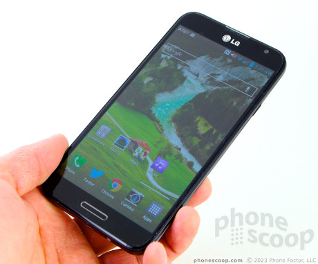
LG attempts to tackle the phablet market with the Optimus G Pro, an Android smartphone for AT&T that offers some innovative features in an over-sized package.
Is It Your Type
The LG Optimus G Pro falls into a very distinct class of devices: the phablet (a phone with a screen so large it's almost a tablet.) If that is the type of device that appeals to you, then perhaps the Optimus G Pro could fill your needs. For many, however, size isn't the only thing that matters. Does the Optimus G Pro offer more than its cinematic screen? Phone Scoop has the answers in this full report.
Body
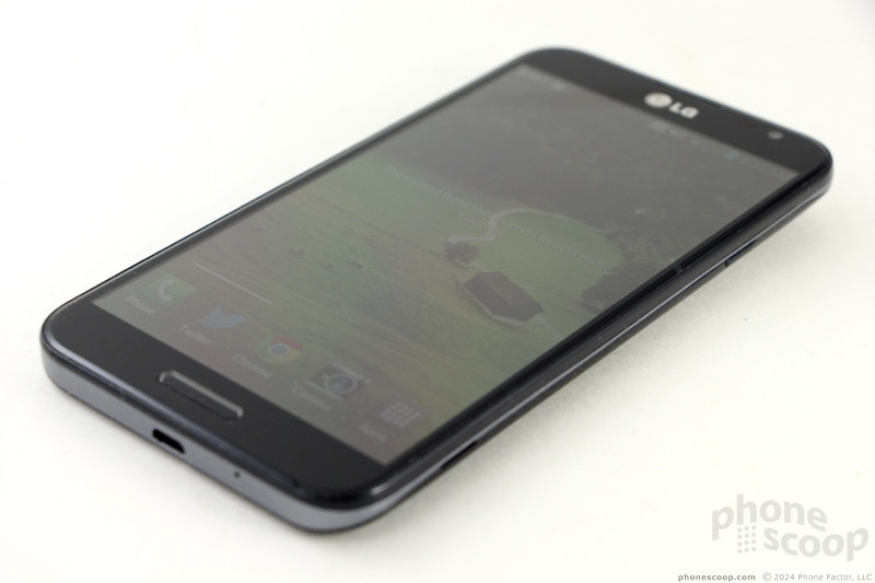
There's no getting around the fact that the LG Optimus G Pro is a large, large device. It is also, to my eyes, a bit plain looking. The design is fairly bland. It's as if LG decided that size alone would sell the G Pro. It's a black slab, but leaves the fancy lines and complicated surfaces to other phones. It may be big, but it doesn't look all that special.
The entire front surface is black. The back is black, too, but has a pattern that's situated below the clear, glossy surface. The effect is that when held in the light, the pattern will jump to life a bit and break up what would otherwise be a blackboard-sized rear cover. The back and front surfaces are both incredibly prone to collecting finger oils and nasty grime. It takes serious effort to keep the G Pro looking clean. Some may find its constant slime coating a bit gross. I know I did. There's a metallic-looking band that wraps around the edges of the G Pro, breaking up the black a bit. It's hardly noticeable, though.
The materials and build quality are okay, but not great. I'd like to see LG get away from the use of plastics on a device such as this, though I understand the weight and cost considerations metal adds to a phone. The pieces all fit together tightly, though, and the G Pro feels strong.
Of course, the G Pro goes head-to-head with Samsung's Galaxy Note smartphones. The G Pro has a slight edge over the Note II, however: it is fractionally smaller in every dimension. Where the Note II measures 5.94 x 3.16 x 0.38 inches, the G Pro measures 5.91 x 3 x 0.37 inches. It weighs less, too, at 6.14 ounces compared to 6.35 ounces. These minor differences may not seem like much to you, but they make all the difference in the world when it comes to daily use of the G Pro. The most significant difference is the width. The slightly narrower build makes the G Pro that much easier to use one-handed, especially when it comes time to reach for items on the far side of the display with your thumb. The rounded curves where the sides meet the back help a little bit, too. It's still more awkward to use than the Galaxy S 4 or HTC One, but not that much more awkward.
Comparisons aside, the G Pro is slim enough for most pockets, but it's a bit tall for some. In fact, it didn't fit completely into the pockets of two pairs of jeans that I own.
The front of the G Pro is nearly all display, though there's about 1 cm of bezel above and below the screen for items such as the speaker and controls. Speaking of which, there's a physical home button situated below the display. It's easy to find, but the button requires too much travel for my taste: you have to push it deep below the surface of the G Pro to get that "click" to happen. It's flanked by two capacitive controls: Back on the left, Menu on the right. The buttons work well, but they're hard to find when they're not backlit, which is too often.
The volume toggle is on the left edge of the G Pro. It's too flush with the surface and offers minimal travel and feedback. I want to be able to adjust the volume quickly, and this button doesn't allow for that. There's also a user-definable action button, (the default is LG's QuickMemo feature,) which is positioned above the volume toggle. It suffers from the same usability problems as the volume toggle. Thankfully the screen lock button, which is found on the right edge, is a bit better. It is both easier to find and offers better feedback (it's still not great, though.) The stereo headphone jack is on top and the microUSB port is on the bottom.
The battery cover forms the entire back surface of the G Pro and even wraps around toward the front a bit. It's a big piece of plastic. It doesn't feel quite as cheap as its counterpart on the Note II, but that's not saying much. The NFC antenna is plainly visible on the inside of the battery cover. It's hard to convey in words just how big the G Pro's battery is. At 3140 mAh, it's enormous. The memory card can be accessed without removing the battery.
The Optimus G Pro does not have a stylus.
Comments
Why- oh why- no stylus
(continues)




 Hands-On: LG Optimus G Pro
 iPhone 15 Series Goes All-In on USB-C and Dynamic Island
 iPhone 16 Brings More Features to All Price Points, Including New Camera Control
 LG Optimus G Pro


