Review: Samsung Galaxy S4 Active for AT&T
Menus
Editor's Note: Though the hardware is different, the Galaxy S4 Active runs the exact same software and includes the same apps that the standard GS4 does. With that in mind, we've copied portions of the text below from our reviews of the standard GS4. Rest assured, we've taken care to re-evaluate every feature of the device and have highlighted a few new ones, as well.
The Active runs Android 4.2.2 Jelly Bean, but Samsung's TouchWiz user interface is what owners of the Active will experience on a daily basis. The latest iteration of TouchWiz crams in more features than most owners of the device will ever notice, let alone use.
The Active starts with a highly customizable lock screen. You can choose to leave it simple, or add up five lock screen widgets plus a large digital clock. The latter was the setup I preferred, as it allows for quick access to key apps, such as the camera, browser, and Gmail, if you wish. You can include a password, too, to keep the device secure. The password works even if you have the lock screen shortcuts enabled.
Once you've made it to the home screen, you'll see a familiar layout. The basic appearance of the home screen panels is essentially unchanged. There are three panels active when you first boot the Active, but that can be altered at will. AT&T actually kept the Active's home screen panels free of widgets out of the box. The home screen panels remain to be as flexible as ever.
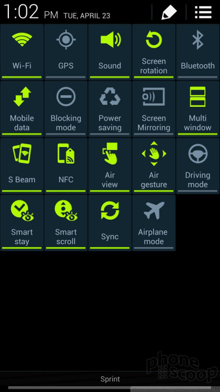
Samsung has made some changes elsewhere in TouchWiz. For example, the notification tray lets you control far more features than before. When you first swipe down, you see five toggles at the top that let you turn on/off various features. You can swipe these toggles to the left to gain access to more. With the notification tray open, you'll notice a cog wheel icon in the status bar for accessing the full settings menu, and a little square block icon. Press this block icon to gain access to all the toggles, of which there are 19 (Wi-Fi, NFC, Screen Mirroring, Airplane Mode, S Beam, Air View, and so on.) Further, you can customize where the toggles appear in this tool. You can also adjust the brightness from the notification tray, and of course see inbound notifications.
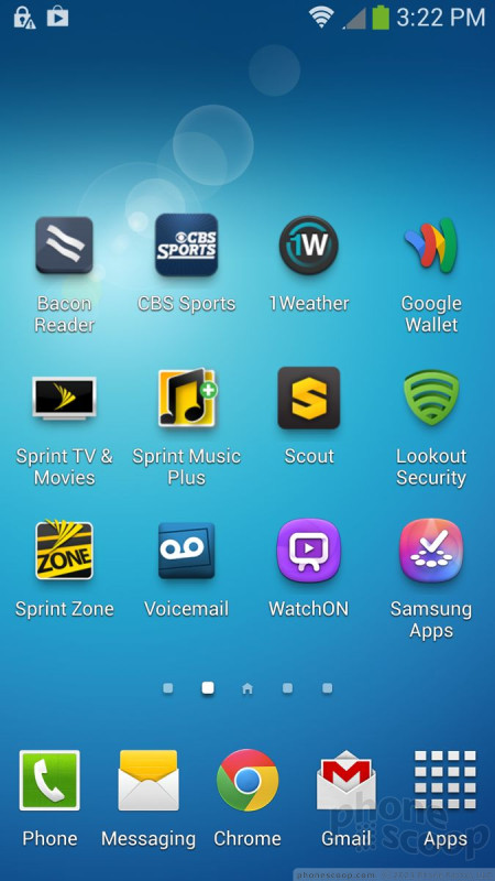
As always, the main app menu is accessed by pressing a button that persists in the dock at the bottom of the home screen panels. The app menu is among the more customizable I've seen among Android handsets. Samsung allows users to see the apps in alphabetical or customized grids, in addition to an alphabetical list. Apps can be hidden or stuffed into folders, and tabs at the top of the screen let you quickly view which apps you downloaded, and what widgets are available. There are 20 apps visible on each page. Samsung lays out the app drawer pages horizontally, so you swipe side-to-side to access more apps. A little indicator at the bottom tells you how many pages of apps there are.
On most Android devices, the main settings tools are listed on a single screen that you scroll up and down. According to its research, Samsung says people don't like scrolling. It decided to break the settings tools into four separate screens: Connections, My Device, Accounts, and More. As the names imply, they each let the owner focus on making adjustments to one set of behaviors per screen. Obviously, the Connections tab is where you'll find controls for the wireless radios, Wi-Fi networks, NFC, S Beam, and so on. The My Device tab lets you adjust the wallpapers, ringtones, accessibility, gestures, and things of that nature. Personally, I don't like this setup. I'd prefer everything to be accessible from the same screen. It doesn't help that Samsung made some odd choices for organizing these control screens.
For example, I'd expect to find location services under the Connections tab, but it's not; it's under the More tab. Even though the My Device tab has many controls for adjusting user preferences, the application manager, battery, and storage tools are all under the More tab, too. Bottom line: people who are used to anything else - even earlier versions of TouchWiz - will need to spend some time relearning where to find their controls.
The Active includes Samsung's Easy Mode. The mode greatly reduces home screen clutter, drastically cuts down on menu confusion, and hides a lot of the Active's features. This mode is meant for first-time smartphone owners who might be overwhelmed by the Active. It looks utilitarian, but Easy Mode is much easier to make sense of, if you don't mind losing half the device's features.
The last major component of the Active's menu system is the split-screen mode. This feature lets you interact with two apps at the same time, albeit in tiny little windows. Split-screen mode was previously reserved only for Samsung's larger Galaxy Note phones and tablets. The tool is pretty straightforward to use, but the number of apps that can use this feature is somewhat limited (Chrome, email/Gmail, Facebook, Twitter, Maps, Google Talk, YouTube, S Memo, etc.). The idea is to let you actually do two things at once, such as watch a YouTube video in one window while replying to Gmail in the other window. The windows can be swapped and resized. Though the Active has a 5-inch screen, this feature definitely works better on devices with even larger screens. It could also be much more intuitive to figure out. (You have to open the multitasking drawer and then drag-and-drop the apps you want to appear in the split screen mode.)
If there's anything that can be said for TouchWiz, it's that it offers Active owners an (over)abundance of options from which to choose when it comes to interacting with and customizing their device.
A note about performance: The Active comes with a Qualcomm 600 quad-core processor, not the eight-core Exynos processor intended for international markets. The Active did not show any screen stutters or app crashes. In fact, everything functioned perfectly. Apps opened in a blink, screen transitions were smooth, and even the most intense games didn't cause the Active to gasp for breath.
Calls/Contacts
Managing the phone and contact applications couldn't be easier. The phone app itself is more or less the stock version of the Android dialer, but it has been reskinned thanks to TouchWiz.
The phone app itself offers plenty of customization powers that really let you dig in and make the phone's behavior your own. When the dial pad is visible, tap the menu button and you'll see an options screen for the phone. Here is where you can set rejection behaviors, alerts, answering/ending calls, set up voicemail, and control the TTY functions. You can turn on/off noise cancellation, as well as dial in your own preferences for volume, clarity, and warmth. It is a pity none of these customizations have any measurable effect on the Active's decidedly poor call quality.
The contact app behaves more or less like the stock Android contact app. Favorites are accessible from a tab at the top of the phone app, as is the entire contact database. There are standard home screen shortcuts for direct access to a contact on the home screen panel, as well as a direct dial, and direct message, but there isn't a larger widget for your favorite contacts, which seems an odd omission.
Messaging
The Active has the typical list of messaging apps. The native communication tools include email, Gmail, Google+ Google+ Messenger, Hangouts, and Google Voice. Neither Facebook nor Twitter is preinstalled. Samsung's own ChatOn is not preinstalled, either. ChatOn is a cross-platform IM app that uses data rather than SMS to deliver messages. ChatOn is, however, available for you to download from the Samsung Apps Hub, which is on board.
Last, AT&T's Messaging app is included. This is a catch-all instant messaging app that bundles together IM functions and SMS into one app. The idea is to give you one spot in which to manage your SMS and IM threads. It's an OK service, and accomplishes its main goal without trouble. However, in my opinion, it's a bit clunky to use, and the individual apps it attempts to replace (SMS, Hangouts, Yahoo IM, etc.) are more feature-rich.


 Hands On: Samsung Galaxy S4 Active for AT&T
 AT&T to Sell Galaxy S4 Active June 21 for $199
 Samsung Galaxy Active Is a Tougher S4
 Samsung Galaxy S 4 Active


