Review: Sony Xperia Z for T-Mobile USA
Jul 10, 2013, 2:30 PM by Eric M. Zeman
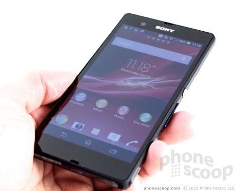
Sony delivers an excellent Android smartphone to the country's "upstart" carrier with the Xperia Z.
Form
Is It Your Type
T-Mobile has made no bones about becoming a threat to market leaders AT&T and Verizon Wireless, and it is phones such as the Sony Xperia Z that are going to help it make good on that threat. The Z is Sony's top-of-the-line smartphone for the year, and matches many competing devices feature-for-feature. If you're a fan of Sony's hardware and services, the Z is well worth a look.
Body
The Xperia Z is probably the best hardware to come from Sony in a long time. It definitely has a few shortcomings, but its makes up for them with several uncommon features.
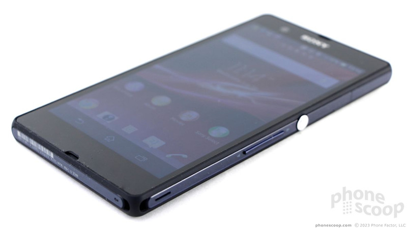
The Z is a black slab made from a carbon fiber frame sandwiched between two glass panels. Both the front and back surfaces are made from glass, not unlike the iPhone 4/4S. It is thin, light, and attractive. Flashy design elements are kept to a minimum. The majority of the surfaces are glossy and reflective, but there are sections of the carbon fiber frame that have a matte finish to break things up a bit. Perhaps the thing one that stands out the most is the large, chrome-colored, screen lock and power button. Sony designed the button to stand out on purpose, something it intends to do across its devices as an identifying feature. Other than that, the Z is black (it's also available in purple).
People who have small hands may have issues with the Z, thanks to its width. Like many of today's super phones, the Z has a sizable footprint to accommodate the large display. In addition to the size, the carbon fiber frame creates a sharp edge along both the front and back faces where it meets the glass. The frame protects the glass when the device is set down, but it cuts into your palm when the phone is held tightly. I didn't care that much for the way it felt in the hand, but it isn't the end of the world. The Z and its frame does get a little sticky when shoved into a pocket, though.
The front of the Z has no physical controls. The screen takes up the majority of the front surface. The standard three Android buttons appear along the bottom edge of the screen as software icons, as needed.
If there is one thing about the Z that I really dislike, it's the hatches. In order to make the Z water resistant (one of its core selling points), Sony covered all the ports with gasket-lined hatches to prevent water from seeping in. There are four hatches. There might be fewer if the Z had a removable back cover, but it doesn't. The headphone jack is on top, the microUSB and microSD card ports are on the left, and the SIM card is on the right. The seams in the hatches meant for your thumbnail are narrow slits that are impossible to find without peering closely at the side edge. They are a serious pain to use. The microSD and SIM card slots may not be used all that often, but the USB port and headphone jack may see daily action. I understand why Sony designed the Z this way, but the hatches impact usability.
The only hardware buttons are on the right edge. As noted, the largest and most obvious is the screen lock button. It is awesome. You can see it from across the room, and it has a great profile and excellent travel and feedback. The volume toggle is below it. The toggle is a large button and easy to find, but action and feedback are pretty miserable.
But the Z is water resistant. It can sit in a meter of water for up to 30 minutes. I tested this out, and it definitely works. I let the Z sit in the sand in about 2 feet of water in Lake Placid for a half hour and it still works just fine. Unlike the Samsung Galaxy S4 Active, it has wet-screen tracking, which lets you use the screen when it is wet. The Z is not rugged, though. In fact, as with the iPhone 4/4S, I worry about the double-sided glass design.
The Z's battery is sealed in, so there's no swapping it out.
Performance
Screen
Sony likes to use a lot of flashy marketing lingo to describe its displays. The Xperia Z has a 5-inch 1080p HD screen with Sony's mobile Bravia Engine 2 for added clarity. I've yet to run across a Sony display that I didn't like, and the Z is no exception. It offers razor-sharp clarity, excellent colors, and enough brightness for the device to be used outdoors with no trouble. Interestingly, you can turn the Bravia Engine on or off, as well as control the white balance (turning the overall hue more blue or more yellow.) It's a great screen on which to watch HD movies, view slideshows, or browse the web. My one complaint is that there is a little bit of a color shift (turns blue) when the display is tilted side to side.
Signal
The Xperia Z performed on par with other T-Mobile devices that I have tested. In areas where there was weak coverage, it struggled a bit to connect calls, but it worked flawlessly in strong coverage zones. It the mountains of upstate New York, it rarely saw anything other than EDGE coverage, but in northern New Jersey it latched onto T-Mobile's HSPA+ network strongly. It didn't drop any calls, but it took several attempts to connect calls in poor coverage areas. I didn't miss any calls, though. I was unable to test the Z on T-Mobile's LTE 4G network due to the network's limited footprint.
Sound
Phone calls sounded really good. The earpiece produced loud, clear sound. I had no trouble hearing callers even in loud restaurants. Calls had a really nice, warm sound, and voices were pleasant to listen to. Similarly, the speakerphone produced easy-to-hear calls that were free of interference. I would say the speakerphone will suffice in a noisy home or office space, but may not be the best choice in the boardroom. People with whom I spoke through the Z said I sounded a bit distant and quiet. Ringers and alerts were plenty loud to get my attention, even when walking down noisy city streets. The vibrate alert could have been a little bit stronger, but it has a pleasant pattern to it.
Battery
Sony has done well with it smartphones of late when it comes to power use. The Z easily managed to live through an entire day, which means it kept a charge between 7am and 11pm most days I used it. Keep in mind, though, that we were unable to use the Z on T-Mobile's LTE network. The Z offers plenty of tools to help manage battery life, too. For example, it includes Sony's Stamina Mode, which turns off the data radio whenever the screen is off. There's also a Low Battery mode that automatically turns off a customizable set of features (brightness, vibrate, Wi-Fi, GPS, Bluetooth, sync, mobile data) when the power level drops below 30%. With these tools, I have no doubt most users will be able to get a full day of solid use out of the Z. The controls help offset the lack of a removeable battery just a wee bit.
Basics
Menus
The Sony Xperia Z ships with Android 4.1 Jelly Bean and Sony's user interface customizations. That means the UI looks and behaves just as it does on the Xperia TL and ZL, which Phone Scoop has already reviewed.
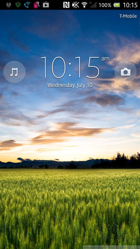
There are only two shortcuts on the lockscreen: one for the camera (even if there's a sdcurity code in place), and one for the music player. You can't customize the lock screen at all. You can also access the notification tray from the lock screen, but not if you've enabled a security code.
There are five home screen panels for customization. The Z includes plenty of widgets, apps, and shortcuts with which to fill the various screens. I like that the main app menu lets you view apps alphabetically, by most recently used, by the order in which they were downloaded, as well as user-arranged order. It's also fairly easy to uninstall apps from the main app menu, as well as share them via social networks. The settings tools function just as on other Android devices, as does the notification tray.
The Z has Sony's Xperia Small Apps feature. When you press the multitasking button, the recent apps you've used appear as normal in a vertical column. However, a little strip of apps also appears along the bottom of the screen. The Xperia Small Apps, as they are called, include a calculator, note app, clock app, and voice memo app. These aren't shortcuts to full-fledged apps. They are miniature apps that pop up as a window on the multitasking screen. They are only accessible from the multitasking screen.
The Z has a 1.5 GHz dual-core Qualcomm Snapdragon S4 Pro processor. It provided more than enough power for the Z's software, apps, and user interface. The Z has no problem operating quickly and efficiently.
Calls and Contacts
The phone and contact applications have been spruced up with a new look from Sony, but are functionally identical to the stock tools offered by Android 4.1. The phone app includes the expected features such as mute, hold, speakerphone, and add a line. The Z includes Wi-Fi Calling, which is a feature long offered by T-Mobile smartphones. Owners can take advantage of Wi-Fi networks to place internet-based calls when the cellular network is crummy. I tested this feature, and it worked well. Call quality over Wi-Fi was quite good.
The contacts app syncs flawlessly with your Google, Google+, Exchange, and Facebook contact databases. There are only a couple of widgets and/or shortcuts for adding contacts to the home screen, but the tools taken together are powerful.
Messaging
The Z has the stock set of Android communications tools, including Gmail, email, Google+, Google+ Messenger, Hangouts, and SMS. These apps function fine, just as they do on other devices. The new Hangouts app is fairly robust and ties into Google+ for video chats. The Z, like the ZL, also comes with Sony's SocialLife app.
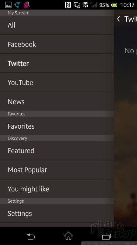
SocialLife is more like HTC's BlinkFeed than anything else. It's a socialized reader app that pulls in your Facebook, Twitter, and YouTube content, and runs it in a stream that's also interspersed with news items. You can customize the news that appears, and use SocialLife to interact with your social networks, as well as share the content that appears in the feed. If you're the type who likes to manage your feeds in a social way from a single user interface, SocialLife does a pretty good job of it (it also has some decent widgets that accompany the app, too). SocialLife stops short of offering all the messaging features found in the dedicated Facebook, Twitter, and YouTube apps, however.
Lastly, the Z has a dedicated app for Civil Alerts. This app receives emergency warnings, such as those issued by the national weather service or local police departments.
Extras
Media
First, Sony reskinned the stock Android music and video player apps. They both offer basic playback functionality of sideloaded music and videos, but look nicer than the stock Android apps. The Google Play Music and Google Play Movies content stores are both on board for your music and movie purchasing/renting needs. These are the same apps found on most Android devices.
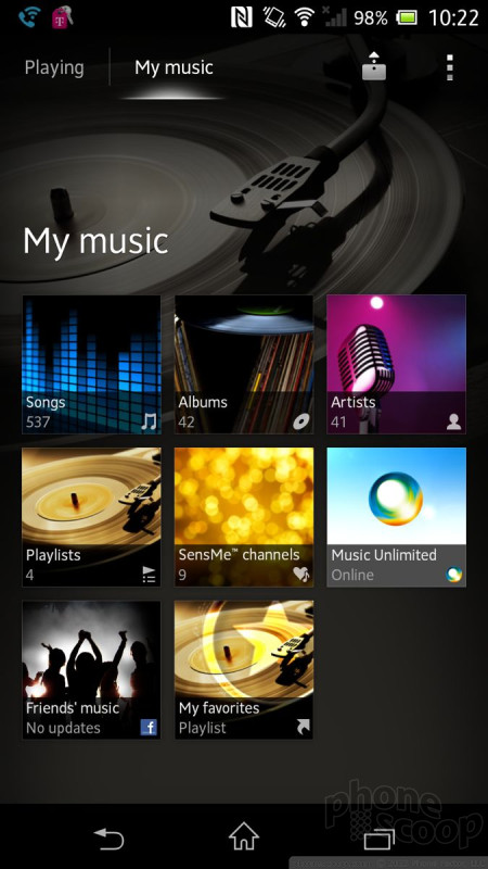
The Sony Walkman app is the most feature-rich music player available on the Z and surpasses the Google Play Music app in terms of usability and cool tools. I like the way it arranges playlists and albums, and it has a nice visual look and feel. It does not have its own store, but it played everything I sideloaded (songs purchased from Amazon, Apple, and Google) without issue. It has a great equalizer for customizing the sound.
Then there's Sony Music Unlimited and Sony Videos Unlimited. These are content services run by the Sony Entertainment Network. Once you create a Sony account (or use your existing PlayStation Network account), $10 per month buys you unlimited music streaming each month via Music Unlimited. The service can cache playlists on the device for offline playback and offers tons more features. The Movies Unlimited service offers movie rentals. Pricing for the rentals varies by title. These services have an incredible wealth of content, and are not limited to Sony's content. The Movies Unlimited offering, for example, will have access to new rentals before Netflix, according to Sony.
The Z has an FM radio and TrackID, which can be used to identify songs. The Z also has an app called Smart Connect that uses DLNA to connect it to other DLNA-certified devices for playing media content. The app works well; I had no trouble pairing the Z with my TV sets, for example.
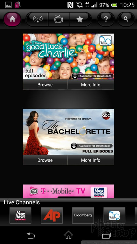
Lastly, T-Mobile TV is on board, which can be used to stream television content over T-Mobile's network. This service, which costs $10 per month, performed poorly in my tests, even over HSPA+. It was slow and stuttery.
Camera
The Xperia Z's camera operates well, and for that we can thank the tireless engineers at Sony. Since there is no physical camera button, you have to use the lock screen shortcut to launch the camera, or the app icon. It launches lickety-split either way.
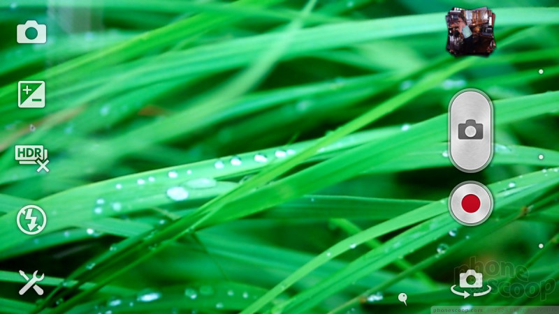
The viewfinder leaves plenty of room for composing images and the tools for adjusting the settings are floating along the left edge. It offers panorama and macro modes for taking wide vistas or close-ups. It can detect smiles, and can make various different shutter sounds. I like that the flash has four settings, including fill-flash. Fill-flash helps take photos when you have a light background and a dark foreground and you want to make the foreground pop a little bit (it uses a lower-power burst than the normal flash mode.)
The camera also has a bunch of different shooting modes. The default is called Superior Auto. It's good at detecting various types of scenes and then adjusting the settings to match what you're looking at. Basically what this means is that it can switch between macro photography (shooting close-ups), HDR photography, and regular photography without forcing you to adjust any settings.
The Z can also be put into normal shooting mode (which gives users more granular control over settings), video mode, and burst shot mode. Users can also choose to add picture effects while capturing images/video, and of course switch to the front camera/video camera. The shooting modes are easily accessed through a large icon that appears in the upper-left corner of the display. When pressed, it shoots a strip of options across the screen.
Everything about the camera is fast. It opens quickly, focuses quickly, and shoots/saves images quickly.
Photos
The Z uses the latest 13-megapixel Exmor RS sensor from Sony with backside illumination. That means it can shoot HDR photos and video and do so in extremely low-light environments. The end results are impressive. The Z did an excellent job of capturing images that were bright and lively, in focus, correctly exposed, and with proper white balance. I was particularly impressed with how it did in poorly lit rooms without the use of the flash. My one complaint would be the presence of grain and digital noise. It is a solid camera that most anyone will be impressed with.
Video
Similarly, the Z's video camera did a great job of capturing HD video. I was impressed with the clarity, white balance, and exposure. In particular, the Z does well in low-light situations thanks to the HDR video powers. Video captured with the Z is certainly YouTube worthy, and looks great on an HDTV.
Gallery
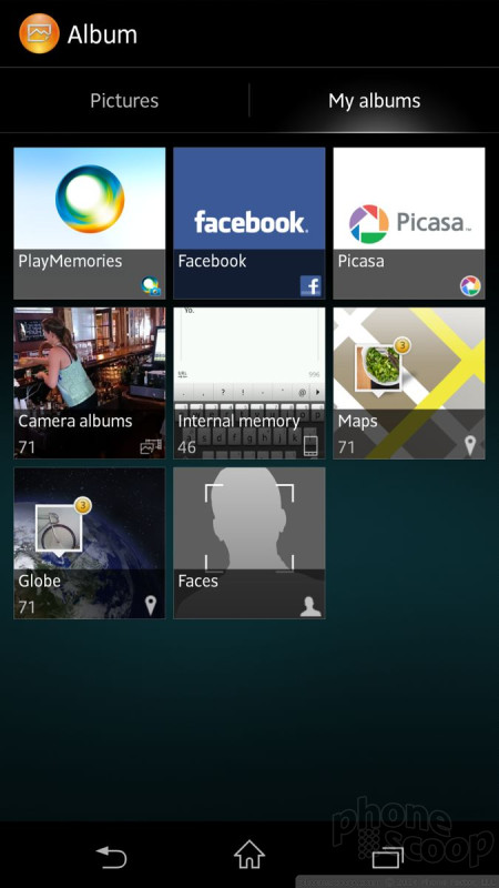
The Z carries over the same cool gallery app that was on the Sony TL and ZL. Basically, the grid of thumbnails in the main gallery view can be expanded and reshaped by using pinch-to-zoom gestures. By default, one thumbnail (the most recent image) is somewhat larger than the others. Grab that and do a reverse pinch gesture and it will grow to fill the screen. You can use these gestures to make all the thumbnails visible at the same time, or as few as three visible at a time. It makes dealing with the gallery more fun.
Otherwise, it has all the tools you expect to find in the Android 4.1 smartphone gallery app. Individual photos and albums can be easily shared with others via messaging apps or social networks. Photos can also be cropped and rotated, as well as adjusted for exposure, etc.
If you're interested in backing up your photos, Sony offers its own online storage solution called PlayMemories Online. You can select any photos that are on the Z and send them to the PlayMemories app from within the gallery. The photos are then synced with an online account (which is free, but you have to register and set up.)
Apps
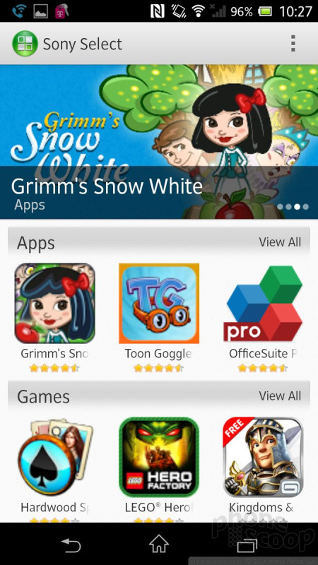
There are 52 apps preinstalled on the Z, and a fair number of them are T-Mobile-branded apps. Many of Sony's apps - such as Walkman and Update Center - duplicate functions that are already baked into the Android platform. It is worth mentioning two other Sony apps: Sony Select, and PlayNow. Sony Select is an app recommendation tool that works similar to the Samsung Hub on Galaxy devices. It offers a selection of apps and games that Sony thinks you'll enjoy.
Bluetooth
I found that the Z's Bluetooth radio worked particularly well. It gave me no trouble connecting to headsets or other devices. Calls routed through my car's hands-free system sounded very good, and music sent to stereo Bluetooth headsets was quite impressive.
Browser
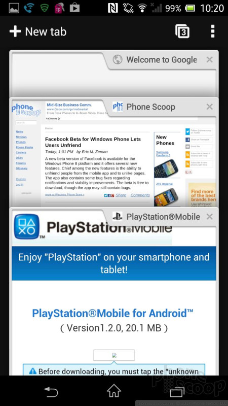
The Z includes Google's Chrome browser. It does good job of rendering web sites quickly on the Z's display. Chrome can be used to sync browsing history and bookmarks with the desktop version of Chrome. There are plenty of alternative browsers available in the Google Play Store should Chrome not suffice for you. Chrome interacted well with T-Mobile's HSPA+ network. The Z delivered a solid web browsing experience as long as T-Mobile's HSPA+ network was around. We were unable to test the Z on T-Mobile's LTE 4G network due to is severely limited availability.
Clock
The lock screen clock is a thin, white, digital clock that's positioned at the top of the display. It can be hard to see and isn't customizable. There are a number of clock widgets for the home screens, but the time is almost always displayed in the status bar at the top.
GPS
The Z includes Google Maps. Google Maps is a known entity that performs very well. In terms of the GPS radio itself, the Z functioned flawlessly. It found me in 15 seconds or less, and was accurate to within about 25 feet. The combination of the Z's processor, GPS accuracy and Google Maps worked well for live navigation.
Wrap-Up
Sony created a very nice smartphone with the Xperia Z. It's an attractive device that has top-class hardware and a long feature list to go with it. The Z was particularly impressive as a voice phone, and battery life was great. The device is water resistant as Sony claims, but the hatches needed to protect it from water are somewhat of a pain to use. The two-sided glass design means you have to be a bit more careful than you would with a plastic or metal phone, though.
In terms of the software, nearly every app and service worked well. The Xperia Z clearly has Sony's stamp on the Android operating system, but that's a good thing. I found the user interface to be flexible and quick; the camera software allows for plenty of shooting customizations; and the media options are endless. Toss in excellent performance from the camera, and a fine viewing experience on the beautiful screen, and the Z is a media powerhouse.
T-Mobile landed a winner with the Z, a solid competitor to the HTC One and Samsung Galaxy S4. If you're looking for an alternative to those models, the Z should be the one you consider.






















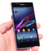 Hands-On: Sony Xperia Z1
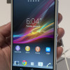 Hands On with the Sony Xperia Z and ZL
 T-Mobile USA to Sell the Sony Xperia Z
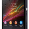 FCC Documents Suggest T-Mobile Will Sell Sony Xperia Z
 Sony's Xperia Z Features 5-Inch 1080p HD Display
 Sony Xperia Z


