Review: Motorola Moto X for AT&T
Aug 6, 2013, 4:17 PM by Eric M. Zeman
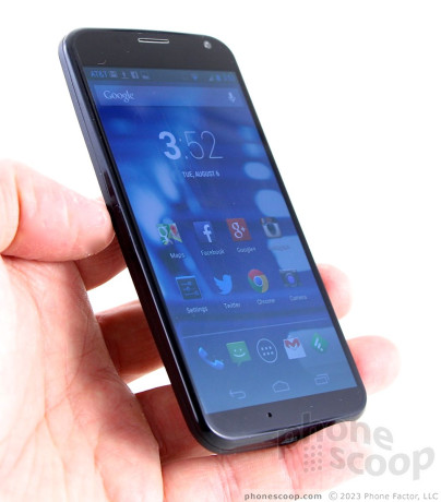
Motorola returns to the smartphone game with the Moto X, an Android device that takes software in a new direction.
Form
Is It Your Type
With the Moto X, Motorola is thinking about a bigger picture than just another device. The new Android smartphone is more for people who are curious about how we'll interact with our devices in the future than it is about offering all the latest and greatest specs.
Body
Motorola chose an interesting path with the Moto X. It is the first smartphone that Motorola created from scratch after it was purchased by Google in May 2012. With Google's budget, the sky was literally the limit. Motorola could have done anything. What we got was the Moto X, a device with middle-of-the-road specs, but better-than-average software.
The Moto X's hardware is rather bland from an arm's length away. It is only upon close inspection that you can really see some of the things Motorola attempted to do to set the device apart.
First, the overall shape. According to Motorola, it wanted to make the smallest-possible handset with the largest-possible screen. After testing thousands of hands, it settled on a width of 2.57 inches and a depth of 0.42 inches. The X is contoured and has a sculpted back surface that is curved to better fit into the hand. The curve is gentle from side-to-side, and tapers a bit, toward to the bottom of the X, giving it a wedge-like shape. The sides are rounded to meet the glass panel on the front. This further smooths out the profile. There are no hard edges or corners, everything about the design is rounded and slim. There's no denying that it is a comfortable device to hold and use. The profile is small, the weight is good, and it is very easy to reach any part of the screen with your thumb. It will easily fit into any pocket.
As for its looks, well, unless you're an AT&T customer (or, later this year, a Verizon customer), the X comes in either black or white. These options are both a bit boring, if you ask me, and have little visual flair or appeal. From several feet away, there's nothing that sets the black/white X apart from any other smartphone, except for perhaps the visible texture of the back cover. The defining element of the X is of course its custom-order color possibilities. From my perspective the custom designs are half the reason to buy this phone. With them, there are hundreds of combinations with the various back panels, accents, and signatures. These allow people to really make the X their own. Want a purple phone with red accents? Go for it. Want a yellow phone with green accents? That's possible, too.
The materials are good, but could be better. The back surface of the black/white versions is a composite lined with Kevlar and has a soft-touch finish to it. (The back surface of the colored versions is a resin, and also has a soft-touch finish. These both contrast with the glossy, greasy finish on the recently-announced Droids.) There's nothing wrong with them, per se, but I will always prefer metal to plastic. At least the X feels better than the materials used by Samsung. The plastic that exists between the X's glass display and the back surface feels a little cheap to me, but all the seams were snug and fit together tightly.
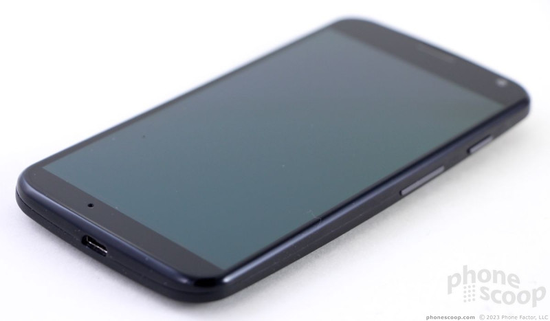
It's an understatement to say that Motorola filled as much of the X's front face with screen as it could. The bezels on the side of the phone are very thin, and there is minimal framing above and below the display. There's a small slit in the glass at the top where the earpiece is located and a tiny round hole near the bottom for the microphone.
The SIM card tray is located along the left edge of the X. It's a fussy thing. Most SIM card holders are full trays. The X's SIM holder - like the new Droids - consists of just two tiny “arms” to hold the card, which makes sitting the SIM card a more delicate affair. Further, the X uses the nano SIM card, the same as the Apple iPhone 5.
There are only two buttons and both are on the right edge of the X. The screen lock key is nearest the top and the volume toggle is below it, closer to the middle The screen lock key has a great profile and even better travel and feedback. I can't say the same for the volume toggle. It has a harder-to-find profile, and the travel and feedback isn't as satisfying. The stereo headphone jack is on top and the microUSB port is on the bottom.
The X's back cannot be removed, even though custom back designs can be ordered for the X. That means you're not swapping out the battery or swapping rear covers. You're stuck with the custom color you pick. The X does not have a slot for microSD cards, which means internal storage is limited to either 16GB or 32GB. The internal components of the X have been given the same water-resistant nano-coating that Motorola has put on its Droids for the better part of a year, but that doesn't mean the device is waterproof. You can sweat on it, but not dunk it in the pool.
The Moto X is a solid piece of hardware, but the stock white and black ones do nothing to set my heart on fire.
Performance
Screen
The X's screen measures 4.7-inches across the diagonal and includes 1280 x 720 pixels. Nope, it's not a full HD screen. If that's a disappointment, take solace in the fact that the X's screen still offers rich detail and sharp text and images. There are no visible pixels. The X's screen uses AMOLED technology. It is easily used outdoors, but there's a noticeable blueing effect when the phone is tilted side to side. Viewing angles aren't as good as I'd like them to be, but colors look nice when viewed head on. It's a fine display, but not a great one.
Signal
The Moto X performed on par with other AT&T phones across a range of different network conditions. In areas where coverage was strong, data was speedy and calls connected instantly. In areas where coverage was weak, data was still quick, but latency (time it took the phone and network to initially talk to one another) increased noticeably. The same goes for calls: they connected on the first dial, but the connection took a few beats to set up. The only time the X crapped out on me was when I attended a sold-out concert and the local cell site's capacity was overwhelmed. The X didn't drop any calls and didn't miss any calls.
Sound
The X is a good voice phone. The quality of calls reaching the earpiece were very good. They had a mostly nice tone to them, though they perhaps leaned towards being a little sharp. The volume in the earpiece was excellent. I was able to hear calls at a concert (before the band came on) with a rowdy crowd chanting in the background. I was also able to hear calls clearly when in a noisy restaurant. The speakerphone worked equally well. I was able to hold a conversation over some very loud restaurant patrons and hear everything clearly. Volume and quality were good over the speakerphone. Those with whom I spoke said I sounded decent on their end, but not great. The ringers and alerts are plenty loud, and the vibrate alert is nice and strong.
Battery
The X's curved backside houses a specially-designed 2200mAh battery. Motorola said it didn't want to waste the space created by the contours of the rear shell, so it created a new battery to fill the space. That's good news for X buyers, because whatever Motorola did worked well. The X's battery was designed to provide 24 hours of continuous use, and that's what it does. Over the course of a weekend I had a hard time killing the battery even though I left the X unplugged for several days. Most people will get more than a full day's use out of their X, I have no doubt. Those who charge it each night will have plenty of power to spare at the end of the day.
Basics
Menus
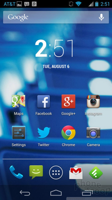
The Moto X runs an essentially clean stock version of Android 4.2 Jelly Bean, with a few neat extras tossed in for good measure.
Android 4.2 includes lock screen widgets, which let you peek at your SMS or Gmail inbox without unlocking the phone. It also has notification shade controls that make it easy to switch off Wi-Fi, for example.
There are plenty of home screen panels for user customization, the main menu app menu can be arranged at will, and the ability to place apps in folders on the home screens lets you organize the device how you like.
Performance of the Moto X's software is incredibly fast. The phone has a dual-core Snapdragon S4 Pro processor on board, and this engine gets the X revved up. I didn't notice any performance problems, despite the pre-production nature of our review unit.
Calls and Contacts
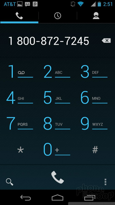
Pressing the phone button on the home screen brings you to the dialpad. You can swipe sideways to access the call log, and your favorite contacts. The call log provides some information about calls (time, duration) in addition to shortcuts for redialing or sending a text message to that number.
Contacts are automatically synced with your Google accounts and whatever other contact databases you might wish. Contact cards, or direct dial or direct message shortcuts can be placed on the home screens, which give you instant access to your besties. You can also add contacts to your Favorites list — which is visible in the phone application and includes a homescreen widget.
Messaging
The X comes with the same stock Android communications apps that are on every other Android device. That means Gmail, email, SMS, Hangouts, Google+, and Google+ messenger. There are no third-party communication tools on the phone when you pull it out of the box; Google is all you get. If you want more, the Google Play Store has plenty to wade through. The stock tools work well.
Moto Apps
Motorola designed some really neat applications and services for the Moto X that are what truly define the device. The big ones are Active Display and Touchless Control. They take what might otherwise be a boring smartphone and make it an interesting and more functional experience.
Active Display
According to Motorola's research, most people turn on their smartphone's screen about 60 times a day--only to shut it off 5 to 10 seconds later. Motorola discerned that people were doing this to check the time and see if they had any notifications. Motorola thought to itself that this might be an opportunity to accomplish a few different things, including improving notifications and improving battery life.
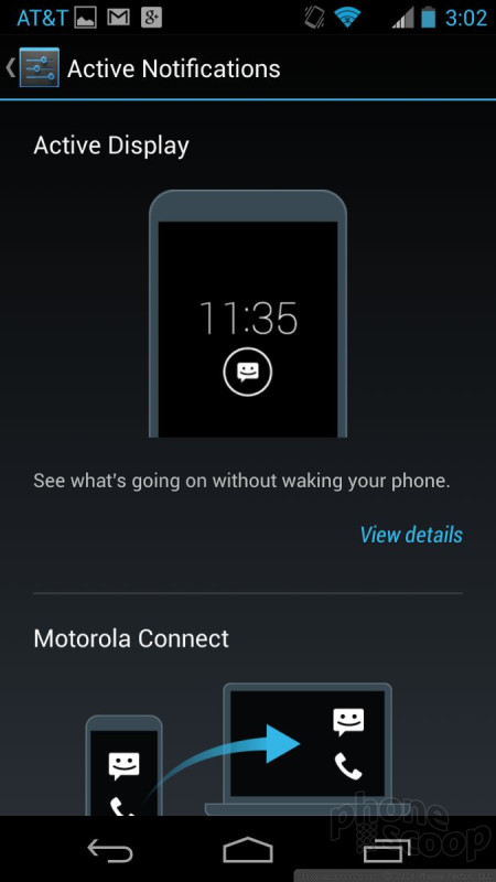
Active Display brings the clock and notifications to the screen (when it is locked and off) without turning on the whole display. Instead, it only shows the clock and notifications in white on a black screen. You don't have to push any buttons to check the time or see if you have any new emails. If the X is sitting on a desk, it will automatically light up the Active Display when a new email or message arrives. It will then pulse on and off with that notification until dismissed. Active Display will turn on when you nudge the X, when you turn it over, when you pull it out of your pocket or bag, when you shake it, and pretty much any time you move the phone. Pretty much any moment at which you might want to see the time and what notifications are waiting for you, the X shows you. On our review unit, more than two dozen apps were able to provide Active Display notifications.
What's better, you can interact with the notifications.
For example, say I get three emails. The Gmail icon will be displayed in a little circle under the clock on the Active Display. I can press-and-hold the icon, and the notification expands to show me the sender details and subject line from the three emails. (If there's just one email, I'll see the first line of the message, as well.) At this moment, you can do one of several things: swipe sideways to dismiss the notification, swipe up to open the Gmail and, or swipe down to unlock the phone. The same behaviors apply for a missed call, Google+ interaction, or a text message.
This is all very helpful, but there are limitations. The biggest is that you can only interact with the most recent notification. So if you get a text message and then three emails, you can't peek at the text message, you can only peek at the three emails. I was expecting to be able to peek at the text message after dismissing the email notification, but that's not the case. That's a bit limiting in my mind. You'll still be able to see, however, that you have a text message waiting for you.
I like the idea of Active Display a lot, and I think Motorola accomplished at least one goal: I spent far less time hitting the screen lock button to turn on the screen to check the time and my notifications. This is perhaps one reason why the X has good battery life.
(This same feature is available on the new Motorola Droids being sold by Verizon Wireless.)
Last, Active Display works with another feature called Motorola Connect. Motorola Connect basically uses an extension for the desktop version of Chrome to push incoming text messages and phone calls to a desktop or laptop computer. The system sends notifications to the Chrome browser, which can be used to receive/respond to text messages, and see incoming/missed call notifications, but not to answer calls.
Touchless Control
Touchless Control is Google and Motorola's big leap forward with its Google Now product. Google Now has been available on Android devices for the better part of a year and is a really useful tool for performing searches with your voice. (It's a bit like Apple's Siri.) One of its big limitations is that you have to wake the device up before you can use it. Touchless Control solves this issue.
The Moto X uses what Motorola calls its X8 processor architecture. The X8 set-up includes the Qualcomm Snapdragon S4 Pro chip, as well as a separate processor to handle Touchless Control. Motorola said that if it used software to handle all the Touchless Control functions, the Moto X's battery would drain in just two to three hours. Using a separate, low-power processor that's always running, however, solved Motorola's power-usage needs. The bottom line here is that Touchless Control is always listening, and you don't have to worry about it killing your battery.
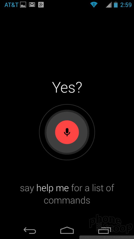
Each person must first train Touchless Control. In a quiet environment, you speak "OK Google Now" three times so the X learns your voice. This catchphrase is then what you use to wake the Moto X and launch Google Now. According to Google, the phone should only respond to the owner's voice, but there are cases in which people with similar-sounding voices can open Google Now with the catchphrase. (And no, you can't customize the catchphrase.) The idea is to let people interact with their phones without requiring that they actually pick them up.
For example, with the X sitting on my desk, I can say, "OK Google Now, call Mom's cell phone," and that's what the X will do. I don't have to touch anything else. The device provides visual feedback on the screen telling you what it is doing, and will speak that feedback, too, if you want it to. Making phone calls is the only task Touchless Control can perform if you've locked the Moto X with a code. If you say, "OK Google Now, who won the Yankee's game last night?" you'll have to unlock the X before it will give you the search result. That limitation aside, there's a lot that Touchless Control can do.
I was able to make phone calls, open Gmail, use Google Play Music, get directions, search for anything, interact with the calendar, and so on. Google Now responds well to natural language requests and its voice-transcription capability is second to none. It's much, much faster than Siri on the iPhone, and better able to handle requests that arrive in the form of long sentences. It's still not perfect, though. All too often Touchless Control performed a Google Search when I really wanted it to open or use an app. There's a helpful tutorial that's worth watching before you really sink your teeth into Touchless Control.
I sort of felt like a psycho talking to my phone as it sat on my desk all day, but you get used to it after a while.
Moto Assist
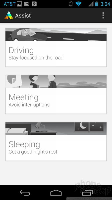
Moto Assist is a tool meant to help save you some trouble when using the Moto X. It monitors the X for three scenarios — driving, meeting, and sleeping — and controls the X's behaviors accordingly.
First, driving: The X will automatically sense when the device is moving fast enough to be in a car. I tried to use Touchless Control to make a call when driving and Moto Assist popped up first and asked if the device should be put into Car Mode. It can also do things such as read incoming text messages aloud, speak the names of people who call, and automatically send quick replies, such as,"I'm driving and will get back to you soon."
The meeting and sleeping functions are essentially the same and are meant to help prevent interruptions. They both need to be turned on manually, and don't start automatically like driving mode does. During meetings, for example, the X can be set to silence, allow favorites to ring the phone, or to ring when the same number calls multiple times. It can also send auto-replies.
The sleeping mode is a bit less feature-rich and only silences the device between set hours. Again, though, it will ring if a predetermined favorite calls, or when the same number calls multiple times. It's much like Apple's Do Not Disturb feature.
Migrate
Last, Migrate. The X has a feature called Migrate that is meant to help you transfer all your content from one device to another. It works with media, call and text history, as well as SIM contacts. The tool makes use of a QR code scanner to pair the two devices and then uses Google's servers to migrate the data between the phones. It makes it pretty easy to send data to another device.
Extras
Media
The Google Play Store is your one-stop-shop for music, movies, TV shows, books, and magazines. It addition to the Store itself, the X comes with all the ancillary apps that are used to interact with each type of content (Play Music, Play Movies, etc.). There are no other installed music or video services, but obviously the app store has plenty from which to pick.
Camera
Motorola made a few changes to the basic Android camera. The changes are welcome and improve usability, but considering how much effort HTC and Samsung put into their camera software, Motorola could have done much better.
To start, the camera can be set to launch with a gesture rather than pushing any buttons. The gesture requires you to hold the phone horizontally and shake your wrist twice (like you're turning a doorknob). You'll then receive vibration feedback that the camera is in fact opening. I like this feature. The X can go from locked to ready-to-shoot in about two seconds. It's really easy to pull the phone out of your pocket and shake it quickly to launch the camera. You don't have to look at the device at all. Neat.
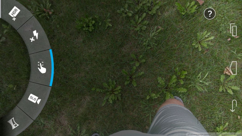
The camera UI is bare bones and there are only two buttons: one for the video camera and another for the user-facing camera. (Every so often, a little "?" appears in the upper right corner. If you're confused about how to use the camera, this offers you a helpful tutorial.) All the settings and controls can only be accessed by swiping from the left side of the viewfinder towards the center. This opens the control dial that has all the options. The Moto X includes HDR (which can be set to come on automatically) and panorama shooting modes, and the flash, geotagging, shutter noise, and touch-to-shoot features can be turned on or off. That's it. No special GIF creating features, or anything fun of any kind.
It took me forever to figure out that dragging your finger from the top of the screen down zooms in, and dragging your finger from the bottom to the top zooms out. Here I was pinching-to-zoom like a fool. Perhaps the one thing I really like is that the camera has an always-on burst mode. Press the screen and hold, and the X will focus and then fire of two shots per second until you take your finger off the screen.
The camera software is step up from stock Android, but barely. You can't adjust scenes, ISO, brightness, or white balance. It's rather limiting if you like to take creative control over the camera. Motorola needs to do a lot of work here to even come close to what its competitors are doing with camera software.
Photos
The Moto X has a 10-megapixel sensor that does a fairly good job. I was particularly impressed with its low-light performance. The X did well getting some shots at a concert I attended, which are typically challenging environments for even the best cameras. Focus was generally nice and sharp, exposure was mostly accurate, and white balance was only off a handful of times. I think there are better cameras out there, but the X's should suffice for most people.
Video
The 1080p HD video I shot looked good, as well. Video captured outdoors in daylight looked the best, as is often the case, but some of the footage I captured at the concert was surprisingly clear and had good audio. The video camera has zero options, so you get what you get once you hit the record button. Most people will be satisfied with the video they capture.
Gallery
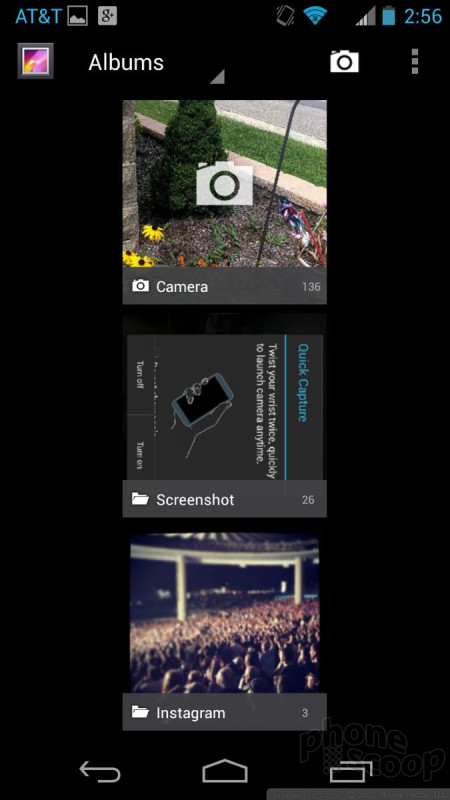
The gallery app is the same one that comes with most Android devices. It doesn't offer anything new or different compared to other Jelly Bean phones. It is acceptable for managing photo albums and sharing photos with social networks. It also has a some simple editing features, such as crop, rotate, red-eye reduction, and filters that help correct color, exposure, and other issues.
Apps
The Moto X is relatively free of junky AT&T apps. It has only the MyAT&T and Address Book apps. The rest is stock Google or Motorola.
Bluetooth
The X's Bluetooth radio worked well. I was able to connect with an array of other gadgets and pass phone calls and music to mono and stereo headphones. Calls sounded good through my favorite headset, but the volume was a bit low (even though both phone and headset were turned all the way up). Music also sounded good via Bluetooth, though volume could have been a bit better. One odd bit of behavior: the Moto X cannot push files to other devices. I was able to pair it with my PC and another phone and was not able to send an image file to either device. This should be resolved when the X is updated to Android 4.3.
Browser
The X includes Google's Chrome browser and not the older, generic Android browser. I find Chrome to be the best choice for Android handsets, but there are plenty of alternatives in the Google Play Store. Chrome worked perfectly at rendering web sites over AT&T's network. Web sites were quick to load, for the most part, and web sites looked good on the X's display.
Clock
Thanks to the Active Display feature, there's almost always a clock visible on the Moto X, even when the phone is idle. It could be a little bigger/brighter, but it can be read in most environments other than under direct sunlight.
GPS
The X's GPS radio worked just fine. Google Maps is the only navigation service on board and it worked like a charm. The GPS radio was very quick; it pinpointed me to within about 15 feet in 5 to 10 seconds. Google Maps is a great tool for plotting directions or searching for local points of interest.
Wrap-Up
The few things that set the Moto X apart from other smartphones have nothing to do with the hardware at all. The Touchless Control feature will sure delight many people who've so far shied away from using their voices to interact with electronics gadgets. The Active Display brings notifications to the forefront in a way that's not intrusive but still manages to save power. Moto Assist can figure out when you're driving and will make sure you're not doing things with your phone that you perhaps shouldn't do behind the wheel. These three features may sound like minor upgrades or tweaks, but they have a profound impact on how people will use the Moto X on a day-to-day basis.
As far as the hardware goes, the off-the-shelf black and white models are fine, if unexciting. The customizable colors should prove popular with AT&T customers. The screen may not be a full HD panel, but it still looks good. The wireless performance was quite good, and the Moto X is a good voice phone. Battery life was commendable. The camera and video recorded both performed better than average.
The Moto X is being sold for $199 with a contract. That's the same price as the HTC One, Samsung Galaxy S4, and Apple iPhone 5. All three of these competitors have better hardware specs, and perhaps some superior individual features here and there. What does the Motorola Moto X have that they don't? A personality.
Comments
No messages























 Hands-On: MOTO X
 Moto Maker Now Available to Sprint, T-Mobile, Verizon
 Motorola Says Custom Moto X Orders May Not Arrive in 4 Days
 Motorola Intros Skip, Easier Security for the Moto X
 Motorola's MOTO X Offers Voice Control and Customizations
 Motorola Moto X (GSM, 1st gen.)


