Review: Samsung Galaxy Mega for AT&T
Aug 29, 2013, 3:20 PM by Eric M. Zeman

Samsung brings its largest Android phone yet to the U.S. with the Galaxy Mega super phone. This huge handset offers plenty of real estate, but may be too much phone for some people.
Form
Is It Your Type?
The Samsung Galaxy Mega is an absurdly large "phone." It takes the idea of the phablet — or phone/tablet hybrid — much closer to the tablet end of the spectrum. If you want the biggest screen possible on a device that's still portable, the Mega may be up your alley.
Body
People were aghast when Samsung announced the Galaxy Note in 2011 with its 5.2-inch screen. "Crazy," "Huge," "Ridiculous," some called it. The Galaxy Mega, as the name implies, dwarfs the Note with its mega proportions. It has a 6.3-inch screen and a massive 6.6 x 3.46-inch footprint. It's not that much smaller than some tablets.
The family resemblance between the Note and the Mega is clear. Held side-by-side, they are almost indistinguishable, aside from the difference in size. The Mega has the same chrome-colored rim and speaker grill, the same coloring, and nearly identical button shape and placement as the Note. It's a decent-looking device, though it of course uses the same cheap-feeling plastics common to Samsung smartphones. It comes across as classy and elegant sort of in the way Shaquille O'Neal does when wearing a suit rather than his basketball uniform.
The Mega's size is obvious to everyone. My daughter walked into my office while I was working on this review and said, "Whoa, Dad, that's a big phone." Everywhere I took the Mega over the course of a week elicited similar comments and reactions. The size also makes it more difficult to use. There's no such thing as one-handed use. My thumb could only reach about 50% of the screen. You have to use two hands, and the Mega doesn't come with stylus like the smaller Note does. My hand suffered fatigue from using the Mega. It's not that heavy, but my palm really has to stretch to properly hold the phone. I dropped it a lot, and felt stupid using it as a phone to make calls.
The Mega will fit in some pockets (thanks mostly to its thin profile), but certainly not all. It had no problem slipping into some of my jeans and cargo shorts, but tighter jeans that have smaller pockets left the Mega sticking out in an unsightly fashion. If you have small hands, chances are the Mega is not the phone for you.
The front of the phone is nearly all screen, but there's a thin bezel above and below the display. Each has silver accents that help break up the black sea of screen. As on many Samsung Galaxy devices, the Home button is a physical key that has a nice shape and good action to it. It's flanked by two capacitive buttons for the Menu and Back functions. The capacitive keys worked well, too.
The volume toggle is placed along the left edge. It's easy enough to find. There's plenty of travel to the toggle, but the feedback produces a loud "clack" sound that I wasn't overly fond of. The screen lock button is on the right edge of the phone. It's small and doesn't have a large enough profile, especially considering how big the rest of the Mega is. Travel and feedback are minimal. Samsung could have done a better job with this button. The stereo headphone jack is on top, and the microUSB port is on the bottom.
The battery cover is removable, a feature Samsung has retained on its devices. The cover itself has a dotted pattern on it that looks decent, though I prefer the faux brushed look of the Note II. It is thin and cheap feeling. Under the cover you'll find the large (and also removable) 3,200 mAh battery. Memory cards can be swapped without yanking the battery.
Samsung did a fine job designing and assembling the Mega, but the size may be too much for many buyers.
Performance
Screen
The whole point of the Mega is to give people a huge screen. It's a bummer that the screen doesn't impress me much. The screen has 1280 x 720 pixels spread across the 6.3-inch diagonal. By way of comparison, the Note II has 1280 x 800 pixels in a 5.5-inch screen, and the Galaxy S4 has 1920 x 1080 pixels packed into a 5.0-inch screen. You can tell immediately that the Mega's screen is inferior to its more pixel-rich brothers. Text looks hazy, icons have noticeable pixels along the edges, and nothing about the screen looks sharp or crisp. In fact, the lack of pixels leaves it looking somewhat dull. Color reproduction and brightness are both fine, but the resolution bugged me a lot. I am sure some prospective buyers will prefer the large size despite the lower resolution, but I am not one of them.
Signal
The Mega performed on par with other devices using AT&T's network in and around the metro NYC area. I was able to make calls everywhere I took the phone, though areas with weak coverage slowed down data speeds to a crawl. The Mega didn't drop any calls, and I didn't miss any calls. I was able to use the Mega on both AT&T's HSPA+ and LTE networks. Hand-offs between the two were transparent as far as data sessions were concerned. LTE speeds were good, but not the best I've seen. The max download speed I achieved was 26 Mbps. I've seen some devices double that.
Sound
The quality of phone calls was quite good. I thought voices sounded warm and present, and they came through the earpiece clearly. I didn't experience any interference during calls. The earpiece produces only adequate volume, though. It's loud enough for use indoors, such as your home or office, but in loud spaces it's difficult to hear. Using it outdoors is even more problematic. People who I spoke to through the Mega said I sounded a bit distant, but clear. The speakerphone offers good quality and decent volume, but it could be better in both regards. Ringers and alert tones were loud enough to get my attention most of the time, but the vibrate alert was rather weak.
Battery
The Mega's 3,200mAh battery should provide enough power to get most users through about a full day. This is one area where the screen's lower resolution helps: the Mega's processor has fewer pixels to push, and needs less energy to do so. Still, 6.3 inches is a large canvas to fill. I was able to get the Mega to last from 8AM to 11PM about 60% of the time I used it. Several days, however, it conked out closer to 8 or 9PM. I used it quite heavily on the days it died earlier, which involved plenty of phone calls, streaming music and video, use of all the radios (Wi-Fi, LTE, Bluetooth, and GPS), and lots of social networking. If you really want to kill the batter off in a hurry, play Candy Crush or Temple Run for a while. Those chew through battery life quickly. I'd plan on charging the Mega every night and keeping a charger handy.
Basics
Menus
The Mega runs Android 4.2 Jelly Bean, and uses the same TouchWiz user interface from Samsung that graces the Galaxy S 4, Note II, and other handsets. Anyone who's used a Samsung smartphone in the last two years or so will have a pretty good idea of how the Mega operates.
The Mega has a customizable lock screen. You can choose to leave it simple, or add up to five lock screen widgets plus a large digital clock. You can include a password, too, to keep the device secure even if you have the lock screen shortcuts enabled.
There are three home screen panels active when you first boot the Mega, but that can be altered at will. The home screen panels remain to be as flexible as ever.
The notification tray lets you control gobs of features. When you first swipe down, you see five toggles at the top that let you turn on/off various features. You can swipe these toggles to the left to gain access to more. Further, you can customize where the toggles appear in this tool. You can also adjust the brightness from the notification tray, and of course see inbound notifications.
The main app menu is accessed by pressing a button that persists in the dock at the bottom of the home screen. The app menu is also customizable. Samsung allows users to see the apps in alphabetical or customized grids, in addition to an alphabetical list. Apps can be hidden or stuffed into folders, and tabs at the top of the screen let you quickly view just your downloaded apps.
As on the GS4, Samsung broke the settings tools into four separate screens: Connections, My Device, Accounts, and More. I dislike that the settings are spread across four different screens rather than one.
The Mega includes Samsung's Easy Mode. The mode reduces home screen clutter, drastically cuts down on menu confusion, and hides a lot of the Mega's features. This mode is meant for first-time smartphone owners who might be overwhelmed by the Mega. The downside is you lose access to some of the Mega's features.
The Mega also offers Samsung's split-screen mode for multitasking. This feature lets you interact with two apps at the same time. The tool is pretty straightforward to use, but the number of apps that can use this feature is somewhat limited (Chrome, email/Gmail, Facebook, Twitter, Maps, Google Talk, YouTube, S Memo, etc.). The idea is to let you actually do two things at once, such as watch a YouTube video in one window while replying to Gmail in the other window. The windows can be swapped and resized.
Last, the Mega offers one-handed operation. Turning this feature on clumps some controls in either the lower-right or lower-left corner. This makes it easier to use the device one handed. The only problem is it doesn't apply to all apps and aspects of the phone, only the lock screen, phone, and calculator. (What about the keyboard, yo?)
The Mega uses a dual-core 1.7 GHz processor. I didn't notice any performance hiccups while using it. It managed to keep everything working smoothly. Games, such as Temple Run 2, worked well and didn't give my any trouble.
Calls/Contacts
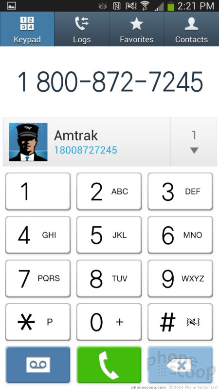
The phone app itself is more or less the stock version of the Android dialer, but it has been reskinned so it looks a bit different. It offers plenty of customization powers that really let you dig in and make the phone's behavior your own. When the dial pad is visible, tap the menu button and you'll see an options screen for the phone. Here is where you can set rejection behaviors, alerts, answering/ending calls, set up voicemail, and control the TTY functions. You can turn on/off noise cancellation, as well as dial in your own preferences for volume, clarity, and warmth.
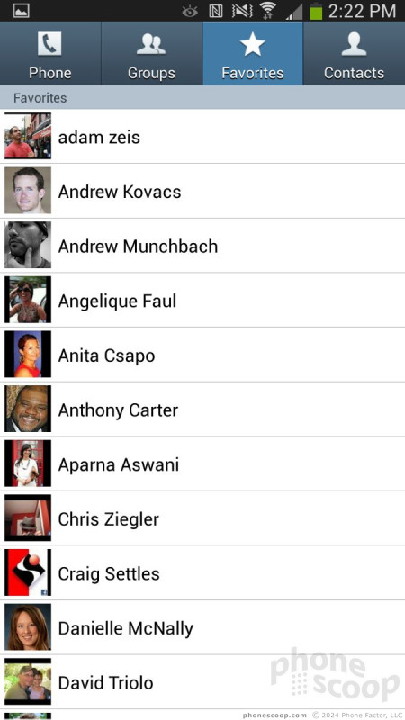
The contact app behaves more or less like the stock Android contact app. Favorites are accessible from a tab at the top of the phone app, as is the entire contact database. There are standard home screen shortcuts for direct access to a contact on the home screen panel, as well as a direct dial, and direct message, but there isn't a larger widget for your favorite contacts, which seems an odd omission.
Messaging
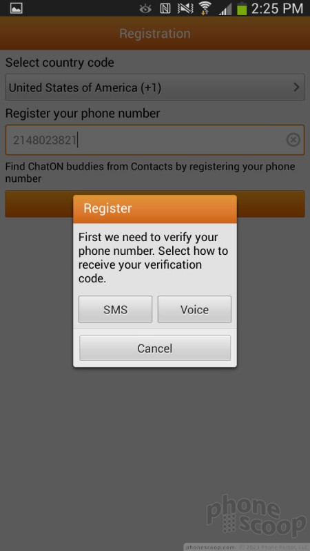
The Mega has the typical list of messaging apps. The native communication tools include email, Gmail, Google+, and Hangouts. Neither Facebook nor Twitter is pre-installed, but Samsung's own ChatOn is. ChatOn is a cross-platform IM app that uses data rather than SMS to deliver messages.
AT&T's Messaging app is also included. This is a catch-all instant messaging app that bundles together IM functions and SMS into one app. It's an OK service, and accomplishes its main goal without trouble. However, in my opinion, it's a bit clunky to use, and the individual apps it attempts to replace (SMS, Hangouts, Yahoo IM, etc.) are more feature-rich.
Extras
Media
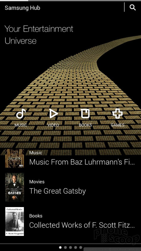
The Mega comes with a significant amount of media software. In addition to the stock Google apps and services, the Mega also includes options from Samsung. For example, the Samsung Hub is on board for purchasing and renting music and movies. In my opinion, the Google Play Store is a better option based on its wider selection and easier usability. The Mega also has Samsung's WatchOn software, which is based on the Peel engine and lets you discover video content across the web and play it back on your device or TV. WatchOn can also act as a remote control for your TV, DVR, and other pieces of home theater equipment. (We reviewed these features in full in our look at the Galaxy S4.)
The Mega comes with Samsung Link, a tool that makes it easier to stream content across different devices. It uses DLNA to connect to devices (smartphones, tablets, laptops, cameras, and TVs) and lets the user push photos, music, and video between the devices somewhat easily.
The Mega also includes Samsung's Group Play app, which lets the Mega share music on other Samsung Galaxy phones nearby.
Camera
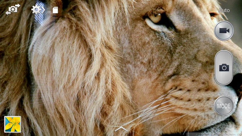
The Mega's camera is a direct carryover from the Galaxy S4. It can be launched with a lock screen shortcut, but there is no dedicated hardware button associated with the camera. Due to its size, I found the Mega awkward to hold for photo taking, though it's not as goofy looking as using a full-size tablet.
The user interface lets you easily switch between 10 different shooting modes, which include Night, Sports, Panorama, HDR, Sound & Shot, Best Face, Continuous Shot, Best Photo, Beauty Face, and Auto. (We have extensive explanations of each mode here.)
In addition to the extensive selection of shooting modes, the Mega also lets users take control of resolution, metering, ISO, white balance, exposure, GPS tagging, and so on. It's an incredibly feature-rich camera.
It doesn't take long to figure out how to use all the modes and tools to take creative photos. The Mega's large screen makes framing shots easy thanks to the ample canvas, and it operates quickly across the board.
Images
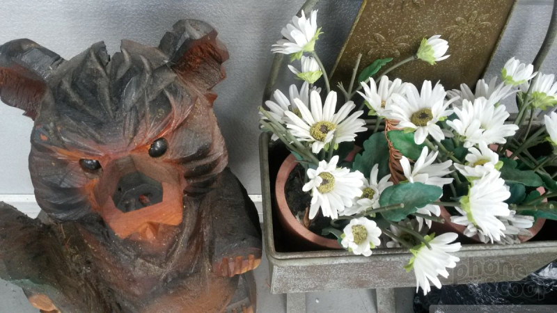
The Mega has an 8-megapixel sensor that does an admirable job of capturing accurate and in-focus images. I was generally pleased with the results I achieved; the Mega did a good job at representing why my eyes saw. Focus was mostly sharp, white balance was good, and exposure was good. Fast motion was mixed (see fan shot below), and low-light performance was acceptable, though grainy. I am happier with the images I took with the Mega than I am with the Moto X's 10-megapixel shooter, for example. Most people who use the Mega to take pictures should be satisfied with the results, (but please don't hold the Mega in front of me when snapping away, as you'll block my view.)
Video
Video captured with the Mega also looks very good. Video was rich with color, properly exposed, and in focus. It even worked well in really low-light situations, such as an end-of-the-summer gathering that I attended over the weekend. My guess is you'll be pleased with the results, too.
Gallery
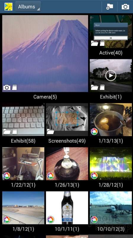
The Mega uses the stock Android 4.2 gallery application, with a few extra features tossed in for good measure. The top-level view of your albums can get distracting if you're not careful. The device will automatically sync thumbnails from your Google+ and Dropbox accounts, but you can thankfully turn these off. There's a drop-down menu accessible from a button at the top of the screen for sorting between albums.
When you dive down into the individual galleries, the Mega goes into a split-screen mode: a vertical list of other galleries forms a strip along the left edge of the screen, and the rest is reserved to show larger thumbnails of the images in the gallery you chose to view. You have to press one of the thumbnail images to go into a full-screen view of that image. Once there, you can swipe through photos, perform edits, and share quite easily thanks to the numerous options in the gallery app.
The editing features don't go beyond those offered by the standard Android gallery app, which means you can crop and rotate, take out red-eye and apply a load of filters.
Bluetooth
The Mega includes a Bluetooth radio and I had no trouble connecting the Mega to a variety of devices. Discovery and setup was a snap thanks to Samsung's on-screen prompts. The quality of phone calls passed through both a mono headset and my car's hands-free system was quite good. I was easily able to hold (and understand!) conversations via Bluetooth. Music sent to Bluetooth headphones sounded decent.
Browser
The Mega ships with both Chrome and the generic Android browser on board. Both are fine tools for browsing the web and do a good job of rendering HTML web sites. Chrome offers more features in that it can be synced with the desktop version of Chrome, but the generic Android browser offers simpler controls. Both were quick to load web sites via AT&T's HSPA+ and LTE networks. I was impressed with the browsing performance except in weak coverage areas where speeds slowed down a bit.
Clock
The lock screen clock takes some work in order to be useful. Out of the box, Samsung has placed a really small digital clock on the home screen. I found it somewhat hard to see when I wanted to check the time quickly. If you choose to set up lock screen shortcuts, you can select a different view of the lock screen that makes the clock much, much bigger. It takes a few steps, but it's worth it.
GPS
The Mega includes Google Maps and AT&T Navigator. Google Maps works the same as on any other Android device. AT&T's service, which costs $10 per month, works well, too, but you aren't getting any extra features for that monthly fee. Both apps interacted with the Mega's GPS hardware without issue. The Mega was very quick to pinpoint my location to within about 25 feet.
Samsung Apps
The Mega ships with a wide range of applications made by Samsung, many of which we covered in detail in our review of the Galaxy S4.
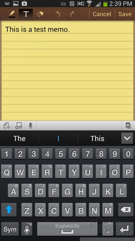
Some of the most prominent apps are: Story Album, which lets users create photo albums and even order physical copies. S Voice is Samsung's Siri and Google Now clone. It accepts spoken queries and commands. S Translator lets users speak one language and have it automatically translated into another. S Memo lets people create custom notes and other documents, even though the Mega doesn't have a stylus (just use your finger.) There's also a separate Samsung App store, which is — as the name implies — an app store curated by Samsung. You'll see most of Samsung's apps and services available in there, as well as apps made by third parties that Samsung happens to like. The Mega also includes gimmicky features such as Air View and Air Gesture, which let you interact with certain apps without actually touching the screen. Air View, for example, can be used to preview the content of emails, while Air Gesture can be used to answer calls or advance through a photo album.
Wrap-Up
The Samsung Galaxy Mega, while capable and powerful, is not a phone I would ever choose to purchase or use myself. It's simply too big. Where the Note II lives on the edge, the Mega leaps right over into the land of Can't Fit My Hand. Aside from the size, the hardware is decent. It's a good looking phone, though it would be nice if the materials were of slightly higher quality.
The signal, sound, and battery performance all fell into good ranges, though the large screen was a bit fuzzy to my eyes. Clearly, the Mega is not as high-end a device as the GS4 or Note II, and the screen is the defining factor there. The camera does a good job, and features such as the removable battery and memory card are sure to appeal to some users.
As far as the software goes, the Mega is just as over-the-top as the GS4 with its insane customization options and too-many-to-list apps and features.
If you thought the Note was too big, stay away from the Mega. If you truly want something that falls in between a smartphone and a tablet, there's a case for the Galaxy Mega. Whatever you do, don't buy this phone without going to an AT&T store and handling it yourself.
Comments
Straight From The Island of Misfit Toys.
Their target market, as it's been said "consumers who want a phablet without the $299.99 price of admission." This market does not exist!
The Note II is more powerful, better resolution, handy stylus with air view, enough processing power to get out of the way of its own shadow and if you do your homework can be purchased NEW from indirect channels may be for the SAME $149.99 "sweet spot" (maybe even less once the Note III drops)
May I add "mid-line" Samsung smartphones are lackluster, buggy, and fail to meet expectations. Just make you feel bad that you didn't ante upthe difference. Its almost like they cantracted the prodution of their mid line to either ZTE or K...
(continues)
(continues)
Yes I agree with you on the device. I would spe...
(continues)
Also - if your phone is all-encompasing, so important and needed that you sweat or can't go anywhere without your phone, that person should probably get a life.
...
(continues)
This is a purse phone
You are 100% right, however - I don't think this phone would fit in any of my pants pockets, you'd need something to carry it around in.
Bummer.
The other is I want to point out the hilarity of your comparison it made me laugh for a while.
"It comes across as classy and elegant sort of in the way Shaquille O'Neal does when wearing a suit rather than his basketball uniform."
hahahaha immediately thought of Shaquille O'Neal in Shazzam and Steel. Thanks for that laugh.
Then this "I dropped it a lot, and felt stupid using it as a phone to make calls. "
With a 6.3 inch phone I agree that it is very silly t...
(continues)
(continues)
I miss
"Music sounded really good through my favorite pair of..."
It is very important for me to have a decent music player in my phone.
I would really like to have a device like this one (specially now that I deal with lots of emails from clients). So sad it just has a so-so battery life. It would fit well inside my big pockets (I'm most often wearing shorts).
No air gesture
Unless it's hidden somewhere I'm not seeing it.


















 AT&T, Sprint, U.S. Cellular to Sell Samsung Galaxy Mega
 Samsung Goes Mega with Two Huge Handsets
 AT&T Launches New Samsung Phone for Kids
 Samsung Galaxy Mega (GSM)


