Review: LG G2 for Verizon Wireless
Sep 13, 2013, 1:49 PM by Eric M. Zeman
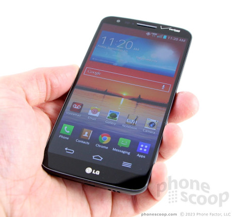
The LG G2 is a flagship smartphone that is bristling with technology, but stumbles here and there getting it all to work. Here are our thoughts on the Verizon version, which is slightly different from the AT&T version.
Editor's Note: Phone Scoop has already reviewed the AT&T version of the LG G2. Because so many features are identical, we carried over portions of the text from that review. We've fully re-tested the device on Verizon's network and updated the relevant portions of the review to reflect those results. Both phones were reviewed side-by-side and tested at the same time.
Is It Your Type?
The G2 is LG's answer to the Samsung Galaxy S 4 and Apple iPhone. It's a flagship smartphone that includes every feature known to tech-kind, all wrapped in a slick shell. The G2 definitely pushes buttons, but are they the right ones? Phone Scoop digs deep to give you the answers.
Body
The LG G2 is a slim, sleek, and large smartphone. As with nearly all modern flagship phones, the big screen pushes the length and width ever-outward. LG did all it could to minimize the overall size with razor-thin bezels surrounding the screen, but it's still a big device. It's also - aside from one design element in particular - quite boring.
The G2 has the most conservative design out of all today's superphones. Nothing about the appearance, other than perhaps the size, stands out. At least the Galaxy S4 has a chrome band around the outside. The G2 is black (or white) through and through, with no sizzle or flash. It's non-discript. From more than three feet away, it looks like any other large phone on the market. Last year's flagship from LG, the Optimus G, had more personality … but that's not saying much.
I haven't seen a device this year more prone to collecting finger grime than the G2. The front surface is of course glass and the rear shell is made from plastic. Both are reflective, glossy, and slippery. I needed little more than 60 seconds to smear them from top to bottom with oils from my skin. Gross. The glass is of good quality, but I seriously question LG's choice to use such a cheap-feeling plastic for the rear shell. LG could have done a better job. I also had a hard time holding onto the G2 thanks to the slick surfaces.
There's a rather sharp edge where the display meets the side. The shape of the Verizon G2 is fairly square along the sides. It's not uncomfortable to hold and use, per say, but it could be thinner and lighter. Even so, the G2 will slip into most pockets fairly easily.
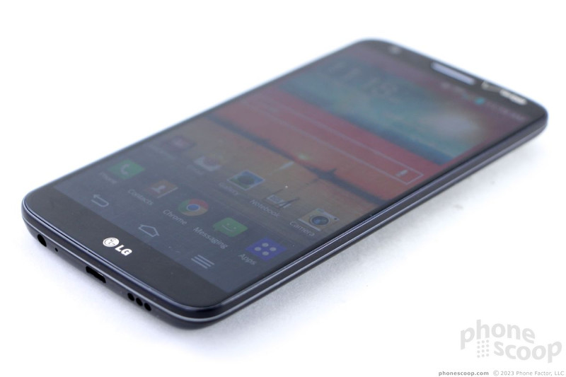
The display measures 5.2 inches across the diagonal and consumes the vast majority of the front surface. There are hair's-width bezels on either side of the screen, and somewhat thicker ones above and below. There's a slit in the glass at the top for the earpiece speaker, and a reflective LG logo positioned below the display. There are no capacitive buttons, the G2 makes use of on-screen Android controls. Of course, Verizon had to stick its logo on front, too.
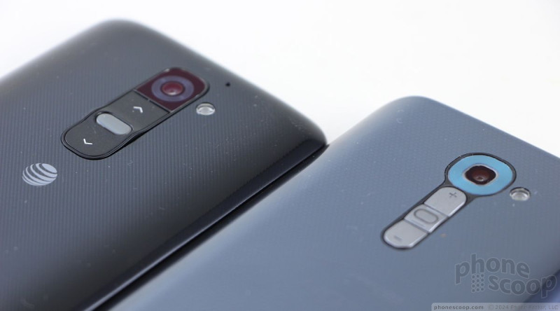
Looking for the volume toggle and screen lock button along the G2's edges? You won't find them. LG decided to break with more than a decade of smartphone design and moved them to the back surface of the G2. LG's research shows people hold their phones like this:
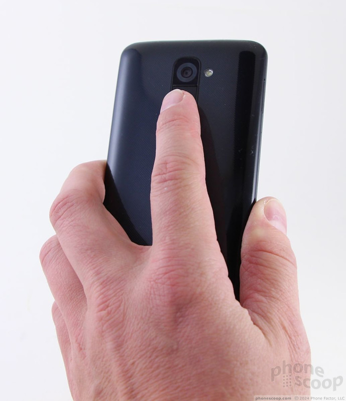
So it thought to itself, why not move the essential screen lock and volume buttons there, instead? I can't argue with LG's decision to try something different and new. Smartphones are so homogenous these days that any amount of differentiation in the hardware is appreciated. I couldn't get used to the button placement in the first week, but my guess is I'd get used to it after another week or two (as would most owners).
Placement aside, I didn't find the buttons satisfying to use at all. They are located directly beneath the camera module. The up volume button is the top-most button, the screen lock button is in the middle, and the down button is the bottom one. The buttons don't have a lot of definition. That means the buttons are much harder to tell apart. I often found myself pressing the volume down when I meant to press the screen lock button. The good news is these three buttons have decent travel and feedback. Still, the positioning is somewhat awkward and will take time to learn.
Because LG put the screen lock button on the back and also got rid of the physical Home button on the front, there's no way to wake the G2 without picking the darned thing up. You can choose, however, to activate a feature, called Knock On, that lets you double-tap the screen to wake the device or put it to sleep. Why it's not activated out of the box is beyond me. LG touted the feature as "cool" and "hip", but due to the hardware design, it's quite necessary.
LG points out that the buttonless design leaves your hand free to tightly grip the phone and still use the controls on the back. I guess. It didn't feel like I had a stronger grip on the G2 when using it. However, the side edges are seamless and free from protrusions. There are no buttons sticking out. This adds to the G2's slick feel.
The LG's back cover cannot be removed. That means no swapping batteries. There's also no memory card slot; you're stuck with either 16GB or 32GB. Interestingly, the SIM card can be pulled out with your thumbnail. It has a cleft that lets you wiggle your nail in and pry it loose without requiring a tool. Motorola does something similar with its DROID Ultra.
Comments
Pull down notification shade diff??
http://img.phonescoop.com/img/a/p/47619_800.jpg »
I have seen other comparisons of the AT&T and verizon version. The verizon version does not have a brightness and sound slider like the AT&T version does, is this true or not??
thanks






 Hands-On: LG G2
 LG G2 Boasts 5.2-Inch Screen, Snapdragon 800 Processor
 LG G2 (Verizon)


