Review: Apple iPhone 5s
Menus
The iPhone 5s runs iOS 7. For a full run down of all the new features in iOS 7, see Phone Scoop's separate review of iOS 7 here. If you're looking for the quick and dirty version, read on.
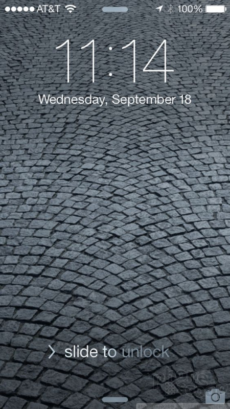
iOS 7 is a complete redesign of Apple's tried-and-true operating system. It looks entirely different and adds tons of features. There's a nice, big, digital clock that's visible on the lock screen. In addition to the clock, you can access both the notification shade and new Control Center from the lock screen. The notification center has been dramatically improved. It offers a nice "Today" screen complete with your appointments, weather, and stocks. It also shows you missed calls, emails, messages, and so on.
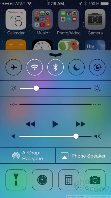
The Control Center is a new feature that you access by swiping up from the bottom of the screen (you can disable it in the lock screen if you want.) It provides quick access to hardware functions, such as the wireless radios, screen brightness, volume, and several apps (flashlight, calculator, timer, camera.) The lock screen can be used with or without a pass code.
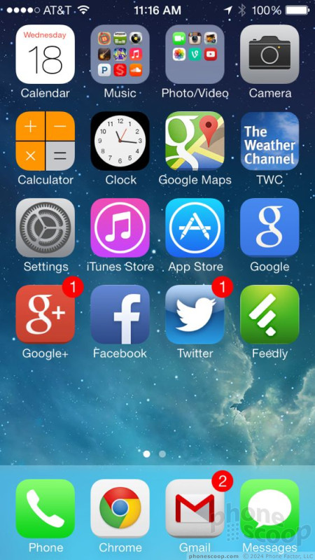
The home screens have a new look, but they're one area of iOS that has remain virtually unchanged as far as behavior goes. You're stuck with a rigid grid of app icons that populate the screens. You can place up to 20 apps, shortcuts, or folders onto a single home screen. The folders can hold an innumerable number of applications, but you can't see them all at once inside the folder. iOS doesn't offer dynamic or resizable content on the home screen like Android and Windows Phone do.
The settings menu has a different look thanks to the new design, but it behaves about the same as before. The settings have been rearranged together in clumps of controls, such as all the radios in one spot, all the account tools in another, and so on. There's a lot in the settings menu, but it is all very easy to understand and control.
As far as customization goes, users can adjust wallpapers, ringtones, and alerts. iOS 7 includes a wide array of new wallpapers and sounds (thanks goodness!). Text size is easily changed. Apps can be placed in any order that you like on home screens, including in the permanent dock at the bottom that spans all home screens.
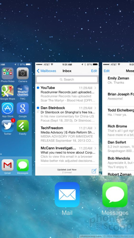
Multitasking has been changed, too. Rather than a list of open apps appearing in the dock, open apps now float in the middle of the screen with previews that show the app. The user interface is nice and lets you flick apps off the screen to close them. It doesn't let you see as many open apps at a time, though, which means you have to scroll sideways a bit more to see what's running.
Performance of iOS 7 on the iPhone 5s was a bit uneven. The first version of any major new operating system from Apple is typically buggy, and iOS 7 is no different. Despite updating to 7.0.1 right away, the iPhone 5s had plenty of app crashes (including Apple stuff like the Settings menu and Safari.) There were some jitters here and there, and the screen transitions — especially the ones that occur when you jump to/from the home screen — were sometimes slow. It's by no means bad, and Apple will probably patch iOS 7 in a month or so, but don't be surprised if you notice a few quirks here and there.
Bugginess aside, iOS 7 is a fast platform and it rarely felt bogged down. Further, the iPhone 5s processor (Apple A7, speed unknown) was able to handle incredibly complex and textured games, such as Infinity Blade III, without breaking a sweat. Most apps opened in a blink, and processing time for tasks such as piecing together videos in iMovie was noticeably quicker than on the iPhone 5.
Calls and Contacts
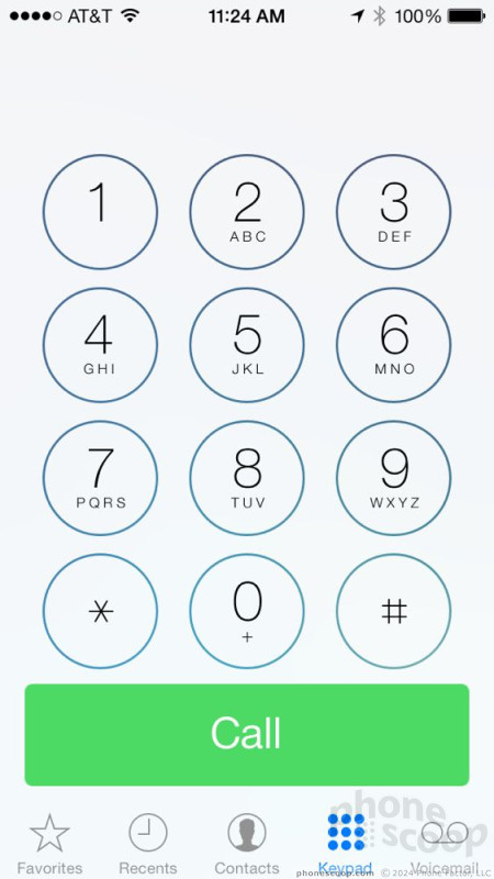
Apple changed the look and feel of its phone and contact applications, but the changes are only skin deep. One of the more disappointing aspects to iOS 7 is how skimpy the phone and contact apps are. Sure, the phone works fine for dialing numbers and storing favorites, but it doesn't offer advanced features. The phone app offers a basic set of tools, including speakerphone, contact search, add a line, and send to Bluetooth.
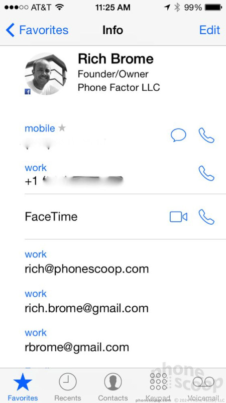
The contact application is breeze to set up and use, but it is really lacking in social skills. It may port over social networking profile images (why are they so tiny?!) and contact data, but it doesn't offer status updates or views of your contacts' recent photos. You can reach out to people easily, and syncing data to the contact app is a cinch, but I wish it were more visually and socially immersive. Both Android and Windows Phone excel with their contact apps. There are also no active widgets/tiles for the iOS home screen.
Both the phone and contact apps work fine at handling the basics, and FaceTime continues to be the most user-friendly video chatting application out there.
Messages
The messaging apps are another area to which Apple paid little attention during the iOS 7 redesign.
The SMS application has been warmed over with the new design language, but it doesn't many any significant leaps in usability or features. It offers the same threaded conversations that appear in bubbles. The one thing you can do now is to easily check when each message arrived/was sent with a new swiping gesture. Of course, you can set up iMessage so that texts are sent either over your data network (when available) or as SMS as a back-up. iMessage can also be used on iPads, iPods, and Mac computers. For those fully invested in Apple's hardware ecosystem, it can be really helpful to have your messages accessible from other devices. Turning iMessage off, however, can be problematic and lead to lost messages. It's one of those features that you either need to jump into with both feet, or leave alone entirely.
The email application also gains new swiping gestures to help with accessing menus and features, but the overall behavior is hardly changed compared to the previous version. It's still just as cumbersome to add attachments, and doesn't have as many features as Gmail does on Android devices. That said, it syncs with POP3, IMAP4, and Exchange, and is as flexible as ever as far as delivering messages is concerned.
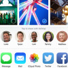
Both Facebook and Twitter have been baked into the operating system to a small degree. This means you can share content from the photo gallery directly to Facebook or Twitter, but beyond that the sharing options in iOS aren't as varied as on Android devices. You still need to download and install the dedicated Facebook and Twitter apps to really use them. Google+ and other social networks can only be reached through third-party applications.

















 ReSound Smart Hearing Aid Connects To Your Phone
 Review: Apple iOS 7 from A to Z
 MetroPCS Opens Up iPhone Sales Nationwide
 Apple Makes iOS8 Available to the Masses
 CarPlay Lets Drivers Access Their iPhone Via Siri
 Apple iPhone 5s


