Review: Sony Xperia Z1S for T-Mobile
Jan 15, 2014, 7:00 PM by Eric M. Zeman
The Sony Xperia Z1S offers T-Mobile customers a top-notch media experience in a slim and attractive piece of hardware. Here is Phone Scoop's full review.
Is It Your Type
T-Mobile continues its hot streak with the Sony Xperia Z1S, a waterproof smartphone that has good looks and solid performance. The Z1S takes the place of the Z as Sony's hero phone in the U.S. and it goes toe-to-toe with today's best devices. Toss in a dose of Sony style and you have a compelling combination. If you're tired of Galaxys, iPhones, and Lumias, this Xperia might offer the differentiated experience you're seeking.
Body
The Xperia Z1S makes a good thing better. It takes the best aspects of last year's Z and improves upon them markedly. The hardware is top-notch in terms of quality and construction, and it has good looks to boot.
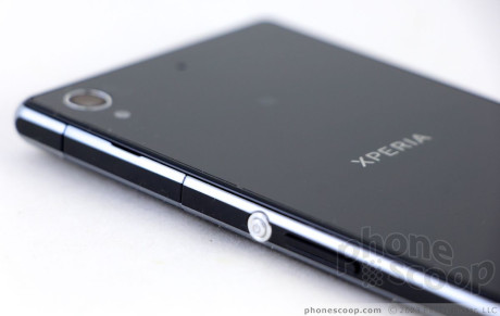
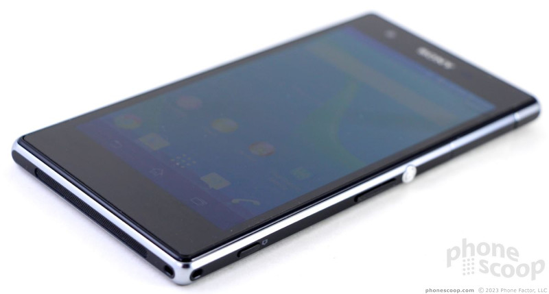
The Z1S is a slab-style device that has a polycarbonate frame sandwiched between two glass panels. Similar to the LG Nexus 4 and Apple iPhone 4/4S, glass forms both the front and back surfaces. The device is thin, light, and attractive. The simple design elements speak for themselves. You don't have to do much to give glass some class, and the Z1S has both to spare. The glossy and reflective glass panels are offset by the matte-finished frame. The signature Sony screen lock button, which is large, chrome, and circular, stands out nicely along one edge of the device. This button design was a conscious choice from Sony, and it's found on most of Sony's modern Xperia-branded devices. The Z1S is available in black, white, and an attractive purple.
Perhaps the Z1S's biggest improvement over the Z is the overall feel in the hand. The Z had sharp edges that often cut into your palm when the phone was held tightly. The Z1S has rounded edges that are much more comfortable when the phone is gripped. That said, the Z1S is still a wide phone that may introduce usability issues for those with small hands. My thumb could not reach the top 20% of the phone unless I repositioned my grip. The waif-like front-to-back dimensions mean it should fit into most pockets without issue, but the height and width might cause pocketability problems here and there.
Like the Z, there are no physical controls on the front of the Z1S. The screen consumes a significant portion of the front surface, but there is still a wee bit too much bezel as far as I'm concerned. I'd prefer Sony minimized its bezels moving forward. The three standard Android buttons show up along the bottom edge of the screen as they are needed.
The Z1S is waterproof. Sony has upped the marketing lingo. The Z was water resistant. Waterproof, to Sony, means the Z1S can sit in up to 4.9 feet of water for up to 30 minutes. In order to gain that protection from water, the Z1S is sealed up tight. There is no removable back cover and no access to the battery at all. The microUSB port - and slots for the SIM and memory cards - are all accessible along the side edges. Each is protected by its own hatch. I dislike the hatches intensely, but I suppose at the end of the day the only one with which most people will interact on a daily basis is the one protecting the microUSB port. The microUSB and microSD hatches are on the left and the SIM card hatch is on the right. All three require a bit of fingernail action to pry them loose. The headphone jack is not protected by a hatch, but is waterproof all the same. The hatches *must* be properly sealed in order to make the Z1S waterproof.
Considering just how often people manage to drop their devices into drinks, sinks, toilets, and puddles, perhaps dealing with the hatches is a worthy trade-off. By the way, I tested the waterproof-ness of the Z1S, and it can handle blowing rain, a faucet, and a bathtub quite well. The device includes wet-screen tracking, which means the screen (and even the camera!) can be touched and used when the device is submerged.
All of the buttons are placed along the right edge of the Z1S. The most obvious of these is the lock button, which is positioned approximately in the middle. It's really easy to find and use, and the travel and feedback are quite good. The volume toggle is below that. Its profile is minimal, and travel and feedback are quite poor. Sony could have done a much better job with this button. The Z1S adds a physical camera button. The button is very small, but it works well. I had no trouble finding and using it, and both stages of the two-stage key are clearly defined.
At the end of the day, the Z1S is an attractive piece of hardware that's well built. It's too bad there are a few usability niggles that detract just a teensy bit from the overall package.
Comments
No messages




 Hands on with Sony's Xperia Z1 Compact
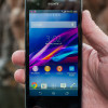 Hands-On: Sony Xperia Z1S for T-Mobile
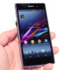 Hands-On: Sony Xperia Z1
 T-Mobile Will Sell Sony Xperia Z1S Flagship Phone
 Sony Xperia Z Ultra, Z1, and SmartWatch 2 Now Available
 Sony Xperia Z1 / Z1s


