Preview: Moto RAZR2 Series
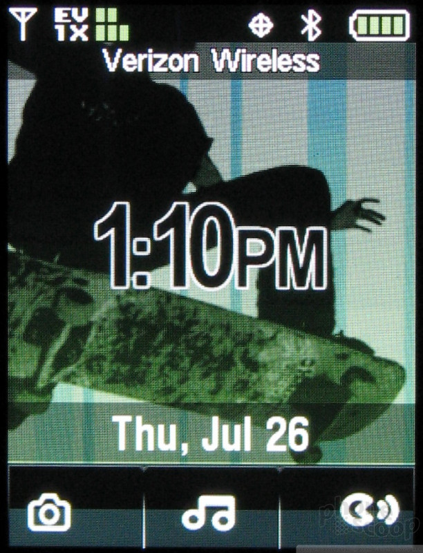
The V9m has the most complete external interface. A quick press of any of the phone's side keys (including the volume buttons) brings up 3 icons at the bottom of screen to activate the camera, the music player or the voice navigation software. To activate any of these, you touch the icon on the screen and the phone will vibrate. But you have to continue to press on the icon until the phone beeps.
Even though the vibration is used to acknowledge a key press in every over aspect of this interface, that is not the case for launching applications. Motorola claims this is to protect against accidental launches, but we still wonder why Motorola made the phone vibrate long before the launch occurs. In fact, because the vibration usually signals a button has been pressed, we just assumed this feature was broken since by removing our finger after vibration but before the beep, none of the applications would launch.
Because the camera is just above the external screen, the external interface is used for self portraits (or including yourself in group portraits). It features simplified controls, where you just touch the word "take" to take a picture. Although there is no indication of it anywhere, you can also use the volume keys to adjust the digital zoom level of the camera as well. Snapping a picture automatically saves it and returns you to the viewfinder. To do anything else, including exit out of the viewfinder, you have to open the phone.
Opening the V9m, the camera interface is also horizontal but features more labels and more status readouts. Although the labels are in the same place on the screen as the external interface, there is no touch sensitive portion of the screen, so you need to use the keypad. This difference is a bit confusing the first few times. You keep looking for separate keys on the outside or touch keys on the inside.
Launching the music player immediately starts the first song in your playlist. The music player is the same as on the MAXX Ve, so it does not remember where you left off playing if you've exited the player, and you cannot do any tasks in the background, so you have to exit the player to do anything other than answer a phone call. The touch keys change to the traditional play/pause, previous and next track keys. And the external display shows album art for the current song as well as a playlist, so that you can see what's coming up to skip to it (or skip it). Skipping between tracks takes longer from the external interface than the internal one. There is a pause and a rotating icon to indicate that a new track is loading, but on the internal screen new art loads immediately and the next song starts playing much faster. Again the only way to exit the player is to open the phone and quit.
Launching the voice navigation application displays a list of commands you can say, which allow you to do a wide variety of tasks in addition to dialing numbers. The touch controls are not used in this application at all. The screen is big enough to display all the commands at once, so you don't even need to scroll.


 Moto RAZR 2 Launch
 Hands On with the 2023 moto g 5G & moto g stylus
 iPhone 15 Series Goes All-In on USB-C and Dynamic Island
 Samsung S24 Series Adds More AI, Updates the Hardware
 Qualcomm Expands Snapdragon 8 Series to Cover More Price Points
 Motorola RAZR2 V9 / V9x
 Motorola RAZR2 V8
 Motorola RAZR2 V9m


