Review: HTC One for Windows
Aug 29, 2014, 6:30 AM by Eric M. Zeman
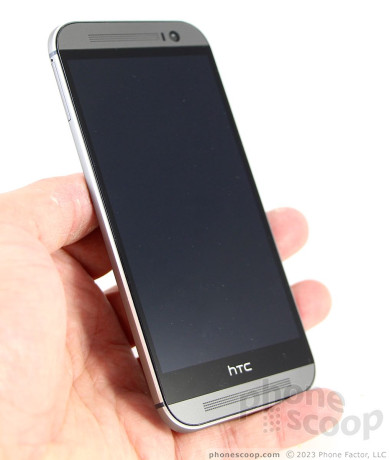
Verizon Wireless was the first U.S. carrier to score the HTC One for Windows, which swaps Android for Windows Phone. Here is Phone Scoop's full review of this stylish handset.
Form
Is It Your Type?
The HTC One for Windows is the company's re-entry into the Windows Phone market. And what a re-entry it is. The One for Windows takes the same great hardware we know and love from the One (M8) and trades Google's Android platform for Microsoft's Windows Phone. If you're seeking a premium Windows Phone handset, the One for Windows is the one for you.
Body
The HTC One for Windows is identical to the One for Android. The hardware is 100% the same, both outside and in. The One is a large device, skinned in aluminum, and crafted with care. It stands in stark contrast to the polycarbonate designs from Nokia and Microsoft.
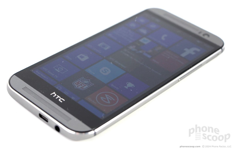
As far as Windows Phone handsets go, it doesn't get much better than this. HTC did a great job designing and manufacturing the One for Windows. It is slim, smooth, and lustworthy. The phone features HTC's BoomSound speaker grills on the front, chamfered edges all around, and tapered sides. The are black lines that run across the back surface, which help with the radio performance, and both HTC's and Verizon's logos are etched finely into the metallic back surface. The materials are top-notch, though after using the One for Android the past few months, I will say the metal is susceptible to dents and fine scratches if abused.
Due to its size and slightly oblong shape, the One can be awkward to use one-handed. For example, my thumb can't reach the top 20% of the screen unless I reposition the phone. In so doing, I risk dropping it. It is weighty and slippery. You always know it is in your hand and your pockets, but it will slip into (and out of!) your pockets easily thanks to its slim profile.
The front surface is a busy place. Two gray bars, one above and one below the screen, hold the machine-drilled BoomSound speakers. The top houses a camera and sensor. HTC hid a notification light in the speaker grill above the screen. There are no physical control buttons; instead, HTC developed on-screen buttons to interact with the Windows Phone system (more on this in detail later).
The side edges are crammed with various things. The screen lock / power button is on top. To my fingers, it feels dramatically better than the button on the One for Android. The new button is less flush with the top surface, making it much easier to find. Travel and feedback is excellent. Paradoxically, the volume toggle on the right edge is harder to find than on the One for Android, and has mushy travel and feedback. There is no dedicated camera button. Most - if not all - Windows Phones feature a hardware camera button, as mandated by Microsoft. The One for Windows appears to be an exception to that general rule.
The SIM card and memory card have their own trays, one on either side of the One. The SIM tray is on the left and the memory card tray is on the right. Both require a SIM tool or small paper clip to eject. The micro-USB port and stereo headphone jack are both on the bottom.
The One for Windows' back cover is sealed up tight and cannot be removed. That means no swapping batteries. The back houses the Duo-Camera design from HTC, along with a two-tone flash.
In all, the HTC One for Windows is an excellent piece of kit. Despite a few minor flaws, you really can't ask for much better.
Performance
Screen
The One for Windows has a 5-inch LCD screen with 1920 x 1080 pixels. It is protected by Gorilla Glass. It's a great display. Text and graphics look razor sharp, colors are brilliant, and it's very bright. You'll have no trouble using the One indoors and out, thanks to the dazzlingly bright screen. Viewing angles are excellent; I didn't see any color shift or brightness drop-off when I tilted the One. Bottom line: the One for Windows has a great screen.
Signal
The One performed almost flawlessly on Verizon's LTE 4G network. It remained connected to 4G throughout my time testing it and never dropped to 3G. I was able to connect all calls on the first attempt, in both weak and strong coverage areas. The phone did manage to drop one call when in a fast-moving car. Data speeds were nice and quick, though they slowed just a wee bit in weak coverage. In all, though, the signal performance is top-notch.
Sound
The One for Windows performed way above average as far as call quality is concerned. Voices in the earpiece sounded clean and bright. The earpiece produced plenty of volume. You can set it at 60% or 70% most of the time. I only needed to crank it all the way up in the noisiest spaces, and was still able to hear calls above the din of NYC, as well as chatty coffee shop-goers. The people I spoke to through the One said I sounded very good. The speakerphone is just as good as the earpiece. Voices were loud and clear coming through the BoomSound speakers. They can easily overpower the noise in your home or office, and perhaps even most cars. The ringers and alerts are incredibly loud. You'll have no trouble hearing the phone ring even when several rooms away. The vibrate alert is OK, but not great.
Battery
Like the One for Android, the One for Windows Phone is a battery champ. The phone provided enough power to get through about a day and a half with what I'd define as normal use. I used multiple email accounts, browsed social networks, surfed the web, and streamed some Pandora. I had the Bluetooth and Wi-Fi radios on at all times, and used GPS for navigation. You shouldn't have any trouble getting at least a day out of it.
The One for Windows does not have the great HTC-made battery saving tools found on the One for Android. Instead, it includes the Windows Phone Battery Saver. You can use the Battery Saver to shut off select apps once the battery reaches a predetermined level. For example, when enabled you can control which apps continue to run in the background, or have access to the data radio. I didn't need to use it while testing the One.
Basics
Menus
The One runs Windows Phone 8.1, which is the latest version from Microsoft. Phone manufacturers are not allowed to customize Windows Phone like they are Android, so the One behaves much like every other handset running Windows Phone 8.1, with a few key differences.
Nearly all Windows Phones have permanent buttons below the display for controlling the device. The One for Windows does not. Instead, HTC created a software nav bar that comes and goes when needed, much like Android. I found this hard to get used to. Though the nav bar appears with a swipe up from the bottom of the screen, it's an extra step not needed on every other Windows Phone handset. It also eats into the real estate on the screen, shortening the visibility of apps/menus just a little bit.
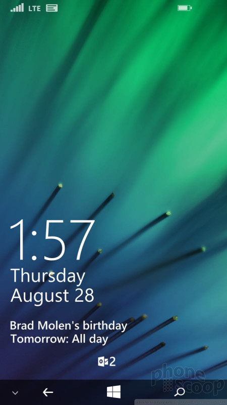
The lock screen is much more customizable than on earlier versions of Windows Phone. It always shows the time, but can also be set to show missed calls, calendar appointments, as well as the number of unread emails/messages, Twitter DMs, and Facebook mentions. The lock screen is dynamic, and can show breaking news stories from CNN, or trending topics on Twitter complete with images and text, if you want.
The Start screen is a fairly flexible space that's quite different from what's offered by Android and iOS. Apps appear as Live Tiles, or dynamically changing squares/rectangles. You can arrange the Live TIles however you wish. Most Live Tiles can be sized in small, medium, or large. Windows Phone 8.1 allows users to create three columns of Live Tiles on the Start Screen. The Start screen can be infinitely long, and also now supports Live Folders. Just like stand-alone apps, the Live Folders will update along with the apps contained therein. One neat trick from WP8.1: the Live Tiles can be made transparent, so you can actually see the wallpaper you've chosen for your phone.
The main app menu is more or less the same as it was when Windows Phone 7 launched in 2010. It's a long, alphabetical list of all the apps installed on the phone. If you have a lot of apps installed, it can take a while to scroll to the bottom. The one thing I really like about Windows Phone is that you can uninstall any app on the phone, even the bloatware loaded by Verizon. The settings tools are also carried over from earlier versions of Windows Phone. They consist of thin white text on a black background. Since they aren't arranged alphabetically, it can take a while to dig through them.
Last, the Action Center is a just a swipe away on nearly every screen. The Action Center, which behaves just like the notification shade in Android and iOS, offers shortcuts to wireless radios, rotation controls, and all your notifications. I like that notifications tell you only how many new emails or phone calls you've received since you last checked, and that notifications from select apps can be deleted in bulk.
The One for Windows Phone's performance is unequalled. It is flat out the fastest phone I've ever used. The four-core Snapdragon 801 is a beast and pushes Windows Phone to its limits. You're not going to have any problems running multiple apps at a time.
Calls and Contacts
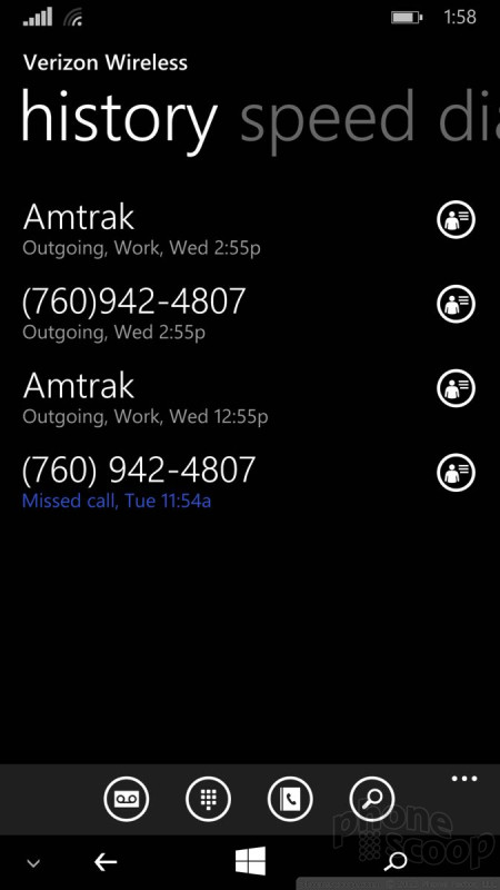
The phone app and People Hub haven't changed all that much over the years. The phone app is spartan almost to a fault. Its stark user interface is plain and simple. You swipe between several different screens that show your call log, speed dials, and dialpad. Connecting calls is a cinch, and in-call options include Skype, Bluetooth, speakerphone, mute, hold, and add a line. They are all simple to use.
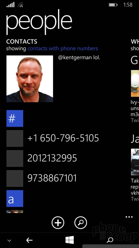
The People Hub is its own bustling social network of sorts, thanks to integration with Twitter, Facebook, and LinkedIn. Not only can you find your friends' and colleagues' email addresses, but you can also see their most recent social network status updates. The People Hub also highlights you, and reminds you of what you last said on those various networks. Of course, the Hub also holds your non-social network contacts and can sync with a number of contact services, such as those that accompany Hotmail, Outlook, Gmail, and Yahoo Mail. The contact cards are easily edited and are chock full of info.
Messaging
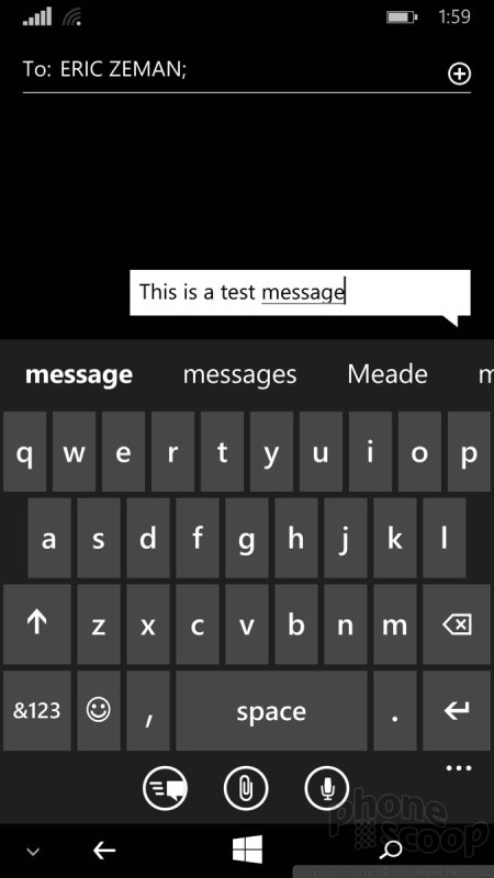
One of my favorite features about Windows Phone 8.1 is the WordFlow keyboard. It supports trace input (like Swype), and is excellent at predicting your next word. It makes typing so much easier and faster.
The SMS/MMS messaging app is decent. It manages conversations well, and of course displays them in threads. I like that you can back up your SMS convos to the cloud, as well as set read receipts. The SMS app also handles emergency alerts, such as those concerning weather or natural disasters. You can turn off all but Presidential Alerts (the most severe type) if you want.
The Windows Phone email client is a solid piece of software. It plays nicely with Exchange, POP, and IMAP, which means most internet-based email services are supported. The setup tools make adding email accounts a breeze. The tools for reading through your inbox are good, and I like the way it handles threaded email conversations. Even better, you can pin individual email accounts to the Start screen, or merge them into a single master inbox.
Skype and Facebook each have their own messaging client for Windows Phone.
Verizon did not place a version of its Messaging+ app on the One for Windows, but it did include its Integrated Messaging service. With Integrated Messaging turned on, users will be able to send, receive, and sync their messages between phones, tablets, and computers. It's handy if you want to be able to send text messages — from your own number — with a computer or other keyboard-equipped device.
Extras
Media
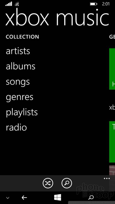
The One for Windows has a fairly solid set of media apps aboard. To start, there's an FM radio (headphones required,) the Microsoft Music app, Verizon's NFL Mobile, Podcasts, Slacker Radio, and Microsoft Video. The two Microsoft apps tie in to its XBox services. The Music app is used both to play side-loaded tunes and to access and buy songs/albums from Microsoft. Or, for $10 per month, you can subscribe to Microsoft's Music service and access it both from your One and XBox. Microsoft Videos follows a similar path. It can play side-loaded content, or be used to browse through and purchase/rent movies and TV shows from Microsoft. I like both of these apps.
The other apps work fairly well, too. The NFL Mobile app is quite good at providing scores and game highlights on game day, and analysis/news the rest of the week. With football season kicking off in early September, it's worth using.
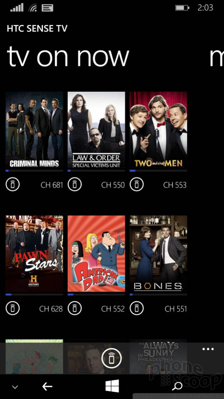
HTC carried over its Sense TV application from the One for Android, which is an added bonus. The app looks entirely different from the Android version, but the net result is the same. Once setup, you can not only turn on/off your TV and cable box, but also browse through the channel guide directly on your device. It's simple to use.
Camera
The One for Windows has two camera apps: the Windows Phone camera and HTC's Sense camera. The latter of the two is the one you should use. The HTC camera functions *exactly* like the camera on the One for Android. This is a good thing. There's no dedicated camera button, but the camera can be opened when tipped on its side joined by a press of the volume key.
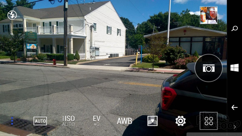
The basic UI has several key elements. Most of the screen is used as a viewfinder and controls are kept to a minimum. There's a button that lets you jump between the basic shooting modes, and another for adjusting the flash. A third button lets you access the full set of camera options.
There's one shutter button on the still photo viewfinder; you have to switch modes for video. The video mode does include a second button for snapping stills while recording video. There are six basic shooting modes: normal, video, Selfie, Lenses, and Panorama. Zoes are gone, as is the dual-camera (front and back) function. The One for Windows also loses the One for Android's cool trick for creating and saving camera profiles in the mode switcher. That stinks.
Video mode lets you pause filming and resume while creating a single file rather than two. This means you can put multiple cuts in your video and have them automatically pasted together in the end result. The One can also record in slow-motion for those moments that deserve a bit more drama. The Selfie mode offers a countdown timer and lets you adjust all the same settings as the main camera, including filters, exposure, and so on. These shooting modes are fairly easy to master and produce results that you expect. The Lenses function ties into the feature that's long been part of Windows Phone. Think of Lenses as camera add-ons, and you'll get the picture.
The full set of tools for adjusting the camera is quite extensive. Press the three little dots in the lower-left corner and a control strip pops out across the bottom if the viewfinder. There are controls here that let you adjust ISO, exposure, and white balance on the fly, as well as apply one of 5 different pre-set filters. The tools offer access to a handful of scenes, which include night, HDR, simple panorama, electronic image stabilization, full manual control, portrait, landscape, backlight, text capture, and macro. Each of these scenes is meant for a specific type of photography. Seasoned users will know what to do with them, but it might take longer for novices to figure some of them out. I do wish that they were easier to reach. As it stands, you have to press two selections just to open the menu for selecting a scene, and then choose the scene itself. The scenes should be easier to reach, especially HDR, which is among the most useful of the tools.
In all, the One offers the ease-of-use that many prefer (point and shoot), while still giving creative types plenty of options for exploring their artistic side.
The Microsoft camera is just fine for taking pictures - especially considering it uses the same sensor as the HTC camera. Thanks to Windows Phone 8.1, it supports burst shooting and integrates with Lenses more easily. It also lets you choose from 16:9, 4:3, and 1:1 aspect ratio.
Pictures
The One's camera captures 4 "ultrapixels." HTC says these are bigger than standard pixels in order to collect more light. In general, the One for Windows' camera does a good job. I was pleased with focus, exposure, and white balance most of the time and noticed few real problems. The ultrapixels' imitations aren't really noticeable until you want to blow images up to ginormous sizes or crop to “zoom in”. For example, zooming way in on my 27-inch monitor showed how the ultrapixels don't fill in nearly as much detail as would, say, a 12-megapixel camera. Rest assured, the One for Windows is great for general photography and for taking on vacation.
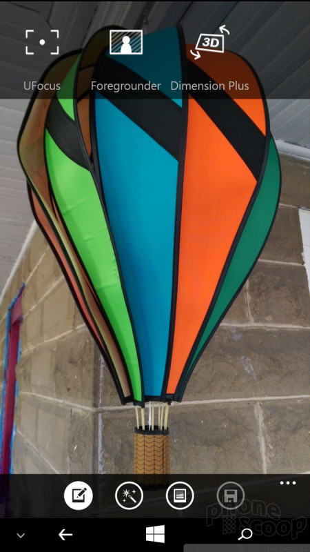
Like the One for Android, the One for Windows has a second sensor that's capturing depth information. That info can be put to use after the fact with the HTC Photo Edit app, which allows you to apply three different 3D-like effects. The first is called UFocus and it allows you to tap anywhere to choose what will be the “foreground” and thus in focus. The second is called Foregrounder, which will "pop" the subject out, and not only blur the background, but also apply certain effects to the background to really set the subject apart in the foreground. The last is called Dimension Plus, and it allows you to see your photos in a 3D effect. Images edited with the first two effects can be saved and shared, but the Dimension Plus is limited to viewing on the handset itself.
Video
The One captures full HD video and it looks great. Focus, exposure, and white balance were spot on almost all the time. The One is one of the better handsets available when it comes to the quality of video. The slow-motion capture mode make for some fun results, as well.
Gallery
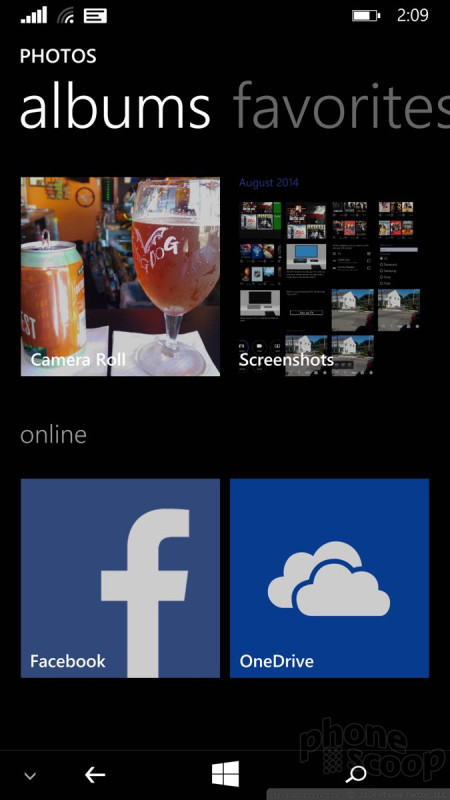
The One for Windows uses the stock Windows Phone gallery application. I've always liked this app, which hooks into your Facebook account for a more social experience. It's easy to swipe through different albums and drill down into the images you want to adjust. The editing features are rather limited. You can crop, rotate and "fix" your images. Fixing entails applying preset adjustments, such as exposure and balance.
Separately, you can use the HTC Photo Edit app to apply filters or add frames. That's about it as far as editing goes. (Since this isn't a Lumia, the excellent Nokia Gallery app is unavailable.)
Apps
The One for Windows has a number of apps that Microsoft, HTC, and Verizon pre-installed. Of course, it packs Microsoft Office, OneDrive, OneNote and Outlook, all of which have been around for a while. Microsoft's suite of Bing apps are on board, such as News, Sports, and Weather.
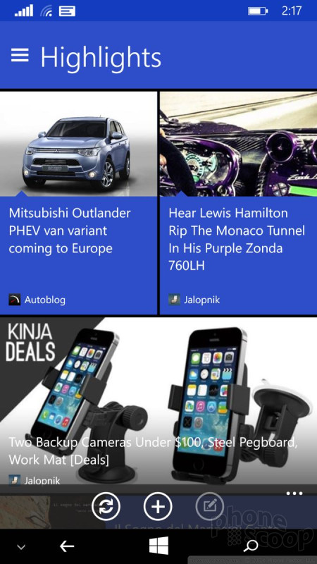
HTC's apps include Sense TV, Photo Edit and Blinkfeed. HTC created a version of its Blinkfeed social news reader for the One. It doesn't consume a home screen panel as it does on Android devices, but instead acts like any other Windows Phone app. Importantly, it can be set as a large Live Tile on the home screen with active, dynamic content changing what's visible at set intervals. The app itself looks a little different from the Android version, but offers the same features. I found it easy to set up which feeds pour into the app and fill it with news, images, and stories.
Verizon's apps are limited to the NFL app, My Verizon, Verizon Messages, and VZ Navigator.
Bluetooth
The One for Windows includes a capable Bluetooth radio. It paired easily with a range of devices, including headsets, speakers, computers, and my car. Calls routed through my car's hands-free system sounded great. They were loud and clear. Music sent to my favorite Bluetooth speaker sounded excellent, thanks to support for the aptX profile. I also managed to connect the One to my FitBit and track my daily walks.
Brower
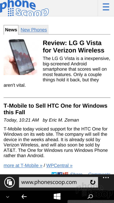
Internet Explorer is the only browser loaded on the One for Windows. This version packaged with Windows Phone 8.1 is the best yet and does a much better job of rendering web pages. Paired with Verizon's LTE network, I found it to be quick. It's nearly equal to Safari for iOS and Chrome for Android, though it lacks some of the more advanced features, such as bookmark syncing across various devices. As far as browsing is concerned, it does a fine job.
Clock
Windows Phones have always offered a good lock-screen clock experience. By default, the one has a large, digital clock that shows up close to the bottom of the screen. If you choose, you can download the Live Lock Screen app (beta) from the Windows Store that allows you to really mess around with the style of the lockscreen clock. For instance, it adds various fonts, layouts, and themes for the clock.
Cortana
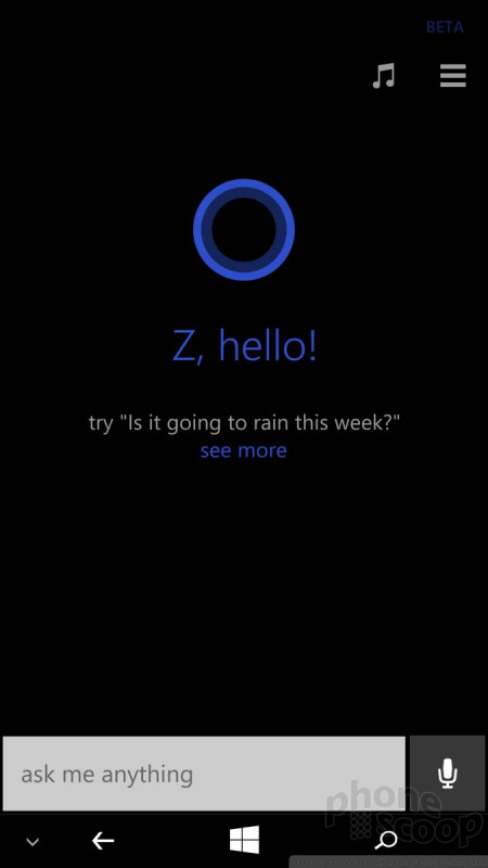
One of Windows Phone 8.1's biggest features is Cortana, Microsoft's voice-activated assistant. Cortana is similar to Google Now in Android and Siri on the iPhone. You can use Cortana to perform voice searches, dictate messages, and keep track of your flights and/or calendar. I've been using Cortana for several months now and have come to really like it. The reminders feature is one of the best. For example, you can have Cortana remind you to ask about a friend's health the next time you talk to them. When you call that person, the reminder will pop up. Cortana also parses the internet for items related to your interests, such as news headlines, sport scores, the local weather, and more. Cortana controls quiet hours and inner circle. Quiet hours are used to silence notifications during set periods of time, such as at night. The inner circle represents the closest of close contacts, typically family members. You can use Cortana to offer the inner circle access to you even during quiet hours. Last, Cortana can be used to listen to a song and search for it on the internet. I find Cortana isn't as good at this as other third-party apps, though. In sum, Cortana is a great feature worth exploring. It functioned perfectly on the One for Windows.
GPS
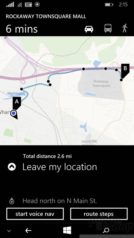
The One for Windows includes a solid mapping product, but not the advanced navigation apps available to Nokia's Lumia devices. The native app will provide directions, but only in list form. VZ Navigator also provides basic driving directions in list form. If you want step-by-step, voice-guided navigation you need to pay Verizon $5 per month. These basic mapping products are good for discoverability, (especially with Windows Phones' Local Scout tool,) but this is an instance where I really miss the Lumia-exclusive apps, such as HERE Drive and HERE Transit.
Wrap-Up
The One for Windows is a solid effort from HTC. The hardware is quite good, and possibly the best available for the Windows Phone platform. The device truly conquers the basics, with an excellent screen, great audio quality, superb performance on Verizon's network, and killer battery life.
The Windows Phone platform looks and performs great on the One for Windows. I had no trouble with any of the apps or services on board, and it processed everything at blazing fast speeds.
HTC's additions to Windows Phone aren't as extensive as Nokia's, but tools such as Sense TV and HTC Photo Edit - with its 3D effects - are neat extras. The camera is powerful and produces results that are very good. I wish the navigation tools were a little bit better, but that's hardly the worst complaint I can levy against the phone.
Simply put, the One for Windows is a great Windows Phone. Heck, it's a great smartphone, period. Be sure to check it out.
Comments
No messages






























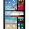 Hands-On: HTC One for Windows Phone
 Motorola Gets Serious About Foldables with New RAZR Lineup
 Fairphone 4 Comes to the US
 Google's New Fitbit Blurs the Line Between Tracker and Smartwatch
 Boost Updates its Celero Phones for 2024
 HTC One (M8) for Windows (CDMA)


