Hands-On: Sony Xperia Z3, Z3 Compact, and E3
Sep 3, 2014, 12:23 PM by Eric M. Zeman
updated Sep 10, 2014, 11:48 AM
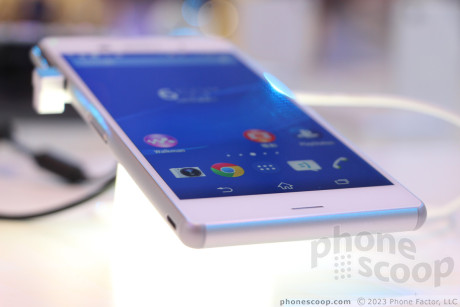
Sony revealed a new line of Xperia Z-class devices today, including the Z3 flagship and its close cousin the Z3 Compact. Here are our first impressions of these two winsome handsets, in addition to the mid-range E3.
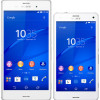
Sony's new trio of smartphones are a handsome lot. They carry over the same design language Sony has been using for several years now, but make some nice refinements that go a long way to improve the overall appeal of the devices. The Z3 and Z3 Compact share nearly all features, save for the shape and screen, while the E3 is a mid-range handset that borrows heavily from its higher-spec'd cousins.
Z3
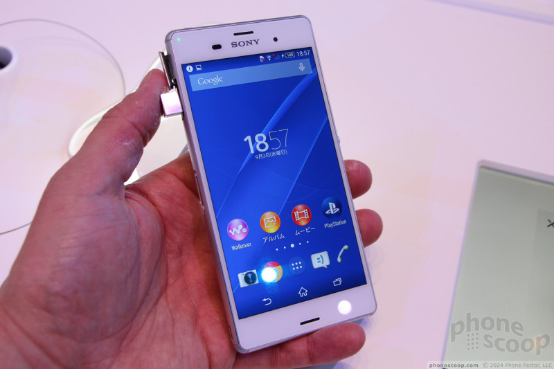
The Z3 is an impressive piece of work. It ranks right up there with Apple and HTC in terms of industrial design and manufacturing. The phone makes use of Sony's Omnibalance design, which means it has a metallic frame rimming the outside and two pieces of glass forming the front and rear surfaces. Sony has refined this design over the years, and the progression from Z1, to Z1S/Z2, and now Z3 has been steady, if not a bit slow.
The overall look is sleek and slim. It looks high-tech, and it is. The Z3 is one of the slimmest devices ever made by Sony at 7.4mm thick. It hardly has any weight. Sony did itself a big favor and was able to reduce the overall size of the handset by slimming down the bezels around the display. The Z line has always been beset by bezels that are way to thick, which give them an odd look. The thinner bezels of the Z3 not only improve its look, but also make it easier to hold and use.
The exterior frame is made of aluminum. It has a lot of hatches, ports, and other doohickeys interrupting what could otherwise be a svelte look. The corners and edges are nicely rounded, which help the device fit better in the hand and your pocket. The aluminum and glass combination is hard not to like. The glass surfaces are silky smooth, though the back surface is particularly adept at collecting fingerprints.
The left edge has a moderate hatch to protect the charge port, while the right edge has a larger hatch to protect the SIM and memory card ports. The Z3 is waterproof, but only if these hatches are firmly sealed. I dislike interacting with them, but the aren't too bad. The left edge has a dock built in, while the right edge has three buttons lined up. The screen lock / power button is the typical, overlarge round knob we've seen on Sony handsets since 2012. It is easy to see, easy to find, and has excellent travel and feedback. I can't say as much for the volume toggle, which is under the power button. It is too short, and somewhat narrow. It is hard to find, and even harder to press up when you mean up and down when you mean down. I wish it had nubs or some other way for your thumb to tell where it is on the button. The dedicated camera button is positioned close to the bottom. It has a good profile and good two-stage action. The stereo headset jack is on top and does not require a hatch.
The screen is absolutely gorgeous. At 5.2 inches and 1080p HD, it simply looks great. Sony said it was able to generate two times the brightness with the TriLuminos / Mobile Bravia Engine technology - and I can tell. It is significantly more appealing than the displays of Sony's earlier Z devices.
Sony's user interface hasn't changed much over the years. Sony's own apps have evolved little, but that's fine since they have worked well. The camera app is more or less carried over from other Sony devices. Speaking of which, the camera is impressive. It has a 20.7-megapixlel monster with an Exmor R sensor, 25mm G Lens, and optical image stabilization. Sony worked hard to improve the audio performance of the device, both in terms of play back and capture. It features noise cancellation to help clarify audio captured along with 4K video.
T-Mobile is going to sell the Z3 in the U.S., and Sprint might. If you have ever been tempted by Sony in the past, the Z3 will likely convince you to take the leap.
Z3 Compact
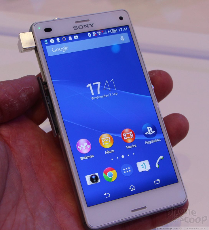
The Z3 Compact is nearly as good as its larger brother, but it makes a few key concessions that impact its desirability - at least as far as I am concerned. To start, it loses the aluminum frame. Instead, it has steel corners to help protect against falls. In between the four corers is some sort of plastic / polycarbonate. It is really smooth, and even translucent, but it doesn't hold the appeal of the aluminum. This plastic rim is broken up just like the Z3 with buttons and hatches. Most are the same, but the volume toggle is so small as to be nearly worthless. It is flat-out impossible to tell if you're pressing it up or down.
The Z3 compact also downgrades the screen. It measures 4.6 inches across the diagonal and runs 720p HD resolution. The smaller size helps keep the pixel density rich, and Sony used all the same display technologies to give it maximum sharpness, clarity, and brightness. Though it is a shame to lose full HD, the smaller screen is still impressive. Sony kept the bezels nice and thin.
Other than these changes, the design is nearly identical. It has the same glass front and back surfaces, and the same internals. It's more compact measurements may appeal to those who don't like phablets or large-screened devices. It is certainly easier to use one-handed than the larger Z3.
It will do well, depending on how Sony prices it. None of the U.S. carriers have said they'll sell it yet, but that may change.
E3
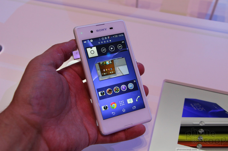
The E3 is an interesting tag-along at IFA. It is a mid-range handset (maybe even low-end). It steals the design of the Z3 Compact, but uses plastic materials and other down-graded specs in order to drop the price point.
It is thicker than both the Z3 and Z3 Compact, and the materials definitely give the phone a mid-range feel to it. It has four rubber corners that are nicely curved. The corners are joined by a polycarbonate rails that form the side edges. The screen is smaller than the Z3 Compact's, but it is surrounded by a really thick bezel that increases the size of the handset in an unfavorable way.
The charge port is on the left side, but there is no hatch to protect it. The Omnibalance Design home button is on the right edge, as is the volume toggle. The E3's volume button is much better than those of the Z3 and Z3 Compact. It does not have a dedicated camera button. The headphone port is on top.
The 4.5-inch screen carries a disappointing 854 x 480 pixels. It would be nice if Sony had opted for qHD, but since the display is the most costly component, the low-res screen helps drop the price. It is certainly bright and colorful, though. The back panel is made of polycarbonate and it has a soft-touch finish to it that gives it some good grip.
The E3 also downgrades the internal specs heavily. It has a 1.2GHz Snapdragon 400 processor, 5-megapixel camera, VGA user-facing camera, and 1GB of RAM, instead of 3GB. I noticed it ran a bit slower than the other two devices, though that could be attributed to the pre-release nature of the handsets on-site in Berlin.
None of the U.S. carriers have voiced their support yet for the phone, but it would be a good bet we'll see it offered from a prepaid carrier.
Comments
Z3 Compact on Verizon Please!?








 Review: Sony Xperia Z3 for T-Mobile
 Review: Sony Xperia Z3v for Verizon Wireless
 Sony Pushing Marshmallow Concept to Testers
 Sony Xperia Z3+ Is a Z4 for the Rest of the World
 Sony Shows Off Xperia Z3, Z3 Compact, Z3 Tablet
 Sony Xperia Z3v
 Sony Xperia Z3
 Sony Xperia Z3 Compact

