Review: Apple iPhone 6 Plus for AT&T
Sep 23, 2014, 3:30 PM by Eric M. Zeman
Apple's latest smartphone is a huge addition - literally and figuratively - to the Mac-maker's iPhone lineup. The 6 Plus sports a huge screen, powerful iOS 8 operating system, and a no-holds-barred approach to what a phablet can and should be. Here is Phone Scoop's in-depth report.
It It Your Type?
The iPhone 6 Plus is the bigger of the two new iPhones. If you've been longing for a large-screened smartphone from Apple, the 6 Plus is it. It's a well-built phablet that excels in the way only Apple products can. That's not to say it doesn't have a few flaws.
Body
Mark 2014 as the year Apple went big. Finally. After years of people complaining about the small screens of its iPhones, Apple responded to market pressure and produced two larger smartphones. The 6 Plus is a phablet - a large-screened device that often requires two hands to use effectively. If you want maximum iPhone, this is it.
Apple changes the iPhone design every other year. The iPhone 5s looked pretty much the same as the iPhone 5, so Apple was due to debut brand new hardware with the iPhone 6; that's exactly what it did. The 6 and 6 Plus look quite different from earlier iPhones.
Apple stuck to a minimalist design language. The 6 Plus uses a mix of aluminum, glass, and plastic (eek!) to form the outer skin. The shape of the device is simple and straight-forward. It is elegant and refined. The metals look and feel good. Apple tapered the edges of the glass so it meets the aluminum frame in a smooth seam. With the rounded side edges, the overall effect creates a smooth device that's comfortable to hold and use, despite its size.
Speaking of size. Yeah, it's big; but it's not too, too big. The 6 Plus is smaller than the Galaxy Note 4, for example, though the Note 4 has a slightly larger screen. That means I was able to use it one-handed much of the time, but not all of the time. Apple added a software trick to make the stuff lining the top of the 6 Plus's screen easier to reach: tap the home button twice and the all the content of the screen slides down so your thumb can tap it. This function works pretty well and reduces how often you have to resort to two hands to use it. The 6 Plus is impressively thin and light. It isn't heavy at all and at 7.1mm thick, few devices can claim to be thinner. The 6 Plus fits in my pockets pretty well. I didn't have any trouble stuffing it into even my tightest jeans. If you're a small person who wears small clothes, however, the 6 Plus may not work for you.
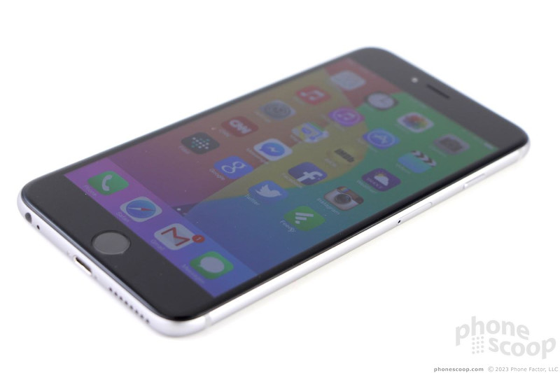
As is typical of iPhones, there are thick bezels above and below the screen. Apple is sticking with its over-sized, circular Home button below the display. In keeping with Apple's design principles, it also likes balance. This means the bezel above is as thick as the bezel below. The bezels along the sides are slim, but not the slimmest I've seen. Bottom line: the screen is swimming in more framing than some competitive phones (think LG G3). The Home button, which also acts as a fingerprint reader, is a depression in the front surface. It is dead simple to find and use. Travel and feedback is good, but I've felt better. There's a tiny slit in the glass above the screen for the earpiece speaker. The user-facing camera is little more than a pinhole.
Apple has long favored a three-button setup on the left side of the phone. There's a switch at the top that sets the phone in either ring or silent modes. It's a good switch. Below that are two separate buttons for the up and down volume functions. The buttons are dashes that have great profiles and even better travel and feedback. The up button doubles as a shutter release when using the camera.
Apple wisely moved the screen lock / power button from the top to the right edge. At this size, there's no way anyone could reach it on the top. The screen lock button of most phablets is on the right side, so Apple is simply joining the pack. The button itself is of decent size and shape, and works really well. The tray for the SIM card is built into the right edge, as well. You need a paperclip or SIM tray tool to eject the tray. Most people will probably never bother with it. The iPhone 6 Plus takes a nano SIM card.
Both the stereo headphone port and Lightning port are on the bottom of the phone. It's annoying that the Lightning port is proprietary and doesn't work with standard USB cables. However, it is among the strongest, easiest ports in which to jam a cable. It's especially useful that the Lightning port is reversible and accepts the cable in either orientation. There are also drilled holes on the bottom for the single, mono speaker. It's a bit of a shame that Apple didn't include stereo speakers, especially considering how many people will probably use the 6 Plus as a mobile movie device.
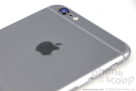
The back surface is mostly aluminum, but there are lines running from side to side that help frame out two plastic panels at the top and bottom. The plastic panels, which allow the wireless radios to function better, are a bit of a let down. Apple used glass for these panels on the iPhone 5 and 5s. The plastic just isn't up to snuff, and I'd even call the seams somewhat uneven in places. This is the one real detractor of the hardware. Apple should have stuck with the glass, even if it added a little weight. The upper plastic panel houses the camera module, which is the first on an iPhone to protrude from the body of the phone. I've seen some criticism online about this design choice, and I find it a bit unwarranted. The number of smartphones that have protruding camera modules is innumerable. The slight protrusion means the iPhone 6 Plus gets a better camera. It is the smallest of compromises. As with all iPhones, the phone is sealed up tight; there's no access to the battery at all, nor is there support for expandable memory.
The iPhone 6 Plus is a really good piece of hardware from Apple. As far as phablets go, few are as refined, well-built, usable, and attractive.
Comments
The phone bends in your pocket
connecting phone to your car UVO
Phonescoop is soooooo hilariously hypocritical
Except that it misses many key features already available on the Note 3. You might conveniently dismiss the missing features, but that hardly justifies your statement here.
>> Apple went big. Finally.
In your articles and on the forums you guys have constantly and consistently maintained your position that small screens are better, even if everyone else disagrees with you. You couldn't be more hypocritical if you tried.
>>and plastic (eek!) to form the outer skin.
This is probably the only place in the article where you don't sound like an Apple apologist. I commend you for at least maintaining your position on build materials.
>> The 6 Plus is smaller than the...
(continues)
Lololol at this review. It's a piece of garbage with how fragile the device is. There are countless reports out about people bending their brand new iPhone 6 Plus in their their pants. 🤣
http://gizmodo »...
(continues)
"Speaking of which, the Note 3 is a large p...
(continues)
At the end of the day...
For anyone who is on the fence, wait until Oct 17th and buy a Note 4. Don't fall for Apple's B.S. all because they have a "big phone"now. Please. Watch them include a stylus with the 6S Plus (you know theres gonna be one) and call it innovative. 🙄
P.S. If you're on T-Mo, the Note 4 will have LTE Band 12 (700Mhz) which the new iPhones don't.
http://www.con »...
(continues)
Larger, not smaller than Note 4




 Review: Otterbox Universe and Olloclip 4-in-1
 ReSound Smart Hearing Aid Connects To Your Phone
 Twitter Adds Landscape Support to iPhone 6 Plus
 Twitter's Periscope App Powers Live Video Streaming
 Google Calendar for iPhone Now Available
 Apple iPhone 6 Plus


