Review: Samsung Galaxy Note 4 for AT&T
Media
There are no fewer than 10 different apps for media consumption on the Note 4.
First, the Play Store and its associated apps (Books, Games, Movies & TV, Music, and Newsstand) are all available, as is Google's YouTube application. These apps behave the same on all Android devices and the Note 4 is no different.
AT&T Mobile TV in available if you don't mind paying an additional monthly fee to stream TV and movie clips to your phone. Mobile TV has been around forever. It performed fine when LTE was available.
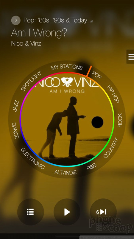
Samsung-branded apps include an MP3 player and video player for side-loaded content, as well as its Milk music service. Milk is free to use in the U.S. on Galaxy devices and has a really nice UI. Milk's content all comes from Slacker Radio. You need to sign in and create a Samsung account if you want to access the best features (offline playback).
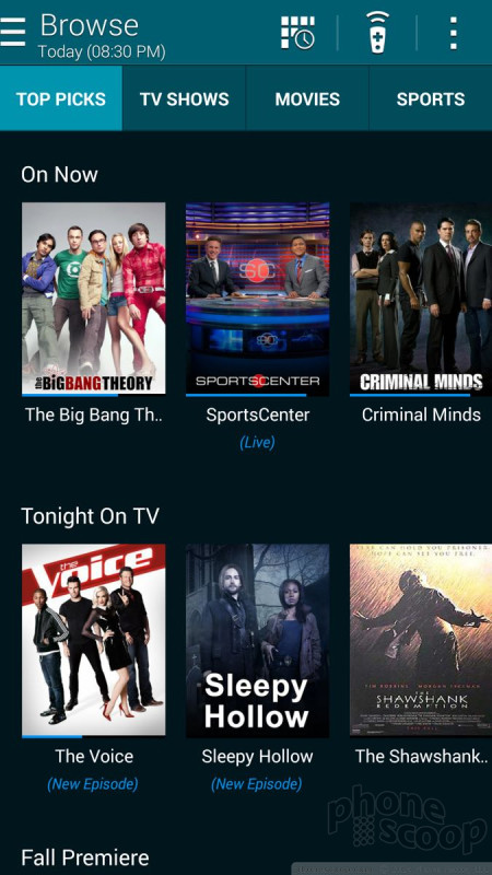
The Samsung Smart Remote is also on board. Smart Remote serves two purposes: it controls your home theater equipment, and surfs your cable provider's content guide. As always, I had no trouble using the app and Note 4 to control my TV, receiver, and TV box. The content guide uses the Peel Engine. It's pretty good as far as showing the actual guide for your local provider, and lets you surf for stuff to watch without using the guide on your TV set.
How does 1080p HD content look on the Note 4's screen? Well, that's an interesting question. Some of it looks good, but much of it looks really, really bad. We've reached out to Samsung for an explanation of how the Note 4 handles or scales 1080p HD content. It's a bit like watching non-HD content on an HD TV. Let's just say that my Google Play purchases didn't look so great when I watched them on the Note 4.
Music sounded great through my favorite headphones, but I think it's rather lame that the Note 4 doesn't have stereo speakers. It's good for sharing video content with others, but the crummy mono speaker just doesn't cut it.
Camera
The Note 4's camera app is almost a clone of the one found on the Galaxy S5, but Samsung added some really cool extra tricks to make it unique. The camera can be opened from the lock screen shortcut or from the home screens. There is no dedicated camera button.
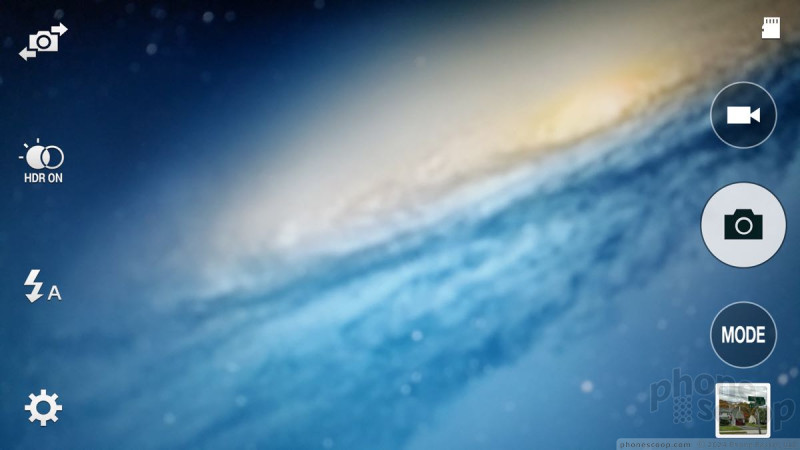
The viewfinder fills the entire screen; the controls float within. There are some quick settings available on the left side of the screen, including a toggle for the user-facing camera, HDR, and the full settings. The action buttons on the right include a dedicated video camera button, a separate shutter button, and access to the various shooting modes and gallery.
Press the gear icon in the lower-left corner and a strip of five basic choices appears: full menu, image size, effect, time, and flash. I prefer to have the flash control on the main screen. Guess what? All you need do is drag it from the control strip over to the action buttons and there it is. The full settings are organized in a grid of icons. Further, it is customizable; You can drag the icons for the settings around in the grid and arrange them however you like. The Note 4 offers control over picture size/resolution, metering modes, stabilization, timer, white balance, exposure, guidelines, shutter sound, and on. Basically, everything you need is there.
Samsung has pared the shooting modes down to just four: auto, rear-cam selfie, selective focus, and panorama. The phone includes beauty face, shot & more, virtual tour, and dual camera, as well, but they are relatively hidden. They're now settings instead of a top-level mode. We've seen all these modes before except for rear-cam selfie, and it is perhaps the most useful idea Samsung's come up with.
The rear-facing camera is typically better than the user-facing camera. With rear-cam selfie activated, users can include themselves in shots using the rear-facing camera without asking fellow tourists to help. The Note 4 opens a small window on top of the camera's viewfinder. You position that box where you want to be in the image, such as in the middle, or the left side, or the bottom corner, etc. Then you turn the Note 4 around so the main camera is facing you. When the Note 4 senses your face is in that box, it will give you an audible alert and then count down and take the image.
That's not the only selfie mode on the Note 4. The user-facing camera has its own nifty new feature: it can take selfie panoramas. Point the selfie cam at yourself and then pan left and right to create a wide-angle shot with you in the middle. You can also use voice commands to control the camera.
Samsung just might be getting this camera software right.
Photos
The Note 4 has a 16-megapixel main camera with optical image stabilization. It produces excellent results. I was thoroughly impressed with the Note 4's ability to capture perfect exposures with vibrant color and sharp focus. It was particularly impressive in low-light thanks to the OIS. I took some shots sans-flash that looked as sharp as any I've captured under the bright sun. It performed well at a concert, (a notoriously difficult environment,) as well as in brightly lit soccer arena. I'd say the Note 4's camera is as good as — if not better than — the iPhone 6 Plus's camera. It's that good.
Video
The Note 4 records video up to Ultra HD (4K) resolution. Interestingly, when you capture 1080p HD (which is the default setting), it's played back in a small 1080p window on the Note 4's screen, i.e., in its natural resolution. You can expand it to fill the entire window, but it's best to judge the results on a computer. The intermediate WQHD video format looks best on the Note 4's screen, for sure, but the Ultra HD capture mode isn't worth using unless you have a 4K monitor.
How does it look? Well, I think exposure, white balance, and focus are all spot on most of the time. I noticed a lot of weird motion, though, and obtained the best results when both the Note 4 and I were absolutely still. I wasn't too pleased with the audio quality, either, which came across as somewhat choppy.
In short, with just a couple minor reservations, it excels at capturing everyday moments, and can even serve as a video cam stand-in at some important functions.
Gallery
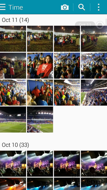
The Note 4 uses a Samsung-designed gallery application, which offers some fun extra features. The device will automatically sync thumbnails from your Google+ and Dropbox accounts, but you can thankfully turn these off. There's a drop-down menu accessible from a button at the top of the screen for sorting between albums. Images can also be filtered by people, scenery, documents, and vehicles. (Apparently Samsung thinks most people frequently take photos of their cars.)
When you dive down into the individual galleries, the Note 4 goes into a split-screen mode: a vertical list of your galleries forms a strip along the left edge of the screen, and the rest is reserved to show larger thumbnails of the images in the particular gallery you chose to view. You have to press one of the thumbnail images to go into a full-screen view of that image. The entire screen of thumbnails can be pinched to make them smaller or enlarged. This can be a really good birds-eye view of an entire album at once if it has a lot of images. Once you open a single image, you can swipe through photos and share quite easily thanks to the numerous options in the gallery app.
The editing features are extensive. No only does the Note 4 offer crop, resize, and rotate, but it includes a number of handy tools for making OK photos exceptional. It allows users to adjust brightness, contrast, saturation, and red/green levels. It includes a number of Instagram-like effects. There's a suite of tools for touching up portraits, such as red-eye reduction, airbrushing, and blurring. I like the UI animations here. Samsung did a good job making the editing tools fun to use.
The Note 4 also includes the Google+ Photos app, which can be used to sync and backup images to your Google account.
Apps
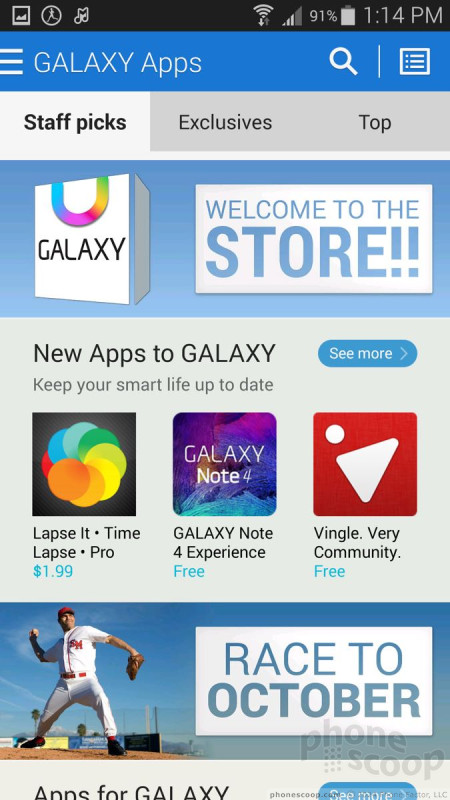
Good lord, AT&T! I've never seen so much bloatware on a single phone in all my life. There are 15 AT&T-branded apps/services on board, most of which are superfluous junk you'll never use. (Yellow Pages, really?) Samsung has crammed its fair share, too. There are tons of Galaxy Apps installed, as well as an entirely separate Galaxy Apps Store. The amount of crap on this phone is almost overwhelming. Worse, you can't uninstall most of it: you can only hide it.
Bluetooth
The Note 4 supports Bluetooth 4.0 LE. I was able to pair it successfully with a number of different devices, including wearables, headsets, and speakers, as well as other smartphones and PCs. Phone calls routed to a headset offered mediocre quality; in-call volume was pretty decent. Music sounded good coming from Bluetooth speakers, but I've heard better.
Browser
The Note 4 ships with an AT&T-skinned version of the stock browser in addition to Chrome. The AT&T app has toolbars that come and go as you browse through sites. One at the bottom offers basic back, forward, home controls, as well as a link to your favorites and a notepad. The top navigation bar lets you type in web addresses as well as manage tabs and so on. The browser does a fine job of rendering web sites and was quick over AT&T's LTE network. Chrome is Chrome. It looks and acts the same way as it does on other Android devices. It performed well on the Note 4 and AT&T's network. There's definitely something uber-satisfying about browsing on the Note 4's huge, hi-res screen.
Clock
You can choose to put a clock on the lock screen or not. It's your call. If you do, it'll be a large, white, digital clock positioned near the top of the screen. The weather can be paired with it, which shows the current conditions wherever the Note 4 happens to be. I wish you had more control over the lock screen clock.
GPS
AT&T Navigator and Google Maps are both preloaded. The Note 4 performed excellently as a navigation tool. It pinpointed me in about 5 seconds consistently, and had no trouble plotting routes and finding nearby points of interest. Google Maps is free, of course, and Navigator carries a monthly fee. Maps offers all the same tools as Navigator, plus features such as Street View.
Private Mode
The Note 4 gains Private Mode, a special, sealed-away part of the OS that debuted on the GS5 earlier this year. Private Mode is mainly meant to protect sensitive files. It can interact with the photo gallery, the Google+ Photo app, the MP3 and video player apps, as well as the file browser. You can, in effect, hide pictures, songs, and videos you don't want others to see or hear. Though pictures will technically exist in the gallery app, they can only be viewed when in private mode, for example. Private Mode could certainly be appealing for business users, as it lets them lock away work files if they wish. It can also come in handy for those who like keep… sensitive… personal content on their phone, and take comfort that others won't be able to view it.
S Health
The Note 4 has a heart rate monitor and runs the same version of S Health we saw earlier this year on the GS5, though it gains two new features.
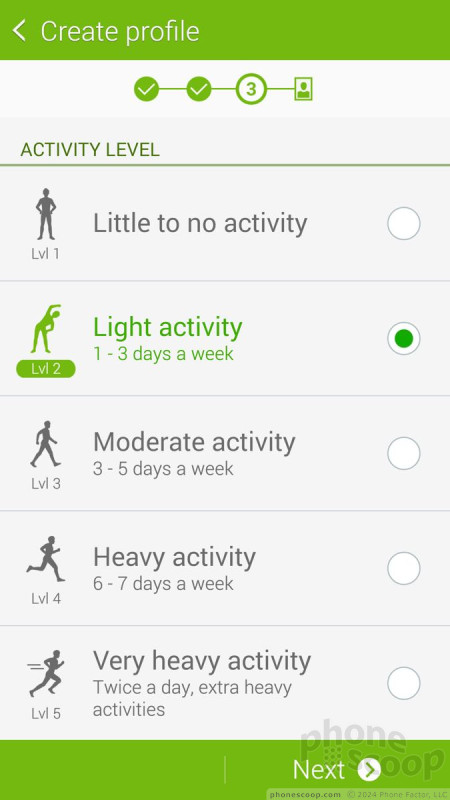
The app can be used as a fitness pal and diet planner all in one. S Health forces you to create a profile, including your age, sex, height, and weight. It automatically calculates your body mass index and asks how active you are in general. You can use the app to track walks, runs, hikes, and bike rides.
The Note 4 has a built-in pedometer and heart rate monitor. Pair these with the calorie tracker and you really have a good idea of your fitness level. I found the pedometer to be fairly accurate at counting steps and measuring approximate distances. The heart rate monitor was also accurate, as it delivered the same result that my treadmill did. The one bummer is that you have to be still to track your heart rate. This means you can't track while you're actually working out. You have to stand still for 30 seconds with your finger on the sensor to get an accurate reading. That kind of stinks. I was hoping Samsung would have improved this since the GS5's release, but those hopes were dashed.
S Health gains the ability to gauge your blood oxygen level, sometimes referred to as pulse oximetry. This lets you know how efficiently your body is absorbing oxygen and delivering it to your cells. S Health will also try to assess your stress level with a combination reading of your heart rate, pulse-ox and how they relate to one another. Despite the fact that I was totally chilled out on my couch relaxing, the Note 4 told me I was semi-stressed. I'm not sure how much stock I put in that result.
S Health is a solid fitness partner, there's no doubt. I wish it worked with my FitBit, though.














 Hands on with Samsung's Galaxy Note 4
 Liveblog of Samsung Galaxy Note event
 AT&T Selling Samsung's Virtual Reality Headset
 Samsung Releases Milk Video
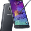 Samsung Note 4 Is More of A Big Thing
 Samsung Galaxy Note 4 (GSM)


