Review: Samsung Galaxy Note 4 for AT&T
Oct 15, 2014, 8:00 AM by Eric M. Zeman
Samsung is back with a new Note. This time around Samsung went bolder, but not necessarily bigger, with the Note 4. One might call it the ultimate phablet. Here is Phone Scoop's full report on one of the most anticipated Android smartphones of the year.
Form
Is It Your Type?
The Galaxy Note 4 is Samsung's top-of-the-line device. It boasts the best of everything. Its bells and whistles are stuffed with bells and whistles. The Note 4 is for those who want it all: the ultimate in size, screen, camera, multitasking, and productivity. It is a beast of a phone, and one of Samsung's finest efforts.
Body
When approaching the Note 4, Samsung said it decided to listen to customer feedback. It took to heart some of the complaints levied at its design and material choices and aimed to correct them. In that respect, Samsung partially succeeded. The Note 4 is a step up from the Note 3, no doubt, though it carries over many of the basics that have defined the Note series from the very beginning.
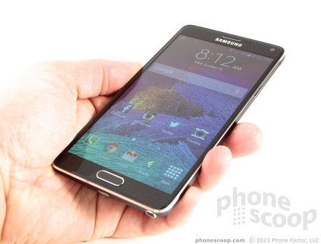
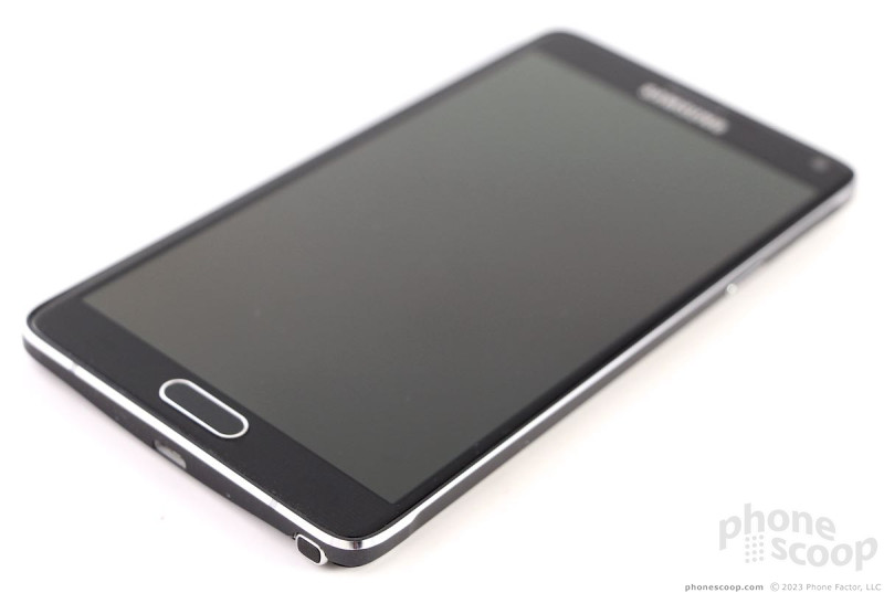
The Note 4 is a classy - if busy - device. There are different shades, materials, angles, and surfaces all over the place. The front is glass, the side edges are aluminum, and the back is polycarbonate. You'll see black, gray, and chrome-colored accents. It borders on chaotic, and is the antithesis of Apple's minimalistic approach to design. The front glass is smooth and curves downward ever-so-slightly right where it meets the aluminum frame. The frame itself is half painted and half polished. The frame has chamfers where it joins the front and back surfaces, and the chamfers are bare, gleaming metal. I honestly can't understand why Samsung painted the rest of the frame. I think it would look better if the entire frame were polished. The back cover carries over the faux leather look from last year's phone, but does away with the cheesy fake stitching. It looks better.
As with all phablets, the Note 4 is sizable. It measures 6.04 x 3.09 x 0.33 inches, which is slightly smaller than the Note 3 (5.95 x 3.12 x 0.33 inches), and the iPhone 6 Plus (6.22 x 3.06 x 0.28 inches). It is the heaviest of these three devices, probably due to the aluminum frame. I would call one-handed usability of the Note 4 and iPhone 6 Plus about dead even. I have a hard time reaching the top portions of the Note 4's screen without adjusting my grip. Most often, I elected to use two hands instead of one. (The Note 4 has several software tricks to make it easier to use with one hand, such as moving the keyboard/dialer to one of the lower corners.) Despite the chamfers, the Note 4 has noticeable edges that feel a bit harsh against your palm. This gripe aside, the Note 4 is easily the highest-quality device Samsung has produced. It easily bests earlier generations of hardware. Like most big phones, the Note 4 will fit easily into some pockets and not-so-easily into others.
The Note 4's face is relatively clean. Only a few design elements interrupt the glass. Samsung has long preferred a physical button and the Note 4 is no different. The home button is wide and rimmed with a chrome accent. It has a great profile and superb travel and feedback. The Note 4 has two capacitive buttons, one to either side of the Home key. The Recents (or multitasking) button is on the left, and the Back button is on the right. Both offer haptic feedback if you wish and function perfectly. I didn't have any trouble finding or using them. The Samsung logo rests above the display, and is crammed beneath a cut-out in the glass for the earpiece speaker. The user-facing camera is plainly visible in the upper-right corner, and an alert light blinks in the upper-left corner.
Samsung has gussied up the side edges a bit. The Note 3 had a polycarbonate frame. Samsung traded the polycarbonate for aluminum. Like the frame itself, the buttons along the edge have been painted and polished. The volume toggle is on the left. The flat surfaces are painted the same gray as the rest of the side surface, but the edges of the button are polished to help it stand out visually. I like the result. The toggle itself has a great profile and excellent travel and feedback. Ditto for the lock button on the right side. There is no dedicated camera button. The headphone jack is on top and the USB port is on the bottom. Interestingly, the Note 4 ditches the USB 3.0 SuperSpeed port found on the Note 3 and reverts to the much more common (but slower) micro-USB High Speed port. The S Pen is tucked into the bottom edge and is easy to retrieve and replace.
Like its predecessors, the Note 4's rear cover is removable. The polycarbonate panel is far superior to those used on older phones. It's tougher, stronger, and flexible. You can bend it in half and not break it. I could live without the fake leather texture, but it's better than the Galaxy S5's dimpled band-aid look. It peels off with a bit of prying and snaps back in place just as easily. With the cover off, you have access to the battery, SIM card, and memory card slot. All three are easy to interact with. Many count the removable battery as a major selling point.
There's no question that the Note 4 is the best Note hardware yet.
Performance
Screen
The Note 4 has the same 5.7-inch screen size as the Note 3, but jumps from 1080p HD to quad-HD resolution. That means the screen goes from 2 million pixels to 3.7 million pixels, all crammed into the same dimensions. To call it amazing would be an understatement. The resolution is flat-out incredible. Everything on the screen is razor sharp. Samsung stuck to Super AMOLED technology for the panel. It's very bright and I had no trouble using it indoors or outdoors - even on a sunny afternoon. Viewing angles are superb; there's no change in brightness or color when the phone is moved around. Samsung's Super AMOLED displays do tend to over-saturate colors, and that's readily apparent on the Note 4. Colors look almost unnaturally strong. Despite pushing the colors a bit, you simply can't ask for a better display.
Signal
Our review unit performed very well on AT&T's network in and around New York City. It remained connected to LTE nearly 100% of the time. I saw it dip down to HSPA only a handful of times in areas where AT&T's cell sites were likely over capacity (such as a concert, sporting event, etc.) I didn't have any trouble making calls or surfing the web even when under the weakest coverage in the tri-state area. Data was definitely slower in those conditions, but still decent. The Note 4 did not drop or miss any calls during the review period. I'd call it an excellent cellular device.
Sound
I'd rate phone calls at just above average on the Note 4. The quality of calls ranged from crummy to really good, with most falling in the "OK" spot. Some people I spoke to sounded a bit robotic, and there was interference on several occasions. Earpiece volume is quite good, however. I had no trouble hearing calls in all but the loudest spaces. For example, the raucous crowd of a professional soccer game was unable to drown out a call. The Note 4 has noise elimination, which means the same crowd was inaudible to the person on the other end of the line. This feature can be turned on or off. The speakerphone isn't quite as loud as I'd like it to be, and the quality of calls definitely dips a little bit. I've heard louder, higher-quality speakerphones for sure (think HTC's BoomSound). Ring tones and alerts are generally quite loud. I didn't miss any calls for not hearing the ringer. Incoming bleeps and blurps for text messages and emails are also attention-grabbing. I thought the vibrate alert was a touch on the weak side. It's fine if the phone is in a tight pocket, but you might miss it otherwise.
Battery
The Note 4 has a massive 3,200 battery packed inside. It provides an adequate power supply for the Note 4, though it's not quite as good as the iPhone 6 Plus. The quad HD display requires lots of power. When I checked what was draining the Note 4's battery, the screen was most often the main culprit. All that said, I routinely achieved a full day's use from the Note 4 without waver. If I unplugged it at 8am, it generally had 30% power left by the time I went to bed around midnight.
Like many modern smartphones, the Note 4 has several tools to help manage battery life. The phone has both "Power Saver" and "Extreme Power Saver" modes available. The former covers the basics, such as dimming the screen and turning off extraneous apps and radios when not in use. The latter takes a more aggressive approach and shuts down major systems. It can grey-scale the screen, simplify user interface, and otherwise lock down anything beyond the core communications tools to save battery life. Most people people, however, shouldn't have to go to these extremes in order to get a full day from their Note 4.
The Note 4 uses Samsung's quick-charge technology. It can achieve a 50% charge in just 30 minutes when used with the included charger. The device also supports Qualcomm Quick Charge 2.0, and will charge expediently when used with QuickCharge 2.0-compliant chargers. Samsung recommends Note 4 owners use the included charger when possible.
Last, the Note 4 does support wireless charging when fitted with an optional rear cover.
Basics
Menus
The Note 4 runs the latest version of Android with Samsung's TouchWiz user interface on top. If you're keeping track, Samsung says it no longer refers to versions of TouchWiz. Instead of TouchWiz 5.0, it's just TouchWiz from now on. What we see on the Note 4 builds on the foundation set by the Galaxy S5 earlier this year, with some understandable adjustments for the larger screen.
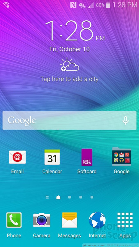
By default, the lock screen includes a software shortcut to the camera, but you can add more if you want. The lock screen can show one or two clocks, the date and weather, select notifications, and of course a series of different locks. One of the locks can be your fingerprint, thanks to the fingerprint sensor built into the Home button. Like the Galaxy S5, the fingerprint sensor needs to be trained, and it can store several different fingers if you wish. I had no trouble training it. It performs a bit better than the reader on the GS5. It more correctly read and identified my fingerprints on the first try. It's just unreliable enough, however, that I resorted to using a standard PIN for locking purposes. I'd put it on even footing with the iPhone 6/6 Plus Touch ID sensor. It works best when you use two hands - one to hold the phone and the other to swipe your finger. Swiping one-handed requires more dexterity than my thumbs can muster.
Anyone remotely familiar with Android will know exactly what to do with the home screen panels and app menu. There are multiple home screens live out of the box, with the leftmost reserved for Samsung's "Briefings" app (more on that in a sec). The panels are awash with shortcuts and widgets, but obviously these can all be removed so owners can personalize their device. The main app menu can be arranged in alpha order or by preference, but not in a list. You can hide apps easily, as well as use folders to reduce the amount of clutter.
Samsung revised the settings panel - again! - after GS5 owners complained about the confusing grid-array of tools seen in the GS5's settings menu. The settings can be viewed in a single, long list or in tabs. The problem with the tabs is there are too many (at least five by my count) and they stretch beyond the edge of the screen. This means you have to swipe the tabs left and right to see the entire lot of them. That's annoying. Settings are lumped together in the usual set of categories, such as Network, Sound & Display, Personalization, Motions, System, etc.
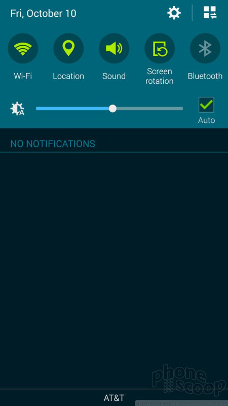
The notification tray is as useful as ever. The icons and toggles are easy to read and discern from one another. I dislike how much junk has become part of the notification tray, though. In addition to toggles for the radios and other controls, there's a brightness slider, another row of controls, and then the notifications. The extra controls take away valuable real estate from the notifications.
The Note 4 is another device to offer Samsung's Easy Mode, which is an optional, dramatically simplified user interface. It's meant for first-time smartphone owners and helps them get over the initial hump of using a touch screen device. It makes icons and text larger, removes home screen panels, and dumbs down the menus into simple lists. On the Note 4 its benefits are even more impressive, as icons and text are downright huge. It even has a "magnifier" tool to help enlarge anything in front of the camera.
The Note 4 also offers a one-handed mode, which shrinks the UI down by about 25% to one corner. The idea behind one-handed operation is to make elements such as the keyboard, dialpad, and other controls align with the side of the phone so you can reach everything with your thumb. With its 5.7-inch screen, my big hands can't stretch all the way to the upper corner unless I reposition the phone or use this mode. The one-handed mode can be turned on with a quick (very quick) back-and-forth swiping gesture. This gesture works better on the GS5. I found it unreliable on the Note 4.
The Note 4 is among the first devices to ship with the Qualcomm Snapdragon 805 processor, which is a top-of-the-line engine. There's no need to worry that the Note 4 doesn't perform. It has four cores clocked at 2.7GHz and I can tell you that this device absolutely screams. It never felt slow or bogged down. It's always quick on its feet. Apps open in a blink, animations and screen transitions are smooth, and apps download and install incredibly fast.
Multitasking
Multitasking is one of the Note series' defining features and Samsung made it even better on the Note 4.
For starters, the number of apps that are compatible with the multitasking function has roughly doubled. Further, the tool is simpler to use. On earlier Note devices, you had to enable multitasking in the settings menu. After you did this, a little tab floated along the side of the screen all the time so you could call up the multitasking apps. I hated that little tab. Now, a long press of the Back key opens up the tray for multitasking. I like this better.
As before, you grab any two apps from the tray and drag them to the screen. Resizing the windows is vastly easier thanks to a dead-simple tool. Further, more content can be dragged between the windows. For example, I was able to snag several screen shots from the gallery and dump them into the Scrapbook app.
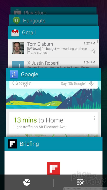
The Note 4 also makes a nice visual improvement to the app switcher. A long press of the Recents key calls up a vertical 3D carousel with apps floating on cards. You can cycle through the carousel to see all the recently-used apps, as well as close any apps that you may no longer want running in the background. It's much more appealing than the old app switcher.
Last, Samsung reimagined what it called Pen Window on the Note 3. Basically, any app that can run in the multitasking environment can also run as a reduced-size app on top of other apps. For example, I was able to load a map in the background and then open the camera on top of it. I could interact with the Map to see where I was going, but kept the camera open in case I saw something cool. Samsung calls this the Pop-Up View shortcut. When first opened, each app runs in a 1080p HD window on the screen. However, you can resize the Pop-Up View to fit as much or as little of the screen as you want. The Pop-Up View works similar to QSlide apps on LG's devices.
There's no doubt the Note 4 is the king of multitasking on smartphones.
Calls and Contacts
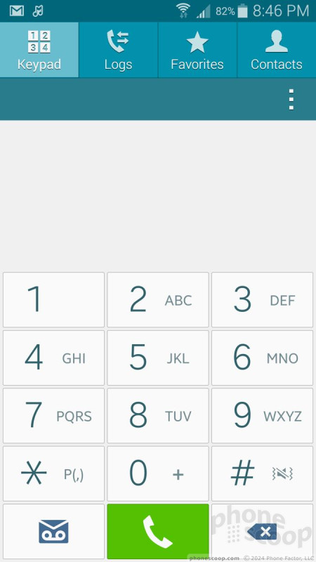
The phone app offers more customization than is available on most other handsets. When the dial pad is visible, tap the menu button and you'll see an options screen for the phone. Here is where you can set rejection behaviors, alerts, set up voicemail, and control the accessibility functions. You can turn on/off noise cancellation, too. It's quite a long list.
Other than the added settings, the contact app behaves more or less like the stock Android contact app. Favorites are accessible from a tab at the top of the phone app, as is the entire contact database. There are standard home screen shortcuts for direct access to a contact on the home screen panel, as well as a direct dial, and direct message, but there isn't a larger widget for your favorite contacts. Each individual contact card can hold tons of details about each person.
Messaging
You won't be surprised by any of the messaging tools on the Note 4. The standard Android apps are all present and accounted for, which means Gmail, email, Hangouts, and messaging. You can select either the messaging or Hangouts apps to handle SMS duties. Samsung's ChatOn and AT&T's Messaging apps are both missing in action. So, too, are Facebook and Twitter. If you want anything other than the stock apps you'll have to download them from the Play Store yourself.
Perhaps AT&T has caught on that people will use the over-the-top messaging apps (WhatsApp, SnapChat, Skype) of their choice.
Briefings
Briefings is a repackaged version of Flipboard. I'd call it Flipboard Lite. (Samsung's standalone My Magazine app, which debuted on the GS5 earlier this year, must have been a total flop. It's gone.) Briefings has some visual appeal, but lacks the extensive filtering options and news sources available to the full Flipboard app. For example, you can choose only three subjects of interest, which the app will then package together and show you. The full Flipboard app is installed, but you need to open it directly to get the full Flipboard experience. Weird.
S Pen
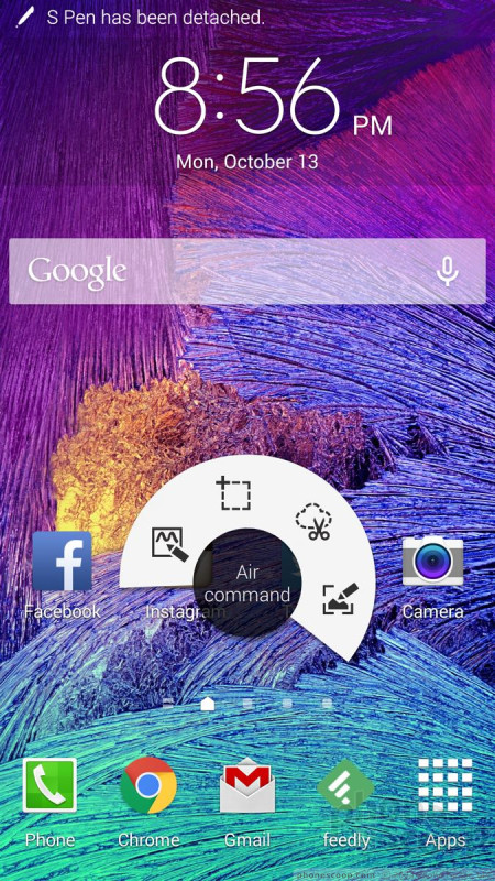
Samsung made only minor adjustments to its S Pen and the associated software. First, the S Pen itself is even thinner and sturdier than earlier models. The button is easier to find and has better travel and feedback. According to Samsung, the software that interacts with the S Pen is much more sensitive to pressure. It now senses more than 2,000 levels of pressure, twice that from the Note 3. Samsung claims it's more like writing on paper than ever. (Instant Judgement: Um, nope, still feels like writing on glass to me.) Pulling the S Pen out automatically launches Air Command.
Air Command
Air Command is a small pop-up menu that lets you access the different S Pen tools. The Air Command menu itself can be dismissed or called up with the stylus (when you press the stylus button and hover). It comes and goes as needed and offers one-tap control over the essential stylus functions.
Action Memo
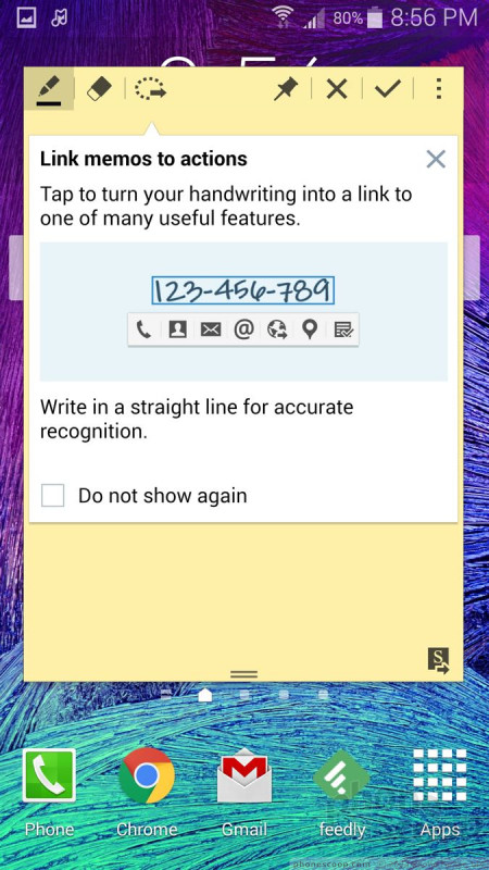
The most useful tool in Air Command is the Action Memo. You can use the stylus to write notes or whatever content you're in the mood to create. The real use, though, is adding actions to the text you've written. The app lets you write down a phone number, for example, and then use the action tool to call it, add it to a contact, send a message, perform a web search, and so on. It does this by reading your handwriting, but it's more than that. In effect, the memos you write are now actionable, thus Action Memo. It's really useful if you write down an address and then want to open it in Google Maps, or if you write down a web address and want to open it in the browser.
Smart Select
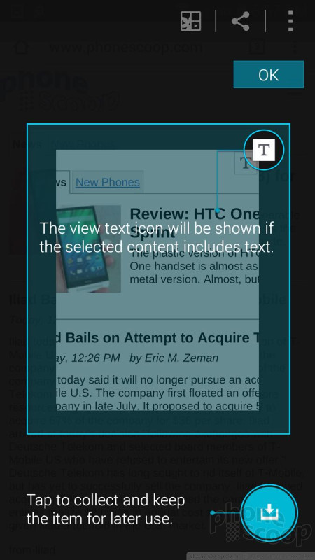
This tool does more or less what the name implies. Using the Pen, you draw a square or rectangle against some content you want to capture, such as a web page. The tool will then grab the text, images, hyperlinks, and the actual web address of the web page you select. This is very handy if you want to send someone the specific details from a web page.
Image Clip
Image Clip is similar to smart select, but there are some key differences. First, you can draw any shape you want, be it a box, circle, star, or trapezoid. Rather than pick up text and hyperlinks, however, image clip is only capturing an image of whatever is inside the shape you draw. So, if you open Facebook and draw a star right in the middle of your news feed, the tool will clip a star-shaped image from your newsfeed. You can then add the clip to an S Note document, save it, comment on it, or share it.
Screen Write
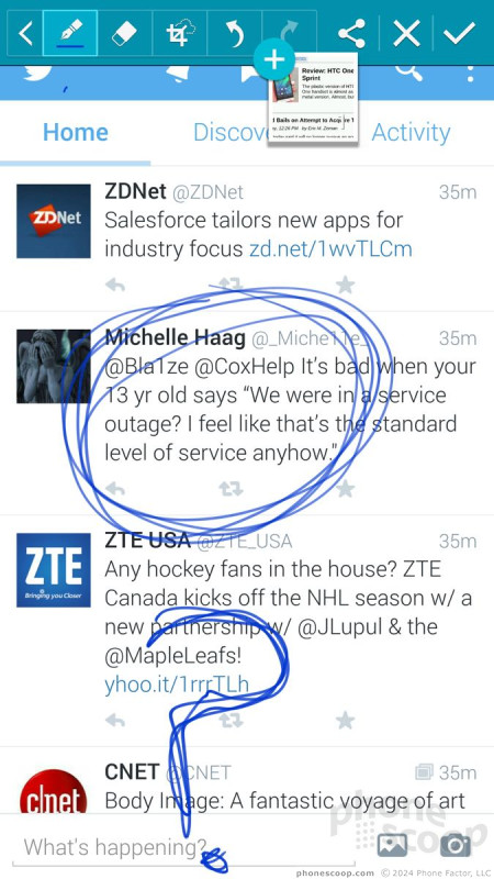
The last of the Air Command tools is called Screen Write. When you select this option from Air Command, the Note 4 automatically takes a screenshot and then opens the S Note function again. You can use various pen styles and colors to mark up the screen shot, as well as crop, erase, undo/redo, and then share your annotation with whomever via whatever method you like (text, email, etc.). Nothing you write on this screen is actionable, though; it's just marked up.
Misc.
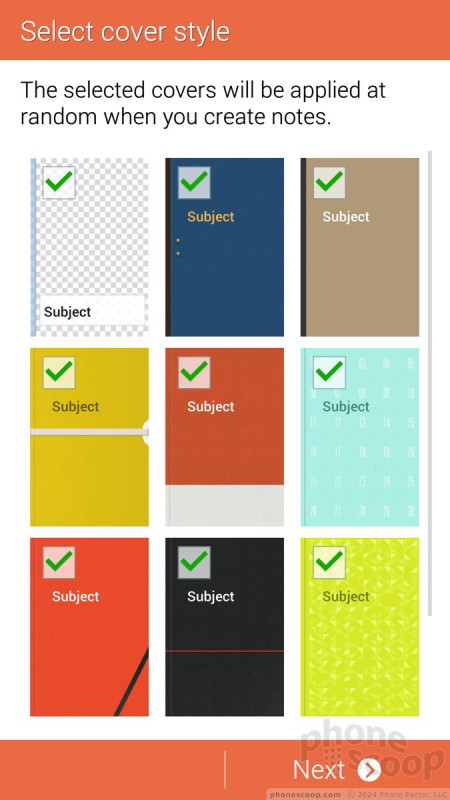
Samsung appears to have gotten rid of the S Finder tool, which turned the stylus into a search function. Further, Samsung removed the ScrapBooker tool from Air Command and dumped it into the app menu. It's now called simply Scrapbook and can be used to create collections of images, videos, and sounds.
Extras
Media
There are no fewer than 10 different apps for media consumption on the Note 4.
First, the Play Store and its associated apps (Books, Games, Movies & TV, Music, and Newsstand) are all available, as is Google's YouTube application. These apps behave the same on all Android devices and the Note 4 is no different.
AT&T Mobile TV in available if you don't mind paying an additional monthly fee to stream TV and movie clips to your phone. Mobile TV has been around forever. It performed fine when LTE was available.
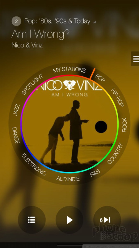
Samsung-branded apps include an MP3 player and video player for side-loaded content, as well as its Milk music service. Milk is free to use in the U.S. on Galaxy devices and has a really nice UI. Milk's content all comes from Slacker Radio. You need to sign in and create a Samsung account if you want to access the best features (offline playback).
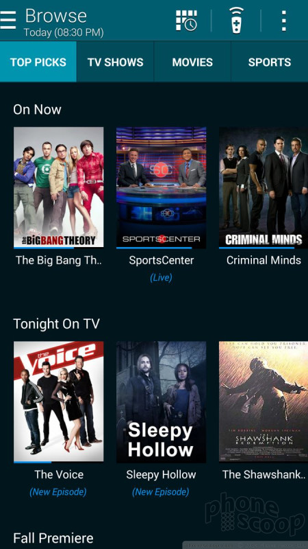
The Samsung Smart Remote is also on board. Smart Remote serves two purposes: it controls your home theater equipment, and surfs your cable provider's content guide. As always, I had no trouble using the app and Note 4 to control my TV, receiver, and TV box. The content guide uses the Peel Engine. It's pretty good as far as showing the actual guide for your local provider, and lets you surf for stuff to watch without using the guide on your TV set.
How does 1080p HD content look on the Note 4's screen? Well, that's an interesting question. Some of it looks good, but much of it looks really, really bad. We've reached out to Samsung for an explanation of how the Note 4 handles or scales 1080p HD content. It's a bit like watching non-HD content on an HD TV. Let's just say that my Google Play purchases didn't look so great when I watched them on the Note 4.
Music sounded great through my favorite headphones, but I think it's rather lame that the Note 4 doesn't have stereo speakers. It's good for sharing video content with others, but the crummy mono speaker just doesn't cut it.
Camera
The Note 4's camera app is almost a clone of the one found on the Galaxy S5, but Samsung added some really cool extra tricks to make it unique. The camera can be opened from the lock screen shortcut or from the home screens. There is no dedicated camera button.
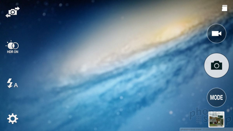
The viewfinder fills the entire screen; the controls float within. There are some quick settings available on the left side of the screen, including a toggle for the user-facing camera, HDR, and the full settings. The action buttons on the right include a dedicated video camera button, a separate shutter button, and access to the various shooting modes and gallery.
Press the gear icon in the lower-left corner and a strip of five basic choices appears: full menu, image size, effect, time, and flash. I prefer to have the flash control on the main screen. Guess what? All you need do is drag it from the control strip over to the action buttons and there it is. The full settings are organized in a grid of icons. Further, it is customizable; You can drag the icons for the settings around in the grid and arrange them however you like. The Note 4 offers control over picture size/resolution, metering modes, stabilization, timer, white balance, exposure, guidelines, shutter sound, and on. Basically, everything you need is there.
Samsung has pared the shooting modes down to just four: auto, rear-cam selfie, selective focus, and panorama. The phone includes beauty face, shot & more, virtual tour, and dual camera, as well, but they are relatively hidden. They're now settings instead of a top-level mode. We've seen all these modes before except for rear-cam selfie, and it is perhaps the most useful idea Samsung's come up with.
The rear-facing camera is typically better than the user-facing camera. With rear-cam selfie activated, users can include themselves in shots using the rear-facing camera without asking fellow tourists to help. The Note 4 opens a small window on top of the camera's viewfinder. You position that box where you want to be in the image, such as in the middle, or the left side, or the bottom corner, etc. Then you turn the Note 4 around so the main camera is facing you. When the Note 4 senses your face is in that box, it will give you an audible alert and then count down and take the image.
That's not the only selfie mode on the Note 4. The user-facing camera has its own nifty new feature: it can take selfie panoramas. Point the selfie cam at yourself and then pan left and right to create a wide-angle shot with you in the middle. You can also use voice commands to control the camera.
Samsung just might be getting this camera software right.
Photos
The Note 4 has a 16-megapixel main camera with optical image stabilization. It produces excellent results. I was thoroughly impressed with the Note 4's ability to capture perfect exposures with vibrant color and sharp focus. It was particularly impressive in low-light thanks to the OIS. I took some shots sans-flash that looked as sharp as any I've captured under the bright sun. It performed well at a concert, (a notoriously difficult environment,) as well as in brightly lit soccer arena. I'd say the Note 4's camera is as good as — if not better than — the iPhone 6 Plus's camera. It's that good.
Video
The Note 4 records video up to Ultra HD (4K) resolution. Interestingly, when you capture 1080p HD (which is the default setting), it's played back in a small 1080p window on the Note 4's screen, i.e., in its natural resolution. You can expand it to fill the entire window, but it's best to judge the results on a computer. The intermediate WQHD video format looks best on the Note 4's screen, for sure, but the Ultra HD capture mode isn't worth using unless you have a 4K monitor.
How does it look? Well, I think exposure, white balance, and focus are all spot on most of the time. I noticed a lot of weird motion, though, and obtained the best results when both the Note 4 and I were absolutely still. I wasn't too pleased with the audio quality, either, which came across as somewhat choppy.
In short, with just a couple minor reservations, it excels at capturing everyday moments, and can even serve as a video cam stand-in at some important functions.
Gallery
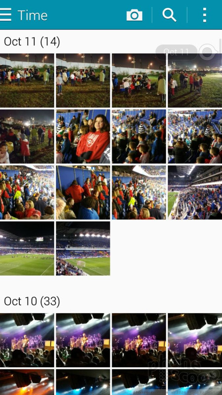
The Note 4 uses a Samsung-designed gallery application, which offers some fun extra features. The device will automatically sync thumbnails from your Google+ and Dropbox accounts, but you can thankfully turn these off. There's a drop-down menu accessible from a button at the top of the screen for sorting between albums. Images can also be filtered by people, scenery, documents, and vehicles. (Apparently Samsung thinks most people frequently take photos of their cars.)
When you dive down into the individual galleries, the Note 4 goes into a split-screen mode: a vertical list of your galleries forms a strip along the left edge of the screen, and the rest is reserved to show larger thumbnails of the images in the particular gallery you chose to view. You have to press one of the thumbnail images to go into a full-screen view of that image. The entire screen of thumbnails can be pinched to make them smaller or enlarged. This can be a really good birds-eye view of an entire album at once if it has a lot of images. Once you open a single image, you can swipe through photos and share quite easily thanks to the numerous options in the gallery app.
The editing features are extensive. No only does the Note 4 offer crop, resize, and rotate, but it includes a number of handy tools for making OK photos exceptional. It allows users to adjust brightness, contrast, saturation, and red/green levels. It includes a number of Instagram-like effects. There's a suite of tools for touching up portraits, such as red-eye reduction, airbrushing, and blurring. I like the UI animations here. Samsung did a good job making the editing tools fun to use.
The Note 4 also includes the Google+ Photos app, which can be used to sync and backup images to your Google account.
Apps
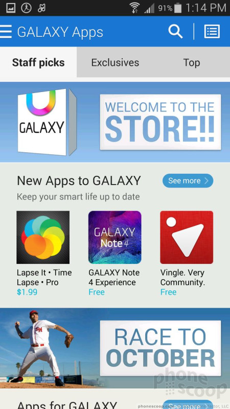
Good lord, AT&T! I've never seen so much bloatware on a single phone in all my life. There are 15 AT&T-branded apps/services on board, most of which are superfluous junk you'll never use. (Yellow Pages, really?) Samsung has crammed its fair share, too. There are tons of Galaxy Apps installed, as well as an entirely separate Galaxy Apps Store. The amount of crap on this phone is almost overwhelming. Worse, you can't uninstall most of it: you can only hide it.
Bluetooth
The Note 4 supports Bluetooth 4.0 LE. I was able to pair it successfully with a number of different devices, including wearables, headsets, and speakers, as well as other smartphones and PCs. Phone calls routed to a headset offered mediocre quality; in-call volume was pretty decent. Music sounded good coming from Bluetooth speakers, but I've heard better.
Browser
The Note 4 ships with an AT&T-skinned version of the stock browser in addition to Chrome. The AT&T app has toolbars that come and go as you browse through sites. One at the bottom offers basic back, forward, home controls, as well as a link to your favorites and a notepad. The top navigation bar lets you type in web addresses as well as manage tabs and so on. The browser does a fine job of rendering web sites and was quick over AT&T's LTE network. Chrome is Chrome. It looks and acts the same way as it does on other Android devices. It performed well on the Note 4 and AT&T's network. There's definitely something uber-satisfying about browsing on the Note 4's huge, hi-res screen.
Clock
You can choose to put a clock on the lock screen or not. It's your call. If you do, it'll be a large, white, digital clock positioned near the top of the screen. The weather can be paired with it, which shows the current conditions wherever the Note 4 happens to be. I wish you had more control over the lock screen clock.
GPS
AT&T Navigator and Google Maps are both preloaded. The Note 4 performed excellently as a navigation tool. It pinpointed me in about 5 seconds consistently, and had no trouble plotting routes and finding nearby points of interest. Google Maps is free, of course, and Navigator carries a monthly fee. Maps offers all the same tools as Navigator, plus features such as Street View.
Private Mode
The Note 4 gains Private Mode, a special, sealed-away part of the OS that debuted on the GS5 earlier this year. Private Mode is mainly meant to protect sensitive files. It can interact with the photo gallery, the Google+ Photo app, the MP3 and video player apps, as well as the file browser. You can, in effect, hide pictures, songs, and videos you don't want others to see or hear. Though pictures will technically exist in the gallery app, they can only be viewed when in private mode, for example. Private Mode could certainly be appealing for business users, as it lets them lock away work files if they wish. It can also come in handy for those who like keep… sensitive… personal content on their phone, and take comfort that others won't be able to view it.
S Health
The Note 4 has a heart rate monitor and runs the same version of S Health we saw earlier this year on the GS5, though it gains two new features.
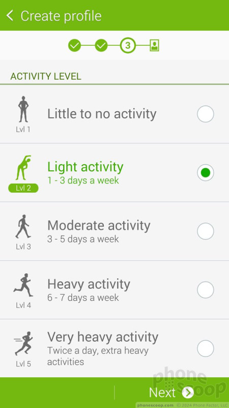
The app can be used as a fitness pal and diet planner all in one. S Health forces you to create a profile, including your age, sex, height, and weight. It automatically calculates your body mass index and asks how active you are in general. You can use the app to track walks, runs, hikes, and bike rides.
The Note 4 has a built-in pedometer and heart rate monitor. Pair these with the calorie tracker and you really have a good idea of your fitness level. I found the pedometer to be fairly accurate at counting steps and measuring approximate distances. The heart rate monitor was also accurate, as it delivered the same result that my treadmill did. The one bummer is that you have to be still to track your heart rate. This means you can't track while you're actually working out. You have to stand still for 30 seconds with your finger on the sensor to get an accurate reading. That kind of stinks. I was hoping Samsung would have improved this since the GS5's release, but those hopes were dashed.
S Health gains the ability to gauge your blood oxygen level, sometimes referred to as pulse oximetry. This lets you know how efficiently your body is absorbing oxygen and delivering it to your cells. S Health will also try to assess your stress level with a combination reading of your heart rate, pulse-ox and how they relate to one another. Despite the fact that I was totally chilled out on my couch relaxing, the Note 4 told me I was semi-stressed. I'm not sure how much stock I put in that result.
S Health is a solid fitness partner, there's no doubt. I wish it worked with my FitBit, though.
Wrap-Up
The Samsung Galaxy Note 4 is a monster. Samsung took the everything-but-the-kitchen-sink idea to the Nth Degree. The Note 4 has more features than most people will likely ever use or need, but that's sort of the point.
The hardware is about the best we've seen from Samsung. I genuinely appreciate the addition of the metal frame and improved rear cover made of polycarbonate. They make a palpable difference in how the phone feels. Like all phablets, the Note 4 is big and often requires two hands to use, so it's not for everyone. The screen absolutely is to die for. I was mostly impressed with the Note 4's signal and call performance, and the battery life is class-leading.
As is often the case, Samsung stumbles a bit with the software. Android and TouchWiz make for a powerful platform, but are sometimes overbearing. Samsung made excellent strides with the S Pen and stylus-based features, which I find are slimmed down in just the right ways. No device multitasks better than the Note 4, and the new split-screen controls are a vast improvement over Samsung's older devices.
With a 16-megapixel camera and 4K video camera, the Note 4 can be a content-capturing beast. Both the camera and video camera perform near the top of the class. Let's not forget the novel selfie-taking tools, which let people capture themselves at their best (or is it worst?). The content-consumption apps run the norm, and let owners enjoy an array of media.
It is costly, however. Most carriers are selling it for about $300 with a contract, and it starts at $750 at full retail. Expect to see monthly installment payments close to $45 or $50. Would I recommend the Note 4? If you like phablets, and have the cash, absolutely. It's a solid competitor to Apple's iPhone 6 Plus and bests most other phablets in pretty much every way imaginable.
Comments
Still At A Loss.
I understand that these are handheld products and how they "feel" plays a certain part in purchases by some people. But, in the same principle, they are also mobile devices that are subject to almost unlimited elements of destruction and 95% of users tend to use a case on the phones. This inherently negates the "feel." All the excuses in the world don't change this fact.
As the author pointed out, you can bend the rear panel and not have it break. Isn't this important for durability? To me, this says millions on what punishment a device can...
(continues)
(continues)
The second fallacy is that us...
(continues)
































 Hands on with Samsung's Galaxy Note 4
 Liveblog of Samsung Galaxy Note event
 AT&T Selling Samsung's Virtual Reality Headset
 Samsung Releases Milk Video
 Samsung Note 4 Is More of A Big Thing
 Samsung Galaxy Note 4 (GSM)


