Review: Google Nexus 6
Nov 12, 2014, 1:00 PM by Eric M. Zeman

Google's latest Nexus handset comes from Motorola and runs Android 5.0 Lollipop. The new operating system shines on Motorola's excellent hardware, which should appeal to more than nerds.
Form
Is It Your Type?
Google's Nexus-branded devices have typically been for a specific set of people: Those who want early access to the latest version of the Android operating system from Google. This year marks a bit of a change. The Nexus 6 is a true flagship and will probably appeal to people beyond the hardcore operating system nerds who usually chase Nexus phones. It is the anti-Nexus Nexus phone. The Nexus 6 is for anyone who likes big phones.
Body
I'm going to come right out and say it: The Nexus 6 is Motorola's best-ever piece of hardware. It's the piece de resistance for a company that helped usher Android into the mainstream. It's also among the last handsets launched by Motorola under Google's ownership. Lenovo owns Motorola now, and I think it is fair to say the Nexus 6 is Motorola's farewell effort as a US-owned company.
The Nexus 6 is a larger version of the Moto X, but with the Droid Turbo's guts. It's a powerful and appealing combination. The N6 has a glass front, aluminum frame around the sides, and polycarbonate on the back. It doesn't have the Moto X's customizable rear panels, but it does have the same shape, contours, and structure. The phone comes in either white or indigo blue. I think both are rather attractive.
The materials are excellent. The glass covering the front is sleek and curves just a bit along the outer edges to help it feel smoother. I like that the phone has a strong, aluminum frame. It's not overly shiny. The back panel feels strong, as well, and all three materials are fit together snugly. The phone feels solid through and through.
Thanks to its 6-inch screen, the N6 is a massive device. It's taller, wider, and thicker than the iPhone 6 Plus, but let me tell you, it fits in your pocket much more comfortably. The N6 may measure 0.4 inches at its thickest point, but the device is tapered aggressively. It's much thinner along the edges than the iPhone 6 Plus, which maintains the same thickness across the entire footprint of the phone. I was much more apt to notice the IPhone 6 Plus in my pocket than the Nexus 6, despite latter's larger size and weight. The N6's shape also makes it more comfortable to hold and use. Well, at least as comfortable as a phone that measures 6.27 inches tall and 3.27 inches wide can be.
When the screen is off, the front face is pitch black. There are no logos, no chrome, nothing but darkness. The slits for the stereo speakers are hardly visible. There are no buttons, as the N6 uses the on-screen controls for manipulating Android. Motorola did the best it could to minimize the bezels around the outer edge and succeeded admirably in that respect. The screen consumes a huge proportion of the front, with minimal framing.
There are only two physical buttons adorning the N6's outer edge. The screen lock button and volume toggle are on the right edge. The buttons each have an excellent profile and solid travel and feedback. I'd rate the buttons as practically perfect. There are no controls along the left edge of the N6, leaving it clean.
You'll find the USB port on the bottom and the stereo headphone jack on the top. There's a tray for the SIM card positioned next to the headphone jack. You'll need a SIM tool or paperclip to eject it. The N6 does not support memory cards, nor does it support swappable batteries. The phone's battery is sealed in tight, which some people dislike.
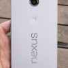
The Nexus logo is carved deeply into the back cover and embossed with a chrome accent. It will catch the light from time to time. The stylized Motorola "M" logo is there too, nestled in the now-standard circular indentation.
I'm sure some people will say the Nexus 6 is too big, or not premium enough. Surely it isn't for everyone, but I dig it.
Performance
Screen
Motorola and Google went all out with the Nexus 6 display. It measures 6 inches across the diagonal and stuffs 2560 x 1440 pixels into the 16:9 panel. Only a handful of smartphones have stepped up to this quad-HD resolution, and the Nexus 6 competes with the best of them. I compared the N6 directly to a Samsung Galaxy Note 4. which is a similar size and resolution. The Note 4's screen is brighter, but the N6's screen looks sharper to my eyes. The N6 also has slightly better viewing angles and more accurate color representation. The Note 4 is definitely easier to use outdoors under direct sunlight, but the Nexus 6 holds its own. The N6 easily bests the excellent screen of the Apple iPhone 6 Plus in absolute performance. You're going to love watching video on the Nexus 6.
Signal
We tested an unlocked version of the Nexus 6 that's compatible with networks such as those operated by AT&T and T-Mobile. I used it on both networks and came away impressed.
On AT&T's network, the Nexus 6 almost always remained attached to LTE and only rarely dipped down to HSPA+. LTE data speeds were excellent, and HSPA performance was solid, too. I didn't have any trouble connecting calls in New York City and the surrounding tri-state area, but I did miss a couple that somehow went straight to voicemail despite solid coverage. The Nexus 6 didn't drop any calls on AT&T's network.
As for T-Mobile, when its LTE network was available, the Nexus 6 connected and blasted data back and forth at incredible speeds. The N6 performed above average when compared to other phones I've tested on T-Mobile's network in the NYC area. It didn't miss any calls, nor did it drop any.
I was pleased with the Nexus 6's overall performance on both AT&T and T-Mobile's networks.
Sound
The Nexus 6 sounded fantastic on both AT&T and T-Mobile's networks. I have no complaints whatsoever about how phone calls sounded. The quality of voices resonating through the earpiece speaker was excellent no matter the network. I had no trouble hearing callers in loud spaces, such as coffee shops, crowded shopping malls, and busy city streets. The speakerphone is able to deliver a significant amount of sound thanks to the stereo speakers, and the quality of such calls was quite good. The N6 will easily provide enough volume for your office. Ringers and alert tones can be set to ear-grabbing volumes, but the vibrate alert could be much stronger.
Battery
The Nexus 6 has a 3,220 mAh battery. I found it consistently got me through an entire day — from 8AM to Midnight — with intense usage. I pushed the N6's battery as hard as I could over the course of two weeks. I never had a problem with it giving out before I was ready to call it quits for the day. Keep in mind, I tested it with a consistent LTE connection, and had the WiFi, Bluetooth, and GPS radios on at all times. I often used the Nexus 6 for tracking workouts and listening to music, as well as messaging, watching YouTube, tweeting, and updating apps. The Droid Turbo has a larger battery and lasts longer, but a full day is respectable.
Thanks to the Android 5.0 operating system, the N6 also has a rudimentary battery saver function. The battery saver ramps down processor speeds, turns off background data syncing, and dims the screen. It can be set to come on automatically when the battery reaches 15% or 5%. You can also turn it on manually. Motorola doesn't make any usage claims about how much extra time you'll buy with the battery saver mode enabled. Honestly, I doubt you'll have much need for it.
Last, the Nexus 6 ships with what Motorola is calling a "Turbo Charger." With the supplied power adapter, 15 minutes of charging time nets Nexus 6 owners about six hours of additional battery life. The feature is based on Qualcomm's Quick Charge 2.0 technology.
Basics
The Nexus 6 runs a completely stock version of Android 5.0 Lollipop. It is entirely unencumbered by phone-maker user interface adjustments and tweaking. All Nexus devices run "pure Android", which is a large part of their appeal. They are also among the first Android devices to receive system updates from Google. (That means if you're rocking a Nexus 4 or Nexus 5, you can expect to get a taste of Lollipop very soon.) We've reviewed Android 5.0 Lollipop and Material Design in depth here. We suggest you check that out for the full skinny on Lollipop. What follows is a light re-cap of what's new and improved.
Menus
Google was smart enough to maintain the basic user interface elements we've come to know and rely on in Android. That means there's a lock screen, home screen panels, a settings menu, notifications, and quick settings, all of which are easily accessible. The most obvious change is the Material Design aesthetic and interface principles.
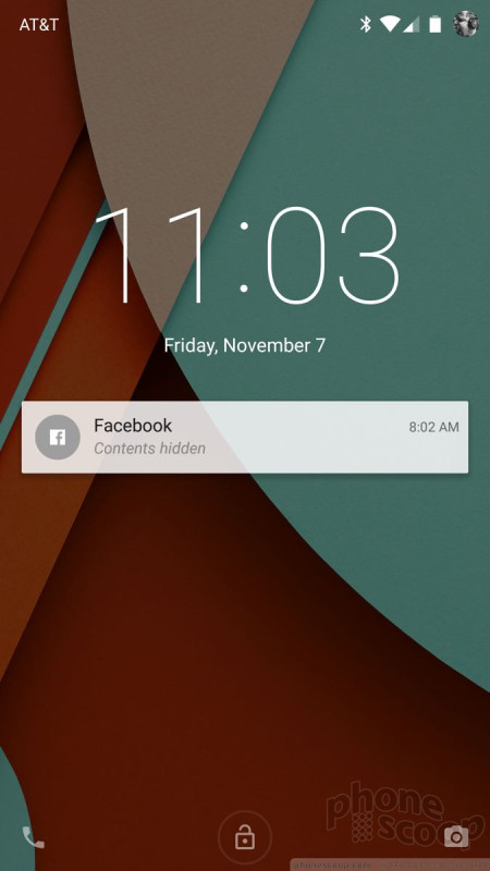
Lollipop's lock screen is a simplistic place, but offers lots of room for customization. You control whether or not there's an actual lock, what notifications are visible, and what your phone does at rest. There are shortcuts for opening the phone and camera, and Android supports a range of security options, such as passwords, PINs, and trusted devices (nearby Bluetooth accessories).
The Nexus 6 has three home screen panels when you first boot it, and one of them is Google Now thanks to the Google Now Launcher (you can turn this off if you want). As always, they slide left and right. You can drop pretty much anything you want on the home screens, such as apps, folders, contacts, and widgets. All of the screens maintain a dock at the bottom. The dock holds up to five shortcuts; one of them must be to the main app menu.
The Nexus 6 has a basic app menu: It's a simple, alphabetical grid. There's no dedicated shortcut to the Play Store, no list view, and no rearranging of the apps. You can group them into folders, but you can't even hide the apps that you're not interested in, at least not on our test device.
Lollipop supercharges notifications, which now closely resemble those of Apple's iOS platform. It helps that the N6 adopts a simple version of Moto Display. This means notifications surface on the screen when the phone is sleeping. They come and go as you touch the phone or move it. Multiple alerts can rest on the home screen at a time. If you want to act on a notification, double tap the alert to open the app. This applies to SMS messages, emails, missed calls, and so on. The alerts can contain the message contents and/or contact name, but these details can be hidden for privacy.
Lollipop carries over the Quick Settings from KitKat. It's accessible much like the notification tray. Simply swipe downward with two fingers to open Quick Settings. This provides access to basic controls such as cellular on/off, Bluetooth, and WiFi radios, as well as auto-rotate and the flashlight. In other words, they've made it more like the Control Center in iOS.
Lollipop also introduces a new Priority Mode for notifications. With Priority Mode, you can control which alerts bother you and which don't. There are three basic operating behaviors with Priority Mode: All, Priority, None. When you select All, every app is free to send notifications to the device. WIth Priority, only contacts you've assigned as priority contacts will be able to reach the device with notifications when they call or message. With None selected, no alerts of any kind will show up on the phone. It's similar to Do Not Disturb mode in iOS, but I don't think it's as user-friendly.
The settings tools look different, but act almost entirely as they did before. Rather than white text on a black background, the settings are green text on a white background. The tools are still organized into several groups, such as Wireless Networks, Device, Personal, and System.
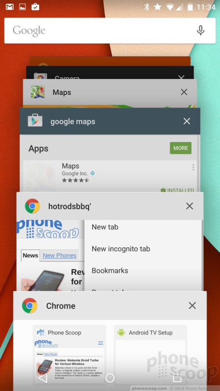
The Nexus 6 multitasks much like before, but the user interface is much nicer thanks to the 3D carousel layout. Otherwise, jumping between open apps is easy. It's a shame the Nexus 6 doesn't support running two apps side-by-side at the same time.
As far as performance goes, the Snapdragon 805 processor on the N6 ran Lollipop perfectly. The 805 is a quad-core beast that provides amazing performance across the board.
Calls and Contacts
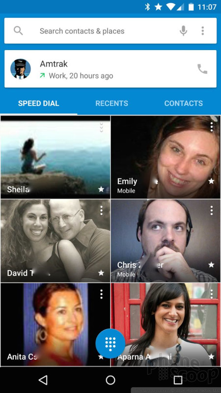
The phone app has three screens: speed dial (aka, favorites), recents, and contacts. The speed dial screen is visually appealing with photos of your favorite contacts. It holds at least 20 contacts in a 2x10 vertical grid. Buttons make it easy to send emails, texts, and make calls to each contact. The recents screen is where your call log is. I like how the app now separates call logs into separate days, making it easier to see the calls you've missed today, yesterday, and so on. If you press an individual call entry, a little pop-up box makes it a snap to call the person back, see the details of the call, add the number to your contacts, and so on.
Then there's the contact screen. You'll see a long list of your contacts with circular photos next to each name. Press the contact name, and beautiful, colorful new contact cards pop up. I really like the way the new contact cards look. They are much more appealing than the spartan and bare contact cards of Android 4.x.
Two things persist across the speed dial, recents, and contacts screens: the search bar at the top and a small button on the bottom right corner. The search bar's use is rather obvious. The button in the bottom corner calls up actual phone dialer. I like that you can open the phone dialer from any of the screens within the phone app itself..
Messaging
The Nexus 6 and Android 5.0 have new Gmail and text messaging apps, but Hangouts and Google+ are largely carried over from early versions of Android.
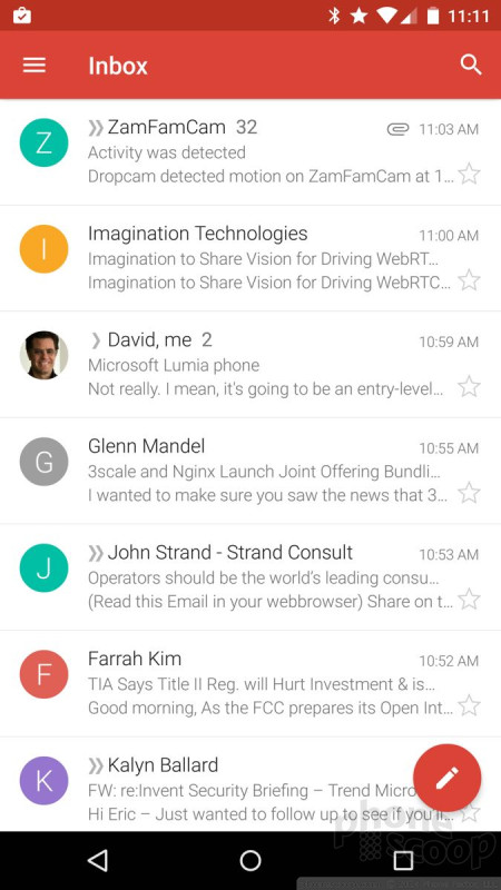
Like most other core apps, Gmail adopts Material Design in a big way and looks and feels very different from previous versions of Gmail. Think lots of color, circles, and smooth animations. Gmail now supports other email accounts and services. Before Android 5.0, Google offered two email apps: email and Gmail. Gmail was reserved for Google's own email service, while email was for everything else. The old email app is still there, but it redirects you to Gmail. The Gmail app can now handle everything. It supports Gmail and most POP3/IMAP4 email services, plus Microsoft Exchange. I was able to add my Yahoo and Outlook.com email accounts to Gmail with no problem. This resolves one of the more confusing aspects of Android for first-time users of the OS. Gmail makes it easy to view all your inboxes at once or separately. This could be life-changing for some people.
The stand-alone text messaging app makes great use of Material Design and is much more pleasant to use. I can't say the same for Hangouts. Why both of these apps exist is a question that needs answering. Google simply needs to combine them already, though it hasn't been able to do so successfully so far. Hangouts can handle SMS duties if you allow it, but it's not a smooth experience.
Extras
Media
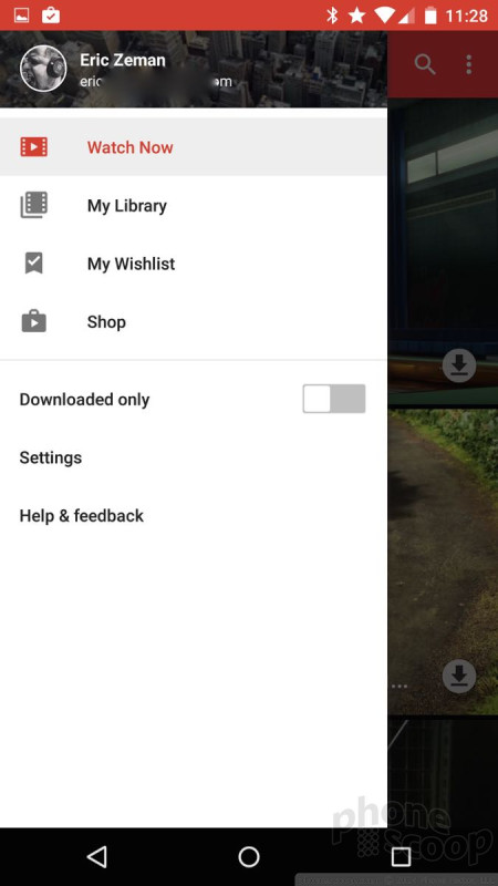
The Play Store and all its associated Play apps (Music, Books, Games, Movies & TV, Newsstand) have been updated with Material Design. All these apps make extensive use of the control tray, which slides out from the left edge when you press the three horizontal lines at the top of the screen. The uniformity of how you interact with the apps helps users adjust to them quickly.
These are all apps that Google updates regularly outside of full system updates, so many of the individual features aren't exactly brand new. For example, Google updated Play Books in late October with better navigation tools for non-fiction content. It also updated Play Movies & TV with new info cards that appear when you're casting content to a Chromecast or Nexus Player. Play Music has new, better radio stations, and a much better controls over how your music sounds. For example, it has a five-band equalizer in addition to more than a dozen equalizer presets (pop, dance, rock, etc.). The Play Music and Play Movies/TV apps are also much better at differentiating between content that's stored locally versus content that's only available online.
The Nexus 6 doesn't have any third-party media services. I am particularly bummed that it doesn't have an IR transceiver and the ability to control your home theater equipment. If you want to share your media, Google expects you to use the $35 Chromecast media stick or the brand new Nexus Player ($99). These tools make it easy to push content from your phone onto your TV.
Camera
The Nexus 6 trades Motorola's camera app for Google's and I think this is a good thing for most people.
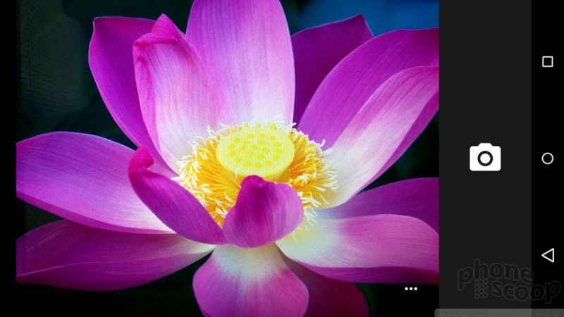
The camera has two main screens: shooting mode and menu mode. You can access several settings from the shooting mode by pressing the three little dots that appear in upper right corner. A strip of icons drops down that allow you to swap to the user-facing camera, toggle the flash and HDR on/off, turn on the framing grid, set a timer, and adjust exposure. These are all pretty self-explanatory. Pressing the shutter button captures an image and you're ready for the next one.
If you want to capture anything other than regular images, you need to call up the larger menu. Slide your finger from the left side of the screen toward the center and you'll see the different capture modes that are available. They include photo sphere, panorama, lens blur, camera, and video camera. Most of these are self-explanatory, with the exception of lens blur.
Lens blur is meant to help make the subject of photos stand out against the background by ensuring that they are in focus, while everything else is out of focus or blurred. Lots of phones offer this type of feature, but perhaps call it something else. I think this feature is a bit hard to use, but there's a tutorial to teach you how it works. Like a Lytro camera, you can select any part of the image to be in focus after the fact (either the foreground or the background). I don't quite know how they're doing it, but it works.
From the menu mode screen, you can also press a little cog in the corner to adjust aspect ratio, image resolution, video resolution, and how the camera handles exposure.
Photos
The Nexus 6 has a 13-megapixel camera. It can capture images in either 4:3 or 16:9 aspect ratios. Motorola has typically had weak cameras, but the Nexus 6 rates above average for a Motorola phone. It doesn't come close to matching the cameras of the iPhone 6 Plus or Galaxy Note 4, but it does reasonably well. I thought exposure was good most of the time, as was focus. White balance was iffy from time to time. The N6 really struggles to focus when light is scarce and the results aren't pretty. You really need to use the flash — and the flash is hella bright — but it often goes too far and overexposes the image.
I am a bit bummed about the N6's camera performance. It works great outside in daylight - but so do most cameras. Other situations are an issue.
Video
The Nexus 6 can shoot video in three resolutions: 4K, 1080p, and 720p. Skip the 4K unless you have a TV that can support it. I'd skip the 720p, too, as I thought the results were a wee bit grainy looking. The 1080p HD setting delivered the best and most consistent results. Focus and exposure were generally good and white balance was on target more often than it was with the camera. Low light shooting added plenty of grain to videos, but the 1080p setting exhibited less than 720p. As with the camera, the video camera should suffice for everyday shooting needs. I'd resort to dedicated video equipment for special occasions.
I am majorly disappointed that the Nexus 6 doesn't offer any fun video shooting modes, such as slow-motion or time-lapse.
Gallery
The old-school Photo Gallery app is finally no more. In its place is the Photos+ app, which Google has placed on Android phones for more than a year. Now, it is simply called Photos.
The app offers an extensive selection of editing tools. The tools are arranged in a strip across the bottom of the screen. As always, there's the Auto Enhance feature, which will automatically adjust brightness, contrast, and color. I find Auto Enhance doesn't do enough, though. Crop and rotate are both simple tools that work well. The rest of the tools are filter-based and have names such as Vintage, Drama, Black & White, HDR Scape, Retrolux, Center Focus, Tilt Shift, and Frames. Each allows you to adjust the strength of the filter, and of course you can apply multiple filters and effects if you wish. Honestly, it's almost overwhelming. You can spend forever tweaking your photos.
As always, you can set Photos to automatically back everything up to your Google+ photo account. The app takes some initiative in helping you organize photos into usable albums. For example, it will create Stories, which are based on time and location. The Nexus 6 automatically created a Story around all the shots I took of my kids on Halloween and even named the Story "Halloween in Rockaway." I like this feature a lot. Sharing tools are a breeze to use.
Apps
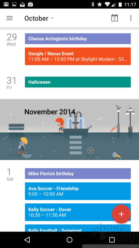
Since this is a Nexus phone, there should be no bloatware at all on the device. There certainly wasn't on our unlocked review unit, but we have yet to see the carrier-offered versions. Google has updated nearly all of its own apps, such as Docs, Drive, Keep, Calendar, and others. They all take advantage of Material Design and look great. I'm very pleased with the new suite of apps from Google. They are worth checking out if you haven't used them in a while. The N6 does lose Motorola's excellent Moto Voice app, though, which makes Google Now always available via voice commands.
Bluetooth
I had a few issues with the Nexus 6's Bluetooth radio. It connected to headsets, speakers, and an Android Wear device with no issue, but it would not talk to my FitBit at all. Phone calls sounded only OK when passed through my favorite headset or car's hands-free system. Music sounded OK through a good speaker, but the N6 doesn't support the aptX profile for the best possible sound. I wasn't able to pass files using Bluetooth, for some reason. I could pair with other devices, but not send/receive files. (The N6 didn't have any trouble casting to the Chromecast, though.)
Browser
Google updated its Chrome web browser with Material Design in October. The tabs look a bit different, and the fonts have changed, but there's less color and more white space in Chrome.
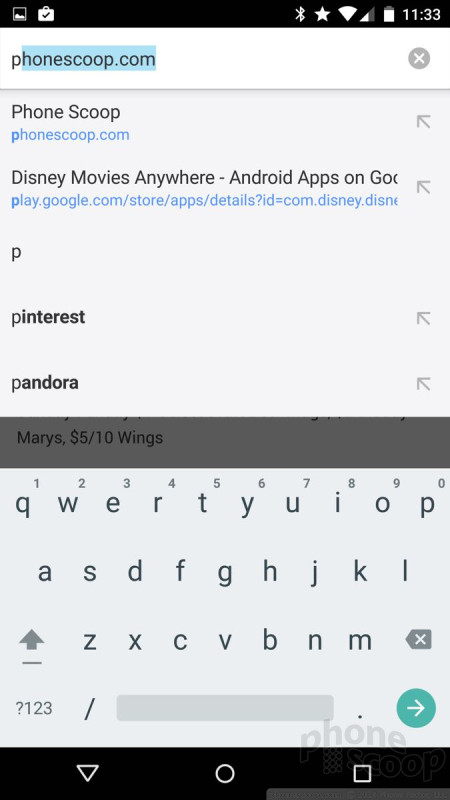
Google made minimal changes to the behavior of the omnibox and settings tools within the app, which function much like they do on devices running earlier versions of Android. The omnibox is lightning quick to suggest URLs and search queries as you type, thanks in part to your browsing history. The settings tools appear in a drop-down menu, through which you can launch new tabs, access your bookmarks, see recently-closed tabs, as well as access your entire browsing history. Sharing tools are extensive, and it's easy to search the contents of individual web pages, add shortcuts to the home screen, or request desktop sites. If you care to dig further, you can set Chrome to autofill forms and passwords, restrict content, and tamp down data usage.
It performed great on the Nexus 6, both on AT&T and T-Mobile's networks. It delivered web pages in the blink of an eye consistently. It was even better over Wi-Fi. It's a good browser and the Nexus 6 does it justice.
Clock
With the Moto Display feature on board, the clock is often illuminated on the N6's home screen. It comes and goes when notifications arrive. It also lights up when you tap or move the Nexus 6. It's a thin, digital clock that's easy to see most anywhere but outside. If you're outdoors, you'll have to find some shade to check the time. Sadly, you can't change the lock screen clock.
Maps
Maps is one of those apps that Google updates all the time. Google only recently added Material Design to Maps, but also cooked in some tasty extras. Maps now lets you make restaurant reservations from within the app itself thanks to a partnership with OpenTable. The app also offers details about potential Uber rides, such as ETA and price estimates, and can take you directly to the Uber app for bookings. Maps continues to be a useful tool for planning routes, be they by car, bus, train, or foot. The accuracy of Maps is excellent, and Street View imagery is an added bonus. I really like Maps' ability to suss out details for local businesses and points of interest. The new cards for business listings are pretty and chock full of data. The cards make it a breeze to call the business, obtain directions there, or read reviews. Of course the cards are bright and colorful, and often incorporate images of the businesses in question.
Wrap-Up
Motorola did a great job with the Nexus 6 for Google. As solid as the hardware is, Android 5.0 Lollipop really shines on the impressive display.
The Nexus 6 may be an over-sized Moto X, but I count that as a benefit. It has more personality than many other handsets on the market, and the build quality is excellent. It may be big, but I find it comfortable to hold and use. The 6-inch quad HD screen is lustrous. The phone's signal performance was excellent on both AT&T and T-Mobile's networks, call quality was impressive, and the battery performs well enough to meet most peoples' needs.
Lollipop is the most attractive, usable, and powerful version of Android yet. It makes the Nexus 6's UI an excellent platform for not just Nexus addicts, but all users. It offers plenty of media options, excellent communications tools, and even some productivity apps for those who need to get some work done.
The Nexus 6's biggest weakness is the camera. It's not a bad camera; it's an average one. I was hoping for better.
If you're in the market for a phablet, I'd strongly suggest you check out the Nexus 6 alongside the Note 4 and the iPhone 6 Plus. It competes well with these devices in most respects, and includes the added bonus of ahead-of-the-curve system updates from Google.
Comments
N6 screen sharper then Note 4?
JJinNYC said:
I call B.S. The N6 has 493 ppi and the Note 4 has 518. I'll compare the two in the store when I can
You're kidding right? That is a 5% difference in PPI you're referring to, to make some sort of defi...
(continues)


















 Hands-On: Google Nexus 6
 Google Releases Final Developer Preview of Android 7 Nougat
 Google Reveals When Nexus Phones Will Cease Receiving Android Updates
 Yahoo Adds Search Tools to Aviate Android Launcher
 Google Publishes Android 5.0 Preview, Updates SDK
 Motorola Nexus 6


