Review: Samsung Galaxy Note Edge for Sprint
Dec 17, 2014, 4:30 PM by Eric M. Zeman
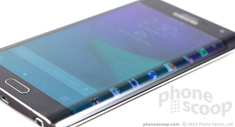
The Samsung Galaxy Note Edge is a unique Android smartphone thanks to its curved display. Samsung puts the extra pixels to good use, but it could have done a lot more. Here is Phone Scoop's full review.
Form
Is It Your Type?
The Galaxy Note Edge from Samsung is for phablet lovers who want a little something extra on the side. It offers all the great features found on the Note 4, but adds a unique, curved display that acts like a notification and control center on steroids. If you don't mind taking a chance on new things, the Note Edge shows promise beyond its unique display.
Body
The Note Edge carries over many of the Note 4's design features. In fact, from 10 feet away you might not be able to tell the two phones apart. That all changes when the screen lights up.
Like the Note 4, the Note Edge is made from several different materials, including glass, aluminum, and polycarbonate. It's awash in varying shades and accents that glint and gleam in the light. It follows in the same semi-conservative path as its predecessors from Samsung, aside from the obvious difference. It looks like the high-end handset that it is.
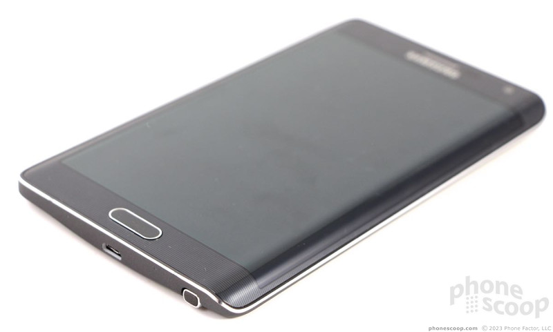
The glass surface curves very gently to where it meets the aluminum frame along the left, top, and bottom edges. It curves steeply to form the "edge" display along the right side, where the aluminum frame is far slimmer. Despite the curved glass, the aluminum frame is sharp all the way around the phone. You can easily catch your skin on it thanks to the polished, sharp chamfers. Apart from the chamfers, the frame has a matte paint job that looks good. The seam between the frame and rear polycarbonate (plastic) back plate is much smoother. The back plate is patterned to look like leather. It's a high-quality phone, despite the pleather.
The Note Edge is 3mm shorter than the Note 4, but also 3mm wider. Both phones are the same thickness at 8.4mm, and only 0.07 ounces separate their weight. It's a phablet, which means it's large, and somewhat heavy. My thumb can't reach the entire screen; it will be a two-handed device for most people. It's definitely more comfortable to hold in your right hand than your left. Southpaws, like myself, might not appreciate that overmuch. This is one phone that fits better in your pocket with the screen facing out, rather than in. It's still large, and will stretch the pockets of tight pants, but the curve of the screen helps it feel more comfortable when the plastic rear shell is against your leg.
Glass runs edge-to-edge across the front face. It's mostly black, save for the chrome-colored Samsung logo and the chrome accent that encircles the home button. The home button is excellent; I like both the profile and the action. It's flanked by two touch buttons for multitasking and navigation. Samsung perfected its haptic-feedback touch buttons long ago, and these work perfectly. There's a slit in the glass above the logo for the earpiece. The user-facing camera, notification light, and several sensors are also visible in the right light.
Samsung was forced to reposition many of the buttons due to the edge display forming the entire right side of the phone. The volume toggle is on the left. The flat surfaces are painted the same gray as the rest of the side surface, but the edges of the button are polished to help it stand out visually. The toggle itself has a great profile and excellent travel and feedback. The screen lock button has been moved from the right edge to the top. It has the same design as the volume toggle, and I like the action. Some might be disappointed that there's no hardware camera button, but I say don't worry about it too much (more on why later.) The headphone jack is on top and the USB port is on the bottom. The S Pen stylus is tucked into the bottom edge and is rather difficult to retrieve and replace. It's wedged in there pretty tightly.
The Note Edge's rear cover is removable. I could live without the fake leather texture, but it's better than the materials used on older Samsungs. It peels off with a bit of prying and snaps back in place just as easily. With the cover off, you have access to the battery, SIM card, and memory card slot. All three are easy to interact with. Many count a removable battery as a major selling point. I like that you can swap memory cards without pulling out the battery.
In short, it's a Note 4 with a smoother right edge.
Performance
Screen
The main display on the Note Edge measures 5.6 inches across the diagonal and includes 2560 x 1440 pixels. That's 0.1 inches smaller than the Note 4's, but that's not including the side display. The main and side displays are separated by a hard (digital) line on the screen. The side display is usually shaded darker to set it apart visually from the main screen.
The main screen is awesome. It's just as awesome as the screen of the Note 4. It's pixel-rich, bright, colorful, and all-around impressive. I was able to use it outdoors with no problem, and viewing angles are incredible.
The secondary screen comes and goes when needed. It features its own user interface, but content from the main screen will bleed over from time to time (think wallpapers, etc.) You do have to position the phone differently in order to see all the content on the side display, thanks to the curved nature of the screen. That said, it's just as bright and colorful as the main screen. You can see it when outdoors, no problem.
Signal
The Note Edge performed on par with other devices I've tested on Sprint's network in and around New York City. It is Spark-enabled, which means it has a better chance of finding usable LTE 4G service in about 100 major markets around the country. I had trouble connecting calls on the first try when coverage was weak (two bars or below,) but no trouble at all when the phone reported stronger service. Similarly, data speeds were best under the strongest coverage conditions and they slowed a bit as the signal deteriorated. Even under the worst conditions, the Note Edge was able to make calls and load web sites, even if not right away.
Sound
The Note Edge performed far better than other phones I've tested on Sprint's network as far as voice quality was concerned. Not only was volume excellent, so was the clarity of calls. I had no trouble hearing calls in noisy restaurants during lunch, nor when out and about at the mall, or in the car. Voices could have been a bit warmer, but otherwise I have no complaints. Those I spoke to through the Edge said I sounded great. The Note Edge has noise elimination, which means background noise on my end was inaudible to the person on the other end of the line. This feature can be turned on or off. The speakerphone could have been a bit louder, but the quality was just as good as the earpiece. Ringtones and alerts are generally quite loud. I didn't miss any calls for not hearing the ringer. I thought the vibrate alert was a touch on the weak side.
Battery
The battery inside the Note Edge is slightly smaller than the one inside the Note 4, but you wouldn't know that unless you compare spec sheets. It offers comparable battery life, which is to say it gets from early in the morning to bedtime without trouble (even with the extra screen real estate). It will be gasping for breath at the end of the day, especially if you've used it intensely. You'll need to charge it each night.
The Note Edge does feature some tools to help manage battery life. The phone has both "Power Saver" and "Ultra Power Saver" modes available. The former covers the basics, such as dimming the screen and turning off extraneous apps and radios when not in use. The latter takes a more aggressive approach and shuts down major systems. It can switch to monochrome graphics, simplify the user interface, and otherwise lock down anything beyond the core communications tools to save battery life. Most people people, however, shouldn't have to go to these extremes in order to get a full day from their Note Edge.
It's worth pointing out that the Edge includes quick-charge technology. It can achieve a 50% charge in just 30 minutes when used with the included charger from Samsung.
Basics
Menus
The Note Edge is, first and foremost, a Galaxy Note smartphone from Samsung. That means it runs Android (KitKat, initially) with Samsung's most feature-rich user interface on top. The Edge offers the exact same tool set as the Note 4 when it comes to the operating system and user interface.
It simply has a few extra pixels set aside for other things. The side screen comes and goes as needed. In many apps, it's simply blank. When and where Samsung found use for it, it lights back up and offers some extra tools for interacting with the phone.
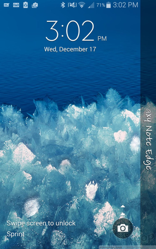
The lock screen includes a software shortcut to the camera, but you can add more if you want. It shows one or two clocks, the date and weather, select notifications, and of course a series of different locks (including your fingerprint if you wish.) The Edge Screen doesn't show any additional data on the lock screen.
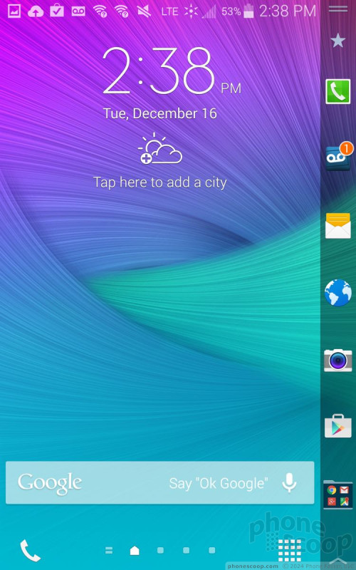
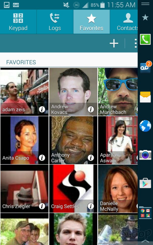
The home screen panels are where the Edge Screen is most useful. It acts as a home for your app shortcuts that would normally be in a dock at the bottom, such as the phone, messaging app, browser, camera, and Play Store. These shortcuts remain on the right side of the home screens no matter what else you have on the home screen. Think of it as a different way to multitask.
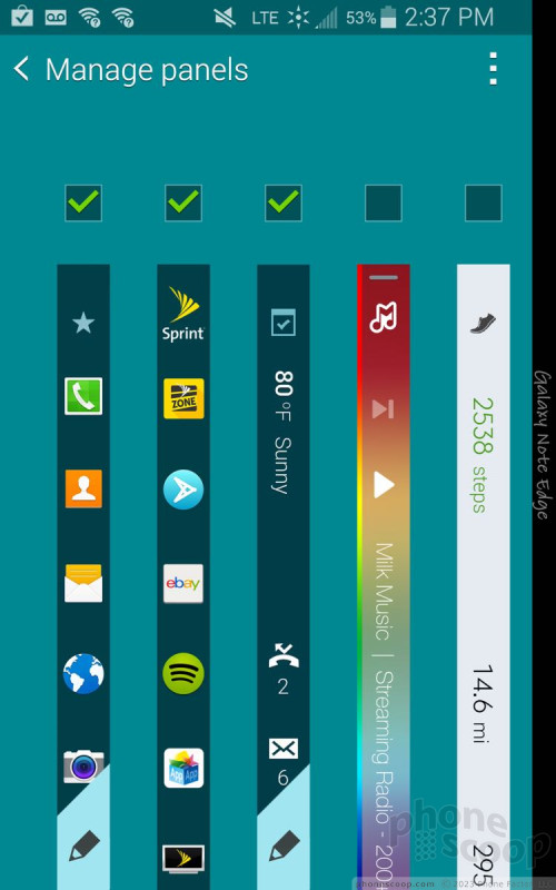
There are 12 different Edge panels available out of the box, but only seven of them can be active at a time. You cycle through the different Edge panels by swiping back and forth. Since I'm reviewing the Sprint version, one of the panels has shortcuts to Sprint-preferred apps (Sprint Zone, Spotify, etc.). One of the panel offers notifications, such as missed calls, unread message count, and weather stats. The rest are all tied to specific apps, such as Milk Music, S Health, Twitter, Stocks, Sports, News, favorite contacts, and even games. You can have anywhere from one to seven of the Edge Screens active, as well as arrange them in any order you wish.
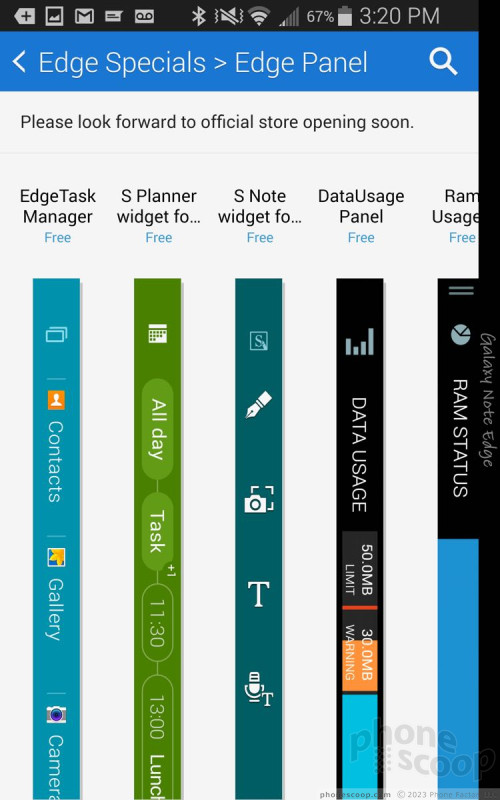
If you're not pleased with the selection of Edge Screens on the device, there are about a dozen more available for download from Samsung. They range in utility but are mostly associated with apps like CNN, S Note, S Planner, data usage, and browser bookmarks. There are even some fun ones, such Bended LOL, Tiny Burger, Tiny Word and so on. Samsung says more Edge Screens are on the way. Personally, I think Twitter, Facebook, and other social apps should be at the top of the list.
Each Edge Screen also slides up vertically to reach more content. The main Edge Screen offers more app shortcuts, for example and the Milk Musc Edge Screen offers media controls, and so on. The main settings tool for all the Edge Screens pop up when you pull up slightly.
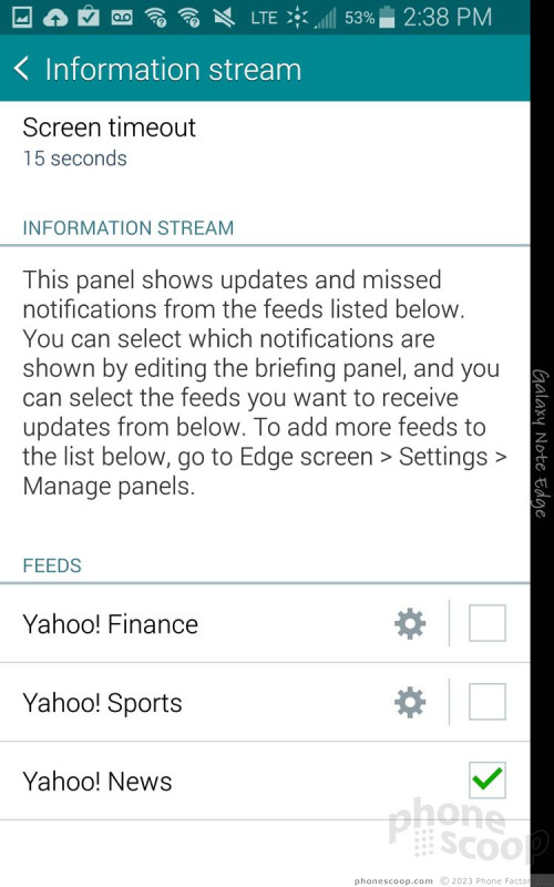
One of the panels is called Information Stream. It shows updates from missed notifications from select feeds. It would be great if this applied to the phone or messages or email. Instead, it applies to Yahoo News, Yahoo Sports, and Yahoo Finance. I don't give a hoot about having a stock ticker traipsing up and down my phone's screen (though I'll allow that some people might. Further, the Info Stream can only remain active for a maximum of 10 minutes, which negates its usefulness entirely in my opinion.
Last, all the Edge Screens include a set of Quick Tools, which are a ruler, stop watch, timer, flashlight, and microphone for S Voice. These tools are available by swiping downward no matter which of the main Edge Screens you're using.
As for the rest of the menus, it's identical to the Note 4. There are multiple home screens live out of the box, with the leftmost reserved for Flipboard (set up sort of in the vein of HTC's Blinkfeed). The main app menu can be arranged in alphabetical order or by preference, but not in a list. You can hide apps easily, as well as use folders to reduce the amount of clutter.
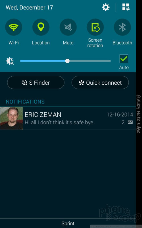
The settings can be viewed in a single, long list, or in tabs. Settings are lumped together in the usual set of categories, such as Network, Sound & Display, Personalization, Motions, System, etc. The notification tray is as useful as ever. The icons and toggles are easy to read and discern from one another. I dislike how much junk has become part of Samsung's notification tray, though. Contrary to what you might think, the Edge Screen doesn't act as a substitute for the notification tray.
The Edge includes Samsung's Easy Mode, which is an optional, dramatically simplified user interface. It's meant for first-time smartphone owners and helps them get over the initial hump of using a touch screen device. Easy Mode, sadly, turns off the Edge Screen entirely.
The Edge also offers a one-handed mode, which shrinks the UI down by about 25% to one corner. The idea behind one-handed operation is to make elements such as the keyboard, dialpad, and other controls align with the side of the phone so you can reach everything with your thumb.
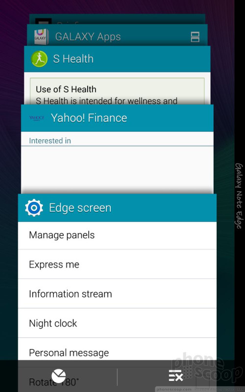
The Edge offers all of the Note 4's multitasking functions, such as multi-window mode, the improved fast-app switching tools, and the Pop-Up View apps (think LG's QSlide apps or Sony's Small Apps.)
Last, the Edge includes Sprint iD. Sprint iD, which has been around for several years, lets users download theme packs. The packs often include wallpapers, ringtones, and apps centered on a specific theme or idea. The service functions fine on the Edge, but I find the packs also include unwanted third-party apps that can clutter up the phone.
The Edge uses Qualcomm's Snapdragon 805 processor, which is the best currently available. There's no need to worry that the Note Edge doesn't perform. It has four cores clocked at 2.7GHz and functions perfectly.
Calls and Contacts
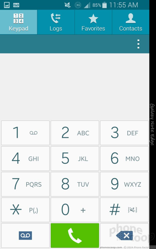
The phone app is highly customizable. You can set rejection behaviors, alerts, set up voicemail, and control the accessibility functions. You can turn on/off noise cancellation, too. Few other phones offer as many options here.
The Edge includes Wi-Fi calling from Sprint. Once enabled, Wi-Fi calling is added to the main phone app itself. The app makes it clear when you're passing a phone call over the cellular network or over your local Wi-Fi network. Call quality over Wi-Fi was on par with calls I made via Sprint's cellular network.
The contacts app behaves more or less like the stock Android contacts app. Favorites are accessible from a tab at the top of the phone app, as is the entire contact database. Each individual contact card can hold tons of details about each person.
The Edge Screen goes dark when using the phone and contact apps as it doesn't do anything unique when there's an incoming call. You can always activate the Edge Screen, however, by swiping from the right edge of the phone inward. You might want to think about this feature as a form of multitasking that's specific to the Note Edge. Certainly that's how some will put it to use.
Messaging
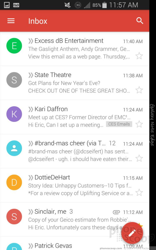
The standard Android communications apps are all present and accounted for on the Note Edge, which means Gmail, email, Hangouts, and messaging. You can select either the messaging or Hangouts apps to handle SMS duties. Interestingly, Facebook and Twitter are absent, but Facebook's Messenger app is pre-installed. If you use the new Gmail app, you can ignore the email app entirely, as Gmail handles multiple different email services in a single app.
The Edge Screen goes dark when using any of these messaging apps/services. It does this to let you know the Edge Screen offers no special functionality for these particular apps. However, you can wake the Edge Screen up by swiping from the right edge of the phone toward the center. Once turned back on, you have access to the core Edge Screen services.
The Edge includes the Sprint Family Wall app. This app acts as a messaging board for subscribers to Sprint's Family plans. People who share an account can leave notes for all members of the group or for individuals. It can also hook into the calendar for sharing events.
Sprint also included Messaging+, a third-party messaging app that can handle SMS/MMS, as well as Facebook messages and Twitter DMs. It's a little clunky, but may consolidate most your messaging into a single app.
S Pen
One of the Note series' defining features is the S Pen stylus. Samsung overhauled it for the Note 3 in 2013 and only refreshed it slightly for the Note 4 this year. The stylus functions on the Note Edge just as it does on the Note 4; the Edge Screen doesn't do anything interesting or special with respect to the S Pen.
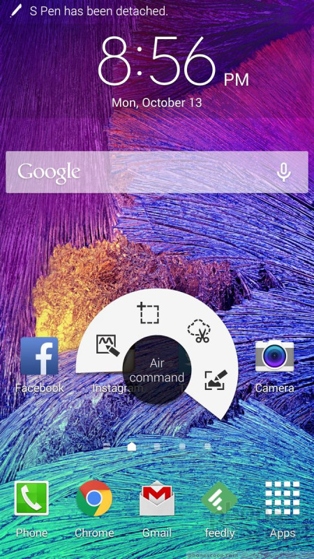
To use the S Pen, hover the tip over the screen and press the button on the S Pen. The Air Command interface pops up under the stylus, with options for Action Memo, Smart Select, Image Clip, and Screen Write. You can use Action Memo to write notes or whatever content you're in the mood to create. With Smart Select, you draw a square or rectangle around some content you want to capture, such as a web page. The tool will then grab the text, images, hyperlinks, and the actual web address of the web page you select. Image Clip is similar to smart select, but there are some key differences. For example, you can draw any shape you want, be it a box, circle, star, or trapezoid. Rather than pick up text and hyperlinks, however, image clip is only capturing an image of whatever is inside the shape you draw. With Screen Write, the Note Edge automatically takes a screenshot and then opens the S Note function again. You can use various pen styles and colors to mark up the screen shot, as well as crop, erase, undo/redo, and then share your annotation with whomever via whatever method you like.
Extras
Media
The Edge includes the Google's standard (and decent) Play apps for buying and using various media, from books to video. The Edge also includes the standard YouTube app, a generic MP3 player for sideloaded music, and a generic video player for sideloaded video.
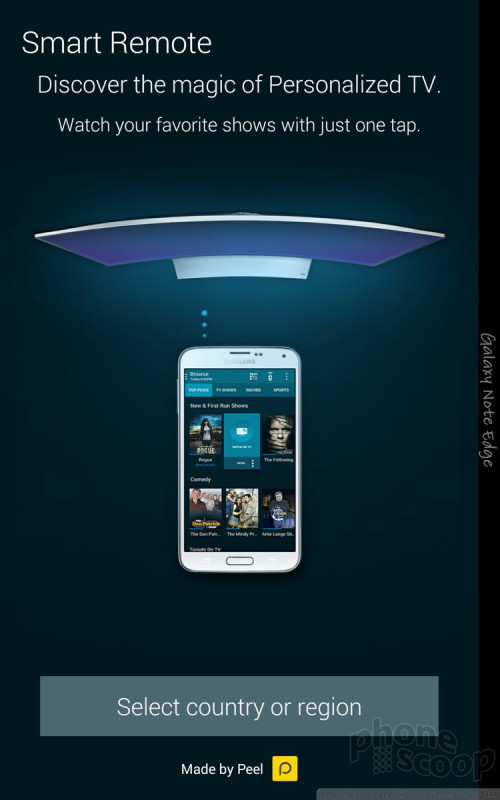
The Edge offers Samsung's Smart Remote app. Smart Remote can both control your home theater equipment via the built-in infrared port, and also peruse various content sources for something good to watch. Setting up the remote is a cinch. It walks you through the process of pairing with various devices and doesn't take more than a few moments to lasso control over your TV, cable box, DVR, disc player, and receiver. The app's "smarts" come from the Peel engine. Answer a few questions and the app will be able to interact with all of the content from your TV provider, as well as view schedules in advance, interact with the DVR, and so on.
Sprint was sure to bundle in a ton of its preferred apps, as well. You'll find NASCAR Mobile, NBA Game Time, NextRadio, Spotify, Sprint Music Plus, and Sprint TV & Movies. The NextRadio and Spotify apps are for streaming music, and Sprint TV & Movies is for streaming video content. These apps worked passably over LTE or Wi-Fi. Sprint Music Plus is a for-pay ringback tone service.
Samsung's Milk Music service is there, too, for good measure. Samsung updated this app recently and it works really well now. The UI is great and the music selection is supplied by Spotify. The Edge Screen offers controls and basic data for Milk when you're using it, such as track details. It remains dark for all the other media apps, which seems like a major lost opportunity to me.
Camera
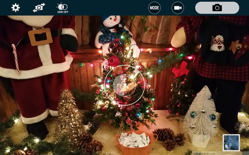
The Edge's camera app behaves identically to that of the Note 4 with one major difference: all of the on-screen controls have been moved off the main screen and onto the Edge Screen. The camera can be opened from the lock screen shortcut or from the shortcut on the Edge Screen. There is no hardware camera button on the Note Edge.
I really love how the camera works with the controls moved up to the top of the screen. The left end of the Edge Screen has a toggle for the user-facing camera, HDR, and the full settings. The action buttons on the right end of the Edge Screen include access to the various shooting modes and gallery, a dedicated video camera button, and a separate shutter button.
Press the gear icon in the upper-left corner and a strip of five basic choices appears: full menu, image size, effect, time, and flash. The full settings are organized in a grid of icons that is, thankfully, customizable; You can drag the icons for the settings around in the grid and arrange them however you like. The Edge offers control over picture size/resolution, metering modes, stabilization, timer, white balance, exposure, guidelines, shutter sound, and on. If you can think of it, it is probably in there.
As on the Note 4, the main “shooting modes” on the Note Edge number just four: auto, rear-cam selfie, selective focus, and panorama. The phone includes beauty face, shot & more, virtual tour, and dual camera, as well, but they are relatively hidden. You can also choose to download more from Samsung's Galaxy Apps Store. All of the shooting modes behave on the Edge just as they do on the Note 4.
Photos
The Note Edge takes great pictures. It uses the same excellent sensor found on the Note 4 and the results speak for themselves. The Edge does a great job of capturing images that are true-to-life, with accurate exposure, focus, and white balance. The Note Edge can serve as your main shooter for everything but the most serious life events. It's second only to the iPhone 6/6 Plus.
Video
Ditto for the video camera. It captures content in Ultra HD (4K), QHD (2560 x 1440 pixels), and 1080p HD resolutions, but you may as well stick with the 1080p capture mode. The screen itself is QHD and video content you've shot in QHD uses every pixel on the screen. It looks great, but most TVs can't yet handle 4K or QHD resolution. The Edge did a great job with focus, exposure, and white balance, leaving me impressed with nearly all the footage I captured. Audio quality was actually improved over what I saw with the Note 4. You can use the Note Edge as your everyday video-capturing device, and even get away with leaving the video camera at home for some important family events.
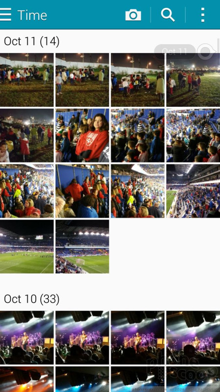
Gallery
The Note Edge has both the older Android gallery app and the newer Photos app from Google. At this point, I'd recommend you skip the former in favor or the latter for several reasons. First and foremost, the old gallery app is being discontinued in Android 5.0 Lollipop. Second, the new Photos app offers a richer array of tools for editing and managing your photos.
Photos' best features are the Auto Awesome enhancements, which touch up things like exposure, color, and contrast automatically. If you want to do more with your photos, be sure to look at the lengthy number of filters, crop/rotate, and other tools. In addition to the raw editing functions, Photos is really good at automatically uploading and storing your photos to Google's servers. Further, it will automatically create photo galleries based on events/locations as you shoot stuff during your travels. The Edge Screen offers nothing to the gallery.
Apps
Samsung devices are some of the most bloat-ridden in the market, and the Note Edge is no different. Samsung and Sprint loaded the device to the bursting point with useless garbage such as Sprint iD, Sprint Zone, Hancom Office, 1Weather, and myriad others. Uber comes pre-loaded whether you want it or not. There are tons of Galaxy Apps installed, as well as an entirely separate Galaxy Apps Store. You can't uninstall most of it: you can only hide it.
Bluetooth
I don't know how Samsung, the world's largest maker of smartphones, ships a flagship device without the best-possible Bluetooth profiles on board, but it somehow managed to do just that. The typical stuff is all there and works well. I was able to pair it successfully with a number of different devices, including wearables, headsets, and speakers, as well as other smartphones and PCs. I was very pleased with the quality of calls send to my favorite headset. Music is another story. The device doesn't include the aptX profile, which is necessary if you *really* want music to sound good when streamed via Bluetooth. I tested the Note Edge with a high-end Bluetooth speaker and it sounded crummy. There's just no excuse for that on what's supposed to be Samsung's kitchen-sink flagship.
Browser
The Edge has both the generic Android browser and Google's Chrome browser. I prefer Chrome, but they both function well enough for basic browsing purposes. Chrome also offers a broader set of tools, such as syncing bookmarks and open tabs across devices. Both browsers were quick over Sprint's LTE network. I was hoping the Edge Screen would offer some cool features in the browsers, such as navigation tools, but alas that's not the case. The Edge Screen remains dark by default when the browsers are running.
Clock
You can choose to put a clock on the lock screen or not. It's your call. If you do, it'll be a large, white, digital clock positioned near the top of the screen. The weather can be paired with it, which shows the current conditions wherever the Note Edge happens to be. I wish you had more control over the lock screen clock.
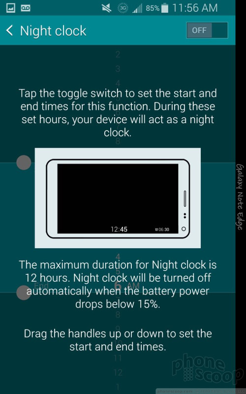
The one neat feature offered by the Edge is a night clock that uses the Edge Screen. With the night clock turned on, the Edge Screen always displays the time, date, and alarms. This has a negative impact on battery life, of course, so the Note Edge automatically turns off the night clock feature if/when the battery reaches 15%. If the phone is plugged in, the clock will stay on all night long.
GPS
Scout and Google Maps are both preloaded on the Note Edge. The Edge performed excellently as a navigation tool. It pinpointed me in about 5 seconds consistently, and had no trouble plotting routes and finding nearby points of interest. Scout is really useful when it comes to searching for nearby points of interest, such as restaurants, gas stations, ATMs, and so on. Google Maps and Scout are free. The Edge Screen remains dark when either mapping app is in use.
Private Mode
The Note Edge has Samsung's Private Mode, a special, sealed-away part of the OS that is mainly meant to protect sensitive files. It can interact with the photo gallery, the Photos app, the MP3 and video player apps, as well as the file browser. You can use it to hide pictures, songs, and videos you don't want others to see or hear. Though pictures will technically exist in the gallery app, they can only be viewed when in private mode.
S Health
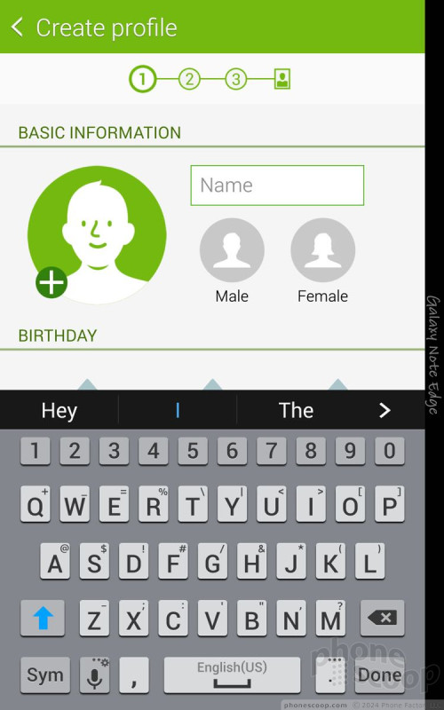
The Note Edge runs the same version of S Health we saw earlier this year on the Note 4. The app can be used as a fitness pal and diet planner all in one. S Health forces you to create a profile, including your age, sex, height, and weight. It automatically calculates your body mass index and asks how active you are in general. You can use the app to track walks, runs, hikes, and bike rides.
The Note Edge has a built-in pedometer plus a heart rate monitor. Pair these with the calorie tracker and you really have a good idea of your fitness level. I found the pedometer to be fairly accurate at counting steps and measuring approximate distances. The heart rate monitor was also accurate, as it delivered the same result that my treadmill did. The one bummer is that you have to stand still for 30 seconds with your finger on the sensor to get an accurate reading. This means you can't track it while you're actually working out.
Thankfully, Samsung dressed up S Health a bit and it takes advantage of the Edge Screen. As noted earlier, one of the dozen or so Edge Screens is dedicated to S Health and includes step counts, most recent heart rate, and so on.
Wrap-Up
The Note Edge from Samsung is the Galaxy Note 4's more tempting cousin. Where the Note 4 is a safe choice, the Note Edge is a bit riskier thanks to the unknown value of the Edge Screen. The hardware is fantastic. It's a well-designed and well-built phone. Its dimensions may make the Note Edge too big for some, but it should appeal to anyone who likes phablets.
The main screen is superb, the battery life good, call quality excellent, and signal/data performance among the best as far as Sprint phones are concerned. The buttons and controls function well, and the removable battery and memory cards will certainly have their fans.
Samsung and Sprint's apps are functional, but I find them overwhelming at times. The core Android features are all good, especially thanks to recent updates from Google.
The real question mark with the Note Edge is of course the Edge Screen. Is it worth it? I like that there are a dozen different Edge Screens to use, and that Samsung extended the usefulness of some apps into the Edge Screen's real estate. I think it could do a lot more with respect to notifications and accessing settings menus or tools within other apps. We can only hope Samsung will extend the functionality of other apps to the Edge Screen over time. The curved screen could offer a lot more utility than it does, but it offers enough that I wouldn't brand it a gimmick. At the very least, think of it as a unique way to multitask on the phone.
If you like phablets and have been considering the Note 4, I'd encourage you to check out the Note Edge first.
Comments
4k video recording limit?
I am one of the few who actually owns a 4k TV and can benefit from that feature.
Best review yet






































 Hands On with Samsung's Galaxy Note Edge
 Samsung Releases Milk Video
 US Carriers Agree to Sell Samsung Galaxy Note Edge
 Galaxy Note Edge Brings New Meaning to Curved Display
 Samsung Galaxy Note Edge (CDMA)


