Review: Motorola Q9M
Sep 20, 2007, 4:20 PM by Eric M. Zeman
The Motorola Q9M is the next evolution of the Moto Q. But did it evolve enough? With video tour.
Form
Is It Your Type?
Is It Your Type?
For lovers of the original Motorola Q, there are definitely improvements to be excited about with the new Motorola Q9M. It represents a solid step up in hardware from the previous generation Q. Not only is it more visually appealing, it just feels better to use.
But the original Q had many shortcomings. Surely Motorola listen listened to all the feedback and fixed all the Q's faults in the Q9M. Or did it?
Body
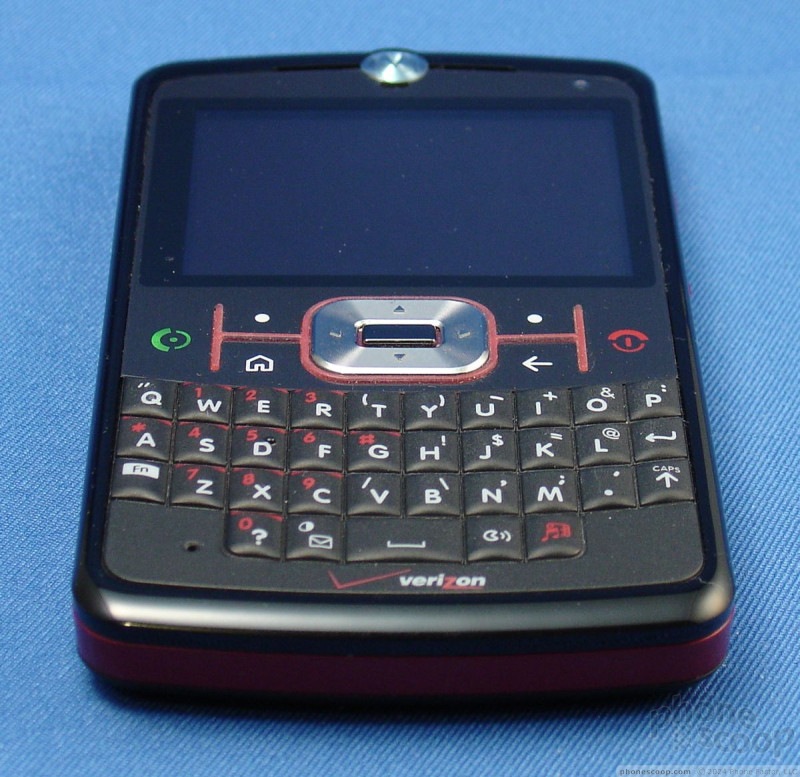
There's no question that the Q9M is a more attractive phone than its predecessor. Rather than the slate gray appearance, the Q9M is branded in Verizon's color scheme, which is to say black and a deep red. These colors pair together well, but I guess anything goes with black. The dimensions of the Qs are almost identical and the overall layout is similar. Most of the buttons are placed in the same spots on the Q9M, but they are all improved.
The Q9M has a very solid weight to it. The build feels beefier and has more authority than the original as you hold it in your hand. Where the original had several ridges along the sides that dug into your hand, the Q9M is smooth and comfortable. It weighs more than the original, but this isn't much of an issue.
The quality of the buttons is vastly better. Using the flat keys in the navigation cluster is much more satisfying. Each has good travel and action and you definitely know that you've pressed each one. The clicking sound is pleasant and doesn't feel cheap, as it did on the original. The send/end keys are twice as large on the Q9M and much easier to use. The home and back keys are about the same size, and positioned to the left and right of the D-pad, respectively. Speaking of which, the D-pad is far better. Rather than the high, narrow plastic ridge around the outside of the original, it is flatter and larger. While it isn't super easy to know exactly where your thumb is, it is more comfortable to use than the original, and also provides good action and feedback. The center select button is similarly bigger and easier to use.
The most notable improvement with the Q9M's hardware is the QWERTY keyboard. Where the original had tiny nub-like keys that were difficult to use, the Q9M features a textured keyboard. The material feels ever-so-slightly scratchy as your run your thumb over it. The keys may not be as distinctly separated as they are on the original, but this new keyboard is still easier to use. They keys are all larger and feedback is solid. The textured surface prevents your thumbs from slipping off the keys and hitting the wrong one, improving accuracy and speed.
A few of the buttons of the keyboard were swapped, and this is also for the better. On the original version, there was a dedicated camera button to the right of the space bar with the speakerphone button on the outside. These two buttons have effectively been swapped, with the speakerphone button now directly to the right of the spacebar and the media key on the outside. The media button activates Verizon's media menu. The mail button and "0" buttons have been swapped on the left side of the space bar, as well. This change up doesn't really affect performance.
Our one quip is that Motorola did not change the location of the delete key. As on the original, the only back/delete key is the one in the navigation cluster. Many other QWERTY-equipped phones place the delete button in its normal place on the keyboard. Not the Q9M. This led to an insane number of typing errors, as we hit the return key when we thought we were hitting the delete key. In the time we had the phone, we were unable to get used to this odd button placement. It really slows down usability for those used to regular QWERTY layouts.
The trackwheel along the right side of the phone has been recessed deeper into the phone. It is a little bit hard to find and dial with your thumb, but this is still an improvement, because the original Q's trackwheel stuck out too far from the side of the phone. The movement of the trackwheel is acceptable, but pressing it to make a selection is a little tough because your thumb often hits the frame of the phone surrounding the trackwheel rather than the wheel itself. The button underneath it doubles as a second "back" button. Hitting it will take you back to the previous screen. It has good travel and feedback.
Opening the 2.5mm headphone jack port along the top of the phone is tricky unless you have long fingernails. The miniSD slot on the side is much easier, and even though my fingernails are chewed down to the nub, I was able to dig enough in there to get the hatch open easily. Removing the battery hatch on the back is also a snap. Simply press in the button and slide the hatch off.
Shortcomings aside, the hardware of the Q9M is a solid improvement upon the Q.
The Three S's
Screen
The Q9M brings over the same 320 x 240 resolution screen from the original. To our eyes, the screen appeared to be a bit muted. Colors were not as vibrant as those we've seen on other phones. Also, given the size of the Q9M, the screen could be a lot larger. It was easily viewable indoors, but not so much in direct sunlight. Some menus (those with excessive amounts of white on them) were very difficult to read. The home screens and others screens with large icons were okay.
Signal
We found signal strength to be a major shortcoming of the Q9M. It rarely had more than two bars of signal strength, even in high coverage areas where other Verizon phones had 5 bars. In my basement, it dropped to one bar or no bars. It completely failed the NJ vault test, where it failed to connect 2 times, and dropped 2 calls after less than 10 seconds. It also dropped the signal in the Lincoln Tunnel, and EV-DO data speeds were frequently slow and laggy.
Sound
We tested two Q9Ms. The second device suffered from the exact same signal issues as the first, but calls were clear and less cluttered with noise. Judging by the second unit, call quality was 'good' at best. Volume was good for both the earpiece and external speakers. Not earth-shattering loud, but loud enough not to miss calls in crowded coffee shops. Sound quality of the stereo speakers was good for both music and other media played through the Q9M. The one drawback is that since the speakers are located on the back, the sound is a bit muffled if you place it flat on just about any surface. The speakers sound best when the phone is placed with the screen side down. Sound quality of the first Q9M was another issue. Most calls were crackly and garbled, with a lot of hissing and static. We had a lot of conversations fade in and fade out and had to ask people to repeat things they had said. This was true using the Q9M as a regular phone, with the speakerphone and with Bluetooth headsets.
Battery
Battery life fared better for the replacement device we received from Motorola than the first. It lasted a solid 2.5 days with regular voice, SMS, and web browsing usage. You might be able to go away for the weekend without recharging, but we wouldn't recommend it. The first Q9M didn't perform so well, losing its charge in less than 24 hours, even if left just on standby. We can only hope that the first Q9M was an anomoly.
Basics
Menus
The Q9M uses Windows Mobile 6 Standard along with some Verizon Wireless-specific menu overlays. When you first fire up the Q9M (which, by the way, takes a full minute and 10 seconds), you are greeted with Verizon's new media menu.
This media menu is a large silver ring with 10 red boxes around it, each representing a different media action. You can use either the scroll wheel or the D-pad to navigate around the ring to the selection you want. From this menu, you have access to the camera, media player, photo gallery, the V CAST Music Store, as well as some basic controls to play/pause or otherwise interact with your media. In the center of the ring is where you will see video content displayed, or more advanced selections for whichever media app you choose to open. The one bone we have to pick with this otherwise intuitive menu is that the icons are not really explained with a label. While some of them are obvious, a handful are downright confusing, and you wouldn't be able to guess what they actually do before opening them up.
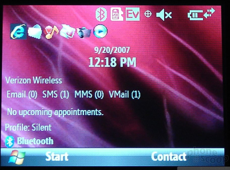
Other than a couple of Verizon-specific themes, the Windows Mobile 6 menu system works as normal. From the Today screen, the left softkey is the start key, and the right softkey takes you to your contacts. Across the top of the screen are shortcuts to your favorite applications or actions, and it also displays any messages or upcoming appointments you might have.
Hitting the Start key takes you to a grid of menu options. This is where you access the majority of the Q9M's applications and functions. There are 28 applications or folders found in here. Each one is labeled in a way so that you know exactly what it does or where it is going to take you. It is far more intuitive to use than many proprietary menu systems that are built into phones, if only because we are all somewhat familiar with the way Microsoft builds its menu systems.
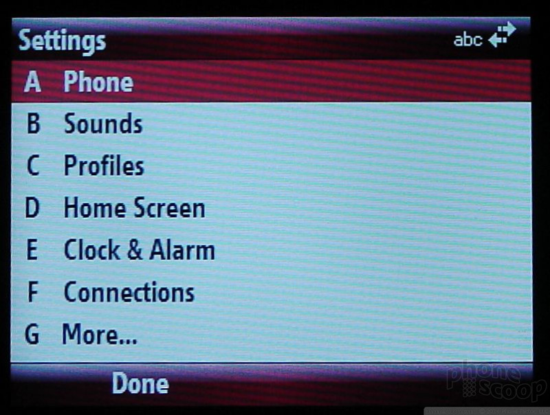
Once you select a menu icon, it generally opens up to a plain list with black letters on a white background. No fancy dancing icons here. Just utilitarian lists. All of the menu selections listed in this type of view have a keyboard shortcut (A, B, C, D,...etc.) before it, so if you are fast with your fingers on the keyboard you can jump directly to that action without scrolling to it. This seems a bit redundant, though, because the trackwheel almost always gets you there faster. These B&W menus are particularly difficult to read in the sun.
The one important thing to note is that the Q9M often has trouble moving from one application to the next. Though it has a decent processor, there is often a noticeable lag from the time you select an action and when that action is completed. This lag is present in almost all menus and applications.
Calls / Contacts
Using the calling and contacts features of the Q9M were on par with other smartphones. These two applications are intertwined and have shortcuts that make them easy to use one handed with a minimum amount of typing. The number keys are embedded in the QWERTY keypad and tapping them from the homescreen always brings up numbers and not letters. As you type a phone number, the Q9M will begin autosorting everyone in your contact database. If you start typing elsewhere on the keyboard, the Q9M will sort via the letters and not the numbers. You can choose to complete typing in the number/name, or begin searching through your contacts for the number you want to dial.
Once you are in a call, the left softkey becomes a mute button, and the right sofkey becomes a menu button, which lets you do various things during the call, such as select the speakerphone. The speakerphone can also be launched from the dedicated button along the bottom of the keyboard.
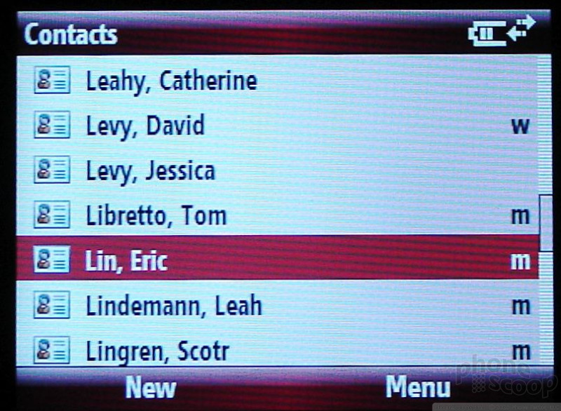
The contacts database syncs seamlessly with Outlook and will hold gobs of information about each contact. Each contact can have multiple email addresses, phone numbers, and IM screen names, as well as two addresses and lots of personal information, such as birthdays, anniversaries and kids' names.
When scrolling through existing contacts, the left softkey lets you add new ones, and the right softkey lets you select from a list of actions to perform when you have a contact highlighted, including send via Bluetooth or locate via Google Maps. Opening a contact who is already saved presents you with a few options on that contact's home screen, including call their mobile/work/home numbers, send them an SMS, or view their address. You can also choose to edit that contact or delete them.
Messaging
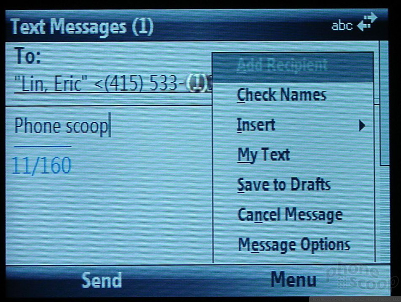
Since the Q9m is a Windows Mobile-based smartphone, you can rest assured knowing that if you're an email or SMS freak, it's got your back. Not only will it accept push Microsoft Outlook mail, but you can also sync it with your personal POP3 accounts. We were able to load up multiple Google, AOL, Hotmail and Yahoo email accounts. They all delivered email seamlessly.
When viewing the Today screen, there is a line reserved for messages. It shows you how many emails, SMS's, MMS's and voicemails you have in your inboxes. SMS, MMS and voicemail messages also have icons that appear in the status bar across the top of the screen, so you have two visual cues letting you know that messages are waiting.
From the home screen, simply hitting the shortcut to the messaging center will bring you to the main messaging menu, though it is also accessible from the start menu. Here, the messages are sorted by SMS, Outlook Email, MMS, and POP3 accounts. There will be a number next to each one to let you know how many unread messages are in each inbox. Each message type has its own set of inboxes, drafts, sent and outboxes so you can tell the status of all your messages at a glance. From the home screen, you can also navigate down to the one inbox that has a new message, say an email, and select it. This will take you directly to that inbox, allowing you to skip the general messaging center.
When in each of the separate inboxes, the left softkey is a delete key, and the right softkey a menu key. When viewing a message in any of the formats, the right softkey becomes your options menu, and lets you take just about any action you can think of, including delete, reply, forward, move, etc. The left softkey becomes a reply key.
Everything about the messaging center is intuitive. We were never left scratching our heads asking ourselves, "Why did they do it that way?" The way messages are accessed and interacted with just makes sense.
Extras
Music
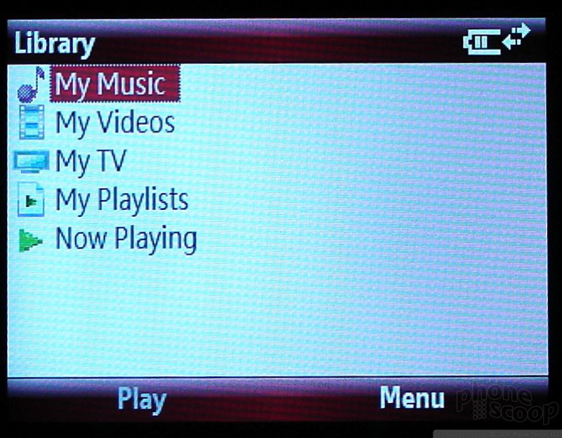
The Q9M comes loaded with Windows Media Player 10.3. It is a very capable player. You can launch it either from the Today screen, the Start menu or the Verizon Wireless media menu.
From the Verizon media menu, the WMP action items are on the left side of the wheel. They are, from top to bottom, skip back a track, play/pause, skip forward a track, WMP Menu, and full screen toggle. If you scroll down to the WMP menu icon and select it, the box in the center of the wheel will show you your basic WMP menu selections, such as Now Playing, Music, Videos, etc. Any media you play will show up in the box in the center. This would be album art for music, or video content, such as those shot with the phone. If you want to watch video content on the full screen, simply hit the toggle button and it will automatically expand.
Navigating your music library is just as easy from the Verizon media menu as it is through the regular Windows Mobile menus. Music and video libraries can be sorted by genre, album and artist.
In order to add content to your library, it has to be manually updated. You can add media via a microSD card, or side load it from a PC. Once you've loaded in onto the device using one of those two methods, use the menu selection to update the library, which will pull the songs you've loaded and make them available to be played. The Q9M played both MP3 and WMA files without issue.
The player interface lets you simply rewind, play/pause or fast forward. There are no equaliizer presets to use, nor are there any other ways to adjust the sound aside from making it quieter or louder via the volume controls. Music pauses when a call comes in and resumes once the call is complete. It will also play in the background when you are doing other tasks, though you can set it to stop if you leave the WMP program. You can also customize keyboard shortcuts, assigning keys to stop, play/pause and so on. If you dig into the Accessories folder, however, you will find a menu item called "Audio Enhancements". In this menu, you can adjust some bass, treble and stereo controls for headsets you've paired with the Q9M, as well as the stereo speakers.
The Verizon Media menu also includes a shortcut to the V CAST Music store. Hitting it will launch the music store, where you can browse or search for music and make purchases. Songs that are downloaded automatically add themselves to your library.
The WMP interface is a little too simple and we wish it gave us more options to manage and control our music, but for a basic player, it gets the job done. Since the Q9M has a 2.5mm headphone jack, you can't use regular headphones with it. You'll either have to buy an adapter, or use stereo Bluetooth headphones. Music sounded good through both, but it didn't knock our socks off.
Camera
Camera
As with WMP, the camera can also be activated from the Verizon Media menu, the Today screen shortcut, or the start menu. There is no dedicated camera key. There is a full 3-second wait from the time you turn the camera on before the viewfinder shows up on the screen.
Once the camera is running, the left softkey will toggle between full-screen view, viewfinder view, and photo gallery. The right softkey opens up the menu selections. In the menu, you can adjust brightness, resolution, degree of zoom, white balance, the flash and more. One feature will let you select from a timer or burst modes. The burst mode takes 5 shots separated by about 3 seconds each, increasing the probability that you'll come out with a good shot.
Pressing the shutter release button, which can be either the trackwheel or selector button in the center of the D-pad, takes the picture almost immediately. It freezes the image on the screen for about 3 to 4 seconds while it saves the file to the Q9M. Eventually, it pops back up in the viewfinder mode and lets you choose to go back to the camera application or choose from a short menu of selections such as send via Bluetooth, compose MMS and make the image your wallpaper.
While composing images, the live picture you see on the screen is a grainy mess. There's lots of noise, digital artifacting and ghosted images, and there is a delay on the screen when you move the Q9M around. It takes the viewfinder a second or so to catch up to what it is really pointing at.
Gallery
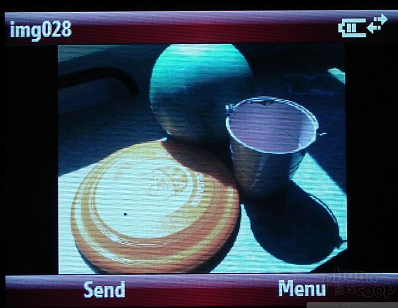
The gallery application shows you 8 pictures at a time in grid layout. The left softkey will enlarge any selected image to fill the screen, as will hitting the center of the D-pad. While in the gallery app, the right softkey brings up the options menu. The options menu lets you manipulate and move the picture files around the phone and send them to others. With a picture open, the left sofkey turns into a "send" key and the right remains as the menu key. If you choose "send", it pulls up the main messaging center and lets you pick which method or account you'd like to send the picture from. This is integrated fairly well, and keeps you from having to type anything in.
Pictures
Pictures
Pictures shot with the Q9M were not all that great. It has a 1.3 Megapixel camera, and this is evident in the end results. It scored a 20/60 on the vision test. Images shot both indoors and out were full of grain and many lacked focus. Even using the flash did not save night time or indoor shots from being hard to see. This was especially true if you zoom in at all. The one good thing about the Q9M's camera is that it did a good job of capturing colors. The pictures may be grainy and out of focus, but the colors were just right.
Video
The Q9M's video capabilities are on par with its camera. Color looked accurate and good, but the images were grainy and the sound choppy. Any movement of the camera or subject seemed to really confuse the video recorder, and it took a while to get rid of the digital smears of color and refocus on the subject.
MotoQ9m

3GPP2 / MPEG-4 format (viewable with QuickTime)
Browse / Customize
Browse
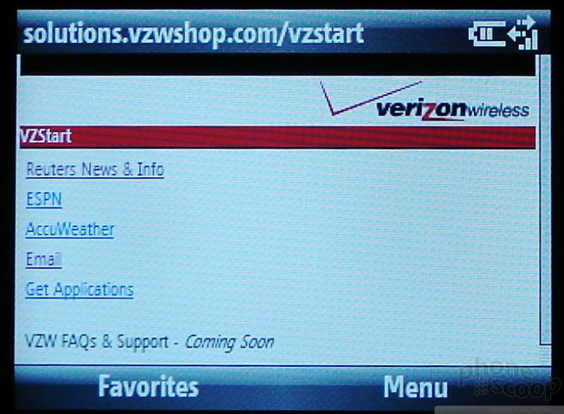
The Q9M uses Microsoft's Internet Explorer to browse the web. It also has an EV-DO radio, which means wireless data speeds should be fairly snappy. Launching the browser takes you to a very slimmed down version of the Verizon web portal where there are only five options, Reuters, ESPN, AccuWeather, Email and Get Applications. Each of these sites loads quickly and are easy shortcuts if you want some headlines, scores or the weather report. The email link takes you to a set of links for AOL, Hotmail or Yahoo mail. This is about the extent of the Verizon portal for Internet Explorer for smartphones.
You're much better off using the menu key on the right to surf to the open Web. With the full QWERTY keyboard, typing in web addresses in the address bar is a snap. Holding the clear key for about 3 seconds deletes the entire address bar save for the "http://". It sets you up nicely to start typing in a web address.
Most sites figure out that they need to reformat themselves into a single column for your device these days, but you can also set that manually. The menu system works well enough to help you navigate the web, save and access favorites, and customize the browser to meet your surfing needs. For example, you have five different font sizes to choose from, and you can choose to view or hide images on the web pages you browse to. These help bolster the overall speed and usability of the browser.
Customize
The Q9M lets you change up a number of things to make the phone feel more like it is your own. Out of the box, the home screen is the Verizon media menu. You can also choose from six other home screen layouts, including two Windows Mobile screens and two slightly more customized Verizon screens. One of which is a large circle of icons that you can zoom around with the wallpaper of your choosing serving as the background.
In the start menu, there is a little icon that reads "personalize my Q". In it you can adjust the home screen, home screen shortcuts, sounds and start menu view. There are a 17 different color palettes to choose from, and you can customize the ringers and alert tones to all manner of activities and actions. The settings menu also lets you adjust sound profiles and a large number of behind-the-scenes aspects of the phone that are best let to IT admins or those with a thorough understanding of Windows Mobile.
File Management
The Q9M uses a folder system that resembles...Windows...to help you manage files stored on the device and on storage cards. It is fairly robust and lets you manipulate, copy, send or move your files around at will. It is also easy to find in the Windows Mobile menu system, unlike other phones that bury the file management tools deep within subfolders.
Other
Bluetooth
The Q9M supports several Bluetooth profiles. We were able to seamlessly pair regular headsets as well as stereo headphones. We also paired it with our PC and were able to swap several different types of files, including pictures and music and a Word document. Everything worked flawlessly, though sound quality of the music could have been better.
Converter
Is has a nifty little app buried in the Accessories folder that lets you make a number of different unit conversions on the fly, such as currencies, weight, temperature, volume and several others.
PIM
Because the Q9M is a Windows Mobile Smartphone, it syncs all you calendar, contact and other Outlook information directly to the device and vice versa. Any calendar appointments you make on the Q9M or on your PC are automatically replicated on the other next time you sync. This can be done via USB cable or Bluetooth. It is a bit slow with Bluetooth, though. Adding appointments on the phone is simple and straightforward. The software walks you through it step by step. Each appointment can hold tons of information, including notes, locations, participants and so on.
Productivity
The Q9M also comes with the full suite of mobile Office applications. From the phone, you can create Word, Excel, and PowerPoint documents, as well as view and edit PDF documents. You can also use these programs to open up attachments in emails, make changes, save them, and then re-attach them and send them along their merry way. For those who need to create simple documents when on the go, this is a very powerful feature to have in your back pocket.
Video
Here is a brief tour of the Motorola Q9M. You can watch it here:
Or visit YouTube for more viewing and sharing options.
Wrap Up
While the Q9M makes serious strides compared to the original Q, there are still some minor issues to consider. A weak signal and so-so battery life can be deal breakers for some. Its laggy processor can also be frustrating at times. Even with these detractors, the Q9M is much more stylish, has improved hardware and usability of the keyboard, and has powerful smartphone and productivity capabilities.
Comments
Detailed Review Available
The review can be found at: http://arajani.blogspot.com/2007/09/moto-q9m- review-verizon-wireless.html#links
Enjoy!
Email Impractical with Q9
I set up my email using my Outlook account. Because my business email is very public, I receive over 200 spam emails a day. I have a spam filter on the Outlook account.
Once my email was configured thru the Q auto-sync, I would receive these unwanted spam emails because the emails were pulled from the server, not my inbox. I was told this was the only possible way to do this. My only option was to only allow specific senders thru my VERY LIMITED push preferences. This is not practical either, as I need to get email from people contacting me thru my business website.
But that's not the worst part! There is no option to block attachments on emails coming to the ph...
(continues)
I get spam in my...
(continues)
You CAN adjust the sound
I didn't think they were that effective. I tested them on my S9s as well as the external speakers. The sound was worse when used with...
(continues)
signal strength
(continues)
Mediocre
Expected
When it comes to the laggy processor, they probably just have some left over from the old RAZR and decided to stick them in there.
😛 We all know Motorola has finally upgraded there processors with the new RAZR2 and W490 phones, so it is definately an interesting choice to keep an older, slower processor for the Q9M.




















 Verizon Parades Spring Lineup
 Hands On with the 2023 moto g 5G & moto g stylus
 Hands On with the moto g stylus 5G (2023)
 Motorola Updates its Most Affordable Phones
 Motorola Q9m / Q9c

