Review: Motorola Moto E for Cricket Wireless
Menus
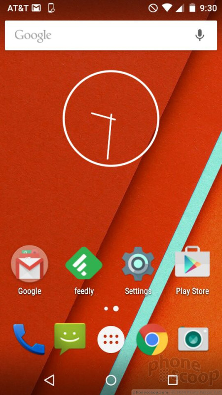
Motorola has, blessedly, decided that stock Android is the way to go. The Moto E runs Android 5.0 Lollipop with a handful of Motorola's most useful applications for managing alerts and notifications.
Unlike the Moto G, which arrived last fall, the E offers a version of Motorola's Active Display, which surfaces simple notifications to the lock screen so you know there are unread messages, missed calls, and new emails waiting for you. The lock screen also supports the usual set of passwords and other protections, as well as shortcuts to the phone and camera apps.
Beyond the lock screen behaviors, the basic home screen and menu functions in Android 5.0 Lollipop are very similar to those of Android 4.4 KitKat and earlier versions of the operating system.
There are minimal home screens active out of the box, and they aren't littered with widgets and shortcuts. It takes only a few moments to customize the panels to suit your own needs. Google Now stands as the leftmost home screen panel, which will surface cards with personalized information culled from your email, calendar, and search history. (I really like Google Now, but it takes some getting used to.) The app menu is laid out in a clean grid on a white background. Apps are listed alphabetically, but you can drop them into folders if you want. There's no list view option.
The settings menu offers green text on a white background, which you can blame on Lollipop's Material Design. The individual settings are clumped together under categories such as "wireless and networks", "system", and so on. It's a simple and straightforward tool for managing the E.
The notification shade offers a list of your notifications, which can be dismissed en masse or individually, and access to the Quick Settings menu with a second downward swipe. The Quick Settings screen has been modified in Android 5.0, but the controls are all easy to use.
Motorola yanked out the first-generation E's Snapdragon 200 processor and crammed a Snapdragon 410 processor in its place. Motorola kept the RAM at 1GB, but improved storage from 4GB to 8GB. The phone was slower to download and install apps than today's best phones, but that's expected of a device with an entry-level processor. Otherwise, the Moto E performed flawlessly.
Calls and Contacts
Motorola stuck with the stock Android 5.0 phone application. It's not the most user-friendly app in the world, but it gets the job done. At least it's a colorful place full of pictures. The app has a search bar and your most recent call perched at the top of the screen. Below these two items are three tabs for accessing your favorite contacts, your call history, or all your contacts by swiping left and right. The call log provides some information about calls (time, duration) in addition to shortcuts for redialing or sending a text message to those numbers. You need to press the circular dialpad button at the bottom of the screen to call up the number pad for dialing new numbers.
Though built into the phone app, your contacts can be accessed and managed through a stand-alone app. The contact app has two basic views: your favorites, and all of your contacts. Searching through your family, friends, and colleagues is a breeze thanks to the search tool. The app automatically syncs with your Google accounts if you use Gmail, but also supports Exchange and IMAP. As always, you can place direct dial and direct message shortcuts on the home screen panels if you wish, but there's no larger contact widget.
Messaging
Thanks to the stock nature of the Moto E's operating system, there are but a few messaging tools aboard the handset. The newest version of Gmail is quite good and supports multiple email inboxes and services (including Exchange, etc.). Motorola included the older, generic email app for good measure, but it's redundant.
The Moto E includes both the newer Google Messenger and Google Hangouts apps for sending text and IM messages. The Messenger app handles only SMS/MMS, while Hangouts handles SMS, MMS, and IM. Messenger is easier to use, but it's nice to have everything in one app within Hangouts. I find Hangouts to be a bit messy, but it works. You can download an alternative SMS app from the Play Store if you want.
The E doesn't have any social networks preinstalled, save for Google+.


 Hands-On: Motorola Moto E, 2nd Gen.
 Cricket to Sell Motorola Moto E Beginning March 13
 Sprint to Sell Motorola Moto E Across Its Prepaid Brands
 Motorola Updates Moto E with LTE
 Motorola Refreshes razr Lineup with Better Batteries & More
 Motorola Moto E (2nd gen., LTE/GSM)


