Review: HTC One M9
Menus
The One M9 runs Android 5.0 Lollipop with Sense 7.0 on top. HTC's user interface overlay is more palatable to me than Samsung's TouchWiz, and can be overridden in favor of the Google Now home screen setup if you wish. HTC has left the basics of Sense in place while also tweaking and updating the design to fall more in line with Lollipop's attractive and modern Material Design. I like the fonts and general appearance Sense 7, and find it less intrusive than previous generations of the user interface.
I like HTC's lock screen treatment, which shows the clock and weather, notifications, and four shortcuts to select apps. The shortcuts mirror the four apps you've placed in the home screen dock. The lock screen shows notifications as they arrive, but also provides access to the notification shade as long as the phone isn't protected. You can protect the device with a pattern, PIN, or password if you want.
Lock Screen and Quick Settings
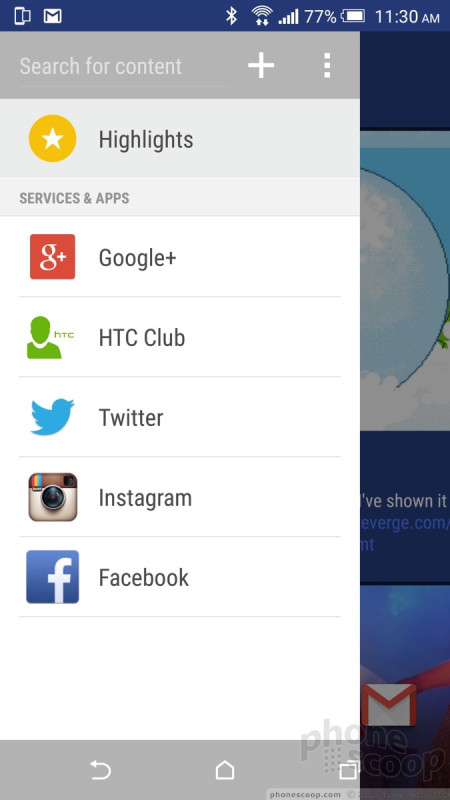
Just one home screen panel is active out of the box, but you can add a handful more if you wish. The panels are a good place for app shortcuts and widgets. As it has since the M7, HTC forcefully added its BlinkFeed social newsreader to the home screen panels, where it's positioned to the far left. BlinkFeed is a bit like Flipboard in that it combines your social networks with your preferred news sources to create an unending stream of "snackable" content. You can ignore it if you choose, but you can't turn it off nor uninstall it. (Although it does disappear if you ditch HTC's home screen (launcher) for another, such as the Google Now launcher.)
The main app menu offers a number of options that I appreciate. For example, you can view apps in alphabetical, custom, or most-used orders; you can hide and unhide apps; and you can change the grid size from a 3 x 4 arrangement to a 4 x 5 arrangement.
The notification panel serves two purposes: to let you access incoming notifications, and to provide access to the Quick Settings controls. A single swipe downward reveals actionable notifications and a second swipe down reveals the controls. HTC lets users customize the controls visible in the Quick Settings tool, which I appreciate. The panel holds up to 12 controls. You can decide which ones are visible and also choose the order in which they appear. Stock Android phones don't have that sort of flexibility.
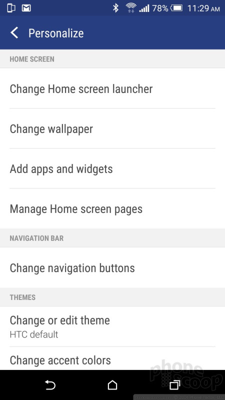
Perhaps the most powerful aspect of Sense 7 is the extensive customization tools; they might leave your head spinning. As with all phones, you can change wallpapers, ringtones, alarms, and so on. Sense 7 allows people to pick the color of the phone dialer and the keyboard, manage home screen panels, and set behaviors for the Dot View case.
Moreover, the One M9 comes with nine pre-installed themes. Each theme has its own fonts, wallpapers, accent colors, and so on. There are many more themes available in a small storefront on the handset. The themes make extensive changes to the appearance of the home screen panels as well as apps such as messaging, phone, media player, clock, and Dot View case. The M9 also permits owners to adjust the themes to their own liking by changing the accent colors seen on menu screens and such. You can even use a favorite wallpaper photo as an automatic starting point for a your own theme with a matching palette of accent colors. It's a powerful set of customization tools.
HTC borrowed a feature from LG and made it possible to customize the Android nav buttons that appear at the bottom of the screen. The basics are back, home, and multitask, but you can add a fourth button if you wish and arrange them however you choose. Some of the extra choices include buttons that turn off the screen, open notifications, hide the nav bar, or open Quick Settings.
HTC was generous to include the Google Now launcher, which is the same one used by Google's Nexus-branded phones. It's a nod to some users' preference for a stock Android experience. If you switch to the Google Now launcher, the home screen panels and top-level menus all revert to stock Android. Google Now replaces BlinkFeed as the far left home screen panel. Some screens, such as the settings menu, remain unchanged.
The M9 is among the first devices to ship with a Snapdragon 810 processor. This is an octa-core, 64-bit beast paired with 3 GB of RAM. The phone was fast and fluid. It does tend to get a bit warm. During large app installs, for example, the device became very warm to the touch.
Calls and Contacts
The phone and contact apps are one and the same. They may have different icons in the app drawer, but they open the same app.
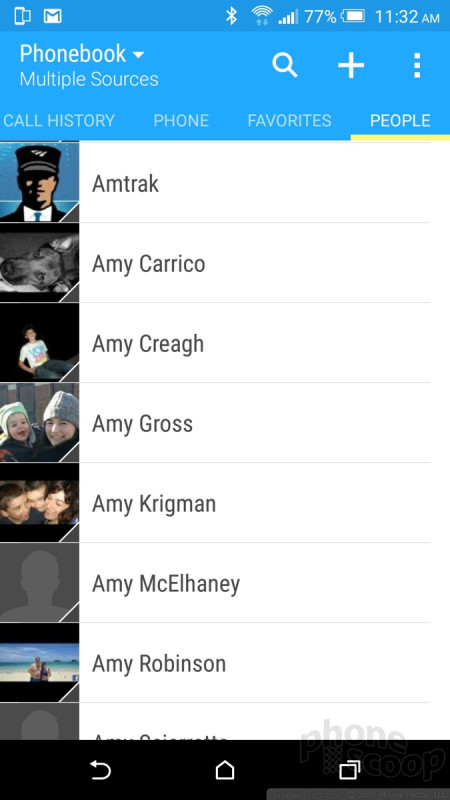
HTC tweaked the Android phone app to suit its own needs. The result is something less clunky than the Lollipop dialer, but still more complicated than it needs to be. The default view is the actual number pad along with the most recent call. There are five tabs stretched across the top of the app (history, phone, favorites, people, groups) and you scroll sideways to reach them. You can rearrange the tabs to your preferred order, and even remove some of them. Whether you dial from the number pad or the search bar, the calling features work smoothly.
The M9 syncs with myriad online contact sources, but defaults to your Gmail account. There's a drop-down menu at the top of the screen that lets you pick which phone books are visible. For example, my device showed phone books from the SIM card, my Google account, Twitter account, and Outlook account. I turned off the Twitter contacts to reduce the clutter in my phone book. If the phone sees duplicates, it will make suggestions on linking contacts together.
Together, the phone and contact apps work well.
Messaging
There's a pretty simple story to tell here. The phone has the Google Gmail and email apps, as well as Google+, Google Hangouts, Messages, and Google Messenger.
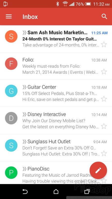
The newest version of Gmail — which is dripping with Google's Material Design — is quite good. Perhaps its best feature is support for multiple accounts. It negates the need for the separate, generic email application, although that's installed on the M9 anyway.
When it comes to sending text messages, you have three choices: Hangouts, Messages, or Messenger. As I've mentioned in other reviews, Hangouts handles SMS, MMS, and IM, but does so rather poorly. It works, but it isn't as easy as it should be. The Messages application is HTC's SMS app. It is functional and fits in well with HTC's Sense user interface. It's no problem to send messages and attach files, pictures, and other content to them. The Messenger application is Google's new SMS app for Android devices. Like Gmail, it relies on Material Design and is pleasing to the eye.
All three get the job done. Which you use boils down to personal preference.










 HTC Updates Lock Screen and Sense Home Apps
 Hands On with the HTC One M9
 HTC Bringing the One M9+ to Europe
 HTC's One M9 Earns RAW Support Via Camera Update
 HTC to Sell One M9 March 27 for $649, Carriers April 10
 HTC One M9 (CDMA)
 HTC One M9 (GSM)


