Review: Samsung Galaxy S6 for AT&T
May 27, 2015, 4:30 PM by Eric M. Zeman
Samsung's flagship Android smartphone for 2015 is stunning in many ways. This metal-and-glass handset is attractive and powerful. Here is Phone Scoop's in-depth report about AT&T's version of this remarkable phone.
Form
Is It Your Type
The Galaxy S6 is Samsung's flagship smartphone for 2015. It represents the best in design and technology from the market leader, though it cuts a more conservative path than its brother, the S6 Edge. The Galaxy S6 makes a compelling case for picking Samsung over LG and HTC when it comes to premium Android smartphones. If you are looking for a great all-around device that is both stylish and powerful, the S6 is a heavy-weight contender.
Note: Since the Galaxy S6 and S6 Edge are very similar — as are the Sprint, Verizon, and AT&T versions of each — portions of this review have been carried over from our other reviews of the S6 and S6 Edge.
Body
The Galaxy S6 isn't quite as bold as the S6 Edge, but it's still a significant leap for Samsung. The phone trades the oft-derided plastic build of past S handsets for modern and sharp glass-and-metal construction. Samsung was sure to stuff its new baby with a powerful set of specs for good measure.
For all intents and purposes the S6 and S6 Edge are the same phone. Where the S6 has a fairly standard frame and flat screen, the Edge has a thinner frame to accommodate curved glass. Other than this detail, the phones are practically identical. They are clearly cut from the same cloth as previous generations of Galaxy S smartphones, but manage to make their own mark in Samsung's expansive lineup.
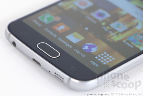
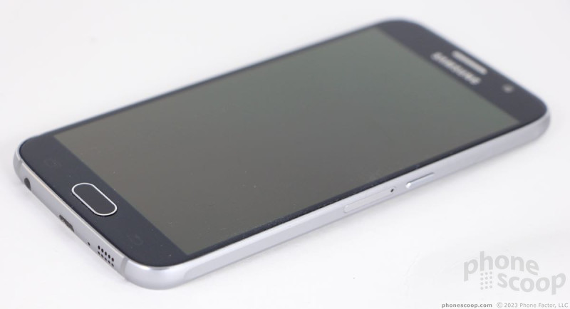
The front and back panels of the S6 are both made from Gorilla Glass 4. The glass panels are fitted tightly to the metal band that forms the outer edges of the phone. The band has a uniform thickness around the exterior edges. Samsung polished the edges of the metallic band to give them some extra sparkle. Matching accents can be found on the home button, earpiece grill, and camera module. The quality is top-notch. Samsung clearly took great care in designing and assembling the S6. It absolutely goes toe-to-toe with Apple's iPhone and HTC's One in terms of fit and finish.
The S6 is more comfortable to hold than the S6 Edge thanks to the thicker metal frame. Samsung did a great job tapering the glass fractionally right where it meets the metallic housing. This, combined with the shape of the frame, makes it relatively smooth in your hand. (The Edge has a sharp edge that isn't as palm-friendly.) The S6 is thin and relatively light. It doesn't sit deep in your palm, but it's not so wide as to make it unwieldy. Thanks to the smooth glass surfaces, the S6 will glide into any pocket or pouch like an eel through water.
The front face is all glass, save for the physical home button placed below the display. The home button doubles as a fingerprint reader. As per usual, Samsung bestowed the S6 with two capacitive keys (back, multitask) on either side of the home button for help in navigating the user interface. All three buttons work perfectly. The home button has an excellent profile and wonderful travel and feedback. On the obsidian black model — which we're testing — the user-facing camera module and sensor array disappear nicely. They are separated by the chrome-accented earpiece. There's a hidden notification light for good measure.
You'll find the volume buttons on the left. They are two separate keys, rather than a single toggle. Their profiles, travel, and feedback are excellent. You can apply these same descriptors to the screen lock button, on the right side. The SIM card tray is also on the right edge, which differs from the S6 Edge, which places the SIM tray on top. I do wish the S6 had a dedicated camera button. Alas, it doesn't. The bottom edge holds the stereo headphone jack, the micro USB port, and the grill for the speakerphone. I will say I'm rather surprised Samsung didn't make the jump to the USB Type-C connector, which is reversible and faster for data transfers. The top edge of the phone holds the IR port for interacting with home theater equipment.
The back panel is perfectly flat and smooth glass, save for the camera module, which protrudes noticeably. Samsung placed the flash and heart rate sensor in a separate module to the right of the camera, but they are flush with the surface.
Perhaps the biggest departure for Samsung with respect to the design is the rear panel, which cannot be removed. For years Samsung has teased rivals for their sealed designs and pointed to its own swappable batteries as a benefit. Samsung can no longer make such claims. The S6 is sealed up tight, which means no swapping batteries. It can, however, work with most wireless charging pads thanks to support for multiple wireless charging standards. What's more, it includes rapid charging. These will offset the battery's inaccessible state for some. Further, the S6 doesn't include a memory card tray, though Samsung sells it in 32GB, 64GB, and 128GB variants.
Using two glass panels has practical limitations. Anyone who dropped and broke an iPhone 4 or iPhone 4s can tell you what a pain in the rear it is to deal with replacing so much broken glass. Samsung is taking a bit of a risk with the double glass design, but Gorilla Glass 4 is supposed to be pretty tough stuff. Consider yourself warned.
Samsung did about as well as it could have in designing and manufacturing the Galaxy S6. No phone is without compromises, and the S6 certainly has a few, but overall it's an excellent piece of hardware that should please most people.
(It's a shame that U.S. carriers are not initially offering the blue and green colors, which I thought looked spectacular. The white and black models are a bit dull, and the gold is too... well, not for me.)
Performance
Screen
The S6 and S6 Edge both sport a 5.1-inch quad HD screen. The S6 has a traditional, flat screen and the Edge's display wraps around the side edges just slightly. The S6 screen relies on Samsung's OLED technology and it's very bright. Colors are perhaps not quite as accurate as I'd like, but that's only because Samsung likes to boost them to appear more intense. The size and resolution are a match made in heaven. The pixel density is incredible; everything on the screen is razor sharp. I found the display quite easy to read outdoors, even under sunny skies. You can't ask for a much nicer display in a modern smartphone.
Signal
I was genuinely impressed with how the S6 performed on AT&T's network. In my tests in the general metro NYC region, the phone maintained a strong connection to AT&T's LTE service. Not once did the device lose its connection, though it did drop to HSPA a handful of times in areas lacking LTE coverage. The device always connected calls on the first dial and did not drop nor miss any calls, either. Apps downloaded swiftly and the GS6 tackled everyday tasks like uploading photos to Instagram or Twitter in a blink.
Sound
The AT&T S6 produced better-sounding phone calls than the Sprint and Verizon models I've already tested. I was more pleased with the clarity and volume available from the earpiece. The S6 isn't the clearest nor loudest phone, but it's above average for sure. I was able to hear calls in most environments without trouble. Voice sounded good to my ears, and those I spoke with via the S6 said I sounded very good.
The speakerphone was moderately better than the earpiece for calling purposes. The speaker offered distortion-free conversations that were loud enough to hear at a soccer game.
Ringers and alerts will certainly get your attention without trouble, even if the phone is in a different room. The vibrate alert is strong enough for you to feel it in a coat pocket, backpack, or purse. When the phone is flat on a table, the vibrate alert will send it sliding sideways.
Battery
The S6 has a 2,550 mAh battery sealed inside the chassis, which is a step down from the 2,800 power cell inside last year's Galaxy S5 and just slightly smaller than the Edge's 2,600 mAh battery. Sadly, the AT&T variant of the S6 exhibited the worst battery life of all the models I've tested. It crapped out consistently at about the 15-hour mark with heavy use, where the Sprint and Verizon models lasted closer to 16 or 17 hours. The phone has a power-hungry processor and display.
Samsung included its Power Saver and Ultra Power Saver modes. These do make a difference if you run into trouble. The first option tones down a few features and doesn't crimp the phone's performance too much. For example, it will limit the CPU a bit, turn down brightness, turn off the key backlights, and put the display to sleep faster. The second takes a more aggressive approach and kills off all but the basics. It strips the UI down to the bare essentials, goes grey-scale, and prioritizes only key functions, such as calling and messaging. These will help you save power.
I tested the S6 on two different wireless charging pads I have. It worked with both. It charged slowly, but it had no problem switching between the two different standards used by the pads. The phone is very quick to charge when plugged into the supplied wired charger.
Basics
Menus
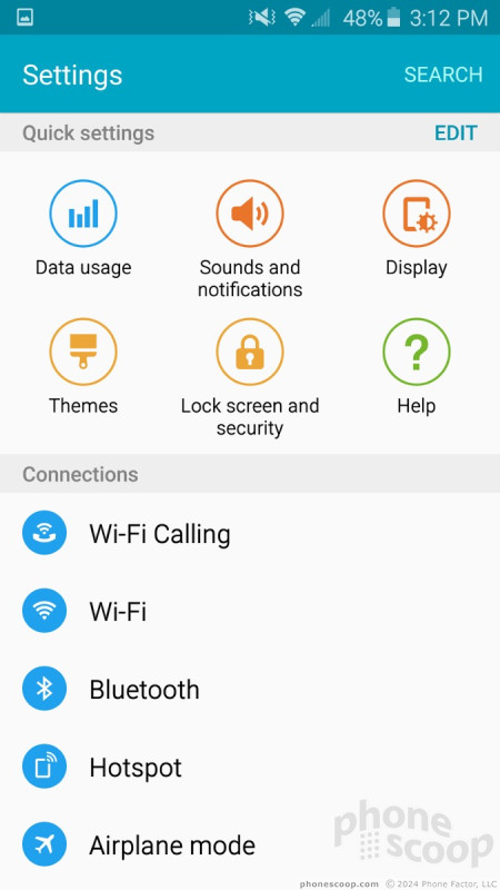
Android 5.1 Lollipop is the underlying operating system, but Samsung slathered its TouchWiz user interface on top. The basics — lock screen with app shortcuts, notification shade, home screen panels, widgets, app menu, settings tools — are all more or less in place. Samsung dressed most of these core elements up with its own design language, but the way they function is the same as most other Android devices.
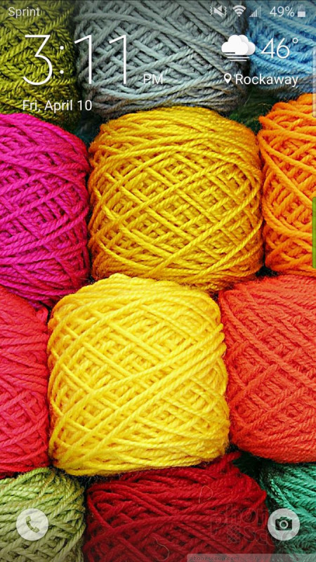
The lock screen includes shortcuts to the phone and camera. It's worth noting that the app menu displays items in alphabetical order and supports folders, but you can't uninstall apps. Samsung adopted the same silly “3D” parallax effect (apps move against the background) that Apple did when it introduced iOS 7. I couldn't find a way to turn it off. The notification shade and settings menus rely on the same circle-centric design we saw on the GS5 last year and are rather clunky in their layout. Otherwise, it's Android.
If you're looking to personalize the S6, you have plenty of options. There are a wide variety of wallpapers, alerts, ringers, and widgets. You can also set fonts, text sizes, and control many different aspects of the display. One new thing I really like: you can choose how many app shortcuts and/or widgets will fit on a single home screen panel. For example, the base configuration is four across and four down for a total of 16 shortcuts per home screen. You can alter the grid to a 4x5 configuration or a 5x5 configuration to fit more apps/widgets, if that's how you roll. That's pretty cool. (HTC offers this option as well.)
Samsung still thinks everyone loves Flipboard and has made it the left-most home screen panel. Samsung hopes people will use it as a socially-connected newsreading platform, much like HTC's BlinkFeed in Sense. You can get rid of it if you want, which is what I did. I replaced it with Google Now.
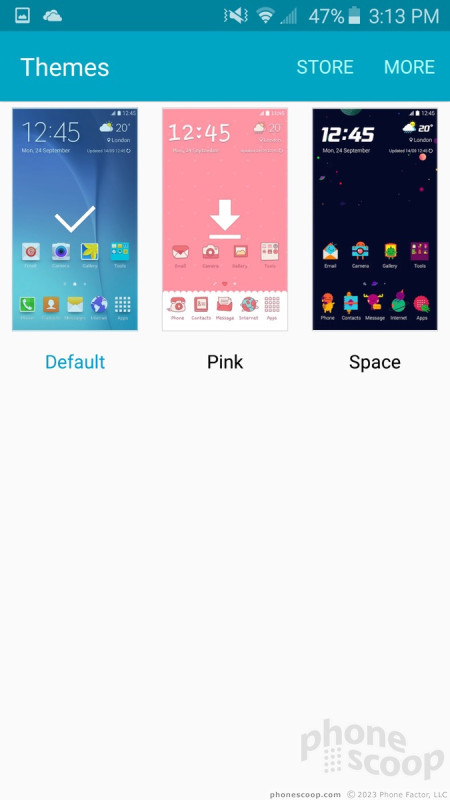
The other big addition to TouchWiz this year is themes. Like the themes in HTC's Sense UI, the themes in TouchWiz completely alter the look and feel of the user interface elements. For example, all the app icons, fonts, and colors are different within each theme. Only three themes are pre-loaded: the bluish one we've seen on many Galaxy phones; a pink theme (for girls?); and a space theme that turns your smartphone into an "Adventure Time"-like alternate universe (seriously, it's bonkers). There are dozens more available for download, but, annoyingly, you have to create a Samsung ID/account in order to access them.
The S6 includes support for Samsung's split-screen mode, which allows two apps to function in separate windows at the same time. It's fairly easy to activate, and a decent number of apps work with the feature, such as the browser, Gmail, YouTube, messaging, and so on. It's a cinch to drag content from one live window to another, and otherwise interact with the multiple windows. This is a useful feature I wish more smartphone makers would adopt.
The S6 offers Samsung's Easy Mode, which dumbs down the user interface for beginners. It's no doubt useful for people who might otherwise be overwhelmed by TouchWiz, but for goodness sake buy something cheaper if you need to use Easy Mode.
The standard S6 does not have the Edge's cool edge-based features (alerts, information streams, night clock), but they're not vital functions by any stretch.
A few words about performance. Samsung kicked Qualcomm's Snapdragon processors out of its premium device in favor of its own Exynos-branded chips. The S6 has an octa-core processor with four cores at 2.1 GHz and four cores at 1.5 GHz in a big.LITTLE configuration. The processor is paired with 3 GB of RAM. After spending nearly a week with the phone, all I can tell you is that the device is hella fast. It does everything in a blink. It's Mario Andretti meets Mario Kart.
Calls and Contacts
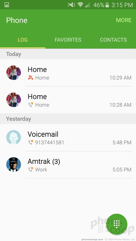
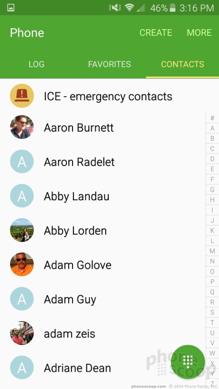
Samsung's phone app is a slight variation on the Lollipop phone app. Samsung's app is easier to use, in my opinion, and looks better too. The default screen is the dialpad, but tabs across the top will take you to your call log, favorites, or contacts. In-call options run the norm. Like most Galaxy-branded handsets, the S6 offers extensive control over the minutia of the phone app. For example, you can define call rejection behaviors and whether or not it automatically sends text messages. You can choose to automatically reject all calls from select numbers, how the phone answers calls (press the home button, using voice commands, etc.), and even automatically answer all calls when connected via Bluetooth.
There are several gestures for interacting with the phone app. For instance, if you're viewing a contact, raising the phone to your head will automatically call that person's main number. If you've missed calls or messages the phone will vibrate when picked up. Placing your hand over the display or turning the phone over will silence incoming calls.
AT&T's variant of the Galaxy S6 does not include WiFi calling, which the Sprint version does. It does, however, offer a for-pay Caller ID app that costs $2.99 per month.
The contact app is practically the stock Android version. Samsung gave it a fresh coat of paint, but otherwise it functions as we've come to expect. When you open the actual contact app, the default view is all contacts. There are tabs for reaching your favorites and/or groups. All the graphical elements are fitted into colorful circles and it is certainly bright. Individual contact cards hold tons of data these days, and the phone can easily sync with pretty much any internet-based contact database (Gmail, Outlook, Yahoo, Exchange, etc). You can also merge your social networking contacts into the fold and even choose to view only your Gmail contacts, your Facebook contacts, and so on.
Messaging
Gmail is on board, as is the no-longer-relevant Android email app. Gmail handles all types of email accounts these days so the other email app is just a waste of space. AT&T has placed its own AT&T Mail app aboard, as well, though why you'd use it is beyond me.
As far as text messaging goes, the AT&T S6 only includes the older Android SMS application. I don't know why the newer Messenger app (SMS) from Google isn't on board, but you can snag it from the Play Store quite easily.
The S6 also has Google's Hangouts app, which handles SMS and IM together, if you wish. Let's not forget Facebook Messenger, as that's pre-installed, too. The actual Facebook and Twitter social network aren't pre-installed, but you can be sure Google+ is (ugh).
Extras
Media
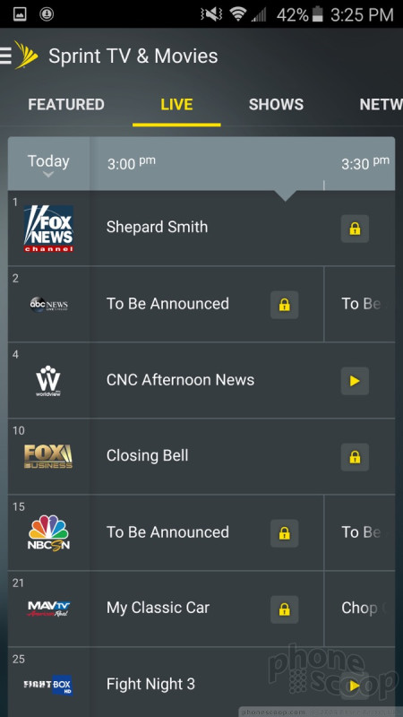
There is no shortage of media apps on the S6 from AT&T, that's for sure. By default, the phone comes with Google's Play apps for buying and consuming movies, books, TV shows, and magazines. It also supplies the native YouTube app, as well as basic music and video apps for playing side-loaded content. I rather like the music player, but the movie app is somewhat bare-bones.
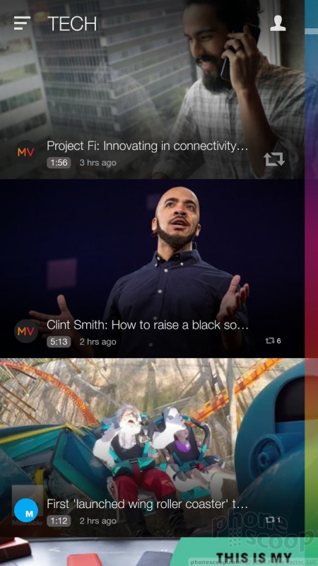
Samsung installed its own Milk Music app on the S6. This uses Slacker's back-end but has a user interface created by Samsung. It's actually pretty cool and the selection of music is solid. You have to pay to get an ad-free experience. Samsung also stuck its Milk Video service on the AT&T S6. Milk Video is kind of like YouTube Lite, but highly curated.
Other media apps include AT&T Mobile TV, which streams video content over the network. It works best via LTE.
Last, there's a separate app called Peel, which acts as both a TV remote control and content guide for your cable provider. (HTC uses this same app on the One M9.) It's really, really easy to set the app up so you can control your home theater equipment. The Peel engine is pretty good for scouring through your cable provider's content, but also includes options from streaming services, such as Hulu and Netflix.
You have no excuse to get bored if your Galaxy S6 is nearby.
Camera
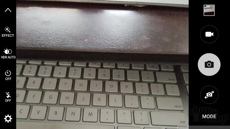
Samsung completely overhauled the camera application and that's a good, good thing. The app is so much cleaner and easier to use than Samsung's older camera software. As mentioned, there's no dedicated camera button, but you can set the camera to launch — even when the phone is locked — with two quick presses of the home button. It springs to life spritely.
The shutter buttons are on the right and the settings and other tools are on the left. Gone are the design-heavy icons and elements, which have been replaced with simpler, black-and-white icons. In addition to a large shutter button, the controls on the right also include a separate button for capturing video, one for accessing your photo gallery, another for switching to the selfie camera, and one more for accessing the different shooting modes. On the left, the settings strip includes toggles for the flash, HDR, timer, and effects. The strip also lets you access the camera's full settings menu. Some of the tools in there let you adjust aspect ratio and image size, set location tags and review behaviors, and so on.
If you tap anywhere on the screen, it will focus on that spot but you still need to press the shutter button to take a picture. If you press-and-hold, it will focus on that spot and also use it to set the exposure.
Rather than besiege users with 50 different shooting modes preinstalled on the phone, there are only seven: normal, pro, bokeh, panorama, slow-mo, timelapse, and virtual shot. All the old shooting modes from Galaxy S phones of years past (Shot & More, Sound & Shot, etc.) are available for download from Samsung if you want them.
The normal shooting mode is for those who want to simply point-and-shoot. The pro mode is for those who like to take more control over options such as white balance, focal distance, ISO (or speed), exposure, and so on. In fact, these tools are only available in the pro mode.
The other effects behave as they do on other phones, but the virtual tour tool is pretty unique. When in this mode, you walk around a still object (like a car, or a statue) while recording a handful of shots. You can then send that collection of images to others, providing them with a virtual tour of whatever the object is. They can pan through the images to see what it is like from all sides. I don't really find this all that useful. Sending a short video clip makes more sense to me.
Then there are the different selfie modes. Samsung made it (sort of) easier to take selfies when using the front camera. Let's face it, getting that perfect shot of yourself and touching the screen can be awkward. With the S6, switch to the front camera and aim the phone at yourself. You'll see a circle appear around your face. This means the camera recognizes that a person is in the frame. Then place your finger over the heart rate sensor on the back of the phone to take the picture. It's easier to do in real life than it is to explain it. The bummer is that it doesn't always work.
The selfie camera also includes a wide-angle mode for those group shots, and an interval mode for taking four photos in quick succession. The interval shot mode is to help get the best possible selfie. You pick to keep the one you like best once the shots are all taken.
My favorite aspect of the camera is its speed. It is always lightning quick to do everything. Camera applications can sometimes be a drag on processors, but the S6 handled the app just fine. It was quick, speedy, fast.
I like the overhauled camera software very much.
Photos
The S6 has a 16-megapixel sensor and an aperture of f/1.9 to let in more light. It's a very capable camera and performs beautifully. I was very pleased with the results I achieved with the camera. Focus, exposure, and white balance were almost always spot-on, even in challenging spaces with lots of bright and dark spots. I hardly saw any grain. Colors look fantastic. It really is a great smartphone camera and can cover most of your needs. I'd say it's almost as good as the iPhone 6 / 6 Plus camera, and leagues better than the HTC One M9 camera. With the Galaxy S6 in your pocket, you shouldn't ever need to worry about missing those special moments as they occur.
The selfie camera has a 5-megapixel sensor and it, too, is highly capable. My ugly mug never looked so good. People who are big fans of themselves will be really happy with the S6's selfie prowess.
Video
The video camera can capture video up to 4K resolution, and also includes quad HD, full HD, 720p HD, and VGA options. It's probably best to ignore the 4K setting unless you have a 4K TV or display handy. Shooting with the quad HD setting lets you use every pixel on the phone's screen when playing the video back. The resolution is crazy good.
Whichever resolution floats your boat, the S6 delivers sharp, accurate video. I was impressed with the results. The video camera is good enough to cover most of your potential video needs.
Gallery
Like many phones these days, the S6 has both Google's Photos gallery app and one created by Samsung. The Samsung gallery is actually rather decent. It makes organizing photos a snap thanks to clear and easy controls for sorting and moving them around. When viewing individual photos, a control strip along the bottom lets you access sharing and editing tools. The sharing dialog box closely resembles the one in the Google Photos app, but adds a couple of options for mirroring the screen to nearby devices, sending the photo to your TV (via DLNA, and also printing them.) These functions all worked well. The editing tools aren't as advanced as the one in Google's app, but they are a breeze to use. There's an auto-adjust function as well as rotate and crop. There's a really neat collage creator for piecing together a handful of images, and a more in-depth editor for adding effects and changing things like contrast, brightness, color saturation, and so on.
Want to save your photos online? There are at least two ways. First, the Google Photos app can be set to automatically upload your images. Second, Samsung will store them if you set up an account. Third, Microsoft OneDrive is available if you prefer to store your photos on Microsoft's servers rather than Google's or Samsung's.
Apps
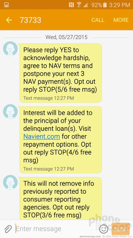
AT&T is one of the worst offenders when it comes to bloatware. AT&T is, however, allowing S6 owners to delete some (but not all) of its third-party add-ons. Some of the bloatiferous apps include AT&T Live, AT&T Locker, AT&T Navigator, AT&T Mail, AT&T Mobile Locate, Smart Limits, Usage Manager, Mobile TV, Digital Live, and AT&T Mobile Transfer. Let's not forget Amazon, AT&T FamilyMap, the Galaxy App Store, Keeper, Lookout, Uber, and Yellow Pages. You're allowed to get rid of about half of these.
Bluetooth
You shouldn't have any trouble with the S6's Bluetooth radio. I sure didn't. It connected to everything I threw at it, including headsets, speakers, other phones, smartwatches, PCs, and my car. I made some calls with the S6 through my car's hands-free system and they sounded quite good. Music sounded awesome blasting from my best Bluetooth speaker thanks to the aptX profile.
Browser
The generic internet browser app is still making its way onto Android smartphones and I don't know why. It's not a bad app, but there's no point in including both it and Chrome. That gripe aside, the two browsers each do a fine job of rendering web sites on the phone's screen. I thought speeds were particularly speedy over AT&T's LTE network. Web sites look fantastic on the quad-HD display.
Clock
The lock screen offers a large digital clock and the weather, if you want them. You can choose to leave the home screen blank, have just the clock, or the clock and weather. I wish the white clock were a bit easier to read.
Fingerprint
Like the S5, the S6 has a fingerprint reader built into the home button. Samsung improved the performance of its reader by leaps and bounds. Perhaps this is because it changes from using a swipe-style reader to a touch-style sensor. I found it was much faster to train the device to learn fingerprints, and it was more consistent at recognizing them correctly on the first attempt. You can use the fingerprint sensor to secure the device, or to secure individual apps, files, and folders if you want to keep things private. You can also use the fingerprint with Samsung's Private Mode, which is a sealed away part of the phone that no one but the owner (or the owner's finger) can access.
GPS
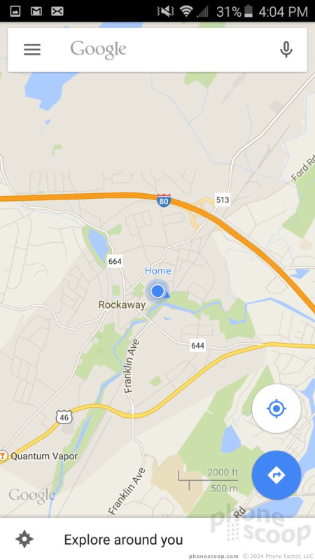
The GPS radio worked fine and was very quick to pinpoint my location. It functioned well with both Google Maps and AT&T Navigator application. Maps is great for getting yourself from place to place, and even better when it comes to searching for nearby points of interest. AT&T's app is functional, but not as feature-rich as Google Maps. It does, however, respond better to dynamic driving conditions. I don't think it's worth the extra monthly fee.
Samsung Stuff
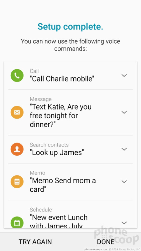
Samsung's good ole' S Voice, S Finder, and S Health apps are available if you care to use them. S Voice is Samsung's voice-activated assistant, but it's nowhere close to being as good as Google Now (or Siri or Cortana, for that matter). It functions OK for doing basics, like making phones calls.
S Finder is Samsung's phone-based search tool. It will help you discover anything on your phone. It's available from the notification tray.
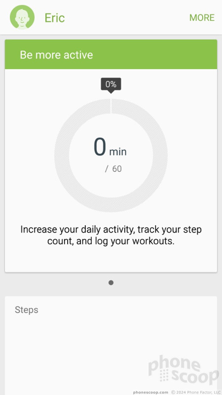
S Health is Samsung's health and fitness tracker. It's actually quite good. You build yourself a little profile and can then track workouts, your diet, set goals, and stuff like that. The heart rate monitor works, but only when you stand still. That means no checking your rate mid-workout.
The Samsung Pay app is not launching until summer, so we're unable to test that feature at this time. It will use a combination of NFC and magnetic swiping to work with a great deal more payment terminals than Apple Pay can at present. I was able to set up Google Wallet, too, but not to make payments with the NFC radio.
Wrap-Up
Samsung simply killed it with the Galaxy S6. It may not have the raw sex appeal of its curvy brother, but the S6 offers an experience that is almost entirely the same. The Galaxy S6 is well designed and well made, with quality materials. The phone is a winner in most respects.
The metal and glass design lends a premium feel to the S6 not previously available from Samsung's lineup. The phone is small and light enough to use comfortably, and the quad-HD screen will knock your socks off. Some may be put off by the locked-in battery and lack of memory card. For me, these are acceptable trade-offs to gain such an attractive phone.
The phone performed great on AT&T's network in terms of data, and call quality was slightly improved compared to competing variants. The Quick Charge feature works as advertised and being able to drop it on any wireless charging pad is a bonus. (It might be time to invest in one.) I do wish the phone coughed up a few more hours of battery life. In fact, at 15 hours, it's almost a deal-breaker. You can squeeze more from the S6 if you use Power Saver Mode, but that defeats the purpose of owning such a powerful device.
Samsung and AT&T stuffed the phone to the max with unwanted and unneeded apps, but they all work perfectly thanks to the zippy processor. The camera does a fantastic job and the new camera app is a joy to use. With advanced features such as Samsung Pay coming in a few months, there's hardly anything the S6 can't do.
I think the Edge is the better of the two new Galaxy phones, but you're not missing all that much if you opt for the S6 instead. If you can throw caution to the wind (i.e., you're not constrained by money,) I say go for the Edge. If you're more interested in a standard handset that still sets the bar for quality Android devices, the Galaxy S6 is an excellent selection. At $100 less than the Edge, the S6 is also more affordable.
The Galaxy S6 is the phone we've always known Samsung could make. I'm glad it's finally here.
Comments
No messages




























 Review: Samsung Galaxy S6 for Sprint
 Hands-On: Samsung Galaxy S6 and Galaxy S6 Edge
 Liveblog of Samsung's Galaxy S6 Launch
 Samsung's Galaxy S6 and S6 Edge Tout Metal and Glass Designs
 T-Mobile Teases Samsung's Galaxy S6
 Samsung Galaxy S6 (GSM)


