CES 2008
Jan 6, 2008, 9:24 PM by Eric Lin, Eric M. Zeman and Rich Brome
updated Jan 10, 2008, 6:32 PM
Our complete coverage of CES in Las Vegas. Hands-on with Mirasol displays, plus new phones from LG, Nokia, Sony Ericsson, Motorola, Neonode, UTStarcom, and OpenMoko.
Part 1
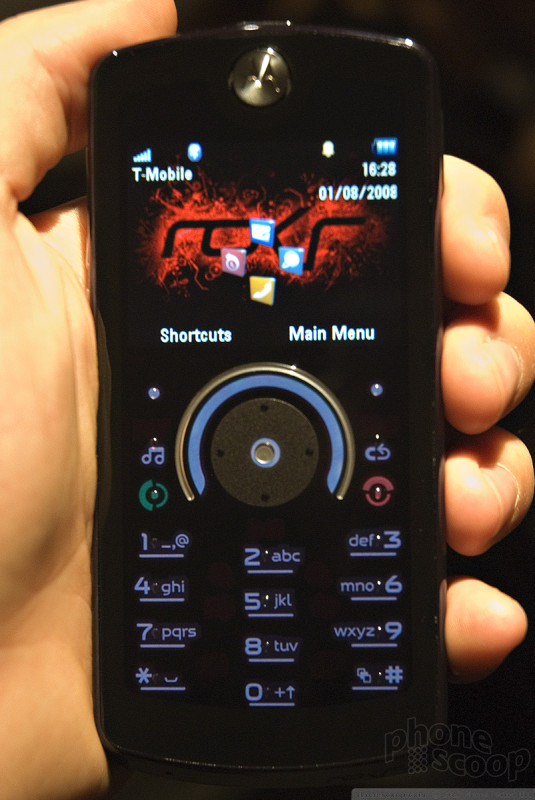
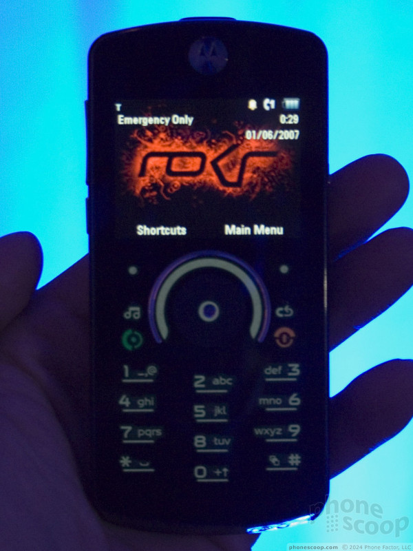
Moto ROKR E8
The ROKR E8 is Motorola's new concept for a music phone.
To hear Motorola tell it, their goal was a device that looked and worked like a phone in phone mode, but also looked and worked 100% like a dedicated music player in music mode. We've heard lines like this from a lot of companies in the past year, but it usually amounts to just a few extra side keys or a few software gimmicks. With the ROKR E8, however, Motorola has really put some new ideas and technology into this concept of a "no compromise" converged device.
(Note that parts of the keypad that appear red in the above photos are actually white in normal lighting. Our camera flash made them appear red for some reason.)
The first key innovation of the E8 is the unique "morphing" keypad that changes depending on the mode the phone is in. The basic idea is not new. The Samsung Heat and LG Venus, for example, both have contextual keys in the d-pad area that only become visible in the relevant modes.
However the E8 takes this concept to the next level by extending it to the entire keypad area. The result is a device that really could be mistaken for a standalone music player in music mode, because all of the phone keys completely disappear from surface. A special set of dedicated keys appears only for camera mode, as well.
The front of the phone is just one flat surface of glossy hard plastic. A few tactile elements have been added to help your fingers find their way, such as a small grid of bumps over the lower half, and a textured d-pad area. But otherwise the front is flatter and smoother than any other phone I can think of.
The second key innovation is the incredible haptic feedback system integrated into the keypad surface. To put it simply, it's the first true touch keypad that feels like real buttons.
All current phones on the market with touch keys and "haptic feedback" actually just vibrate the whole phone a little bit to let you know your touch registered. On the E8, however, the haptic feedback is localized so you only feel it under your finger, not the whole phone. What's more impressive is that it doesn't just vibrate a little; it actually has separate "press down" and "release" types of feedback that actually simulate the feel of pressing a physical button.
This new type of haptics really works, and quite well. The effect is best described as "spooky". It works so well that if Motorola had told us it had real keys under the surface - and wasn't a touch keypad at all - we would have believed them and never doubted it. In fact , if you treat it like a touch keypad, you'll have trouble with it. That's because it's designed to be treated like a "real" keypad; key presses only register if you press as hard as you would with physical buttons. A light touch like you might use with other touch phones won't cut it on the E8.
Another unique part of the E8 is the silver, semi-circular scroll control that surrounds the d-pad. At first you might assume it works like an iPod scroll wheel. However, in the PowerPoint presentation on this feature, they explained that it's supposed to be more like a scroll speed control, where putting your finger on the right half always scrolls forward, while the left half scrolls back, and the further from the top, the faster it scrolls.
Either of those two options might have been fine, but in fact Motorola's own presentation was wrong, because the way it actually works - as explained by the actual product managers and seen during our own hands-on time - is an extremely awkward combination of the two methods. I found it very un-intuitive and difficult to use, even with one of the engineers who worked on the project coaching me.
As the "ROKR" branding implies, the focus of this phone is definitely music. In addition to the unique keypad, you'll find a 3.5mm jack topside for use with standard music headphones, plus stereo Bluetooth for the cord-averse. There's also a generous 2 GB of built-in memory which can be expanded via the microSD slot supporting cards up to 4 GB, for up to 6 GB total for your tunes.
As for the rest of the phone, it feels small and light, but well-built. It has a great feel to it. The screen is crisp thanks to it being QVGA resolution, but it's awfully small, which is due to the puzzling landscape orientation.
Here is a video preview of the Motorola ROKR E8, where you can see the three keypad modes in action, plus a little scroll wheel action:
Sony Ericsson
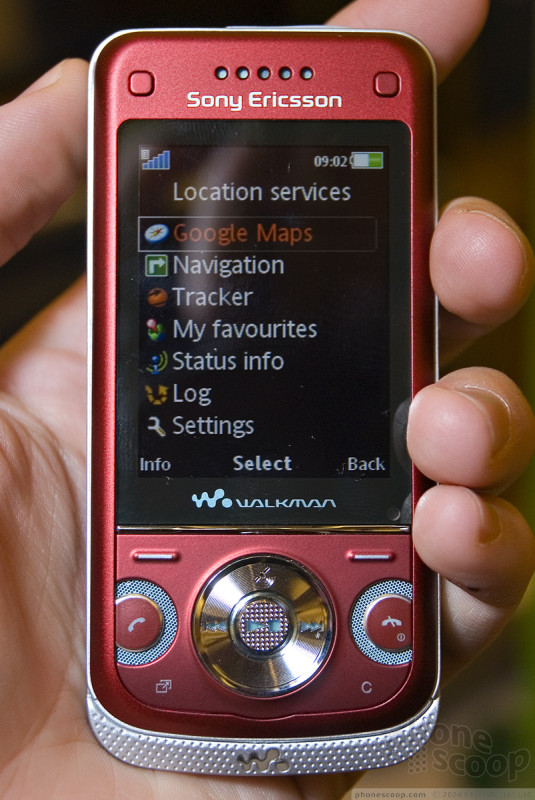
Sony Ericsson got an early jump on the show announcing its new phones before anyone else got a chance. The W760 is the most notable among them by far. With this phone, we see Sony Ericsson was merely dipping their toe in the water with the K850. Now they're wading into the pool, with a much more, shall we say traditional, looking slider.
The W760 fits in the hand well and slides open and closed nicely. The navigation controls are on the face of the phone so they are accessible when the phone is closed. These are dominated by a huge D-pad in the center, with a fairly large number of keys surrounding it, including send and end keys - which are strange to see on a Sony Ericsson phone. In fact I was so dumbfounded that I kept pressing them instead of the soft keys when trying to use the phone. Sliding the W760 open reveals a very nice numeric keypad. The keys are large, have good feedback, and are very easy to text with.
The W760 has so many tricks up its sleeve that Sony Ericsson could not work them all out in time for it's premiere. However the phone's accelerometer was working and will automatically rotate the screen when you are using the Walkman interface, playing games, and in a few other instances. The GPS, SenseMe and other noteworthy features weren't as ready for prime time yet. The phone was working well enough for us to learn that although the camera is 3 MP, it is not autofocus nor does it have a flash.
Here is a video preview tour of the W760:
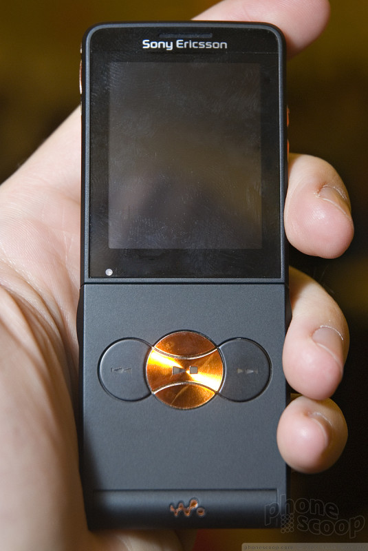
After the W760, it's difficult to be impressed by the W350, but it's not fair to demand as much from a mid-range phone. Everything old is new again as Sony Ericsson brings back the flip phone - both Sony and Ericsson's original form factor of choice. Although it makes me nostalgic for my first phone, which was an Ericsson flip, it also reminds me how much more we do with our phones now. The W350 has thousand more features and is 1/10th as thick as that old Ericsson.
But unfortunately the flip style was designed back when we didn't do much other than make phone calls, and modern tasks like typing out texts or even using the D-pad are far more difficult with the flip obstructing your normal grasp of the phone. It doesn't help the the D-pad is fairly small, though the 2 soft keys, back and clear key surrounding it are plenty larger. However with the flip closed, it is easy to control your music with the dedicated playback keys.
The small 176 x 220 screen helps to keep the W350 svelte, unfortunately it feels really small, especially compared to the QVGA model on the W580.
Here is a video preview tour of the W350:
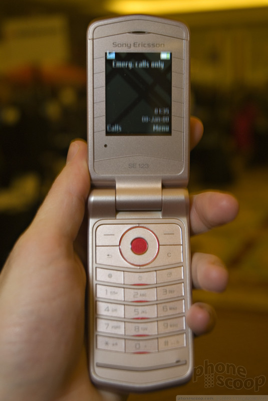
The Z555 has the same 176 x 220 screen as the W350, which looks positively minuscule floating in the center of the Z555's large plastic face.
The large body may make the screen look small, but it assures that the keys are large, and they are very easy to use. Though we still liked typing on the W760 better.
This clamshell has a monochrome OLED screen hidden beneath it's faceted cover. It looks quite stylish when lit up, even if it's just displaying the time.
Here is a video preview tour of the Z555:
Part 2
LG
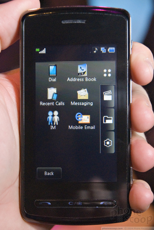
LG had a few surprises in their booth. Chief among them was the long-rumored Vu, which is essentially a US version of LG's much-hyped Prada phone. The Vu sports essentially the same finger-touch UI as the Prada phone; the differences are a slightly more tapered design and the addition of MediaFLO mobile TV.
LG gave us the obligatory "the carrier hasn't been decided yet" line and asked us to obscure the logos, but rumors across the web are that this is destined for AT&T, and there were plenty of clues to confirm that. Most obvious is that LG told us this would launch soon as "the first" MediaFLO phone for the intended GSM carrier, and AT&T has announced plans to launch MediaFLO soon.
The Vu is just as sleek and slick as the Prada phone; perhaps even more so thanks to a less-blocky design at the ends. It's quite light and thin, especially for a phone with such advanced features. The massive touch screen on the front is crisp and bright, and the touch capability works well. We did have trouble with the scroll bar in the browser, but LG made it a point to tell us that the browser was an older, non-final version. The final version will support full HTML web sites like the Voyager.
In text entry fields, you can choose a virtual numeric keypad and use multi-tap to enter text, or you can press the little keyboard icon at the top and switch to a very iPhone-like keyboard in landscape orientation The virtual keyboard works well. The face of the Vu sports only three physical keys - send, clear, and end - arranged in a thin row below the display. The black keys are illuminated with a white backlight when appropriate, but when the keys are not illuminated they all but disappear into the face of the phone, giving it an even sleeker look.
Here's a quick video of some Vu features:
Video looks great on the large display, as does the large, easy-to use channel guide for MediaFLO mobile TV. With the phone situated in landscape orientation for TV watching, a long antenna can be extended from the top to improve TV reception. Unlike the antennas on other MediaFLO phones, the one on the Vu does not bend at the base, potentially making it very prone to damage if it gets knocked while extended.
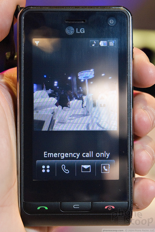
Also on display was the Viewty, which is really quite similar to the Prada and Vu, but adds a high-quality 5 megapixel camera. The camera adds some thickness, but it still feels thinner than its competition like the Sony Ericsson K850 and Samsung G800.
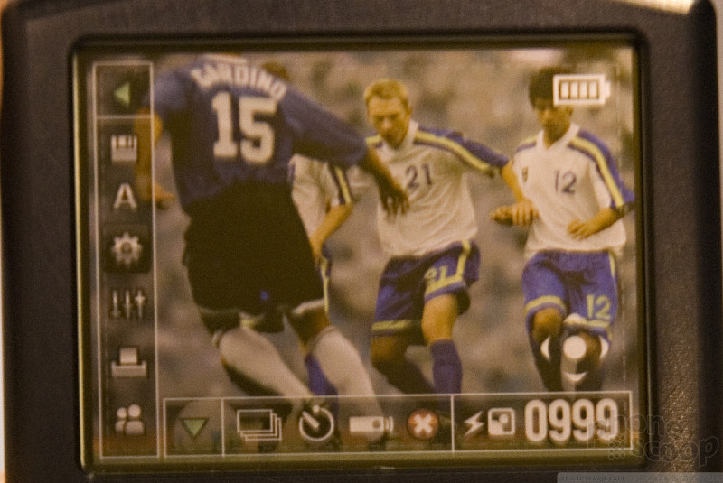
The camera interface is one of the most extensive and well-designed we've seen, with large touch buttons offering quick and easy access to a plethora of controls. Pretty much any camera feature or control you've ever seen on a camera phone is on the Viewty.
Check out the Viewty camera interface in action in this video:
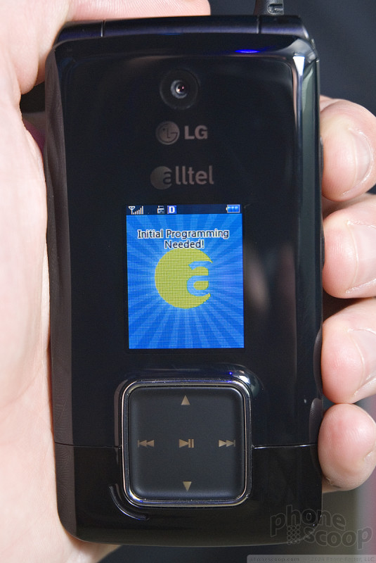
Also making an appearance is the AX-565, which is essentially a Muziq for Alltel. The circular touch music controls on the outside of the Muziq are square on the AX-565, but otherwise the two phones are nearly identical, including the handy FM transmitter feature.
We've also got a quick video of the AX-565:
Bluetooth Headsets
Three Bluetooth headsets stood out tonight both because of their design, and their technology. Whether any of them can make a clear call has yet to be seen.
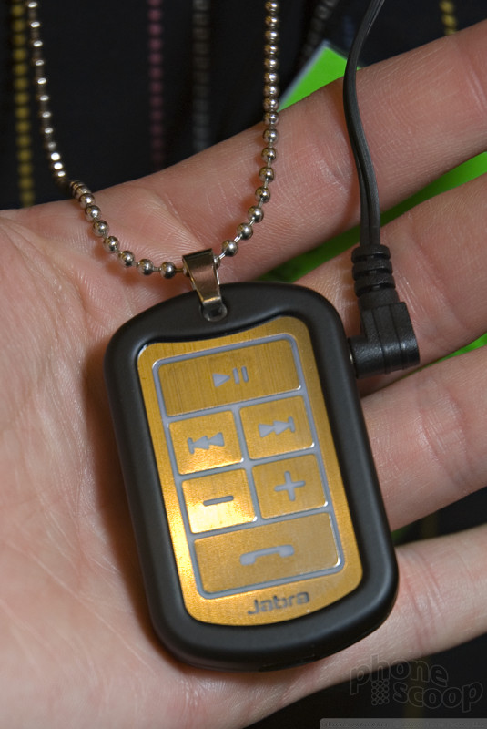
The Jabra 3030 is meant for a younger crowd than your average Bluetooth headset.
It is a stereo headset that looks like a dogtag with etched music and call controls and a headset jack. Plug in the headphones and you can rock out to your tunes, or take a call since there's a microphone built into the dogtag. The 3030 sounded great and looked hip enough to wear around without looking like a borg. It also did a great job at playing back a music stream without dropping the connection every time you moved around.
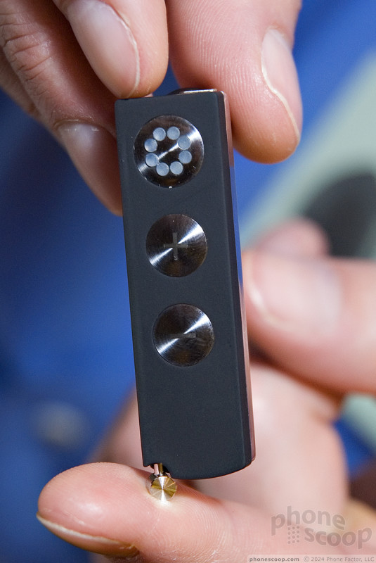
The Joby Zivio is a small little mono headset with an even smaller surprise.
It has a tiny little boom mic that pulls out so that you're talking into a microphone near your mouth instead of near your ear. The mic is suspended on the same memory metal used for many wire rimmed glasses, so it will bend without crimping or breaking. It also has a large variety of rubber grommets to fit the headset to many ears, as well as a magnetic ear hook should you need more support.
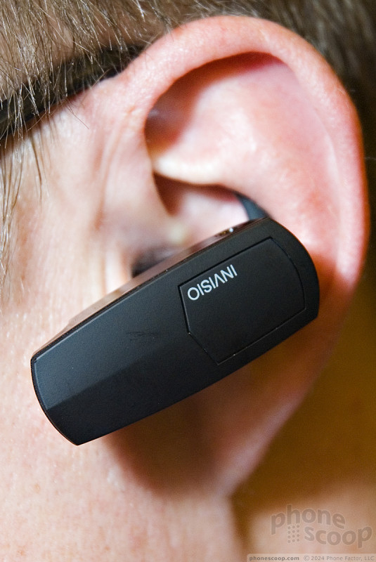
The Invisio Q7 takes a different approach to ensuring your voice, and not background noise, is heard.
It uses technology SWAT teams and special forces have had for years - the microphone is actually inside your canal. The Q7 slides in your ear and the microphone sits against your ear canal picking up your voice as it's transmitted through your jawbone. The rest of the headset is small and designed to fit just outside the ear. We don't know how the Invisio sounds, but the technology totally appeals to our inner Sam Fisher.
Part 3
UTStarcom
UTStarcom surprised us at this year's CES with a few quite interesting new phones in addition to their usual parade of lower-end CDMA clamshell phones.
In UTStarcom's lineup, the 8000 series are manufactured by Pantech, with UTStarcom essentially acting as Pantech's representation in the North America, handling the carrier relationships, marketing, and branding. New 8000-series phones here at CES include three clamshell-style models, a standard slider, and a slider messaging phone.
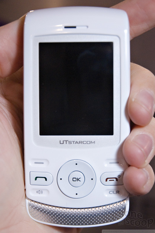
The standard slider - the 8965 - is a fairly stylish number, available in a number of color combinations.
The 8965 also sports a respectable feature set, including EVDO, Bluetooth, a memory card slot, and a 1.3 megapixel camera. The 8965 is slated for a summer launch with regional carriers and/or MVNOs.
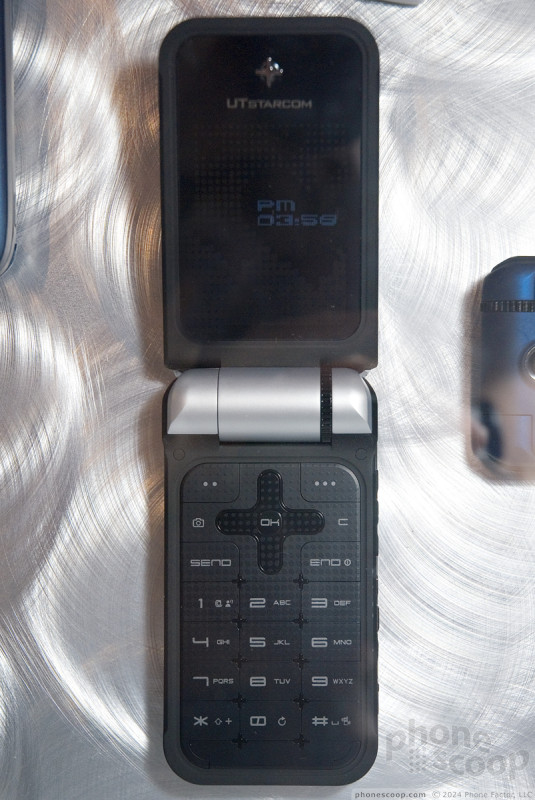
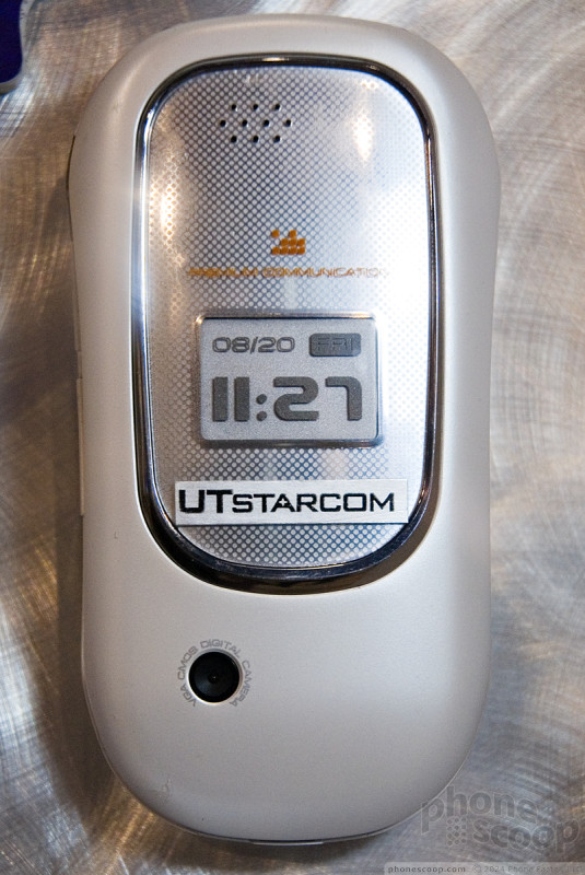
Moving up the new 8000-series lineup is the 8970, a thin clamshell with a couple of unique features.
The first unique feature is the oversize external display. An array of LEDs can display the time, scrolling text messages, and more, at a size than can be read from across the room.
The next unique feature of the 8970 is the scroll wheel built into the hinge. This clever innovation puts a physical wheel right at the tip of your thumb for easy scrolling and/or volume control (they haven't nailed down what it will control yet.)
Other features of the 8970 include EVDO data, Bluetooth, a 1.3 megapixel camera, and a microSD memory card slot. Don't expect to see this one until the second half of 2008, though.
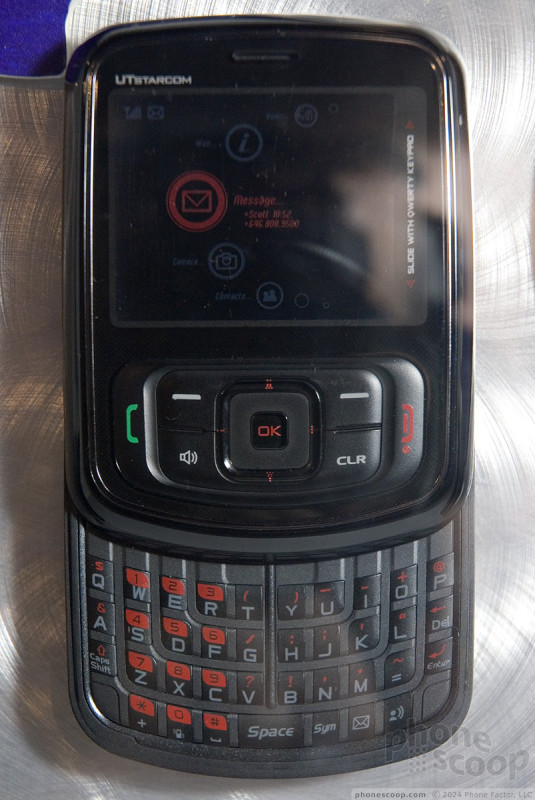
The oddball phone in the new 8000-series is the TXT8010, which sports a very rare type of sliding-keyboard form factor. The only other phone we've seen with a landscape display and keyboard that slides out from the bottom is the Samsung i620 for Europe. This curious form factor creates a phone that is almost square when closed, not unlike the new iPod nano.
Other than the unique form factor, the features are mostly basic. It does have Bluetooth and a memory card slot, but the camera is only VGA and there's no EVDO data. It's a basic messaging phone for the price-sensitive youth market, so it will compete with phones like the LG Rumor / Scoop and Samsung R410.
The TXT8010 is one of the few phones UTStarcom would confirm is slated to be offered by a major US carrier. It's currently planned to debut in June.
UTStarcom is also launching three AWS phones in 2008, including two made by UTStarcom (7000 series) and one from Pantech. These are tri-band CDMA phones (CDMA 850/1700/1900,) so they support today's CDMA networks as well as new CDMA networks launching in a few months that will use the new AWS (1700 MHz) frequency band.
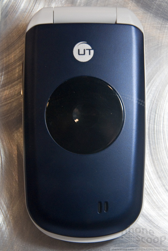
As one might guess, the first AWS phone to launch will be the most basic one, and then UTStarcom will work their way up to models with a few more features. That first one is the 7126, which is an extremely basic clamshell model with a set of indicator lights on the outside in leiu of a full external display.
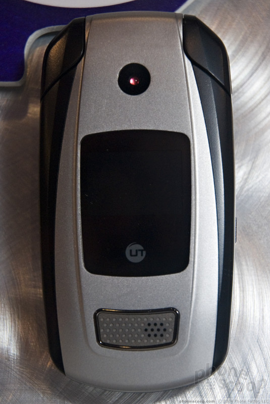
Moving up the lineup slightly is the 7176, which adds a true external display and a camera, but is otherwise similar to the 7126.
Both the 7126 and 7176 are 1xRTT-only, so they don't support EVDO (3G). Both phones are also based quite closely on existing models; they're basically just the 7125 and 7175 with AWS support added.
The Pantech AWS phone is the 8076, which was first shown off at the fall CTIA show a few months ago.
The last new 8000-series phone is the 8950.
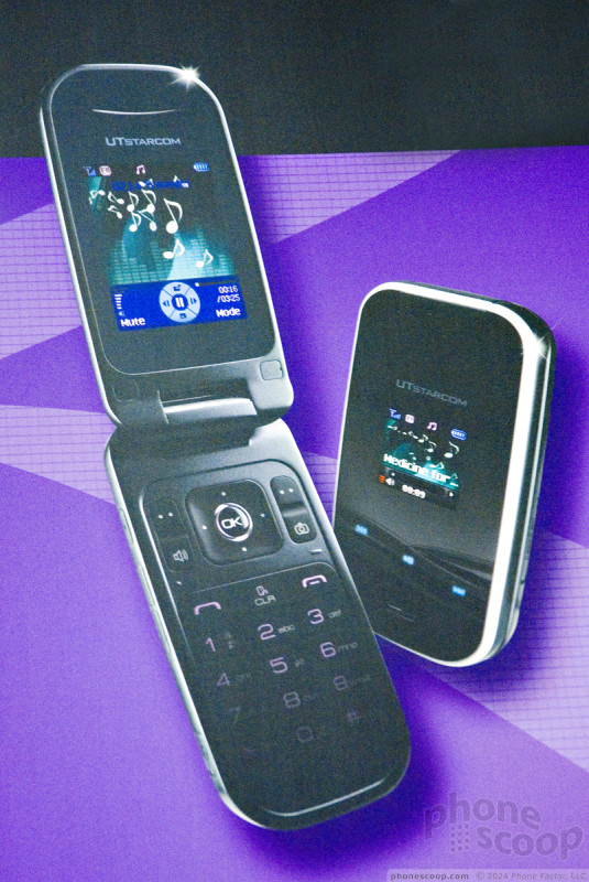
UTStarcom wasn't discussing many details of the 8950, but we did find out that it will sport EVDO and launch with a smaller carrier in late summer. There may not be much more to say about it; it appears to be a fairly typical mid-range clamshell CDMA phone. Like some recent LG phones, it seems to take styling cues from the iPhone, with a black glossy face framed by a chrome edge.
OpenMoko
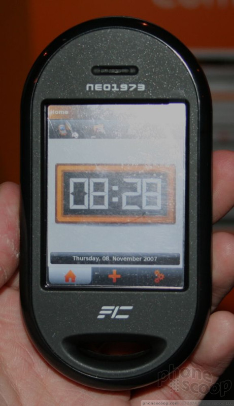
We had a chance to spend a few moments with the OpenMoko Neo FreeRunner open-source Linux phone. This phone was clearly a work in progress.
Just a quick bit of background on this one. The Neo is an open source project. The reference hardware was released to developers last summer, who have created a basic mobile operating system. Now that the basic operating platform is in place, OpenMoko re-released the Neo in a version that can be modified for consumers. It hopes to offer a consumer version of the phone sometime later this year.
The hardware was solid, lending it an air of ruggedness. It is large, meaning it is not pocket friendly in its current state. It was thick. We're talking a veritable brick here. Despite its size, it was not overly heavy. The plastics were rounded and fairly smooth, but it was easy and comfortable to grip in your hand.
There are very few buttons on this device. There were two on the right side, and one on the left. Functions were not yet assigned to these buttons.
The front of the device is dominated by ample touch screen. The screen was bright and had a nice, sharp resolution. The Neo is controlled almost entirely by using the touch screen on the front.
The basic operating system was only working about two layers deep. The home screen features a nice big clock. Along the bottom is a row of buttons that take you to the phone's three main systems: the home screen, contacts, and settings. Activating the buttons on the screen was intuitive, but the Neo does not provide any sort of haptic feedback. The software was fairly responsive to button pushes, and loaded the selected screens in short order.
Once you get about this deep, however, the secondary layers of menus and functions were clearly not fully working yet. None of the functions I tried to activate in these main systems were operational.
Along the top of the of the phone are four different tabs that access the phone's major applications, such as the phone, calendar and messaging menus. Again, once you got down into each of these different menus, the OS became non operational. But the buttons were easy to interact with and the basic layout makes sense from a usability perspective.
This phone will see another 3 to 6 months of development time before it hits the mass market. We expect a lot of the unfinished touches to be all tidied up by then.
We were able to shoot a couple of minutes of video of the Neo FreeRunner. You can check it out here:
Part 4
Neonode
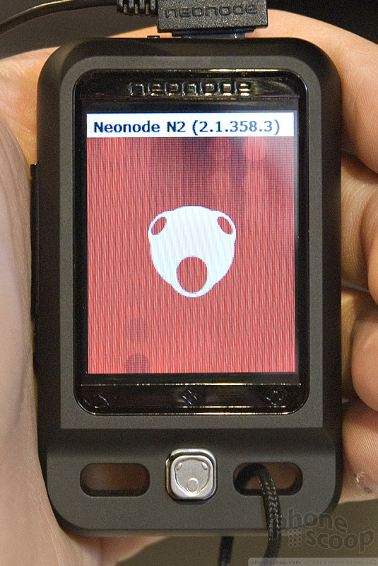
Probably one of the cooler phones we saw on the show floor at CES was the Neonode N2. This is a phone that's been available in Europe for a while, and now Neonode is making a play to bring it into the U.S. by the second quarter. It is available unlocked from European stores for about 350 Euros, and the representatives we spoke to said they are hoping to sell it for about $299 through a U.S. carrier.
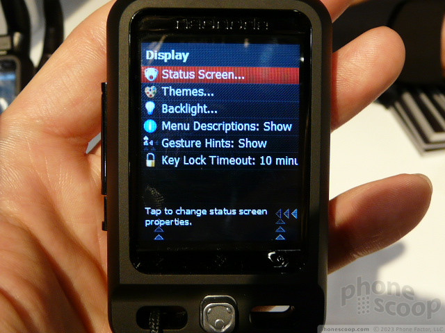
It is teeny tiny itty bitty small, small, small. Did we mention that it is diminutive, small of stature, and minute? Now that that point is drilled home, this is also one nifty piece of hardware. It is a simple black block with a grip-y black paint finish. It is also very light. The extreme pocketability of this phone means you can really take it anywhere. There are very few buttons. Only a volume toggle and power button are on the left of the phone. Otherwise you need to use the touch screen to interact with the N2.
Rather than use a touch screen LCD like the iPhone, Neonode instead opts for an older, infrared-based technology. Essentially, an IR field is floating just above the screen. When you press the screen, you interrupt the field and it activates the corresponding button below. The most interesting part of the UI is that rather than simple touch gestures, you use up and down, and side to side sweeping gestures to access the phone's different menus. This is a lot of fun. The phone provides you with guides to show you exactly where you sweep for different actions. The N2 provides haptic feedback, so you know when you've pressed buttons to dial numbers or compose messages.
The N2 also has a silver joystick at the bottom. The joystick is used only for select applications, such as the SMS composition screen. It helps you move the cursor around for faster editing. You also use it for browsing the web and zooming around web pages.
The N2 offers a lot given how small a package it is wrapped in. Quad-band GSM/EDGE, stereo Bluetooth, 2 Megapixel camera, video playback, web browsing, SMS and MMS. Really you'll find everything you'd expect in a mid-range feature phone.
We shot some video of it so you can really get a sense of how it works.
Mirasol
No matter how in love with your phone you are, the one thing everyone complains about is battery life. Everything about a cell phone - the radio, the screen, the camera, the chips inside - is a huge drain on the battery. Since the batteries aren't getting much better yet, the only thing left to do is make everything else more power efficient.
For their part, Qualcomm is taking on displays - in addition to their chips, of course. Today we got some hands on time with Qualcomm's Mirasol display technology.
Mirasol combines some of the technology behind a number of existing screen types, but in a new way that yields some pretty impressive results. Take a little bit of old reflective LCD, a little DLP, and a pinch of mechanical (not liquid) e-ink and what you get is something pretty exciting.
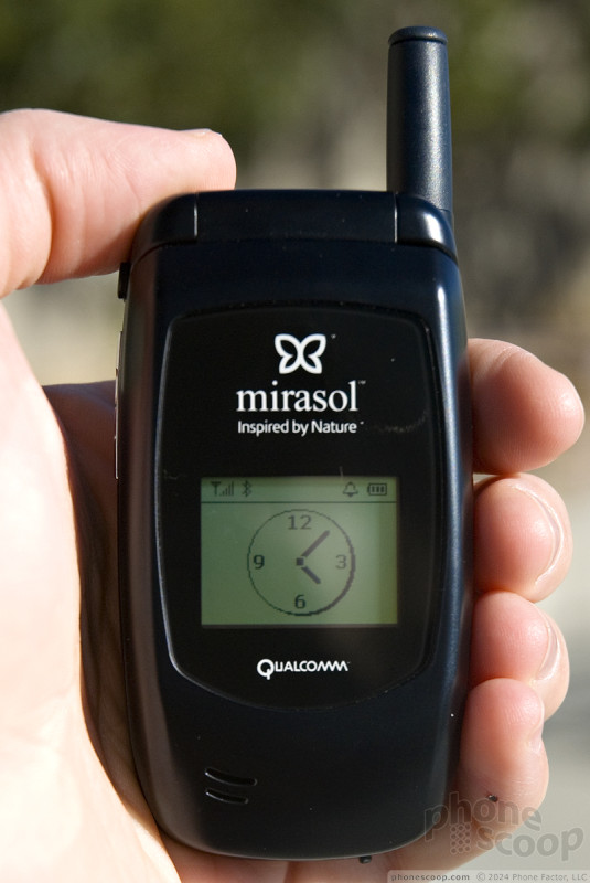
Most TFT LCD screens use about 200 milliwatts when they're on, but the the Mirasol uses somewhere between 1 and 30 milliwatts, depending on whether it's displaying a static image or something as power hungry as video.
Mirasol is a reflective system, only it is much more efficient at reflecting light than reflective LCDs because everything is a mirror reflecting back light all the time. Typical reflective LCDs reflect about 15% of light back, but Mirasol reflects about 50% for monochrome versions and 30-45% for color versions.
Most Mirasol displays will have frontlighting for dim environments. Again, the Mirasol implementation is a giant leap ahead of how frontlighting worked on reflective LCDs. For example, old Sidekick screens - which were reflective LCD - were very hard to see in the shade because it was too bright for the light to come on but too dim to read without the light. A Mirasol display doesn't have that problem. In fact you don't even need the front light to see a Mirasol display in really dim light. We were able to read the screen just fine holding the phone under a heavy table, without the frontlighting on.
The Mirasol also has much better resolution than old reflective LCDs. The samples we were shown were about 130 dpi - around the same resolution as the iPhone. Gone is that chunky look, although it's not as crisp as e-paper just yet.
Unfortunately only the monochrome version of the Mirasol is available for sale today, and it's not currently in any handsets, though a handful of smaller manufacturers have already committed to trying it in their phones. The color model is not quite ready for production, but the color prototype we saw was impressive. Colors are much better than reflective LCDs but still don't approach what we see from screens as lust-inducing as the OLED on Nokia's 8800 Arte.
Once color screens are ready, it's far more likely we'll see this technology in handsets stateside. Until then, it's something to watch for sure.
Nokia
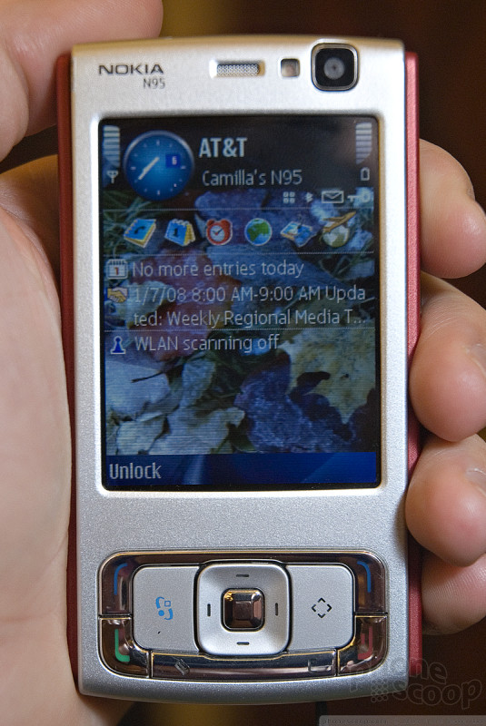
There was only a small collection of new devices from Nokia at CES this year. The first ones we saw were two new versions of the N95 for the U.S. market. The first was a simple additional color. The standard N95 U.S. will now also come with a red backplate. Otherwise it is unchanged from the version that's already for sale.
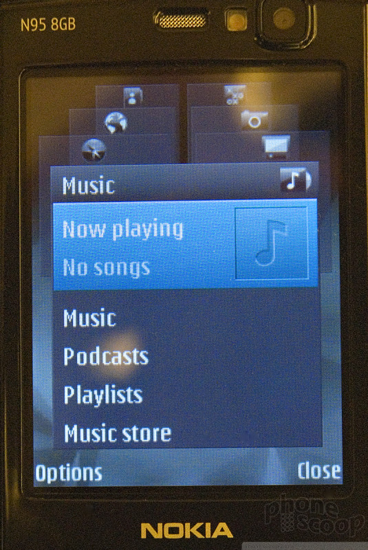
Nokia also announced a U.S. version of the N95 8GB. The N95 8GB features a few changes over the original version of the N95. First as the name implies, it has 8GB of internal storage. It is jet black all the way around. The original N95 (and the U.S. version) have a 2.6-inch screen. The 8GB model has a 2.8-inch screen. This difference may seem minute, but in real life it is huge. Putting them side by side, the screen of the 8GB looks far larger than the standard and U.S. versions.
Also, on the original and U.S. versions, the top sliding mechanism is perhaps a millimeter or two narrower than the body of the phone itself, creating an edge along that seem. On the 8GB model, the width of the sliding portion is even with that of the edges of the body underneath, creating smoother sides. It is still just as fat as the original and U.S. versions, but it feels smoother in your hand because this seam has been made flush. Lastly, to fit the larger screen, the navigation cluster has been squished down a little bit. Even though the size of all the keys was reduced, it was still easy to use.
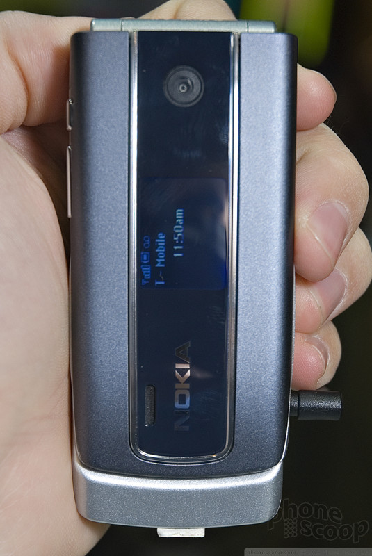
The only other new piece of hardware we saw from Nokia was the 3555. The 3555 has been announced for Latin America, bit is also compatible with AT&T's WCDMA 3G network in the U.S., so it will arrive here at some point. It is similar in most respects to the 6555. It shares the same shape, though the exterior styling is slightly different.
Both displays have been downgraded form the 6555 a little bit, and the keypad has been changed entirely. The 6555 has some AT&T-specific keys on it in the navigation cluster. Those keys are gone on the 3555, and the numeric keypad itself is entirely different. It has a simpler style and the keys are rounded and separated a little bit. The D-pad is very large. In fact, it is almost too large. You really have to move your thumb to reach from one side of the D-pad to the other. The camera was downgraded from 1.3 Megapixels to VGA. It does, however, still support stereo Bluetooth.
Snapdragon
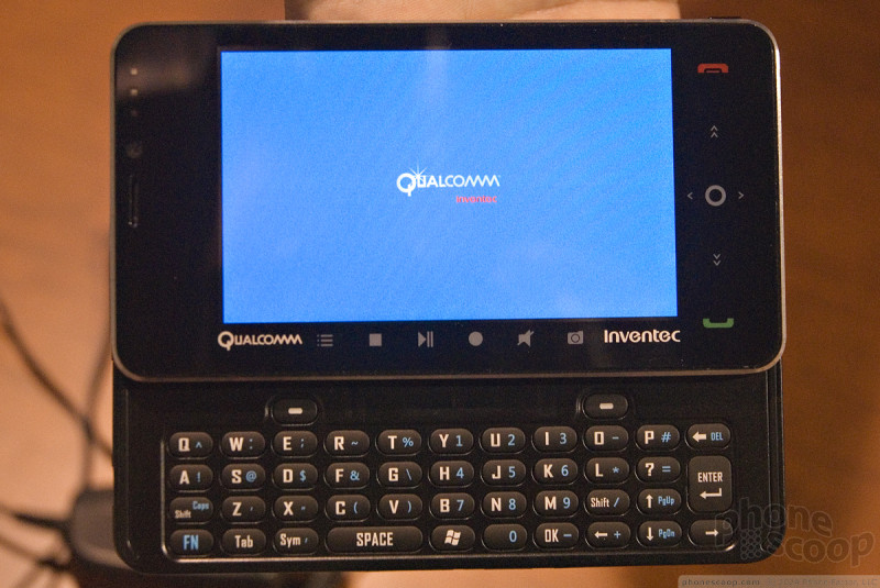
We sat down with Qualcomm to look at one of the first reference designs built around its Snapdragon chipset. Snapdragon enables devices to host a wide range of air interfaces and services that make them super-powered connectivity and media devices.
The model they had on hand was a large, UMPC-sized device that featured a big screen and sliding form factor that revealed a full QWERTY keyboard. This particular device, built by Inventec, was running Windows Mobile 6, but Snapdragon will support multiple mobile platforms including Android.
The device really had everything on board. It was a smartphone with MediaFLO mobile TV capabilities, full audio and video playback functions, GPS navigation, Bluetooth, etc. To be truthful, this piece of hardware was too large for daily use. It is far too big to fit into a pocket, and would server more as a temporary laptop replacement or add-on. The large LCD was a touch screen and because of its size, using your finger was easy and natural for accessing the Windows Mobile 6 features.
Other than the touchscreen, this device had seen better days. The sliding hinge was loose and definitely not a final design. The keyboard felt similar to those you might find on an HTC smartphone.
Qualcomm told us that it envisions high-end devices to be the first with Snapdragon on aboard, and it will filter down to mid-range and lower-end devices over time. It really believes that the mobile Internet and media playback functions will be the hallmark features of this technology.
Misc.
After covering all these big-ticket items, we still have a few phones left in our hopper...
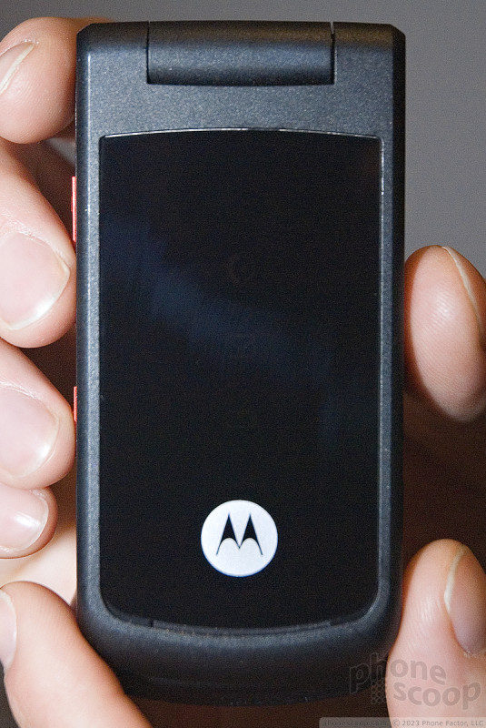
Motorola's big news at CES was definitely the ROKR E8 and Z10, but they also rolled out a lower-end phone that might make its way stateside: the W270.
The W270 is a very basic clamshell in the spirit of the W370. In fact, the two are very similar, but since it's now 2008, Motorola is following the trend of putting serious music features in its entry-level phones. Therefore the W270 has a microSD memory card slot that the W370 lacks, even though it's technically a lower-end phone with a smaller display. It's pretty neat to see a true music phone at (what we expect to be) a very low price point.
The W270 doesn't have the high-quality, RAZR-inspired styling of the W370, but it still has a nice feel to it. It has a very plastic feel to it, but a solid, durable kind of plastic.
The W270 is technically for overseas markets. It will come to the US... basically. It may have a feature or two changed, like FM radio, and it may even arrive on our shores under a different model number, but it will essentially be the same phone as what you see here. Look for it to be a prepaid model with one of the smaller carriers or MVNOs.
We were able to spend a few moments with the previously announced Sony Ericsson W380. It is a Walkman clamshell that offers only basic features. The lavender skin covering the W380 has a nice soft-touch paint job to it, and the front hides an OLED display that is visible when you interact with the music controls. The buttons in the interior were large and easy to find and use. They are covered with a slick rubbery surface that allows your thumb to slide over them easily. There is a lock key on the top/back of the phone that lets you activate the front-panel controls. The menu system is similar to other mid-range Sony Ericsson's. You can see a short video tour of it here.
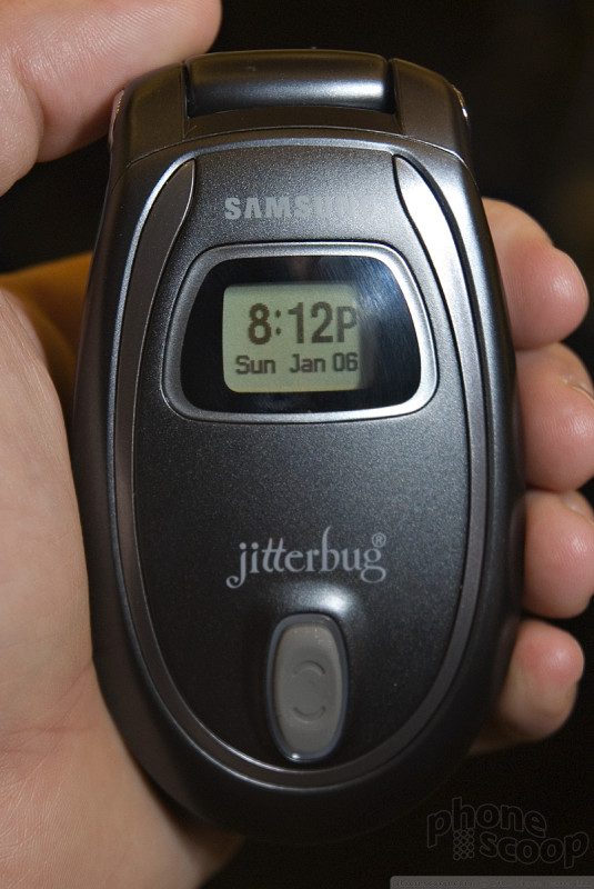
Samsung has also added a new Jitterbug in grey. We're not quite sure what prompted the color change but there are some improvements. First off, there's no more glare off that bright white paint job. And now the text is all white on dark grey, which believe it or not is easier for aging eyes to read than black on bright white. Finally, even though the charge port is still tiny, it is now surrounded by a bright white square and stands out much better than the black hole on the previous model. The new model is also updated with a new home screen that asks the user if they want to see a simple user guide for about 3 seconds every time the phone is opened. (This can be turned off.)
First Look
This special page displays a raw feed of many of the photos we're taking at CES, in real time, as we take them. You can see what we're seeing as we see it.
Check back often for exclusive first hands-on photos of new phones. Then come back later to see our full analysis on the other pages of this CES article.
Comments
Sony Ericsson W760 Release Date
I hope this is a saving grace for Sony's part for me. I bought the 580 through Amazon, sent two of em back because of cracked...
(continues)
(continues)
Rich, any update to this CES 2007 story?
https://www.phonescoop.com/articles/ces_2007/index.p ... »
Sony Ericsson's main carrier partner in the U.S. these days is Cingular, so that would be a good guess as to who will offer both phones.
Sony Ericsson is working hard on getting some phones back into T-Mobile's lineup by the end of the year. The current hangup is T-Mobile's custom software requirements like MyFaves.
I was looking on T-Mobile UK, and DE's website and they have Sony Ericsson my-Faves phones, yet no love for T-Mobile USA.
Samsung last min phones
Anyone has more detail about them?!!
The Vu? AWESOME!
Mirasol
New Bluetooth headsets.
AWS 1700Mhz support please!
There are WCDMA AWS phones already being sold, of course. T-Mobile is selling the Samsung T639 and Nokia 6263, for example. I don't thi...
(continues)
https://www.phonescoop.com/articles/article.php?a=17 ... »
UTStarcom...Look like Sony Phones
N2!!!
Sponsored by Blackberry???
We have always been impartial and unbiased, and we always will be. I give you my word.
Sponsorship is a very common form of advertising. It doesn't mean...
(continues)
I knew it
They are retiring the cash cow that is the RAZR, or at least changing it enough to warrant a revisiting.
This e8 looks hawt. I would definately drop some cash to be the first to ejoy this revolutionary phone.
I have been saving.




























































 Review: Motorola ROKR E8
 CTIA 2008
 Motorola Announces E8 and Z10
 Motorola ROKR E8 Details Emerge
 Unannounced Motorola Media Phone Spotted In Fergie Video
 Nokia 3555
 LG Vu / CU920 / CU915
 Motorola ROKR E8
