Review: Motorola G4 and G4 Plus -- Unlocked
Jul 14, 2016, 2:15 PM by Eric M. Zeman

Motorola's middleweight smartphones are back for another round. The Moto G4 and Moto G4 Plus share most features, but the Plus adds a little something extra. These devices run a near stock version of Android and enjoy some welcome enhancements from Motorola. Here is Phonescoop's in-depth review of Moto's latest mid-range handsets.
Hardware
Is It Your Type?
Lenovo's mid-range, fourth-generation Moto G and G Plus are intended for those who prefer unlocked handsets that don't cost a whole lot. If you're looking for a big phone that runs stock Android and offers a small degree of customization, the Moto G4 and G4 Plus are worth consideration.
Body
The fourth generation Moto G (G4) is a departure from the previous three models in many ways. The G series falls in between the entry-level Moto E and high-end Moto X smartphones, and has always been an excellent value. In fact, the first three Moto G versions have been among my top recommendations the past few years for affordable Android handsets. That changes somewhat with the Moto G4.
To start, the G4 is significantly bigger than its predecessors (6.02 x 3.02 inches compared to 5.59 x 2.85 inches). Lenovo bumped the screen size from 5 inches to 5.5 inches and had no choice but to increase the phone's dimensions. Amazingly, the G3 and G4 weigh the same at 5.47 ounces. Where the first three generations were a good size for most people, the G4 is a phablet and may be too big for some. (The G4 Play, due later this summer, is a bit smaller with its 5-inch screen.)
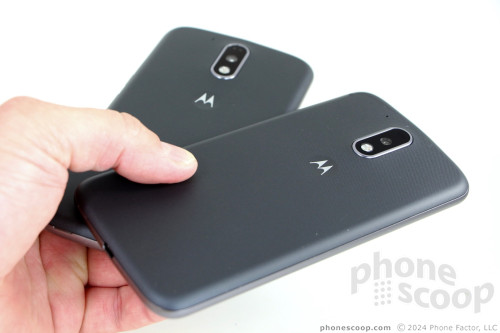
The design has a bit less personality. The G has always had a somewhat plain face but a curvy backside that helped the phone sit deeper in your palm. The G4's face is even more plain (something I didn't think was possible) and the rear has been flattened out in favor of a more cookie cutter shape. BO-RING. What we're seeing here is the Lenovo-ing of Motorola's industrial design and I don't like it one bit.
In the plus column, consumers may still customize their Moto G4 by selecting either a white or black front; one of eight rear panel colors (bright blue, teal, pink, white, black, navy blue, dark purple, or lava); and one of five accents (gray, silver, pink, blue, gold). Using the Moto Maker web site to design your own G4 is as simple as ever, and is the only way to inject some life into this otherwise buttoned-down design.
The phone feels decent to hold. The front is glass, the frame is polycarbonate, and the rear shell is made of textured resin. If definitely comes across as plastic-y. The flat shape makes it difficult to reach your hand all the way around the phone. It's probably pushing the limit of what tight jeans can manage, but it swam in the pockets of loose cargo shorts with ease. Build quality is good enough for this class of device. The phone is fitted together well.
The screen takes up most of the front face. I appreciate that the display disappears into the black glass when off. The polycarbonate frame forms a very thin rim around the outer edge of the glass, helping protect it when placed face down. The user-facing camera is plainly visible next to the earpiece. There are no buttons, capacitive or otherwise, adorning the front.

The only obvious physical difference between the G4 and G4 Plus is the addition of a small fingerprint reader to the Plus variant. The reader has a rather annoying and uncomfortable rim protecting it. Further, the surface of the reader is sunk in a bit, which means you have to really mash your thumb into it for the reader to work properly. The fingerprint reader does not double as a home button. This drove me crazy after about 5 minutes.

Lenovo stuck the volume toggle and screen lock button on the right edge of the phone. Both buttons are easy to find thanks to their sharp profiles. I don't care for travel and feedback that much. The volume toggle is okay I guess, but the screen lock button is rather sticky. The headphone jack is on top, while the micro USB port is on the bottom. There are no buttons or hatches on the left side, and the G4 does not have a dedicated camera button.
I like the feel of the resin rear panel, which is similar to soft-touch paint. It lends some grip to the phone, helping it stay in your grasp. The G4 has the now-standard indentation on the back with Motorola's stylized "M" logo painted in chrome. The elongated, oval-shaped camera module sticks out from the rear surface quite a bit.
The G4's rear panel comes off easily, revealing only two card slots. The battery is not removable, nor even visible. Separate slots for the SIM card and memory card are carved into the left edge. You can hot swap both, which is something I appreciate.

I wish the Moto G4 and G4 Plus had the personality of earlier versions of this phone, but there's nothing inherently wrong with the refreshed design. The hardware is perfectly acceptable for a $200 phone.
Screen
The G2 and G3 each had 5-inch 720p displays that were just fine for their price point. The G4 steps up to a 5.5-inch screen with 1080p HD resolution. It's a great display. The resolution is dense enough that individual pixels are invisible; everything on the screen is razor sharp. The display throws off plenty of light. I was able to use the G4 indoors and out no problem, though it needs to be set to max brightness outdoors. (The auto-brightness function is really, really fussy.) With no blue shift or brightness drop, viewing angles are excellent. It's a fine display for a mid-range phone.
Signal
The phone has very good support for the LTE networks of all major U.S. carriers (Bands 1 / 2 / 3 / 4 / 5 / 7 / 8 / 12 / 13 / 25 / 26 / 41) and that bore out in our testing. We tested the G4 with AT&T, T-Mobile, and Verizon.
The G4 walks right down the middle when it comes to performance on the nation's three largest networks. The phone was always connected and never dropped the network no matter how weak the coverage from AT&T, T-Mo, or Verizon. I was able to connect calls in known weak spots without issue. The G4 did drop a few calls when on AT&T's and Verizon's networks, but didn't drop calls on T-Mobile.
Data performance was comparable between the the three. T-Mobile posted the fastest peak speeds, but good speeds were more consistent from AT&T and Verizon. No matter the network, the G4 was adept at streaming YouTube and Spotify, and keeping up with my Instagram, Facebook, and Twitter feeds. The phone never felt slow or bogged down by the network.
Sound
The G4 is a solid voice phone. The earpiece produces loud, if somewhat harsh, voices that are easy to hear almost anywhere. The volume is there in spades at the cost of clarity. Calls were prone to distortion when set all the way up. The good news is you'll be able to hear calls at lower volumes with better clarity. Voice tones were bright in the earpiece, and those I spoke to through the G4 said I my voice sounded "very good."
The speakerphone can bet set to incredible volumes. You can easily fill a moderate room with your conversation if you wish. The speakerphone works very well in the car, at home, in the office, around town, and so on. Moreover, the speakerphone is less prone to distortion so calls are clearer than they are through the earpiece.
Notifications are very, very loud, but the vibrate alert is too subtle and could lead to missed calls if you've stashed the G4 in a purse or backpack.
Battery
Along with the bigger screen, the G4 and G4 Plus have a bigger battery, too. It jumps from the 2,470 mAh power cell in last year's phone to 3,000 mAh. That's a huge upgrade. After testing the phones over the course of a week on three different networks, I feel confident in saying the Moto G4 should get everyone through a full day of average use with enough power to last through the night and halfway into the following day. Even under heavy use, the battery delivered a full day with some power to spare.
Lenovo says the G4's battery supports Quick Charge 2.0, which can push 6 hours worth of uptime into the phone in just 15 minutes. I'd say this claim is accurate.
If you somehow do find yourself in trouble, the G4 has the system-level battery saver tool. You can use this to dial back the phone's performance in order to extend battery life. I doubt you'll ever need it.
Bluetooth, GPS, NFC, WiFi
Lenovo did a fine job with the Moto G4's ancillary radio systems. Bluetooth, in particular, worked very well. The G4 connected to PCs, headsets, speakers, and my car in a blink. Call quality through headsets and my car was excellent. I tested Bluetooth stereo with a number of third-party speakers and was pleased across the board. Music sounded very good.
The G4 doesn't have NFC.
The G4 pinpointed me on Google Maps in just seconds and was accurate to within 10 feet. That's the good news. If locating me on a map is all I ever asked of the G4, it would rate among the best. When used as a navigation device, however, it falls woefully short. Google Maps performs sluggishly on the G4 and that sluggishness becomes compounded when traveling between two points in real time. Bottom line: the G4 is a poor navigation helper.
The WiFi radio was very speedy.
Software
Lock Screen
Motorola's lock screen has been among the industry's best for several years. It's so good, in fact, that Samsung, LG, and others copied it on their flagship handsets this year. I'm talking, of course, about the Moto Display.
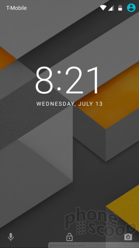
Notifications and other lock screen behaviors are now managed from a single spot, the Moto App. Moto Display can wake the screen regularly with a list of the current notifications, or show important notifications on the lock screen as they arrive, or leave the screen entirely dark. It's up to you. Double tap the screen any time to see the time and notifications in list form.
The Moto G doesn't have some of the fancy screen-waking features from Motorola's older flagship phones (wave or speak to wake), but it doesn't need them. The tap-to-wake and on-again/off-again nature of notifications provide plenty of opportunity to see what's up. You can, however, twist the phone (like a doorknob) to launch the camera even when the phone is locked.
If you press the screen lock button, the display wakes fully to show the clock, wallpaper, and notifications listed below the clock. There are shortcuts to the phone and camera available on this screen.
As far as security goes, both the Moto G4 and Moto G4 Plus include the trusty PIN, pattern, and password options. The Plus adds biometric security via the fingerprint reader. The process of recording fingerprints during setup is no different than any other phone. Once properly configured, the reader is a bit slow for my tastes when I wish to unlock the phone. It takes the G4 Plus half a second longer than I want it to. It's definitely slower than some other mid-range handsets, such as the HTC One A9 or iPhone SE.
Sadly, the "Hey, Moto" voice action to wake the phone is not included.
Home Screens
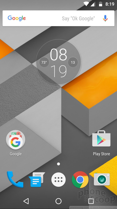
If Lenovo kept one of the G series' best features, it is the stock build of Android. The G ships with Android 6 Marshmallow and no carrier junk. The device has only one home screen panel active out of the box. G4 owners can customize the typical stuff, such as wallpapers, widgets, and so on.
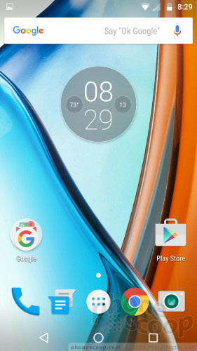
The home screen behaves as expected for a Marshmallow phone. Similarly, the app drawer, notification shade, and settings screens are all stock, and work accordingly.
The G4 ships with the Google Now launcher, but it is not active by default. You have to agree to turn it on. The Google Now launcher creates a new home screen panel with alerts and notifications about stuff relevant to you. It's one of my favorite tools.
As for performance, the Moto G4 uses a 1.5 GHz Snapdragon 617 processor with 2 GB of RAM. This combination is adequate, but not the best. As noted earlier, Google Maps struggles big time. The camera app does too, making it frustrating at times, and so does the Google Play Store. More to the point, last year's Moto G — which had a Snapdragon 400 processor — felt speedier. I wish the Moto G4 were faster.
Camera
Lenovo has simplified the camera in a big, big way. Gone is the odd camera UI from Motorola, which relied on a semicircular control strip; in its place you'll see a much simpler and more accessible set of tools.

The G4 does not have a dedicated physical camera button, but there are several ways to open the camera: a twisting gesture, a double press of the screen lock button, or the lock screen shortcut. The double press of the lock button is the way to go as far as I'm concerned. It's the quickest and most reliable method for launching the camera.
The camera would seem to have hardly any features at all. There are three controls on the left side of the screen (timer, flash, HDR) and three on the right (mode, shutter, front camera). I like that the flash and HDR tools can be set to on, off, or auto.
As for shooting modes, the G4 offers auto, video, slo-mo, panorama, and full manual. The manual mode lets you take full control over focus, ISO, shutter speed, brightness, and white balance. The controls line the top of the screen and are easy to adjust. It's a shame the shutter only lets you select speeds as slow as one-fifth of a second. That's hardly long enough to get creative. There's no 360 photo/video mode, which feels like an odd omission, nor is there any sort of GIF maker.
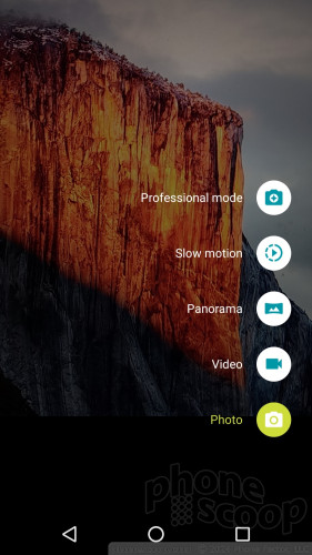
The default is always auto mode. Slide your finger up or down to zoom, tap to focus and set exposure. Press the shutter button to take standard pictures, or press-and-hold to capture a burst. Swipe from the left side of the screen to access the settings.

The layout makes far more sense than the old camera app from Motorola. My only complaint is speed. It takes a hair too long to focus and capture pictures. You may "miss the moment" because the G4 can't quite get its act together.
Photos/Video
The only other difference between the Moto G4 and the G4 Plus (aside from the fingerprint reader) is found in the camera. The G4 has a 13-megapixel sensor and uses a contrast-based focusing system, while the G4 Plus steps up to a 16-megapixel sensor with laser-assisted, phase detection autofocus.
Is one better than the other? Yes, but just barely and, for all intents and purposes, not really. The G4 Plus was quicker to focus, but only by a fraction of a fraction of a second. Moreover, the G4 Plus produced minutely sharper images, but you can only tell on a huge PC monitor by zooming in all the way. Seriously, the differences are so slight as to be negligible.
Both cameras do a mediocre job of capturing decent pictures, but fall far short of good. Focus, exposure, and white balance are all over the place. Sometimes all three are great, and other times all three are awful. You can see areas of under/over exposure in the shots below, as well as soft focus. White balance was the most consistently accurate. It's a shame that Lenovo wasn't able to capitalize on the better camera app, as the results just don't impress.
I'd use the G4 or G4 Plus for everyday, around-town photography, but not for my vacations or anything else important.
The same is true of the video camera. Both phones can capture full HD video. Focus and white balance are decent, but exposure is just no good. I was particularly disappointed with the slow-motion video results, which are dialed down to quarter HD (540p) resolution.
Bloatware
Lenovo is selling the Moto G4 directly to consumers online and it is only pre-loaded with apps from Google and Motorola itself. Unlike the manufacturer apps made by Motorola's competitors, Motorola's software (Moto App) actually benefits users. There is no bloatware from carriers.
Wrap-Up
The Moto G4 and G4 Plus are a bit of a curiosity in that I'm having trouble understanding why they exist. These two phones, while "decent" in just about every way, feel like the result of Lenovo going through the motions. It's as if Lenovo woke up one day and, with cold, dead eyes staring off into space, said to itself like a robot, "Time to make the $200 mid-range phone."
The Moto G4 and Moto G4 Plus are the result of that unemotional, business-driven reflex. They are soulless phones that have been stripped of the heart Motorola put into the first three generations of G-branded handsets.
At $200, the G4 falls in step with the company's strategy of offering low-end, mid-market, and high-end phones. The G4 — the mid-market phone in this lineup — works well as a $200 handset and can compete with similar offerings from LG, Samsung, and ZTE. Consumers will certainly find the big screen, excellent battery life, and stock Android UI appealing.
The $250 G4 Plus makes no sense to me at all. Lenovo clearly used a bargain-bin fingerprint reader, and the denser camera sensor doesn't deliver an appreciable improvement in photo quality to justify the price increase.
Don't buy the G4 Plus; you'd be wasting $50. If you really want a Moto-branded device, with its customizable rear shells, go for the less expensive G4 instead. And please, for Pete's sake, give it some personality via Moto Maker.
Comments
No messages




 Amazon to Sell Discounted Unlocked Phones As Long As You Agree to Watch Ads
 Motorola's Refreshed G Series Streets July 12
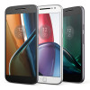 Fourth-Gen Moto G Comes In Three Varieties
 Motorola Shows Off New Concepts in AI, Foldables
 Lenovo ThinkPhone by Motorola Gains New Microsoft Features
 Motorola Moto G4
 Motorola Moto G4 Plus


