Review: Samsung Galaxy Note7 for T-Mobile
Lock Screen
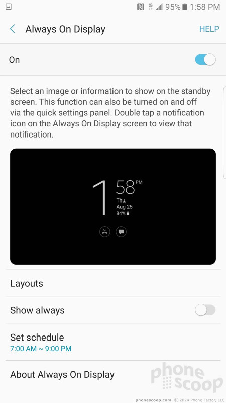
Samsung's Always On Display gives users an incredible amount of control over notifications. There are several basic configurations: the clock, the calendar, and a wallpaper.
The first option (clock) offers the most flexibility. The Note7 includes more than a dozen clock styles, including digital and analog. The second option (calendar) offers a couple of views, too. You can turn off notifications entirely, so only the clock or only the calendar are visible. You can also set the Always On Display to turn on in the morning and off at night. Want a color other than black as the background? Go ahead and pick something else. This level of granular control is the best in the business.
Then there's the actual lock screen. Pressing the home button or screen lock button will fully wake the display and you'll see the time, date, notifications, and several app shortcuts. I like that you can customize how much detail is revealed by the individual notifications. By default, the shortcuts open the phone app and camera, but you can change these to just about any other app you wish.
The physical home button doubles as a fingerprint reader. I trained several prints and found it to be very reliable. It's one of the fastest fingerprint readers I've used.
Then there's the iris scanner, a rarity on phones at the moment. Similar to the fingerprint reader, you need to train the iris scanner to read your eyes. I had some trouble setting it up, but managed to record my irises after several attempts. When the iris scanner is set as the unlocking mechanism, you need to line up your eyes in two little circles that appear on the screen. Lining up your eyes takes more time than it does for the scanner to read your irises.
It works well enough, but I think the fingerprint reader is quicker. Moreover, the fingerprint reader is often more convenient. For example, you can unlock the Note7 with your finger when it is resting on a table or desk without picking it up. The iris scanner requires you to hold the phone about 10 inches from your face. That gets old.
Home Screen
The Galaxy Note7 runs Android 6.0 Marshmallow. I'm a little disappointed it isn't running Android 7 Nougat, and even more disappointed that Samsung has made no commitment to updating the device to Nougat. Even so, Marshmallow is a solid foundation and Samsung has built a fine — if complicated — castle atop it.
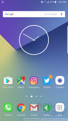
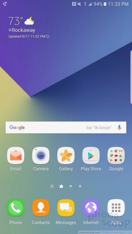
There are three home screen panels active out of the box and they are filled with an assortment of Samsung and T-Mobile apps and services. It takes some effort, but you can clear away the junk and customize the home screen panels with the apps, shortcuts, and widgets of your choosing. I like that Samsung allows you to assign which panel is the home panel, such as the middle screen or left-most screen, etc. You can activate the Briefing panel (which is Flipboard) if you want, or ignore it. If activated, Flipboard automatically becomes the left-most panel.
I'm not happy that the app drawer is anchored to the far right of the home screen dock. I prefer the button to be in the middle, but Samsung won't let you move it around. At least the dock holds up to five app shortcuts. You can adjust the size of the home screen panel grid between 4x4, 4x5, or 5x5 icons.
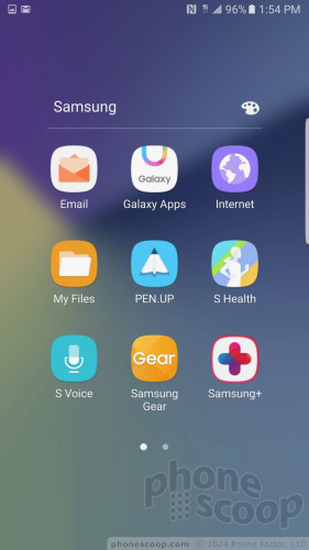
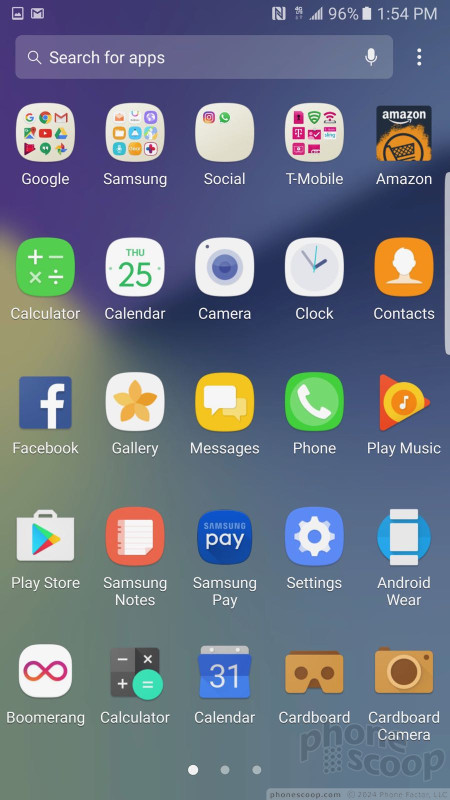
Inside the app drawer, Samsung organizes it into horizontal panels. Out of the box, there is a single panel that has a handful of folders jammed with T-Mobile, Samsung, and Google apps. The Note7 carries over one of the more frustrating app drawer behaviors from the S7. Samsung used to allow people to choose between alphabetical order, custom order, or order based on frequency. Typically, if you choose alphabetical order, which is what I prefer, all of the apps are pulled out of folders and listed individually. On the Note7, choosing the alphabetical arrangement doesn't pull the folder-bound apps out. This is really annoying to me. You can take the time to individually remove the apps from folders, but it should be much easier.
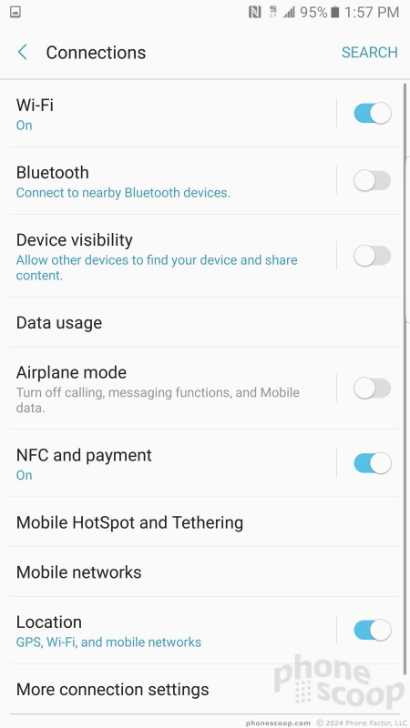
The Note7 makes a dramatic change to the settings screens. The company has cut down on the number of selections that appear on the main settings panel. With fewer selections, it's easier to breeze through to find what you want. Further, each selection clearly labels which controls can be found within. That's helpful. Last, the settings screen offers helpful suggestions at the bottom. Say you're looking for the ringer controls inside the notification controls. The bar at the bottom will point you to sound profiles. You can turn this off if you want to.
Samsung changed up the fonts, colors, and icons of the Quick Settings panel, but the underlying functionality of the Quick Settings panel is mostly unchanged. That means you can tweak where the toggles land for controlling various radios, and such. The Note7 adds a search bar to the Quick Settings panel and it can be used to search the device.
When it comes to personalization, the Note7 reaches the ridiculous. First, themes. Themes override everything: fonts, colors, icons, graphics, wallpapers, and more. There are just two alternate themes preinstalled on the phone. If you want more, you'll have to create a Samsung account to download them. I particularly like that you can download different app icons. These fully replace the Samsung icons, which I dislike. Better yet, you can turn off custom app icons altogether.
You can multitask on the Note7 by running two apps at the same time in separate windows. Not all apps are supported, but those that are have a distinct icon (two rectangles on top of one another) to indicate their compatibility with the tool. It works fine. The Galaxy Note series pioneered this functionality and it can be truly helpful when you need to shift content from one app to another.
The Note7 includes Easy Mode, which gets rid of the complicated home screen panels and app drawer in favor of larger icons and fewer screens through which to navigate. This tool is meant for people who may be new to smartphones, or those who have seriously bad vision.
You can use a number of different gestures to control the phone. For example, you can capture a screenshot by swiping the edge of your hand across the display, or call the contact whose call log, message, or contact details are on the screen by bringing the phone to your ear. Incoming calls can be muted by placing your hand on the screen or turning the phone over. The gestures can all be turned on or off individually, which is nice.
The Note7 has a Snapdragon 820 processor with 4 GB of RAM. Like the Galaxy S7 and every other Snapdragon 820 phone I've tested, the Note7 is fast as hell. You won't see any staggering, slowness, or lagging. It performed every task in the blink of an eye. Benchmarking might tell a slightly different story, but if you spend your time using your phone rather than measuring it, you'll be very happy with the speed of the Note7.
Edge Screen
There is no "Edge" variant of the Note7, but that didn't stop Samsung from adding its Edge Screen software to the phone.
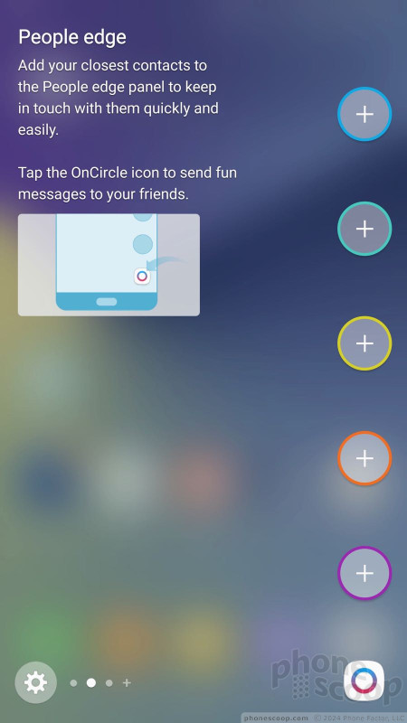
Edge content is available by swiping a thin tab that appears on the curved side of the screen. You can position the tab anywhere along either side of the Note7's display. You can choose how large the tab is, as well as how transparent it is. When swiped open, the Edge panel accommodates two rows of icons for apps, contacts, and other content.
The phone ships with a dozen Edge panels such as app shortcuts, contacts, news, profiles settings, stocks, scores, compass, calendar, weather, and so on. Each of these panels can be customized to suit your individual tastes and needs. More Edge panels are available for download from Samsung (Samsung account required.)
The panels work fine, and I like the flexibility afforded by the Edge screen behaviors. They each offer a snapshot of the content you want as well as the option for accessing more content, notifications, or details. I'm not sure they're necessary on a device with such a large screen that already supports multitasking, but the option will surely make some people happy.
Camera
The Note7 includes several ways to launch the camera. The fastest way is to double tap the home button. This launches the camera even when the phone is locked. It's very fast to open. There's also a shortcut on the lock screen.
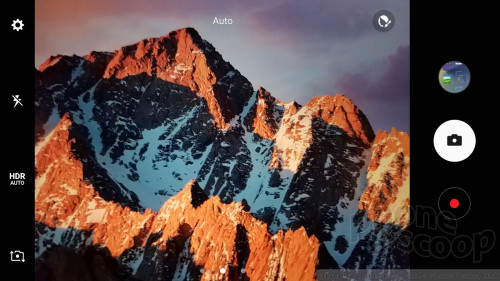
Samsung tweaked the camera app user interface a bit in order to make it even simpler to use.
The basic viewfinder offers access to the selfie camera, HDR, flesh, and settings controls on the left, with separate shutter buttons for photos and video on the right. If you swipe the viewfinder to the right, you'll see nine artsy filters (sepia, B&W, etc.) Swipe the viewfinder to the left to access all the shooting modes. Swipe down to switch to the selfie camera.
The shooting modes are less exotic than on Notes past, but represent what have become mainstay features for most smartphones. The modes include: auto, pro, panorama, selective focus, slow motion, hyperlapse, food, virtual shot, video collage, and live broadcast.
The auto mode is the fastest and simplest way to take pictures. Auto mode includes tap-to-focus, and tap-and-hold to set exposure. Tweak the flash and HDR settings (which can both be set to on, off, or auto) and you have a solid base set of tools even with the basic camera mode.
The pro mode is a fully manual mode that adds control over focus, white balance, exposure, and ISO. You can choose your own shutter speed, too, up to 10 seconds for creative night shots, as well as fiddle with metering and color correction. This mode is fairly complicated and some knowledge of how photography works is ideal.
Select focus (bokeh) allows you to alter which subject is in focus after you've taken the photo. The video collage tool automatically assembles a handful of photos and videos (based on time, location) to create shareable moments. Live broadcast lets you push live video directly to YouTube. The virtual shot tool lets you take 360-degree images of stationary objects. Most of these modes work easily enough.
You can download other shooting modes from Samsung if you wish. Some of the options include sound & shot, rear-cam selfie, sports shot, and animated GIF.
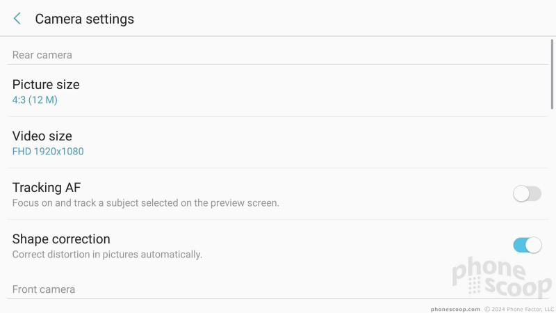
The camera's full settings menu has a few important options hidden in there. For example, you can turn on the Motion Photo capture mode, which captures video and images at the same time (like HTC's Zoe and Apple's Live Photos). It works well. The Note7 also has a tracking auto-focus feature that lets you select a subject and keep it in focus even if it moves around.
The Note 7's selfie cam has more features than many regular smartphone cameras do. The basic selfie mode includes a beautification tool that can make your face slimmer, make your eyes bigger, add a heavenly shine to your face, or adjust your skin tone. The selfie cam includes a wide-angle mode to fit more people into group shots. Last, the selfie cam offers several different ways to capture images: tap anywhere on the screen, say "cheese" or tap the heart rate monitor on the back. These can be handy when you're posed awkwardly to make a shot look good.
The camera app is very fast. It does everything immediately. The Note7's camera is one of the most powerful I've seen.
Photos
Samsung gave the Note7 the same 12-megapixel sensor found in the S7 and S7 Edge. This high-quality sensor has larger pixels to absorb more light and, let me tell you, it captures excellent pictures. Like the S7, the Note7 includes one of the best cameras available from a smartphone today. It trounces most competing phones.
The majority of the images I captured were in focus, exposed correctly, and delivered accurate color. The Note7 takes good shots in daylight and after the sun sets (see concert pics). I was very pleased with the lack of grain and the balanced lighting. The camera's f/1.7 aperture and optical image stabilization definitely provide some assistance in low light. The Note7 has a great camera.
The front camera has a 5-megapixel sensor and an f/1.7 aperture. It produces excellent selfies. I found self portraits to be highly accurate in terms of exposure, focus, and color.
The phone captures video up to 4K at varying frame rates, but full HD provides all the resolution you need. The Note7 does a great job at delivering sharp, accurate video.
Summer may be wrapping up, but fall colors are right around the corner. If you're going on one final vacation or a weekend getaway there's no need to bring your DSLR. The Note7 can handle the majority of your photography and video needs.
S Pen
Samsung has rearranged and combined the S Pen tools in order to make them easier to use. They are. Sort of.
If the screen is off and you remove the S Pen, the Note7 automatically opens a basic note-sketching app that allows you to draw whatever you want. Save it, shove the stylus back in, and your idea is safe for later. It's quick and easy.
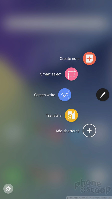
If the screen is on and you remove the S Pen, the Air Command button appears on the home screen and stays there until the stylus is put away. This lets you quickly tap into the S Pen's features, which appear in a semi-circle when you touch the stylus to the Air Command button. I like that the Note7 allows users to customize the tools that show up in Air Command.
There were multiple different note-taking apps in previous versions of the Note software. That is changed. Now there is a single note-taking app (which makes sense) called Create Note. The screen write tool still takes a screenshot and allows you to annotate it.
Samsung changed up the smart select tool. Smart select lets you capture text, photos, and hyperlinks from web sites, and now create GIFs from just about any video. Creating GIFs takes practice, but isn't too hard to master. You have to load the video you want to use as the source, open the smart select tool, and draw a box around the video itself. This will record a short snippet and automatically turn it into a GIF. Neat.
Last, Samsung added a translation tool to the S Pen's stable. Hover the S Pen over a word you'd like translated. The default is Spanish to English, but you can select from over 100 different languages. It works for single words and very short phrases (three to four words). If you need to translate an entire paragraph or a menu, use Google Translate instead.
Samsung / T-Mobile Stuff
Samsung and T-Mobile together have 16 apps on board that border as junk. Thankfully, you can delete some of the apps. The S Health app is actually pretty good for tracking fitness and nutrition and it now plays better with third-party fitness gear, such as FitBit.
The Secure Folder is probably the best addition from Samsung. This is an utterly secure folder that only the device owner can access. You can lock it with your fingerprint, irises, PIN, pattern, or password. WIthout one of these keys, the folder won't open. You can stick files, other folders, and complete apps in the secure folder. It's a great place for sensitive work files, or compromising photos of yourself.
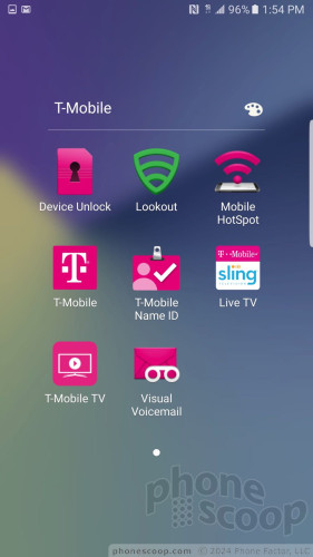
The T-Mobile apps run the typical selection, including an account tool, T-Mobile TV, caller ID, and so on. The most annoying bloatware is Lookout, a security app. It'a far too aggressive for my tastes. It takes real effort to disable. If you don't, the darned thing continually scans every aspect of your phone. Security is important, but this isn't the way to do it.
Thankfully the Note7 ships with 64 GB of storage. You shouldn't run out of space for apps on the phone. If you do, take solace in the fact that the Note7 supports microSD cards up to 200 GB.





















 Hands-On with the Samsung Galaxy Note7
 Samsung's Gear VR Headset Given a Redesign
 Galaxy Note7 Borrows from S7 as Samsung Reworks Pen Features
 Samsung Resurrects the Note 7 'Fan Edition' for Korea
 Samsung Plans to Sell Refurbished Galaxy Note7
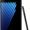
 Samsung Galaxy Note7


