Hands On with the Samsung Galaxy S8 and S8+
Mar 29, 2017, 10:00 AM by Rich Brome @rbrome.bsky.social
updated Mar 30, 2017, 11:58 AM
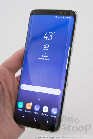
The S8 is Samsung's flagship phone for 2017, and it combines absolutely every idea Samsung has ever come up with for a high-end phone, plus a couple of new ones. From the extra-tall curved display to the iris scanner, to a new voice assistant, Samsung is throwing down the gauntlet. It aims to be a sexy, no-compromise monster. How well does it deliver? We find out in our hands-on. Read on.
When you pick up the Samsung Galaxy S8, two things immediately strike you.
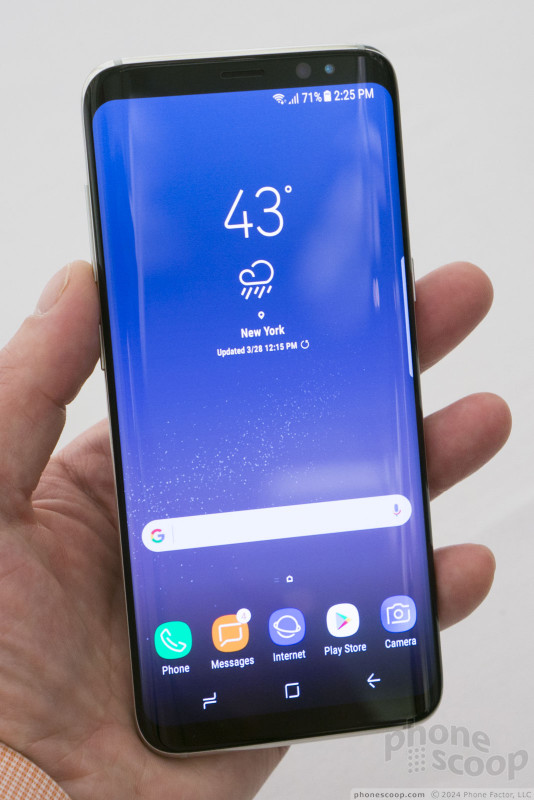
First, this is one sexy phone. Samsung has largely carried over the luscious design from last year's S7 edge, with its curved glass, curved screen, metal frame, and refined lines. What's new is that you get the sexy curved screen even on the smaller standard model. There's no "edge", just a "+", and that model is simply larger; that's the only difference.
The other thing that strikes you is that screen. Like on the LG G6, it's taller than you're used to. This gives you a screen that looks huge, (and it is,) yet is narrow enough to fit comfortably in any hand. Compared to the S7, the screen on the S8 is 0.7" larger (diagonally), yet the phone is 2mm narrower. Think a phone with a 5.8-inch screen is too big for you? Think again. And staring at it, the screen feel positively expansive, in a way that photos don't fully convey. Yet the phone feels small. In fact both sizes feel quite manageable. This screen shape is the future.
The corners of the screen are rounded, something you'll also find on the LG G6. I'm not sure if this is practical or just trendy, but it sure is attractive. On the G6, the corner radius is a bit off; the Samsung doesn't have that problem. It looks organic and sleek.
Since both the front and back glass is curved at the sides, the sides are just very thin metal strips that stick out from the solid metal frame. It's not as uncomfortable as it looks. The side buttons are thinner than I would prefer, but they work just fine.
The front glass is black on all color variations, which helps with the "Infinity Display" effect of a screen that looks like it's the whole face of the phone. If the white front on the new red iPhone bothers you, Samsung has your back.
The metal frame has a chrome-like high polish. The size and shape of these surfaces prevent fingerprints from being too much of an issue. I don't usually like a chrome finish, but it works surprisingly well here, adding to the phone's liquid look. There aren't any unnecessary chamfers interrupting the simple, undulating lines, all of which flow together seamlessly. The design is an instant classic. All of the curves are in perfect proportion in a way that people usually associate with Apple, and yet this phone is no iPhone clone. Quite the opposite, in fact: it's immediately recognizable as a Samsung. Everything about the phone oozes sex and quality. The Galaxy S8 looks and feels like the future.
To get the screen to fill pretty much the whole front, Samsung has moved to on-screen buttons for home, back, and multi-tasking. This was probably inevitable.
Also moved is the fingerprint sensor, which is now next to the camera on the back. This questionable decision means you're likely to smudge the lens (affecting photo quality) when trying to unlock the phone. Samsung says putting the sensor below the camera would have required a smaller battery or a thicker phone. Fortunately, there's also an infrared iris scanner on the front, giving you an easy alternative for biometric security.
The main camera module is pretty much flat — no hump — with is nice. It's the same exact camera module as on the S7, and that's not a bad thing. The front camera has been upgraded to auto-focus, which is extremely rare, even for a flagship phone. The front camera aperture is also f/1.7, which is excellent. Your selfies should stellar.
The U.S. versions will have a Snapdragon 835 processor, the latest and greatest from Qualcomm. This is paired with 4 GB of RAM, which is good, if not great. It's the first phone with Bluetooth 5.0, which should improve speed and range.
There are too many other features to list them all. It has everything the S7 had, including NFC, Samsung Pay, IP68 rating for water, fast charging, wireless charging, and wireless fast charging. There's even a heart rate sensor. Of course the battery is sealed inside, but I was grateful to see a good ol' 3.5mm audio jack and memory card slot.
As I mentioned, the only difference between the S8 and the S8+ is the size. Unless they're side-by-side, they're difficult to tell apart. There are actually three "size" elements that change: physical size, screen size, and battery size. The smaller S8 has a 5.8-inch screen and 3,000 mAh battery. The larger S8+ has a 6.2-inch screen and a 3,500 mAh battery.
Even if you prefer larger screens, be sure to check out the smaller one in person before committing to a purchase; you may be pleasantly surprised with how large the screen is in the "smaller" model. Conversely, the S8+ feels much smaller than you'd expect for a phone with a 6.2-inch screen, so don't automatically rule it out if you normally shun larger phones. The larger battery is a very good reason to consider the S8+. In sum, the normal size rules don't apply to phones with this shape screen. You really need to check these out in person before you'll know for sure which one you'll be happiest with.

The S8 and S8+ will come in Midnight Black, Arctic Silver, and Orchid Purple in the U.S.. All three are very attractive colors in person. The black is inky, inky black. The silver has a slight blue shimmer and the purple is quite fetching, yet they all look refined and professional. Some other countries will also get Maple Gold and Coral Blue.
Software
The software on the S8 is based on Android 7.0 "Nougat". It has Samsung's tweaks on top, and Samsung seems to be more aggressive about doing its own thing this year. If you were hoping for a more "pure" Google experience this time around, you'll be disappointed.
Almost every facet has received a visual makeover. I personally find the unique icons, fonts, and colors to be quite attractive. But it's also annoying that Samsung has diverged so far from the standards that Google has established while trying to unify Android. Even the main Android controls at the bottom are completely wrong; according to Google, a "square" symbol is supposed to take you to recent apps, but here the square is the home button.
To accomodate the screen's rounded corners and curved sides, much of the on-screen interface elements seem to be pushed away from the screen edges, toward the center. That makes sense, but it also means less of the screen is truly useful area.
By default, the app drawer works like it does on the Google Pixel. That means there's no apps icon on the home screen; you just need to know to drag up from the dock to see all of your apps. There is a small arrow hint to educate you on this, but it seems much smaller and more subtle than on the Pixel. I worry that some people will miss it and have trouble accessing their apps at first. You can also dig into settings and enable the apps icon.
As with Samsung's previous "edge" phones, there's a sliver of a tab on the side that you can swipe inward to summon a half-screen of various shortcuts. This feature doesn't feel nearly as interesting nor unique as it did on the first Note Edge. It's just a shortcut bar for accessing contacts, apps, news, and various screen-shot options.
Bixby
Manufacturers love to put something special on the left-most panel of the home screens. In the past, Samsung has put Flipboard there. On the S8, that's where the new Bixby personal assistant lives. This screen will show you a summary of your email and calendar, and try to make intelligent suggestions based on what it knows, such as "You usually call your wife around this time of day. Call her now?".
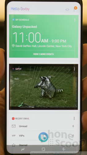
Bixby is also a voice assistant, like Siri. There's a dedicated Bixby button on the left side of the phone. You can press it quickly to reach the Bixby screen described above, or you can press and hold the button at any time to speak directly to Bixby through the voice interface. You can issue the expected set of commands, and they're context-aware, so you can say things like "remind me to buy milk on the way home", and Bixby will figure out how to do just that.
There's more. (Bixby wears a lot of hats.) Bixby is also a voice control for (almost) everything on the phone. In Bixby-enabled apps, anything you can do by touch, you can also do by voice. But it's not a siloed hands-free mode; you can switch back and forth between voice and touch at any time.
Then there's Bixby Vision, which is a lot like the old Bing Vision. From either Bixby or the camera app, you can enter the Bixby Vision mode, which tries to figure out exactly what you're pointing the camera at. Point it at a menu and it will offer to translate it to another language. Point it at a book or product box (etc.) and you'll get a link to buy it online. Business card? Import it into Contacts. Landmark? Find out more about it. And of course it does QR codes.
Speaking of the camera app, the user interface there is mostly what you'd expect. You can swipe sideways for the main mode menu, or swipe the other way for filters. The mode menu has super-tiny icons and text; it should be easier to read. There's a pro (manual) mode, panorama, selective focus (blurred background), hyper-lapse, and slow motion. The pro mode supports long exposures.
There is also a face-mask feature, similar to Snapchat Lenses. Everyone's copying this in their social apps now, but Samsung is the first to bake it into the phone's default camera app. Go ahead and make yourself look like a bunny. It's fun.
One note about the camera app: it doesn't seem like Samsung made much effort to adapt it to the unique screen shape. This is something LG went to great pains to do with the G6. In fact, LG might have gone a tad overboard with their Square Camera concept, but Samsung doing nothing here leaves a lot of wasted screen space when taking photos. They could have added so many more on-screen controls, or a photo roll, or... something. Anything. It's a waste.
DeX

DeX is Samsung's attempt at Windows Continuum. Pop your S8 into a small, portable desk dock, and suddenly your phone is a full desktop computer. Well... almost. It's still running Android, not Windows. But with a full-size monitor, keyboard, and mouse. The interface is a heavily adapted version of Android with a more computer-like layout, including movable windows. It can run special enlarged versions of Microsoft Office and Adobe Photoshop Express. It has its own "desktop" web browser. Video is no problem. You can access full Windows via remote-access software if your corporate network offers that.
A special cooling fan built into the dock helps DeX tap into the full processing power of the Snapdragon 835 processor with no compromise. The dock's ports include power, HDMI, Ethernet, and two full-size USB ports. You can also use Bluetooth keyboards and mice.
When using DeX, you're still using your phone, with your phone data and phone apps. You can message people in WhatsApp while you work on a spreadsheet and watch sports on YouTube. You can even take a phone call (by speakerphone.)
DeX is a funny thing. It's ambitious, and also irrelevant to most people. Only a small number of users will find the DeX dock worthwhile; a separate laptop or tablet will make more sense for most. And yet a phone this powerful is capable of this, and some users will find it makes sense for them. So why not have the option? We look forward to testing this out some more. It's not a complete desktop experience, but it may be very useful for certain, specific scenarios.
Accessories
The usual array of cases and accessories are available. Fuzzy cases, rubber cases, slick flip cases, leather flip cases... you name it, in every color of the rainbow. There's even a text keyboard case, for that BlackBerry experience, if that's your jam.
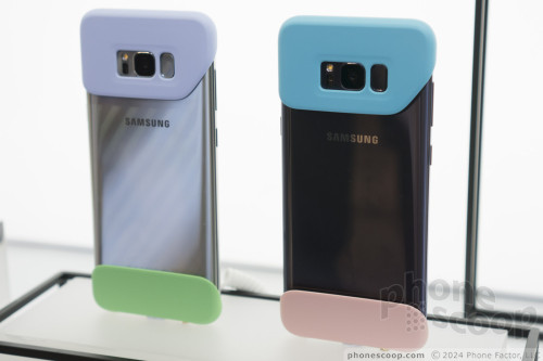
But my favorite by far are the stick-on rubber end-caps. The main problem with the design of the Galaxy S8 is that it's all curved glass. That makes it very sexy, but also very fragile. You buy a phone like this to show it off, but it's completely impractical to carry without a case. The end caps solve this problem by attaching only to the ends — with special adhesive — providing basic drop protection for all four corners while leaving most of the sexy, curvy body visible for all to see. Assuming the adhesive holds, it's a clever solution.
Thoughts
If you liked the Galaxy S7 edge, you'll probably love the Galaxy S8. It's a step up in every way. This is Samsung at the top of their game, putting everything you could possibly want into one phone. And it comes in two sizes.
As with most recent flagship phones, there's a lot of curved glass, and that means it's on the fragile side. This one has more curved glass than most. There's a reason Samsung is launching this alongside so many case and protection options.
The taller screen shape is fantastic; it's the future. The LG G6 also has this, but that phone doesn't do VR; the Galaxy S8 does.
I also appreciate that Samsung isn't turning its back on the 3.5mm audio jack and expandable memory.
If you want the phone that has everything, this is it. It will probably be priced accordingly, but that's to be expected. You can pre-order it starting tomorrow; look for it in stores on April 21.
Comments
No messages




 Top Five Flagship Handsets of 2017
 Review: Urban Armor Gear Cases for Samsung Galaxy S8
 Review: Speck Presidio Cases for Samsung Galaxy S8
 5 Best Phones to Take On Summer Vacation
 5 Reasons to Buy the Unlocked Samsung Galaxy S8 or S8 Plus
 Samsung Galaxy S8+
 Samsung Galaxy S8

