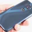
Review: LG G6
Lock Screen
The full lock screen behaves just like it does on any other Android phone, but some of LG's customizations improve the experience a bit.

First, the G6 adopts the "Always On Display" pioneered by Motorola and later copied by other phone makers. The screen always shows the time, date, and battery life in white on the black screen. Incoming notifications, such as email, SMS, or Facebook, will cover up the clock for a split second before lining up next to the battery meter. This way you can always see what unread notifications await within. I really like this feature and LG's implementation works well.
You can customize the lock screen a bit. For example, you can set which shortcuts appear at the bottom, as well as where the clock appears on the screen. You can also adjust the swiping animation and choose whether or not to display the weather.
The G6 includes LG's KnockOn and Knock Code. Double-tap the display to wake the lock screen. This is most helpful when the phone is sitting on a table or desk. KnockCode is an optional security tool that unlocks the phone through a custom pattern of taps on the screen. I'm not sure it's necessary, given the G6's fingerprint sensor, but at least you have more than one way to wake the screen.
The G6's fingerprint reader is quick and reliable. It takes only a few moments to set up several fingerprints and I found the reader was consistently the fastest way to unlock the phone. The reader works with just a light touch; you don't have to press the actual button. Beyond unlocking the phone, the fingerprint reader can be used to secure individual photo galleries and QuickMemo files, but not apps or folders.
Home Screen
The G6 ships with Android 7.0 Nougat, though it's hidden quite well under LG's heavy interface layer.

The G6 ships with three different versions of the LG home screen. Out of the box, the default home screen doesn't include the app drawer. This means users don't have access to a central repository for apps; instead, all the apps are bundled together in folders on the home screens. I don't like this home screen layout, as it reduced the amount of screen real estate for widgets. You may elect to choose a different home screen experience that includes the app drawer (literally called Launcher + App Drawer). The third home screen experience is LG's EasyHome, which dumbs down the interface for novice users.
The device allows you to switch up wallpapers and other behaviors with ease. I like that apps can be arranged in various grid configurations (4x4, 4x5, 5x5) to allow for more effective use of the screen's real estate, and, using menu options, you can elect to hide apps you know you won't use often, as well as bring them back when needed. You can control behaviors such as fonts, font size, button arrangement, screen effects, and so on.
LG didn't mess with the Quick Settings panel too much. It includes five toggles across the top, as well as a slide to control screen brightness. You can customize which toggles appear in the Quick Settings screen and swipe the toggles to see more. The panel also allows you to access, act on, and dismiss notifications.
The main settings tools are broken down into several tabs by default, but you can adjust it so they appear on a single screen. It's rather dense and not that easy to use.
LG's Smart Bulletin is still around. The tool is inactive when you first boot the phone, but you can choose to turn it on if you wish. When activated, Smart Bulletin becomes the left-most homescreen and provides quick access to certain data sets, such as LG Health, your calendar, and action items. I didn't find it that useful.
What about those 320 extra pixels offered by the taller display? Some of those extra pixels are eaten up with the on-screen controls (back, home, etc.). On the G6, there's a pretty big gap between those buttons and the dock. There's also a big gap between the dock and the first row of apps/widgets that you can place on the home screen. Apps designed using Google's latest tools and guidelines will automatically adapt to fill the whole screen; older apps may leave the top and bottom as black bars. LG also claims to have some extra logic to help apps fit the space as well as possible. From what I can tell, it mostly just stretches the control elements at the bottom of the screen. I did notice that split-screen multitasking is improved thanks to the extra space. (There is one major exception with respect to the screen real estate, and that's the camera. More on that below.)
The G6 is the first phone other than the Pixel / Pixel XL to ship with the Google Assistant aboard. (Since LG announced the device in February, Google has made Assistant available to most Marshmallow and Nougat handsets through a separate download.) I like the Google Assistant a lot and have slowly been using it more and more. Utter the awkward "Ok, Google" catchphrase and the G6 will turn on and begin listening to your voice commands. It works just as well on the G6 as it does the Pixel and other Android phones. The Assistant is far better at understanding natural language requests than Apple's Siri.
Please, don't fret about the processor. The G6 ships with Qualcomm's Snapdragon 821 processor, the company's most advanced chip as of last fall, rather than the brand new Snapdragon 835. If someone says the 821 isn't good enough, don't listen. For one thing, LG worked with Qualcomm to port some of the 835's best features to the 821. The result is a smartphone that hauls ass. The G6 does everything in a blink of the eye. I couldn't find any task or app to tax the G6 while I tested it. Games ran smoothly and VR content presented no trouble whatsoever. It's a quick phone.
Camera
LG seems to have borrowed some features from the V20's powerful camera app, but it overhauled much of the experience to better suit the G6's 2:1 display and dual rear cameras. The G6 doesn't have a physical camera button, but you can launch it from the lock screen or with a quick double press of the volume-down button.

Both cameras on the rear of the phone have 13-megapixel sensors, though one shoots with a 71-degree (normal) field of view and the other shoots in a 125-degree, wide-angle field of view. A toggle at the top of the camera app allows you to jump from the regular-angle camera to the wide-angle camera any time, no matter which shooting mode you're in. Like the iPhone 7 Plus, the G6 allows you to zoom seamlessly from one camera to the other.
The camera interface is a really busy place. Starting from far left, a batch of options runs down the left side of the main screen and includes flash controls, user-facing camera, film effects, shooting modes, and settings. None of these buttons cannot be customized.
There is a decent selection of shooting modes, including auto, manual, “square”, popout, food, snap, panorama, 360-degree panorama, slo-mo, and time-lapse.
“Square” shooting is the big addition and made possible thanks to the 2:1 screen aspect ratio. The UI changes a bit to show you two identical squares. The left square is the viewfinder while the right square is a preview of the last image you took. LG says this lets people compare the previous shot to a potential new shot so they can get a better picture if they want. This is called Snap Shot. But there's more. Snap Shot is only the first of four Square modes. Match Shot lets you take two separate square photos and then paste them together, or take two photos or videos at once using the main rear camera and user-facing camera. Grid Shot lets you take four photos or videos and the create a large, square collage, while Guide Shot lets you use an image as a guide to take successive photos with the same composition. For example, let's say you want to take four pictures of your dinner plate, from meal start to meal end. You can use the first to line up the successive shots so they all have the same framing.
Each of these modes has a tutorial to help you learn how to use them. I didn't have any trouble figuring them out, and I'm sure you won't either.
As for the rest of the shooting modes…
Pop-out mode creates a picture-within-a-picture effect. In other words, you have a smaller box in the middle of the frame with the subject, and larger box around the outside to which you can add effects (blur, fisheye distortion, etc.) to make the central image pop.
The multiview mode lets you shoot pictures with both rear cameras and the front camera at the same time so you can include yourself in a three-panel montage. There are several different panel configurations and you can arrange them however you wish.
The snap shooting mode lets you assemble video clips into a 60-second story. You can shoot with 1, 2, or 3 panels in a variety of configurations. A quick tap of the shutter button records a 3-second video segment. You can piece together up to 20 of the 3-second clips, or press-and-hold the shutter button to record longer clips up to 60 seconds long. It takes some practice to use effectively.
Manual mode is for knowledgeable users who want to be creative. As the name implies, you have full control over everything: white balance, focus, brightness, ISO, and shutter speed. Shutter speed can be set as long as 30 seconds, (for dramatic and/or creative night shots.) You can also set the auto-exposure to lock. Each option has its own slider that lets you, for example, alter the focal point between close and far. As you do this, the screen changes to provide a preview of how the resulting image might look. It gives you some neat insight into how each individual part of the exposure process may affect the final result. It is not easy to master, and doesn't always produce the results you're seeking.
Looking for HDR? It's buried in the settings menu. You can set it to on, auto, or off. I wish the HDR tool was accessible from the main viewfinder.
The user-facing camera includes a number of its own tools, including a screen flash, smile capture, gesture shot (make a fist to start a photo timer), and beautification filters.
The G6's camera software is extraordinarily quick to focus and snap photos. It's a powerful app that performs well. I wish it were less overwhelming.
Photos/Video
The G6's twin cameras are the best ever to grace an LG handset. LG picked a fantastic sensor/lens combo and is putting the Snapdragon 821's image processing capabilities to effective use. Where the standard view lens has an aperture of f/1.7, the wide-angle lens has an aperture of f/2.4. Other features include optical image stabilization (on the standard lens), tracking focus, and zero shutter lag image capture. The results are amazing.
I used the camera for an afternoon in Barcelona and came away impressed with the results. The G6's ability to capture even exposures that are sharp and accurate with respect to color is second to none. I shot in a really challenging environment with lots of shadows and bright spots, and the G6 was able to balance them out thanks to the auto HDR function. The images I took around my home and of my kids were great, too. Whether you're shooting normal or wide-angle, the G6 delivers.
I must say, I really like the wide-angle camera. There's definitely ripe opportunity to take advantage of stuffing more into the image with the wide view. It was particularly helpful on tight city streets where you want to capture as much of the background as possible.
The 5-megapixel selfie camera shoots at a 100-degree angle a f/2.2, but you can toggle a more narrow view of 82 degrees if you want. There's no second lens here; LG is using software to accomplish the effect. The selfie camera also has a skin tone fixer-upper, a lighting adjustment tool, and a lot of filters. I was pleased with the results. It doesn't offer quite the same visual pop as the main camera, but it's a fine tool for taking self portraits for sharing across social networks.
LG perhaps offers too many options when it comes to video. As you'd expect, you can shoot at 720p HD, 1080p HD, and 4K UHD all in the standard 16:9 aspect ratio. Alternately, you can shoot 1080p HD in LG's 18:9 aspect ratio, which is actually the default. This means the video you shoot on the phone will fill the phone's screen, but won't quite fill today's 16:9 screens.
The footage is excellent. I shot a lengthy video of my daughter's play over the weekend and I was able to adjust exposure to handle the bright lights on stage and show accurate color. I was very pleased with the video results.
The G6 truly does impress. You can leave the dedicated camera at home and use the phone for nearly all your photography needs.
LG Stuff
LG installed a number of its tried-and-true software tools on the G6 so LG fans will have plenty to be happy about.
First up, QuickMemo. It's accessible from the Quick Settings panel. As always, it takes a screenshot and then opens a basic editor so you can annotate the screenshot and share it with others.
Next, QSlide apps are on board, too. Certain applications, including the phone, browser, calculator, notepad, and others, can be shrunk down to smaller sizes for multitasking. You can drop several QSlide apps on the home screen and quickly bounce between them. I've always liked that you can control the transparency of QSlide apps.
Last, LG's Health app is a powerful fitness companion. It includes beginning and advanced modes to cater to individual needs. LG suggests new users start with the beginner toolset and move to the advanced tools once they've reached a certain level of health and fitness. If you're interested in doing things like tracking steps and diet, that's easy to do with LG Health. It handles walking, running, climbing and cycling, and provides an overview of your progress.
AT&T Stuff
Carrier-branded phones can be annoying and I'm here to warn you that AT&T has sullied its variant of the G6 with a ridiculous amount of trashy bloatware. The most egregious are AT&T's own apps, which are pushy about being selected as the default tool for this, that, and the other thing. There are far too many AT&T-branded and partner apps that cannot be deleted, such as AT&T Protect Plus, FireFox, Smart Limits, LookOut, Games, Uber, Yellow Pages, and DriveMode. AT&T, LET ME DELETE UBER!
AT&T's DirecTV app is terrible, as it constantly fills up the notification tray with advertisements. You can turn them off, but it takes some digging. This aggravates me to no end. Why do you hate your customers so much, AT&T?


 Top Five Flagship Handsets of 2017
 5 Best Phones to Take On Summer Vacation
 LG G6 vs. Samsung Galaxy S8: Buying Points to Consider
 Hands On with the LG G6
 LG Touts the G7 ThinQ's 6.1-Inch Super Bright Display
 LG G6
LG G6


