First Look: What's New In Android O
May 18, 2017, 2:15 PM by Eric M. Zeman

Google this week released the first public beta of Android O, the next version of its core mobile platform. Android O has a handful of interesting new features, including picture-in-picture, notification dots, autofill for app logins, easy text selection, and much more. Android O may not be huge on hallmark additions to the platform, but it shows an excellent level of refinement from Google. We downloaded the Android O beta and took it for a quick spin. Here are our first impressions of this super early build of Android O.
Android O will replace Android Nougat later this year, but if you're anxious to run the latest code from Google the initial public beta is now available. Google talked about a number of new features for the platform, but there are seemingly fewer user-facing changes than in previous new versions of Android.
Android O Beta
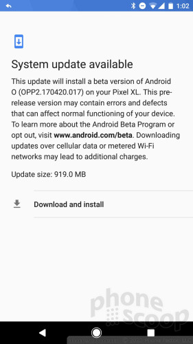
First, just about anyone can download and install the Android O beta. You'll need a Google Pixel, Pixel XL, Nexus 6P, or Nexus 5X in order to install the new bits. Go to Android.com/beta to register your device. Once enrolled, wait a few moments and check the phone's system updater. The new OS should appear shortly. If you're on a Pixel coming from Android N, you can expect the download to be about 920MB. Be sure to perform the install over wifi.
Picture-In-Picture
Google touts PiP as one of the most significant new features headed to Android O, but I'm not all that turned on by it. First, PiP has been available to Android tablets since last year, and the implementation demonstrated by Google isn't much more exciting than split-screen multitasking. Basically, video or other media apps can minimize into a small window that will float on top of another app in use.
Pic-In-Pic
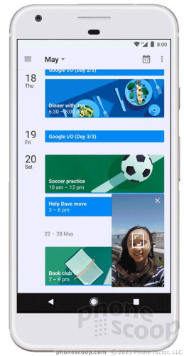
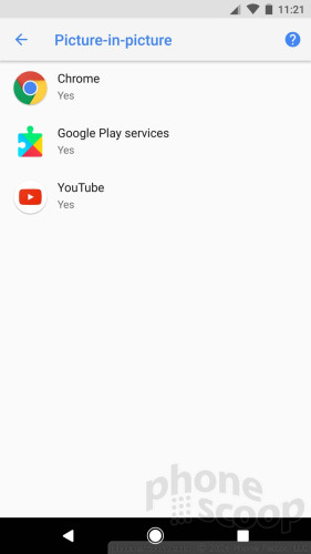
To start, only Chrome and YouTube support PiP at the moment. The feature is still nascent. The controls are there to implement it, but I couldn't get it to work at all. I can only assume I have a buggy build on my Pixel XL. Others attending Google I/O in Mountain View this week has similar difficulty getting PiP to work.
PiP
Notifications
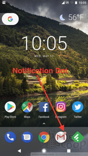
One of the biggest changes coming to Android O concerns notifications. Google is taking a page from competing platforms to improve how notifications work for both developers and end users. The most obvious change is what Google calls notification dots. In Android O, apps that have new, unread notifications will now show a small red dot in the upper right corner of the app shortcut. This provides an obvious visual cue to people about notifications.
Notification Dot
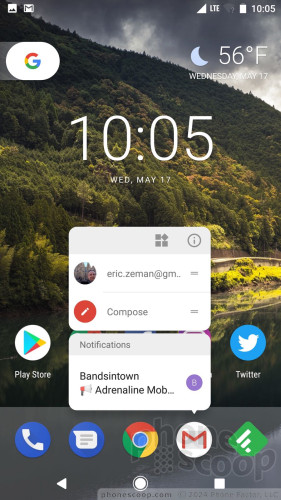
Moreover, a long press of app shortcuts on the home screen will call up a notification panel that details the newest message or other unread content. Even better, you can dismiss the notification from this new panel.
Notifications
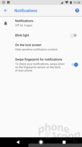
Last, Android O will let people take more control over how notifications alert them, including the notification light, vibrations, sounds, and so on. Google says adopting this new style of notifications will be mandatory for all apps running on Android O and up.
Notification Controls
Widgets
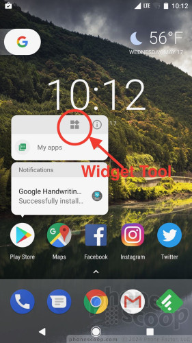
Android O makes it easier to discover and drop widgets on your home screen. A long press of any app shortcut on your home panel brings up the new notification and control window. A small icon in the upper right corner gives you instant access to that particular app's widgets. Press it and you'll see the available widgets at the bottom of the screen. Select the one you want, drag it to the home screen, and voila, new widget.
Widget Tool
Quick Settings Shade
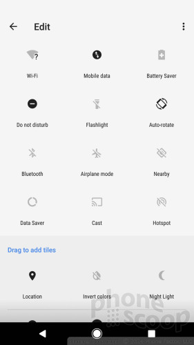
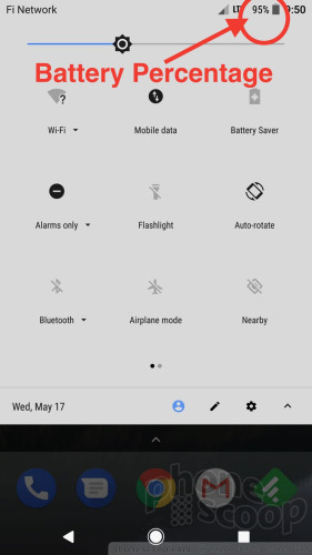
The Quick Settings shade has a new look and feel. Google changed up the fonts and and colors a bit to refresh the appearance some. The basics remain the same, meaning you can arrange the settings toggles any way you wish.
Quick Settings
Perhaps most helpful, pulling down the Quick Settings shade will toggle the battery tool to show the percentage of battery life left.
Battery Percentage
Settings
Similar to the Quick Settings shade, the full settings menu has been give a new coat of paint. You'll see less white and more gray in the background. Accent colors have shifted to a new blue that I find rather appealing. The settings menus are also stuffed with new options. For example: the nightlight function has a new control slider; the battery saver now requires fewer clicks to activate; a new dashboard makes it easier to see what devices your phone is connected to; and security tools let you more easily find your phone, see its security patch level, and new the status of your apps.
One thing I'm bummed about: Android O appears to do away with the handy settings switcher that's in the upper left corner of Android Nougat. It's possible Google will add the tool back in in subsequent beta builds of Android O.
Emoji
The native Android emoji have been ugly, jellybean-shaped blobs for several years now. I hate them. Thank goodness that changes with Android O. Google has adopted a more traditional design for its emoji, which are now round as they are on most other platforms.
Emoji
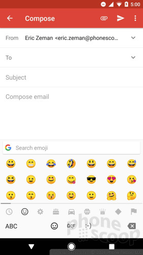
It's worth pointing out that Google's phone-making partners, such as Samsung, typically include their own emoji on smartphones. In other words, this change impacts mostly (only?) those who use the stock Android experience on their handset. In other words, Nexus and Pixel owners have something to be happy about.
Odds and Ends
Many of the other features mentioned by Google for Android O aren't quite working yet. For example, the Text Selection tool isn't functional. Google says the vast majority of text that's highlighted by end users is phone numbers, addresses, and business names. I couldn't get this to work in the Android O Beta, so it must not be activated. The same is true of Autofill, which requires an API for developers to enable in their apps. Ditto for the adjustable app icons for the home screen.
Surely Android O has lot more hiding under the hood, but this is what we were able to glean after just a little while with the refreshed platform. Surely we'll have more to say as Google updates and finalizes Android O for everyone.
Comments
I want an "UNDO" feature
(continues)


 5 Best Unlocked Smartphones
 Review: OtterBox Commuter for Google Pixel XL
 Review: Google Clear Case for Pixel XL
 Google Schedules Oct. 4 Phone Event As Pixel 2 XL Swings by FCC
 Google Camera Adds Selfie Flash, Double-Tap to Zoom
 Google Pixel
 Google Pixel XL


