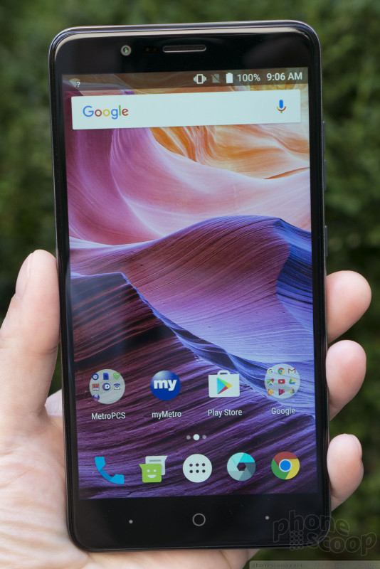
Hands On with the ZTE Blade Z Max
Aug 14, 2017, 8:00 AM by Rich Brome @rbrome.bsky.social
updated Aug 14, 2017, 9:37 AM

This follow-up to the affordable ZMAX Pro keeps the huge 6-inch screen, while upgrading a few key specs. It has a premium metal-frame design, fingerprint reader, huge battery, and dual-lens main camera. The ZMAX Pro has been a very hot seller for ZTE and MetroPCS, and they hope to keep that streak running with the new Blade Z Max. How does it stack up in person? Read on for our first impressions.
Last year's ZMAX Pro stood out not only for being affordable and having a huge, six-inch screen, but for unexpected extras like a premium design, fingerprint camera, and USB-C connector. The new ZTE Blade Z Max keeps all of those features, while enlarging the battery, upgrading to a dual-lens camera, and adding fast charging. All for an entry-level price.
The design looks exactly the same from the front, including glass with curved edges. On the sides is the exposed metal frame, which is confidence-inspiring and comfortable.
The side buttons on the right feel good and work well. The lock button has a nice rough texture to help distinguish it form the volume control by feel. The size of the phone places the volume control up very high, so that you'll usually have to adjust your grip to adjust the volume. The bottom holds a USB-C connector — very rare for a phone at this price — and a welcome 3.5mm audio jack.
On the back, you'll find a shape that's flatter and thinner. Instead of a gradual curve across the whole back, you'll find a flat surface with just a bit of curve at the sides. It is very slightly thinner than last year's model, but the shape somehow makes it feel much thinner.
The back panel has a rubber coating with a honeycomb texture. It's intended to improve grip, but by reducing the surface area where your fingers make contact with the phone, it actually seems to reduce grip.
It's quite a large phone. You'll almost certainly end up using two hands most of the time. Comparing strictly against other phones in this price class, the bezels around the display are relatively small. But a phone with a 6-inch screen (and 16:9 aspect ratio) is always going to a big phone.
The overall impression when holding the phone is that it feels much more expensive than it is. The curved-edge glass, metal frame, and solid build quality go a long way.
The screen is full-HD, (not just the basic 720p,) which is still rare at this price point, but also very important with a screen this large. It looks very sharp. Viewing angles aren't great, but hardly the most critical thing for most people shopping for a phone like this.
The battery is sealed inside, but there is fast charging. A tray on the side holds both a memory card and the SIM card.
The interface is almost completely pure Android 7.1.1, as designed by Google and unmolested by ZTE.
The camera has two lenses, including a main 16-megapixel module, assisted by a 2-megapixel monochrome sensor.
The camera app has three "Dual" modes that specifically use the extra camera: Bokeh, Portrait, and Monocolor. It's not really clear what the difference is between Bokeh and Portrait; in some quick tests, they both seem to blur the background in the same way.
The Monocolor mode lets you pick a color (red, blue, or green) and turn everything else monochrome. It works well, but it's not clear how a second camera helps this function.
Other camera functions include the dual-LED flash, HDR, panorama, multi-exposure, and time-lapse. A manual mode lets you control focus and activate interval mode, but doesn't offer shutter-speed control.
There are a handful of MetroPCS apps pre-loaded, plus Lookout security.
Look for the Blade Z Max around the end of the month, for just $130. That's a pretty great price for everything you're getting. Look for our full review soon.
Comments
No messages


 Top Five Budget Handsets of 2017
 Holiday Gift Guide 2017
 Review: ZTE Blade Z Max for MetroPCS
 ZTE Blade Z Max Brings 6-Inch Display to MetroPCS for $129
 iPhone 15 Series Goes All-In on USB-C and Dynamic Island
 ZTE Blade Z Max


