Review: Samsung Galaxy Note8
Lock Screen
Editor's Note: Many aspects of the Note8's software are identical to those of the Galaxy S8 and S8+, so some portions of the below text have been carried over from our earlier reviews. Rest assured, we re-tested every feature and paid detailed attention to the aspects unique to the Note8.
Samsung has almost made a mess of the lock screen experience, though chiefly because there are so many ways to customize the Note8's behavior.
The Note8 offers the same Always On display from the S8/S8+. You always have a view of the clock, date, battery percentage, and notifications. The notifications can range from simple badges to the full text of incoming messages. Samsung offers plenty of ways to tweak the Always On display, and I appreciate that.
The easiest way to turn the screen on is to press the screen lock button on the right side of the phone. This brings up your wallpaper, full notifications, access to the Quick Settings menu, and lock screen shortcuts. You can also reach this screen by pushing the new “home button”. Samsung replaced the physical home button with a software key on the front. It's a little square that sits at the bottom of the display. It's always visible, part of the Always On display. A simple tap won't do it; you need to hard-press or double-press the button.
As with all Android phones, you can set a PIN, pattern, or password for security. You need to wake the phone and then swipe up on the screen to access these locking methods. The same is also true of the iris scanner and facial recognition tool. Once you've woken the display and swiped up, using the iris scanner is pretty quick. The iris scanner, in particular, can read your eyes in less than a second. However, if you're in near total darkness or out in super bright sunlight the iris scanner doesn't want to work well. It's better if you don't wear glasses at all, and even contacts can gum it up. The facial recognition tool is spotty. It was able to read my face about 70% of the time, though that's a dramatic improvement over the S8/S8+. The steps for recording your irises or face are simple enough. Each offers a rich tutorial to walk you through the process.
My opinion of these methods has not changed since I reviewed them on the S8. Using any of these five locking methods (PIN, pattern, password, iris, face) takes too much time. You have to wake the screen, swipe to reach the lock, then interact with the lock. Three steps is two too many.
Use the fingerprint reader on the back. It may be in an odd spot, but it's easy to record multiple fingerprints and, once you get used to the reader's location, it's by far the quickest and most consistently simple way to unlock the phone. Grab the Note8, touch the fingerprint reader, and the phone skips the lock screen / unlock screen entirely and goes straight to your home screen. Moreover, if you use a case you'll discover the fingerprint reader is a snap to find.
Home Screens
The home screen experience ranges from simple to saturated. Thankfully, you're in full control. The Galaxy Note8 ships with Android 7 Nougat on board and the latest build of Samsung's user interface skin that serves as your window into the Note8. It's highly configurable, and sometimes annoyingly complex. (Samsung hasn't said anything about updating the phone to Android 8 Oreo.)
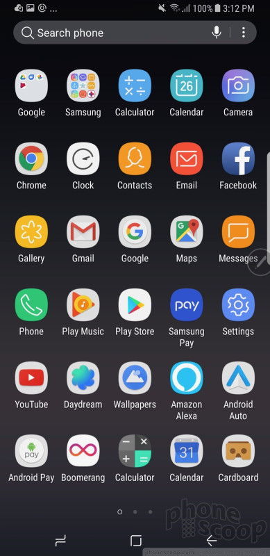
Samsung has hidden the app drawer. Instead of a dedicated apps button, you'll find if you swipe the home screen up or down the app drawer will appear. Samsung's solution is elegant in its simplicity, even if it's not intuitive at first. After a day or two, though, I found the swiping gesture to be quick and easy. You need to be nimble-fingered about it; if you press too long or too hard you might accidentally perform a different action with something on your home screen.
The app drawer is organized alphabetically by default. The entire drawer can be arranged however you wish, including folders. Samsung allows you to hide unwanted apps, but I found only a couple could be removed completely.
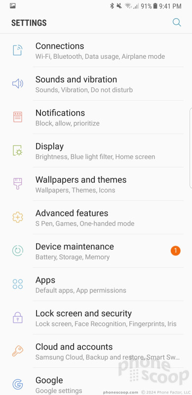
The Quick Settings panel has clean icons and blue-on-white coloring that helps you understand at a glance what's turned on. You can customize the Quick Settings panel to a small degree. The main settings screen is really nice. Like the Quick Settings panel, it uses clean colors, sharp fonts, and a bright background. It's arranged more or less how Google arranges the settings on its own phones.
Things I really like about the Samsung interface: the colors, the fonts, the icons, the symbols, the individuality.
You can spend all weekend customizing the Note8. For example, the phone offers access to Samsung's themes. Only a couple are pre-installed, but you can download more. Some themes are free, some cost a few dollars. All of them will change your entire visual experience, from the wallpapers to the icons to the fonts and colors.
Then there are the small tweaks. How many apps do you want on the home screens (4x5, 5x5, 6x5)? How big do you want the icons to be (small, medium, large)? Which font do you want? Do you want icons with or without borders? Care to re-arrange the software buttons at the bottom of the screen? You can.
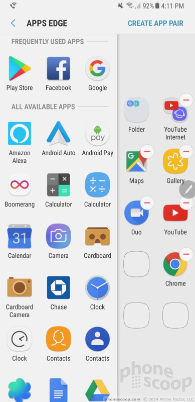
Like the early Galaxy devices with curved screens, the Note8 supports Edge-based shortcuts. Swipe the little tab open to see People Edge, Apps Edge, and others.
Here, the one new and exciting addition with the Note8 is called App Pairs, which really improves multitasking. With App Pairs, you can pair together any two apps and open them simultaneously. Let's say you want to see your calendar and contact list at the same time. Simply create an app pair and tap the icon, which will open both apps in separate multitasking windows. Samsung said this feature is available to any app that can be used in multitasking mode. My favorite was running YouTube in one window and Twitter in another. It works really well. The Note8's extra-tall screen really helps here. Samsung hinted to us that this feature might come to the S8 or S8+.
The remaining Edge Panels work as they do on older Samsung handsets. You can position the handle anywhere along either side of the Note8's screen. You can choose how large the tab is, as well as how transparent it is. The phone ships with 15 Edge panels: app shortcuts, contacts, smart select, clipboard, tasks, weather, tools, calendar, sports, CNN, and more. More are available for download. Each of these panels can be customized to suit your individual tastes. Nine Edge panels can be active at any one time. The panels work fine.
The Note8 includes Easy Mode, which gets rid of the “complicated” home screen panels and app drawer in favor of larger icons and fewer screens through which to navigate. This tool is meant for people who may be new to smartphones, or for those who have bad eyesight.
You can use a number of different hand gestures to control the phone. For example, you can capture a screenshot by swiping the edge of your hand across the display, or call the displayed contact by bringing the phone to your ear. Incoming calls can be muted by placing your palm on the screen or turning the phone over.
The Galaxy Note8 ships with the Qualcomm Snapdragon 835 with a class-leading 6 GB of RAM. This is Qualcomm's best, and it's a generational leap over earlier Snapdragon 800 series chips. The Note8 crushed everything I asked it to. Every app on the phone runs quickly and smoothly, screen transitions are fluid, and the phone practically begs for a real challenge. Even running virtual reality apps for an hour didn't seem to task the processor. The Note8 never became uncomfortably hot and does everything instantly.
S Pen Apps
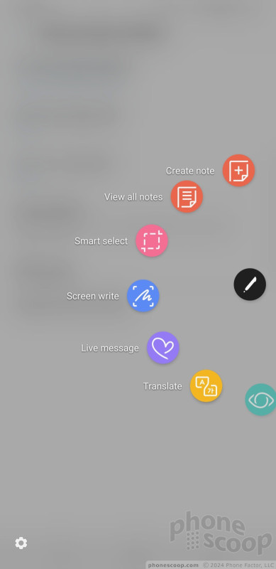
The S Pen is at the heart of the Note series. Pop the stylus out and Air Command — Samsung's semi-circular stylus interface — comes to life. Air Command supports up to eight app/action shortcuts and you can customize them. Samsung says the tip of the S Pen itself is smaller at just 0.7mm and it responds to 4,096 levels of pressure, twice that of the Note7. This means people have far more control over exactly how the S Pen writes and/or draws, particularly in the PenUp tool.
The primary new S Pen feature is called Live Message. With it, anything you write or draw is animated. The message is sent via the animated GIF format, so it should be compatible with most messaging apps, email apps, and even operating systems. You can draw on a blank canvas, on top of photos, or on top of screen shots. The recipient sees the words draw themselves magically as they watch the message. It's cool, but it doesn't always function well, because GIF can be an inefficient format. I ran into file size errors that prevented me from sending Live Messages to others. The Live Messages that did go through delighted the recipients.
Samsung improved the Screen Off Memo that debuted on last year's Note7. With Screen Off Memo, Note8 owners can write directly on the lock screen without unlocking the handset. It's simple: white text on the black background. This new version supports up to 100 pages of text. You can then pin memos on the lock screen so they are accessible at a moment's notice even when the phone itself is locked. The best use case is something like a shopping list. The list is accessible from the lock screen and you can cross items off as you navigate your local supermarket all without unlocking the screen. It works well.
The S Pen improved its ability to translate between languages. Last year, the S Pen could translate single words. Now, it can translate entire sentences and/or phrases from 30 different languages just by highlighting them with the S Pen. I tried it several times with some emails I received in Spanish, Chinese, and Korean, and it did a decent job.
The PenUp tool, which is a free-range drawing app, adds some coloring book templates so even those without artistic talent can enjoy some doodling time. The PenUp feature targets illustrators and is the most impacted by the S Pen's improved sensitivity.
The Note8 carries over Smart Select for grabbing content from web sites, and Screen Write for doodling on screenshots.
Camera
Samsung simplified its camera app and made it more fun to use. Several options open the camera, including a double-press of the screen lock button, and the lock screen shortcut. The camera jumps to life in a blink.
With the Note8's camera, swiping is everything. The main viewfinder is fairly typical: tools on the left, viewfinder in the middle, shutter buttons on the right. Swipe the viewfinder up or down to switch to the selfie camera, swipe right to open shooting modes, swipe left to open Instagram-style filters. The camera has separate picture and video buttons, which make it easy to snap photos when shooting video. The controls on the left allow you to toggle the flash and HDR to on, off, or auto.
As far as the shooting modes are concerned, the Note8 includes live focus, dual capture, auto, pro, panorama, selective focus, slow-motion, hyperlapse, food, and virtual shot. You can download more (sports, sound and shot, others) if you want. Most of these have been around for a while and function as they did on Samsung's older phones.
Live Focus is new and unique to the Note8 and relies on the dual camera configuration. It is basically bokeh on steroids. This mode uses both cameras to help create blurred background effects. What's neat is you can adjust the level of background blur both before and after you take the picture. The tool provides a live preview of the potential results as you adjust the strength of the blur effect. This mode is accessible directly from the viewfinder. It does take some practice to use, but delivers fun results. I particularly like that you can change the focal point after the fact.
Dual Capture is the other major addition to the Note8 camera app. It also puts both the rear cameras to use. The idea here is to let you take telephoto and wide-angle shots at the same time. For example, maybe you're at a concert and want to zoom in on the lead singer. The telephoto lens will allow you to do that. When you snap the shot, it will also capture an image from the wide-angle camera so you can see the entire stage in addition to the close-up of the lead singer. It's complicated, and is only available when using Live Focus mode.

Thanks to the second camera, the Note8 supports 2x optical zoom. There's a simple "X2" button in the viewfinder. Tap it to automatically jump in by a factor of two. (Which is actually simply switching between the two lenses.) You can still use the slider tool to adjust zoom, and it will stick to the main lens until it reaches 1.9x, then switch over to the telephoto lens for the rest.
The Note8 also supports a tool for capturing 2 seconds of video before a picture, and makes it easy to turn these short clips into shareable GIFs. I wish this were an easy feature to enable, but it's buried deep in the settings menu.
The “pro” mode lets you tweak most of the camera's core settings, including exposure, white balance, autofocus, color, shutter speed (up to 10 seconds), and ISO. It's a little difficult to use. Adjusting the settings requires you to slide your finger up and down the right side of the screen, which is where the control bar appears. If your finger is off just a little bit, however, you'll accidentally swipe yourself into selfie mode and lose the pro mode entirely.
The Note8 carries over the S8's masks, stickers, filters, and other extras for enhancing your pix before you share them on social media. The “masks” tool includes a decent variety and lets you adorn your face with the ears/snout of a dog, cat, bat, deer, rabbit, sheep, and other animals. Moreover, opening and closing your mouth when using a mask generally causes it to animate in some entertaining way (see embarrassing samples below). The stickers are rather simple black-and-white affairs. The phone has at least 16 different filters. These tools are available when using both the main camera and the selfie camera.
Last, the camera includes Bixby Vision. Once enabled, the Bixby Vision shooting mode turns on Bixby's artificial intelligence to help you figure out what you're looking at. Bixby Vision can read/translate text, read QR/barcodes, and help you shop with location-based suggestions. We've seen these features on phones before, so Bixby Vision isn't particularly eye opening.
One complaint: There's no true wide-angle shooting mode. I love the wide-angle camera on the LG G6 and V30. It would be a nice feature to have here.
The camera, like every other app on the phone, performs incredibly well. It's fast through and through.
Photos/Video
The Note8's camera might be what differentiates it the most from the S8+. Where the S8+ has one camera sensor, the Note8 has two. The twin 12-megapixel sensors capture full-color images. The main lens has an aperture of f/1.7 and a standard field of view, while the secondary lens has an aperture of f/2.4 and a telephoto field of view. Optical image stabilization is available to both lenses, which is particularly important with the telephoto lens.

There's no question the Note8 offers the best camera on a Samsung device. Image quality is a smidge better than what the S8 and S8+ produce, but the second lens and added features such as bokeh and dual capture give the Note8 a significant edge.
I was surprised by the ease with which the Note8 captured good photos in bright and dark environments alike. Moreover, I spent an afternoon in Berlin taking in sights like plazas, towers, train stations, churches, and memorials, and came away very pleased with the results. The Note8 performed admirably in low-light situations, and didn't destroy photos with grain. Focus was sharp, white balance was accurate, and exposure was spot-on. The Note8's camera impressed me in every way.
The Note8 has a powerful 8-megapixel user-facing camera with screen-based flash, auto-focus, and an f/1.7 aperture of its own. The selfie cam does a really, really good job. Seriously, putting auto-focus in the user-facing camera goes a long way to improving the sharpness of selfies, particularly in low light. As noted above, you can make use of the masks, stickers, and filters when using the selfie cam, as well as the “beautification” tool.

On the video front, the Note8 captures resolutions up to 4K. The best features — HDR capture, video effects, tracking autofocus — aren't available when shooting in 4K or 2K. The Note8's video camera does an excellent, excellent job. Video is sharp, rich in color, and properly exposed. My only complaint would be about the grain I saw in some low-light environments. The HDR video capture mode helps mitigate this a bit as long as you don't mind keeping it to 1080p HD.
There's no better smartphone for photography and videography on the market. This phone can easily be your everyday and dedicated shooter for vacations, important family events, and more.
Bixby
Bixby wasn't available in full when I reviewed the S8 earlier this year. Samsung has since released the feature to the S8, S8+, and includes it on the Note8 as well.

As noted earlier, the small key on the left side of the Note8 activates Bixby. Right now this is all the Bixby button can do; it cannot be customized to do anything else. I find this to be utterly infuriating. After fully testing the feature, I've decided Bixby is not for me. It's simply not as useful nor as convenient as Google Assistant. At least once a day I accidentally depress the Bixby button and launch the app even though I don't want to use it. This is a poor, poor user experience that I've come to despise.
On first launch you'll be asked some simple questions to get started. The Bixby screen includes cards that present a lot of information about you and the stuff you typically do. For example, it details the weather, your next calendar appointment, and highlights from your Twitter and Facebook feeds. This is really no different from competing services from other handset makers.
More than just launching apps, Bixby allows you to interact with apps by calling up their menus and settings so you can, ostensibly, do everything that particular app can do all through voice commands. You have to have an incredible amount of familiarity with each app and its organizational structure to fully take advantage of this. I struggled to get Bixby to really do complex tasks. At best, I could get it to do things like open the email app and create a draft email to a specific contact. Don't get me wrong, that's helpful, but it's not all that different from what Google Assistant can do.
It's best put to use with simple commands for opening and interacting with main apps like your calendar, messages, and email, and even then I find Google Assistant superior in most every way.
I really, really wish you could remap the Bixby button to open Google Assistant or the camera. Short of that, it would honestly be better if you could just deactivate it entirely.












 Top Five Flagship Handsets of 2017
 Holiday Gift Guide 2017
 Review: Otterbox Cases for Samsung Galaxy Note8
 Review: Samsung Alcantara Case for Galaxy Note8
 Hands On with the Samsung Galaxy Note8
 Samsung Galaxy Note8


