Review: Samsung Galaxy Note8
Sep 5, 2017, 10:00 AM by Eric M. Zeman

The Galaxy Note8 is Samsung's ultimate flagship for 2017. The Note8 takes the attractive design language from Samsung's own Galaxy S8 and pairs it with one of the largest screens and best cameras available. This Android powerhouse is more capable than most thanks to the added benefits of the S Pen stylus. If you want the biggest and the best, and have the huge amount of cash needed to buy this phone, then the Galaxy Note8 is indeed an attractive option. Here is Phone Scoop's in-depth review.
Hardware
Is It Your Type?
The Galaxy Note8 is Samsung's strongest offering for professionals and others who require productivity on the run thanks to the powers of the S Pen stylus. The Note8 adopts the design language we saw on the S8 and S8+ earlier this year, and tweaks the size, shape, and feature set to appeal to a more work-minded base. The Note8 may be Samsung's most powerful smartphone, but that doesn't necessarily mean it's the best phone for everyone. It boils down to the two Ps: pen and photography.
Body
The Galaxy S8, announced in March, was a generational leap forward not only for Samsung, but for all phones. Many aspects of the S8's design signaled a new path that the rest of the industry will be forced to eventually follow in order to remain relevant. (LG has already done this, now we're waiting on Apple and others.) Samsung took the S8's design and adjusted it to accommodate the larger screen and S Pen stylus common to its Note-branded smartphones. The result is a blended beauty that stuns thanks to its sheer size and simplicity.
If we look back at the Note7, (pulled from the market due to disastrous battery fires,) we see the end of an era. It was the last major device from Samsung to debut before the company's radical re-imagining of its hardware with the S8 and S8+. Rather that follow its own path, the Note8 is more a retread of the S8+ with a few extra features added for good measure. What I'm trying to say here is that the Note8 is not as "new" as I'd like it to be, despite its gorgeous, refined design: it doesn't set the bar as high as it could have.
The Note8 is, at its most basic, a taller S8+ with sharper, more rectangular corners. The glass surfaces of the Note8 curve and flow into the metal frame seamlessly, making the Note 8 feel like a singular unit rather than an amalgamation of individual parts. The metal frame is visually indistinguishable from the glass around it on our black review unit thanks to a matching, shiny finish. The uniformity of the shape, the thin profile, the luscious materials all make the Note8 something to lust after, just like they (still) do with the S8 and S8+.
The Note8 carves the same oblong shape that defines its smaller siblings. The phone is narrow, yet very tall at 6.3 inches. It's significantly taller than the Pixel XL and iPhone 7 Plus. I do appreciate the Note8's narrow waist. What's it like to carry the phone around? The added height, thickness and weight make the Note8 more difficult to carry around at times. The height, it particular, got in the way when the Note8 was in my front pocket, making it more difficult to bend over to tie my shoes, for example, or sit in an airplane seat for hours. The sharper corners of the Note8 are more painful than the rounded shoulders of the S8+; they stab you through your pocket liners.
The Note8 was not designed to be a one-handed device, so don't kid yourself. It's more or less impossible to reach the top of the screen without performing some funky hand acrobatics. It's size definitely took me longer to adjust to than did the S8+'s size. The majority of Note8 owners, particularly those with smaller hands, will require two hands to operate this device at all times.
You'll be hard-pressed to find a more finely built handset than the Note8. Samsung selected high-quality Gorilla Glass and strong aluminum, and pieced them together flawlessly. The seams between metal and glass are practically nonexistent. Samsung has mastered the art of curved glass. The Galaxy Note8 is an expert vision in design, materials, and manufacturing.
The Note8 employs Samsung's Infinity Display concept, meaning the phone's face is nearly all screen. Samsung practically eliminated the side bezels entirely thanks to the curved glass. The bezels above and below the screen are more obvious than those of the S8+ thanks to the blockier corners. With no interruptions to the glass, the front face is left entirely smooth. The earpiece grille is almost invisible. Your eyes might find the user-facing camera and iris reader easily, but two sensors also located above the screen are nearly impossible to spot in the black glass. (All color options have a black front, to enhance the display design.) Samsung didn't even bother to cram its logo anywhere on the front face; that's how committed it is to the notion of the Infinity Display.

I love the way the slim metal frame wraps around the outer edges of the phone. The frame is only a couple of millimeters thick along the sides, but it swells up at the top and bottom. You may notice some plastic antenna lines, but they are color-matched fairly well.
Two buttons are located along the Note8's left edge. The top button is the volume toggle. It's only about an inch long, which makes it a bit too easy to accidentally press up when you mean to press down, and vice versa. The second button is dedicated to Samsung's Bixby personal assistant tool. I hate this arrangement (more on that later). The lock button is where you expect it to be, on the Note8's right edge. All of the side buttons have excellent profiles, and perfect travel and feedback. Samsung tucked the nano SIM and microSD memory card tray in the phone's top edge.
If you're upgrading from a Note5, it's time to adopt USB-C, which is the port found on the bottom of the Note8. This may require some new cables and/or accessories. Samsung also squeezed a standard 3.5mm headset jack and the speakerphone onto the Note8's bottom edge. The headphone jack is nice to have, considering some phone makers have dropped it.

The S Pen is tucked into the bottom corner on the right side. You need to press the small, squarish top of the S Pen to pop it out. It slides in and out easily, and cannot mistakenly be inserted the wrong way. The stylus itself has a rectangular shape. The button is located in one of the wider sides. Samsung moved the button closer to the pen tip, which I appreciate, though the button's action is minimal at best. The phone vibrates when you replace or retrieve the S Pen, and it will warn you if you accidentally leave the stylus behind. I found the S Pen popped partially out on accident from time to time. Over the course of a week, I pulled the Note8 out of my pocket on several occasions and found the top of the pen sticking out. You might need to keep an eye on it.
Like the front, the Note8's rear panel is nearly all uninterrupted glass. It's prone to fingerprints. If you shun a case, you'll find yourself wiping oily grime off the back constantly. I'm glad Samsung was able to set the dual-camera module flush with the rear surface. It's contained within a frame that also houses the flash, heart rate monitor, and fingerprint reader.
Samsung put the fingerprint sensor in an awkward spot on S8 / S8+ and I had hoped it would reconsider for the Note8. It didn't. It can be hard to reach and tricky to find. Moreover, its proximity to the camera module more or less ensures you're going to get fingerprints all over the lens, impacting photo quality. The camera app regularly reminds you to wipe the lens clean. The Note8's sheer size makes the fingerprint reader even harder to find than on the smaller phones, though I've found a case helps quite a bit.
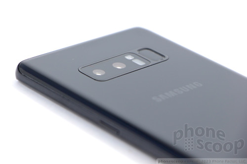
The Note8 is rated IP68 for protection against water, dust, dirt, and sand. Technically, it can sit in 1.5 meters (~5 feet) of water for up to 30 minutes without drowning. Moreover, the phone is waterproof with or without the stylus inserted, and the stylus works even when the screen is wet. I tested this, and found the Note8 survived water-based abuse just fine.
Durability is another matter. The phone may be protected by Gorilla Glass 5, but dual curved glass surfaces mean the phone is twice as likely to shatter when dropped. In fact, I dropped an S8+ earlier this year and the rear glass cracked. Not only does this look bad, it negates the water resistance. Using a case on a phone this expensive is an insurance policy you probably want to invest in.
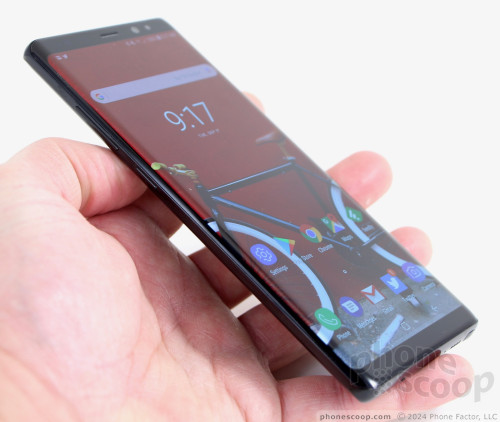
I don't like the Note8 hardware as much as I do the slightly smaller S8+, but you may feel differently. The S8+ is more usable in almost every way. That said, the Note8 is a fine, fine piece of hardware that's wholly impressive. For serious Note fans, there's no other phone to consider.
Screen
The Note8's display is visually arresting. Samsung has adopted a new aspect ratio for its flagship phones, which is an odd 18.5:9. It's nearly 2:1, but slightly taller. The screen measures 6.3 inches across the diagonal, with 2,960 by 1,440 pixels. (That's just 0.1 inches more than the S8+.) The aspect ratio makes it look tall and narrow, and it is. The Samsung-made Super AMOLED display supports mobile HDR video for incredible color range. As I said of the Note8's smaller siblings, the Infinity Display is infinitely appealing. I can't heap enough praise on it. The Note8 delivers razor-sharp text, images, and graphics; the resolution is second-to-none. The display is very bright and easy to use indoors and out. Samsung even managed to improve viewing angles and color a bit, compared to the S8 and S8+.

You can control the resolution. Samsung allows Note8 owners to choose between three resolutions: 1,480 by 720 pixels, 2,220 by 1080 pixels, and the display's full 2,960 by 1,440 pixels. Out of the box, the phone is set to the middle option, which Samsung calls Full HD+. The middle option is only slightly less amazing than the phone's full resolution. The benefit of choosing a lower resolution is better battery life. The full resolution (Quad HD+) is outstanding when it comes to virtual reality content.
The size, shape, and resolution of the Note8 also help with running two apps at the same time in split-screen mode.
You may notice that not all apps support the taller aspect ratio. You'll often see an alert at the bottom of the screen to "extend to full screen." Essentially, Samsung's software will stretch apps a bit further down the screen to cover all the pixels, while leaving its software-based controls visible at the same time. I suggest you take this path when it is presented.
Signal
I tested the Galaxy Note8 on AT&T's and T-Mobile's networks in and around New York City, as well as several German networks when roaming in Berlin. The phone delivers excellent wireless performance. The Note8 offers wide support for the major carriers' LTE bands, (though it is possible that carrier-branded models may not have all the bands enabled.) Notably, the Note8 supports T-Mobile's new Band 66 service, though not its newest Band 71 service (600 MHz).
The Note8 always remained connected to the network, whether the signal was strong or weak. The phone delivered blazing fast speeds, allowing me to upload photos and videos to Instagram no matter where I took it. Streaming music from Spotify and video from YouTube didn't present any challenges for the Note8. There were no hiccups. Facebook, Twitter, and email updates flew to/from the handset. Data never disappointed while I reviewed the phone.
The Note8 was able to connect all calls on the first dial. It maintained calls over long distances at highway speeds, and didn't drop any calls while I tested it. The cellular radio does its job well. This is what I expect from a flagship device.
Sound
The calls I made with the Note8 were above average when compared to other phones I've tested in recent months. The earpiece delivers clear, loud voices that have a pleasing tone. I didn't have any trouble hearing calls in noisy German train stations, nor in bustling airport hallways. I was impressed; you probably will be, too. People I spoke to through the phone said I sounded great.
The Note8 supports WiFi calling on both AT&T and T-Mobile. Setting this service up hardly takes more than a few seconds and delivers a small but noticeable upgrade to audio quality. If you can make calls over WiFi, you'll appreciate the improved clarity.
The speakerphone outperforms those in the S8 and S8+. During my tests I found I could keep the volume at about 60% for most spaces. You will need to turn it up in the car, but it doesn't suffer from as much distortion as Samsung's older flagships.
Ringers and alerts are loud enough to get your attention, and the vibrate function always made me take notice. I love that you can control vibration intensity and even select from a dozen or so different vibrating patterns.
I wish the phone had stereo speakers. Like the S8 and S8+, the Note8 ships with a pair of specially-tuned AKG earbuds. Believe it or not, they work pretty well. (I'm picky about audio; in-box earbuds usually disappoint.) They're nothing fancy, but the included software lets you tweak the sound enough that I would consider using the AKGs in a pinch, were my favorite Bluetooth headphones missing or uncharged.
Battery
We could talk about Samsung, the Note series, and batteries all day long. What you need to know is this: the 3,300 mAh battery in the Note8 may be smaller than the one in the S8+, but it lasts just as long (if not longer.)
Using a smartphone during a trade show (6-day work trip) is the ultimate battery test. I used the Note8 as my main device while reporting all over Berlin. The Note8 delivered the goods. After long days of incredibly intense use, the Note8 often had 50% battery life remaining well after midnight. Only once did it ever reach just 40%. I was roaming on a foreign network, using social networks, taking pictures, listening to music via Bluetooth, uploading videos, seeking directions and navigating, and much much more each day. The phone crushed it.
I will say this: I set the screen to the middle resolution (2,220 by 1080 pixels) and kept the screen on the automatic brightness setting during the majority of my review. At full resolution and set at 60% brightness, the screen took a greater toll on battery life and you might find it reaching 20% after an intense day of use. Even then, you have plenty to spare.
The Note8 includes three different power-saving modes from Samsung: off, mid, max. "Mid" reduces some behaviors and "max" really restrains the phone. Moreover, each mode can be customized to a certain degree (tweak brightness, CPU output, notifications, etc.) so you get exactly what you want/need out of them. You can also take control of individual apps to make sure they aren't draining power in the background.
The Note8 supports Quick Charge 3.0 and rapid wireless charging. When plugged into the included wired charger, I found the Note8 charged from 40% to 100% in 75 minutes. Wireless charging took only a little longer using Samsung's rapid wireless charging pad. It feels quick either way, and a short 15-minute charge pushes about 30% into the battery. It will even charge through most cases.
Bluetooth, GPS, NFC, WiFi
The Note8 includes Bluetooth 5.0. This doesn't mean a whole lot right now, but it ensures the phone will be compatible with some high-performance Bluetooth 5.0 accessories down the road. The Note8 worked with all of the Bluetooth devices I pushed at it, including phones, cameras, headsets, speakers, and PCs. The Note8's Bluetooth software made pairing with a variety of devices a simple, painless process. I didn't encounter any trouble with it. Calls sent to mono headsets sounded very good, while calls routed to my car's hands-free system were improved compared to the S8/S8+. Music pushed to a stereo speaker sounded excellent.
Of course the Note8 includes GPS and it worked perfectly with Google Maps and other apps. Maps was able to pinpoint me in several blinks of an eye, and location was as good as 10 feet. The Note8 makes for a fine navigation device via Maps, Waze, or the voice-guided app of your choice.
The Note8 ships with Samsung Pay, which is one of many apps that can take advantage of the NFC radio. NFC is also compatible with Android Pay. I mostly used the NFC radio to assist in pairing with Bluetooth accessories. To that end, it worked perfectly. Samsung Pay also works with MST (magnetic strip), which is available within the Note8 too.
Last, the Galaxy Note8 packs 802.11a/ac/b/g/n/ac dual-band WiFi. This means the Note8 is compatible with a wide range of WiFi access points for the best speeds. I had no trouble at all with the Note8's WiFi.
Software
Lock Screen
Editor's Note: Many aspects of the Note8's software are identical to those of the Galaxy S8 and S8+, so some portions of the below text have been carried over from our earlier reviews. Rest assured, we re-tested every feature and paid detailed attention to the aspects unique to the Note8.
Samsung has almost made a mess of the lock screen experience, though chiefly because there are so many ways to customize the Note8's behavior.
The Note8 offers the same Always On display from the S8/S8+. You always have a view of the clock, date, battery percentage, and notifications. The notifications can range from simple badges to the full text of incoming messages. Samsung offers plenty of ways to tweak the Always On display, and I appreciate that.
The easiest way to turn the screen on is to press the screen lock button on the right side of the phone. This brings up your wallpaper, full notifications, access to the Quick Settings menu, and lock screen shortcuts. You can also reach this screen by pushing the new “home button”. Samsung replaced the physical home button with a software key on the front. It's a little square that sits at the bottom of the display. It's always visible, part of the Always On display. A simple tap won't do it; you need to hard-press or double-press the button.
As with all Android phones, you can set a PIN, pattern, or password for security. You need to wake the phone and then swipe up on the screen to access these locking methods. The same is also true of the iris scanner and facial recognition tool. Once you've woken the display and swiped up, using the iris scanner is pretty quick. The iris scanner, in particular, can read your eyes in less than a second. However, if you're in near total darkness or out in super bright sunlight the iris scanner doesn't want to work well. It's better if you don't wear glasses at all, and even contacts can gum it up. The facial recognition tool is spotty. It was able to read my face about 70% of the time, though that's a dramatic improvement over the S8/S8+. The steps for recording your irises or face are simple enough. Each offers a rich tutorial to walk you through the process.
My opinion of these methods has not changed since I reviewed them on the S8. Using any of these five locking methods (PIN, pattern, password, iris, face) takes too much time. You have to wake the screen, swipe to reach the lock, then interact with the lock. Three steps is two too many.
Use the fingerprint reader on the back. It may be in an odd spot, but it's easy to record multiple fingerprints and, once you get used to the reader's location, it's by far the quickest and most consistently simple way to unlock the phone. Grab the Note8, touch the fingerprint reader, and the phone skips the lock screen / unlock screen entirely and goes straight to your home screen. Moreover, if you use a case you'll discover the fingerprint reader is a snap to find.
Home Screens
The home screen experience ranges from simple to saturated. Thankfully, you're in full control. The Galaxy Note8 ships with Android 7 Nougat on board and the latest build of Samsung's user interface skin that serves as your window into the Note8. It's highly configurable, and sometimes annoyingly complex. (Samsung hasn't said anything about updating the phone to Android 8 Oreo.)
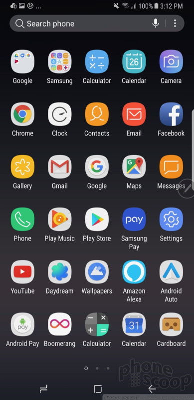
Samsung has hidden the app drawer. Instead of a dedicated apps button, you'll find if you swipe the home screen up or down the app drawer will appear. Samsung's solution is elegant in its simplicity, even if it's not intuitive at first. After a day or two, though, I found the swiping gesture to be quick and easy. You need to be nimble-fingered about it; if you press too long or too hard you might accidentally perform a different action with something on your home screen.
The app drawer is organized alphabetically by default. The entire drawer can be arranged however you wish, including folders. Samsung allows you to hide unwanted apps, but I found only a couple could be removed completely.
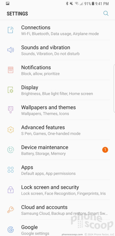
The Quick Settings panel has clean icons and blue-on-white coloring that helps you understand at a glance what's turned on. You can customize the Quick Settings panel to a small degree. The main settings screen is really nice. Like the Quick Settings panel, it uses clean colors, sharp fonts, and a bright background. It's arranged more or less how Google arranges the settings on its own phones.
Things I really like about the Samsung interface: the colors, the fonts, the icons, the symbols, the individuality.
You can spend all weekend customizing the Note8. For example, the phone offers access to Samsung's themes. Only a couple are pre-installed, but you can download more. Some themes are free, some cost a few dollars. All of them will change your entire visual experience, from the wallpapers to the icons to the fonts and colors.
Then there are the small tweaks. How many apps do you want on the home screens (4x5, 5x5, 6x5)? How big do you want the icons to be (small, medium, large)? Which font do you want? Do you want icons with or without borders? Care to re-arrange the software buttons at the bottom of the screen? You can.
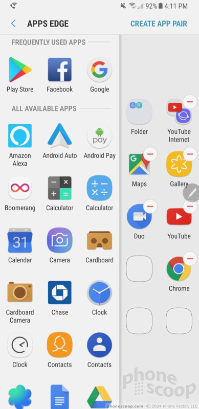
Like the early Galaxy devices with curved screens, the Note8 supports Edge-based shortcuts. Swipe the little tab open to see People Edge, Apps Edge, and others.
Here, the one new and exciting addition with the Note8 is called App Pairs, which really improves multitasking. With App Pairs, you can pair together any two apps and open them simultaneously. Let's say you want to see your calendar and contact list at the same time. Simply create an app pair and tap the icon, which will open both apps in separate multitasking windows. Samsung said this feature is available to any app that can be used in multitasking mode. My favorite was running YouTube in one window and Twitter in another. It works really well. The Note8's extra-tall screen really helps here. Samsung hinted to us that this feature might come to the S8 or S8+.
The remaining Edge Panels work as they do on older Samsung handsets. You can position the handle anywhere along either side of the Note8's screen. You can choose how large the tab is, as well as how transparent it is. The phone ships with 15 Edge panels: app shortcuts, contacts, smart select, clipboard, tasks, weather, tools, calendar, sports, CNN, and more. More are available for download. Each of these panels can be customized to suit your individual tastes. Nine Edge panels can be active at any one time. The panels work fine.
The Note8 includes Easy Mode, which gets rid of the “complicated” home screen panels and app drawer in favor of larger icons and fewer screens through which to navigate. This tool is meant for people who may be new to smartphones, or for those who have bad eyesight.
You can use a number of different hand gestures to control the phone. For example, you can capture a screenshot by swiping the edge of your hand across the display, or call the displayed contact by bringing the phone to your ear. Incoming calls can be muted by placing your palm on the screen or turning the phone over.
The Galaxy Note8 ships with the Qualcomm Snapdragon 835 with a class-leading 6 GB of RAM. This is Qualcomm's best, and it's a generational leap over earlier Snapdragon 800 series chips. The Note8 crushed everything I asked it to. Every app on the phone runs quickly and smoothly, screen transitions are fluid, and the phone practically begs for a real challenge. Even running virtual reality apps for an hour didn't seem to task the processor. The Note8 never became uncomfortably hot and does everything instantly.
S Pen Apps
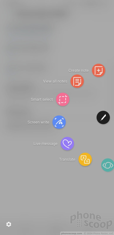
The S Pen is at the heart of the Note series. Pop the stylus out and Air Command — Samsung's semi-circular stylus interface — comes to life. Air Command supports up to eight app/action shortcuts and you can customize them. Samsung says the tip of the S Pen itself is smaller at just 0.7mm and it responds to 4,096 levels of pressure, twice that of the Note7. This means people have far more control over exactly how the S Pen writes and/or draws, particularly in the PenUp tool.
The primary new S Pen feature is called Live Message. With it, anything you write or draw is animated. The message is sent via the animated GIF format, so it should be compatible with most messaging apps, email apps, and even operating systems. You can draw on a blank canvas, on top of photos, or on top of screen shots. The recipient sees the words draw themselves magically as they watch the message. It's cool, but it doesn't always function well, because GIF can be an inefficient format. I ran into file size errors that prevented me from sending Live Messages to others. The Live Messages that did go through delighted the recipients.
Samsung improved the Screen Off Memo that debuted on last year's Note7. With Screen Off Memo, Note8 owners can write directly on the lock screen without unlocking the handset. It's simple: white text on the black background. This new version supports up to 100 pages of text. You can then pin memos on the lock screen so they are accessible at a moment's notice even when the phone itself is locked. The best use case is something like a shopping list. The list is accessible from the lock screen and you can cross items off as you navigate your local supermarket all without unlocking the screen. It works well.
The S Pen improved its ability to translate between languages. Last year, the S Pen could translate single words. Now, it can translate entire sentences and/or phrases from 30 different languages just by highlighting them with the S Pen. I tried it several times with some emails I received in Spanish, Chinese, and Korean, and it did a decent job.
The PenUp tool, which is a free-range drawing app, adds some coloring book templates so even those without artistic talent can enjoy some doodling time. The PenUp feature targets illustrators and is the most impacted by the S Pen's improved sensitivity.
The Note8 carries over Smart Select for grabbing content from web sites, and Screen Write for doodling on screenshots.
Camera
Samsung simplified its camera app and made it more fun to use. Several options open the camera, including a double-press of the screen lock button, and the lock screen shortcut. The camera jumps to life in a blink.
With the Note8's camera, swiping is everything. The main viewfinder is fairly typical: tools on the left, viewfinder in the middle, shutter buttons on the right. Swipe the viewfinder up or down to switch to the selfie camera, swipe right to open shooting modes, swipe left to open Instagram-style filters. The camera has separate picture and video buttons, which make it easy to snap photos when shooting video. The controls on the left allow you to toggle the flash and HDR to on, off, or auto.
As far as the shooting modes are concerned, the Note8 includes live focus, dual capture, auto, pro, panorama, selective focus, slow-motion, hyperlapse, food, and virtual shot. You can download more (sports, sound and shot, others) if you want. Most of these have been around for a while and function as they did on Samsung's older phones.
Live Focus is new and unique to the Note8 and relies on the dual camera configuration. It is basically bokeh on steroids. This mode uses both cameras to help create blurred background effects. What's neat is you can adjust the level of background blur both before and after you take the picture. The tool provides a live preview of the potential results as you adjust the strength of the blur effect. This mode is accessible directly from the viewfinder. It does take some practice to use, but delivers fun results. I particularly like that you can change the focal point after the fact.
Dual Capture is the other major addition to the Note8 camera app. It also puts both the rear cameras to use. The idea here is to let you take telephoto and wide-angle shots at the same time. For example, maybe you're at a concert and want to zoom in on the lead singer. The telephoto lens will allow you to do that. When you snap the shot, it will also capture an image from the wide-angle camera so you can see the entire stage in addition to the close-up of the lead singer. It's complicated, and is only available when using Live Focus mode.

Thanks to the second camera, the Note8 supports 2x optical zoom. There's a simple "X2" button in the viewfinder. Tap it to automatically jump in by a factor of two. (Which is actually simply switching between the two lenses.) You can still use the slider tool to adjust zoom, and it will stick to the main lens until it reaches 1.9x, then switch over to the telephoto lens for the rest.
The Note8 also supports a tool for capturing 2 seconds of video before a picture, and makes it easy to turn these short clips into shareable GIFs. I wish this were an easy feature to enable, but it's buried deep in the settings menu.
The “pro” mode lets you tweak most of the camera's core settings, including exposure, white balance, autofocus, color, shutter speed (up to 10 seconds), and ISO. It's a little difficult to use. Adjusting the settings requires you to slide your finger up and down the right side of the screen, which is where the control bar appears. If your finger is off just a little bit, however, you'll accidentally swipe yourself into selfie mode and lose the pro mode entirely.
The Note8 carries over the S8's masks, stickers, filters, and other extras for enhancing your pix before you share them on social media. The “masks” tool includes a decent variety and lets you adorn your face with the ears/snout of a dog, cat, bat, deer, rabbit, sheep, and other animals. Moreover, opening and closing your mouth when using a mask generally causes it to animate in some entertaining way (see embarrassing samples below). The stickers are rather simple black-and-white affairs. The phone has at least 16 different filters. These tools are available when using both the main camera and the selfie camera.
Last, the camera includes Bixby Vision. Once enabled, the Bixby Vision shooting mode turns on Bixby's artificial intelligence to help you figure out what you're looking at. Bixby Vision can read/translate text, read QR/barcodes, and help you shop with location-based suggestions. We've seen these features on phones before, so Bixby Vision isn't particularly eye opening.
One complaint: There's no true wide-angle shooting mode. I love the wide-angle camera on the LG G6 and V30. It would be a nice feature to have here.
The camera, like every other app on the phone, performs incredibly well. It's fast through and through.
Photos/Video
The Note8's camera might be what differentiates it the most from the S8+. Where the S8+ has one camera sensor, the Note8 has two. The twin 12-megapixel sensors capture full-color images. The main lens has an aperture of f/1.7 and a standard field of view, while the secondary lens has an aperture of f/2.4 and a telephoto field of view. Optical image stabilization is available to both lenses, which is particularly important with the telephoto lens.

There's no question the Note8 offers the best camera on a Samsung device. Image quality is a smidge better than what the S8 and S8+ produce, but the second lens and added features such as bokeh and dual capture give the Note8 a significant edge.
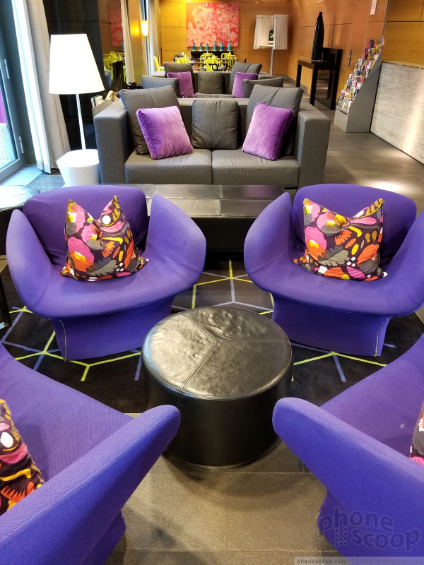
I was surprised by the ease with which the Note8 captured good photos in bright and dark environments alike. Moreover, I spent an afternoon in Berlin taking in sights like plazas, towers, train stations, churches, and memorials, and came away very pleased with the results. The Note8 performed admirably in low-light situations, and didn't destroy photos with grain. Focus was sharp, white balance was accurate, and exposure was spot-on. The Note8's camera impressed me in every way.
The Note8 has a powerful 8-megapixel user-facing camera with screen-based flash, auto-focus, and an f/1.7 aperture of its own. The selfie cam does a really, really good job. Seriously, putting auto-focus in the user-facing camera goes a long way to improving the sharpness of selfies, particularly in low light. As noted above, you can make use of the masks, stickers, and filters when using the selfie cam, as well as the “beautification” tool.

On the video front, the Note8 captures resolutions up to 4K. The best features — HDR capture, video effects, tracking autofocus — aren't available when shooting in 4K or 2K. The Note8's video camera does an excellent, excellent job. Video is sharp, rich in color, and properly exposed. My only complaint would be about the grain I saw in some low-light environments. The HDR video capture mode helps mitigate this a bit as long as you don't mind keeping it to 1080p HD.
There's no better smartphone for photography and videography on the market. This phone can easily be your everyday and dedicated shooter for vacations, important family events, and more.
Bixby
Bixby wasn't available in full when I reviewed the S8 earlier this year. Samsung has since released the feature to the S8, S8+, and includes it on the Note8 as well.

As noted earlier, the small key on the left side of the Note8 activates Bixby. Right now this is all the Bixby button can do; it cannot be customized to do anything else. I find this to be utterly infuriating. After fully testing the feature, I've decided Bixby is not for me. It's simply not as useful nor as convenient as Google Assistant. At least once a day I accidentally depress the Bixby button and launch the app even though I don't want to use it. This is a poor, poor user experience that I've come to despise.
On first launch you'll be asked some simple questions to get started. The Bixby screen includes cards that present a lot of information about you and the stuff you typically do. For example, it details the weather, your next calendar appointment, and highlights from your Twitter and Facebook feeds. This is really no different from competing services from other handset makers.
More than just launching apps, Bixby allows you to interact with apps by calling up their menus and settings so you can, ostensibly, do everything that particular app can do all through voice commands. You have to have an incredible amount of familiarity with each app and its organizational structure to fully take advantage of this. I struggled to get Bixby to really do complex tasks. At best, I could get it to do things like open the email app and create a draft email to a specific contact. Don't get me wrong, that's helpful, but it's not all that different from what Google Assistant can do.
It's best put to use with simple commands for opening and interacting with main apps like your calendar, messages, and email, and even then I find Google Assistant superior in most every way.
I really, really wish you could remap the Bixby button to open Google Assistant or the camera. Short of that, it would honestly be better if you could just deactivate it entirely.
Wrap-Up
Who is the Samsung Galaxy Note8 for? Stylus lovers and shutterbugs. If you demand the added functionality of the S Pen and hanker for one of the best-possible cameras on a mobile device, then the Note8 is the handset for you.
Samsung crafted an impressive handset in the Note8. It offers a top-notch experience thanks to the dazzling design and top-notch materials and build quality. The screen is impressive beyond words, battery life is excellent, voice and data performance are world class, and all the secondary radios perform at peak levels.
The Nougat-based user experience may be a bit over the top in terms of features, but it offers more flexibility and customization tools than most will probably ever use. It's insanely powerful, and the S Pen tools such as Screen Memo mean power users can always be productive.
The Note8's twin-camera design is a significant differentiator when compared to Samsung's other flagship offerings, though plenty of competing modes have offered dual cameras for well more than a year. Samsung's software and hardware combine to deliver an exceptional imaging device that includes a dizzying array of tools for your creative impulses.
My biggest complaint regarding the Note8 is the size. The Galaxy S8+ is more comfortable to use day in and day out, and is a fine option in its own right if you're not sold on the value of the S Pen.
Speaking of value, holy cow this phone is expensive. Most carriers are pricing the phone at a stomach-churning $930. That's a huge, huge investment for a smartphone. The S8+ is $100 cheaper, though you lose the S Pen and dual camera. If you have the cash, however, and want the best of the biggest, the Galaxy Note8 is here to conquer the competition.

Comments
Does the unlocked Note 8 support VoLTE on AT&T, T-Mobile & Verizon?
Does the unlocked Note 8 support VoLTE on the 3 real phone networks (AT&T, T-Mobile & Verizon)?
I ordered an unlocked Note 8, but may return it if there is no VoLTE support.
Thanks to all!












 Top Five Flagship Handsets of 2017
 Holiday Gift Guide 2017
 Review: Otterbox Cases for Samsung Galaxy Note8
 Review: Samsung Alcantara Case for Galaxy Note8
 Hands On with the Samsung Galaxy Note8
 Samsung Galaxy Note8


