Review: Google Pixel 2
Lock Screen
The Pixel 2's lock screen evolves a bit when compared to last year's Pixel.
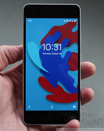
The absolute best addition is the Now Playing widget. When music is playing nearby you can elect to see the song name and artist, which shows up in small white text at the bottom of the screen. Now Playing works even when the device is offline and never sends songs or conversations to Google. It's freaking awesome. It works very quickly. According to Google, it has stored the necessary data of some 17,300 songs in a small 50 MB file to enable this tool. It's really, really handy.
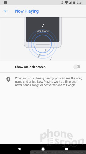
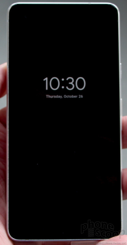
The phone carries over the Ambient Display, which keeps the clock and day/date on the screen at all times. Thanks to the OLED display, this doesn't destroy your battery life the way it would with an LCD. You can turn the Ambient Display off if you wish.
You have the typical options for managing how much information is displayed by incoming messages, which means you can block them altogether or view the full contents when they arrive. My favorite option is in between. Picking the "hide sensitive content" setting means new emails, messages, or calls simply pop up as a small icon under the clock.
The lock screen itself is typical for an Android handset. A quick double tap on the display or press of the screen lock button wakes the screen and reveals a large digital clock with detailed notifications lined up beneath it. Notifications can be dismissed one at a time or en masse. The Quick Settings shade is accessible from the lock screen, and shortcuts to voice search and the camera are near the bottom.
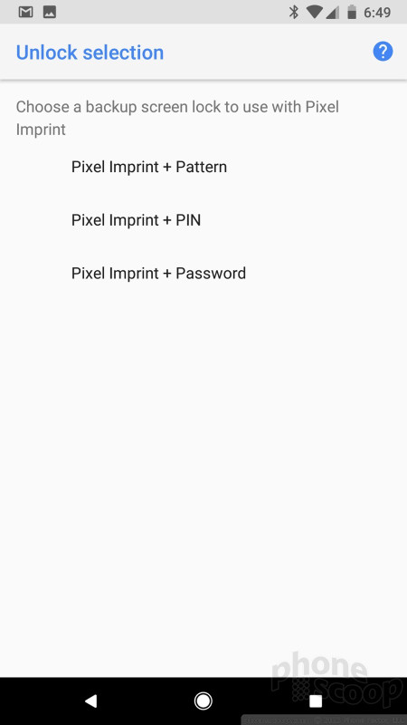
The fingerprint reader is your best bet as far as security goes. I easily set up several fingerprints and the reader is quick and accurate. It's far quicker to use the fingerprint reader than type in a PIN or password, though those options are available, too. What's more, you can secure individual apps/folders with the fingerprint sensor, allowing you to add another layer of protection to your device.
Last, you can choose to use the fingerprint reader to open the notification shade. When using the phone, swipe down on the reader to open notifications, swipe up to close the shade.
Home Screens
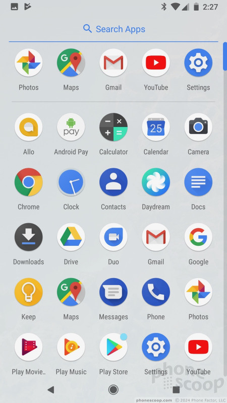
The Pixel 2 ships with Android 8 Oreo, which revises the home screen experience a bit when compared to Android 7.
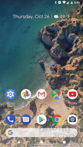
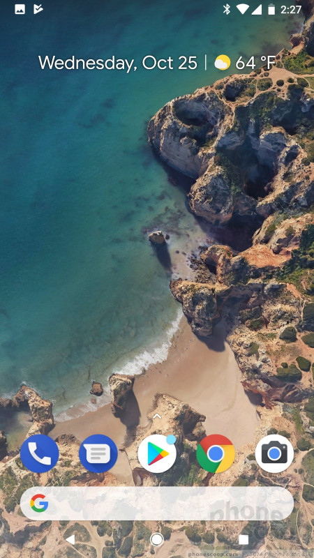
To start, the Google search bar is now at the very bottom of the screen, closest to your thumb. Five app shortcuts are situated above the search bar. Out of the box, a nice date widget crosses the top of the screen. One of the more obvious changes in Android 8 Oreo is the addition of notification dots. Apps that have notifications will display a small dot in the top right corner of the app icon. A firm press of the app icon will call up a window that lets you see the basics of those notifications, such as the most recently received email or text.
The left-most home screen is reserved for the Google Now panel, with subsequent panels laid out to the right. Google Now is different from Google Assistant. Google Now scans your calendar, email, location history and other personal data to offer suggestions about travel times, potential events, and so on. I like that it encapsulates the weather and news headlines, too. I've come to love Google Now over the last couple of years.
The settings menu of Android 8 Oreo drops colored text altogether and switches to dark gray text on a white background. Boo. (I liked the blue color of Nougat better.) I continue to appreciate that the settings menu provides more details so you can glean information (battery life, storage space) at a glance while perusing the settings screen.
The drop-down Quick Settings panel is unaltered from Nougat and is a cinch to use. The Pixel 2 includes the awesome Google Wallpaper app, which automatically rotates the home and lock screens through high-quality, themed wallpapers.
On the performance front, the Pixel 2 ships with Qualcomm's top processor, the Snapdragon 835, accompanied by a respectable 4 GB of RAM. This chip is amazing and the Pixel 2 chomps through everything without breaking into a sweat. I've never seen a phone download and install Play Store apps as swiftly as the Pixel 2. The phone is wicked fast.
Camera
You can launch the camera with a double-press of the screen lock button or via the lock screen shortcut. The camera opens lickety-split.
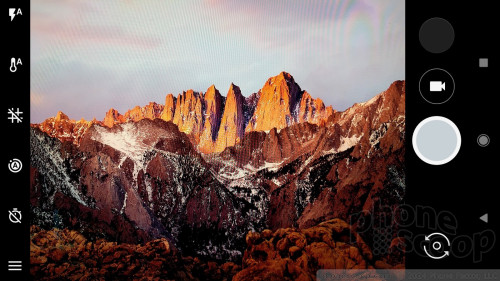
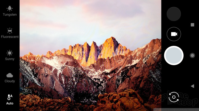
Google's camera app has a fairly basic feature set. There are just a few shooting modes: auto, slow motion, panorama, photo sphere, and the new one: portrait. I like having slow motion, but I'd also like to see timelapse or hyperlapse. The Pixel 2 does not include a manual mode, which is a pretty big omission for a flagship handset.
The portrait shooting mode is sort of an update to the old Lens Blur tool. Portrait lets you create shots where the subject is sharp, but the rest of the image is out of focus (sometimes called bokeh). With Google's old Lens Blur tool, users needed to move the camera while shooting to gather the needed perspective data to define the subject. That's all gone with portrait mode; you now just point and shoot (and hold still!)
The results are relatively good, though not always perfect. You can see in the shot of my daughters holding pumpkins how well-blurred the background is. Conversely, the shot of them standing in front of the corn stalks clearly has some background that's still in sharp focus.
It's impressive on a technical level, when you consider most other phone makers need two lenses to create the same or similar effect. This mode is easy to use and does a fine job relative to other phones offering this feature.
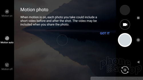
The motion photo tool is pretty much exactly like the 'Live Photos" feature seen on the iPhone and high-end Samsungs. The Pixel 2 captures two seconds of video before you press the shutter button so you get some motion in your image. You can share the really short video clip or remove the motion and keep the normal still image. The only thing I don't like about Google's version of this tool is that it zooms in quite a bit, (to ensure all the backgrounds line up,) which means you may lose the framing of your shot.
The Pixel 2 focuses and captures images in a blink. Need to shoot video? Swipe the screen and the 2 will jump to video mode. There aren't any special video modes, but you can select up to 4K resolution.
I like that you can easily switch between the selfie camera and the main camera by twisting the phone.
The camera is painless to use.
Photos
The Pixel has a 12-megapixel sensor with optical image stabilization, PDAF, and an aperture of f/1.8. Those are all good specs. The phone leans heavily on the Snapdragon 835's advanced image signal processor and its HDR+ mode to put those megapixels to more effective use than many other phones on the market. The phone also has a dedicated, custom image chip that Google plans to enable in the weeks ahead. Given how good the Pixel 2's images already are, I can't wait to see what this new chip does.
Like last year's Pixel, the Pixel 2 produces some of the best images to come from a smartphone. The basics — including focus, white balance, and exposure — are generally spot-on. The camera almost always did exactly what I wanted/expected it to do, even in challenging shots like bright sunlight or darkened performance spaces. I saw a small amount of grain in some low-light shots, but it's nothing egregious or worse than any other phone.
As noted above, the portrait shots are excellent. The live motion images are pretty good, too.
The Pixel 2's 8-megapixel user-facing camera does a very good job. The phone includes a screen-based flash that produces above-average white balance. It helps a lot.
You can shoot 4K video with the Pixel 2. I was pleased with the video I captured with the Pixel 2, and the 4K resolution looked great on my PC monitor.
Google is giving Pixel 2 owners unlimited, full-resolution storage in Google Photos for pictures and video. Shooting in 4K will eat up huge amounts of your phone's storage, but you can set Google Photos to "optimize" local storage by offloading files to Google's servers rather than keep them on the phone.
The Pixel 2 has a fine, fine camera that most people should be happy using for most occasions.
Squeezable Google Assistant
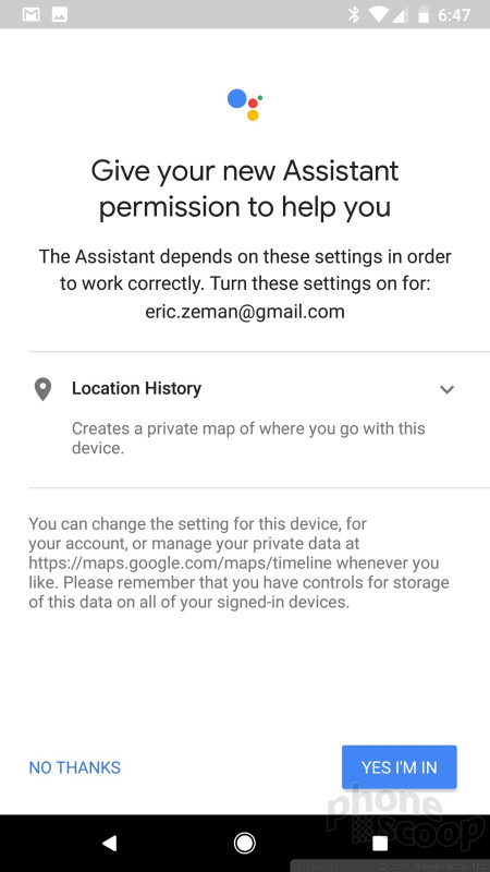
The Google Assistant gives the Pixel 2 a lot of its smarts. It ships with the phone and can be accessed by squeezing the sides of the phone. This is a feature Google borrowed from HTC, which gave a similar tool to its U11 flagship. How does it work?
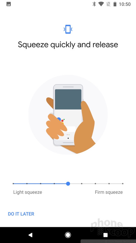
It's pretty straightforward. Sensitive pressure sensors are placed in the sides of the phone. They can detect very small amounts of pressure, even when the phone is protected in a case. A short tutorial walks you through the process of setting up the squeeze action. You can determine the strength and length of the squeeze needed to activate Google Assistant. You'll need to squeeze the phone below its waistline.
While I like the general idea, the real-world experience doesn't live up to the hype. The biggest problem is accidental activation of Google Assistant. I can't tell you how many times I pulled the phone out of my pocket and accidentally triggered the Assistant because I grabbed the phone by its side edges. Simply gripping the phone too tightly can trigger Google Assistant. Worse, the action can't be customized. On HTC's own U11, the Edge Sense tool can be adjusted to perform a number of different actions. On the Pixel 2 only one action is available upon squeezing: launch Google Assistant. Meh.
Google Assistant itself is amazing. It's come a long, long way since it launched in mid-2016. I use it all the time on my Android devices to compose text messages and emails, spin playlists, and even take selfies.



















 Google Feature Drop Brings New Smarts to Pixels
 Verizon Running Promo for Half Off Pixel 2 or Galaxy S9
 Pixel's Motion Photos Can Now Be Exported as GIFs
 February Security Patch for Pixel 2 Phones Tweaks Performance Across the Board
 Google Turning On Pixel Visual Core in All Pixel 2 Handsets
 Google Pixel 2


