Review: Apple iPhone X
Nov 9, 2017, 7:00 AM by Eric M. Zeman

Apple's iPhone X represents the company's vision of the future. If we follow Apple's gaze, we see an all-screen handset with advanced facial recognition and powerful imaging features. The iPhone X is no doubt a big step forward for Apple, but is that step in the right direction? Find out in Phone Scoop's full review.
Hardware
Is It Your Type?
The iPhone X is for Apple lovers who want something fresh to admire and show off. It's the first genuinely new smartphone design from Apple since the 2014 iPhone 6, and that makes it compelling in its own right. Toss in advanced features such as Face ID, Animoji, and the all-screen design, and you have an iPhone that finally breaks new ground. Be prepared to pay up, however, as the iPhone X is one of the costliest smartphones ever.
Body
It's often said that "change is the only constant." It seems like this is rarely said at Apple. Between 2014 and 2017, the company trotted out no less than four generations of iPhones that were nearly identical in appearance and basic functionality (iPhone 6, 6s, 7, 8). The company likes to stick with its designs for years at a time, presumably because it wants them to become iconic, which takes time. While the designs are nice, they can eventually seem stale compared to the fast-moving competition.
This is what makes the iPhone X so important: It's the first time Apple has embraced a true and significant change in its core money-maker in years. And we may be stuck with this design for a few years to come.
Apple competitors began adopting a new screen aspect ratio early this year. Devices such as the Samsung Galaxy S8 and LG G6 pioneered ~2:1 screens and they were rapidly followed by others. The taller screen shape permits an "all-screen" appearance.
One of the first pitches about the iPhone X you'll see on Apple's web site is that "it's all screen." Thank goodness, because the bezels surrounding the screens on older iPhones (and even the new iPhone 8) give them an outdated look.
Despite the new screen size/shape, the iPhone X is an Apple smartphone through and through. From a distance, it's almost indistinguishable from the smaller iPhone 8. The front glass panel of the X is curved along the edges and it tucks into the metal frame seamlessly. The same can be said of the glass that forms the rear surface. The metal frame itself is rounded gently and is comfortable against your skin. There are no sharp or pointy edges anywhere; the iPhone X is incredibly smooth all the way around.
The X comes in space gray or silver. Similar to the iPhone 8/Plus, the glass of our "space gray" iPhone X review unit definitely looks more gray than black. The "silver" version looks nearly white to my eyes, rather than a true silver.
Apple designed the iPhone X for everyone. It splits the middle when compared to the smaller iPhone 8 and larger iPhone 8 Plus, though it's a bit closer in size to the 8. For another point of comparison, it's shorter but wider than the Galaxy S8. The X is a really, really nice size (5.65 by 2.79 inches) and weight (6.14 ounces). The size and shape together make the iPhone X one of the most comfortable devices to hold and use over time. It's easy to carry about, and fits into most pockets with ease. If you love mega-screen phablets, it's possible the iPhone X may feel too small to you. To be quite honest, I wish Apple had targeted a 6-inch screen rather than 5.8.

The quality of materials and manufacturing is world-class, as expected. Apple builds some of the highest-quality hardware in the world. The glass and metal of the iPhone X are outstanding.
Like the 8 and 8 Plus, the X has an IP67 rating for protection from water and dust. You can drop the phone in 1 meter of water for up to 30 minutes and still have a working phone when you pull it out. It handles running water, sweat, and rain with no problem. You needn't worry about letting it slip into the pool, kitchen sink, or bath.
You will, however, need to worry about dropping it. Two glass panels doubles the likelihood you'll break something. Early estimates from insurers and tear-down specialists suggest replacing a cracked rear iPhone X panel may cost as much as $275. Considering the X's $999 starting price tag, I highly recommend you protect it with a case.
Every iPhone since the original has relied on a home button for interacting with the user interface. Apple dropped the home button on the iPhone X. This introduces huge adjustments to the overall experience and user interface that will take even expert iPhone users time to adjust to.
The screen stretches from bottom to top; no home button, no bezels, just the notch. To me, the notch looks hideous. Apple scooped out a huge portion of the display to fit the earpiece speaker, user-facing camera, and Face ID sensors. The result is a grotesque black interruption to the display that even my 10-year-old can't understand. The screen looks like it has horns. I don't understand why Apple couldn't have given the iPhone X a slim bezel above the screen, like the S8 or V30, with no notch. I'm beginning to think Apple's design guru, Jony Ive, has lost his freaking mind.
Notch
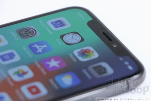
Nothing else adorns the front of the iPhone X, and that's a positive. Many of today's top Android handsets have already done away with physical buttons on the front. Given the power of software, there's no longer a need for them and that leaves the iPhone X with a clean face that's all glass (if not necessarily all screen).
The ringer switch is right where you expect it to be on the left side. The switch is easy to find and use by feel, and the action is excellent. The separated volume buttons below the ringer switch have good profiles, but travel and feedback is minimal. They double as shutter buttons when using the camera. The screen lock button and SIM card tray are positioned on the right edge of the phone. The screen lock button is much longer than those of older iPhones. Action on the button is pretty good, but I wish it were better.
The iPhone X skips the headset jack. The included wired earbuds plug into the Lightning port. Like the iPhone 7, 7 Plus, 8, and 8 Plus, the iPhone X can't charge and play music via the Lightning port at the same time, unless you spend extra money on an unwieldy dongle. Apple was one of the first to drop the headphone jack, and a few others have since followed. But at least the competition uses the industry-standard — and just as capable — USB-C connector. Lightning is an Apple proprietary connector.
The iPhone X's rear panel is perfectly flat, save for the camera module. The module protrudes significantly. On the iPhone X, the camera module runs vertically (one lens on top of the other), while on the iPhone 8 Plus the camera module runs horizontally (one lens next to the other). Apple offered no explanation for this difference. I wish the module weren't so large, as it makes the phone wobbly when placed on a hard surface. Using a case mitigates this issue.
Camera Module
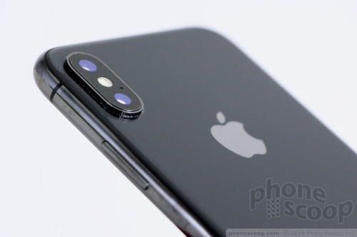
You've never been able to access the battery on an iPhone and that's certainly one thing Apple did not change with the iPhone X. The phone's rear panel is made of glass in order to facilitate wireless charging.
The iPhone X is a well-made phone that brings Apple into line with its direct competitors. I really wish the notch were not a thing, but nearly everything else about the iPhone X body is designed and executed well. It's a highly usable, high-quality smartphone.
Screen
It's one thing for Apple to change the shape and resolution of the iPhone's display, but it's quite another for Apple to also switch from LCD to OLED. iPhones have used LCD panels since 2007. This is a monumental change for the iPhone maker.
The screen runs 5.8 inches across the diagonal. That's from curved corner to curved corner, including the horns. Apple didn't go with an industry-standard resolution like Quad-HD; instead, the iPhone X packs an odd 2,436 by 1,125 pixels. The aspect ratio is even odder at 16.2:7.6. That's not 2:1, nor it is any aspect ratio any other panel maker has ever yielded. (If you delete the 186-pixel height of the horns, you get a 2,250 by 1,125 area, which is 2:1.) The pixel density is great at 458ppi. The display is incredibly sharp. Individual pixels are completely invisible even when you hold the phone close to your eyes. Text, graphics, and apps are perfectly smooth along the edges.
Why would Apple switch from LCD to OLED? Reasons might include contrast and efficiency. This HDR OLED panel (made by Samsung) has a 1,000,000:1 contrast ratio and wide color gamut. It is very, very rich. The blacks are among the deepest I've seen. Contrast and color saturation are far beyond what you'll see on previous iPhones.
The screen also adopts Apple's True Tone technology, which is available in the iPhone 8/Plus. True Tone automatically adjusts the white balance to match the ambient lighting. This means the screen's color will skew slightly blue or yellow so it is easier to read/see based on the surrounding light. To my eyes, the screen's tones most often looked warm (yellow-ish). You can turn True Tone off if you wish.
The screen's brightness is very good. I was able to use it indoors and out with no trouble.
Viewing angles are decent. There's no brightness drop when tilting the phone around, but you will see a slight blue shift. Apple has warned that this OLED panel may be subject to burn-in over time, something we discovered all too quickly on the Pixel 2 XL's OLED panel. We haven't seen any evidence of burn-in yet, however, and can't say whether or not it will be worth worrying about.
Bottom line: the screen is good, just as good as the screens Samsung puts on its own phones.
Signal
Just like the iPhone 8/Plus, the iPhone X is widely compatible with U.S. LTE 4G networks. There are two significant versions: the A1865 (with a Qualcomm modem) and the A1901 (Intel modem). The Qualcomm variant is for Verizon/Sprint, while the Intel variant is for AT&T/T-Mobile. The AT&T/T-Mobile version supports Band 66 for T-Mobile, but not the new band 71 (600 MHz). If possible, we recommend you buy the Verizon model, as it is compatible with all U.S. networks and provides the most flexibility to end users. (Apple is not selling an unlocked variant of the iPhone X right away.)
We tested the AT&T model with the Intel modem. The phone supports Cat 9 LTE and ran very well on AT&T's network. I didn't experience any trouble connecting to 4G and saw strong LTE performance at all times. Data speeds were excellent. You shouldn't have any trouble streaming media, such as music or video, over 4G. Voice calls connected on the first dial and the phone didn't drop any calls when moving at highway speeds. You can't ask for much more than that.
Sound
On the iPhone X, calls are about average for an AT&T device. Voices are clean and free of distortion through the earpiece, and sound a bit warmer than those I experienced with the 8 Plus. The earpiece generates enough volume to hear calls in most places. I was able to maintain conversations on city streets, in coffee shops, and in moving cars. People I spoke to through the iPhone X said I sounded excellent.
The iPhone X supports HD Voice via WiFi or VoLTE on AT&T's network. I noticed a dramatic improvement to voice clarity when connecting with other AT&T phones this way. If clarity is important to you, be sure to enable this feature, as the sound is incredible.
The speakerphone does a fine job. It introduces a small amount of distortion when pushed all the way, but not an egregious amount. The iPhone X is a fine instrument for speakerphone calls at home, the office, or in the car.
Ringers and alarms are surprisingly loud, and the vibrate alert is the best ever for an iPhone.
The iPhone X has decent stereo speakers. As it does on the iPhone 8/Plus, the earpiece leans toward trebly tones when listening to music, while the bottom-mounted speaker leans toward bass-y tones. Moreover, the earpiece can't deliver quite the sonic punch of the bottom-mounted speaker. That means sound is a little unbalanced when you hold the phone sideways. Even so, music and video sound good no matter how you're holding the phone, and the iPhone X produces enough volume to fill a small room with sound.
Battery
The iPhone X packs a 2,716 mAh battery, which is significantly larger than that of the iPhone 8, and even a bit larger than that of the iPhone 8 Plus. That spec, paired with the more-efficient OLED display, should mean superior battery life. Surprisingly, it does not.
Over several days' worth of testing, I found the iPhone X pushed through a full day, though just barely. The phone was often reaching the red zone about the time I went to bed. It lasted a good 15 hours on a single charge with plenty of time spent using the camera, surfing social media, browsing the web, and other activities that kept the screen on. My guess is most people will be satisfied, but power users may find it comes up a bit short.
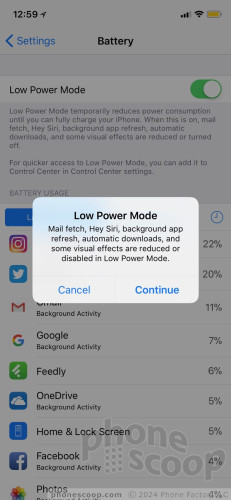
There are a few things to help mitigate this. First, you should take the time to dial in the right mix for notifications so the screen isn't turning on all the time. One of the (more maddening) default iOS behaviors is to allow most apps to wake the lock screen to display notifications. Every time the screen comes on the battery drains just a bit more. Tweak your apps so only the most important ones wake the screen. This alone helped my device get an extra hour of life per day. Second, you can take advantage of the battery saver tool. You can put the phone in low-power mode manually, and this dims the screen, reduces notifications, and so on.
The iPhone X includes wireless charging thanks to the glass rear panel. The iPhone X relies on Qi, one of two competing (and incompatible) wireless charging standards. Qi is popular, and will likely become the dominant standard now that Apple is behind it.
I used the X with a Qi wireless charger and it certainly worked, though it was slower than charging via cable.
The iPhone X supports faster charging than older iPhones, but you have to spend extra money to take advantage. For example, the included charger won't charge the phone quickly at all. You're better off using an iPad charger, which will deliver a quicker charge thanks to the higher wattage. Even then, the iPhone X still won't charge as rapidly as competing Android handsets. The best solution is to buy a specific Apple charger with USB-C, as this charges the quickest.
Low-Power Mode
Bluetooth, GPS, NFC, WiFi
The iPhone X has all the same radios inside as the iPhone 8 and 8 Plus, and each performed just as well.
It includes Bluetooth 5.0, which ensures the iPhone X will be compatible with high-end Bluetooth 5.0 accessories. The X worked with all the Bluetooth devices I tested. Apple's Bluetooth software made pairing with a variety of devices a simple, painless process. Calls sent to mono headsets sounded good, while calls routed to my car's hands-free system were excellent.
I tested the iPhone X with Apple's own AirPods and the pairing process was instantaneous thanks to Apple's proprietary W1 chip. Music streamed perfectly via the Bluetooth connection, even if Apple's headphones are far, far from audiophile quality. I was happy with the quality of music I streamed to a Bluetooth speaker.
GPS worked fine with Apple Maps. The iPhone X was able to find me quickly, and location was as good as 20 feet. Real-time navigation worked perfectly.
Maps

NFC is on board and powers Apple Pay. On the iPhone X, users need to press the screen lock / power button twice to activate Apple Pay, authenticate the purchase using Face ID, then tap their phone to the supporting retail terminal. It works, but the extra steps means it isn't as seamless as the old Touch ID method.
iOS 11 made the NFC radio available to third-party app developers, though we have yet to see good examples of apps using this.
The X packs dual-band WiFi with MIMO. This means the X is compatible with the fastest WiFi networks. I had no trouble at all with the X's WiFi.
Software
Lock Screen
The iPhone X does little to improve the mess Apple made of notifications in iOS 11, but there is a silver lining.
Lock Screen

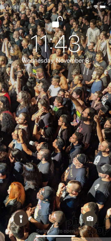
A new addition: Double tap the display to turn on the lock screen. The double tap is perfect for when your iPhone is on a table or desk and you don't want to pick it up or press the side buttons. The iPhone X also supports raise-to-wake. These actions wake the display and show the clock with your notifications underneath. The screen will stay lit for about 5 seconds. There's no real "ambient display" as on some Android phones, but this is at least something.
How you've decided to treat individual notifications plays a big role in what you see when you wake the display. With iOS, you can tune each app to wake the lock screen or leave the lock screen completely free of notifications. It takes a lot more work than it should, but it is possible to find a happy balance.
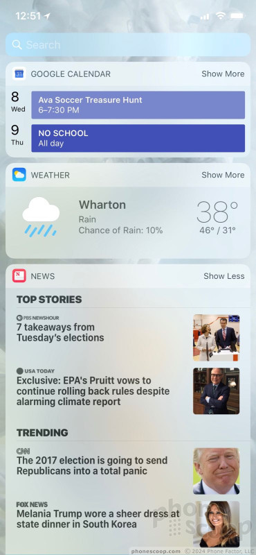
With the lock screen showing, you can swipe to the left to see the widgets screen. The iOS 11 widget screen lets you customize dynamic content, such as your calendar, travel times, music, news headlines, and so on. You still have to unlock the phone to access the apps behind these widgets.
From the lock screen, you can also swipe right to access the camera.
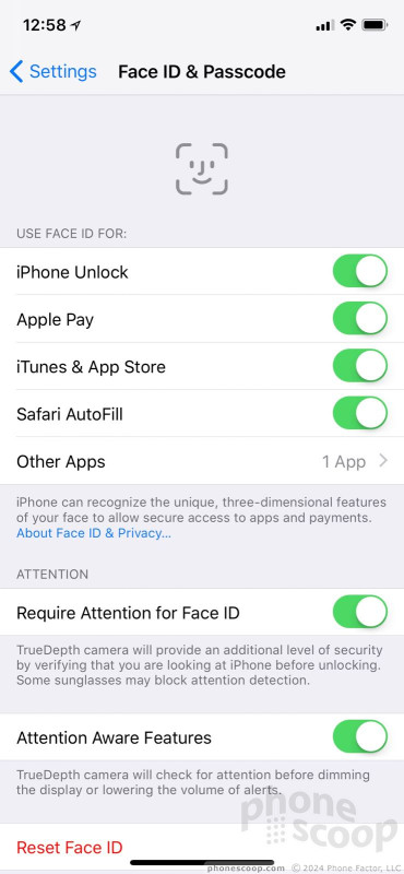
Then there's Face ID. Much ink has been spilled on all aspects of this. What matters to me is how it will change the way you interact with your phone. It will change it a lot.
Remember, the iPhone X has killed off the home button and the fingerprint-reading Touch ID with it. The iPhone X has what Apple calls a TrueDepth camera in the notch. It maps your face in 3D, using thousands of invisible laser beams. Your face then becomes your security key to unlock the device. The software to record your face and set up Face ID is a breeze to use. It takes about a minute. You'll have to scan your face twice and set a passcode as backup (4-digit PIN, a 6-digit PIN, or an alphanumeric password.)
The first generation of the old Touch ID was so-so, but it improved with each generation and is now one of the best fingerprint readers available on modern smartphones. Face ID feels like a first-gen technology to me. You have to hold the phone square in front of you and look directly at it. I tried to unlock the phone at an angle and it just doesn't work. You have to look at it pretty much head-on. It takes a second or so. You could unlock older iPhones in your pocket if you wanted to, or while glancing down at it on your desk, or held at chest level. There's no doing that with the iPhone X, and this comes at the expense of time.
Face ID worked most of the time for me, though I definitely encountered a few hangups. I recorded my face while wearing my contact lenses. Face ID had no trouble identifying me when I used it with my glasses on. But sunglasses — at least the reflective ones I wear — foiled Face ID for sure. So did darkness, on several occasions, which Apple says isn't supposed to happen. Most of the rest of the time it worked swiftly. If Face ID fails, the iPhone X jumps to the passcode screen, as it did when Touch ID failed.
Face ID is just barely fast enough. If it were the slightest bit slower, I'd find it frustrating. There is a bit of a learning curve that takes time to adjust to. In fact, I feel I still haven't hit my stride yet after using the phone for a few days. I imagine I'll be more efficient at the waking and unlocking gestures over time. For now, I have yet to figure out the right dance to get Face ID to work quickly and consistently.
Home Screens
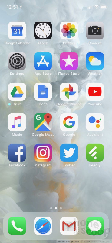
So much is different, and yet so much is still the same. You're going to have to get used to a whole new range of gestures to control the home screen. But once you do, you'll feel right at home.
Home Screen
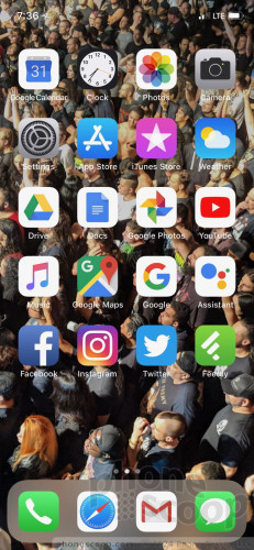
With no home button to take you home, get ready for some swiping. At any time, swipe up from the bottom edge to go straight to the home screen. A thin bar appears at the bottom of the screen to give you a visual hint.
That's simple enough, but that's where the simplicity ends.
If you swipe up and jog your thumb left or right, you'll see the app-switcher screen appear with app cards floating in a deck. It takes practice; too often, I accidentally returned to the home screen. It's not an intuitive gesture by any stretch. (Then again, Apple has always considered the app switcher something of a power-user feature.)
A whole new series of patterns is required with the hardware buttons. Double-press the lock button to activate Apple Pay. Long-press the lock button to open Siri (you can still set the iPhone X to respond to the "Hey Siri" voice command). Press the lock and up-volume buttons simultaneously to take a screenshot. Press the lock button quickly five times to deactivate Face ID. Press the lock button and up volume key quickly three times to enter SOS mode and dial emergency services (even if the phone is locked.)
Got all that?
Most of the home screen experience is just like every other iPhone. As always, apps placed on home screen panels still snap up and to the left into a self-forming grid. Four apps of your choice are always accessible from the dock at the bottom of the screen. Folders can contain dozens of apps, and you can populate nearly unlimited home screens with apps and folders.
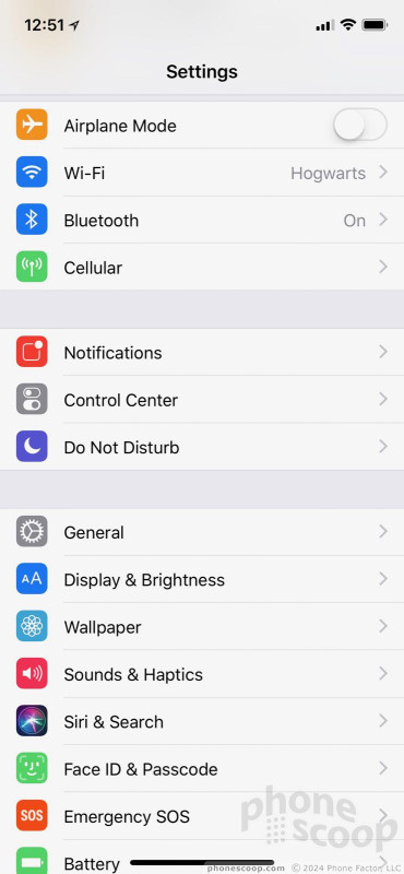
The overall organization and usability of the settings menu is about the same as always. The built-in search tool helps. It's a cinch to adjust wallpapers, ringtones, alerts, and other custom behaviors. iOS allows you to tweak font and icon sizes, too. The accessibility options are plentiful.
It's a shame that Apple hasn't brought split-screen multitasking to the iPhone yet. The extra-long display of the iPhone X is begging for split-screen multitasking. What's more, the X loses the helpful dual-column behaviors of certain apps (iMessage, email) that are available in landscape orientation to the iPhone 8 Plus. The screen is roughly the same size, so that's puzzling. Samsung and LG have Apple beat with their multitasking powers.
The iPhone X offers 3D Touch, which means the screen recognizes light touches as distinct from more firm presses. Firm presses made on the home screen apps call up an action menu of potential secondary options. In general, these action menus let you skip a few steps. To be honest, I (still) forget 3D Touch is even a thing on the iPhone.
The iPhone X makes Control Center much harder to access. On previous iPhones, Control Center is easily opened by swiping up from the bottom of the screen. That gesture, however, is now reserved for returning to the iPhone X's home screen.
Control Center
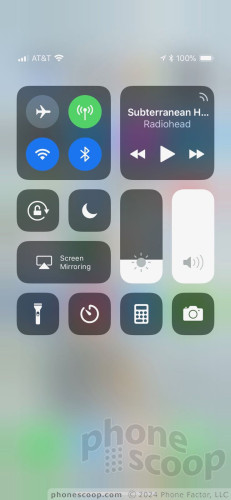
Inexplicably, Apple made Control Center accessible only by swiping down from the top-right corner of the screen. It's really awkward to stretch your hand up there, and is nigh unreachable for people who use the iPhone X left-handed. This is ridiculous. The change in behavior is jarring, as it is no longer possible to quickly and easily adjust screen brightness, or radios, or volume from the bottom of the screen. It now requires a significant change in behavior, one that conflicts directly with the experience on this year's iPhone 8. Apple needs to do something about this, particularly for lefties.
The battery indicator in the right horn cannot display the remaining battery percentage. It offers only a simple visual meter. I'm far more interested in seeing the actual percentage rather than some relatively vague graphic. You can only see the battery percentage by, you guessed it, pulling down the Control Center. This is annoying to the Xth degree.
The iPhone X has Apple's new A11 "bionic" processor with M11 motion co-processor and 3 GB of RAM. This is the same combo in the larger iPhone 8 Plus (the smaller iPhone 8 has 2 GB of RAM.) The processor chews through compute-heavy apps, such as augmented reality, without breaking a sweat. In terms of real-world performance, that means apps open quickly, apps download from the App Store rapidly, and so on.
That doesn't mean performance was awesome across the board. Even though we're already up to iOS 11.1 (the first major bug-fixing release of iOS 11), I did see some odd stutters and animation goofs on the X. Moreover, I experienced a few hanging apps and screen freezes. These software issues may be fixed eventually, but it's worrying that they weren't fixed after all of the public betas Apple made available of both iOS 11.0 and 11.1.
App Sizes
One noteworthy aspect of the new screen size/ratio is that developers need to adjust their apps to fill the extra vertical space. Apple has done a fine job adjusting its own apps, but most third-party developers have not yet.
For example, Google Search stretches from top to bottom on the iPhone X, but Gmail has ugly, letterboxed black bars above and below the app. Your experience will vary depending on how diligent developers are. A number of core social network apps (Instagram, Facebook, Snapchat, and Twitter) have all adjusted properly, but a good number of Google apps (Docs, Drive) have not. Encountering non-optimized apps really detracts from the experience of the all-screen design.
Google designed Android to handle different screen shapes a bit better, and Samsung and LG provided additional tools to make sure older apps worked as well as possible on their taller screens. The result was a more seamless app experience on phones like the S8 and G6, which avoid significant black bars above and below most apps.
This situation should improve on the iPhone X over time, as developers update their apps.
One thing I'm not sure developers can improve is how apps react to the notch. The notch is not too awful when you're holding the phone vertically and the horns to either side of the notch show the time, signal, and battery indicators. It's an entirely different experience when you rotate the phone sideways and video content falls behind the notch. This doesn't impact 16:9 video, which is letterboxed by black bars on either side, but it does impact full-screen movies from iTunes that have, for example, a 2.35:1 aspect ratio. How individual apps interact with the notch in landscape orientation varies widely.
Again, the notch is an ugly and infuriating design decision. You can't escape its impact on how apps appear on the iPhone X.
Camera
The iPhone X does not include any nifty shortcuts for opening the camera, and, dammit, it should. The fastest way to get the the camera is to tap the screen and swipe left. I'd much prefer a hardware shortcut, such as a double-press of the volume keys or something. The camera app does open in an instant and the experience mirrors that of the iPhone 8 Plus more or less exactly.
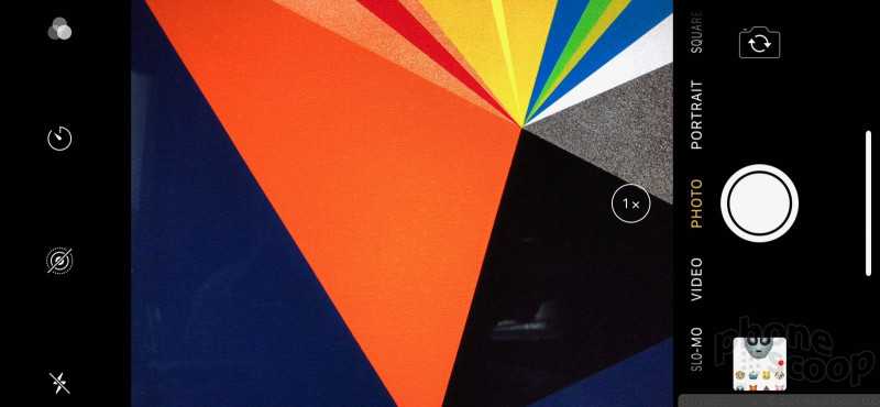
The iPhone camera offers a handful of basic shooting modes: normal, panorama, portrait, and square for pictures, plus normal, slo-mo, and timelapse for video. All seven of these are accessed by swiping the viewfinder sideways from one mode to the next. It can be bothersome to swipe your way through all the modes from one end of the chain to the other, but at least the iPhone X is really fast.
Several small controls are always visible. They let you select from nine filters, set the timer, turn Live Photos on/off, or toggle the flash through on/off/auto. The controls for HDR, which used to appear here, have been moved to the settings. HDR is on by default.
The X includes two cameras. The main camera features a 28mm lens at f/1.8 and the secondary camera features a 56mm lens at f/2.8. A little "1x" button appears in the viewfinder. Tap the "1x" button to instantly zoom in to 2x magnification, with full resolution and sharpness. Technically, the button causes the camera to switch from from the wide-angle lens to the telephoto lens. Apple's software seamlessly switches the camera from one to the other to provide a great zooming experience. You can also use an on-screen dial to adjust digital zoom up to 10x.
The most significant feature available to the iPhone X (as well as the iPhone 8 Plus) is the new advanced lighting tools when shooting in Portrait mode. Portrait mode makes use of both cameras to enhance pictures of people by blurring the background so the subject stands out. This basic effect is often referred to as “bokeh” and it has been around for years now.
The new lighting effects allow you to easily switch between five different scenes, including natural, contour, studio, stage, and stage mono. Each produces slightly different results. For example, "natural" gives you a soft look with warm skin tones, while the stage and stage mono options highlight just the subject's face and do away with the background almost entirely. These are some fancy-pants, artistic modes to help you pretend you're a studio photographer. I found them fun to experiment with and I enjoyed the results. If you find yourself taking pix of people more than anything else, you really need to check these modes out.
Portrait Mode

The iPhone X also shoots Live Photos. Live Photos capture a short video clip along with each still picture. When Live Photos is turned on, the iPhone automatically captures 1.5 seconds of video before and after you actually press the shutter button. The result is a combined still image / video clip that includes motion and sound. Apple's Live Photos are *still* too difficult to share to platforms outside of Apple and Facebook.
The iPhone's camera is slowly becoming more complicated to use. The original iPhone was praised for its simple, effective camera interface. Those days are long gone.
The camera on the iPhone X is the most advanced Apple has ever offered. The good news here is that, thanks to the A11 bionic processor, the camera is faster than ever.
Photos/Video
Both the 12-megapixel wide-angle lens and 12-megapixel telephoto lens enjoy optical image stabilization. Adding OIS to the telephoto lens is a bonus, something the 8 Plus doe not have. The new sensors with OIS work together with a new image signal processor.
The iPhone X takes some of the best photos you'll find on a mobile phone. Daytime shots look great. You'll see sharp focus, excellent exposure, and rich colors. I was very pleased with the way the X performed. It produces photos that are pretty much identical in quality to the iPhone 8 Plus.
I did notice a small quality difference when switching to the telephoto lens, particularly in low light situations, as its slower f/2.8 aperture isn't as on the same level as the main lens. Low-light shots have very little grain, however, which I appreciate.
The 7-megapixel selfie camera, which has a screen-based flash, also does an excellent job. Snapchat and Instagram lovers will be very happy with the selfies produced by the X. Most shots were well-exposed, sharp, and free of grain and other noise. You can use the Portrait mode with the selfie camera for those really important vanity shots.
The iPhone X can shoot video at a variety of resolutions and speeds. The big additions this year are support for 4K at 60fps for smoother ultra high-def, and 1080p at 240fps for even slower, sharper slow-motion. The results are stunning. I like that you can snap 8-megapixel still images while recording 4K video.
The iPhone X can and will probably replace your entire photo/video rig; it can handle tons of scenarios and is good enough for your most demanding events.
The camera goes nose-to-nose with those on the Note8 and Pixel 2 XL.
Animoji
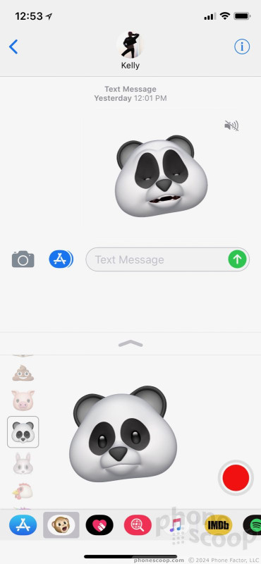
One of the other nifty features introduced by the iPhone X's TrueDepth camera is called Animoji. Essentially, Apple is using the TrueDepth camera to map your face and pair your movements with an emoji. The resulting animated emoji are called Animoji.
Animoji
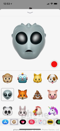
Animojis can only be created within the Apple messaging application, which is a really odd and annoying limitation. The software to record an Animoji is dead simple to use. Pick a character, hit the record button, and do your thing. Apple says the TrueDepth camera is able to capture 50 different muscle movements. Each animation can last up to 10 seconds. You can then share them via Messages or save them as videos/GIFs for pushing to social networks.
I like the basic idea, but dislike the limitations. Right now there are only a dozen or so Animoji options, including cutesy G-rated stuff like dogs, chickens, pigs, and cats, along with some less annoying options like a robot and alien head. We seriously need some less cartoonish, less childish options here. There's far more potential than these initial Animoji offer. I hope Apple updates this feature swiftly and consistently.
Wrap-Up
The iPhone X is the most interesting iPhone to arrive in years. It gets rid of the ugly bezels and moves to a (mostly) all-screen design that's devoid of buttons. Apple designed a high-quality, compact, and usable piece of hardware that should appeal to almost everyone.
In the plus column you can check off great build quality, pretty display, fine wireless performance, good sound quality, wireless charging, and one of the best cameras available on a smartphone. In the minus column you can count the ugly notch, just average battery life, uneven third-party app experience, slow wired charging with the included charger, and limiting factors like the proprietary Lightning port and no headphone jack.
The loss of the home button and Touch ID means all iPhone X users will need to adjust to the new software-based UI paradigm. Many of Apple's decisions make sense, though some still left me reeling. The new button combinations are more awkward than ever, and the Control Center's new home is seriously befuddling.
Unique features, such as Face ID and Animoji, deliver the smile-inducing delight that smartphone owners are seeking to rekindle, but are clearly in their early days. I expect they'll improve over time, though for now they feel a bit underdeveloped.
The iPhone X costs a whopping $999 for the 64 GB model and a wallet-crushing $1,149 for the 256 GB version. Is it worth that much? That depends on what you want from your mobile phone. If you're looking for an all-screen iPhone, the X is your only choice. If battery life matters more to you, or you're addicted to Touch ID, perhaps consider the $800 8 Plus, which lasts significantly longer per charge, is a better option.

Apple is clearly looking ahead, and the iPhone X represents its vision for the future of mobile computing. It's a pricey vision, but a mostly pleasing one all the same.
Comments
This can not stand....
iPhone X takes us to the next level of smartphone, while Eric is stuck in the android trap!
I am a professional photographer and Eric pointed out some of how terrific the camera of the Apple iPhone X is! But in nearly "every" catagory there was mocking and complaints with few compliments for a job well done.
The iPhone X is the fastest, best looking, best built smartphone ever created and I heard none of that here. The final scores were damn good but ran in confli...
(continues)
Nice, Pro Android, review...
Let’s look at it this way. Android phones (many models available) very nice phones. But the same OS is used on different manufacturers devices. iOS is on Apple, period. That lends itself to better hardware to software interplay. Perfect? No. Nor are the competitors.
But I find it tiring when slamming a platform is considered a review. For example, “The Notch”. Who cares? It’s not really that huge an issue, functionally does nothing to the iPhone, and (for me), it gives me an idea where the speaker and front camera are.
...
(continues)
Beware the glass back
"My car fender will be smashed from someone hitting me at 2 mph. This would be a design flaw"
Oh, that notch
The main reason Apple made that notch is for branding identity. It makes a statement even from across the room. There's no mistaking if somebody is using Apple's latest flagship phone in a sea of phones because that notch is unmistakable. Simple as that.
It's a rather brilliant bit of marketing and I expect many copy cats from the competition next year (save for Essential of course).
























 Iconcase Adds Notification Lights to Your iPhone
 Smartphone Camera Shoot-Out: iPhone X, Pixel 2 XL, Galaxy S9+
 Review: Speck Presidio Ultra Case for iPhone X
 Review: IK Multimedia iRig Pro I/O for iPhone
 Review: Kingston DataTraveler Duo Bolt for iPhone
 Apple iPhone X


