Review: Motorola ROKR E8
Jun 26, 2008, 3:03 PM by Stewart Wolpin
Motorola's latest ROKR phone faces the music in Phone Scoop's review. It may have great haptics, but does it have what it takes to impress audiophiles in the crowd?
Body
Is It Your Type?
A year ago, we would have praised the Motorola E8 ROKR as a fine update of its previous ROKRs. Alas, it is not 2007, but 2008 and we're deep into the music phone era, with iPhones, Instincts, Chocolates and others vying or your musical ear. As a result, our expectations for performance and functionality for a music-oriented cellphone have been raised considerably. The E8 has some fascinating technology and it is arguably the best music phone available except for you-know-what. But given the current music cellphone environment, a great deal will depend on the price T-Mobile sets for it.
Body
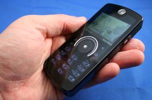
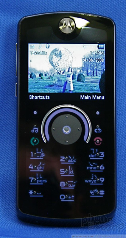
The E8's most significant advancement is its compromise between a touch screen interface and a traditional D-pad. In sleep mode, the thin glass-covered candybar E8 is a near-seamless glossy black blank except for its silver 270-degree navigation arc. There are no visible keys. Only three vertical columns of pin point-like bumps on the lower half of the E8's glass surface indicate where the number and function keys will light up.
Wake the phone up, and a bright backlit touch-sensitive D-pad appears, easily readable even in direct sunlight. Push the dedicated music application musical note icon above the green "call" button and the D-pad disappears, replaced by music control keys. Put the phone into camera mode and camera-specific icons appear, including + and – zoom, play/review and a video icon to switch the phone into video mode.
In the middle of E8's face is its 270 degree FastScroll touch-sensitive arc, designed to operate like iPod's nav wheel. Nestled inside this silver arc is a more pedestrian up/down/left/right push circular navigation toggle.
Physically, the E8, with its wedged top and bottom is about a third wider, taller and thicker than the Nokia 5310 XpressMusic, another contender for best cell/music player, and occupies the same area as its slightly thicker cousin, the Motorola Z9.
On the right spine is a micro USB power charge jack covered for some reason with a tough-to-remove flap, and a rice-sized, three-position silver slide that is hard to operate without a finger nail. Slide the slide down to power up or power down the phone; pressing the red "end" icon, the usual power on/off control on other phones, does nothing except end an operation. Slide the slide up locks the phone's controls.
On the left spine is the slightly convex volume up/down toggle and the ModeShift action key which supposedly toggles through the phone, music and camera apps, but really just activates the camera. Centered on the top is another questionable flap-cover for the 3.5mm stereo headphone jack. On the rear is the 2 MP camera lens. There is no self-portrait mirror or flash.
As with many slim phones, you have to remove the rubberized back cover to insert a microSD card. Two problems: one, you also have to remove the battery (a problem in and of itself – we had to use a butter knife to pry it out), and, two, the back cover can be a bear to get back on correctly. Fortunately, if all goes well you'll only have to worry about this once.
That aforementioned rubberized back cover combined with the E8's slim profile makes the phone easy to grip and easy to operate with one hand and an extended thumb.
The Three S's
Screen
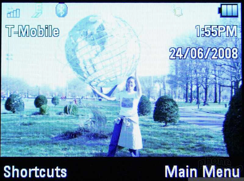
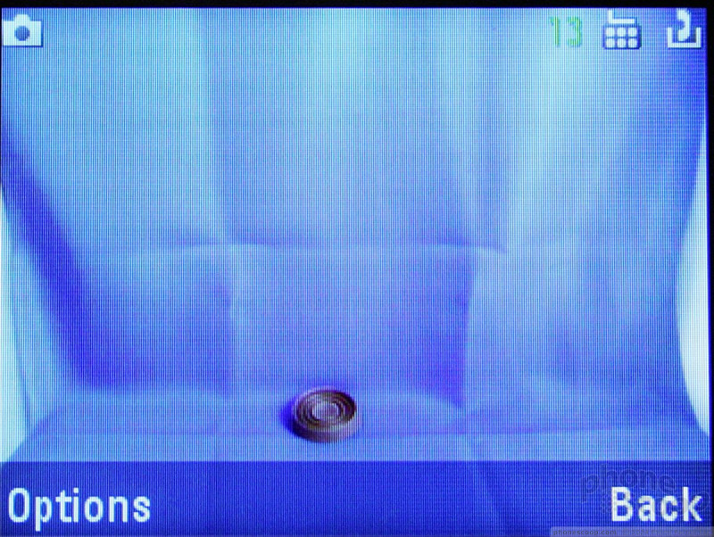
Above the FastScroll arc is a 2-inch 4:3 aspect ratio screen, unusual for a phone; most have elongated portrait LCDs. This squarer shape makes an excellent video and camera viewfinder since the aspect ratio more closely matches the shape of the resulting images. However, the screen's too squat for most menus. There's room for no more than five menu items at most, requiring additional scroll downs to get to additional menu choices than you'd get on phones with a longer portrait-oriented screen. The E8's glass top must have an anti-reflective coating because the screen is almost as bright in direct sunlight as it is in room light.
Signal
We tested the E8 on New York City's T-Mobile network. It retained its signal longer and regained signal faster after going into and emerging from a tunnel than the Nokia 5310, but lagged behind in both categories when compared to an inexpensive Nokia 3555. We lost signal on the E8 while in a residential apartment building elevator where other phones barely blinked. We also experienced some blank spaces in mid-conversation, but I didn't experience any dropped calls.
Sound
With Motorola's Crystal Talk technology, conversations were, well, consistently crystal clear with plenty of volume; only the usual network warbles marred the near-landline conversation quality. The E8's speakerphone also provided plenty of clean volume. Our only complaint is the E8 was not always tolerant of cross talk, resulting in an occasional "whaddya say?" when both conversationalists speak simultaneously.
Ringtone volume and vibrate buzz were not as loud or as violent as some phones. Given how loud the speaker delivers voice and music, we were surprised that the ringtones didn't blare like a megaphone. And there's no menu choice for "vibrate/ring" which would do both simultaneously. Instead, you get "vibrate then ring," which produces a slight delay between feel and sound. If the phone's in a bag, it'll vibrate once or twice before I even have a chance to hear it ring, increasing the odds of missing the call. I understand the quiet-then-noisy alert – it gives you a chance to answer or silence the phone before it disturbs everyone around you – but I'd like a simultaneous vibrate/ring choice as well.
Oddly, sound quality at both ends of calls was better through the phone than through the included earphones. The only advantage to using the earphones was to block out ambient noise while chatting. A higher class of phone earphones made a huge difference.
Battery
In our informal battery tests, the E8 pulled between 5:30 and 5:35 hours of continual talk time, a little less than the rated 6 hours, and 11:30-to-12-hours of music play on a single charge with the cell radio on, another half-hour to an hour in airplane mode. You get several "low battery" buzz alerts before the phone shuts down permanently. Keeping the phone in the "locked" position turns off the display and adds substantially to the battery life. The airplane mode setting is inconveniently buried in the Phone Settings menu, but you can assign a navigation array toggle position for it if you are a frequent flyer.
Basics
Touch
When you hit any key you get a localized haptic feedback, tactile response you feel through your finger where it is pressing rather than the whole body of the phone vibrating. E8's localized haptic feedback is less the feel of pressing a real button and more as a sliding buzz. If feels and sounds as if there's something loose beneath the glass, like you're squashing an ant beneath a silk handkerchief. It feels slightly yucky, and it took me a while to get used to it. It's not good or bad, just different, and I was glad to have it.
Worse, we could not predict the sensitivity of the touch keys. More often than not, a reasonable amount of pressure produced the required result. But for some reason, every once in a while, I touched and nothing happened. Sometimes I pressed with regular pressure and the music paused – and sometimes it didn't. I'd press harder and longer and sometimes the music paused, and sometimes it didn't. I'd lightly touch and sometimes the music paused, and sometimes it didn't. This happened more frequently with the "pause" icon for music, which was doubly annoying considering the lack of pause control on the earphone switchhook. Once I pretended that I was pressing real keys instead of a touch screen, though, the occasional lapses became less psychologically annoying.
I also had trouble mastering scrolling via the 270-degree navigation arc. If you try and circle around it like on an iPod, there's a pause in the on-screen action as you pass over the vacant section. Once you got used the how the arc navigation worked – you speed up by moving your finger to the end of the arc and holding it there speeds through long lists, especially handy for scrolling through your music tracks. Moving your finger back to the center/top of the arc slowed the scroll and I got pretty adept at stopping where I wanted. But arc navigation isn't as efficient for short menu lists, where traditional up/down/left/right pad provides more precise navigation.
Even if the touch aspects of the E8 worked perfectly all the time, the capabilities add nothing to the varying E8 functions. Standard push keys with changing backlit labels or a Blackberry-like trackpea (it's not big enough to be called a ball) or even an old-fashioned scroll wheel would have (and have) worked just as efficiently.
Menus
On the E8 home screen are two options, Menu and Shortcuts, above two corresponding soft keys. The choices under Shortcuts change slightly depending on the application, but at the start include Create Message, Create Contact, Take Picture, View Pictures, Find Bluetooth Device, Set Alarm, and Turn On/Off Bluetooth.
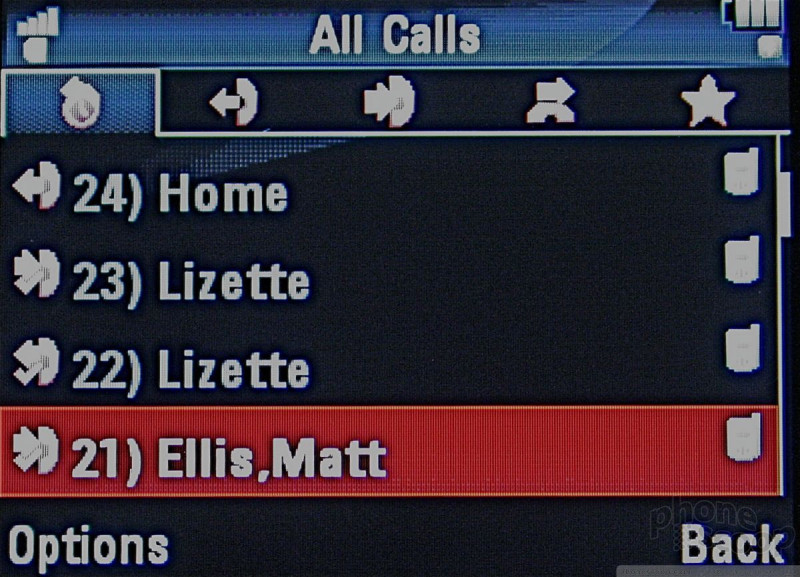
The Main Menu consists a row of tiny function icons arrayed in row along the bottom of the screen, with a larger version of the icon in the middle of the screen along with the item's name. You could try to move across them with the scroll wheel, but using the one-by-one left-right toggle was far easier and infinitely more precise. You can change this default arrangement into more traditional icon grid or list views, which I suggest.
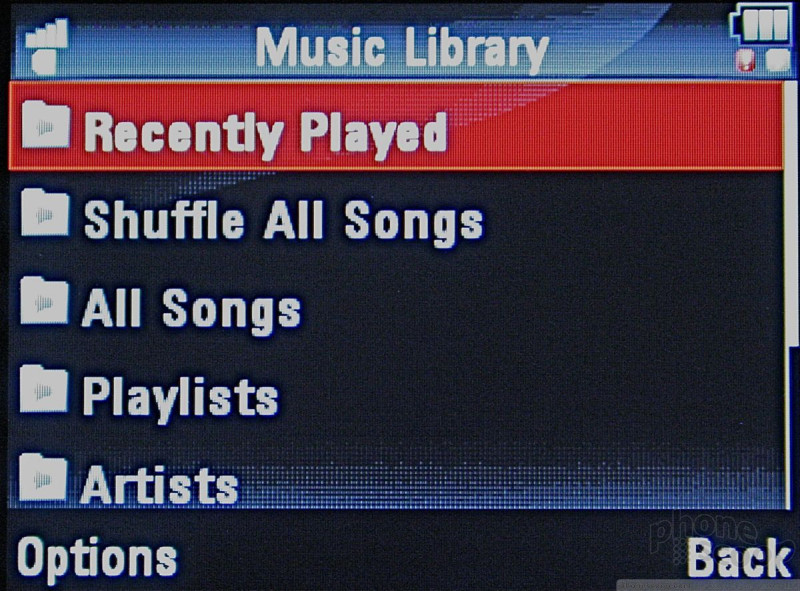
Since the primary function of the E8 is music, the Music icon is the first icon on the left, followed by Contacts, Messages, Mobile Internet, Office Tools, Multimedia, Settings, Recent Calls, SongID, Radio.
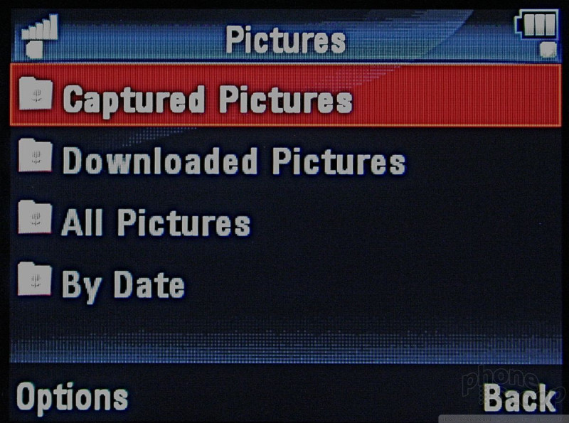
Sub menus are the usual numbered lists, boring but thankfully simple. The selected choice is highlighted in bolder and larger text.
The D-pad navigation button also provides programmable direct application access.
All menus are old-school white on black with red highlights, which makes everything super easy to read regardless of the ambient light. I hope this is a trend.
Calls/Contacts
To make a call from any application, you have hit the red "end" key to get back to the home screen. In the case of music playback, you don't have to put the music on pause. It'll keep playing until you hit "End" again or hit "Send" to start your call. To call from your contact list, select the contact and just hit the green "Send" key.
On-screen numbers as you dial are large enough even the most far-sighted caller can read. While on a call, the screen goes dark but the keypad stays lit in case you have to dial additional numbers for extensions or voice menu options.
Like most smarter phones, you can sync your Outlook contact list into the E8. As with most new T-Mobile devices, the E8 is equipped with MyFaves, five icons on the home screen representing folks you call the most. You use the Fave wheel to cycle through these five, then a single "Call/Send" click dials the Fave number. You can put a picture of your Fave or a representative icon. You can hide your MyFaves icons so they don't block your chosen wallpaper.
Unfortunately, if you don't remember the "down" nav toggle gets you to your contact list, you have to scroll through the Shortcuts or Main Menu to get to the contact list itself, a multi-click operation. You can add full contact info including two email addresses, a photo and any song as a ringtone.
Messaging
E8 offers both messaging as well as POP3 and IMAP email. Setting up email is ridiculously simple. Tap in your email address and password, and the phone goes out and, after a minute of watching the horizontal progress bar roll, the E8 gets all the information it needs from the given domain. Then the E8 goes and gets your email. This process worked quickly and efficiently for my AOL and my .mac email accounts, but failed to register my personal IMAP domain email account and my POP3 cable provider email account. Mail sent from the phone looked exactly as it would have looked my desktop; no pretentious "Sent from my iPhone" or "Sent from my Blackberry" identifications.
The E8 is not a smartphone, so you don't get the niceties of push email, but you can add attachments, as long as they're less than a 1 MB. When sending pictures as attachments, the phone needs to save them again, meaning you have to have enough memory to do so. And when you are prompted to choose the picture attachment, you see only the phone's generated file names, not the pictures themselves. If you want to make sure you're sending the right pictures, go to the Media Files menu, find the picture and send it from there.
If you use multiple email accounts on the phone, one of them will be designated as your default. If you want to send an email from a particular address, choose it first.
The E8 offers no instant messaging.
Extras
Music
Music is the raison d'̻tre of the E8. The big news is the E8 has 2 GB of built in memory, which can be supplemented by up to 4 GB via a microSD card Рor at least that's the limit Motorola lists on its specs. But since the E8 has a high capacity SD slot, it should be able to accommodate any microSD card up to 32 GB. I put in a new 8 GB card from Kingston and the E8 read it fine.
Once you get the microSD card inserted, the phone sees only the total aggregate memory, whether loading the phone with tunes using Windows Media Player 11 or Motorola's included Motorola Phone Tools v5 software, or playing back tracks. Neither of these pieces of software is iTunes, of course, so expect the usual fits-and-starts as you attempt to load songs into the phone, especially if you're new to non-iTunes music management.
E8 will accept and play back all popular formats including AAC and AAC+. We loaded WMA tracks from a Windows Vista PC and AAC tracks from a Mac, and the E8 didn't care one way or the other.
You can locate tracks by song name, artist, playlist or recently played, you can shuffle play, play all and repeat all. An equalizer provides settings for classical, country, dance, techno, latin, pop, reggae, rock, treble boost, vocal booster and bhangra, as well as a simple bass boost if none of the genre settings are to your liking, and something called 3D stereo with seven settings. I wasn't curious enough to find out.
Music continues to play while you traverse the E8's other functions. But when you move to the main splash screen or another application, you lose all music controls. You can only stop the music from the Shortcuts menu from the main screen.
Once music starts playing, switch the phone into "lock." This turns off the battery-sucking LCD screen and, after around 30 seconds, the now useless touch controls.
The earphones are the E8's biggest problem. While not exactly Shures or Ultimate Ears, they fit and sound better than most bundled free earphones. But the switch hook does not double as a music pause control. Instead, pressing the switch hook slips the E8 into its useless Voice Command mode. We understand Motorola's motivation for enabling basic phone operations via voice; if only they worked.
The consequence of this poor design means that when you're bopping about grooving on your tunes with the phone in your pocket and you need the interact with the real world, you have to fish the phone out of your pocket, manipulate the near-microscopic spine slide out of its lock position and press the center action button to pause. Yikes. And, no, "pause" or "stop" aren't available voice commands.
Camera
Press the spine ModeShift to activate the 2 MP camera. But wait a second for the app to load. Hitting the ModeShift button a second time before the app loads results in snapping an accidental picture.
Like all cellphone cameras, the E8 doesn't exactly have a quick shutter so you'll have to hold the phone stock still to not get a blurry picture.
You do get digital 2x, 4x and 8x zoom, but no other picture optimization such as night mode, brightness or white balance, or editing options. I couldn't rotate pictures taken in portrait mode. It does offer a 5- and 10-second self-timer, a multi-shot mode, and several picture styles: black & white, antique, negative, reddish, greenish and bluish. There is no self-portrait mirror and no flash.
Unlike the music player, you have to choose where to save the pictures, but this is the usual procedure, even with digital cameras. But be careful; if you've filled your memory or memory card with music, you might not be able to save or even send pictures.
Gallery
Pictures are stored in the Multimedia/Media Finder folder (what, "My Pictures" was too complicated a menu choice?). You can choose photos from there to send via MMS, email or Bluetooth. It's also easy to make any picture your wallpaper or caller ID photo.
Photos/Video
Photos
Like all cell phone cameras, the imager on the E8 does best in full sunshine. Still photos are big but looked bleached with dull colors even under optimum lighting conditions and lack the robustness one expects from even the lowest end digital camera. The amount of even dull color you get depends greatly on how much light you have. More light more color, it's that simple. Check out the baseball stadium shot, taken at early twilight but a full-lit stadium. The picture of the flowers was taken midday, but these blooms were in the shade. While the E8's indoor shots compare favorably with other 2 MP camera phones I've used, the outdoor shots were disappointing.
In any conditions, object outlines are indistinct and photos look as if there's something not quite right, as if the camera is working to fill in what it wasn't able to capture. With no flash, indoor pictures were even more problematical. The playing cards photo and self-portrait were taken under multiple incandescent and halogen lights at full strength. While both are clear, they are dull.
Video
The less said about the 176 x 144 3gp video quality, the better. As you can see, the E8 footage of a ball game (extra points for identifying the stadium) is nearly unwatchable.

3GPP / MPEG-4 format (viewable with QuickTime)
Browse/Customize
Browse
Because the E8 is an EDGE phone; mobile Web and WAP Web pages take 5 to 20 seconds or so to load, depending on the graphic content. The squat screen, while appropriate for camera and video functions, shows too little of each Web page. The main menu has options for either T-Mobile's T-Zone shopping area and pre-set Web page sections, or to the WAP Mobile Internet. With E8's small screen, the menu font on the T-Zones main screen is impossibly small. From the opening mobile Web browser screen you can choose "Go To URL" from the options menu to navigate to a specific page. But once on a WAP Web page, you annoyingly lose the "Go To URL" choice; you have to exit and re-enter the browser to input another URL.
Customize
You can change the home screen wallpaper, pick any song you load to be a ringtone, alarm or alert, and change the four navigation options on the up/down/left/right toggle and that's about it. The E8 isn't really about personalization.
Extras
Apps
The E8's most interesting app is SongID, which usually has to be a downloadable Java application on other phones. Hold the phone up to the radio while an unknown song is playing. SongID listens to around 12 seconds of the track, then 45 seconds or so later, it identifies the track. I had fun trying to trick it; it correctly identified Al Jolson and Andrews Sisters tracks but was stumped by Allen Sherman. It was fun to try and stump it.
You also get an FM radio, which only operates with the headphone jack plugged in. You can seek one frequency at a time or seek and set presets through the FM radio Options menu.
If you want a giggle, play with the E8 voice command. In a dead quiet room, I slowly and crisply enunciated my home phone number. The closest the E8's confirming voice got to the correct number was seven of the 10 digits in around a half dozen increasingly hysterical tries. A dozen monkeys randomly punching a calculator keypad would have had more luck reproducing my phone number. For this I lose earphone music pause function?
Bluetooth
Being able to access both the power on/off and Bluetooth device location via the front Shortcuts menu is a time- and click-saving blessing. Pairing headphones or my Mac was easy, especially since you can activate Discovery mode for up to three minutes. I had no problems pairing or using the E8 with any device, both mono and stereo Bluetooth.
Sending and receiving images or music files from a Vista PC or a Mac to the E8 was mostly seamless with only the usual Bluetooth alert annoyances (yes, I want my PC to receive the photo I just transmitted from the phone); I got an occasional "no connection" error message but nothing exceedingly annoying. I just find it easier to transfer files via USB or card reader.
Clock
If you've replaced your watch with a cell, the E8 is not for you. The tiny type font in the main display makes the time impossible to read without squinting. If there's a method to change the font size, I wasn't able to find it. You don't even get a big-font time when you wake up the phone from sleep mode. There's a world clock in the Office Tools menu, as well as the alarm clock, easily accessed from the main screen Shortcuts menu.
Sync
I had no trouble syncing Outlook contacts, music and pictures on a Vista laptop via USB. You just have to put the phone into sync mode first. The manual said I could sync with a Mac, but the directions were a little hazy and didn't indicate what Mac apps the phone was compatible with for addresses and calendars. For music, it was just easier to use an SD card reader and drag-and-drop files from my iTunes music folder.
Wrap-up
The E8 is an attractive and highly-functional alternative. It's half-touchscreen/half-dialpad hybrid makes control over all applications, including the phone, simpler than most multi-function multimedia phone, and has more internal memory than most phones so you can take plenty of music with you. But because it's an EDGE phone don't expect speedy Web service, it doesn't offer instant messaging, and the voice command didn't understand a word I said no matter how cleanly I spoke. And the lack of a music pause control on the headset is a glaring oversight for a music-centric phone. But if all you want is music on your cellphone, the E8 is alright.
Comments
XD
Wooo. I was raised on a farm, and those look like farmer's hands. I take it that PhoneScoop isn't your day job?
Video Tour?
Welcome T-Mobile to the wonderful world of 2006
Any people wonder why Motorola is going of business and why T-Mobile has the fewest subscribers. Of course their CSI is awesome, they have the LOWEST subscriber base.
And I am a former T-Mobile high ARPU client who just recently bailed. I live in Los Angeles and their is not a HINT of ANY 3G love out here. Pathetic. I waited and waited.
HELIO done, Next up T-Mobile USA. I wish Rich and the original Eric would come back and bring some investigative journalism back to this site like they used to do.
Shea Stadium
Home of the Mets, Eric. What do I win?
Review
Maybe you could handle the phone better if you took better care of you hands.
"Unfortunately, if you don't remember the "down" nav toggle gets you to your contact list, you have to scroll through the Shortcuts or Main Menu to get to the contact list itself, a multi-click operation"
Really? I don't even know what to say about that comment. That's just trying to find something negative to say.
Terrible Review.














 CES 2008
 Motorola Announces E8 and Z10
 Motorola ROKR E8 Details Emerge
 Unannounced Motorola Media Phone Spotted In Fergie Video
 Motorola ROKR E8

