Hands On with the Moto g6
Apr 19, 2018, 9:00 AM by Rich Brome @rbrome.bsky.social

Motorola's g-series phones have a long-held reputation for value and quality. With the 2018 incarnation, Moto is trying harder than ever to bring high-end features and design to a low price point. For $250, you get a metal body, curved glass back, full-HD screen with 2:1 ratio, dual camera with portrait mode and object recognition, USB-C, fast charging, a fingerprint reader, an ultrasonic sensor that lights up the screen as you approach. It also has much better support for U.S. LTE networks than most unlocked phones, including Verizon, Sprint, and newer bands used by AT&T and T-Mobile. How does it stack up in person? Here are our first impressions.
This "standard" Moto g6 is the higher-end model in Motorola's new g-series. Compared to the lower-end Moto g6 Play, the Moto g6 has a better screen, better processor, better camera, and better body materials. It also adds the cool ultrasonic system that lights up the phone as you approach it, and it has a modern USB-C port, both of which the g6 Play lacks. The one edge the g6 Play has is a larger battery (4,000 mAh vs. 3,000 mAh.) (And you can get an even larger battery and screen by stepping up to the Moto e5 Plus, which, confusingly, is the big brother to the g6 Play.)
In 2018, I expect a $250 Android phone to have a display with a 2:1 aspect ratio (which gives you more screen at a hand-friendly size), a body with premium materials, more than 2 GB of RAM, and a USB-C port. There should also be a little something extra going on with the camera.
The Moto g6 delivers all of this, and goes a little further.
The metal frame is complemented by a curved glass back, something very rarely seen at this price point. There's also an ultra-fine pattern under the glass that adds a subtle curvy shimmer. The back does in fact look and feel much nicer than you'd expect from a phone at this price.
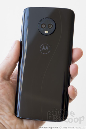
The metal frame has a glossy lacquer that gives the phone a slightly unfortunate plastic-y feeling on the sides. We're assured that the frame is indeed metal, but it's always nicer when it feels like it.
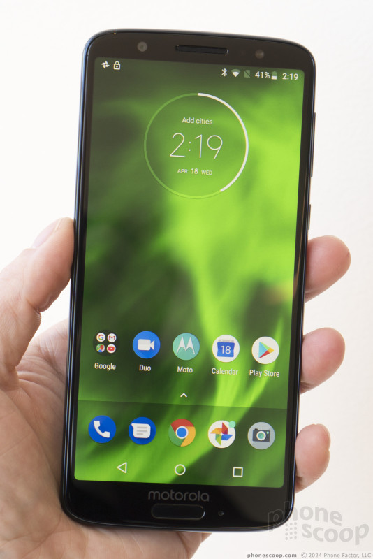
The front has curved-edge glass, which is pretty standard now. The edges aren't as curved and comfy as they are on the g6 Play, though. On the Moto g6, you can feel the seam between the front glass and the frame more than I would like.
I love the overall size and shape of the phone. It feels great to hold, and it does feel well-made.
The side keys are thin and mounted quite high on the right side. Physically, they function just fine. The rough texture on the lock key makes it easy to find by feel. But the 2:1 display means this is a tall phone, so it's a bit of a stretch to reach keys mounted so near the top of the phone.
Speaking of the display, its full-HD resolution means it's nice and sharp. Brightness is average and viewing angles are just OK. I do like how thin the bezels are, and the rounded corners. This is a lot of good screen for a phone this size and price.
Unlike Motorola's other affordable phones this year, the g6 has the fingerprint reader on the front. I prefer them on the back, but Moto put it frontside so that it could replace the usual Android buttons at the bottom of the screen. As some other phones have done, you can use swipe, tap, and hold gestures on the reader to go back, home, etc. This gives you more screen real estate for content. It's an optional features. The fingerprint reader is impressively thin; it's one of the narrowest little strips I've ever seen. At first I thought it was the old style where you annoyingly have to swipe your finger down. It's not; just a quick tap should do it. That's impressive.
I'm delighted to see USB-C and a 3.5mm audio jack, but the decision to put the 3.5mm jack on the bottom may be controversial for some. (The rest of the Moto e/g lineup has it on the top.)
Motorola has added a number of nice extras that aren't immediately obvious given the simple hardware design and "stock" Android interface.
One is the ultrasonic system that senses your hand approaching the phone. So if your phone is laying on your desk, you can just wave you hand over it to see the time and recent notifications. Motorola had something like this on the Moto X2 using infrared instead of ultrasonic. Cleverly, this system uses the built-in speaker and mics. It's a great feature, and very unusual for a phone at this price.
Moto Actions
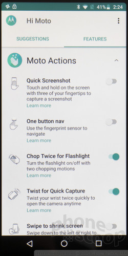
There's also the Moto app, which lets you control a bunch of other shortcut gestures, and adds some smarts like keeping the display on while it can see that you're looking at it.
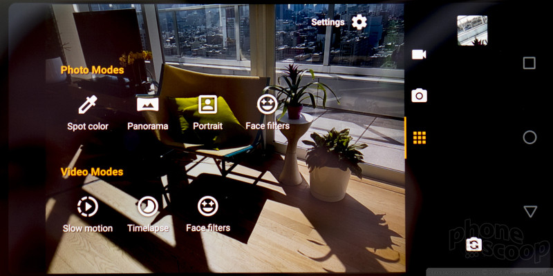
The camera app has a healthy list of advanced features, some of which are still found only on the very highest-end phones from other companies.
For example, there's landmark and object recognition. Testing it out, it successfully recognized an orchid in the room and brought up relevant web search results. The feature isn't real-time, though; you need to press an icon and then wait up to 20 seconds for it to do its thing. It can also scan text, recognize it, and place it in the clipboard to paste into any app you like. Very cool.
Motorola has its own spin on Live Photos now. They call it "Active Photos". It takes a short video clip along with a still, but only when it detects a certain amount of motion in the shot. Smart.
There's also a portrait mode that blurs the background, a manual mode, as well as time-lapse and slow-motion modes. Motorola's camera app has long lacked these essential features, so it's nice to see them added.
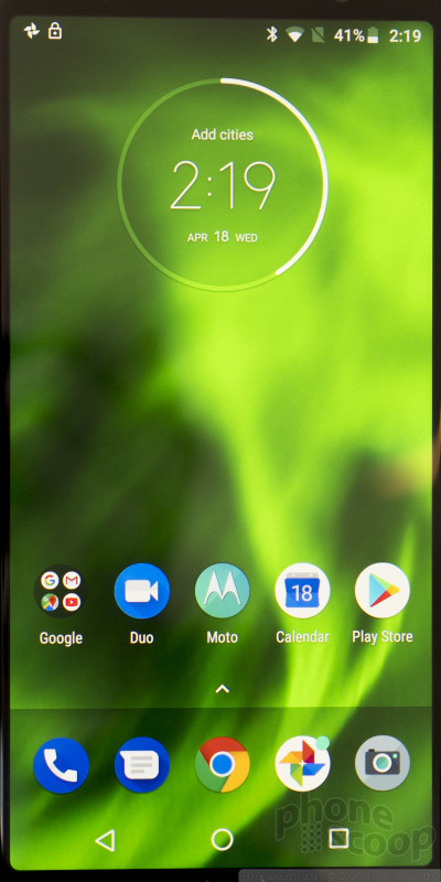
The rest of the interface is quite standard Android, exactly as designed by Google.
It's powered by a Snapdragon 450, one of the newest chips in the 400 series, so it's faster and more efficient than older 400-series chips. That's paired with 3-4 GB of RAM, which is excellent for this class of phone.
Extras worth mentioning include a coating to protect it against mild splashes, fast charging, a memory card slot, and dual-band Wi-Fi.
A lot of $250 unlocked phones can be used with AT&T or T-Mobile, but most of them don't support bands 29, 30, and 66, as this one does. Those extra bands mean better, faster service for both networks. The Moto g6 also fully supports Sprint and Verizon's networks, which is even more rare.
In all, this looks like a pretty solid entry from Motorola. Moto usually nails the basics and delivers good value with these types of phones, and this year they've thrown in a bunch of extras, too. We look forward to reviewing it.
Comments
No messages








 Review: Motorola Moto G6
 Verizon to Carrry Motorola’s Latest Phones On Prepaid and Postpaid
 Motorola Updates Affordable Lineup for 2018
 Samsung Stays The Course with its Entry-Level Model
 Motorola Refreshes moto g power for 2026
 Motorola Moto g6


