Review: iPhone 3G
Jul 14, 2008, 3:58 PM by Eric M. Zeman
Phone Scoop takes a look at the new 3G iPhone from Apple. See what sets it apart from the original ... and what doesn't.
Form
Is It Your Type?
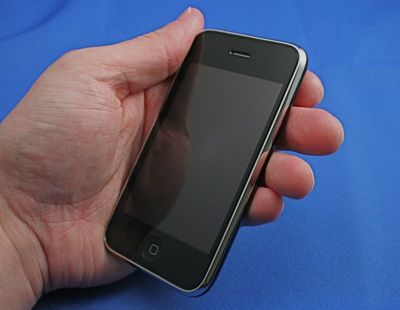
It's been just over a year since Apple's iPhone hit the cell phone scene. Before July 11, about 6 million people from across the country had picked one up. Many of those same people lined up once again for the second version of the iPhone, which brings several new things to the table. Since Phone Scoop has already written a full review of the original iPhone, we're going to focus specifically on what makes this phone different.
Those include the new firmware, the iPhone Apps Store, the 3G radio, the GPS radio and the revisions to the hardware itself. Otherwise many aspects of the phone remain unchanged.
Body
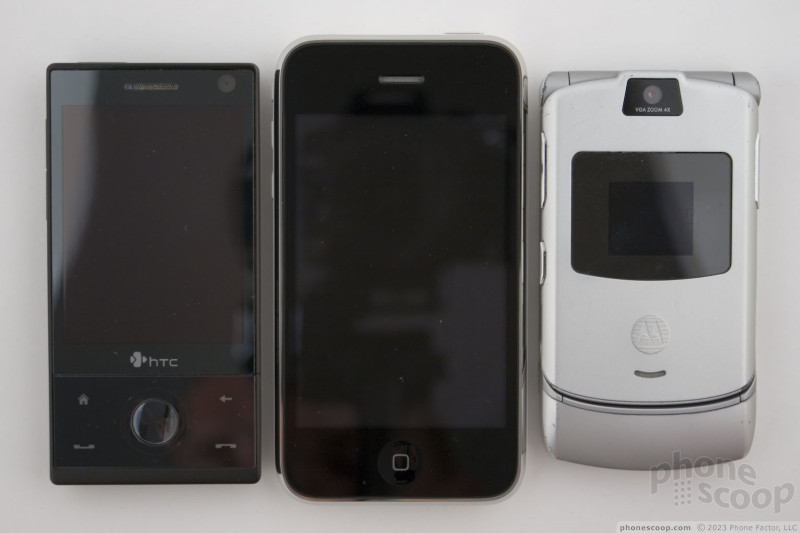
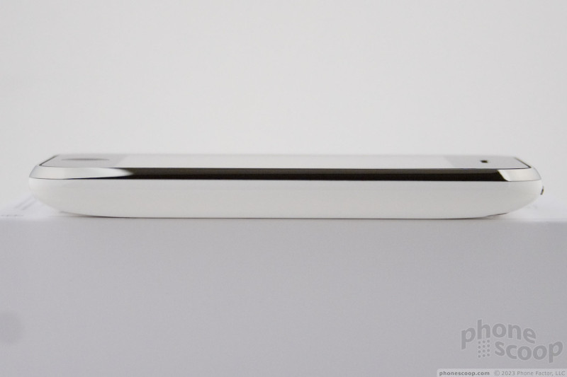
The dimensions of the iPhone are nearly identical. Looked at side by side, the first generation iPhone and the iPhone 3G are nearly indistinguishable from one another. The chrome rim around the 3G iPhone doesn't come up quite as much onto the front piece of glass as on the original, but it takes a moment of studying to even notice this.
The biggest thing you're going to notice is that the 3G iPhone has a tapered edge. Where the first iPhone was flat across the back, the new one is curved. It fits much better in your hand than the original. This slight curvature makes a big difference in the way it feels when resting in your palm. Oh, and the back plate is made of plastic, not aluminum. The aluminum made the original phone feel like it was made with more quality. Can't help it: metal feels better than plastic to my hands.
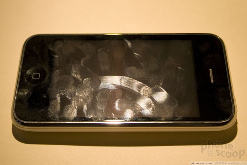
The plastic backing of the 3G iPhone is extremely glossy and slippery. I've already dropped the darned thing (thank goodness onto a couch). The entire iPhone is an absolute magnet for fingerprints. On the black model, they are just insanely obvious on the front and the back. On the white model, you see them mostly just on the glass face.
The buttons are all in the same places, but they feel different. They feel cheaper. Gone is the tough black plastic, which has been replaced by chrome covers. These chromed keys feel slippery and the travel and feedback is not as satisfying. I can't put it any plainer than that. They do, however, work just fine.
The home button at the bottom of the phone feels identical. It has nice travel and feedback.
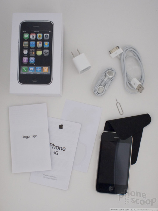
As for some other items related to the body: there are a couple of change-ups. The charger block has been reduced in size. Not that the first one was anything to complain about, but now it doesn't seem like it could be possible for Apple to shrink the thing any more. My one complaint would be that the original charger had the swappable prongs, meaning you could put a U.S. plug or European plug onto the adapter. Now you'll have to use a separate, stand-alone travel adapter when overseas.
The plug that fits into the bottom of the iPhone has also changed. The previous plug required you to pinch the sides to unplug it from the phone. The new connector does not need to be pinched to be removed. If you were hoping for a nice dock, you can forget it. There isn't one included in the box. You can undoubtedly buy one from Apple for $30. Oh, and if you've upgraded from the original iPhone, the old dock does not fit.
Last, but not least, the 3.5mm headset jack has been set flush with the top of the phone. This means any standard pair of 3.5mm headphones will work with the iPhone. We tested several pair, and didn't have any problems.
The Three S's
Screen
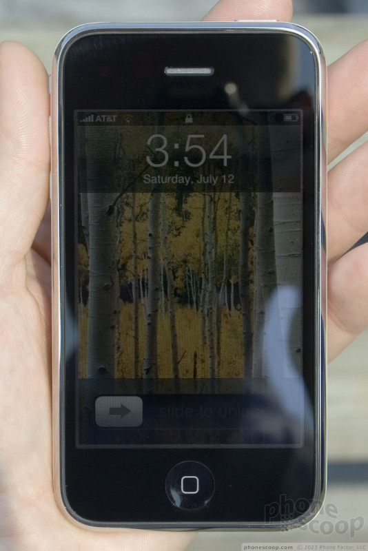
The new screen is similar to the first in that it bright, has high resolution, and is very readable in bright daylight. The new one has been tweaked with software to make things appear more "natural". In reality, this means it looks "yellower" than the original iPhone's screen when held in side-by-side comparisons. First-time owners won't notice this. This can be corrected, however, if you sync your store-bought 3G iPhone, and use iTunes to "restore" the 3G iPhone. Restoring the 3G iPhone will install a slightly updated version of the 2.0 firmware, and correct the yellow tinge.
Signal
Before buying the 3G iPhone, I mapped out the signal strength of the original iPhone in all of my usual test spots for AT&T signals. The 3G iPhone performed pretty much on par with the original when it came to EDGE (2G) reception. No better, no worse. This means it does an okay job. The iPhone is not a signal hound. Compared to a Nokia N95, which was accessing AT&T's 3G signals, it was typically a bit weaker than the N95.
Sound
There's no doubt, the 3G iPhone sounds better than the original. Calls are clearer, less noise, less echo, and less garbling. To my ears, the improvement was night and day. The earpiece is also louder. This helps a lot, because the original's speaker was certainly not packing a Marshall full stack in there. The same can be said for calls taken with a Bluetooth headset. They were cleaner, and suffered from less interference. Music playback did not sound appreciably different. Ringers can be made loud enough for most in-home environments, but it is still lacking compared to others when it comes to outdoor environments.
Battery
With the 3G radio active, you can almost watch the battery level indicator drop while you stare at it. With a full charge at 7PM on the 11th, I left my phone on overnight with the 3G radio active. By morning, the charge was 40% gone. I switched the 3G radio off around Noon on the 12th, and didn't reach the 20% left warning until 9PM of the 13th. I sent a hella lot of text messages, spent time browsing the web, and took several phone calls that lasted more than 10 minutes. I'd call that minimal use. Other reviewers who spent more time with the 3G iPhone noted that it typically lost a full charge in a day with the 3G radio active.
Basics
Touch
Use of the iPhone's touch screen is no different than on the original. To my fingers, it feels identical, and it is just as responsive. You can do all the same things: pinch, spread, push, pull, move things around. Everything glides around under your finger as if floating on air.
Menus
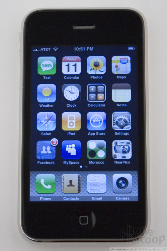
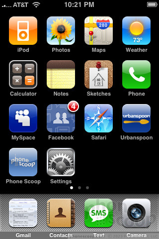
The menu system for the iPhone has experienced a few changes since the phones release a year ago. You have the basic on-board applications available on the phone's home screen. Out of the box, they are placed identically.
You can, however, move them around to wherever you want. The iPhone now has tons of home screens, that you can access by swiping the home screen sideways. This means you have plenty of place to store all those apps you download from the Apps Store, or other things, such as bookmarks to your favorite web sites.
Calls/Contacts
The phone program for the iPhone appears to be completely unchaged. The contacts have only a slight change, and that is the inclusion of a search bar. On the vcertial alphabet that appaers on the contact page's right side, there is a tiny magnifying glass resting just above the "A". I will complain that this is the tiniest button ever; you might not even notice that it is there. If you do, however, and manage to press it accurately, it will bring up a search box. You can type a contact's name in the box, and the phone will bring up the contact or contacts that match as you type.
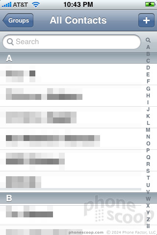
Alternately, you can scroll to the top of your contact list, and the search bar is permanently built into the top of the contact application.
Messaging
The SMS application has not been updated in any appreciable way.
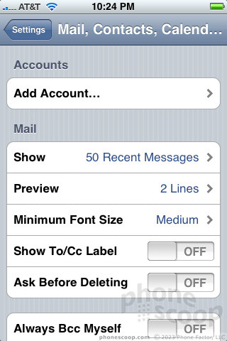
The email application will support push email from Microsoft's Exchange server if your business permits it. It also supports remote device lock and wipe for the security minded, but this ony works if the device is tied to an Exchange server. The best improvement that most people will care about is the ability to download photo images from your inbox to the photo library of the iPhone. This is a nice touch to have. (You can also download and save images from the Safari browser. Just press and hold your finger on a picture, and the phone will ask you if you want to save the image.)
You still cannot send or view MMS messages, which for some, could be a deal breaker. AT&T has a web-based work around, whereby if someone does send you a picture message, you'll be sent an SMS with a link, user name and password where you can view an image stored on a web site. This is an extreme hassle and pretty much negates the joy that picture messages can create.
Otherwise, most aspects of these programs haven't been changed.
Extras
Music
The iPod's functionality does not appear to be change or enhanced in any way. We were hoping that Apple would do something here, such as add a user-configurable EQ, but the controls, functions, and sound quality are the same.
Camera
Camara
The camera and camera software have not been changed, either. This is bothersome to us. All you can do is point and shoot. While the simplicity of the iPhone's camera has its advantages from time to time, we truly wish we had some options.
These include having the ability to adjust brightness, white balance, resolution, quality, effects, zoom, and on and on and on. The iPhone has none of these. We can only assume that Apple expects people to use iPhoto or some other PC-based photo editing program to make adjustments after the fact.
With no manual brightness in the camera controls, you can only force the automatic brightness to do what you want by aiming the camera, so that more bright (or dim) areas dominate the scene. This often means framing your shot oddly, and sometimes cutting off part of your subject to get good exposure.
As before, the camera's automatic white balance is excellent, but like any automatic white balance, it can be fooled by unusual scenes. That makes the lack of a manual control frustrating. For example, there is one flower box we found that will always fool the camera into making the scene extremely purple-tinted.
We know that Apple has the ability to add these basic manual functions. Why it hasn't is beyond us.
Gallery
The gallery application is unchanged.
Photos
Rich noticed a few things about the images captured by the iPhone's camera. The orientation is not set when photo files are created from the camera. Instead, orientation is attached at meta-data, so it's only right-side up in some apps, like iPhoto or Preview. File thumbnail in Finder is oriented the wrong way, and it's the same if the photo file is moved to Windows.
Images taken in daylight can look fantastic. I've also had amazing luck in some low-light situations, such as concerts. Dark bars, on the other hand, prove to be too much, especially since the iPhone does not have a flash. Images can be nearly unusable.
Overall, though, the iPhone's camera does better than many other 2MP cameras.
Browse/Customize
Browse
The iPhone's Safari browser is as powerful as ever. It still doesn't include Flash, but it's the closest thing you're going to get to a desktop experience on a mobile phone. The biggest update, of course, is that the iPhone can now access AT&T's HSDPA 3G network...if you have coverage. Be sure to check AT&T's coverage map before you run out and buy the 3G iPhone, if that's your biggest reason.
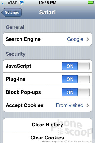
As for browsing, it is definitely faster in 3G zones. Web sites load two to three times faster when you're covered by 3G. According to an Apple spokesperson, under ideal conditions, the iPhone can reach AT&T's limit of 1.4Mbps for phones. Real-world speeds will more likely fall between 500 Kbps and 800 Kbps.
With a 3G iPhone and N95 in tow, the iPhone often loaded full HTML pages just as fast as the N95 did with Opera Mini 4.5. Browsing with the touch browser is simply faster on the iPhone overall (even if pages load in the same time), because you don't have to use the D-pad to scroll around pages to get to what you want. With the iPhone, you just touch and go.
But you're going to pay for this faster functionality with lower battery life. This is on par with other phones we've tested. The N95, for example, also loses a full charge in about one day, the same as the 3G iPhone.
Customize
The iPhone lets you do some customization. You can set your own wallpapers, picture IDs, and settings for ringers and notifications. You can completely change up the menu location of all the applications to suit your needs.
As for ringtones, you can download some from the iTunes Music Store for a fee, or, if you use an Apple computer, import a non-protected song to GarageBand. Using a tool in GarageBand, you can select a 10-second clip from the song and create a ringtone with it. This doesn't cost you anything.
Extras
Apps
One of the biggest aspects of the 3G iPhone is that it has access to the iPhone Apps Store, and the myriad applications available there. At launch, there were 500 applications available from various publishers, and include games, utilities, social networking tools, photography tools and more.
The Apps Store is accessed from a standard icon on the iPhone's main menu.
When you first load the Apps Store, you get to the main entrance. You can snag the hottest and newest applications with buttons on the top of the screen. The front page has a sample list of about 25 applications.
If one interests you, you tap it. It will bring you to an information page about that application. There is a paragraph explaining what the app is about. Below that is a screen shot, and below that are some user reviews, which rate the app. A couple of things about the App store appear to be less than fully realized. For example, each application lists a download counter. Apps listed in the top 25 showed 0 downloads, which I know is wrong, because I downloaded some of them. Each game also has a rating, but the ratings are not explained.
Always at the bottom of the screen are shortcuts to the featured applications, categories, the top 25, a search function and a place to search for updates to existing applications. These are all pretty self explanatory.
The Apps store is incredibly easy to search and use. It will likely be the best way to get content to a cell phone ... when it is finished. It just seems like some aspects of the Apps Store, and the Apps themselves, some were not 100% thought out and were thrown together half-baked. After spending a few moments checking them out, you can see that many of the apps rate three (out of five) stars or less. This includes some of the most popular apps.
Lastly, when you decide to buy an application, there is a little "buy" button. Press it, and it changes to an "install" button. If you press it again, the application will ask you for your iTunes Music Store password. Once you put that in, the Apps store closes and you jump out to your home screen. The initial impression is that the store app crashed. But you'll notice a new app icon appear on your desktop (wherever there happens to be an open space), and it will then download and install.
Rich and I both experienced crashes of the iPhone when using third-party apps and native Apple apps (such as Safari) as well. This is something that the entire notion of the SDK and iPhone developer program were supposed to help avoid: Bad experiences.
Rich would like to point out that the iPhone crashes more elegantly that other phones, which often just freeze up. With the iPhone, when something crashes, it typically just closes and takes you back to the home screen.
Using EDGE, most apps I tried to download took over a minute. Using 3G, it could be as short as 30 seconds. With WiFi, some apps downloaded and installed in about 10 seconds. So you're not there waiting all day for apps to load.
We think once the App Store and the apps themselves are a bit more finalized and stable, it will be a great way to find and purchase content for the iPhone.
Bluetooth
The iPhone still doesn't have stereo Bluetooth, but it's just as easy as before to pair it with other devices. When you're using the Bluetooth menu, the iPhone is automatically made visible and put in pairing mode. If it senses something, it will tell you. You can pair or ignore. Sound quality is improved when compared to the original iPhone.
GPS
The iPhone has Google Maps on board. Now that it also has GPS, it is much improved as a navigation device. Using it for the first time, the iPhone found my exact address in about one minute. That was with me inside. When I stood outside, it found my location in about 30 seconds. It pegged me to within about 25 feet of where I was standing. Not bad. The iPhone uses a-GPS, meaning there needs to be a network signal for it to work. I drove all over with it. Only the time to first lock varied. It always found me. Google Maps does not have turn-by-turn directions, but being able to have constant GPS updates means that if you get lost, you can quickly remap a new route based on your location information.
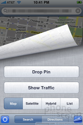
Speaking of location information, there are a lot of applications for the iPhone that want to make use of the GPS data that's available. The phone asks you every so often if it can do this. There doesn't appear to be any unversal way to set the applications to "always allow" the GPS to access the data. Having to check this little screen every 30 minute or so gets old.
Wrap-Up
The biggest advantages of the 3G iPhone are its 3G-ness and GPS. When you're covered by AT&T's 3G signal, the iPhone will browse the mobile web much faster. It is as fast as other 3G phones when it comes to downloading and opening web pages, but we found the finger navigation to speed up the browsing process.
As for the GPS, it works well, and can map out very accurate directions. The 3G iPhone does not offer turn-by-turn directions right now, but I've read that application developers are already working on them. Once these apps are available, the 3G iPhone will be on par with a lot of other cell phones that offer GPS.
The Apps store is a great new feature to have, but exiting first-generation iPhones also have access to the Apps Store with the 2.0 firmware upgrade. If you're an existing iPhone owner and really want to have the 3G and GPS chips, this new device is probably worth the price. If you don't have access to AT&T's 3G signal, then it is probably not worth running out and buying.
But that's not to take away from all the things the 3G iPhone does well. The UI is as great as the original's, it is a fun device to use, it syncs your content easily with iTunes, and it is a better phone than the original.
Comments
Great phone, but I'm still getting the Instinct.
Sprint has Impressed me though. They have released a phone very similar to the iphone. And sprint is playing it smart, theyre making this phone far more accessible then the iphone. As opposed to paying 200 bucks you only pay 129. Instead of paying an extra 60 bucks for unlimited text and web ON TOP of your regular monthly plan, you only have to pay 69.99 for unimited Text and web. whicvh also includes 450 anytime minutes, free mobile to mobile and unlimited nights and weekends starting at 7 as opposed to 9. Sprint has taken a phone most regular phone buyers only dream of...
(continues)
BlackBerry still rules!
It's no coincidence that Q1 of 2008 showed BlackBerry taking in almost 50% of the smartphone market share, more than double the iPhone. And that won't be changing anytime soon.
iPhones are for kids; people that are serious get BlackBerrys.
(continues)
i'll take capacitive multi-touch with safari over resistive crap browser any day of the week.
(continues)
When the first Iphone came out last June, I was pretty excited. Not because I planned on was...
(continues)
You know... There is an entire forum to discuss the Instinct.
https://www.phonescoop.com/phones/p_forum.php?p=1449 »
🙄
-thanks
You do have to admit...
(continues)
Hardly sounds improved at all!
(continues)
















 iPhone 15 Series Goes All-In on USB-C and Dynamic Island
 Hands On with the 2025 Moto razr Lineup
 New Case Adds Keyboard to iPhone Pro
 Apple Intelligence Promises Personalized AI, Requires iPhone 15 Pro
 Apple iPhone 3G


