Review: HTC U12+
Lock Screen
The U12+ runs Android 8 Oreo with HTC's Sense interface on top.
HTC calls its ambient display "Smart Display". It shows the time and basic notifications on the screen as they arrive. You can control when this feature is active, such as during daytime hours, as well as how much information is displayed. I love that HTC has so many different options for the clock, time, and date arrangements.
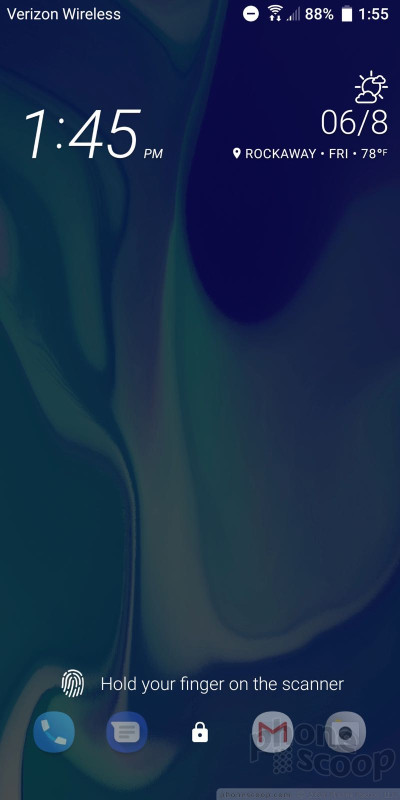
Tap the screen, squeeze the sides, or press the lock button to fully wake the display. The lock screen shows the clock, notifications, and shortcuts. The shortcuts mirror those set in your home screen dock. I like that the clock includes the weather details for your current location.
The U12+'s rear-mounted fingerprint sensor is easy to train and easy to use. The U12+'s sensor is on par with the fingerprint readers on other flagship phones in terms of speed and reliability. It's very good. It's a shame that the fingerprint reader does not support gestures such as scrolling or opening the notification shade. You can, however, tap the fingerprint reader when using the camera to take a quick shot.
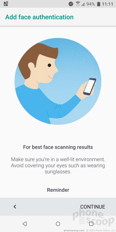
The phone supports a simple face unlock tool based on the user-facing camera. It takes less than a minute to train and works pretty well. HTC warns that it is not the most secure way to lock the phone. I think the fingerprint reader is the quickest and most reliable way to unlock the phone, and it's secure.
Home Screens
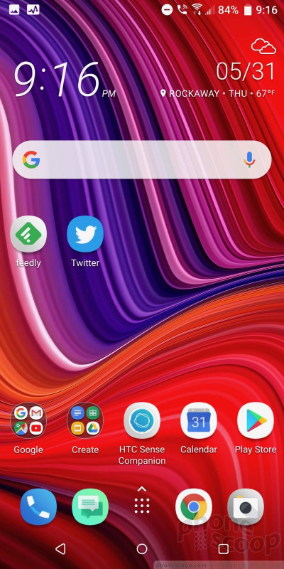
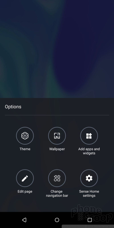
HTC's home screen experience is tired and needs to change — or just go away. The Sense user interface skin has had the same fonts and basic appearance for years. I find it beyond stale and unwelcome at this point. Granted, HTC lets you install themes and make other changes to Sense's basic appearance, but it still stands as one of the heavier-handed skins and feels overwrought. (To be fair, the skins from LG and Samsung are not much better.)
I think Motorola and OnePlus (and, heck, even ZTE and Kyocera) have found the right balance of introducing tasteful features that are truly helpful while keeping the experience as close to Google's excellent design as possible.
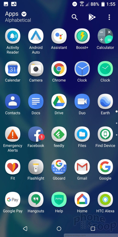
The core home screen experience is fairly straightforward. The app drawer allows users to arrange apps alphabetically, in custom order, or via recents. It also lets you change the size of the grid. The app drawer includes a search tool and supports folders.
Blinkfeed, HTC's social newsreader, is active as the left-most home screen panel of the U12+. You can use it to generate a feed from Twitter, Facebook, and a handful of third-party news sources. I wish it didn't include ads. You can disable Blinkfeed completely if you wish and I recommend you ignore it (particularly if you already make use of Google's feed.)
Amazon Alexa is onboard, and Dual Wake Words means you can speak to either Alexa or Google Assistant as you please. HTC says it improved its microphones for better far-field (across-the-room) recognition. The phone almost always jumped to life when I asked it to, whether it was Alexa or Google doing the waking.
Sense Companion, HTC's spin on the device-side assistant, is on board too. It's more like Samsung's Bixby than Google's Assistant — which is to say I don't really recommend it. You'll need to activate the service, walk through some basic settings, and give it permission to offer suggestions. Over time, Sense Companion will tell you when there's traffic, warn you about upcoming calendar events, record and display your fitness data and such. There's nothing wrong with the concept, but Google already does most of this, and Google is just better at this stuff.
Last, HTC added what it calls the Edge Launcher. Calling up the launcher adds a spinning wheel of app shortcuts to the right side of the screen. If you are nimble fingered you can quickly dial the wheel and open any app you want from inside other apps without returning to the home screen. There's something very similar on Samsung devices. It's sort of a power user multitasking function. It also provides a quick look at the calendar and can include contacts, quick-dial actions, and more.
The U12+ is powered by the top-of-the-line Qualcomm Snapdragon 845 chip, with 6 GB of RAM. The phone ran swiftly with no issues whatsoever. All of the apps opened in a blink and screen transitions were fluid. The Snapdragon 845 gives the U12+ all the power it needs.
Camera
There's no shortage of ways to fire up the camera. The camera can be opened via Edge Sense (squeezing the phone), a double press of the screen lock button, the lock screen shortcut, and the home screen icon. The camera opens quickly.
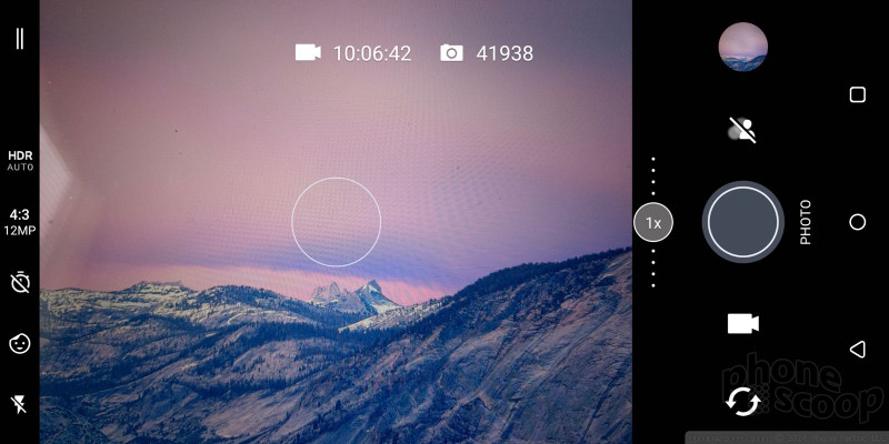
A few settings are available from the camera's main viewfinder screen, including the flash and HDR. Both of these can be set to on, off, or auto. You can also jump between picture aspect ratios, set a timer, or quickly launch the sticker tool. The U12+ has separate buttons for snapping pictures and capturing video, and a useful slider for managing zoom.
Camera modes are accessible from a drawer you swipe open, and they include photo, panorama, pro, video, hyperlapse, slow-motion, selfie photo, selfie pano, and selfie video.
The Pro mode is a manual mode that gives you control over white balance, exposure, ISO, shutter speed (up to 32 seconds), and focal points. The sliding tools for adjusting these are straightforward. You can save three custom Pro shooting modes as presets if you wish. Pro mode also allows you to capture RAW images, which offer more potential for fixing exposure and white balance after the fact. It's a really powerful and manageable Pro mode.
The other shooting modes behave more or less how you expect them to. I wish the slow-mo tool let you make adjustments to capture speed. The U12+ doesn't support anything like 960fps.
The dedicated selfie mode includes a screen-based flash to help with low-light shooting. You have access to tons of animated stickers that you can apply in real-time to your face as you snap selfies.
Once you learn to navigate the app, which has a lot of ins and outs, the camera is quick.
Photos/Video
HTC overhauled the camera system this year. The main camera has a 12-megapixel, wide-angle sensor at f/1.75 and a secondary 16-megapixel telephoto sensor at f/2.6. The camera includes a hybrid of phase detection and laser autofocus. The phone supports optical zoom up to 2x via the dual cameras.
I was happy with the photos I captured with the U12+. Most importantly, shots were accurate to the lighting and conditions I saw. Some pix I captured of downtown NYC on a dreary day are absolutely true to life. They were sharp, perfectly exposed, and showed proper color. I spent an evening shooting a concert with the U12+ and it really impressed me. The zoom function did very well, even in the dark, though there was plenty of grain in the results. Shooting around my house cemented my appreciation for the phone, which takes fine photos.
The front has two 8-megapixel cameras at f/2.0 with support for bokeh portraits, HDR, live makeup, AR stickers, and panorama selfies. It does pretty well. The selfies I took at a concert — without the benefit of beautification — turned out more accurate than I might have preferred. Still, the shots were sharp, colorful, and properly exposed. I like the option for wide-angle selfies.
The video camera includes a feature called Sonic Zoom, which will tweak the microphones to focus more narrowly when users zoom in on a subject. It works, but almost imperceptibly. You need to listen to the results on a decent home theater system to really get the effect. The U12+ can capture 4K video and includes OIS to reduce shake. There's no question it produces sharp video, even in dark settings. The multiple microphones weren't quite able to handle the sonic blast of a heavy metal show, which overpowered the phone and left me with distorted results.
The U12+ is one of the first phones to add Google Lens directly to the camera app. It's a cinch to perform image-based searches right from the camera viewfinder. Results aren't perfect, but they are helpful from time to time.
Edge Sense
HTC put in a lot of effort to improve its Edge Sense system along the metal sides of the U12+, and the results are uneven, if not awful.
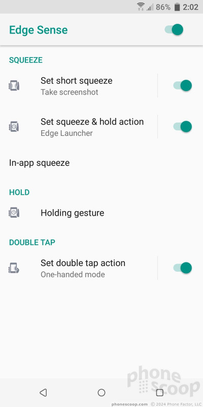
Pressure sensors are buried under the metal frame at/below the phone's waist. Squeezing these sides calls up different actions. The new Edge Sense 2 can do much more, though. For example, a double-tap on one side will shrink the screen to one-handed mode. This works well.
As long as you hold it in a normal one-handed grip, you can set the screen to maintain portrait orientation even when sideways. This is a helpful feature for those who like to browse in bed, but it takes practice to use.
As before, users can customize a quick squeeze to open Google Assistant, Amazon Alexa, fire off a picture, and more. Edge Sense continues to work even when the phone is in a case. Setting up all these behaviors and managing how well they work depends on the sensitivity level you select for the squeezing options and whether or not you can remember what actions you've assigned to short squeeze versus long squeezes.
I had a heck of a time getting the sensitivity where I wanted it, and every now and then I felt like the sensitivity preferences would randomly reset. I also experienced phantom input. The phone would act like I was squeezing it even though I wasn't. Other times, I squeezed it and nothing happened. It's just not reliable. Clearly something is amiss.



















 Best Certified Phones for Verizon Wireless
 Hands On with the HTC U12+
 HTC Offering Red Version of U12+ to US Consumers
 System Update for HTC U12 Mostly Fixes the Buttons
 HTC U12+ Jumps to 2:1 Screen, Improves Edge Sense, Refines Speakers, Adds Sonic Zoom
 HTC U12+


