Hands On with the Samsung Galaxy S10 Series
Feb 20, 2019, 2:30 PM by Rich Brome @rbrome.bsky.social
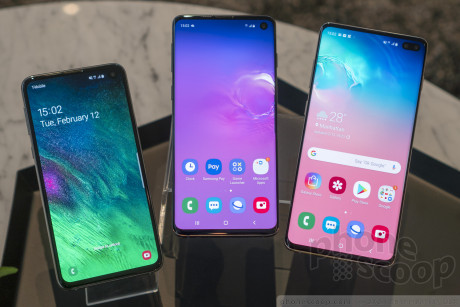

Galaxy S10e
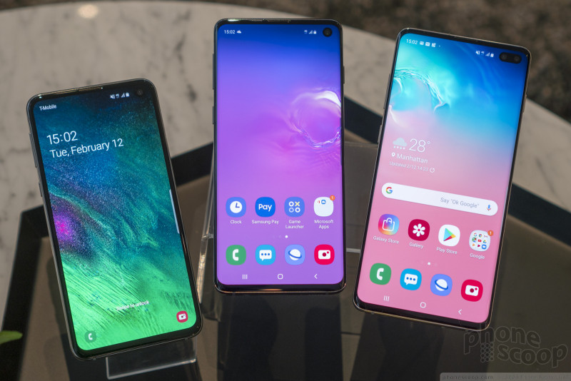
The new Samsung Galaxy S10 isn't just one or two phones, but a series of four phones. We spent some time with the S10e, S10, S10+, and S10 5G. How much smaller is the S10e? What did they leave out to make it cheaper? How huge is the S10 5G? And does the whole lineup live up to the legacy of the Galaxy S line on its tenth anniversary? We have your answers.
The history of the Galaxy S series — Samsung's annual flagship phones — is one of continuous refinement. Each year, they take everything people liked about last year's model and improve on it. The screen gets larger, the bezels get smaller, the design gets sleeker, the materials feel nicer, and they add features to the already-dizzying list. The S10 lineup is no exception. The design is familiar, but more "all screen" than ever, and with more features in the same sleek package.
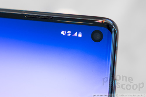
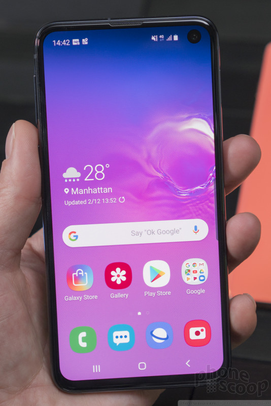
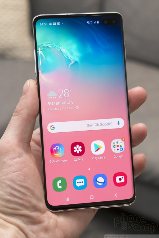
Samsung has been hinting for a while now that the S10 would come with a "hole punch" display that they call "Infinity O". This is a nice alternative to a notch. While I personally don't mind small notches, this is definitely an improvement. Holding the S10 in my hand, I can honestly say that I adjusted to the camera hole tucked in the corner almost instantly. It blends into the screen smoothly, both aesthetically and practically. There's ample room for icons and content. It even looks a bit futuristic. I don't like the pill-shaped hole on the larger models quite as much, but the larger displays mean the "pill" isn't in the way any more than the circle.
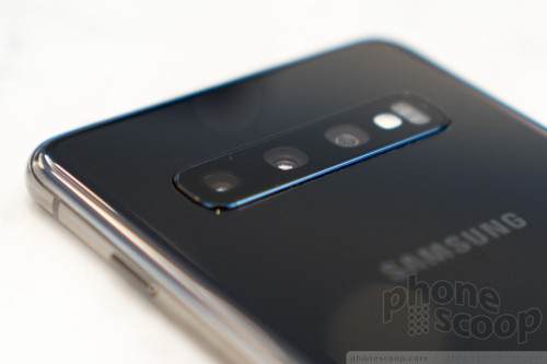
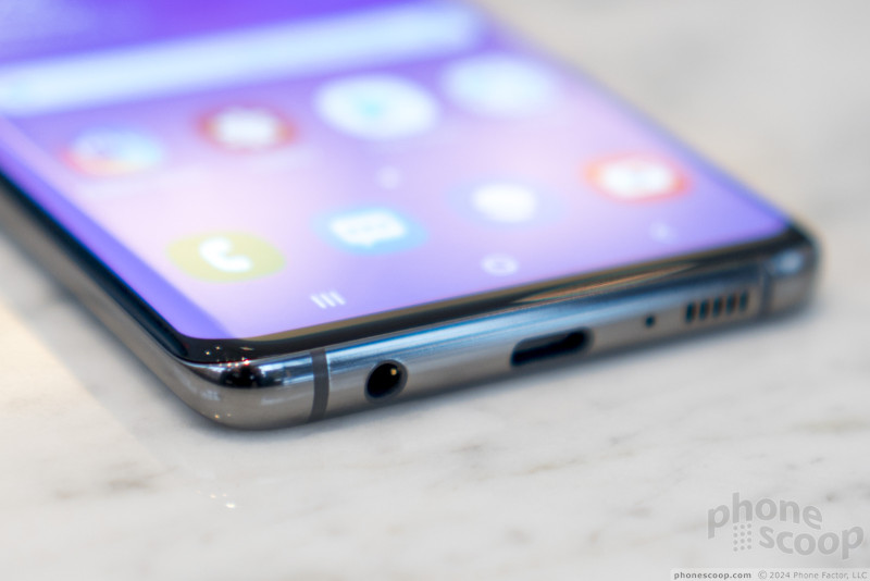
As you'd expect, the frame is metal and the back is curvy glass. The overall shape of the S10 and S10+ is just like the S9, with the metal frame growing thick at the top and bottom, and very thin at the sides, where glass from the front and back curves around. This accentuates the slight curve of the display on the sides.
If you've held an S9 / S9+, you've held an S10 / S10+. They don't feel appreciably different to me. You just get more screen and more cameras in the same package. Samsung is iterating on an excellent, iconic design. It's a design that's been widely-praised and certainly successful, so that's just fine with me.
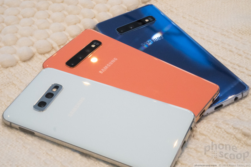
The S10e design is a bit more generic, but still high-quality and attractive. Here, the metal frame is thick all the way around, which matches the flat display and leaves room for the fingerprint reader built into the side lock button. The front glass still has rounded edges, and the rear glass still curves, just not as much.
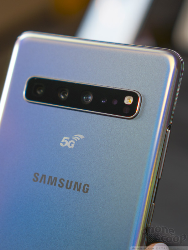
On the S10 5G, the design tweaks go the other way: the metal frame is even thinner, and the rear glass even more curved, to cover a little more of the sides and top with glass. Presumably this gives more exposure to the special 5G antennas inside (since glass is transparent to radio signals.) The metal frame is so thin on the sides that it has to get thicker where it accommodates the side keys.
On each model, it's a very slick package that feels luxurious and refined. Everything is curved in the right places to be comfortable to hold, and the side buttons are nicely rounded to be gentle on your fingertips.
In terms of features and specs, Samsung made all the right choices in order to make the S10e smaller and cheaper. There are zero compromises in the places that really matter, like the processor and camera. You don't get a heart rate monitor (did anyone ever actually use that anyway?) but I'm impressed that they put a 3,100 mAh battery into a phone this size. You can get it with up to 8 GB of RAM. You don't get the quad-HD screen, but honestly unless you're doing VR, full HD is more than sufficient; most people can't see the difference, especially at this smaller screen size.
I am fully in love with the size and feel (and even features) of the S10e. It's a modern Galaxy S in the small package I've always wanted. It fits my hand like a glove, and I actually prefer having the thicker metal frame and less-curved glass; it feels far less delicate than the standard S10. Sure the size bezels are slightly thicker, but they're still quite thin, and I prefer the visual balance of having a more even bezel thickness all around.
In other words, even if they cost the same, I'd probably still prefer the S10e to the S10. Factor in the cost savings, and the S10e is definitely a much better value... although it's still not cheap at $750.
S10e fingerprint reader
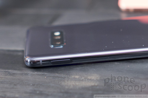
One key difference on the S10e is that the fingerprint reader is integrated into the lock key on the side, which is thicker and flatter than any other S10 side keys. And yet it's still extremely narrow for a fingerprint sensor. It's an little high on the side of the phone for my fingers; that might be my only gripe with the S10e.
I heard one Samsung rep imply that the S10e is sort of Samsung's response to the iPhone Xr, which makes sense. But the iPhone Xr is bulky, with thick bezels and some spec compromises. I much prefer the choices Samsung made in creating S10e. At any rate, it's just refreshing to see a phone maker focus on making an Android phone that's truly high-end but also small; especially since Sony seems to have given up on that.
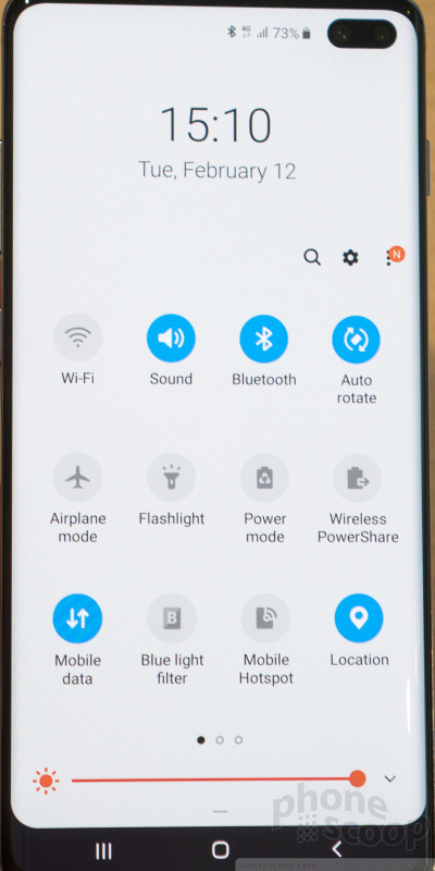
One of the neatest — and most surprising — features of the S10 series is its two-way wireless charging, which Samsung calls Wireless PowerShare. You can simply tap a button on the Quick Settings shade and use the S10 as a charger for any other device with Qi wireless charging, from a watch to a Bluetooth earbuds case to another phone. Smartly, this feature shuts off when the S10 battery gets down to 30%, so you're not accidentally left with a dead battery on your S10. Impressively, even the S10e has this feature.
The S10 / S10+ has an ultrasonic fingerprint reader embedded under the display. In demos, it didn't seem quite as fast as a regular fingerprint reader, but it did seem fast enough to not be annoying. It requires that your finger be in a specific spot. If you wake the phone up first, an obvious icon shows you where to touch. But once you have the muscle memory down, you can touch in that spot without waking the screen first, and it will fully wake and unlock in one smooth step.
The standard "Prism" color options (blue, black, and white) have a subtle color shift at certain angles. The blue can vary from understated slate blue to dazzling blue, depending on the light. The white looks looks a tad blue in ambient light, and yet reflections can be a bit yellow. The black and dark blue also have a subtle shimmer in certain light. They're all very refined and classy finishes, with just a whisper of pizzaz. The Flamingo Pink color isn't a whisper of anything; it's a bold color choice, although the finish is plain. Other countries will get a green option that varies from teal to emerald in different light; I love it and wish the US was getting that color.
The Ceramic options on the S10+ (black or white) do in fact look and feel like fine ceramic with a simple glossy finish. The ceramic doesn't shimmer or shift colors. These options look and feel very nice, but it won't be obvious to anyone that your phone is made of a special material, even if you handed it to them. It's something you just know, (or specifically brag about.)
Samsung hasn't let me hold the S10 5G just yet, but I've seen it in person, up close. It's pretty dang large. It's a fact that most 5G phones will be large, for legitimate technical reasons. But I do worry that the S10 5G will be too large for many people.
I also think it's odd that the S10 5G has no memory card slot. (The other models do.) That's just... weird, and somewhat unfortunate.
I'm not surprised the S10 5G has a 4,500 mAh battery, but the specific addition of 25W "Super Fast Charging" has me worried that battery life could be an issue.
It's also odd that only the S10 5G has any 3D depth sensor using ToF technology. You're going to see a lot of those on flagship phones this year, and some of the use cases are going to be pretty neat. It's a shame they didn't put one (or two) on the regular S10, or at least the S10+.
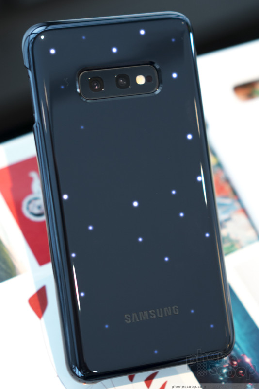
Samsung also has some interesting cases for the S10 series, including several with LEDs embedded in them that can display animations and icons.
The interface is about what I expect from Samsung. I'd prefer Android as Google designed it, but Samsung's newest interface is fine. It is a bit overwhelming that, by default, there are three pages of "quick settings" to scroll through. What's quick about that?
The camera app is a little less intimidating at first glance, but even more powerful. You can tap a toggle at the bottom to select a camera (wide, standard, or tele), or slide it for a continuous zoom using all cameras. The zoom isn't 100% smooth, but it's much smoother and faster than the similar feature on last year's LG V40. The "AI CAM" can now detect more scenes, like "baby", "dog", "cat", "stage" and "drink", and automatically enter modes fine-tuned for each of those subjects.
All of the updates here are welcome. I find wide-angle and telephoto cameras extremely useful in everyday life, so I'm glad to see Samsung getting on board that train in a real way. More screen is always better. The two-way wireless charging is a neat trick that could pair well with certain accessories like the new Galaxy Buds. And the addition of the S10e to the lineup is a smart move.
You can find a few more spec details and launch info in our news article, and be sure to check out our companion video, showing various features — like the in-display fingerprint reader, Wireless PowerShare, camera zoom, and animated LED cases — in action:
Comments
No messages


















 The Correct Way to Train the Samsung Galaxy S10 Fingerprint Reader
 Best of MWC 2019
 Samsung Grows Galaxy S Family with S10, S10+, S10e, and S10 5G
 Samsung Adds New Features to Older Galaxy Phones
 Samsung Galaxy S10e
 Samsung Galaxy S10+
 Samsung Galaxy S10


