Review: Sony Ericsson TM506
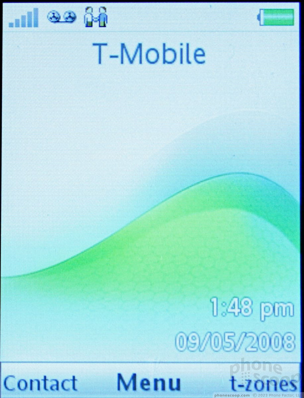
The menu system of the TM506 is a combination of the standard Sony Ericsson menu with a few specific items from T-Mobile. Hitting the center of the D-pad takes you to the main menu. It is a 12-icon grid and looks the same as most other Sony Ericsson phones. Some of the icons open up applications, and some open folders.
If you choose to go into the Entertainment menu, you're greeted with a long list of the phone's different entertainment applications. Selecting the media player app brings you to the familiar Sony PlayStation-style menu, with the same icons you'd see on your PSP or PS3.
The Settings folder is by far the most extensive of the menu items, and uses a tabbed set-up to let you find and alter the phone's settings. Scrolling left or right with the D-pad when in this folder takes you to different sets of options.
The app swapper button, located under the send key to the left of the D-pad, brings up a shortcut menu and a method for managing open applications. The shortcuts list comes pre-populated with some applications, but you can also add your own. Similar to the Settings menu, this shortcut menu uses a sideways tabbed system, and the other tabs let you control which applications are running and help you switch between apps that are active, and those that are running in the background. The TM506 can also run multiple Java applications at once.


 Video Tour: Sony Ericsson TM506
 HMD Launches Barbie Phone in US
 iPhone 16 Brings More Features to All Price Points, Including New Camera Control
 Motorola's New Flagship Gets its Signature Edge Back
 Sony Updates Flagship Phone With New Camera
 Sony Ericsson TM506


