Hands On with the 2021 Moto G series and One 5G ace
Jan 11, 2021, 8:00 AM by Rich Brome @rbrome.bsky.social
updated Jan 11, 2021, 11:39 AM
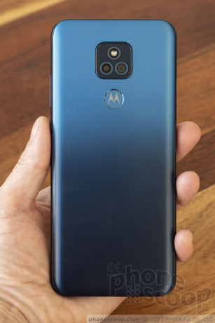
Motorola has a full slate of new affordable phones for 2021, ranging from $170 to $400 for the 5G model. The company's G series has long been well-regarded for quality and value. The new entries are the moto g play (2021), moto g power (2021), and moto g stylus (2021). There's also the Motorola one 5G ace, which — while technically part of the "one" series — seems closely related to the other three. In fact all four phones are quite similar, clearly sharing certain components and design priorities. But what are these phones like in person? How do they feel and what should you know beyond the specs? We're here to show you in this hands-on report.
You might be surprised by both the similarities and the differences between these four phones. I know I was.
What they share
These are all large, heavy phones. In a year where Apple bet on some people wanting smaller phones with the iPhone 12 mini, Motorola seems to think everyone wants a phone with a ~6.5-inch display, and the bulk that comes with having a massive 5,000 mAh battery inside. I can't fault Motorola for going big on the battery front, but phone size and weight are the clear trade-offs here. If you have small hands, beware. These phones feel quite large to me, even without a case. Most of these phones are roughly the same size, with the exception being the g stylus; that one is noticeably even larger.
Speaking of the battery, making 5,000 mAh the default battery size is really something. (Only the g stylus has a smaller battery, to make room for the stylus.) Motorola claims this gives the g play and g power three days of battery life. Previously, companies including Motorola would only give one phone in their lineup a battery that large. Again, this choice has its trade-offs, but it's certainly notable.
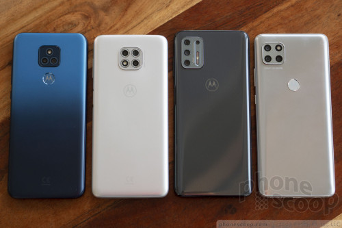
All four phones have a plastic design. No one should expect premium materials in this class of phone, and plastic has the advantage of being more durable than glass. So I don't fault Motorola for this design choice. Two things make these phones feel high-quality despite having plastic bodies: First, Motorola knows how to make phones. They've chosen good materials and the fit-and-finish are top-notch. Second, the large batteries actually help here. A key metric is the ratio of size to weight. Large, light-weight things generally feel "cheap". So having those huge, heavy batteries inside helps these phones feel substantial in a good way.
It's nice to see Motorola making certain features standard across the lineup, like USB-C and fingerprint readers. On the software side, Motorola has made RAW support standard in the camera app on all models, as well as video features like slow motion and time-lapse. That's really nice to see. Sometimes companies remove camera app features from their lower-end models for no reason other than to make the higher models more attractive. Motorola doesn't seem to be doing that here, which is as it should be.
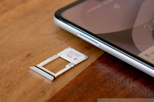
All four phones have a similar SIM and memory card tray that pops out of the left side. All four have a rubber seal to keep water out. This is notable because only the one 5G ace has a proper IP rating for water, (a basic IPx4 for the T-Mobile version and an even more timid IPx2 for other versions), with the rest just being marketed as "water-repellent" to "help protect against moderate exposure to water such as accidental spills, splashes, sweat or light rain". For years now, Motorola has applied a special coating to its phone circuit boards to offer this basic water resistance. But the rubber seal suggests an extra level of consideration re water, one that most manufacturers wouldn't bother with on a phone that doesn't carry an IP rating. This is the mark of a company that takes that one extra step to make sure its phones are reliable in real-world conditions.
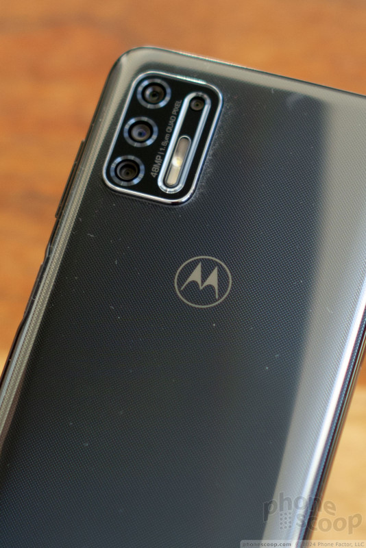
Speaking of the camera, all but the g play have the same "48 megapixel" main camera. I expect this is a pretty decent camera for this class of phone, with decent low-light performance. However, I have a serious problem with this being marketed as a "48 megapixel" camera when it's incapable of producing an image of more than 12 megapixels. It's fine that 12 megapixel (using pixel binning) is the default. That will produce better-quality images in most situations, of sufficient resolution for most people. However, there should still be an option for 48-megapixel mode somewhere, such as in Pro (manual) mode. That there isn't, makes it really deceptive to call this a "48 megapixel" camera. It's really a 12-megapixel camera that uses (insert techno mumbo-jumbo here) to create higher-quality 12-megapixel images, and no more.
Bottom line, these phones have a lot in common; they all riffs on the same basic design. Which makes some of the differences all the more curious.
What's different
The g play and g power have nice matte finishes on the back. Matte finishes hide fingerprints better and I like the feel of them. The g stylus, however, is very glossy, and a real fingerprint magnet as a result. Oddly, the one 5G ace is somewhere in-between with a semi-matte finish. I wish it were more matte, but it's better than full glossy. It's also multi-layered, with a very fine visual texture and a very slight prismatic effect. Motorola was successful in giving the 5G model the most sophisticated look.
The cheapest and most expensive models of the group — the g play and one 5G ace — both have fingerprint readers on the back, integrated with the logo. I love this design touch, which Motorola has been doing with many phones for several years. In briefing us, Motorola extolled the benefit this placement as equally accessible for both left- and right-handed people. So why did Motorola go a different direction with the g power and g stylus, putting the fingerprint reader on the side, integrated with the lock button?
Oddly, only the side-mounted fingerprint readers support a special feature Motorola calls "Power Touch". This brings up a special pop-up bubble with a customizable collection of shortcut icons when you gently double-tap the reader. I'm not sure why Motorola can't implement a similar feature with its rear-mounted fingerprint readers. It's just plain weird that the g power and g stylus support Power Touch but the one 5G ace does not.
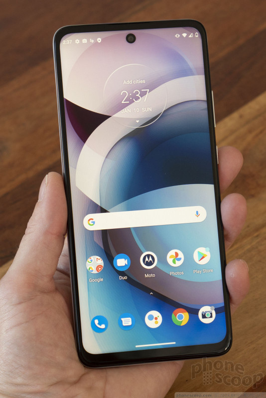
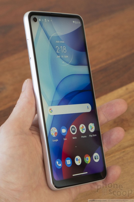
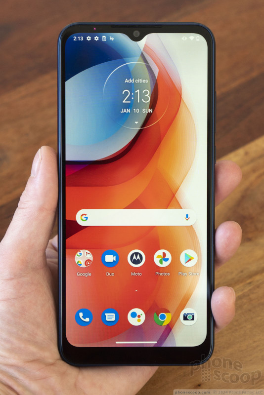
Ditto for the placement of the headset jack and selfie camera on each model. The g play and g power have headset jacks on the top, while the g stylus and one 5G ace have them on the bottom. The g play has a "notch"-style display to accommodate the selfie camera, while the other models use "hole-punch" design. I get that much, since I assume display panels with a hole punch are more expensive. But the one 5G ace puts the hole punch in the middle, while the others have it in the top-left corner.
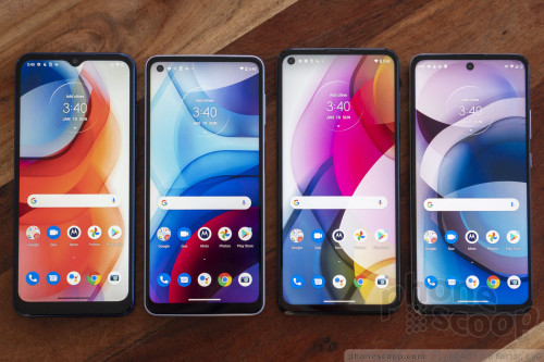
Obviously, the camera module placements also differ, with the g play and power having centered cameras, while the g stylus and one 5G ace put the cameras in the corner. What may not be obvious until you see them in person is that the g play's camera square is almost flush, while the other phones (with the larger, higher-end "48 megapixel" main sensor) have camera humps that stick out a full millimeter.
All of these odd differences make me wonder if Motorola could use a little more leadership and vision. Shouldn't there be someone over there to establish and enforce a design philosophy? Something like "we believe matte finishes are superior, fingerprint readers belong on the back, and headset jacks belong on the bottom", etc.? Or shouldn't they at least care about these things for the sake of having a more consistent design language?
The design language is also not very distinct. Although these new phones look and feel fine, they also look somewhat generic, like every other budget phone on the market this year.
They have kept one distinct Motorola touch that I've always liked, which is giving the lock key a texture or shape that makes it easy to distinguish from the volume keys.
Bottom line
I should talk a little more about the cameras. Depth cameras are almost not worth mentioning. I feel similarly about macro cameras, most of which are a gimmick at best, especially at this price point. And Motorola has only put 2-megapixel sensors in these macro cameras, which is even worse than the competition. So the only "extra" camera I care about is the wide-angle camera in the g stylus and one 5G ace. But unfortunately it's just 8 megapixel. I firmly believe that you shouldn't take a wide-angle camera seriously unless it has *at least* the same effective resolution as the main camera. So I'm quite underwhelmed. But Motorola is hardly alone in skimping on the extra cameras in this price class.
I do like that Motorola put a 16-megapixel selfie camera on the g stylus and one 5G ace. But the 8-megapixel one on the g power is underpowered and the 5-megapixel one on the g play is a joke.
At the end of the day, Motorola has once again produced a lineup of solid-seeming phones that provide an excellent value. While I may question Motorola's strategy on a few minor points, I think the end results are decent phones. I didn't come across any deal-breakers in by brief time with them.
Once you adjust to the large size, each phone has a nice shape that's comfortable to hold. The buttons are well-placed and work well.
All of these phones come with a relatively clean, "Google-like" version of Android 10. Motorola's software additions are truly useful, including a solid array of gestures and shortcuts.
On the value front, I was most impressed by the moto g power. You get the massive battery and relatively premium main camera for a good price. The upgraded processor and option for 4 GB RAM is great for impatient types (like myself.) In all, that's not bad for just $250. Or you can get the 3 GB version for just $200, which is definitely worth the $30 premium over the g play just to get the better-quality camera and faster processor.
The moto g stylus is just too big for me, personally, but if you like 'em huge, it has a good feature set. Just make sure you'll actually use that stylus, because you're trading a fair amount battery life (or phone size, depending on how you look at it) for that luxury.
The one 5G ace seems like a solid entry in the affordable-5G category. But that's suddenly a very competitive category, and I'm not sure this "one" stands out versus the competition as much as it could.
Comments
Can't believe not one comment!
Now, do you also write reviews for a travel blog?
Mexico City is amazing. 😁










 Motorola Unveils Full Affordable Lineup for 2021
 iPhone 15 Series Goes All-In on USB-C and Dynamic Island
 Samsung S24 Series Adds More AI, Updates the Hardware
 iPhone 16 Brings More Features to All Price Points, Including New Camera Control
 Motorola moto g play (2021)
 Motorola moto g power (2021)
 Motorola moto g stylus (2021)

