Hands On with the Orbic Myra 5G for Verizon
Aug 19, 2021, 7:00 AM by Rich Brome @rbrome.bsky.social
Orbic (which is actually a brand of Reliance Communications) has been low-key making low-end phones for Verizon for a few years, but now they're ready to step into the spotlight with a much more interesting 5G phone, the Orbic Myra 5G. It is designed to be one of the more affordable 5G phones in Verizon's lineup, but this mid-range phone goes beyond the basics with a 48-megapixel main camera, Qualcomm Snapdragon 750G chip, huge 5,000 mAh battery, and 18-watt fast charging. But what is it actually like in person? Read on to find out.
Hardware
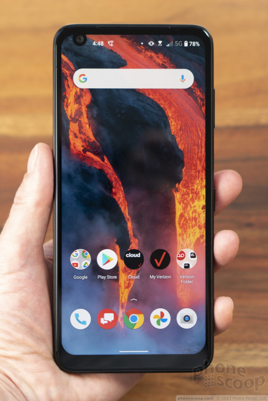
First of all, this is a massive phone. I think it's the largest phone I've tried in the last year, and that's saying something. It's larger than the Samsung Galaxy S21 Ultra, Moto g stylus 5G, and TCL 20 SE. And the design — the very flat back, in particular — doesn't help it feel any smaller or fit in your hand better. You had better be damn sure you like big phones before you even consider this one.
With that said, I commend Orbic on the design of the Myra. It looks much more elegant and classy in person than you might expect from a relatively obscure brand. The glossy back picks up finger smudges easily, but otherwise it's a handsome design. And it feels just as high-quality as it looks. The weight helps it feel solid... it is a quite heavy phone, although that's partly thanks to the massive 5,000 mAh battery inside, which should provide ample battery life.
The side buttons work fine, at least physically. But the fingerprint reader on the back is placed a little too high for my hands. The volume control is far worse, being placed a whole inch beyond my reach.
The display is decidedly not premium. I think the average user — especially in the target market for this device — will be fine with it. But it's not terribly bright. It's also just regular HD instead of Full HD, so it's not particularly sharp. I don't think most people will notice when doing everyday things with it, but Full HD has become somewhat standard on mid-range phones. The ample size of the display (6.78 inches) is nice, but makes the low resolution slightly more noticeable.
I also wish there were better color controls. The display looks way too blue to me by default, but activating Night Light mode over-corrects even at the most minimal setting.
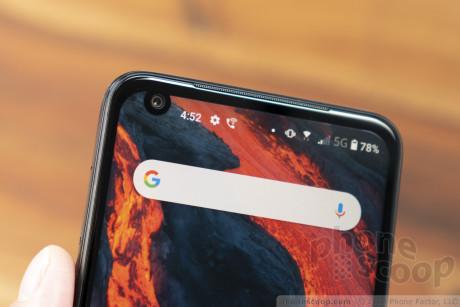
The selfie camera is situated in a display cutout with a unique shape. I thought I'd seen every variation on the "notch", but this style — a cross between a notch and a hole-punch — is novel. The way so many phones look alike these days, I appreciate that bit of distinctiveness.
Software
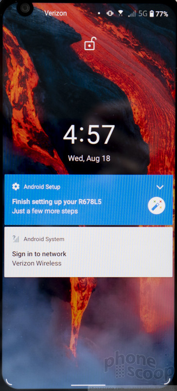
The Android 11 software is both too much like "stock" Android, and not "stock" enough.
There are certain features and tweaks that most phone makers add to Android even when they claim to offer "stock" Android, that most users appreciate. Like tap-to-wake and flip-to-silence gestures, or the ability to control how the interface flows around the display notch, or the density of icons on the home screen. Or maybe they just pretty things up a bit. Even Google does this on their own Pixel phones. This phone has none of those helpful features and tweaks. It is as plain as Android can possibly be, and not in a good way.
corner gesture hints
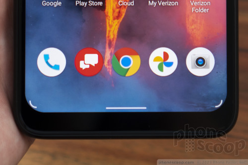
Orbic didn't bother to fully tweak the interface to fit the shape of the display. See how the Google Assistant gesture hints in the corners don't match the radius of the display corners? Man, that kind of thing really bugs me.
On the other hand, there's entirely too much bloatware. (I should note that this is probably mostly Verizon's fault.) Now you might not mind that IMDb and WeatherBug are pre-installed. You might even appreciate that Facebook and Snapchat are there out of the box. But does anyone really want their phone to come with four Yahoo apps, Pluto TV, the McDonald's app, and some game called Tiles Hop? I think not.
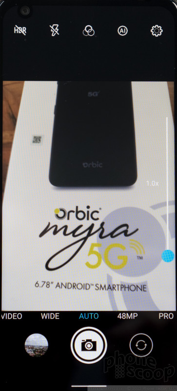
The camera app is an ugly, clumsy affair.
In most camera apps, scrolling through camera modes changes the mode. Not here. You have to scroll, then tap a tiny word. Not only is it an extra step, but if you're used to any other phone, you'll think you changed the camera mode when you actually haven't, which could easily ruin a shot.
The Pro mode has weirdly blurry icons, un-helpful options, and seems buggy. You can't set the shutter speed or do long exposures. And it stays in manual-focus mode no matter what, which is either a major bug or terrible design.
There's a mysterious "AI" icon on the main viewfinder, which you can turn on or off... with no immediate explanation as to what it actually does. After a while I found that it seemed to toggle object recognition, where it will say "human" when you point it at a person, etc. I assume it's doing some kind of scene optimization based on that, but I couldn't detect any difference.
I was not impressed with white balance nor focusing speed in my short time playing with the camera. The wide-angle camera is not terribly useful at only 8 megapixel. Night mode was also disappointing. On the bright side, I thought Portrait mode did an okay job. There's also a QR code scanner, panorama mode, and you can access the full 48 megapixels of the sensor if you like.
Summary
What I like about this phone is the huge display, huge battery, and classy design. It also supports mmWave 5G and the new C-Band 5G that's coming soon. So you should get Verizon's very fastest data speeds wherever you are. And it has a decently fast processor that, indeed, never kept me waiting.
If you need a great camera or have small hands, this isn't the phone for you.
But if you're on a budget, $349 might be the right price for a speedy, good-looking phone with a big battery and even bigger display.
Comments
Low key vendor is right








 Orbic Brings its First 5G Phone to Verizon
 Samsung Refines its Foldable Phones
 iPhone 14 Plus Offers a Big Screen For Less
 Qualcomm Taps Iridium for Satellite Connectivity
 iPhone 15 Series Goes All-In on USB-C and Dynamic Island
 Orbic Myra 5G


