Hands On with the Motorola edge+ (2022)
Mar 24, 2022, 8:00 AM by Rich Brome @rbrome.bsky.social
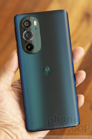
Motorola's newest flagship phone ticks all the standard boxes for a high-end phone, but it also has one totally unique feature: a wide-angle camera with a full 50 megapixel resolution, the same as the main camera. The selfie camera has a similarly unheard-of resolution at 60 megapixel. This phone looks good on paper, but what's it like in person? We take you on a tour and give our first impressions in this hands-on.
Hardware
If you've shopped for phones in person lately, you're probably aware that today's phones are noticeably larger than phones from a few years ago. The new edge+ is no different. Comparing it to the last edge+ (in 2020), you might assume they're the same size because they both have a 6.7-inch display. But the old edge+ had a curved-edge display that helped make the phone narrower. That trend seems to be over and now displays are flat again. But that means that the new edge+ is noticeably wider, which makes a real difference in how it feels, particularly in smaller hands.
The weight is just slightly on the heavy side, but for that you get a feeling of quality and of course a very large battery.
Speaking of feel, the stain finish of the curved glass back feels amazing. You'll probably cover it with a case, but you won't want to because it feels so nice. The color underneath is yet another spin on a subtle shimmer that looks like it has depth and changes color a bit, too. It's a little eye-catching, but without being gaudy. The color shifts between shades of green and blue, and perhaps even a tad purple at extreme angles. I like it.
The camera bump doesn't stick out too much, compared to some phones in this range. This edition has Motorola's new-for-2022 design language with an oval-like shape to the camera area. Personally, I didn't care for it on the company's lower-end phones. But they've done a god job making it look glassier — and classier — on this model.
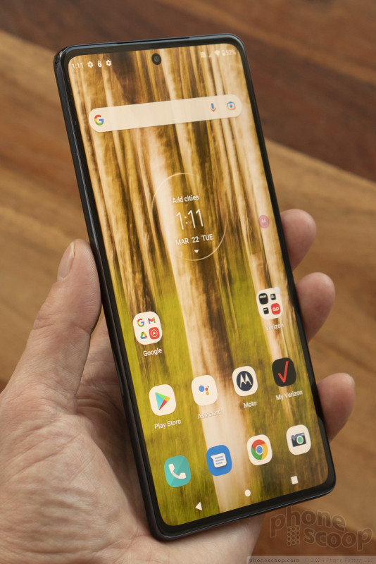
The display looks great. Colors look vivid and relatively accurate to my eye. If you're annoyed by the "chin" that many "all-screen" phones have, you'll be delighted that this phone has no chin. The bezels aren't too thick and they're pretty much the same on all four edges.
The side buttons are small and high up on the phone. These are frequent complaints of mine, but it's a bit more of a problem on this phone for several reasons. First, they're really, unusually high up. You'll definitely have to slide your fingers up from any normal grip position to reach them, and that's really annoying when one of them doubles as the fingerprint reader. Plus the position puts the buttons unnecessarily close to the camera lenses, increasing the chances that you'll smudge a lens as you fumble to unlock your phone, with the smudge ruining your next photo.
side keys
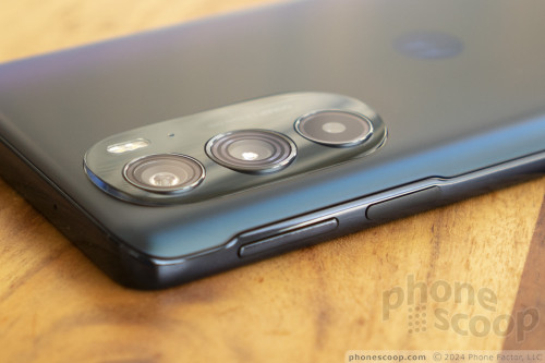
Speaking of the fingerprint reader, this is one of the tiniest fingerprint readers I've ever seen on a phone, and, unusually, the surface is not completely flat. I was worried that would affect its reliability. Unfortunately, I was right. Sampling such a tiny slice of your fingerprint means it often can't make a confident match on the first try. The reliability could potentially improve with several re-trainings or after using some careful, specific training technique. But if such a technique might help, it's not part of the current training instructions. I hope Motorola can improve the reliability with a software update that addresses the algorithm, the instructions, or both.
Software
Motorola continues to do a decent job balancing the "stock Android" experience with its own software additions. The default look is the attractive and clean Google design.
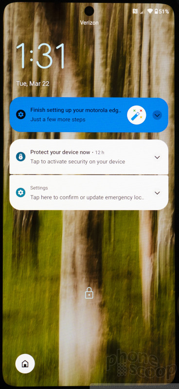
Motorola's myriad extra options and shortcuts — most of which are quite helpful — are controlled in the Moto app. The main menu here can be a bit disorienting, as it's not immediately clear that the smaller buttons are just suggestions from what's behind the larger buttons, and those suggestions can change. It's an odd interface. Fortunately, all the menus beyond that screen are straightforward, and the options are most of the ones I always hope to find on an Android phone.
Camera
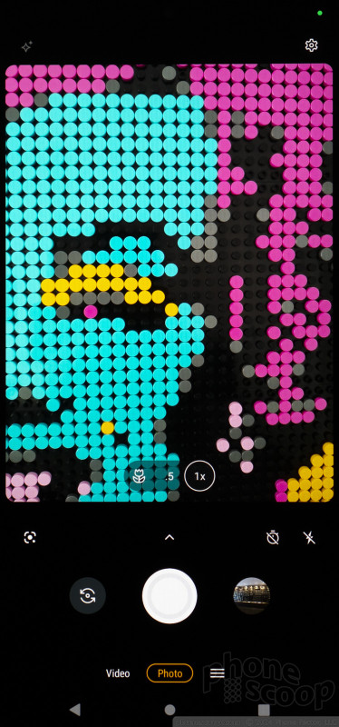
Motorola's camera app has followed a steady evolution over the past few years. Motorola has kept adding good features, while keeping the many settings organized and manageable. If you've used a Moto phone from the last few years, you'll feel right at home. If not, you'll find your way around easily.
I like to see fun and useful features like Active Photos, Dual Capture, document scanner, and audio zoom. The Pro (manual) mode lets you do long exposures up to 32 seconds. One really nice touch is that if there's special mode you use often, you can set it to open the last-used mode as the default.
The special thing about the camera system is the crazy high resolution of the wide-angle camera. Both the standard and wide-angle camera are a generous 50 megapixel. This addresses a huge pet peeve of mine: why do so many phones have less resolution for their wide camera than the main one? Think about it: when you "zoom out", you're seeing a lot more, so if anything, having good detail is more important, not less. A low-res wide camera how you know that particular camera was only thrown in to boost the phone's lens count for marketing purposes.
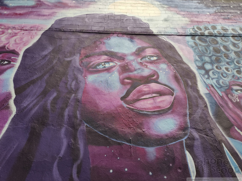
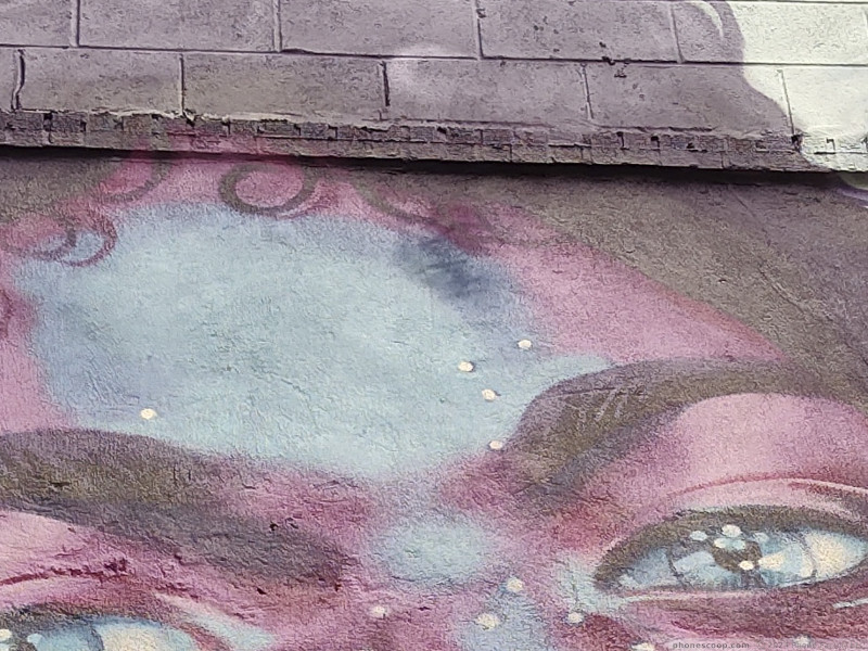
Indeed, as you can see above, you get noticeably more detail in 50 megapixel "Ultra Res" mode. You also get larger file sizes, of course: expect something in the range of 12–26 MB per photo.
In phones today, the main point of so many megapixels in a camera sensor is not that you actually capture that much resolution with most photos, but that the camera system merges neighboring pixels to produce normal-resolution (12 megapixel) photos with better quality.
That's why the front camera is an unprecedented 60 megapixel. I don't know about you, but I have zero desire to see every pore on my face. But if I'm taking a selfie in low light, I don't want to noise to make my face look splotchy. That's exactly where it helps to have a selfie camera sensor with 60 megapixels; it's not really about more detail. It's about making you look better, no matter the lighting situation. And it produces 15 megapixel photos by default, which is still better than many phones.
That probably explains the otherwise inconsistent-seeming way you access higher resolutions in the front vs. rear cameras. For the rear cameras, there's a dedicated "50 Ultra Res" mode for when you want to take a super-detailed, 50 megapixel photo. It's easier than digging into settings for the photo resolution option. That same mode works equally well for both the standard and wide cameras, as it should. But for the selfie camera, you do have to dig into the settings to access the 60 megapixel option. Honestly, I'm impressed that they offer that option at all for the front camera.
The other nice thing about having a 50 megapixel sensor is that it can be a substitute for a telephoto camera. With so much detail when you want it, you can crop a 50-megapixel photo to "zoom in" and still have a decently-sharp photo.
Summary
If you're a fan of Motorola, this looks like it should be a solid high-end entry from them. Or if you find yourself taking wide-angle photos as much as I do, this one is well worth a look for the high-res wide camera alone. I do like Motorola's software, and the specs are all decent for a flagship. At $850 on Verizon, it's well-priced as an alternative to the most popular ($1,000) flagship phones.
Comments
No messages












 Motorola's new Edge+ has Dual 50 Megapixel Rear Cameras and 60 on the Front
 iPhone 15 Series Goes All-In on USB-C and Dynamic Island
 Samsung S24 Series Adds More AI, Updates the Hardware
 Motorola edge+ (2022)

