Hands On with the Motorola moto g stylus 5G (2022)
Apr 28, 2022, 8:00 AM by Rich Brome @rbrome.bsky.social
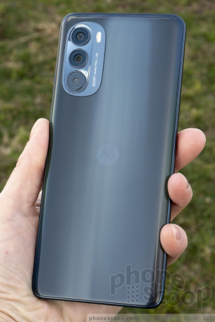
Motorola has a new edition of its mid-range, big-screen phone with a stylus. It has 120 Hz display refresh, an unprecedented feature in this price range. It also fixes two issues with its predecessor: a slow processor and lack of NFC. Otherwise, it seems pretty similar on paper. But what's it like in person? Read on for our hands-on first impressions and photos.
Hardware
The new moto g stylus 5G is a larger phone than I would personally prefer, but I'll gladly give it a pass because that's basically the point of this phone. If we were still using the term "phablet", that's what this is supposed to be.
This phone is for people whose priority is a really nice, big display. On that, it delivers. The display is big, sharp, and has a refresh rate of up to 120 Hz. That's a number more commonly seen on high-end gaming phones, not mid-range phones like this. (But I'm not someone that can tell the difference between 60, 90 or 120 Hz displays.)
Holding the phone, I'm struck by bow tall it looks and feels. This applies to both the body and the display. I wish they could have made the side bezels a smidge thinner to give us a little more display width. If you're hoping for a big canvas for your sketches with the stylus, things might feel a bit cramped on the left and right sides, despite the large diagonal measurement of the display.
Motorola has also continued its recent habit of putting the side buttons up too high. The lock button / fingerprint reader is fine, but the volume buttons are too high to reach without adjusting your grip.
The body feels solid and nice to the touch, but not particularly high-end. It's good for a plastic phone, but it is plastic. It's quite comfortable to hold. The back has a very handsome shimmer effect that's not too flashy. But it seems like Motorola skipped the oleophobic coating, because the back is an absolute fingerprint (and dust) magnet.
There's a subtle thing they've done with the sides, where it's reflective at the edges but matte in the middle. It looks nice and feels nice.
Software
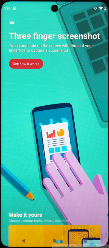
Motorola does a good job of providing a Google-like "clean" Android software experience, yet adding a solid slate of genuinely helpful additions and tweaks. This hasn't changed. My only gripe is that the unified Moto app for controlling these features has turned into a series of billboards promoting specific Motorola features, in a way that hinders usability a bit. I would prefer a more straightforward interface here.
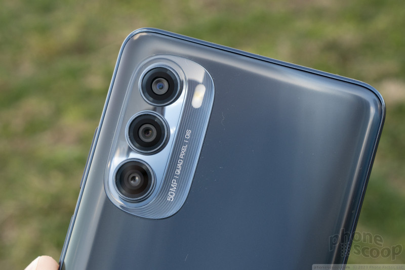
I was not particularly impressed with the camera. Taking a few test photos one afternoon, most shots turned out about how I expected in most regards, which was decent but not impressive. But one aspect was most disappointing: detail. First off, a not-great lens consistently causes the very corners of each photo to be a blurry mess. But more puzzlingly, some areas closer to the center of the image often turned out slightly blurry, even outdoors on a bright, sunny day. Not always, but quite often. It was the inconsistency that was bizarre. I have a suspicion that something was wrong with the OIS and it was adding slight motion blur when it should have been doing the opposite. Regardless, a camera using both pixel binning and OIS in good lighting should be able to turn out much sharper images, more consistently.
The wide-angle camera is only 8 megapixels, which is disappointing. I expect that on cheaper phones, but this is supposed to be closer to a mid-range model. Motorola put a whopping 50 megapixel wide camera on its recent edge+ flagship, so I thought these guys finally understood the importance of megapixels on a wide cam. Apparently not. The resulting photos look fine zoomed out, on your phone screen. But do anything else with them, and... let's just say I doubt anyone will think you took them with an iPhone.
The wide camera doubles as a macro camera. Now here, 8 megapixels is a good spec for a macro camera. Motorola swears people love macro mode. I'm not convinced, and they rarely turn out well when I try. I tried a few with this phone, and most turned out as poorly as I expected.
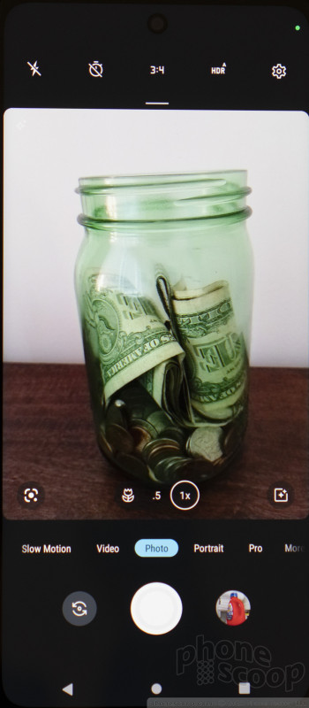
I do like Motorola's camera app. Everything is where it should be and easy to use. It offers all of the most important useful features, plus a few fun ones. You can take some pretty sweet long exposures (up to 32 sec.), use both the front and rear cameras at once, take time-lapses, and output to RAW files. And yes, you can access the full 50 megapixel resolution of the main sensor if you like.
Stylus
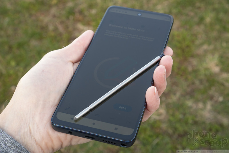
The stylus is handsome and well-made. It's relatively long, but quite skinny. (It fits in the headset jack all too well.) The tip appears to be some kind of soft metal mesh instead of the usual rubber nub. It works well enough. You won't mistake the feel of the stylus against the display for paper, but it feels fine.
I think Motorola did a good job of making the stylus easy to remove and replace, without making it something that will fall out or activate by accident.
As is common, removing the stylus can trigger a little pop-up window of customizable shortcuts. There is, of course, a dedicated sketch/notes app called Moto Note.
There is also system-wide handwriting recognition if you want it. A little floating bar makes it easy to access delete, space, return, and switch to keyboard if you like. The thing is, you have to write right next to the text input cursor for it not to be interpreted as a tap, which is often difficult or even impossible. I didn't find the feature to be very practical.
You can write anywhere when using text mode in the Moto Note app, but it has a similar problem where it sometimes interprets input as a tap, so one word will appear at the top of you note and the next is suddenly near the bottom. It's frustrating.
I had more fun doodling, but the accuracy of the stylus bothered me. The tip is relatively blunt, which I think is why it drew at least a millimeter off from where I expected it to. It made detail work difficult. Even just trying to stay within the lines in the coloring book app was more challenging than it should have been.
I also detected a very slight lag when using the coloring book app. I wouldn't call it a performance "problem", but any noticeable lag at all breaks the illusion that you're actually drawing, as if on paper. It makes a difference.
If you're a serious artist, (or aspire to be,) hoping to get a useful drawing tool for cheap, this ain't it. This is not a premium nor pro-level stylus experience. But that's okay. It's not really supposed to be; this isn't that kind of device. This is strictly for the most casual of sketches and doodles.
Summary
My main reservation with this phone is the disappointing detail in camera photos. I didn't expect flagship-level photos, but this issue put the camera quality noticeably below what I expected for a phone with these specs and this price. The photos were otherwise fine, but if you want to print your photos, or just be able to zoom in and see good detail, it could be an issue.
Otherwise, I think this phone is promising. If a good, big display is your priority, this phone was made with you in mind. I feel better about recommending this year's model now that it has a better processor and NFC for Google Pay. There's also a nice-size battery that should provide great battery life. And while other companies continue to eschew headset jacks and expandable storage, you'll find both here. Motorola makes solid hardware and I really like their software. There's a lot to like here.
Comments
No messages










 Motorola Adds 5G to its 2022 Mid-Range Lineup
 Hands On with the moto g stylus 5G (2023)
 2023's moto g stylus 5G is Smaller
 Motorola Gets Serious About Foldables with New RAZR Lineup
 Motorola moto g stylus 5G (2022)

