Review: Motorola krave ZN4
Browse
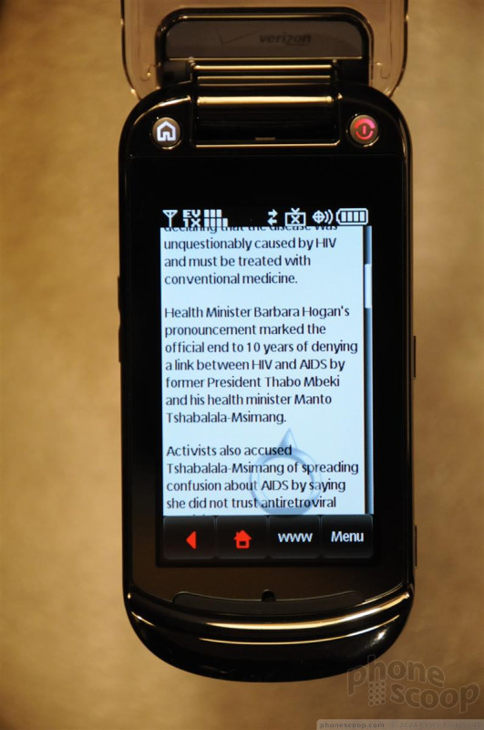
Krave employs a WAP 2.0 browser that is almost impossible to use, primarily because the screen is too small for true touch capabilities.
Instead of being able to touch a link to navigate, there's a large cursor that looks like an engagement ring with a small pyramid-shaped gem as the cursor tip. You move the "ring" cursor around by touch until the tip lands on the link you want to activate. The middle of the ring fills in a light blue, which you then tap to activate the link. The center of the ring turns red when the link is activated.
Except the ring doesn't always want to stay where you put it. When you lift your finger up, it seems to move a millimeter or so from where you thought you placed it, requiring you do make continual minor adjustments. Even if you point the ring gem right on a link and the ring fills blue, touching the blue doesn't always activate the link. And sometimes tapping the blue ring moves it off the link. Unfortunately, there is no other option to navigate around other than this maddening ring curor thing. This was possibly the most frustrating Web browsing experience I've ever had.
You can increase the size of the tiny text in 10% increments up to 200% (although I'm not sure why there should be options below 100% since it's barely readable at full size) if you switch the display mode to widescreen in the browser menu (not by rotating the phone to horizontal). But this enlarged text mode presents problems of its own. Text does not word wrap so you have to move the page left and right to read across. if you rotate the phone from landscape to portrait or vice versa, the zoomed text reverts to its regular size. If you move to a different page, the zoomed text reverts to its regular size. And you still have to use the ring cursor.
Speed-wise, the Krave is not quite as fast at filling Web pages as I'd come to expect from an EV-DO Rev. 0 phone. Booting the browser opens Verizon's Web home page, with its tiny barely readable type, in about 10 seconds. Subsequent pages such as CNN.com, ESPN.com and the New York Times Web page loaded in around 7 to 10 seconds, about twice as slow as other Verizon EV-DO Rev. 0 phones I've used.
Krave includes an accelerometer, so Web pages auto rotate when the phone is turned from vertical to horizontal, but text size does not change.
Customize
You get just the customization basics: choose from 15 pre-set wallpapers and themes, or you can use a photo of your choosing; you can adjust the clock size and the dial type size (although I could detect no difference between the regular and large dial font options); you can select from the included synthesized ringtones; and, you can add a personalized banner (e.g. "My Krave").
You can't re-arrange or move any menu shortcut icons or change how the main menu icons are displayed.


 Verizon Kraves the Motorola ZN4
 iPhone 15 Series Goes All-In on USB-C and Dynamic Island
 Hands On with the Motorola razr and razr+ (2024)
 Apple Previews Major New Accessibility Features for iOS
 Nokia Refreshes Entry-Level Android Lineup for US
 Motorola Krave ZN4


